Scotland Performs Update
Scottish Government performance scorecards and narratives as at 15 December 2016.
Equalities And Human Rights Committee
Scorecard
The following National Performance Framework indicators have been selected as relevant to the Equalities and Human
Rights Committee for the purposes of the Draft Budget Consultation Period.
The report below shows recent performance on these indicators as at 15 December 2016.
The hyperlinks take you to the Scotland Performs website for the latest information on each indicator.
| Performance Improving |
|
|---|---|
|
|
To narrow the gap in participation between Scotland's best and worst performing regions by 2017 ( cohesion) Increase the proportion of healthy weight children Reduce crime victimisation rates Reduce children's deprivation Improve access to suitable housing options for those in housing need |
| Performance Maintaining | |
 |
Supported by increased healthy life expectancy in Scotland in the period from 2007 to 2017 ( population) To increase overall income and reduce income inequality by 2017 ( solidarity) Improve the skill profile of the population Reduce underemployment Reduce the proportion of employees earning less than the Living Wage Reduce the pay gap Increase the proportion of young people in learning, training or work Increase the proportion of babies with a healthy birth weight Increase physical activity Improve self-assessed general health Improve mental wellbeing Improve support for people with care needs Reduce the percentage of adults who smoke Reduce alcohol related hospital admissions Improve the responsiveness of public services Widen use of the internet Improve people's perceptions of their neighbourhood Increase cultural engagement Improve access to local greenspace |
| Performance Worsening |
|
 |
Improve levels of educational attainment Reduce premature mortality Improve people's perceptions about the crime rate in their area Improve people's perceptions of the quality of public services Reduce the proportion of individuals living in poverty |
Performance Improving
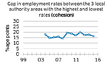
The gap in employment rates between the three local authorities with highest and lowest rates has fluctuated in recent years and is now at roughly the same level as in 2004.
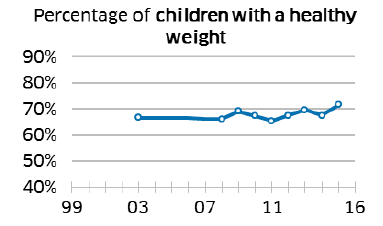
The proportion of healthy weight children has fluctuated around the same general level with no clear pattern between 2008 and 2015.
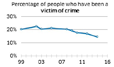
The percentage of people who have been a victim of crime remains on a downward trend.
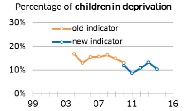
The percentage of children living in material deprivation decreased in 2014/15 following an increase in the previous two years. In 2010/11, there was a change to the questions asked in the survey.
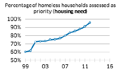
Since December 2012, all unintentionally homeless households have been entitled to settled accommodation.
Performance Maintaining
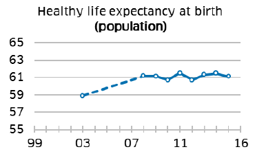
Levels of healthy life expectancy have been gradually increasing since 1980. However, there has been little change since 2008, with year-to-year fluctuations.
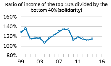
The ratio of income of the top 10% divided by the bottom 40% has remained stable in recent years, following a relatively large decrease between 2009/10 and 2010/11.
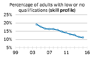
The percentage of the working age population with low or no qualifications continues to decline as part of a consistent downward trend.
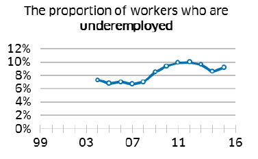
The proportion of workers who are underemployed remained stable between 2014 and 2015, following a declining trend since the peak in 2012. The upward trend in earlier years was due to the recession in 2008.
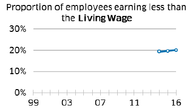
The proportion of employees earning less than the Living Wage remained stable between 2015 and 2016.
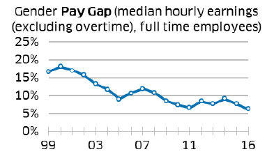
The gender pay gap has gradually decreased since 2000, remaining stable in 2016.
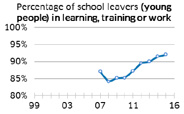
The proportion of school leavers in learning, training or work increased between 2008/09 and 2015/16.
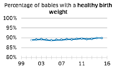
The proportion of babies with a healthy birth weight increased from 88.9% to 90.1% between 2001 and 2016.
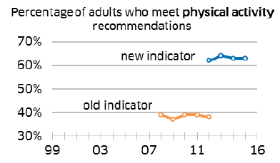
The proportion of adults meeting physical activity guidelines has been stable since 2012. Using the old guidelines, the proportion of adults meeting the recommendations was also stable between 2008 and 2012.
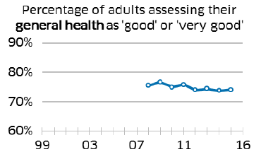
The percentage of adults assessing their health as 'good' or 'very good' fluctuated from 2008 to 2011 and has been more stable between 2012 and 2015.
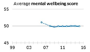
Average adult scores on the Warwick- Edinburgh Mental Wellbeing Scale have remained stable between 2008 and 2015.
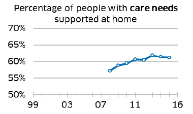
The percentage of people receiving personal care at home, rather than in a care home or hospital, remained stable last year.
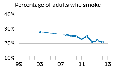
The proportion of adults who smoke has been on an overall downward trend, with a relatively large decrease in 2013.
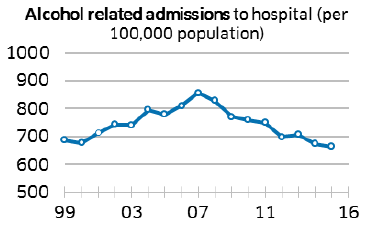
Alcohol related hospital admissions peaked in 2007/08. They have since declined by 22%, remaining stable in 2015/16.
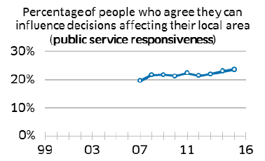
The percentage of people who agree that they can influence decisions affecting their local area has increased since 2007.
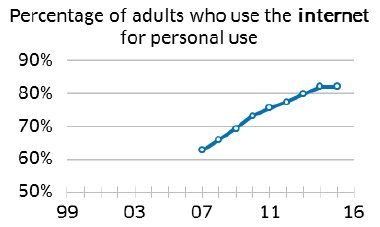
The percentage of adults using the internet for personal use remained stable between 2014 and 2015, following a steep upward trend.
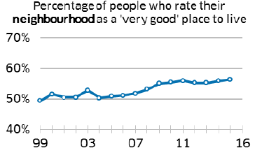
The percentage of people who rated their neighbourhood as a very good place to live increased between 2006 and 2011, but has remained stable since.
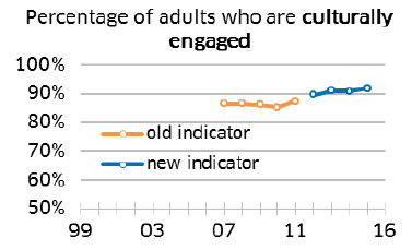
The percentage of adults who engaged in a cultural activity remained stable between 2012 and 2015. The survey question was changed in 2012. Previously the percentage had remained fairly stable since 2007.
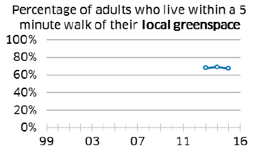
The percentage of adults who live within a 5 minute walk of their local greenspace has remained about the same for the last three years.
Performance Worsening
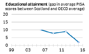
Scotland's educational performance has fallen to 2 points above the OECD average in 2015. This is due to declines in Scottish performance in Science and Reading.
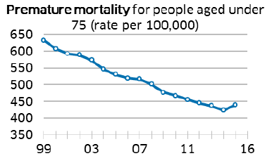
Premature mortality increased for the first time in 2015. Despite the increase, premature mortality is at its third lowest level over the full time series, having previously decreased year-on-year for every year in recent decades.
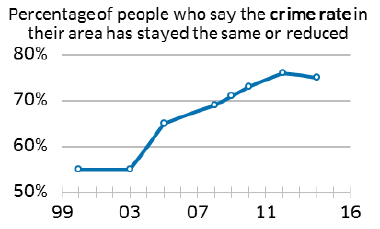
The percentage of people who perceive crime to have stayed the same or reduced in their area decreased in 2014/15. However, this number has risen continuously since 2003.
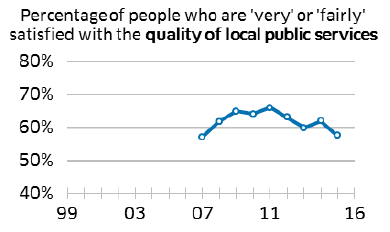
The percentage of people who are 'very' or 'fairly' satisfied with local public services has fluctuated in recent years and decreased in 2015.
Performance Worsening
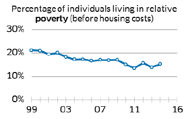
The proportion of people living in relative poverty is on a long downward trend, but has fluctuated since 2009.
Equalities And Human Rights Committee - Appendix
This appendix uses the data available on Scotland Performs to provide data breakdowns for some of the indicators in this scorecard.
- Further breakdowns are available on Scotland Performs for some of these and other National Performance Framework indicators.
- A wider set of equality data is available through the Equality Evidence Finder.
Population - Supported by increased healthy life expectancy in Scotland in the period from 2007 to 2017
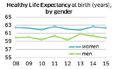
Women have a higher Healthy Life Expectancy than men. The gap widened in 2015.
Improve the skill profile of the population
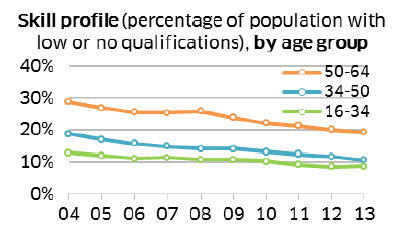
A higher percentage of the population aged 50 and older has low skills compared to those under 50.
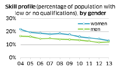
A slightly higher percentage of women than men have low skills. The gap continued to narrow in 2013.
Reduce the proportion of employees earning less than the Living Wage
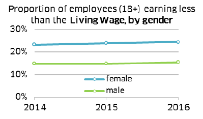
A higher proportion of female employees than male employees earn less than the Living Wage.
Improve levels of educational attainment
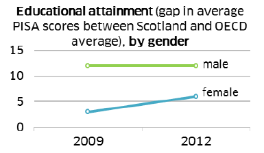
On average (across reading, maths and science) male students in Scotland outperform the OECD average to a greater extent than females do. The extent to which Scotland's mean scores exceed the OECD average has remained the same for males between 2009 and 2012, but has increased for females.
Increase the proportion of young people in learning, training or work
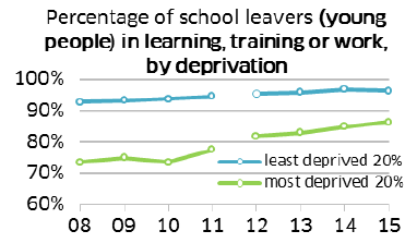
Although the difference has narrowed in recent years, there is still a gap between the proportion leaving school from the least deprived areas going in to learning, training or work compared to school leavers from the most deprived areas.
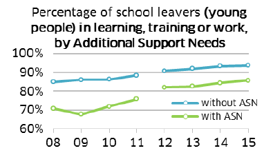
The proportion of school leavers with additional support needs in learning, training or work has been increasing. However, there remains a gap between them and their peers without additional support needs.
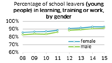
There is little difference in the proportion of female and male school leavers in learning, training or work.
School leaver data from 2012/13 onwards is not directly comparable with data prior to this.
Increase the proportion of healthy weight children
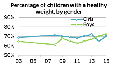
In 2015, the percentage of children with a healthy weight is similar for girls and boys.
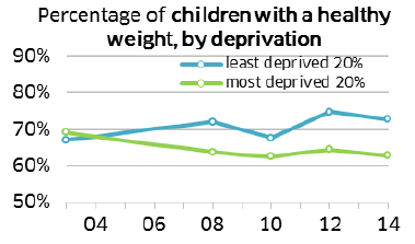
Children in the least deprived areas are more likely to have a healthy weight than those in the most deprived areas.
Increase physical activity
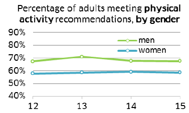
Men are more likely to meet physical activity guidelines than women.
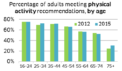
The percentage of adults meeting physical activity recommendations decreases with age. Although, the 75+ age group has seen the largest increase between 2012 and 2015.
Improve self-assessed general health
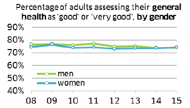
The percentage of men and women assessing their general health as 'good' or 'very good' has been similar since 2008.
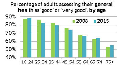
Self-assessed general health decreases with age. Although, the biggest increases between 2008 and 2015 were in the 65- 74 and 75+ age groups.
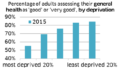
In 2015, self-assessed general health was lowest in the most deprived areas and highest in the least deprived areas.
Improve mental wellbeing
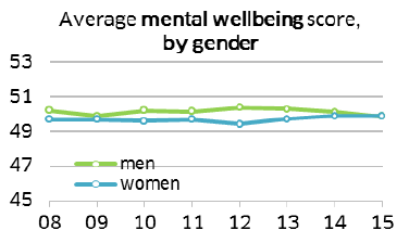
The gap between men's and women's mental wellbeing scores has been narrowing since 2012 and they are now equal.
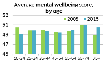
Between 2008 and 2015, people aged 75 and older had the largest increase in mental health score. People aged 16 to 24 had the largest decrease.
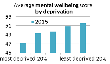
In 2015, mental wellbeing scores were lowest in the most deprived areas and highest in the least deprived areas.
Reduce premature mortality
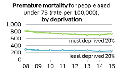
Premature mortality rates are higher in the most deprived areas than the least deprived areas.
Reduce the percentage of adults who smoke
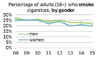
Smoking rates have been falling gradually for both men and women. In 2015, men were slightly more likely to smoke cigarettes than women.
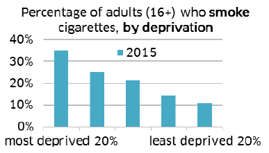
In 2015, smoking rates were highest in the most deprived areas and lowest in the least deprived areas.
Reduce alcohol related hospital admissions
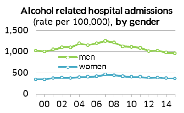
Rates of alcohol related hospital admissions are higher among men than women.
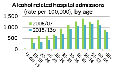
Rates of alcohol related hospital admissions have fallen across all age groups between 2006/07 and 2015/16.
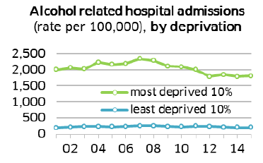
Rates of alcohol related hospital admissions are higher in the most deprived areas than in the least deprived areas.
Improve people's perceptions about the crime rate in their area
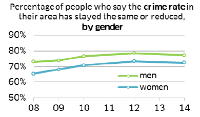
Men were more likely to agree that the local crime rate has reduced or stayed the same than women.
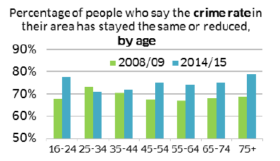
Between 2008/09 and 2014/15, the percentage of people who said that the local crime rate has reduced or stayed the same increased across all age groups, other than those aged 25-34 and 35-44 where changes were not significant.
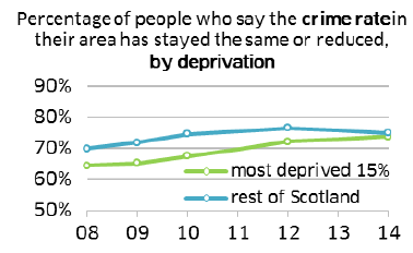
The gap in perceptions of crime rate between the most deprived areas and the rest of Scotland fell between 2012/13 and 2014/15.
Reduce crime victimisation rates
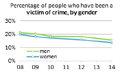
The risk of being a victim of a crime is higher for men than for women.
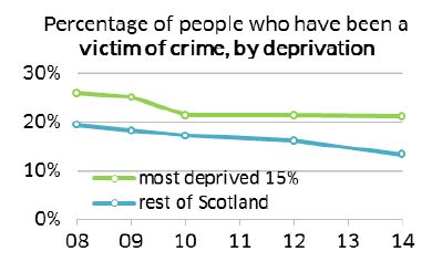
The risk of being a victim of crime is higher for adults living in the 15% most deprived areas, compared to those living in the rest of Scotland.
Improve people's perceptions of the quality of public services
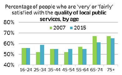
Those aged 65 and older are the most satisfied with local public services, even though in those age groups satisfaction levels have fallen.
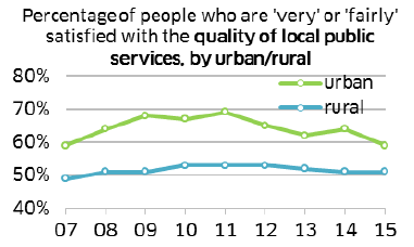
People living in urban areas are more likely to be satisfied with local public services.
Reduce the proportion of individuals living in poverty

The percentage of single working age women with dependent children living in relative poverty has fallen over time. However, in 2014/15 it was higher than the percentages of single working age men and women without dependent children living in poverty.
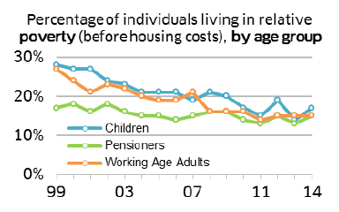
There has been a general decrease in the percentage of people living in relative poverty across the age groups. In 2014/15, levels of relative poverty were similar for each age group.
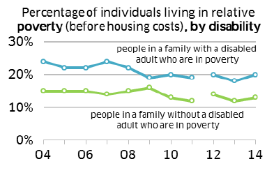
People living in a household with a disabled adult are more likely to be living in relative poverty.
Please note figures from 2012/13 onwards are not directly comparable to previous years due to the definition of disability changing.
Widen use of the internet
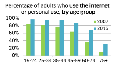
Internet use has risen for all age groups between 2007 and 2015, with the largest rises among those aged 60 and older.
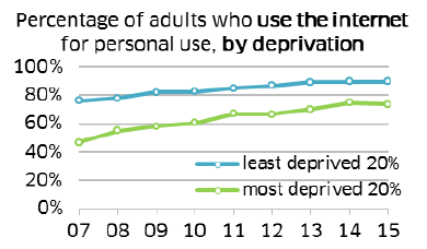
The gap in internet use between the least and most deprived has narrowed from 29% in 2007 to 16% in 2015.
Improve people's perceptions of their neighbourhood
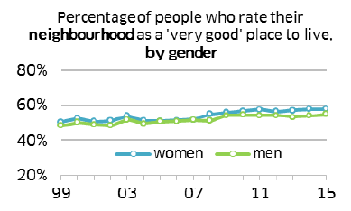
The percentage of people who rate their neighbourhood as a 'very good' place to live has increased for both men and women and are at very similar levels.
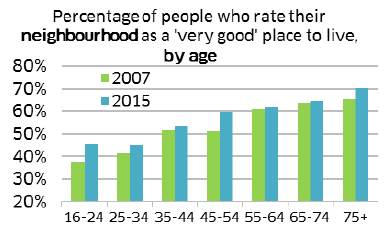
Between 2007 and 2015, the percentage of people who rate their neighbourhood as a 'very good' place to live has increased across all age groups.
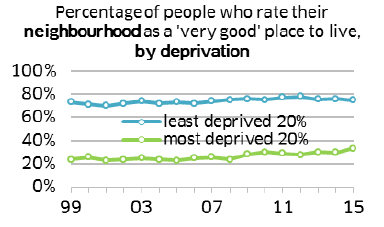
The percentage of people who rate their neighbourhood as a 'very good' place to live is lower in the most deprived areas.
Increase cultural engagement
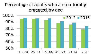
Between 2012 and 2015, levels of cultural engagement have increased across all age groups, although engagement decreases with age.
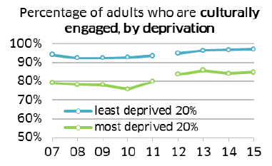
Overall, cultural engagement is at the highest level to date, but people are more culturally engaged in the less deprived areas.
Data for 2012 onwards is not directly comparable with data prior to this.
Improve access to local greenspace
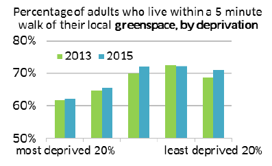
A higher proportion of adults in less deprived areas live within a 5 minute walk of local greenspace.
