Coronavirus (COVID-19): modelling the epidemic (issue no. 46)
Latest findings in modelling the COVID-19 epidemic in Scotland, both in terms of the spread of the disease through the population (epidemiological modelling) and of the demands it will place on the system, for example in terms of health care requirement.
Overview of Scottish Government Modelling
Epidemiology is the study of how diseases spread within populations. One way we do this is using our best understanding of the way the infection is passed on and how it affects people who catch it to create mathematical simulations. Because people who catch Covid-19 have a relatively long period in which they can pass it on to others before they begin to have symptoms, and the majority of people infected with the virus will experience mild symptoms, this "epidemiological modelling" provides insights into the epidemic that cannot easily be measured through testing e.g. of those with symptoms, as it estimates the total number of new daily infections and infectious people, including those who are asymptomatic or have mild symptoms.
Modelling also allows us to make short-term forecasts of what may happen with a degree of uncertainty. These can be used in health care and other planning. The modelling in this research findings is undertaken using different types of data which going forward aims to both model the progress of the epidemic in Scotland and provide early indications of where any changes are taking place.
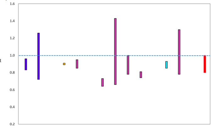
Modelling outputs are provided here on the current epidemic in Scotland as a whole, based on a range of methods. Because it takes a little over three weeks on average for a person who catches Covid-19 to show symptoms, become sick, and either die or recover, there is a time lag in what our model can tell us about any re-emergence of the epidemic and where in Scotland this might occur. However modelling of Covid deaths is an important measure of where Scotland lies in its epidemic as a whole. In addition, the modelling groups which feed into the SAGE consensus use a range of other data along with deaths in their estimates of R and the growth rate. These outputs are provided in this research findings. The type of data used in each model to estimate R is highlighted in Figure 1.
We use the Scottish Contact Survey to inform a modelling technique based on the number of contacts between people. Over time, a greater proportion of the population will be vaccinated. This is likely to impact contact patterns and will become a greater part of the analysis going forwards.
The delivery of the vaccination programme will offer protection against severe disease and death. The modelling includes assumptions about compliance with restrictions and vaccine take-up. Work is still ongoing to understand how many vaccinated people might still spread the virus if infected. As Covid-19 is a new disease there remain uncertainties associated with vaccine effectiveness. Furthermore, there is a risk that new variants emerge for which immunisation is less effective.
The logistical model utilises results from the epidemiological modelling, principally the number of new infections. The results are split down by age group, and the model is used to give a projection of the number of people that will go to hospital, and potentially to ICU. This will continue to be based on both what we know about how different age groups are effected by the disease and the vaccination rate for those groups.
What the modelling tells us about the epidemic as a whole
The various groups which report to the Scientific Pandemic Influenza Group on Modelling (SPI-M) use different sources of data in their models (i.e. deaths, hospital admissions, cases) so their estimates of R are also based on these different methods. SAGE's consensus view across these methods, as of 7 April, was that the value of R in Scotland was between 0.8 and 1.0 (see Figure 1). This is unchanged from the estimate of R as of 31 March.
Source: Scientific Advisory Group for Emergencies (SAGE).
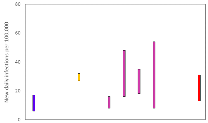
The various groups which report to the Scientific Pandemic Influenza Group on Modelling (SPI-M) use different sources of data in their models to produce estimates of incidence (Figure 2). The Scottish Government results this week have been computed using a platform called Epidemia (see Technical Annex in issue 37) which expands the Bayesian semi-mechanistic model which the Scottish Government runs. SPI-M's consensus view across these methods, as of 7 April, was that the incidence of new daily infections in Scotland was between 13 and 31 new infections per 100,000. There have been no changes in the estimate this week. This equates to between 700 and 1,700 people becoming infected each day in Scotland.
Source: Scientific Pandemic Influenza Group on Modelling (SPI-M).
The consensus from SAGE for this week is that the growth rate in Scotland is between -4% and 0% per day. The estimate of the growth rate was between -4% and -1% on 31 March.
What we know about how people's contact patterns have changed
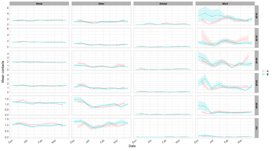
Average contacts have increased in the last two weeks, with a current level of 3.2 daily contacts as seen in Figure 3. Contacts within the work setting have shown an increase in the last two weeks, increasing by 49% whereas mean contacts in the school setting have decreased by approximately 18%, coinciding with spring holidays that commenced in some areas on 26th March. Contacts within the home and 'other' setting (contacts outside of the school, home or work settings) remain similar to those reported two weeks prior.
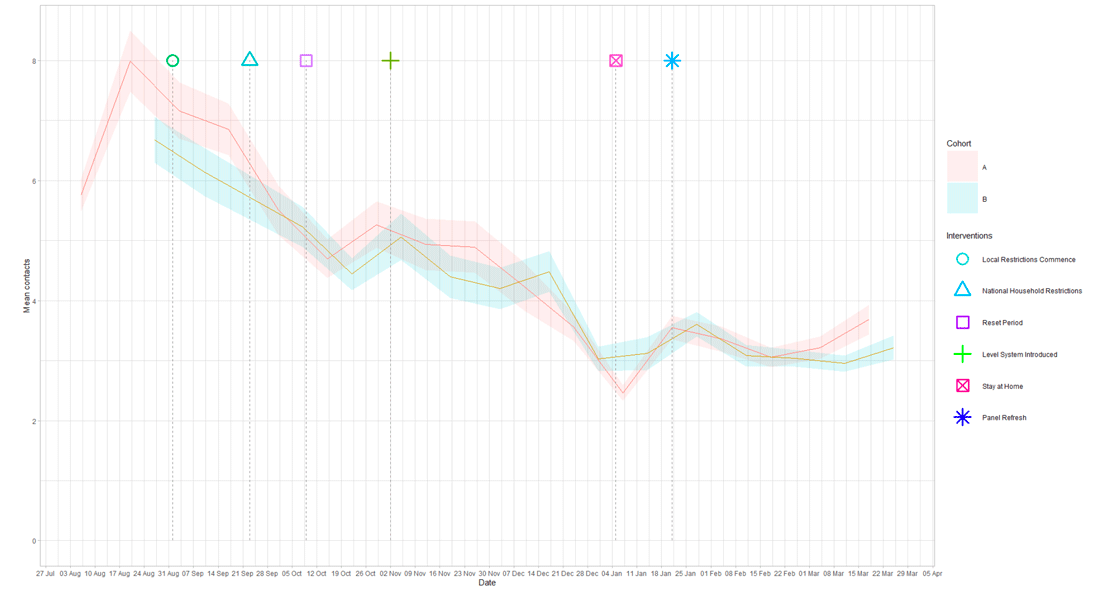
Figure 4 shows how contacts change across age group and setting. Those aged between 50 and 70 have shown the largest increase in contacts in the most recent survey, largely driven by contacts in the work and in the 'other' setting. Those aged 50-59 have had the biggest increase in average contacts, increasing overall average contacts by 53% in the last two weeks.
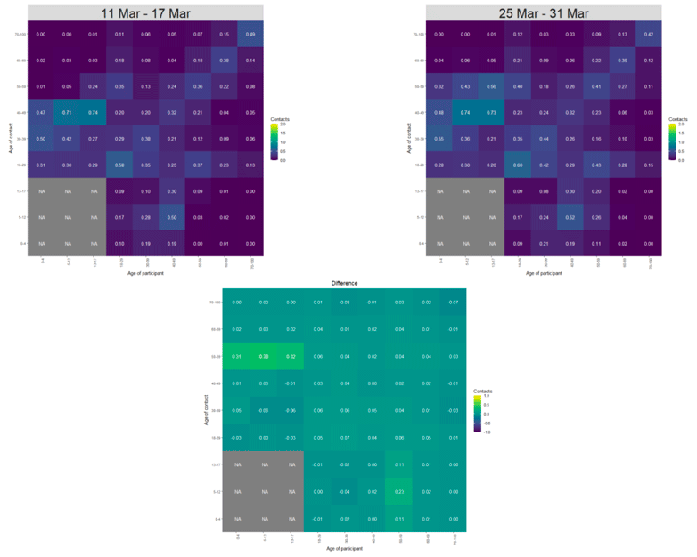
The heatmaps in Figure 5 show the mean overall contacts between age groups for the weeks relating to 11th – 17th March and the 25th – 31st March, and the difference between these periods. The biggest increase in interactions has been for those aged 50-59 with individuals under 18. Interactions between other age groups remain similar to those reported two weeks prior.
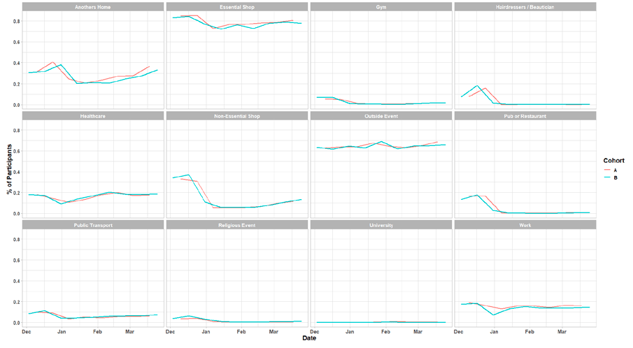
As Figure 6 shows, the biggest change in behaviour in the last two weeks has been the increase in the proportion of people that have visited other people's homes, rising from 27% to 33%. The number of individuals visiting the workplace has remained similar over the same period, however as discussed earlier, the number of contacts within this setting has increased.
Vaccinations and contacts patterns
The vaccinations programme commenced in Scotland from December 2020. This section looks at the contact patterns of those who have been vaccinated against those who have not.
Currently, the age group invited for vaccinations are those aged between 50-55[1]. There is no significant difference in contacts between the vaccinated and unvaccinated within either the 50-54 or 55-59 age group (once healthcare professionals, who were vaccinated earlier as a priority group, were removed).
Due to the high number of vaccinations for those aged 60 and over (greater than 98% of the population[2]) no statistically significant comparison of the vaccinated against unvaccinated can be made for this group.
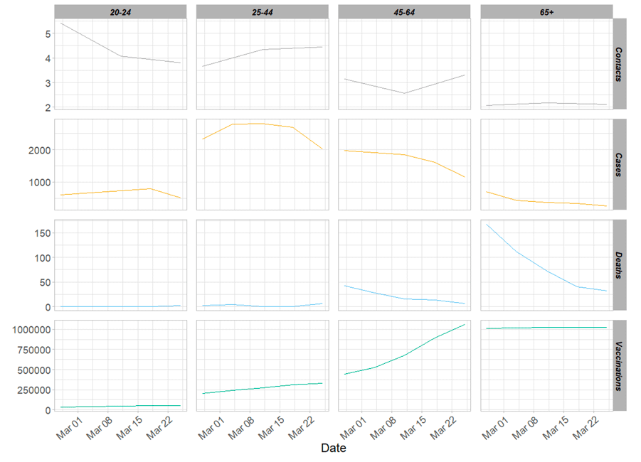
From Figure 7, it can be seen that where contacts have remained consistent or even increased for the older age groups, cases and deaths have decreased. This coincides with the increasing number of vaccinations supplied to the population. This is seen in the 45-64 age cohort where average contacts increased in the last two weeks, from 2.7 to 3.3, whereas daily cases and deaths have decreased over the same period.
What the modelling tells us about estimated infections as well as Hospital and ICU bed demand
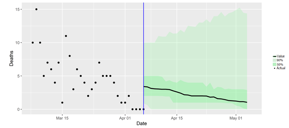
The Scottish Government assesses the impact of Covid on the NHS in the next few weeks in terms of estimated number of infections. For more on how we do this see page 4 of Issue 1 of the Research Findings[3]. Figure 8 shows two projections[4] which take account of compliance and behaviour (better and worse[5]).
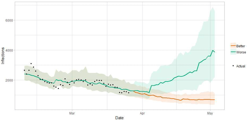
Figure 9 shows the impact of the projections on the number of people in hospital. The modelling includes all hospital stays, whereas the actuals only include stays up to 28 days duration which are linked to Covid-19. Work is underway to show the modelled occupancy for stays up to a 28 day limit and we hope to include the output next week.
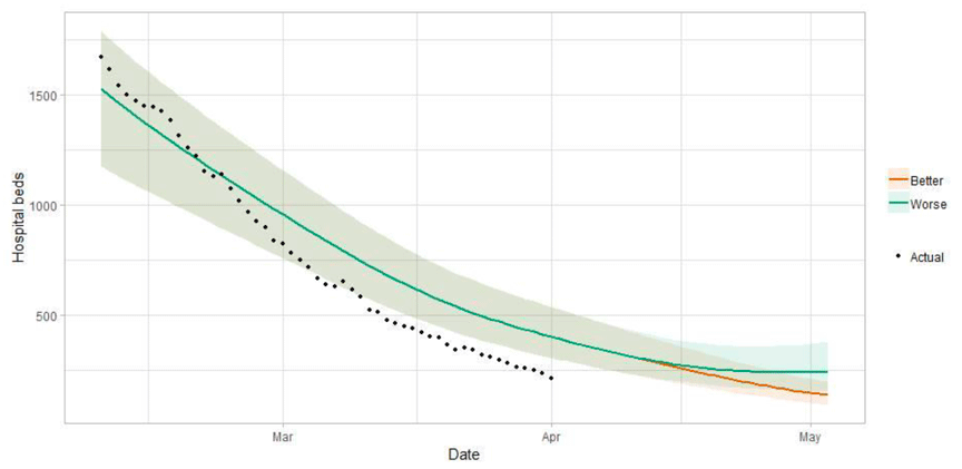
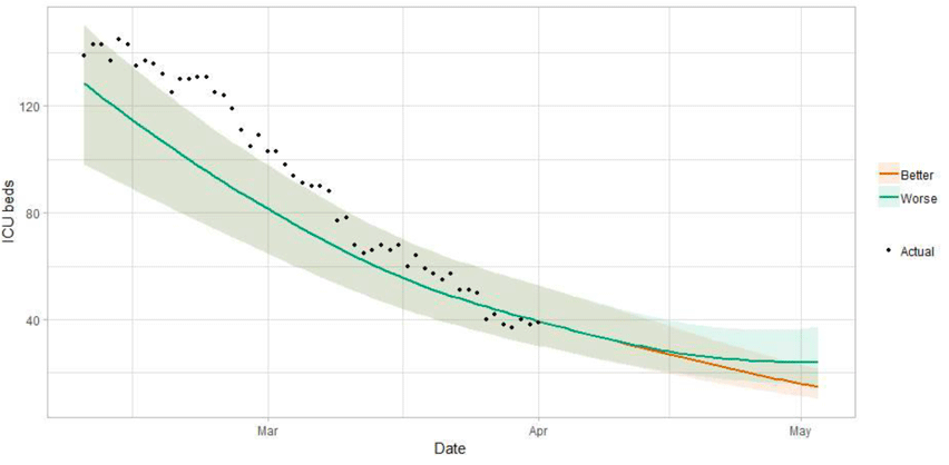
Figure 10 shows the impact of the projection on ICU bed demand.
A comparison of the actual data against historical projections is included in the Technical Annex.
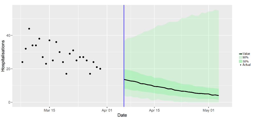
What the modelling tells us about projections of hospitalisations and deaths in the medium term
SAGE produces projections of the epidemic[8] (Figures 11 and 12), combining estimates from several independent models (including the Scottish Government's logistics modelling, as shown in figures 8, 9 and 10). These projections are not forecasts or predictions. They represent a scenario in which the trajectory of the epidemic continues to follow the trends that were seen in the data up to 5 April.
Disruption to data flows and increased reporting delays over the Easter period makes it difficult to interpret recent trends in the data. This means the current state of the epidemic may not yet be fully reflected in the epidemiological data used to produce these projections.
Modelling groups have used data from contact surveys, previous findings[9] and their own expert judgement to incorporate the impact of re‑opening schools and the Easter holidays on transmission. The projections do not include the effects of any other future policy or behavioural changes.
The delay between infection, developing symptoms, the need for hospital care, and death means they will not fully reflect the impact of behaviour changes in the two to three weeks prior to 5 April. Projecting forwards is difficult when the numbers of cases, admissions and deaths fall to very low levels, which can result in wider credible intervals reflecting greater uncertainty.
These projections include the potential impact of vaccinations over the next four weeks. Modelling groups have used their expert judgement and evidence from Public Health England, Scottish universities, Public Health Scotland and other published efficacy studies when making assumptions about vaccine effectiveness.
Beyond two weeks, the projections become more uncertain with greater variability between individual models. This reflects the large differences that can result from fitting models to different data streams, and the influence of small deviations in estimated growth rates and current incidence.
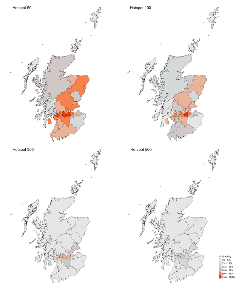
What we know about which local authorities are likely to experience high levels of Covid
We are using modelling based on Covid cases and deaths from several academic groups to give us an indication of whether a local authority is likely to experience high levels of Covid in the future. This has been compiled via SPI-M into a consensus. In this an area is defined as a hotspot if the two week prediction of cases (positive tests) per 100K population are predicted to exceed a threshold, e.g. 500 cases.
Modelled rates per 100K (Figure 13) indicate that for the week commencing 18 April 2021, 4 local authorities have at least a 75% probability of exceeding 50 cases, 1 of those has at least a 75% probability of exceeding 100 cases and none of those have at least a 75% probability of exceeding 300 cases. In last week's issue of these Research Findings, 7 local authorities had a 75% or higher probability of exceeding 50 cases per 100K. Please note that the local estimates should be interpreted with caution as they are based on fewer models than previous reports. Estimates are not available for Na h-Eileanan Siar or the Shetland Islands.
What can analysis of wastewater samples tell us about local outbreaks of Covid-19 infection?
Levels of Covid in wastewater collected at many sites around Scotland are adjusted for population and local changes in intake flow rate and compared to daily 7-day average positive case rates derived from Local Authority and Neighbourhood (Intermediate Zone) level aggregate data. See Technical Annex in Issue 34 of these Research Findings for the methodology.
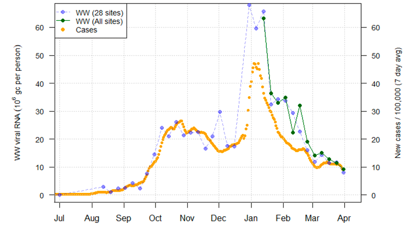
The overall level of wastewater Covid this week was slightly lower than the last few weeks, consistent with a slight fall in the rate of new cases.
The overall trend can be seen in Figure 14, which gives a national aggregate for the original 28 sites with long-term record. This week, we add (in dark green) an aggregate for the full set of 97 currently sampled sites from the time the majority of these sites were first measured, early in January 2021. In both cases we exclude an anomalous February reading from Seafield, Edinburgh – see issue 40 for details.
We observe that the full site data record and the original 28 sites give very similar wastewater Covid aggregate trends. Note that the original 28 sites together cover approximately 53% of the Scottish population, while the additional 69 sites cover another 28%, making up a combined 82% of the population. The additional smaller sites covered will hopefully give us a better understanding of dynamics in smaller sites.
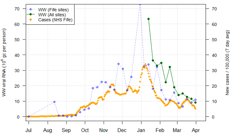
Looking ahead, we will examine different breakdowns of this overall picture, either by population size or geographical region. One example is Figure 15 below, which gives a population weighted average for sites covered by the NHS Fife Health Board. The National all sites average and the Health Board 7 day moving average positive rate is also presented for reference. Fife appears to have lower wastewater Covid-19 levels and cases than the national average. Similarly, it appears that smaller sites may often have lower Covid-19 levels than larger sites, and we plan to investigate this further in the future.
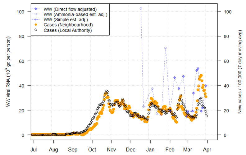
We previously identified (Issue 44) that there was an early March rise in cases in East Calder in West Lothian, which was preceded by a rise in wastewater Covid levels. Since then, in the latter half of the month, both wastewater Covid levels and case rates declined (Figure 16). Note though that wastewater Covid levels have risen again in the most recent observation, suggesting continued moderate levels of infections. This is currently not apparent in the case data, though the latter is a 7-day average and therefore smoothed.
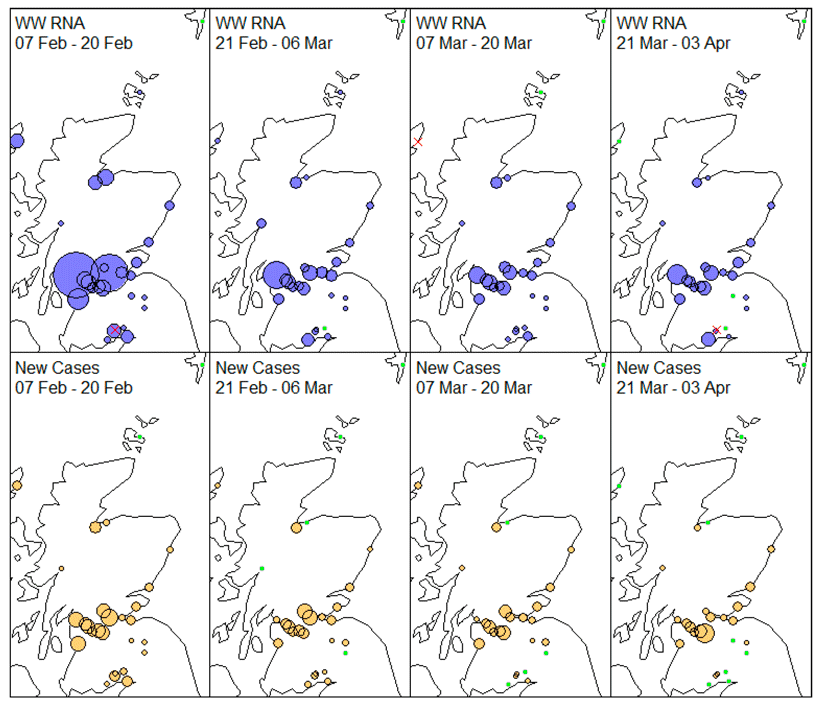
We map the geographic pattern of Covid-19 across the original 28 sites in Figure 17. The situational is generally unchanged compared to previous weeks. Lockerbie in Dumfries and Galloway has become consistently negative in terms of wastewater Covid, while Kirkwall in the Orkney Islands has registered a recent positive reading.