Scottish Household Survey 2020: methodology and impact of change in mode
The methodology report for the Scottish Household Survey 2020 telephone survey which discusses the impact of the change in mode.
Chapter 4: Sample coverage, telephone matching rates, and response rates
This chapter provides details on the coverage of the push-to-telephone/video sample, the telephone matching and where it was most successful, and patterns of response rates by approach.
Sample coverage
The annual SHS sample is drawn using a single-stage unclustered sample design using the small user Postcode Address File as the sampling frame. The sample is disproportionately stratified by local authority with smaller local authorities having a higher sample proportion relative to their populations than the larger local authorities. Overall, the likelihood of any bias from the sampling is low.
The sample is then batched up into workable allocations for interviewers. Batches are spread across fieldwork months to ensure a board geographic spread of interivews each month with all quarters having, as far as possible, the same number of batches in each local authority. Batches that include addresses that are more remote, such as those requiring ferry trips, tend to be allocated outwith the winter months to help facilitate the fieldwork. Additionally, a sizeable proportion of interviews are achieved from addresses that are reissued to a second or third interviewer and will therefore not be completed in the month that they were first worked.
This means that while the overall sample for 2020 should be representative of the target population, the split between the sample worked pre-lockdown face-to-face and the post-lockdown push to telephone/video sample may be less representative overall.
Table 4.1 shows the urban/rural distribution of addresses in the two samples. Compared to the 2020 sample overall, the face-to-face sub-sample included more other urban addresses (39.4% compared to 32.2% overall) and more Remote Small Towns (12.5% compared to 5.2% overall). In contrast, accessible rural (4.9% compared to 11.4%) and remote rural addresses were underrepresented in the sample worked face-to-face.
| Face-to-face sample | Push to telephone/ video sample | All 2020 Addresses | |
|---|---|---|---|
| Large Urban | 32.0% | 32.8% | 32.6% |
| Other Urban | 39.4% | 30.9% | 32.2% |
| Accessible Small Towns | 8.8% | 9.2% | 9.2% |
| Remote Small Towns | 12.5% | 3.9% | 5.2% |
| Accessible Rural | 4.9% | 12.6% | 11.4% |
| Remote Rural | 2.3% | 10.7% | 9.4% |
| Total | 100% | 100% | 100% |
| N | 2,795 | 15,400 | 18,195 |
The addresses worked as part of the push-to-telephone/video show the reverse pattern. However, because most of the 2020 sample was worked this way, the differences are smaller. Compared with all 2020 addresses, the push-to-telephone/video sample has more accesible rural addresses (12.6% compared to 11.4%) and remote rural addresses (10.7% compared to 9.4%), and fewer other urban (30.9% compared to 32.2%) and remote small town addresses (3.9% compared to 5.2%).
Both sub-samples are closer to the overall 2020 sample in relation to deprivation (Table 4.2). The face-to-face sample has slightly more addresses in the 2nd most deprived quintile (23.4% compared to 20.2%), and sligher fewer addresses in the 4th quintile (18.1% compared ot 20.6%) and the least deprived quintile (16.9% compared to 17.6%).
| Face-to-face sample | Push to telephone/ video sample | All 2020 Addresses | |
|---|---|---|---|
| Most deprived | 21.1% | 20.0% | 20.2% |
| 2nd | 23.4% | 19.6% | 20.2% |
| Middle quintile | 20.5% | 21.5% | 21.4% |
| 4th | 18.1% | 21.1% | 20.6% |
| Least deprived | 16.9% | 17.8% | 17.6% |
| Total | 100% | 100% | 100% |
| N | 2,795 | 15,400 | 18,195 |
Table 4.3 shows the distribution of addresses the two sub-samples by local authority area. Overall, the distributions are broadly representative, especially for the larger push-to-telephone/video sample. For the face-to-face sample, Orkney (3.3% compared to 2.0%), Sheltland islands (3.4% compared to 2.1%) West Dunbartonshire (3.8% comared to 2.3%) and East Ayrshire (3.7% compared to 2.7%) were over-represented, while Dumfries and Galloway (0.9% compared to 2.4%) Dundee City (1.1% compared to 2.2%) and Stirling (1.1% compared to 2.1%) were under-represented.
| Face-to-face sample | Push to telephone/ video sample | All 2020 Addresses | |
|---|---|---|---|
| Aberdeen City | 1.7% | 4.0% | 3.7% |
| Aberdeenshire | 3.7% | 3.3% | 3.4% |
| Angus | 2.4% | 2.3% | 2.3% |
| Argyll and Bute | 1.9% | 2.6% | 2.5% |
| Clackmannanshire | 1.5% | 2.2% | 2.1% |
| Dumfries and Galloway | 0.9% | 2.6% | 2.4% |
| Dundee City | 1.1% | 2.4% | 2.2% |
| East Ayrshire | 3.7% | 2.5% | 2.7% |
| East Dunbartonshire | 3.1% | 2.1% | 2.2% |
| East Lothian | 2.4% | 2.3% | 2.3% |
| East Renfrewshire | 1.8% | 2.7% | 2.6% |
| Edinburgh, City of | 8.1% | 8.0% | 8.0% |
| Eilean Siar | 3.2% | 1.8% | 2.0% |
| Falkirk | 2.0% | 1.9% | 1.9% |
| Fife | 3.5% | 5.2% | 5.0% |
| Glasgow City | 11.4% | 10.9% | 10.9% |
| Highland | 4.2% | 3.5% | 3.6% |
| Inverclyde | 2.0% | 2.5% | 2.5% |
| Midlothian | 2.4% | 2.4% | 2.4% |
| Moray | 2.5% | 2.5% | 2.5% |
| North Ayrshire | 2.0% | 2.6% | 2.5% |
| North Lanarkshire | 4.9% | 4.8% | 4.8% |
| Orkney Islands | 3.3% | 1.8% | 2.0% |
| Perth and Kinross | 1.9% | 2.5% | 2.4% |
| Renfrewshire | 3.3% | 2.7% | 2.8% |
| Scottish Borders | 2.2% | 2.4% | 2.3% |
| Shetland Islands | 3.4% | 1.8% | 2.1% |
| South Ayrshire | 3.4% | 2.4% | 2.5% |
| South Lanarkshire | 5.4% | 4.7% | 4.8% |
| Stirling | 1.1% | 2.2% | 2.1% |
| West Dunbartonshire | 3.8% | 2.1% | 2.3% |
| West Lothian | 1.8% | 2.2% | 2.1% |
| Total | 100% | 100% | 100% |
| N | 2,795 | 15,400 | 18,195 |
Overall, these differences are smaller, especially between the push-to-telephone/video sample and the overall 2020 sample and unlikely to have a sizable effect on the point estimates after weighting.
Telephone matching rates
The telephone matching exercise was undertaken to help increase the number of completed surveys. This involved matching names and telephone numbers to addresses using publicly available sources, such as the electoral register and the telephone directory. Telephone matching was undertaken for the entire 15,400 addresses remaining in the 2020 sample when face-to-face fieldwork was stopped.
Two different suppliers were engaged to undertake the telephone matching. The process involved linking the addresses, sampled from the PAF, with databases they held to attempt to match in a name of someone within the household and then, if possible, a telephone number.
| N | % | |
|---|---|---|
| No match | 11,857 | 77.0% |
| Match | 3,543 | 23.0% |
| Supplier 1 only | 419 | 2.7% |
| Supplier 2 only | 2,263 | 14.7% |
| Both[16] | 861 | 5.6% |
| Total | 15,400 | 100.0% |
The matching rate was 8.3% from one supplier and 20.3% from the other supplier, giving an overall match rate of 23.0% (Table 4.4).
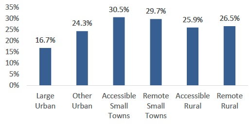
Telephone number matching rates (i.e. the proportion of addresses successfully matched with a telephone number) differed considerably across Scotland. As shown in Figure 4.1, they were lowest in urban areas (17% in large urban areas, and 24% in other urban areas) and highest in small towns (30% in accessible and remote small towns).
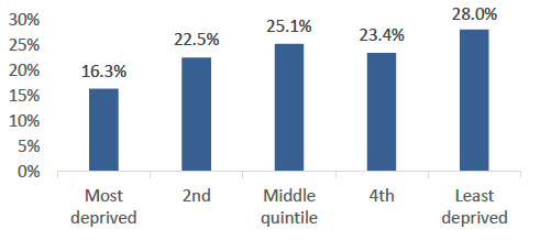
As shown in Figure 4.2, telephone matching was lowest in the most deprived SIMD quintile (16%) and highest in the least deprived quintile (28%).
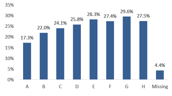
Analysis by Council Tax Band shows a similar pattern (Figure 4.3) with the lowest matching rates in Band A and B (17% and 22%). The bands at the upper end of the scale, E, F, G and H all had higher matching rates, though it is noticeable that there is less variation among these bands, all within the range of 27%-30%.
Overall, the matching rate varied considerably by local authority (Table 4.5). It was lowest in Glasgow (12%), Edinburgh (15%), Renfrewshire (16%) and Dundee City (17%) and highest in West Lothian (33%), Aberdeenshire, Orkney Islands, Moray, and East Lothian (all 31%).
| Local Authority | Match rate | Matched addresses |
|---|---|---|
| West Lothian | 32.7% | 339 |
| Aberdeenshire | 31.1% | 511 |
| Orkney Islands | 30.9% | 275 |
| Moray | 30.7% | 378 |
| East Lothian | 30.7% | 352 |
| Clackmannanshire 7 | 28.7% | 342 |
| Argyll and Bute | 28.3% | 403 |
| Scottish Borders | 28.0% | 364 |
| Fife | 27.9% | 806 |
| Midlothian | 27.4% | 372 |
| Dumfries and Galloway | 27.4% | 405 |
| Angus | 27.1% | 358 |
| Highland | 26.9% | 539 |
| North Ayrshire | 26.4% | 401 |
| East Ayrshire | 26.2% | 385 |
| South Ayrshire | 26.1% | 368 |
| Eilean Siar | 25.9% | 282 |
| Shetland Islands | 24.7% | 284 |
| South Lanarkshire | 23.3% | 725 |
| Stirling | 23.1% | 346 |
| Aberdeen City | 23.1% | 620 |
| East Renfrewshire | 22.2% | 414 |
| North Lanarkshire | 22.2% | 740 |
| Perth and Kinross | 21.7% | 387 |
| Falkirk | 21.6% | 296 |
| Inverclyde | 21.5% | 390 |
| East Dunbartonshire | 21.5% | 321 |
| West Dunbartonshire | 18.4% | 316 |
| Dundee City | 16.9% | 368 |
| Renfrewshire | 15.8% | 412 |
| Edinburgh, City of | 15.1% | 1,229 |
| Glasgow City | 12.2% | 1,671 |
| Total | 23.0% | 2,309 |
Details of the precise telephone matching process are guarded as they are commercially sensitive. However, success in matching a telephone number is likely to be highest among those who use landlines. Landline usage has declined over the last couple of decades, and around a quarter of households in Scotland do not have a working landline[17]. Matching success is likely to be shaped by such things as whether the telephone number is publicly available, and whether they have opted out of the open register[18]. The longer that householders have lived at their current addresses, the more likely they are to have a landline with a publicly available number.
There are a limited number of characteristics with which to examine differences in matching rates - all, except for Council Tax band, relate to area characteristics rather than to individual addresses. However, the analysis above does suggest that addresses where we were able to obtain a matched telephone number are not likely to be representative of all addresses. This should be borne in mind when looking at the composition of both the telephone-matched data and the opt-in data, as any bias in the types of household where a matched telephone number was obtained affects both sub-samples.
Fieldwork outcomes and response rates
Table 4.6 provides details of the number of addresses worked and number of interviews achieved at each stage. When the survey was suspended in March 2020, 2,796 addresses had been fully worked at first issue, 15.4% of all addresses sampled for the 2020 wave.
| Unproductive address | Interview | All addresses | |
|---|---|---|---|
| Face-to-face pre-lockdown | 1,251 | 1,545 | 2,796 |
| Push to telephone/video pilot | 789 | 211 | 1,000 |
| Pilot - Opt-in only | 605 | 95 | 700 |
| Pilot - Telephone matched | 184 | 116 | 300 |
| Push to telephone/video mainstage | 11,579 | 2,820 | 14,399 |
| Mainstage - opt-in only | 9,533 | 1,623 | 11,156 |
| Mainstage - telephone matched | 2,046 | 1,197 | 3,243 |
| Total | 13,619 | 4,576 | 18,195 |
The pilot was undertaken on 1,000 addresses. Addresses with a matched telephone number were over-sampled, to give more robust information on likely response rates among this group. The pilot therefore included 300 addresses where a telephone number had been successfully found (increased from the 230 that would have been selected if they had been included proportionately), and 700 opt-in only addresses. The remaining 14,399 address (79% of the 2020 sample overall) were worked in the push to telephone/video main stage.
Overall, 4,576 interviews were achieved, with around a third (33.8%) undertaken face-to face pre-lockdown, and the remainder undertaken using the revised push-to telephone/video approach. For most of the analysis in the rest of this report, no distinction is made between the pilot and the main stage of the push-to-telephone/video sample.
Response rates
Normally response rates are reported as total interviews over eligible addresses. However, it is not possible to get accurate estimates of deadwood (ineligible addresses) from the alternative SHS approaches (since without face-to-face visits, we cannot identify what proportion of addresses were vacant or derelict or otherwise ineligible). The best comparison between the different approaches is to use total interviews achieved divided by all addresses. This is sometimes referred to as the "unadjusted response rate".
Table 4.7 shows response rates by SHS wave. As detailed in the previous section, the SHS has enjoyed a consistently high response rate from 1999 to 2019. The unadjusted response rate for the 2020 wave prior to lockdown was 55.3%, similar to the two previous waves[19].
| Unadjusted response rate (interviews/all addresses) | Households responding | |
|---|---|---|
| 2018 Face-to-face | 56.3% | 10,532 |
| 2019 Face-to-face | 57.2% | 10,577 |
| 2020 Face-to-face (pre-lockdown) | 55.3% | 1,545 |
| 2020 Push to telephone/video | 19.7% | 3,031 |
| 2020 Push to telephone/video - Opt-in only | 14.5% | 1,718 |
| 2020 Push to telephone/video - Telephone matched sample | 37.1% | 1,313 |
In contrast, the unadjusted response rate for the telephone matched sample was 37.1%, a drop of 18 percentage points from the 2020 face-to-face response. For the opt-in only sample, the unadjusted response rate was 14.5%. While this is relatively high compared to other surveys that use a similar appoach, it is more than 40 percentage points lower than the pre-lockdown face-to-face response rate.
In addition to the overall response rate, another indicator of the potential for non-response bias is the amount of variation in the response rate between different types of area.
Table 4.8 shows the unadjusted response rate[20] by SIMD quintile for the different SHS waves. Across all waves, the response rate is lowest in the most deprived areas of Scoland. In the 2018 wave, the unadjusted response rate in the lowest SIMD quintile was 53.8% compared to 56.3% overall. A similar difference was seen in the 2019 wave (53.1% compared to 57.2%) and in the 2020 fieldwork conducted face-to-face prior to lockdown (51.8% compared to 55.3%).
| 2018 | 2019 | 2020 f2f | 2020 Push to telephone/video | |||
|---|---|---|---|---|---|---|
| Opt-in | Telephone matched | All | ||||
| Most deprived | 53.8% | 53.1% | 51.8% | 9.1% | 23.5% | 11.4% |
| 2nd | 53.3% | 57.2% | 54.0% | 11.3% | 33.4% | 16.3% |
| Middle quintile | 57.5% | 57.6% | 57.1% | 15.7% | 39.2% | 21.6% |
| 4th | 58.8% | 58.9% | 58.6% | 17.9% | 44.6% | 24.2% |
| Least deprived | 58.4% | 59.4% | 55.5% | 19.5% | 39.4% | 25.1% |
| Total | 56.3% | 57.2% | 55.3% | 14.5% | 37.1% | 19.7% |
The difference between quintiles was considerably more marked in the push-to-telephone/video fieldwork. Among the opt-in only sample, the unadjusted response rate in the most deprived quintile was 9.1%, compared to an average response of 14.5%. Among the telephone-matched sample, the difference was also considerable (23.5% compared to 37.1%). This means that there is considerably more variation in participation by SIMD quintile with the push-to-telephone/video approach compared with the face-to-face approach.
It is also noteworthy that, among the face-to-face waves, the least deprived SIMD quintiles are relatively equal with regard to the response rate. In comparison, among the push-to-telephone approach, there are still differences between the middle quintile, the fourth quintile and the least deprived quintile. This is especially pronounced among the opt-in sample, where the relationship beween response rate and SIMD appears linear throughout.
A similar pattern is seen in unadjusted response rates by council tax band across the different waves (Table 4.9). There is more varation in the unadjusted response rate by Council Tax band among the push-to-telephone/video approach than the face-to-face waves. Again, this is more pronounced among the opt-in only sample than among the telephone number matched sample.
| 2018 | 2019 | 2020 f2f | 2020 Push to telephone/video | |||
|---|---|---|---|---|---|---|
| Opt-in | Telephone matched | All | ||||
| A | 54.1% | 55.6% | 55.6% | 8.8% | 30.2% | 12.5% |
| B | 55.7% | 56.7% | 54.1% | 12.2% | 34.4% | 17.0% |
| C | 56.0% | 56.4% | 54.5% | 12.5% | 34.3% | 17.7% |
| D | 55.8% | 58.2% | 58.0% | 17.1% | 41.0% | 23.3% |
| E | 59.9% | 60.9% | 56.9% | 21.0% | 39.2% | 26.1% |
| F | 65.0% | 63.2% | 66.7% | 22.0% | 49.2% | 29.5% |
| G | 63.5% | 65.4% | 60.6% | 25.9% | 38.3% | 29.6% |
| H | 48.9% | 56.4% | 66.7% | 19.0% | 27.3% | 21.3% |
| Total | 56.3% | 57.2% | 55.3% | 14.5% | 37.1% | 19.7% |
Table 4.10 shows the unadjusted response rates by the six-fold urban/rural indicator. Across previous face-to-face waves, response rates have been highest in rural areas and lowest in urban areas. However, the differences have been relatively modest. For example, in 2019, compared to the overall unadjusted response rate of 57.2%, the rate was 53.2% in large urban areas and 62.3% in remote rural areas.
For the push-to-telephone/video approach, the pattern of differential response by rurality is more marked. For the opt-in only sample, the response response rate ranged from 12.4% in other urban areas to 18.5% in accessible rural areas. Among the telephone matched sample, the absolute difference is much more pronounced, ranging from 31.2% in large urban areas to 47.1% in remote rural areas. However, while the absolute difference is greater among the telephone number matched sample, the relative difference in likelihood to take part was similar[21].
| 2018 | 2019 | 2020 f2f | 2020 Push to telephone/video | |||
|---|---|---|---|---|---|---|
| Opt-in | Telephone matched | All | ||||
| Large Urban | 54.0% | 53.2% | 51.5% | 13.8% | 31.2% | 16.7% |
| Other Urban | 54.5% | 56.4% | 55.0% | 12.4% | 33.1% | 17.4% |
| Accessible Small Towns | 58.8% | 61.3% | 55.9% | 15.0% | 40.0% | 22.6% |
| Remote Small Towns | 58.9% | 60.9% | 62.2% | 14.5% | 41.2% | 22.5% |
| Accessible Rural | 60.9% | 61.8% | 57.3% | 18.5% | 43.2% | 24.9% |
| Remote Rural | 61.8% | 62.3% | 67.7% | 18.0% | 47.1% | 25.7% |
| Total | 56.3% | 57.2% | 55.3% | 14.5% | 37.1% | 19.7% |
Summary
Telephone matching was successful for 23% of addresses. However, these addresses were not representative of all addresses and were more likely to be in less deprived areas and small towns.
Previous SHS waves, using the traditional face-to-face approach, have achieved relatively high response rates. The sample design has used historic response rate information to help set the number of addresses required to avoid under-representation. These waves have seen some differences in response rates by SIMD and rurality, but these differences have been relatively modest and consistent across waves.
In contrast, the push-to-telephone/video approach has resulted in a much lower response rate overall. In addition, there is considerably more variation in response rates across different types of area. Overall, where response rates are lower, there is greater potential for non-repsonse bias. This is explored further in the next chapter.
Contact
Email: shs@gov.scot