Coronavirus (COVID-19): modelling the epidemic (issue no. 60)
Latest findings in modelling the COVID-19 epidemic in Scotland, both in terms of the spread of the disease through the population (epidemiological modelling) and of the demands it will place on the system, for example in terms of health care requirement.
Coronavirus (COVID-19): modelling the epidemic in Scotland (Issue No. 60)
Background
This is a report on the Scottish Government modelling of the spread and level of Covid-19. This updates the previous publication on modelling of Covid-19 in Scotland published on 8th July 2021. The estimates in this document help the Scottish Government, the health service and the wider public sector plan and put into place what is needed to keep us safe and treat people who have the virus.
This edition of the research findings focuses on the epidemic as a whole, looking at estimates of R, growth rate and incidence as well as local measures of change in the epidemic.
In Scotland, the modelled estimate for R is between 1.1 and 1.4, with the growth rate between 2% and 6% based on the period up to 12th July.
R is an indicator that lags by two to three weeks and therefore does not reflect any behavioural changes that have happened during this time. In particular, the recent decline in the number of new daily cases in Scotland may not yet be fully reflected in the R and growth rate estimates.
Key Points
- The reproduction rate R in Scotland is currently estimated as being between 1.1 and 1.4, based on the period up to 12th July. The lower and upper limits have decreased since last week.
- The number of new daily infections for Scotland is estimated as being between 105 and 192, per 100,000 people, based on the period up to 12th June.
- The growth rate for Scotland is currently estimated as being between 2% and 6%, based on the period up to 12th June. The lower and upper limits have decreased since last week.
- Average contacts have decreased by approximately 18% in the last two weeks (comparing surveys pertaining to 17th June - 23rd June and 1st July - 7th July) with a current level of 3.8 daily contacts.
- Contacts within the work and other setting (contacts outside of the school, home and work) have decreased compared to two weeks prior by 37% and 13% respectively. Average contacts within the home setting have remained at similar levels over the same period.
- Mean contacts across all age groups have shown a reduction in comparison to two weeks prior with those aged between 18-29 reporting the largest decrease of 37%.
- Those who do not work from home have more contacts than those who work from home.
- The biggest decrease in interactions is seen between those aged 18‑49 with those under 18, decreasing by at least 55%.
- There has been a reduction in the proportion of participants visiting the workplace, decreasing from 18% to 14%, and also a decrease in those visiting a health care facility, decreasing from 21% to 18% in the last two weeks.
- Based on the increase in cases in the last few weeks, hospital beds and ICU are projected to rise – for how long this continues is uncertain.
- Modelled rates of positive tests per 100K using data to 12th July indicate that, for the week commencing 25th July 2021, there are 26 local authorities with at least a 75% probability of exceeding 100 cases per 100k.
- Of these, 4 local authorities (Angus, Edinburgh, Midlothian and West Lothian) have at least a 75% probability of exceeding 300 cases per 100k. There are no local authorities with at least a 75% probability of exceeding 500 cases per 100k.
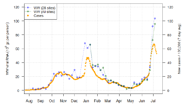
- Overall, wastewater Covid-19 levels continued to rise rapidly in the last week, reaching the highest levels observed. Increases are seen in a broad range of local authorities. Unlike recent weeks, wastewater Covid-19 values significantly exceeded levels suggested by case rates.
- At Hatton, which covers Dundee, wastewater levels in the last week rose to extremely high levels, substantially higher than in January. While this displays a large amount of variability, this shows a clear departure from case trends and represents the highest levels recorded in a major site.
Recent increase in cases
Figure 1 shows the number of cases reported in Scotland between May and July 2021. The vertical dashed lines indicate the cut off points for each of the modelling inputs; after these dates, the number of cases is not incorporated into the outputs.
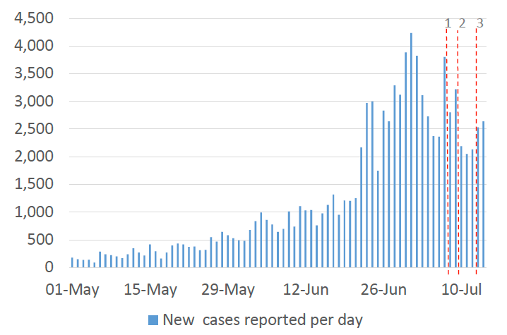
This report covers the period up to 7th July for contact patterns (indicated by dashed line 1). Wastewater data is provided to 9th July (dashed line 2). The estimates of R, incidence, growth rates, the modelled rates of positive tests per 100k, and the medium term projections by the Scottish Government of infections, hospitalisations and ICU beds use data to 12th July (dashed line 3).
Overview of Scottish Government Modelling
Modelling outputs are provided here on the current epidemic in Scotland as a whole, based on a range of methods. Because it takes a little over three weeks on average for a person who catches Covid-19 to show symptoms, become sick, and either die or recover, there is a time lag in what our model can tell us about any re-emergence of the epidemic and where in Scotland this might occur.
However modelling of Covid-19 deaths is an important measure of where Scotland lies in its epidemic as a whole. In addition, the modelling groups that feed into the SAGE consensus use a range of other data along with deaths in their estimates of R and the growth rate. These outputs are provided in this research findings. The type of data used in each model to estimate R is highlighted in Figure 2.
We use the Scottish Contact Survey (SCS) to inform a modelling technique based on the number of contacts between people. Over time, a greater proportion of the population will be vaccinated. This is likely to impact contact patterns and will become a greater part of the analysis going forwards.
The logistical model utilises results from the epidemiological modelling, principally the number of new infections. The results are split down by age group, and the model is used to give a projection of the number of people that will go to hospital, and potentially to ICU. This will continue to be based on both what we know about how different age groups are affected by the disease and the vaccination rate for those groups.
What the modelling tells us about the epidemic as a whole
The various groups which report to the Scientific Pandemic Influenza Group on Modelling (SPI-M) use different sources of data in their models (i.e. deaths, hospital admissions, cases) so their estimates of R are also based on these different methods.
R is an indicator that lags by two to three weeks and therefore does not reflect any behavioural changes that have happened during this time. In particular, the recent decline in the number of new daily cases in Scotland may not yet be fully reflected in the R and growth rate estimates. The decline in new cases suggests it is possible that the current value of R in Scotland could be below 1.
SAGE's consensus view across these methods as of 14th July, using data to 12th July, was that the value of R in Scotland was between 1.1 and 1.4 (see Figure 2)[1].
This week the Scottish Government presented two outputs to SPI-M. The first uses confirmed cases as published by Public Health Scotland (PHS). The second uses instead wastewater data to estimate the number of cases. Both outputs are shown in Figures 2 and 3.
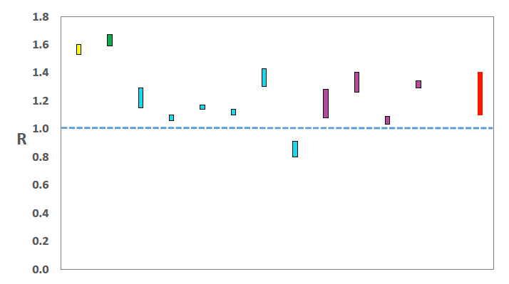
Source: Scientific Advisory Group for Emergencies (SAGE).
The various groups which report to the Scientific Pandemic Influenza Group on Modelling (SPI-M) use different sources of data in their models to produce estimates of incidence (Figure ). SPI-M's consensus view across these methods, using data to 12th July, was that the incidence of new daily infections in Scotland was between 105 and 192 new infections per 100,000. This equates to between 5,700 and 10,500 people becoming infected each day in Scotland.
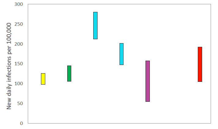
Source: Scientific Pandemic Influenza Group on Modelling (SPI-M).
The consensus from SAGE for this week is that the growth rate in Scotland is between 2% and 6% per day using data to 12th July. The lower and upper limits have decreased since last week.
What we know about how people's contact patterns have changed
Average contacts have decreased by approximately 18% in the last two weeks (comparing surveys pertaining to 17th June - 23rd June and 1st July - 7th July) with a current level of 3.8 daily contacts as seen in Figure 4[3]. Contacts within the work and other setting (contacts outside of the school, home and work) have decreased compared to two weeks prior by 37% and 13% respectively. Average contacts within the home setting have remained at similar levels over the same period.
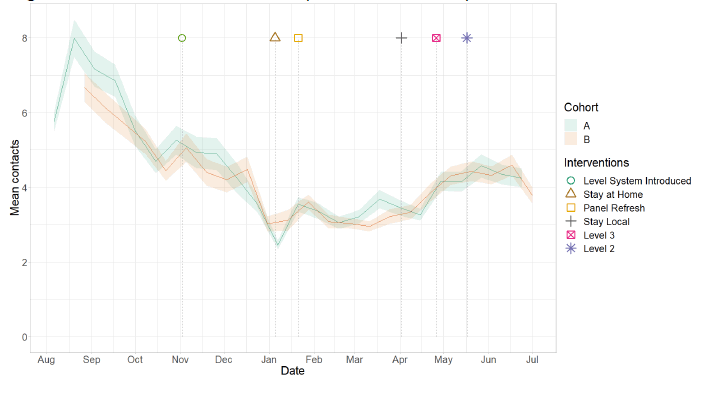
Figure 5 shows how contacts change across age group and setting. Mean contacts across all age groups have shown a reduction in comparison to two weeks prior with those aged between 18-29 reporting the largest decrease of 37%. These decreases are largely driven by reductions in contacts within the other setting for those aged between 18‑29 and within the work setting for all remaining age groups.
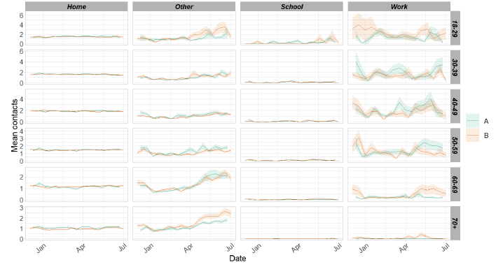
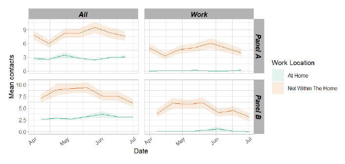
Figure 6 shows the difference in contacts between those who work from home compared to those who have a workplace outside of the home. This shows that those who do not work from home have higher and more variable contacts than those who work from home. This also shows that in the most recent weeks in both panels, there has been a reduction in overall mean contacts for those who do not work from home whereas mean contacts those who do have remained stable.
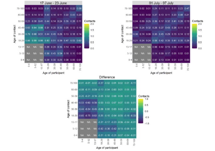
The heatmaps in Figure 7 show the mean overall contacts between age groups for the weeks relating to 17th June - 23rd June and 1st July – 7th July and the difference between these periods. The biggest decrease in interactions is seen between those aged 18-49 with those under 18, decreasing by at least 55%.
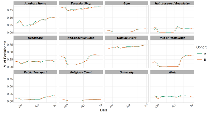
As seen in Figure 8, the proportion of participants visiting different locations remains at similar levels across the majority of locations. There has been a reduction in the proportion of participants visiting the workplace, decreasing from 18% to 14% and also a decrease in those visiting a health care facility, decreasing from 21% to 18% in the last two weeks.
Vaccinations and contacts patterns
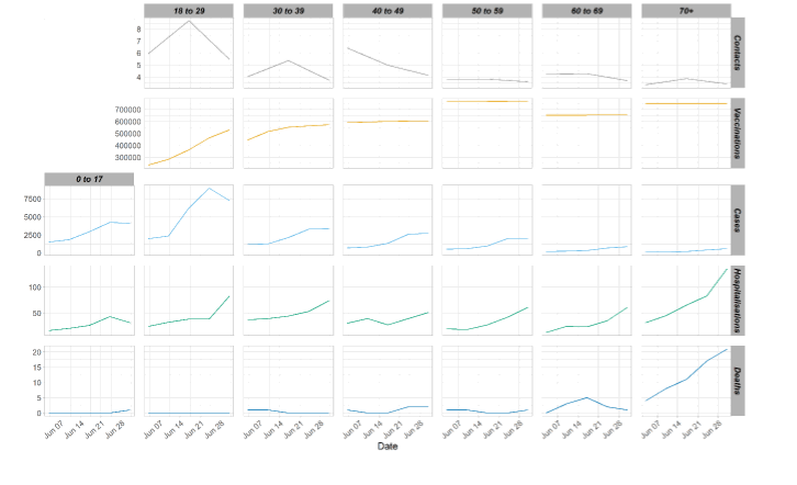
From Figure 9, it can be seen that the older age groups have fewer contacts and more vaccinations than the youngest age group, they also have the lowest weekly case number comparatively to the younger age groups. Despite that, they have similar, or higher for the oldest age group, weekly hospitalization levels to that seen with the younger age groups.
What the modelling tells us about estimated infections as well as Hospital and ICU bed demand
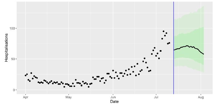
The Scottish Government assesses the impact of Covid-19 on the NHS in the next few weeks in terms of estimated number of infections. Figure 10 shows two projections. 'Worse' assumes that behaviour changes instantaneously after the whole of Scotland moves to Level 0 on 19th July. 'Better' assumes behaviour changes gradually over a period of months.[6]
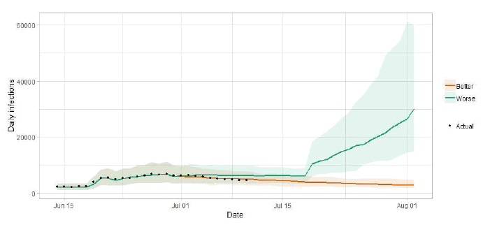
There is uncertainty as to whether infections will increase or remain level in coming weeks. This will drive whether hospital beds and intensive care beds also continue to rise.
Figure 11 shows the impact of the projections on the number of people in hospital. The modelling includes all hospital stays, whereas the actuals only include stays up to 28 days duration that are linked to Covid-19. Work is ongoing to show the modelled occupancy for stays up to a 28 day limit.
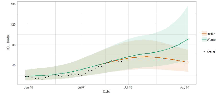
The increase in cases seen in the last weeks is likely to lead to a continuing increase in hospitalisations and intensive care use, with considerable uncertainty as to future weeks.
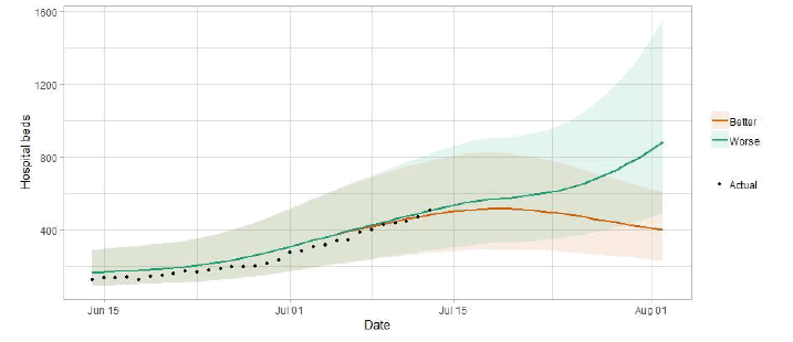
Figure 12 shows the impact of the projection on ICU bed demand.
A comparison of the actual data against historical projections is included in the Technical Annex.
What the modelling tells us about projections of hospitalisations and deaths in the medium term
SAGE produces projections of the epidemic[9] (Figure 13), combining estimates from several independent models (including the Scottish Government's logistics modelling, as shown in Figures 10-12). These projections are not forecasts or predictions. They represent a scenario in which the trajectory of the epidemic continues to follow the trends that were seen in the data up to 12th July and do not include the effects of any future policy or behavioural changes.
The delay between infection, developing symptoms, the need for hospital care, and death means they will not fully reflect the impact of behaviour changes in the two to three weeks prior to 12th July. Projecting forwards is difficult when the numbers of cases, admissions and deaths fall to very low levels, which can result in wider credible intervals reflecting greater uncertainty. The interquartile range can be used, with judgement, as the projection from which estimates may be derived until the 3rd August, albeit at lower confidence than the 90% credible interval.
These projections include the potential impact of vaccinations over the next few weeks. Modelling groups have used their expert judgement and evidence from Public Health England, Scottish Universities & Public Health Scotland, and other published efficacy studies when making assumptions about vaccine effectiveness.
We are not projecting the numbers of people expected to die with Covid‑19 this week. The number of daily deaths has fallen to very low levels. Projecting forwards is difficult when numbers fall to very low levels, therefore SPI-M-O have decided to pause producing medium term projections for daily deaths in Scotland. SPI‑M‑O's consensus view is that the number of deaths will remain low over the next few weeks.
What we know about which local authorities are likely to experience high levels of Covid-19 in two weeks' time
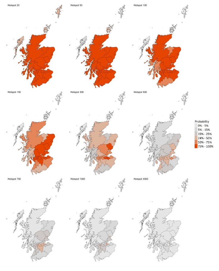
We continue to use modelling based on Covid-19 cases and deaths using data to 12th July from several academic groups to give us an indication of whether a local authority is likely to experience high levels of Covid-19 in the future. This has been compiled via SPI-M into a consensus. In this an area is defined as a hotspot if the two week prediction of cases (positive tests) per 100K population is predicted to exceed a threshold, e.g. 500 cases.
Modelled rates of positive tests per 100K using data to 12th July (Figure 14) indicate that, for the week commencing 25th July 2021, there are 26 local authorities with at least a 75% probability of exceeding 100 cases per 100k[10].
Of these, 4 local authorities (Angus, Edinburgh, Midlothian and West Lothian) have at least a 75% probability of exceeding 300 cases per 100k.
There are no local authorities with at least a 75% probability of exceeding 500 cases per 100k[11].
The local authority level modelling and national level modelling from SPI‑M are based on different groups of models and look at different metrics. Furthermore the local level modelling is produced a day later than the national level. As a result, the local authority level and national level modelling do not exactly correspond to each other.
What can analysis of wastewater samples tell us about local outbreaks of Covid-19 infection?
Levels of Covid-19 RNA in wastewater collected at a number of sites around Scotland are adjusted for population and local changes in intake flow rate and compared to daily 7-day average positive case rates derived from Local Authority and Neighbourhood (Intermediate Zone) level aggregate data. See Technical Annex in Issue 34 of these Research Findings for the methodology.
Nationwide, wastewater (WW) Covid-19 RNA levels rose to over 95 million gene copies per person per day (Mgc/p/d), the highest levels observed so far in this pandemic. Increases are seen in a broad range of local authorities, though recent observations in some large sites show a decline over the course of the week.
Note that from this week for approximately the next month, testing methodology for WW RNA is temporarily changed due to organisational issues. Volumes of samples tested are reduced, while some samples are being tested at other laboratories. It is not expected that these changes will have a great impact on accuracy, though samples with low virus concentrations may fall below detection thresholds.
Figure 15 shows the national aggregate for the original 28 sites (in blue) and, from January 2021, the aggregate for the full set of sampled sites (in green), with a small number of unrealistically large outliers excluded. Unlike recent weeks where WW Covid-19 changed in line with case rates, WW Covid-19 significantly exceeded levels suggested by case rates, attaining overall average levels in excess of 95 Mgc/p/d. This is approximately 50% higher than the peak attained at the start of the year.
Over half of sites sampled in the last week gave WW Covid-19 levels in excess of 50 Mgc/p/d. None of the sites sampled gave WW Covid-19 test results that fall under detection limit, even with the increase in the latter.
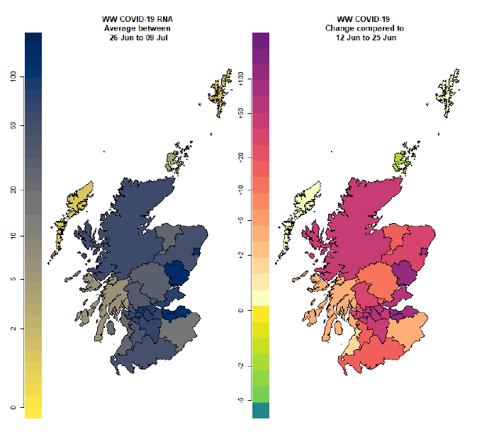
The widespread nature of rises in WW Covid-19 levels is shown in Figure 16, which uses colours to map (i) the local authority average viral RNA levels (in Mgc/p/d) over the two-week period from 26th June to 9th July, and (ii) the change in viral RNA levels compared to the previous two-week period 12th June to 25th June. The highest increases are again seen in and around the major cities.
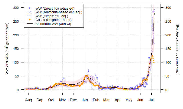
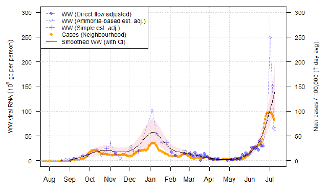
Of particular note are samples from the Hatton wastewater treatment works (Figure 17), which covers Dundee, and Seafield (Figure 18), which covers Edinburgh.
At Hatton, WW Covid-19 levels in the last week rose to extremely high levels, substantially higher than in January, and with multiple measurements in the range of 150-300 Mgc/p/d. While this displays a large amount of variability, this shows a clear departure from case trends and represents the highest levels recorded in a major site.
In Seafield, levels rose to almost 250 Mgc/p/d with a sample taken on 2nd July. However, three subsequent samples were tested and showed a decline in levels from that peak, with the two most recent samples giving an estimate of around 60 Mgc/p/d. This approximates the pattern in cases, albeit in a more exaggerated manner.
Some other sites, including Nigg (covering Aberdeen) and Dalmuir (covering parts of Glasgow), show a similar pattern of a large increase in one sample followed by a reduced second sample. Taken together, however, this still represents a week to week increase in average WW Covid-19 levels. This sort of rapid (intra-week) change in levels is difficult to capture in aggregated statistics for weekly or fortnightly intervals. It is too early to tell if these reductions in WW Covid-19 levels will be maintained.
What next?
The modelled estimates of the numbers of new cases and infectious people will continue to be provided as measures of the epidemic as a whole, along with measures of the current point in the epidemic such as Rt and the growth rate. Further information can be found at https://www.gov.scot/coronavirus-covid-19.
We may report on exceedance in future weeks when the background levels of Covid-19 reduces so that it can be useful in identifying outbreaks.