Coronavirus (COVID-19): modelling the epidemic (issue no. 32)
Latest findings in modelling the COVID-19 epidemic in Scotland, both in terms of the spread of the disease through the population (epidemiological modelling) and of the demands it will place on the system, for example in terms of health care requirement.
Coronavirus (COVID-19): modelling the epidemic in Scotland (Issue No. 32)
Background
This is a report on the Scottish Government modelling of the spread and level of Covid-19. This updates the previous publication on modelling of Covid-19 in Scotland published on 17 December 2020. The estimates in this document help the Scottish Government, the health service and the wider public sector plan and put in place what is needed to keep us safe and treat people who have the virus.
This edition of the research findings focuses on the epidemic as a whole, looking at estimates of R, growth rate and incidence as well as local measures of change in the epidemic. This is the last edition of 2020.
Key Points
- The reproduction rate R in Scotland is currently estimated as being between 0.9 and 1.1.
- The number of new daily infections for Scotland is estimated as being between 35 and 125, per 100,000 people.
- The growth rate for Scotland is estimated as being between -2% and 2%.
- The proportion of people testing positive who are in the 18-39 age group has increased from around 35% at the end of November to about 40% currently.
- The proportion of people testing positive who had no clinical risk groups has risen from around 55% in November to about 60% in mid-December.
- In the last two weeks there has been a slight reduction in the number of contacts. Average contacts per day are currently approximately 50% higher than the level at the beginning of the stay-at-home-advice, and less than half of the level pre-stay-at-home advice.
- Modelled rates per 100K indicate that by the week of 3 – 9 January 2021, 21 (up 2 from last week) local authorities have at least a 75% probability of exceeding 50 cases, 9 (up 1) of those have at least a 75% probability of exceeding 100 cases, 1 (up 1) of those has at least a 75% probability of exceeding 300 cases and none of those have at least a 75% probability of exceeding 500 cases. Overall, this is a slight deterioration compared to last week.
- Results of analysis of wastewater samples have been included this week.
Overview of Scottish Government Modelling
Epidemiology is the study of how diseases spread within populations. One way we do this is using our best understanding of the way the infection is passed on and how it affects people who catch it to create mathematical simulations. Because people who catch Covid-19 have a relatively long period in which they can pass it on to others before they begin to have symptoms, and the majority of people infected with the virus will experience mild symptoms, this “epidemiological modelling” provides insights into the epidemic that cannot easily be measured through testing e.g. of those with symptoms, as it estimates the total number of new daily infections and infectious people, including those who are asymptomatic or have mild symptoms.
Modelling also allows us to make short-term forecasts of what may happen with a degree of uncertainty. These can be used in health care and other planning. The modelling in this research findings is undertaken using different types of data which going forward aims to both model the progress of the epidemic in Scotland and provide early indications of where any changes are taking place.
Modelling outputs are provided here on the current epidemic in Scotland as a whole, based on a range of methods. Because it takes a little over three weeks on average for a person who catches Covid-19 to show symptoms, become sick, and either die or recover, there is a time lag in what our model can tell us about any re-emergence of the epidemic and where in Scotland this might occur. However modelling of Covid deaths is an important measure of where Scotland lies in its epidemic as a whole. In addition, the modelling groups which feed into the SAGE consensus use a range of other data along with deaths in their estimates of R and the growth rate. These outputs are provided in this research findings. The type of data used in each model to estimate R is highlighted in Figure 1.
A short term forecast and projection of the number of cases, ICU and hospital bed demand is also provided at this stage of the epidemic in Scotland.
An update of results are provided from the Scottish Contact Survey (SCS), to indicate how people's contacts have changed over the last two weeks.
What the modelling tells us about the epidemic as a whole
The various groups which report to the Scientific Pandemic Influenza Group on Modelling (SPI-M) use different sources of data in their models (i.e. deaths, hospital admissions, cases) so their estimates of R are also based on these different methods. SAGE’s consensus view across these methods, as of 22 December, was that the value of R in Scotland was between 0.9 and 1.1. The R range is the same as reported last week. (see Figure 1).
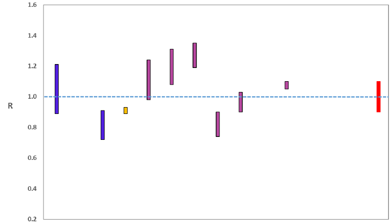
Source: Scientific Advisory Group for Emergencies (SAGE).
The various groups which report to the Scientific Pandemic Influenza Group on Modelling (SPI-M) use different sources of data in their models to produce estimates of incidence (Figure 2). SPI-M’s consensus view across these methods, as of 22 December, was that the incidence of new daily infections in Scotland was between 35 and 125 new infections per 100,000. This equates to between 1,900 and 6,800 people becoming infected each day in Scotland.
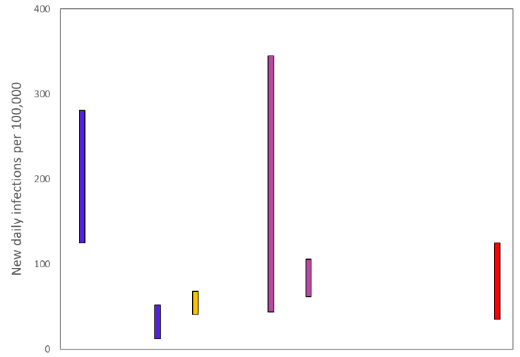
Source: Scientific Pandemic Influenza Group on Modelling (SPI-M).
The consensus from SAGE for this week is that the growth rate in Scotland is between -2 and 2% per day. Last week the growth rate was also in the range -2% and 2%.
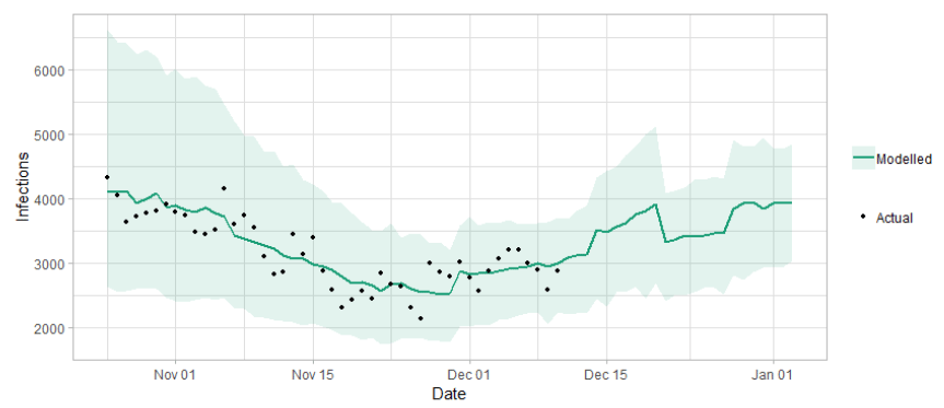
The logistical model developed by Scottish Government to assess implications for health care demand (see previous Research Findings) has been adapted to produce a short/medium-term prediction of infections.
Figure 3 shows a projection that assumes the R value has fallen slightly with schools closed for the winter holiday, but that it is still above 1 and rising.
What the modelling tells us about Hospital bed and ICU bed demand
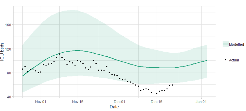
Figure 4 shows the impact of the projection on the number of people in hospital.
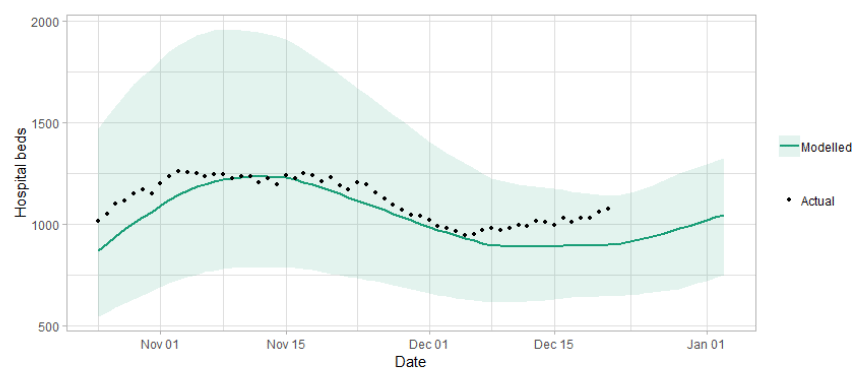
Figure 5 shows the impact of the projection on ICU bed demand.
What we know about who is testing positive with Covid
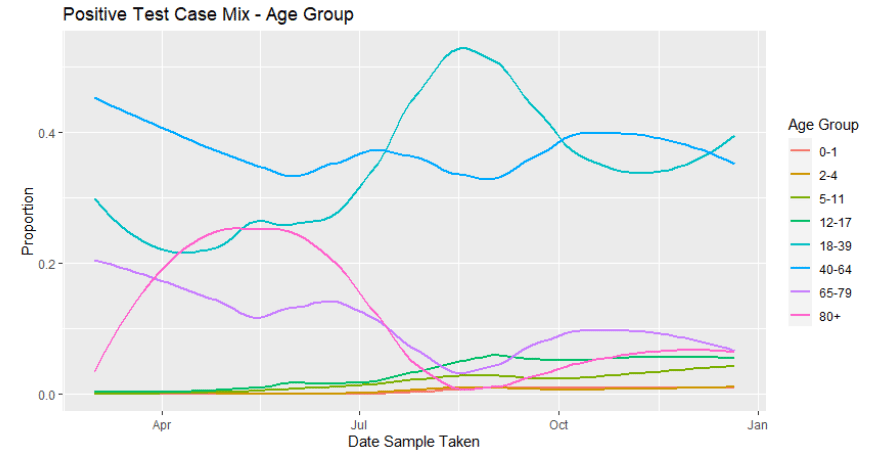
The Early Pandemic Evaluation and Enhanced Surveillance of COVID-19 (EAVE) 2 Study Group[2] have updated the pattern of demographics and clinical risk groups over time for those who tested positive.
This second wave of the epidemic has been characterised by younger people testing positive, this peaked at the beginning of September and has reduced a little since then to around 35% at the end of November, but has increased to 40% in mid-December. The number of people who are testing positive who are older has increased slightly by just over 5% since the beginning of September and, by the first week in December, about 15% of people now testing positive are 65 or over, see Figure 6.
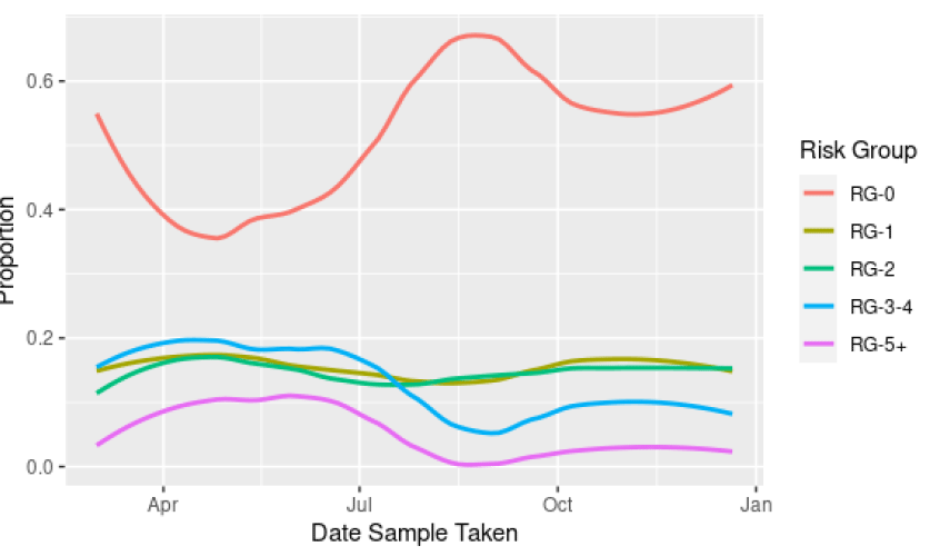
At the end of August, about 70% of those testing positive were categorised as not being in a clinical risk group, decreasing in September to about 60%, in November to about 55% and rising to about 60% in mid-December (Figure 7). From August to late October there were increases in the proportions testing positive with three or more risk groups to 13%. This has reduced slightly since then to 11% in mid-December.
What we know about how people’s contact patterns have changed
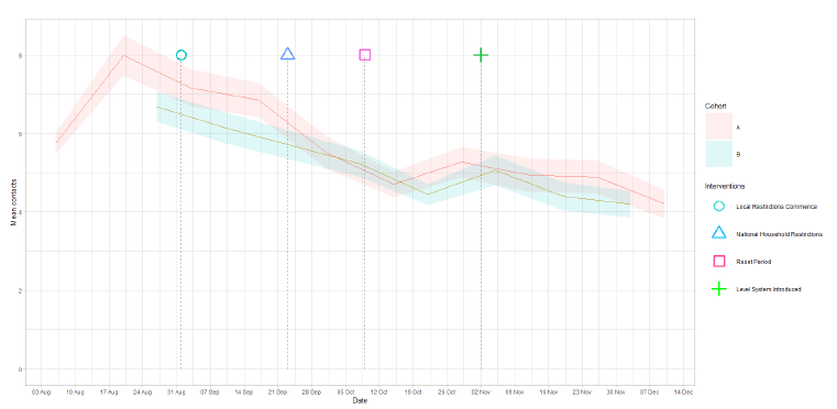
The average number of contacts per day are approximately 50% higher than they were at the beginning of the Stay-at-home-advice (4.2 and 2.8 respectively), and less than half the level pre-Stay-at-home-advice (UK comparison 10.8)[3].
Since the introduction of protection levels, mean contacts have reduced by 20% from the reporting week beginning 29 October to the week beginning 10 December as shown in Figure 8. This number of contacts is at a similar level to that reported before the increases seen following the end of school half terms (ending between 16 – 27 October).
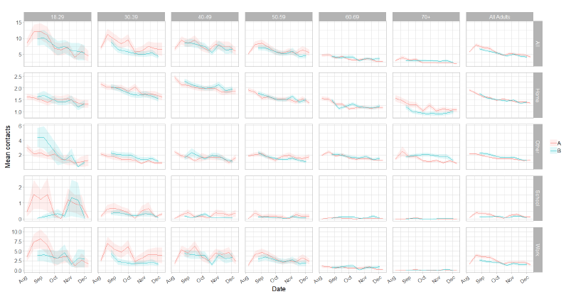
Both panels show similar behaviour with a downward trend over time in all settings with the exception of age group 18 – 29, which cannot be confirmed due to the large margin of error. In the last two weeks there have been increases in mean contacts in the school setting for all age groups whereas in the other setting, all ages show an increase in mean contacts except the over 70 group.
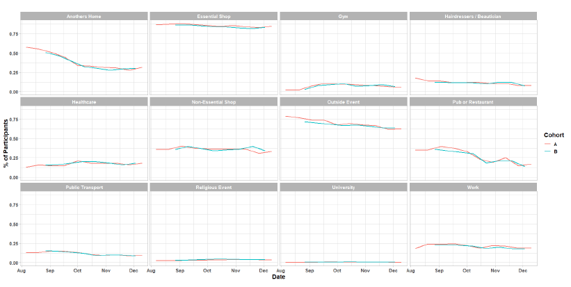
As Figure 10 shows, there have been increases in all locations visited in the last two weeks although these are minor. Essential shopping remains the setting with the highest proportion of participants, followed by visits that are held outdoors, although this behaviour has shown a steady decline over time. The biggest change in behaviour has been the drop off in the proportion of people that have visited other people’s homes since the commencement of the survey to 1 October, dropping from 58% to 34%. There has been a gradual but less pronounced decrease since this date to 31% for the most recent survey (10 – 16 December). There was a significant decrease during October for the number of people visiting pubs (19% in the week of 29 October – 4 November, down from 34% for the week of 1 – 7 October) which will be largely due to the restrictions placed on hospitality, introduced on 9 October. The value fluctuates about this reduced level, showing 17% in the latest reporting week (10 – 16 December). Visits to all other settings remain consistent over time.
What we know about which regions are experiencing high levels of Covid
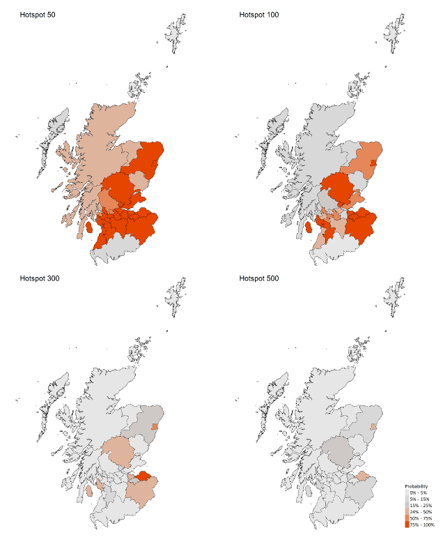
We use modelling based on Covid cases and deaths[4], conducted by Imperial College London, to give us an indication of whether a local authority is experiencing high levels of Covid. An area is defined as a hotspot if the two week prediction of cases (positive tests) per 100K population are predicted to exceed a threshold, e.g. 500 cases. See technical annex in issue 24.
Modelled rates per 100K (Figure 11) indicate that by the week of 3 - 9 January 2021, 21 (up 2 in the last week) local authorities have at least a 75% probability of exceeding 50 cases, 9 (up 1) of those have at least a 75% probability of exceeding 100 cases, 1[5] (up 1) of those has at least a 75% probability of exceeding 300 cases and none have at least a 75% probability of exceeding 500 cases.
What can analysis of wastewater samples tell us about local outbreaks of Covid-19 infection?
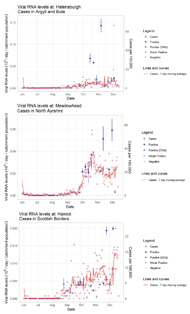
Samples from Waste Water Treatment Works (WWTW) in Scotland have been analysed by the Scottish Environment Protection Agency (SEPA) to detect fragments of SARS-Cov-2 virus RNA in waste water. This is reported from lab analysis as gene copies per litre. The reported levels of SARS-Cov-2 found have been compared to trends in confirmed Covid-19 cases in the surrounding areas.
For a number of outbreaks in Scotland, analysis has shown there are similar trends of Covid-19 viral concentrations and recorded positive tests. Three examples are shown in Figure 12. The level of gene copies recorded at Helensburgh WWTW increased slightly at the beginning of December, which coincided with an increase in cases in Argyll and Bute. Levels of gene copies recorded at Meadowhead WWTW increased at the end of November, which coincided with an increase in cases in North Ayrshire. Levels of gene copies recorded at Hawick WWTW increased at the end of November and remained high at the beginning of December, which coincided with an increase in cases in the Scottish Borders.
What next?
The Scottish Government continues to work with a number of academic modelling groups to develop other estimates of the epidemic in Scotland.
The modelled estimates of the numbers of new cases and infectious people will continue to be provided as measures of the epidemic as a whole, along with measures of the current point in the epidemic such as Rt and the growth rate. The projections of hospitalisations in the medium term will also be provided in the next publication, on Thursday 7 January. Further information can be found at https://www.gov.scot/coronavirus-covid-19.
Investigations are ongoing by NERVTAG, SPI-M, SAGE and Scottish Government regarding the impact of the new variant, SARS-Cov-2 VUI 202012/01, which will be reflected here as work is undertaken.