Housing Options (Prevent 1) Statistics: 2018/19
Housing Options (PREVENT1) Statistics in Scotland to 31 March 2019
Part of
Annex A: How to understand a box plot
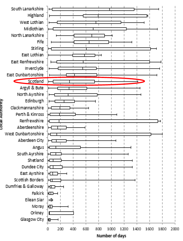
We use box plots to show both the scale and the distribution of a variable across a group. For example in Chart 3c we use a box plot to show the distribution of the number of days Housing Options approach cases have been open, between approach date and 31 March 2019, across all Local Authorities.
Chart 3c: Distribution of the number of days Housing Options approach cases have been open, between approach date and 31 March 2019

How to read a box plot
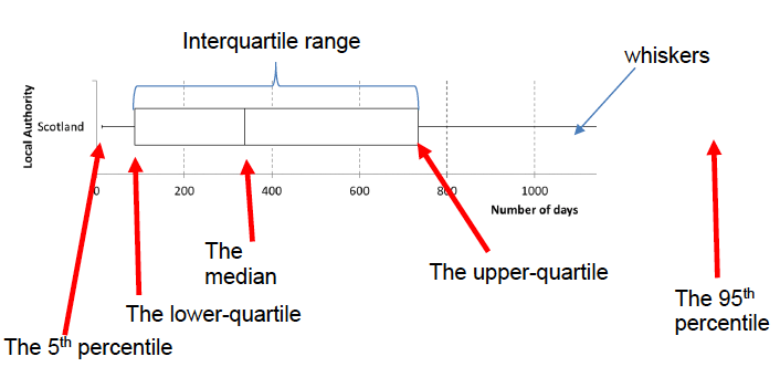
Here is an annotated example, using Scotland from the above chart.

The median, this marks the mid-point of the data and is shown by the line that divides the box into two parts. Half the scores are greater than or equal to this value and half are less. In this example the median is 338. This means that for 50% of open cases the Housing Options approach has been open for less than 338 days (just over 11 months) and for 50% of cases it has been open for 338 days or more.
The inter-quartile range, the “box” represents the middle 50% of values for the group. The range of scores from lower to upper quartile is called the inter-quartile range. The middle 50% of scores fall within the inter-quartile range. In this example, this means that the middle 50% of open Housing Options approaches have been open between 87 and 734 days (between about 3 months and about 2 years)
The upper-quartile line represents the point at which 75% of cases fall below this value (or 25% equal to or above). So in the example, the upper-quartile is 734, meaning 75% of open Housing Options approaches have been open for less than 734 days (just over 2 years), or 25% have been open for over 2 years.
The lower-quartile line represents the point at which 25% of cases fall below this value. So in the example, the lower-quartile is 87, meaning 25% of open Housing Options approaches have been open for less than 87 days ( just under 3 months).
The upper and lower whiskers represent scores outside the middle 50%. In this example the whiskers cover the ranges 5% to 25% and 75% to 95%.
The 5th percentile line, represents the point at which 5% of cases fall below this value. So in the example, the 5th percentile is 12, meaning 5% of the open Housing Options approaches had been open for less than 12 days.
The 95th percentile line, represents the point at which 95% of cases fall below this value (or 5% have this value or above). So in the example, the 95th percentile is 1412, meaning 5% of open Housing Options approaches have been open for 1412 days (about 3 years, 10 months) or more.
How to compare the groups in a box plot
Box plots are used to show overall patterns of response for a group. They provide a useful way to visualise the range and other characteristics of responses for a large group. In the example of Chart 3c, the groups are local authorities.
Looking at Chart 3C, you will see that the box plots for the local authorities do vary quite a lot. Below I will explain what these variations mean in relation to this example.
- The box (inter-quartile range) is relatively small – see Glasgow for example. This suggests that overall Housing Options approaches are open for quite a consistent length of time. In the example of Glasgow, the middle 50% of cases are open between 9 and 44 days (only a difference of 33 days between the 25% shortest cases and 25% longest cases).
- The box (inter-quartile range) is relatively large – see Renfrewshire for example. This suggests that within this local authority there is quite a large variation in the time Housing Options approaches are open for. In the example of Renfrewshire, the middle 50% of cases are open between 26 and 1732 days (a difference of 1706 days (over 4.5 years) between the 25% shortest cases and 25% longest cases).
- One box plot is much further to the right than the other – compare Highland and Aberdeenshire. This could suggest a difference in how Housing Options are implemented by local authorities. For example, the box plot for Highland is much further to the right, meaning the middle 50% of approaches have been open for longer than the middle 50% in Aberdeenshire. This doesn’t mean either approach is right or wrong, it just highlights this difference.
- Same median, different distribution – see Aberdeen City and West Dunbartonshire for example. The medians (which generally will be close to the average) are about the same. However the box plots in these examples show quite different distributions. In Aberdeen City the median length of an open Housing Options approach is 135 days, 25% of open approaches have been open under 59 days and 25% of open approaches have been open at least 292 days. In West Dunbartonshire, the median length of open Housing Options approach is 141 days (less than a week difference from Aberdeen City). However, 25% of open approaches have been open less than 42 days (2.5 weeks shorter than Aberdeen City) and 25% of open approaches have been open for longer than 1623 days (over 3.5 years longer than Aberdeen City). This is a good example of why a box plot is useful to visualise data, as it shows a much wider picture of what is going on than just the average case length.
Contact
Email: lee.bunce@gov.scot