Coronavirus (COVID-19): modelling the epidemic (issue no. 56)
Latest findings in modelling the COVID-19 epidemic in Scotland, both in terms of the spread of the disease through the population (epidemiological modelling) and of the demands it will place on the system, for example in terms of health care requirement.
Coronavirus (COVID-19): modelling the epidemic in Scotland (Issue No. 56)
Background
This is a report on the Scottish Government modelling of the spread and level of Covid-19. This updates the previous publication on modelling of Covid-19 in Scotland published on 10 June 2021. The estimates in this document help the Scottish Government, the health service and the wider public sector plan and put into place what is needed to keep us safe and treat people who have the virus.
This edition of the research findings focuses on the epidemic as a whole, looking at estimates of R, growth rate and incidence as well as local measures of change in the epidemic.
In Scotland, the modelled estimate for R is between 1.2 and 1.4, with the growth rate increasing to between 3% and 6% and modelled estimates of infections now increasing over the next four weeks. There has been a rise in hospital beds in use by Covid-19 patients, which is projected to continue over the next four weeks. The increase in Covid-19 cases is also reflected in the wastewater data.
The measures modelled for this week, as described above, indicate that we are continuing to see a steady increase in the epidemic in Scotland, with considerable uncertainty as to what this means for future weeks.
Key Points
- The reproduction rate R in Scotland is currently estimated as being between 1.2 and 1.4. This is unchanged from last week.
- The number of new daily infections for Scotland is estimated as being between 34 and 54, per 100,000 people. This has increased since last week.
- The growth rate for Scotland is currently estimated as being between 3% and 6%. This is unchanged from last week.
- Average contacts have remained at a similar level in the last two weeks (comparing surveys pertaining to 20th May - 26th May and 3rd June - 9th June) with a current level of 4.3 daily contacts.
- Contacts within the work and school setting have decreased in the last two weeks; by 25% and 56% respectively. Contacts within the other setting (contacts outside of home, school and work) have increased by approximately 16% over the same period.
- Only age groups 40-49 and 60-69 reported an increase in overall contacts in comparison to two weeks prior. Both age groups are also the only to have increased their contacts within the work setting during this period.
- Interactions between those over 18 with each other have remained at similar levels in comparison to two weeks prior with the exception of those aged between 18-29 with individuals 60 and over who have shown the biggest increase in interactions in the last two weeks.
- The biggest increase in the proportion of participants visiting different locations is seen in those visiting another's home. This has increased from 46% to 52% in the last two weeks, followed by visiting an event outside, increasing slightly from 68% to 71%.
- Hospital bed and intensive care unit (ICU) occupancy are projected to rise over the next few weeks but at a lower rate than previously projected.
- Compared to the Alpha variant, the Delta variant is associated with an increase in the risk of Covid-19 hospitalisation by 85% (95% CI 39-147).
- For the whole population, at least 14 days after the second dose, the vaccines were found to provide high protection against infection from the Delta variant.
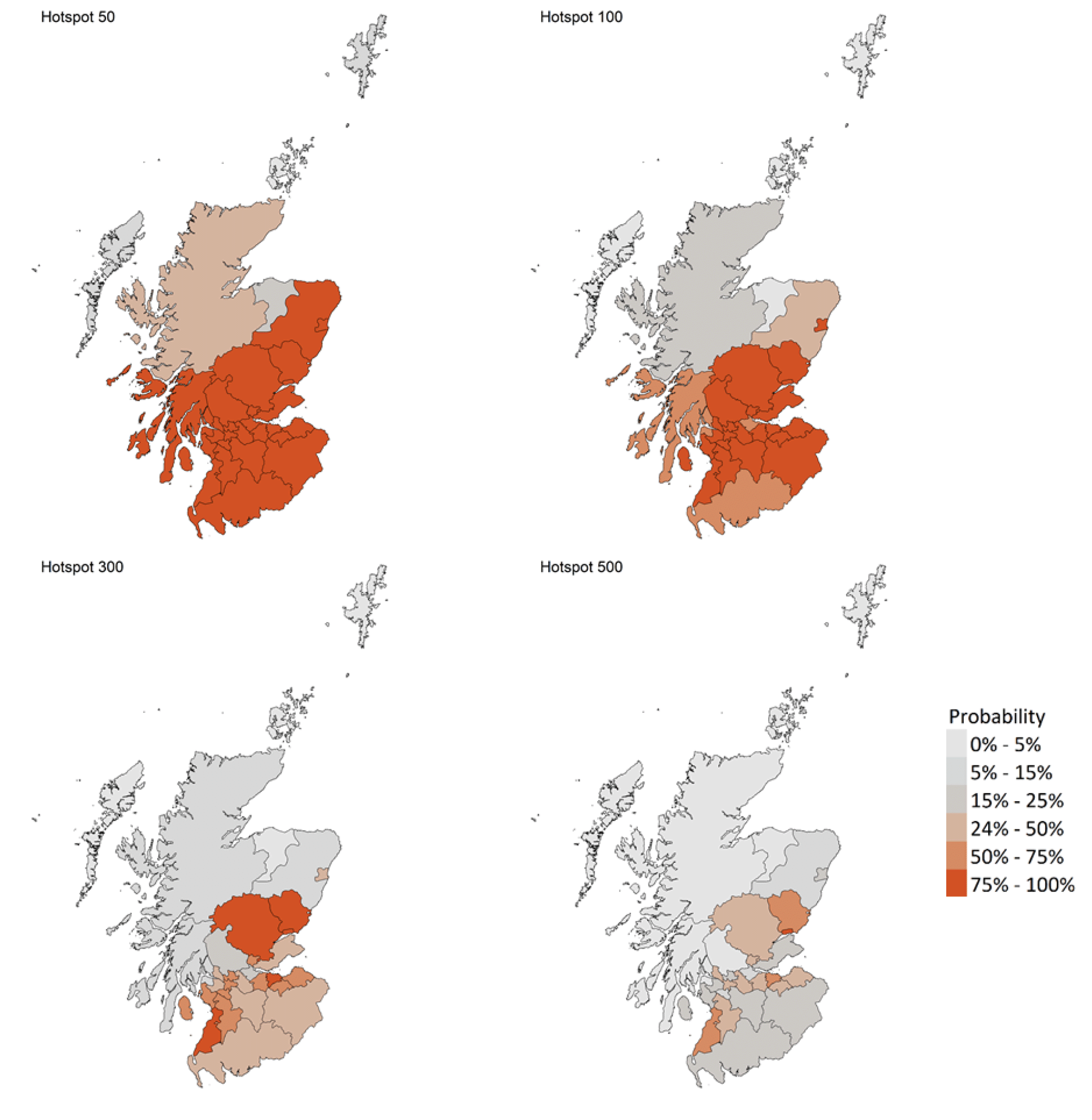
- Modelled rates of positive tests per 100K indicate that for the week commencing 27 June 2021, there are 27 local authorities with at least a 75% probability of exceeding 50 cases. Of those, 22 local authorities have at least a 75% probability of exceeding 100 cases, five have at least a 75% probability of exceeding 300 cases and one (Dundee) has a 75% probability of exceeding 500 cases.
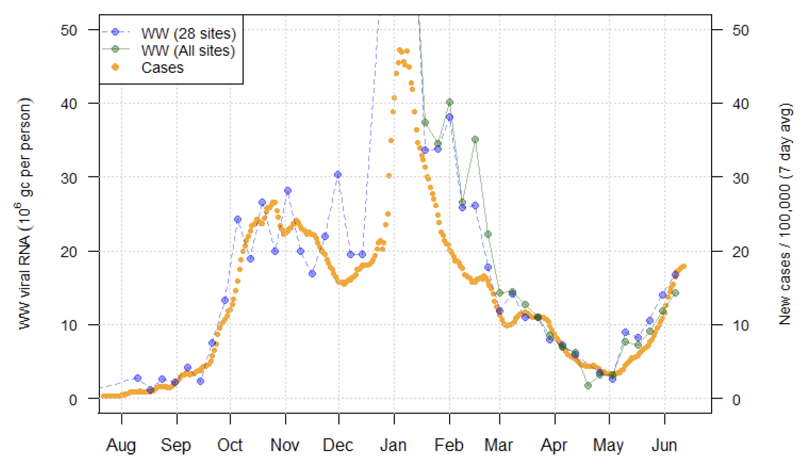
- The overall level of wastewater Covid-19 continues to rise at around the same rate as in recent weeks, with a similar rise in case rates. Levels rose in and around Edinburgh and Dundee as last week, joined by a range of other sites.
Overview of Scottish Government Modelling
Modelling outputs are provided here on the current epidemic in Scotland as a whole, based on a range of methods. Because it takes a little over three weeks on average for a person who catches Covid-19 to show symptoms, become sick, and either die or recover, there is a time lag in what our model can tell us about any re-emergence of the epidemic and where in Scotland this might occur. However modelling of Covid-19 deaths is an important measure of where Scotland lies in its epidemic as a whole. In addition, the modelling groups that feed into the SAGE consensus use a range of other data along with deaths in their estimates of R and the growth rate. These outputs are provided in this research findings. The type of data used in each model to estimate R is highlighted in Figure 1.
We use the Scottish Contact Survey (SCS) to inform a modelling technique based on the number of contacts between people. Over time, a greater proportion of the population will be vaccinated. This is likely to impact contact patterns and will become a greater part of the analysis going forwards.
The logistical model utilises results from the epidemiological modelling, principally the number of new infections. The results are split down by age group, and the model is used to give a projection of the number of people that will go to hospital, and potentially to ICU. This will continue to be based on both what we know about how different age groups are affected by the disease and the vaccination rate for those groups.
What the modelling tells us about the epidemic as a whole
The various groups which report to the Scientific Pandemic Influenza Group on Modelling (SPI-M) use different sources of data in their models (i.e. deaths, hospital admissions, cases) so their estimates of R are also based on these different methods. SAGE's consensus view across these methods, as of 16th June, was that the value of R in Scotland was between 1.2 and 1.4 (see Figure 1). This is unchanged from last week[1].
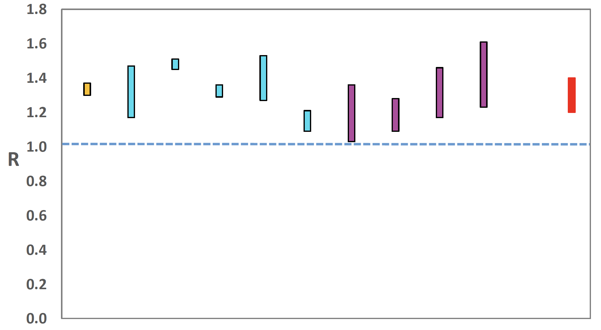
Source: Scientific Advisory Group for Emergencies (SAGE).
The various groups which report to the Scientific Pandemic Influenza Group on Modelling (SPI-M) use different sources of data in their models to produce estimates of incidence (Figure 2). SPI-M's consensus view across these methods, as of 16th June, was that the incidence of new daily infections in Scotland was between 34 and 54 new infections per 100,000. This is an increase since last week. This equates to between 1,900 and 3,000 people becoming infected each day in Scotland.
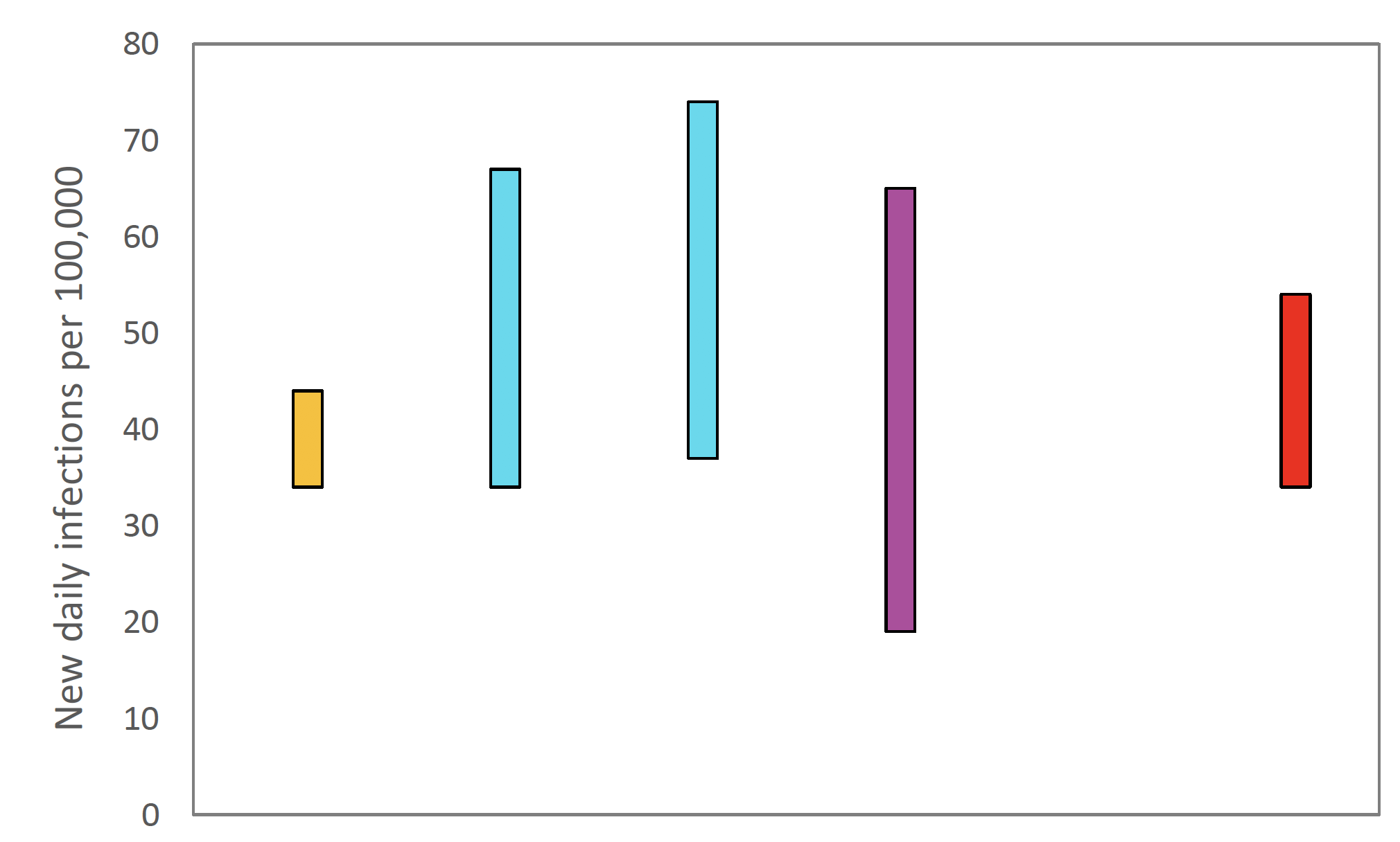
Source: Scientific Pandemic Influenza Group on Modelling (SPI-M).
The consensus from SAGE for this week is that the growth rate in Scotland is between 3% and 6% per day. This is unchanged from the estimate on 9th June.
What we know about how people's contact patterns have changed
Average contacts have remained at a similar level in the last two weeks (comparing surveys pertaining to 20th May - 26th May and 3rd June - 9th June) with a current level of 4.3 daily contacts as seen in Figure 3. This is less than half the UK pre-pandemic contact levels reported in the POLYMOD[2] study (10.8; excluding children) and more recently the BBC Pandemic[3] study (10.5; excluding children <13 years old).
Although overall average contacts remain unchanged, contacts within the work and school setting have decreased in the last two weeks; by 25% and 56% respectively. Contacts within the other setting (contacts outside of home, school and work) have increased by approximately 16% over the same period.
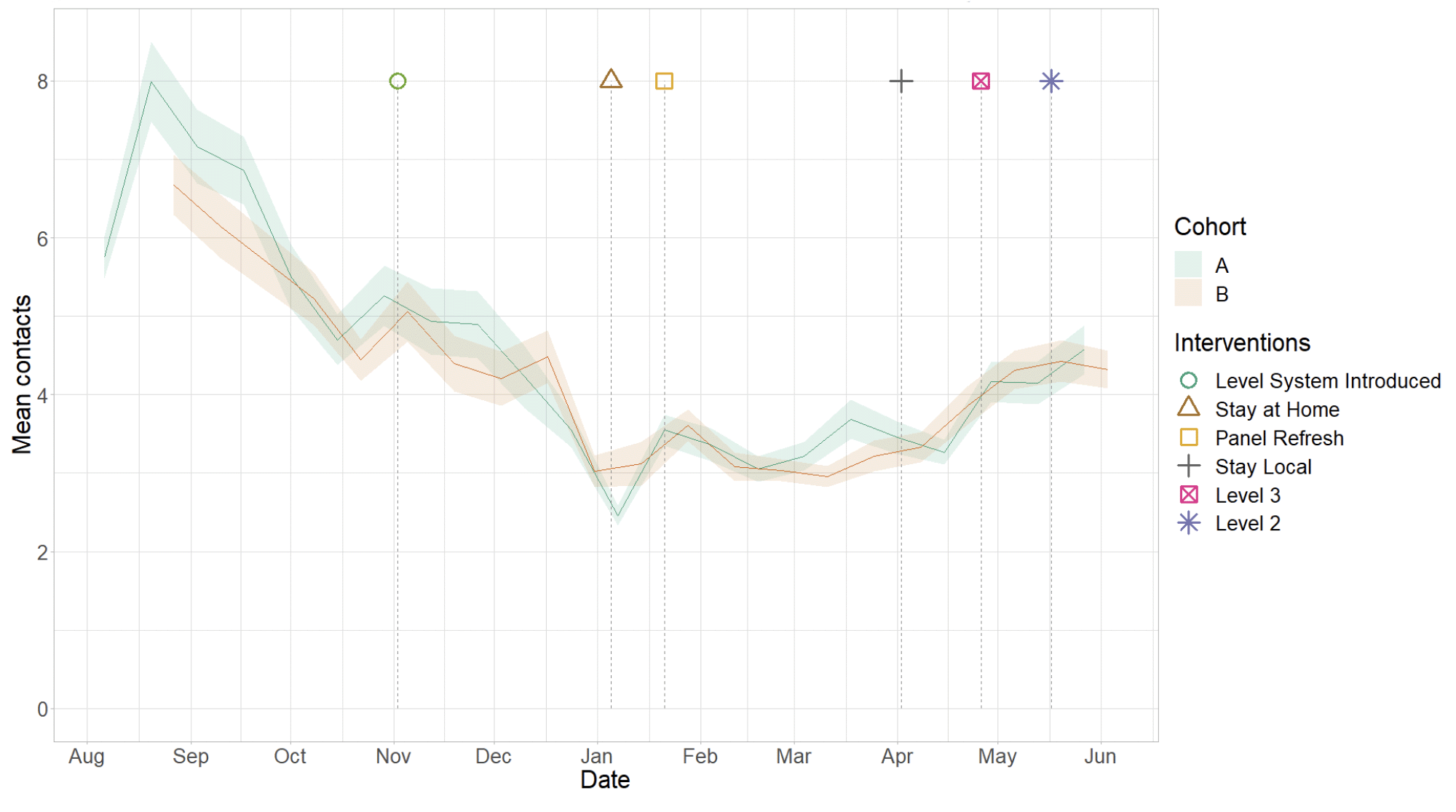
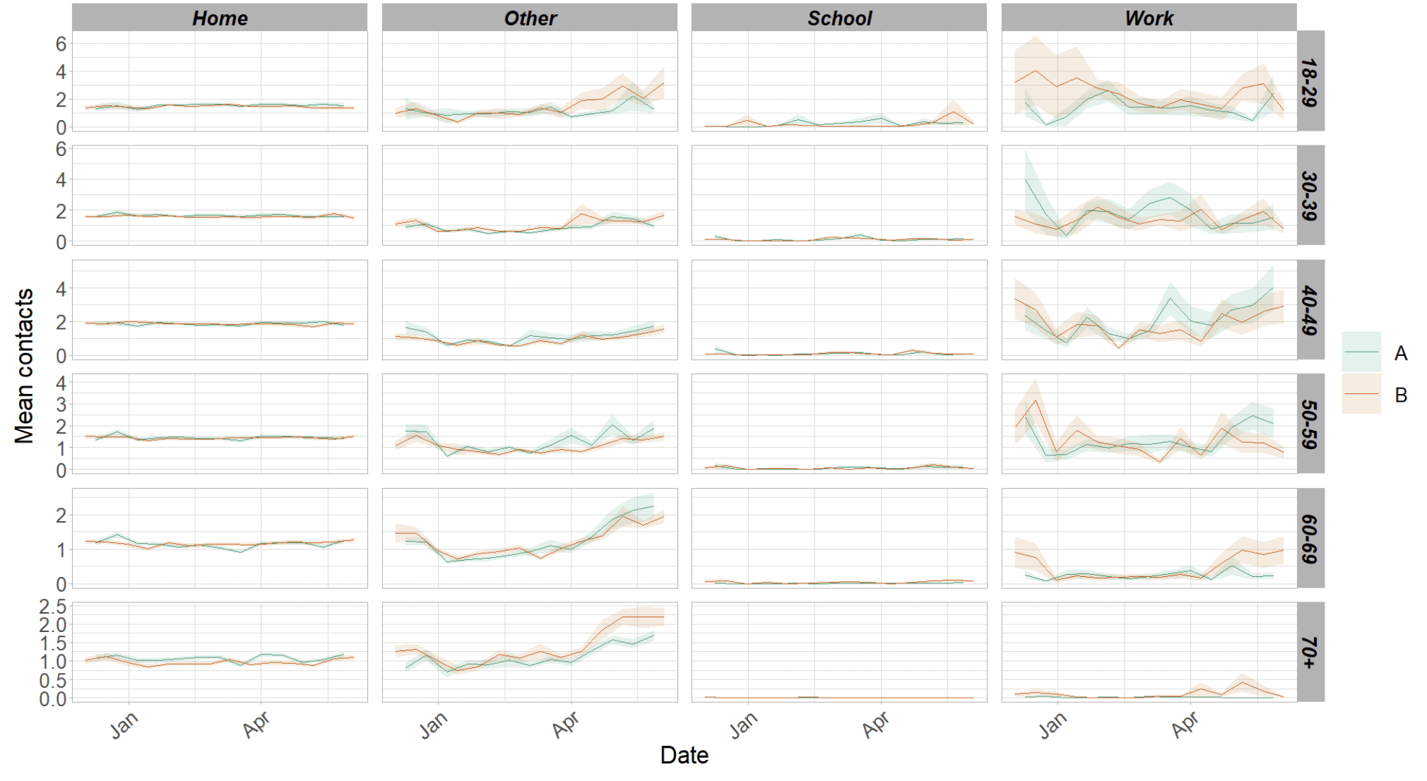
Figure 4 shows how contacts change across age group and setting. Only age groups 40-49 and 60-69 reported an increase in overall contacts in comparison to two weeks prior. Both age groups are also the only to have increased their contacts within the work setting during this period. Although majority of age groups reported an overall decrease in average contacts, all age groups increased their contacts within the other setting.
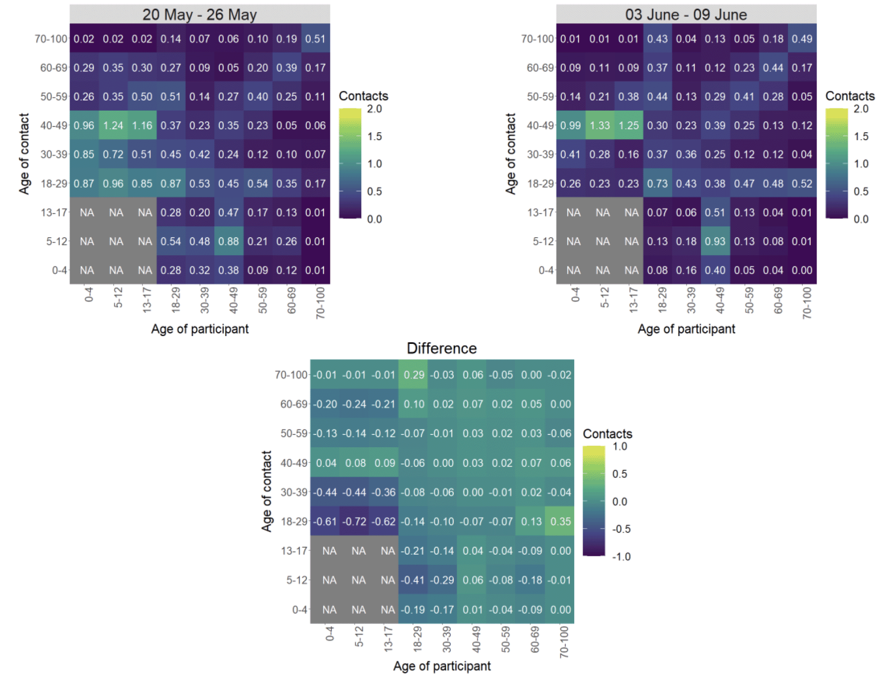
The heatmaps in Figure 5 show the mean overall contacts between age groups for the weeks relating to 20th May - 26th May and 3rd June - 9th June and the difference between these periods. Interactions between those over 18 with each other have remained at similar levels in comparison to two weeks prior with the exception of those aged between 18-29 with individuals 60 and over who have shown the biggest increase in interactions in the last two weeks. Those aged between 18-39 have shown the biggest reduction in interactions with those under 18.
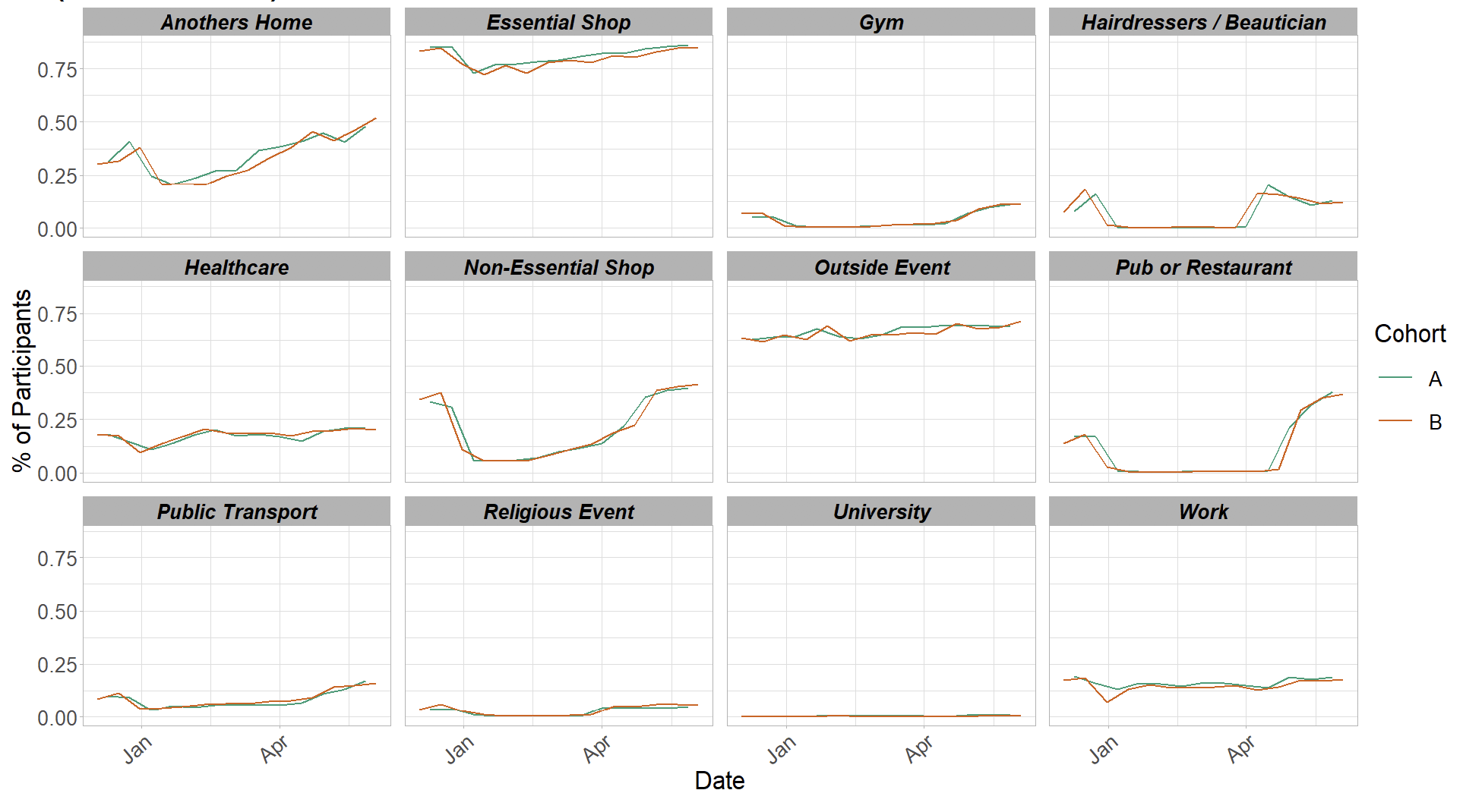
The biggest increase in the proportion of participants visiting different locations is seen in those visiting another's home in Figure 6. This has increased from 46% to 52% in the last two weeks, followed by visiting an event outside, increasing slightly from 68% to 71%
Vaccinations and contacts patterns
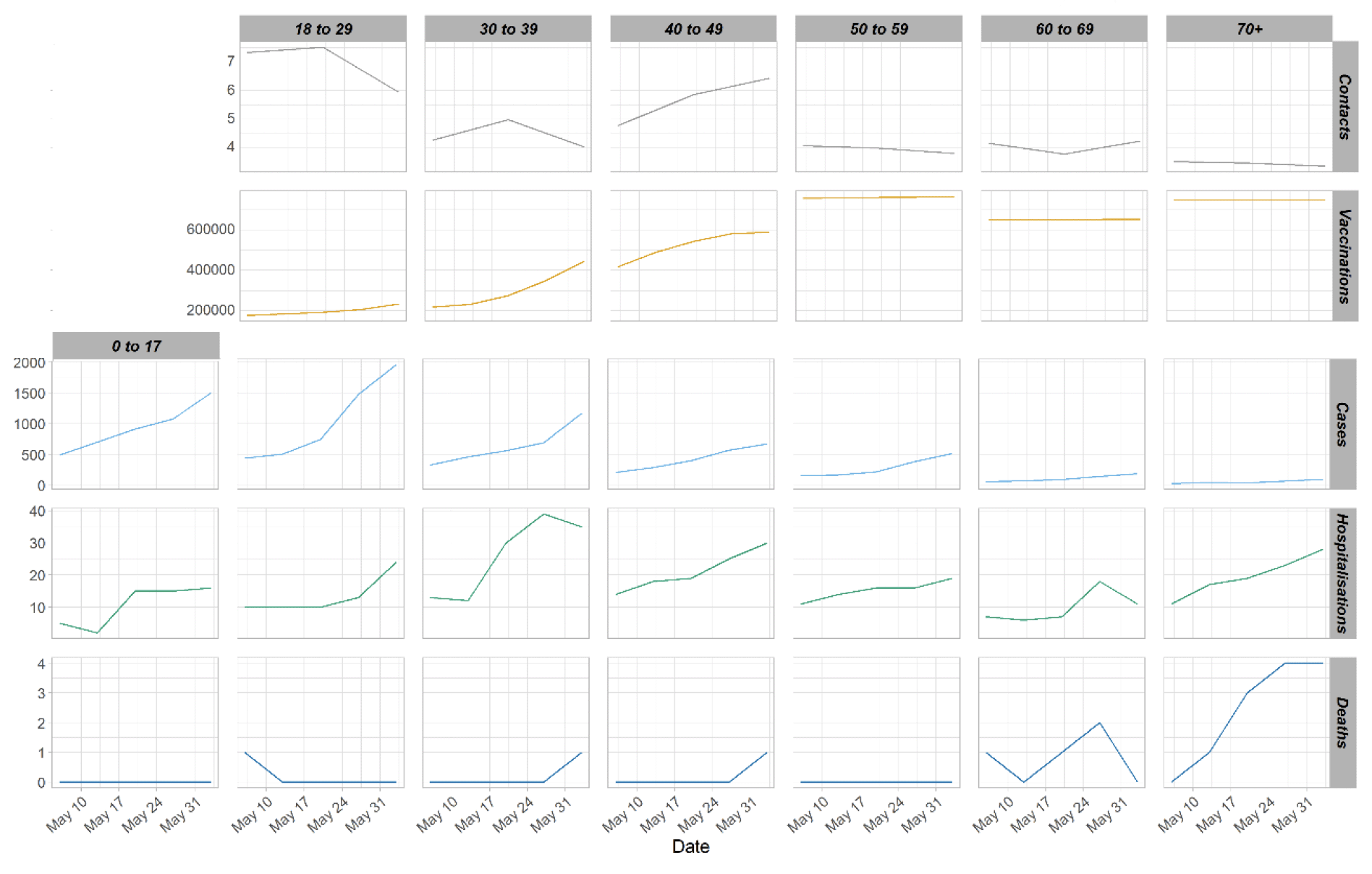
Vaccinations and contacts patternsFrom Figure 7, it can be seen that the older age groups have fewer contacts and more vaccinations than the younger age groups. They also have the lowest weekly case number comparatively to the younger age groups. Despite that, they have similar weekly hospitalization levels to that seen with the younger age groups.
What the modelling tells us about estimated infections as well as Hospital and ICU bed demand
The Scottish Government assesses the impact of Covid-19 on the NHS in the next few weeks in terms of estimated number of infections. Figure 8 shows the modelled number of infections compared to estimates based on actual positive test data.
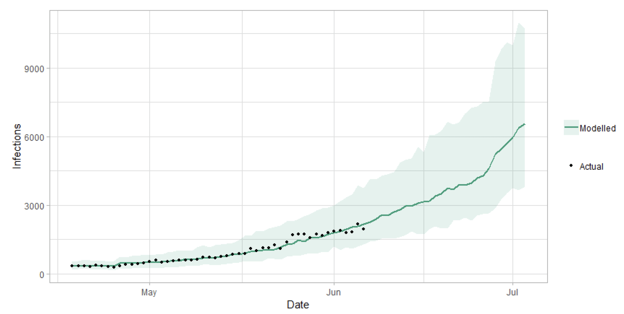
Figure 9 shows the impact of the projections on the number of people in hospital. This week this shows a projection, which take account of the Delta variant and vaccinations with an upper and lower bound at a prediction interval of 90%[7].
The modelling includes all hospital stays, whereas the actuals only include stays up to 28 days duration that are linked to Covid-19. Work is ongoing to show the modelled occupancy for stays up to a 28 day limit.
Compared to last week, the projection of bed demand for the end of June is lower than previously projected, showing a shallower rise in coming weeks. This is because the modelling has been refined. As more information becomes available on vaccination effects and the Delta variant this will be refined further. To note: these projections will continue to be updated as more information becomes available on the Delta variant and vaccinations each week as uncertainties remain. Modelling is only presented until the beginning of July for these reasons. In addition, our estimate infections have fallen as the case data has not increased as much as previously projected.
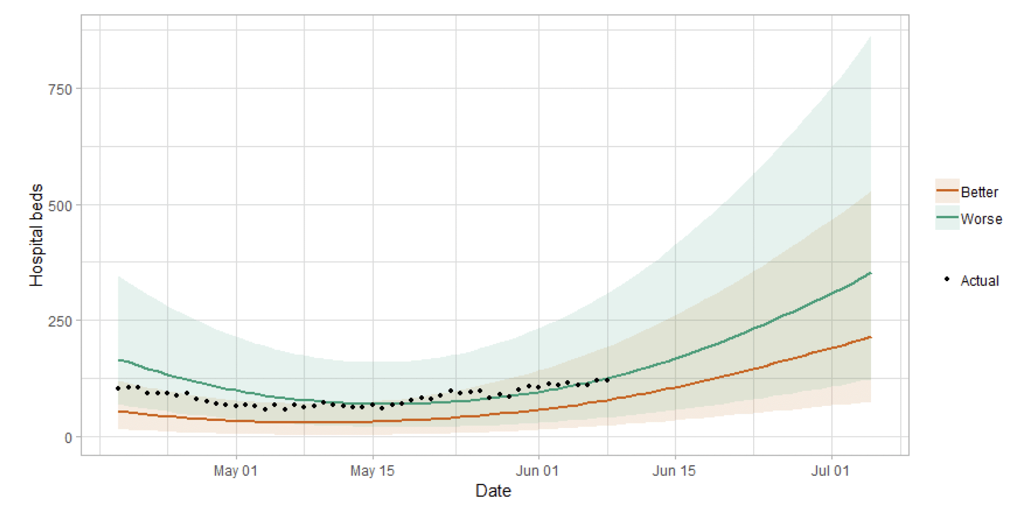
Figure 10 shows the impact of the projection on ICU bed demand.
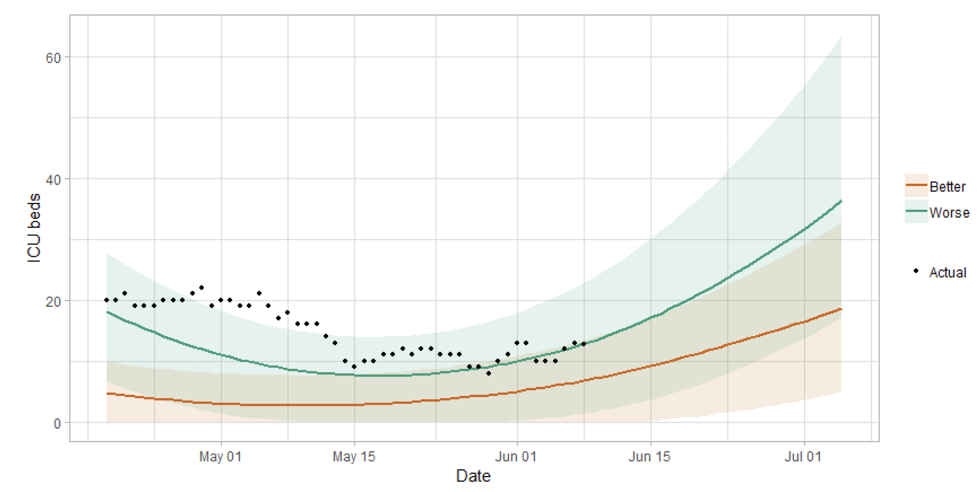
A comparison of the actual data against historical projections is included in the Technical Annex.
SPI-M-O has not produced updated medium term projections this week. The delay between infection, the need for hospital care and death means SPI-M-O does not have confidence that their projections based on the current trends in the data fully capture the recent rapid spread of the Delta variant, and its likely impact on transmission over the coming weeks.
What we know about the risk of hospitalisation and vaccine effectiveness associated with the Delta variant of Covid-19
The Early Pandemic Evaluation and Enhanced Surveillance of Covid-19 (EAVE) 2 Study Group[9] has investigated the risk of hospitalisation from Covid-19 and estimated vaccine effectiveness in preventing hospital admissions in Delta variant cases.
The results are published as a research letter in The Lancet[10]. Research letters are externally peer-reviewed, and their findings are usually preliminary or exploratory.
As part of EAVE II – a BREATHE-associated project – researchers from the Universities of Edinburgh and Strathclyde, and Public Health Scotland (PHS) analysed a dataset covering the entire Scottish population of 5.4 million people to track the pandemic and vaccine roll‑out in real time.
Genomic sequencing data for Scotland shows that from 1st April to 28th May 2021, 97% of S gene-positive cases sequenced in Scotland were the Delta variant. S gene-positive is a proxy for the Delta variant.
Compared to the Alpha variant, the Delta variant is associated with an increase in the risk of Covid-19 hospitalisation by 85% (95% CI 39-147).
Two vaccine doses still provide strong protection against the Delta variant – but it may be at a lower level compared with the Alpha variant, the early evidence suggests.
Vaccines were found to reduce the risk, among those who have tested positive for Covid-19, of being admitted to hospital, but strong protective effects against the Delta variant were not seen until at least 28 days after the first vaccine dose. At this point the risk of hospitalisation is reduced by 62% (95% CI 42-76).
For the whole population, at least 14 days after the second dose, the Pfizer-BioNTech vaccine was found to provide 79% (95% CI 75-82) protection against infection from the Delta variant, compared with 92% (90-93) against the Alpha variant.
For the whole population, at least 14 days after the second dose, the Oxford-AstraZeneca vaccine offered 60% (95% CI 53-66) protection against infection with the Delta variant compared with 73% (95% CI 66-78) for the Alpha variant. This lower vaccine effect may reflect that it takes longer to develop immunity with Oxford-AstraZeneca.
Because of the observational nature of the study, data about vaccine effectiveness should be interpreted with caution and it is not possible to make a direct comparison between both vaccines.
What we know about which local authorities are likely to experience high levels of Covid-19 in two weeks' time
We continue to use modelling based on Covid-19 cases and deaths from several academic groups to give us an indication of whether a local authority is likely to experience high levels of Covid-19 in the future. This has been compiled via SPI-M into a consensus. In this an area is defined as a hotspot if the two week prediction of cases (positive tests) per 100K population is predicted to exceed a threshold, e.g. 500 cases.
Modelled rates of positive tests per 100K (Figure 11) indicate that for the week commencing 27 June 2021, there are 27 local authorities with at least a 75% probability of exceeding 50 cases. Of these, 22 local authorities have at least a 75% probability of exceeding 100 cases and 5 (Angus, Edinburgh, Dundee, Perth & Kinross, and South Ayrshire) have at least a 75% probability of exceeding 300 cases.
Dundee has at least a 75% probability of exceeding 500 cases[11].
What can analysis of wastewater samples tell us about local outbreaks of Covid-19 infection?
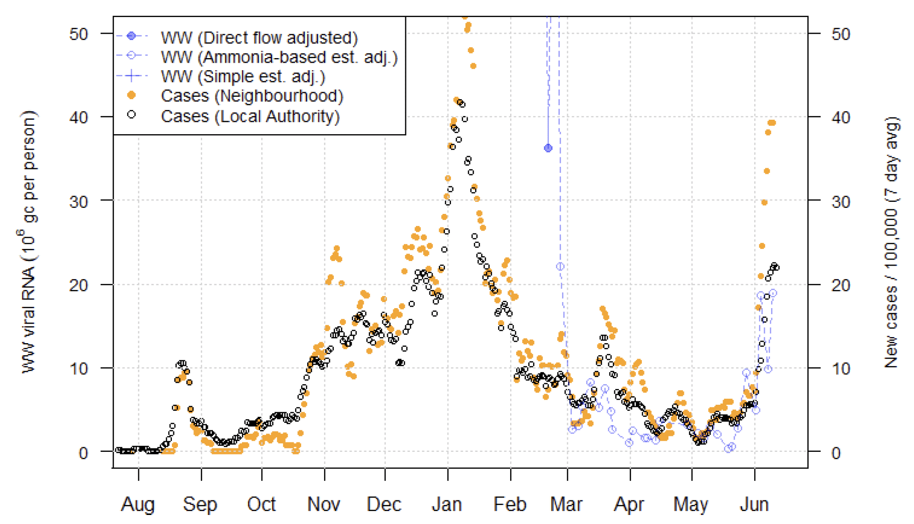
Levels of Covid-19 RNA in wastewater (WW) collected at a number of sites around Scotland are adjusted for population and local changes in intake flow rate and compared to daily 7-day average positive case rates derived from Local Authority and Neighbourhood (Intermediate Zone) level aggregate data. See Technical Annex in Issue 34 of these Research Findings for the methodology.
Nationwide, wastewater Covid-19 levels rose at around the same rate as in recent weeks, with a similar rise in case rates. Levels rose in and around Edinburgh and Dundee as last week, joined by a range of other sites.
Figure 12 shows the national aggregate for the original 28 sites with long-term records (in blue) and, from January 2021, the aggregate for the full set of up to 110 currently sampled sites (in green)[12]. This aggregate shows a continued rise in WW Covid-19 to around 17 million gene copies/person/day (Mgc/p/d), matching the rising rate of new cases and giving WW Covid-19 levels similar to those at the start of October 2020 (though increasing at a slower rate from week to week).
During the increase in COVID-19 levels in January, in many sites the increase in WW Covid-19 exceeded the increase in case rates. During the current period, this does not seem to be the case – indeed in locations like Perth (Figure 16), there is a very rapid increase in new cases that exceeded the rate of increase of WW Covid-19. The cause of this difference is unclear.
While the largest increases in wastewater Covid-19 levels are concentrated in the central belt, many local authorities outside of this area also show some degree of increase in viral levels. This is shown in Figure 13, which uses colours to show (i) the Local Authority average viral RNA levels (in Mgc/p/d) over the 2 week period from 28th May to 10th June, and (ii) in absolute terms the change in viral RNA levels compared to the previous two week period 14th to 27th May. Darker, or warmer, colours show high levels of virus or large increases in virus respectively.
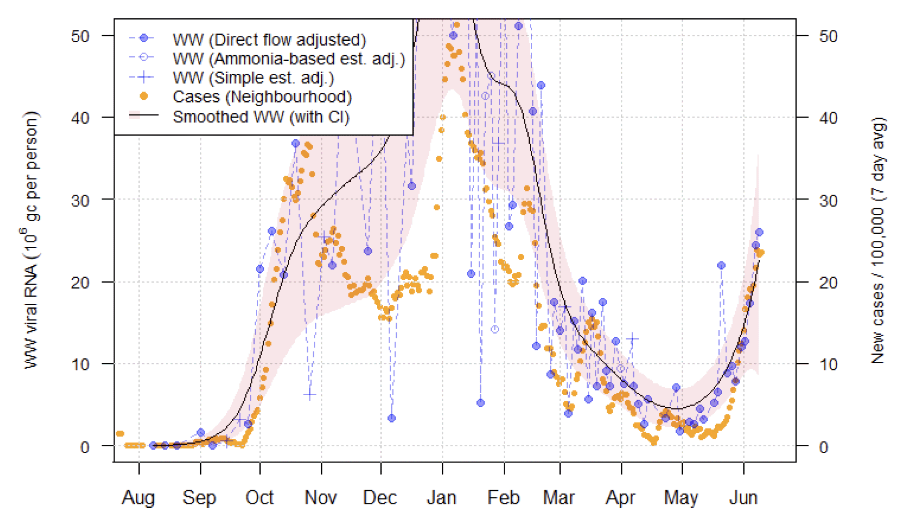
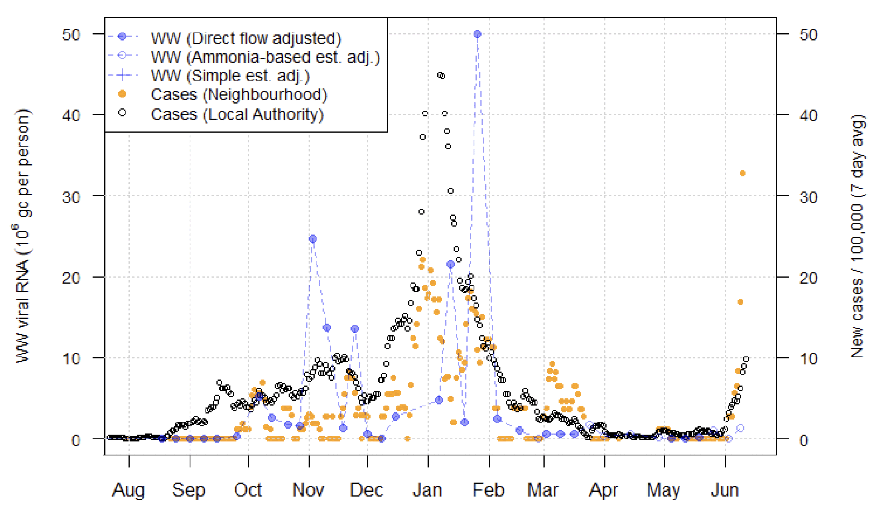
Note that this week, no new measurements from Shieldhall - one of the largest wastewater treatment works and covering much of Glasgow – were recorded. This means we are relatively uncertain about the situation in that location. Though it is notable that the rate of new cases within the Shieldhall catchment has fallen, the reduction in WW Covid-19 at one local authority in that area (seen in Figure 14) should not be over‑interpreted. WW readings of 20-35 million gene copies per person per day (Mgc/p/d) were recorded from the Dalmuir site, also in Glasgow, suggestive of continued increases in Covid-19 levels. Case rates also increased near Dalmuir.
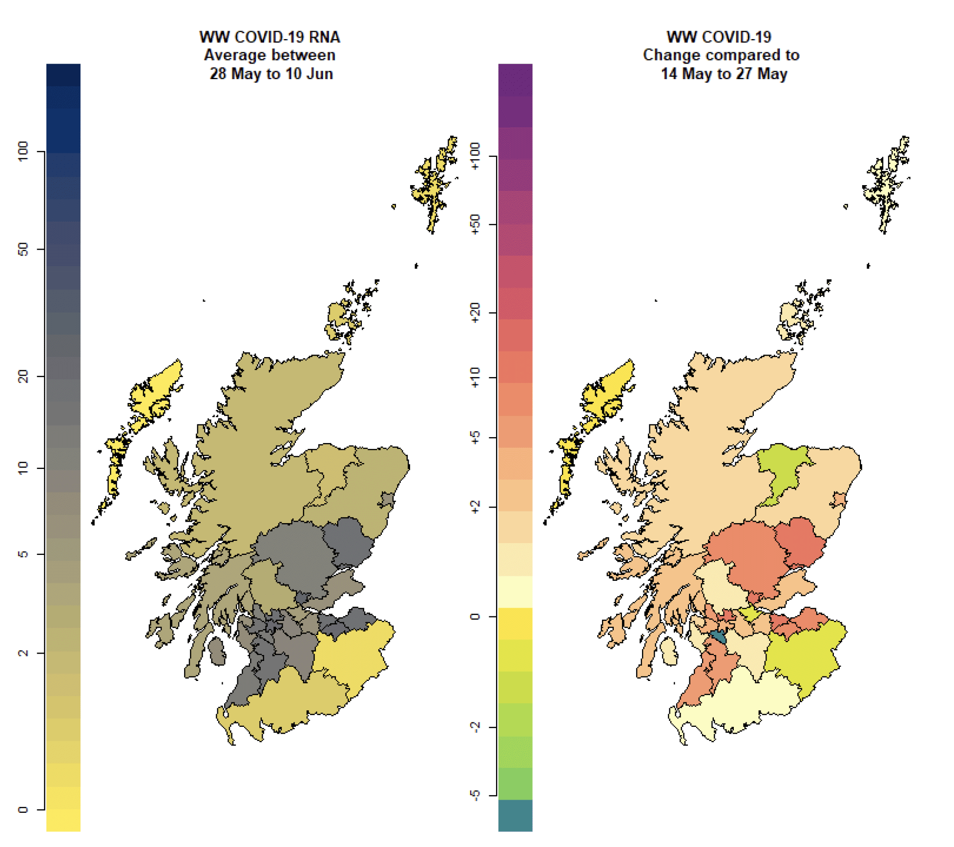
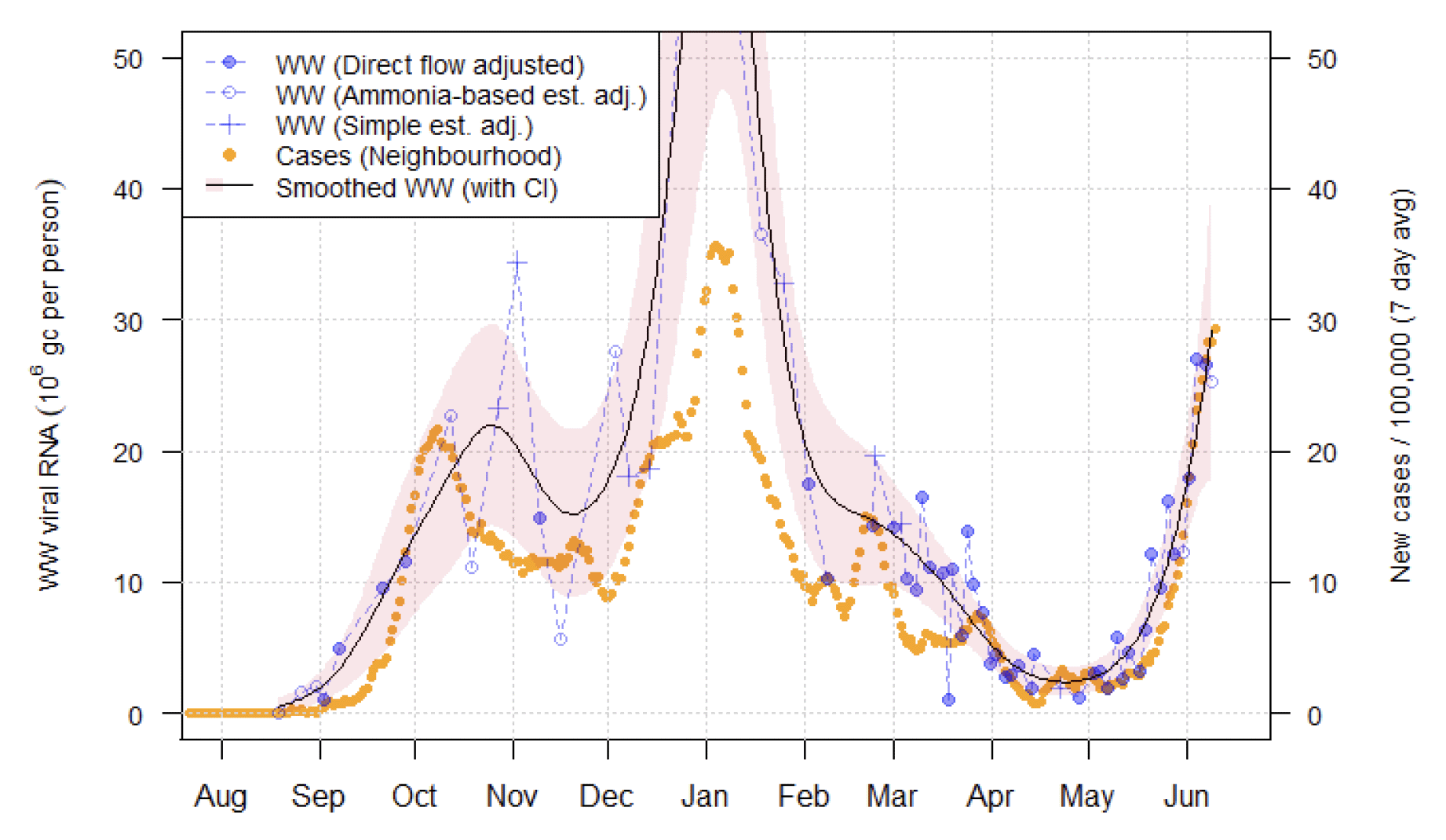
Clear increases in WW Covid-19 levels were exhibited in other major cities. For example, Figure 14 shows continued and rapid increases in WW viral levels at Seafield in Edinburgh. This is supported by an increase in levels at Penicuik nearby in the Midlothian local authority as well as sites like Blackburn and Whitburn in the West Lothian local authority.
A similarly large increase continued at Hatton near Dundee, while Nigg in Aberdeen showed a clear but smaller increase in levels to approximately 10 Mgc/p/d, slightly leading the increase in cases.
As Figure 13 indicates, increases also occurred in a range of other locations. For example, Meadowhead in Ayrshire (Figure 15) and Perth (Figure 16) both also show increases in both cases and WW Covid-19. Similar large increases in both cases and WW are seen at sites like Alloa in Clackmannanshire, Kirkcaldy in Fife and Fort William in the Highlands.
In some sites, especially smaller ones like Maybole in Ayrshire and Galashiels in the Borders (Figure 17), a very large recent increase in case rates contrasts with only a small increase in WW Covid-19 levels. This may relate to poor location matching of cases in those locations, and we will continue to monitor these situations.
What next?
The Scottish Government continues to work with a number of academic modelling groups to develop other estimates of the epidemic in Scotland.
The modelled estimates of the numbers of new cases and infectious people will continue to be provided as measures of the epidemic as a whole, along with measures of the current point in the epidemic such as Rt and the growth rate. Further information can be found at https://www.gov.scot/coronavirus-covid-19.
We may report on exceedance in future weeks when the background levels of Covid-19 reduces so that it can be useful in identifying outbreaks.