Coronavirus (COVID-19): modelling the epidemic (issue no. 50)
Latest findings in modelling the COVID-19 epidemic in Scotland, both in terms of the spread of the disease through the population (epidemiological modelling) and of the demands it will place on the system, for example in terms of health care requirement.
Technical Annex
How the modelling compares to the real data as it emerges
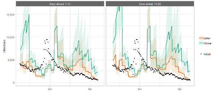
The following charts show the history of our modelling projections in comparison to estimates of the actual data. The infections projections were largely accurate during October to mid-December and from mid-January onward. During mid-December to mid-January, the projections underestimated the number of infections, due to the unforeseen effects of the new variant.
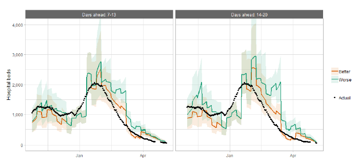
Hospital bed projections have generally been more precise than infections estimates due to being partially based on already known information about numbers of current infections, and number of people already in hospital. The projections are for number of people in hospital due to Covid-19, which is slightly different to the actuals, which are number of people in hospital within 28 days of a positive Covid-19 test.
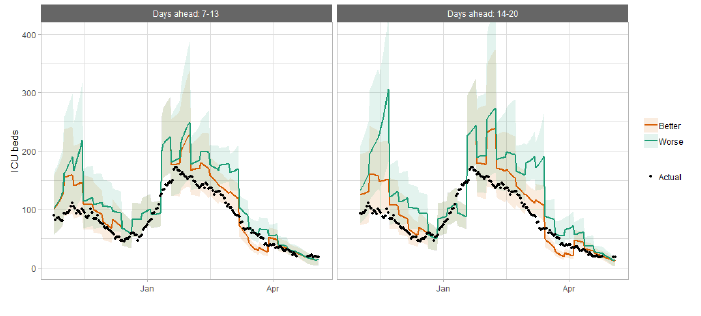
As with hospital beds, ICU bed projections have generally been more precise than infections. The projections are for number of people in ICU due to Covid-19. The actuals are number of people in ICU within 28 days of a positive Covid-19 test up to 20 January, after which they include people in ICU over the 28 day limit.
| LA | P (Cases > 500) | P (Cases > 300) | P (Cases > 100) | P (Cases > 50) |
|---|---|---|---|---|
| Aberdeen City | 0-5% | 0-5% | 5-15% | 15-25% |
| Aberdeenshire | 0-5% | 0-5% | 5-15% | 5-15% |
| Angus | 0-5% | 0-5% | 0-5% | 5-15% |
| Argyll and Bute | 0-5% | 0-5% | 0-5% | 0-5% |
| City of Edinburgh | 5-15% | 5-15% | 15-25% | 25-50% |
| Clackmannanshire | 0-5% | 0-5% | 0-5% | 5-15% |
| Dumfries & Galloway | 0-5% | 5-15% | 15-25% | 25-50% |
| Dundee City | 0-5% | 0-5% | 5-15% | 5-15% |
| East Ayrshire | 0-5% | 0-5% | 5-15% | 25-50% |
| East Dunbartonshire | 0-5% | 0-5% | 5-15% | 15-25% |
| East Lothian | 0-5% | 0-5% | 5-15% | 5-15% |
| East Renfrewshire | 0-5% | 0-5% | 5-15% | 5-15% |
| Falkirk | 0-5% | 0-5% | 5-15% | 15-25% |
| Fife | 0-5% | 5-15% | 15-25% | 25-50% |
| Glasgow City | 15-25% | 15-25% | 25-50% | 25-50% |
| Highland | 0-5% | 0-5% | 5-15% | 5-15% |
| Inverclyde | 0-5% | 0-5% | 0-5% | 5-15% |
| Midlothian | 0-5% | 0-5% | 5-15% | 5-15% |
| Moray | 0-5% | 0-5% | 5-15% | 25-50% |
| Na h-Eileanan Siar | 0-5% | 0-5% | 0-5% | 0-5% |
| North Ayrshire | 0-5% | 0-5% | 5-15% | 15-25% |
| North Lanarkshire | 5-15% | 15-25% | 25-50% | 25-50% |
| Orkney Islands | 0-5% | 0-5% | 0-5% | 0-5% |
| Perth and Kinross | 0-5% | 0-5% | 5-15% | 5-15% |
| Renfrewshire | 0-5% | 5-15% | 15-25% | 15-25% |
| Scottish Borders | 0-5% | 0-5% | 0-5% | 5-15% |
| Shetland Islands | 0-5% | 0-5% | 0-5% | 0-5% |
| South Ayrshire | 0-5% | 0-5% | 5-15% | 5-15% |
| South Lanarkshire | 0-5% | 5-15% | 15-25% | 25-50% |
| Stirling | 0-5% | 0-5% | 5-15% | 5-15% |
| West Dunbartonshire | 0-5% | 0-5% | 5-15% | 15-25% |
| West Lothian | 5-15% | 5-15% | 15-25% | 15-25% |
What is the difference in behaviour between the different sizes of sites and the past patterns of COVID-19 in wastewater (WW)?
The following analysis reviews the difference in behaviour between the different sizes of sites and the past patterns of COVID-19 in wastewater (WW)
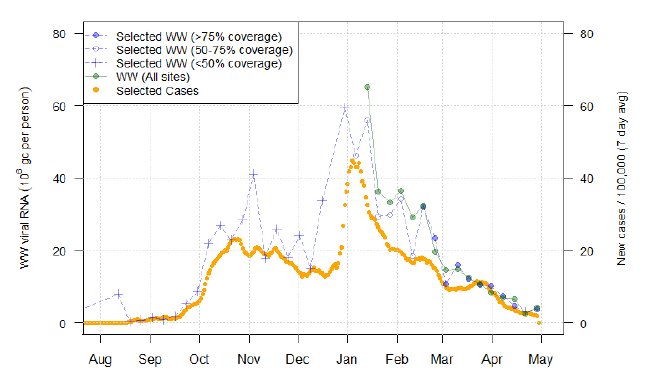
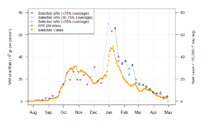
Trends in WW data can be broken down by the population of the associated site. This is an imperfect representation of a variety of underlying factors that might influence COVID-19 levels, including population density and rural/urban divide, but gives a useful summary. In Figures 23 to 25, this is divided into "small" sites with under 10k population, "intermediate" sites with between 10k and 100k population, and "large" sites with in excess of 100k population. The median population of all sites is 11k.
Population weighted weekly averages of normalised WW levels are calculated for each subset of sites, and for comparison, a population weighted average case rate using neighbourhoods local to these sites is presented. A further explanation of this normalisation process is provided below.
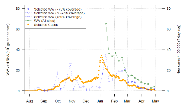
Overall the number of "small" and "intermediate" sites sampled increased with time. To illustrate this aspect of the sampling scheme, a coverage percentage is calculated, this being the percentage of the population associated with those sites sampled in a given week to the total population of sites in the size group from which we have ever sampled WW Covid[10]. The WW aggregate across all sites is presented as a reference on all Figures.
Figures 24-25 show a close relationship between the size-specific WW figure and the WW aggregate over all sites, while Figure 23 shows size-specific WW levels as significantly lower. This suggests that for sites in excess of 10k in population, WW Covid-19 and case rate levels follow the same overall trend as the national average. However, the smaller sites have much lower levels of WW Covid-19. Their aggregated levels also appear to be more variable overall. This variability is greatest in 2020, before the majority of smaller sites were added.
It should be noted that the small and intermediate sized sites only amount to 6.2% and 34% of the overall population being currently sampled, despite making up respectively 49 and 48 out of the 103 sites being sampled. Thus, while the overall set of sites being sampled are increasingly from the smaller sites, it is the larger sites that have most of the impact on the national average. It may be noted that the full collection of 1809 smaller sites cover areas whose inhabitants make up around 20% of the overall population serviced by sewers in Scotland.
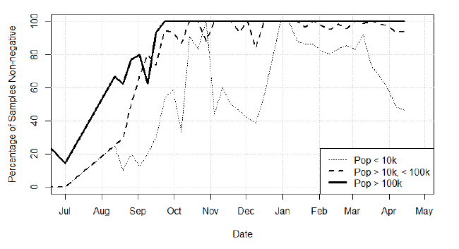
The difference in behaviour between the different sizes of site can also be seen in Figure 26, where we give) the proportion of each week's samples that detected the presence of Covid-19. At the start of the wastewater sampling programme, many samples from all types of site were negative. During the January peak, Covid-19 was detected in most samples. In March and April, the proportion of positive samples for the smaller sites has been declining rapidly as the overall prevalence has declined. The current high proportion of positive samples for larger sites demonstrates the capability of wastewater to detect relatively low levels of Covid-19 in the population.
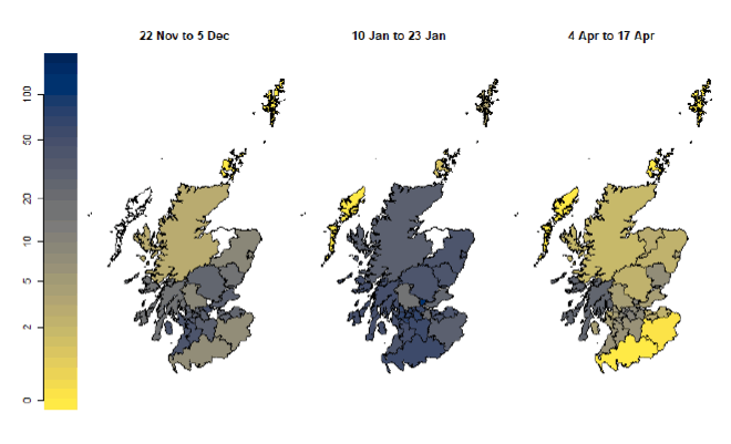
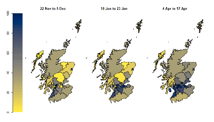
Figures 27 and 28, give population weighted local authority level WW Covid-19 levels, as well as wastewater sampling population coverage for each local authority, focusing on three key moments in the WW-Covid study so far.
Late November 2020: Sampling was based on the 28 initial sites, which were mainly larger urban areas. The local authorities in the central belt had the best coverage.
Mid-January 2021: Sampling expanded to other sites in the central belt, improving coverage in those regions. A large increase in Covid-19 prevalence occurred during the end of the year, encompassing all regions in Scotland (apart from the islands), though especially the major urban areas.
Early April 2021: More sites are being sampled outside of the central belt, though the rural and isolated nature of the Highland and Borders regions makes sampling there difficult. In the meantime, WW Covid-19 has reduced substantially from the January peak. Note the relatively high level for Argyll and Bute; this is due to a single site, Helensburgh, which has consistently had unusually high WW measurements compared to case numbers. We are currently reviewing this site.
The effect of different forms of normalisation of the WW data
Raw measurements of this concentration of wastewater Covid-19 are affected by both the size of the catchment area at each waterworks (and hence the population served), as well as the amount of flow into the works (with high volumes of fluid flow diluting RNA values). Normalisation has a small advantage in matching WW to case data and also has the benefit of allowing comparison of WW results between sites.
RNA concentrations are transformed by one of three methods depending on data availability. For all methods, the normalised figures are measured in daily value of RNA copies per person.
Direct flow normalisation: when measurements of flow are available, the raw RNA measurement is multiplied by the daily flow total, and divided by the population served at each site, to produce a daily value of RNA copies per person.
Normalisation using an ammonia-based estimate: In some cases (especially with the most recent data), flow measurements are unavailable; if however measurements of ammonia concentration are available, they can be used to estimate flow via a statistical model.
Standardisation using a simple estimate: when both flow and ammonia
measurements are unavailable, flow is estimated as the historical average for that site; when a site has no associated flow data at all, a prediction of flow is calculated based on the population characteristics of the site. This is not a full normalisation but does ensure the data is on an appropriate scale.
Graphs and correlations are produced for each site comparing case data, simple standardised WW data, and WW data normalised by flow and by ammonia. Correlations are very high between WW data standardised in different ways (simple, or normalised fully using ammonia or flow). The relationships between case and WW data were only slightly affected by the method of normalisation (direct flow or ammonia), but the simple standardised was not as good. In recent weeks, with the dry weather, flow levels have been low in the wastewater systems, and when flow or ammonia data have not been available, this has resulted in standardised COVID levels being higher than they would have been with full normalisation. Normalisation practice is monitored in other countries, particularly across the UK.