Coronavirus (COVID-19): modelling the epidemic (issue no. 39)
Latest findings in modelling the COVID-19 epidemic in Scotland, both in terms of the spread of the disease through the population (epidemiological modelling) and of the demands it will place on the system, for example in terms of health care requirement
Coronavirus (COVID-19): modelling the epidemic in Scotland (Issue No. 39)
Background
This is a report on the Scottish Government modelling of the spread and level of Covid-19. This updates the previous publication on modelling of Covid-19 in Scotland published on 11 February 2021. The estimates in this document help the Scottish Government, the health service and the wider public sector plan and put in place what is needed to keep us safe and treat people who have the virus.
This edition of the research findings focuses on the epidemic as a whole, looking at estimates of R, growth rate and incidence as well as local measures of change in the epidemic.
Key Points
- The reproduction rate R in Scotland is currently estimated as being between 0.7 and 0.9. This is the same as last week.
- The number of new daily infections for Scotland is estimated as being between 0 and 96, per 100,000 people.
- The growth rate for Scotland is currently estimated as being between -6% and -2%.
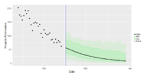
- At a national level the number of daily new infections are projected to continue falling in the next two weeks as result of lockdown restrictions. Hospital bed and ICU occupancy are also projected to fall over the next two weeks in advance of any partial schools re-opening effect.
- Average total contacts have remained steady compared to two weeks prior, currently at 2.9.
- All age groups have shown a decrease in average contacts over the past two weeks, with the exception of those aged between 50-59 and those over 70, where there has been a slight increase.
- Work contacts have decreased by 17% in the most recent survey following an initial uptick seen two weeks prior.
- The biggest change is seen in the proportion of people that have attended a health care facility, up from 14% (21 – 27 January) to 20% (4 – 10 February). The proportion of participants visiting another's home has also increased over the last two weeks from 21% to 24%.
- Nationally, levels of COVID in wastewater dropped 37% from the previous week. The current levels of Covid in wastewater are similar to the levels seen between October and December last year.
Overview of Scottish Government Modelling
Epidemiology is the study of how diseases spread within populations. One way we do this is using our best understanding of the way the infection is passed on and how it affects people who catch it to create mathematical simulations. Because people who catch Covid-19 have a relatively long period in which they can pass it on to others before they begin to have symptoms, and the majority of people infected with the virus will experience mild symptoms, this "epidemiological modelling" provides insights into the epidemic that cannot easily be measured through testing e.g. of those with symptoms, as it estimates the total number of new daily infections and infectious people, including those who are asymptomatic or have mild symptoms.
Modelling also allows us to make short-term forecasts of what may happen with a degree of uncertainty. These can be used in health care and other planning. The modelling in this research findings is undertaken using different types of data which going forward aims to both model the progress of the epidemic in Scotland and provide early indications of where any changes are taking place.
Modelling outputs are provided here on the current epidemic in Scotland as a whole, based on a range of methods. Because it takes a little over three weeks on average for a person who catches Covid-19 to show symptoms, become sick, and either die or recover, there is a time lag in what our model can tell us about any re-emergence of the epidemic and where in Scotland this might occur. However modelling of Covid deaths is an important measure of where Scotland lies in its epidemic as a whole. In addition, the modelling groups which feed into the SAGE consensus use a range of other data along with deaths in their estimates of R and the growth rate. These outputs are provided in this research findings. The type of data used in each model to estimate R is highlighted in Figure 1.
A medium term projection of the number of cases, ICU and hospital bed demand is provided at this stage of the epidemic in Scotland.
It should be noted that this research findings covers a period of uncertainty with the growth of the new variant in Scotland (SARS-CoV-2 VOC 202012/01).
What the modelling tells us about the epidemic as a whole
The various groups which report to the Scientific Pandemic Influenza Group on Modelling (SPI-M) use different sources of data in their models (i.e. deaths, hospital admissions, cases) so their estimates of R are also based on these different methods. SAGE's consensus view across these methods, as of 17 February, was that the value of R in Scotland was between 0.7 and 0.9 (see Figure 1). The value of R on 10 February was also between 0.7 and 0.9.
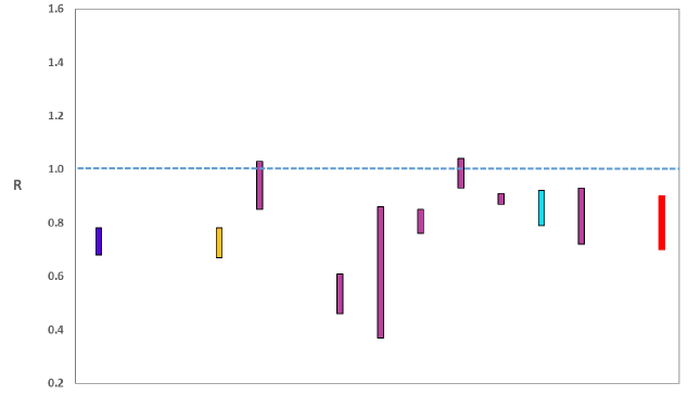
Source: Scientific Advisory Group for Emergencies (SAGE).
The various groups which report to the Scientific Pandemic Influenza Group on Modelling (SPI-M) use different sources of data in their models to produce estimates of incidence (Figure 2). SPI-M's consensus view across these methods, as of 17 February, was that the incidence of new daily infections in Scotland was between 0 and 96 new infections per 100,000. This equates to between 0 and 5,200 people becoming infected each day in Scotland. The Scottish Government results this week have been computed using a new platform called Epidemia (see Technical Annex in issue 37), which expands the Bayesian semi-mechanistic model which Scottish Government runs.
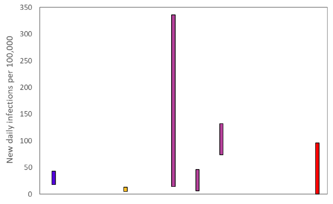
Source: Scientific Pandemic Influenza Group on Modelling (SPI-M).
The consensus from SAGE for this week is that the growth rate in Scotland is between -6 and -2% per day. On 10 February the growth rate was between -5 and -2%.
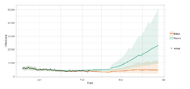
Scottish Government assess the impact of Covid on the NHS in the next few weeks in terms of estimated number of infections. For more on how we do this see page 4 of Issue 1 of the Research Findings for details[1].
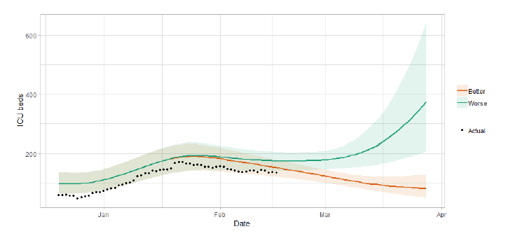
Figure 3 shows two projections which take account of vaccine roll-out (better and worse[2]).
What the modelling tells us about Hospital bed and ICU bed demand
Figure 4 shows the impact of the projections on the number of people in hospital.
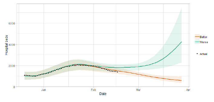
Figure 5 shows the impact of the projection on ICU bed demand.
What the modelling tells us about projections of hospitalisations in the medium term
SAGE produce projections of the epidemic[5] (Figure 6), combining estimates from several independent models (including the Scottish Government's logistics modelling, as shown in figures 3, 4 and 5). These projections are not forecasts or predictions. They represent a scenario in which the trajectory of the epidemic continues to follow the trends that were seen in the data up to 15 February and do not account for the impact of future policy or behaviour changes, such as the phased reopening of schools from 22 February.
The delay between infection, developing symptoms, the need for hospital care, and death means they will not fully reflect the impact of behaviour changes in the two to three weeks prior to 15 February. Nor do they include seasonal effects that might increase transmission.
These projections include the potential impact of vaccinations over the next six weeks. The real-world effectiveness of vaccines, particularly against infection, is not yet known. The first dose effectiveness of the Pfizer-BioNTech and Oxford-AstraZeneca vaccines against both hospitalisation and death have been modelled in line with JCVI's advice[6].
Beyond two weeks, the projections become more uncertain with greater variability between individual models. This reflects the large differences that can result from fitting models to different data streams, and the influence of small deviations in estimated growth rates and current incidence.
What we know about how people's contact patterns have changed
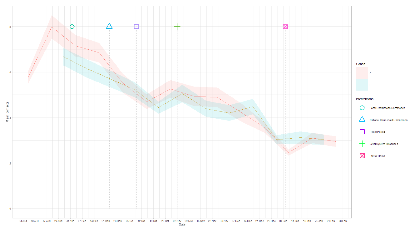
Since the survey pertaining to 21 – 27 January, mean contacts have remained at a consistent level, reducing marginally from 3.1 to 2.9 as shown in Figure 7. This plateau in contacts can also be seen in Panel B where average contacts have remained at approximately 3 since the start of January.
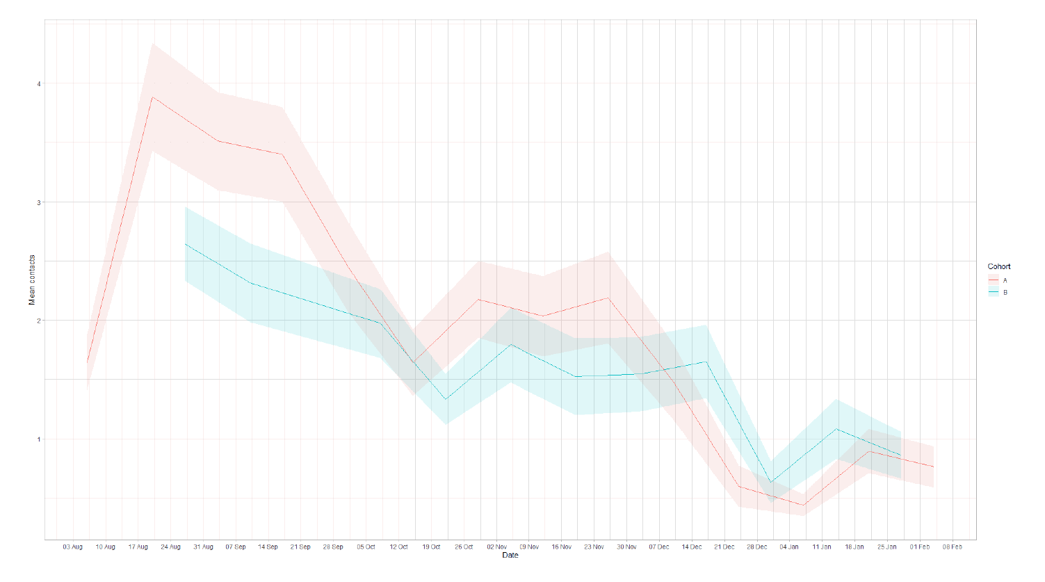
Contacts within the work setting have decreased by 17% in the most recent survey following an initial uptick seen two weeks prior shown in Figure 8. This trend was also replicated in Panel B where work contacts decreased by 21% after an initial increase. Mean contacts in the school, home and other setting have remained at a consistent level in comparison to the previous 2 weeks. These changes in mean contacts can be seen Figure 9.
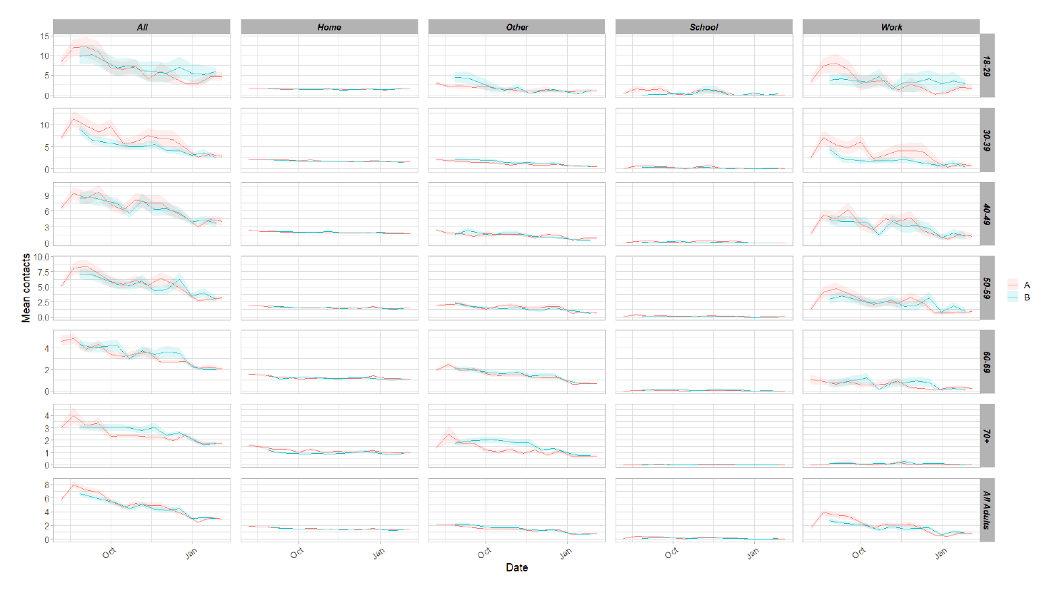
All age groups have shown a decrease in average contacts with the exception of those aged between 50-59 and those over 70, where there has been a slight increase. This is largely due to increases in work contacts for these age groups and also increases in home contacts. Individuals aged between 18-30 continue to have the highest number of average contacts in comparison to all other age groups.
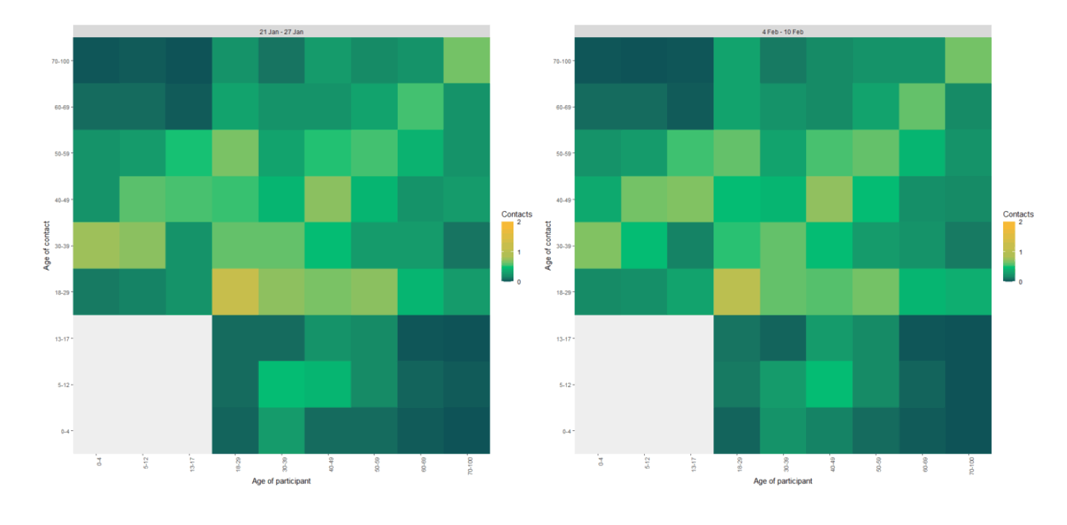
The heatmaps in Figure 10 show the change in mean overall contacts between age groups for the weeks pertaining to 21 – 27 January and the 4 – 10 February. The highest interactions are seen between members of the 18-29 age group. Individuals aged between 18-29 have increased their interactions with those under 18 and over 70 but have decreased contacts with all other age groups.
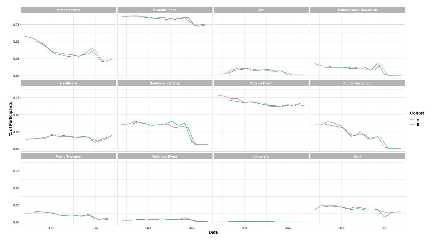
As Figure 11 shows, there has been little change in participant behavior across settings in the last two weeks. The biggest change, though slight, is seen in the proportion of people that have attended a health care facility, up from 14% (21 – 27 January) to 20% (4 – 10 February). The proportion of participants visiting another's home has also increased over the same period from 21% to 24%.
What can analysis of wastewater samples tell us about local outbreaks of Covid-19 infection?
Levels of Covid in wastewater collected at 28 sites around Scotland are adjusted for population and local changes in intake flow rate and compared to daily 7-day average positive case rates derived from Local Authority and Neighbourhood (Intermediate Zone) level aggregate data. See Technical Annex in Issue 34 of these Research Findings for the methodology.
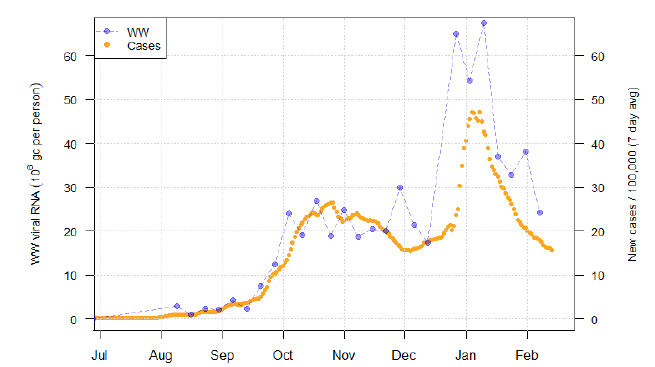
Nationally, levels of COVID in wastewater dropped 37% from the previous week, resuming the decline in levels seen during much of January (Figures 12 and 16). The current levels of Covid in wastewater are similar to levels seen between October and December last year. Qualitatively, the changes in wastewater Covid levels now align more closely with changes in case data.
Figure 12 shows wastewater Covid levels data aggregated over sites to produce a national average time series, with new cases data overlaid. The national picture for new cases data for the last week shows a continued slow decline in levels. A drop in wastewater Covid over the last week of data brings the two types of measurements more back in line with each other.
A specific example of a site with a large catchment population that exemplifies this change in wastewater Covid levels is Hatton in Angus, which covers the area of the city of Dundee and surrounding areas to the east (Figure 13). This site was identified last week as having persistently high wastewater Covid levels despite a reduction in cases. In the most recent data for Hatton, wastewater Covid levels have fallen by approximately 70%, bringing them into line with the case data. A similar pattern was observed at Shieldhall (which covers much of the southern half of Glasgow), though that site shows much more variable levels. Methodologies to smooth wastewater Covid levels data are in development, which should clarify interpretation for sites with less consistent results.
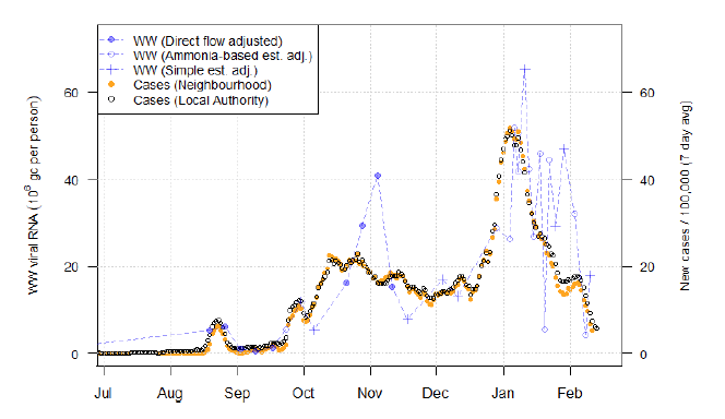
In addition, a number of sites previously showing large and rapid increases in wastewater Covid activity have dropped back to levels similar to prior to the rise. For example, Lockerbie (Figure 14) had spiked at over 50 million gc/person and now has dropped to below 5 million gc/person. Of the other such sites (not shown here), Stirling and Carbarns (which covers the Wishaw area of Lanarkshire) showed similar behaviour. Meanwhile, Falkirk this week showed an extremely high level of 157 million gc/person. The presence of individual spikes of very high levels of wastewater Covid indicates we should be cautious in interpreting such individual days of anomalous data when not supported by other evidence.
In contrast, more reasonable as evidence for a renewed increase in Covid might be sites like Allanfearn which is located in Inverness (Figure 15). This site has both multiple measurements suggestive of wastewater Covid increase as well as a rise in case numbers.
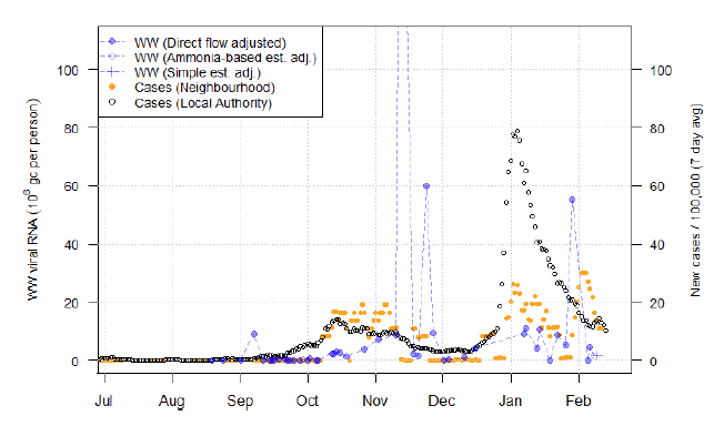
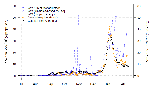
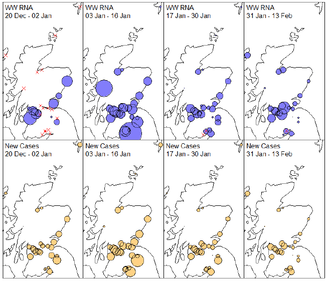
Figure 16 maps out the overall pattern across Scotland, showing that a number of sites continue to have quite high wastewater Covid levels.
What next?
The Scottish Government continues to work with a number of academic modelling groups to develop other estimates of the epidemic in Scotland.
The modelled estimates of the numbers of new cases and infectious people will continue to be provided as measures of the epidemic as a whole, along with measures of the current point in the epidemic such as Rt and the growth rate. Further information can be found at Coronavirus in Scotland.
Investigations are ongoing by NERVTAG, SPI-M, SAGE and Scottish Government regarding the impact of the new variant, SARS-CoV-2 VOC 202012/01, which will be reflected here as work is undertaken.
Imperial local forecasts which indicate which local authorities are likely to experience high levels of Covid will be included next week. Analysis from the EAVE 2 group, which tells us about the pattern of demographics and clinical risk groups over time for those who are testing positive with Covid, will be provided in future issues.