Scottish Energy Performance Certificates - new metrics: research
Research report summarising work to develop new EPC metrics for Scottish EPCs. This report accompanies the Energy Performance Certificate reform consultation.
Distribution of existing EPC metrics and the equivalent levels for proposed new ones
4412 homes for which data was available from the Scottish House Condition Survey (SHCS) were modelled using SAP 10.2[7]. The SHCS sample is designed to be representative of the whole housing stock. In each case, the existing EPC rating and other proposed energy metrics were output for comparison. The distribution of the results was examined. The main findings from this work are reported in this section.
Overall distribution
A key aim of the analysis was to suggest what level any new metric should be set at to give an equivalent standard to the existing metric. Understanding the distribution of the current EPC ratings is therefore important background.
| Band | Count | This analysis |
|---|---|---|
| A | 0 | 0.0% |
| B | 6 | 0.1% |
| C | 1419 | 32.2% |
| D | 1850 | 41.9% |
| E | 641 | 14.5% |
| F | 386 | 8.7% |
| G | 110 | 2.5% |
| Total | 4412 | 100% |
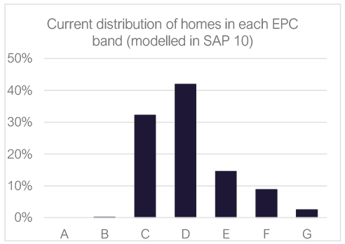
current distribution of homes in each EPC band. This shows around 0% in bands A and B, 30% in band C, 40% in band D, 15% in band E, 10% in band F and 5% in band G.
The above table and graph show the majority of homes in the SHCS sample fall in bands C and D, with very few achieving band B, and a tail of Es, Fs and Gs.
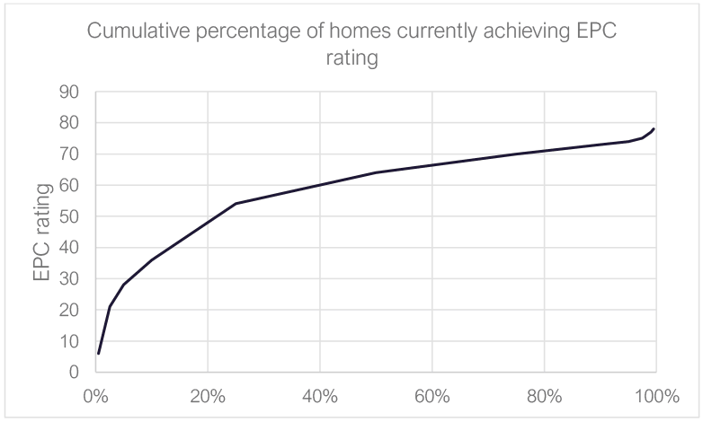
Looking at this another way, using percentiles, the table and chart below show the median EPC rating is 64 (D) and the 75th percentile just exceeds the boundary of band C (69).
| Key stats | |||
|---|---|---|---|
| Mean | 59 | ||
| Median | 64 | ||
| 50% are between | 54 | and | 70 |
| 90% are between | 28 | and | 74 |
| 95% are between | 21 | and | 75 |
| 99% are between | 6 | and | 78 |
| Cs and Ds make up | 74.1% | of the stock | |
| Percentile | EPC rating | Band |
|---|---|---|
| 0.5% | 6 | G |
| 2.5% | 21 | F |
| 5% | 28 | F |
| 10% | 36 | F |
| 25% | 54 | E |
| 50% | 64 | D |
| 75% | 70 | C |
| 90% | 73 | C |
| 95% | 74 | C |
| 97.5% | 75 | C |
| 99% | 77 | C |
| 99.5% | 78 | C |
| Mean | 59 | D |
Mapping alternative metrics against the existing EPC metric
A number of energy efficiency metrics[8] were considered (as described above) which focus more on fabric efficiency than the current more wholistic EPC metric, which is based on running costs. For this reason, when plotted against the existing EPC rating (see graphs below) they all show a similar general trend: as the EPC rating rises, the fabric efficiency improves and therefore each of the energy use related indicators fall. However, this is complicated by the fact that homes with lower EPC ratings are much more likely to use expensive heating fuels, so they can be relatively well insulated but still receive a low EPC rating; hence there is a different trend at low existing EPC ratings.
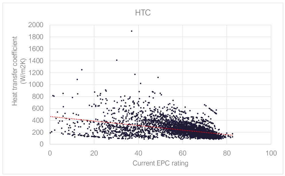
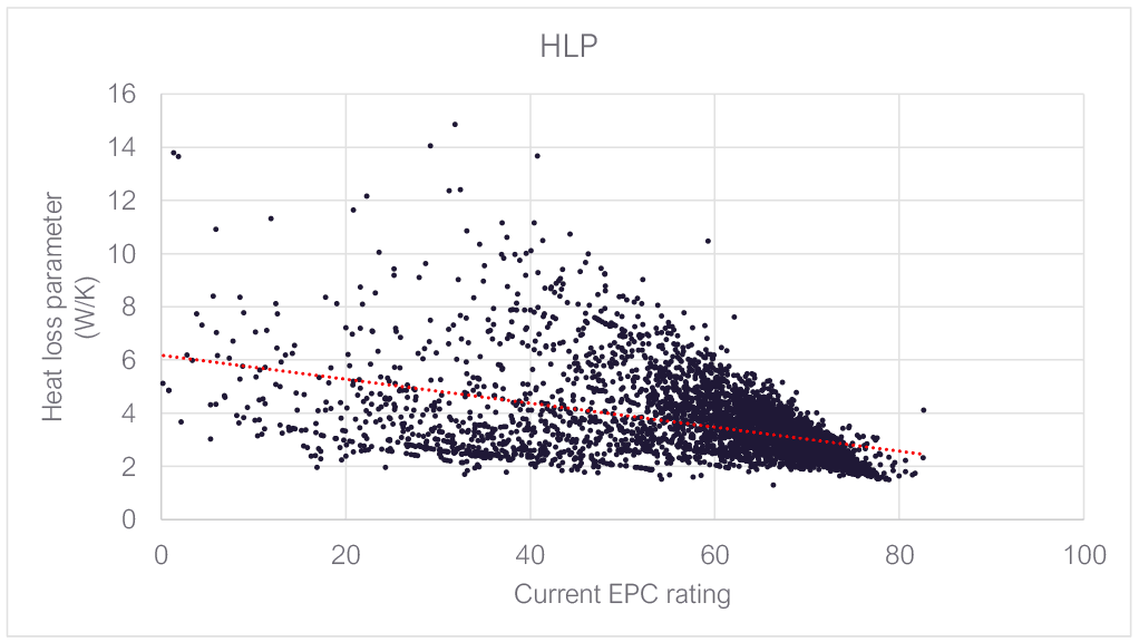
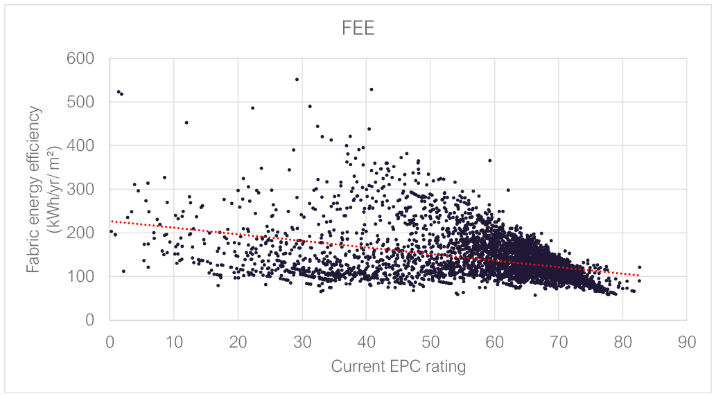
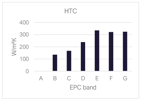
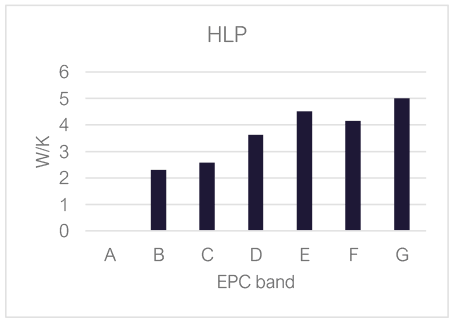
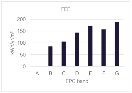
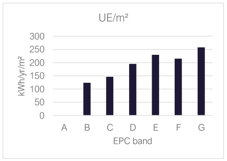
The following table and graphs show how the average ‘score’ under each metric varies with the current EPC band. This gives a similar picture – fabric efficiency improves with EPC band, but this breaks down for the lowest rated properties. It would appear to be the case that E-rated properties have worse fabric efficiency than F-rated properties for example, and G-rated properties typically have similar levels of fabric efficiency to E-rated properties. This is likely to be because G-rated properties are in that band primarily because have the most expensive heating systems.
| Band | SAP rating | HTC | HLP | DFEE | UE/m² | Fuel use/m2 |
|---|---|---|---|---|---|---|
| A | (None in sample) | |||||
| B | 81.6 | 136 | 2.31 | 85 | 123 | 88.7 |
| C | 71.8 | 167 | 2.58 | 105 | 146 | 174.1 |
| D | 62.8 | 239 | 3.63 | 143 | 195 | 236.7 |
| E | 47.5 | 334 | 4.52 | 172 | 230 | 284.4 |
| F | 31.0 | 321 | 4.15 | 157 | 215 | 287.9 |
| G | 11.3 | 323 | 5.00 | 188 | 258 | 328.4 |
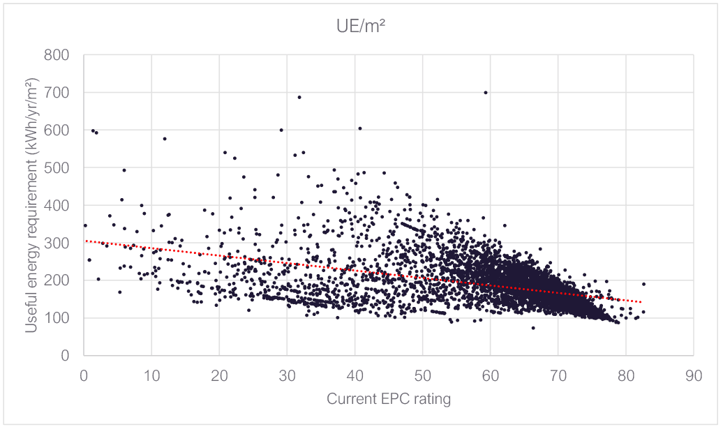
Focussing on useful energy per m²
During the project it emerged that the metric which appears most promising as a basis for a future ‘fabric only’ rating is ‘useful energy’ per m², hereafter shortened to UE/m². After discussions with SG, this was modelled to include:
- Space heating energy requirement
- Space cooling energy requirement
- Water heating energy requirement
all expressed in kWh/yr per m² of floor area.
Later in the project it was decided to consider a second variant of this with the water heating energy also removed. The analysis that follows discusses the data for version of the metric that includes water heating energy, but all the key results were also generated using the alternative definition. Equivalent tables and graphs to those which follow, but based the alternative UE/m² metric, are given in Appendix A.
In order to look in more detail at the relationship between the existing EPC rating and UE/m² the data was sorted by EPC rating, then replotted (below) allowing averaging to be applied over groups of 50 homes with similar existing EPC ratings, thus making clearer the trends amongst the large scatter of data points.
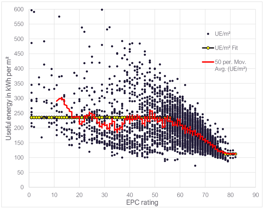
A 3-stage linear fit was found to approximate the trend observed in the partially smoothed data, showing a particularly good fit at higher existing EPC ratings.
A key point to note is that although there is a downward trend to the right of the graph, at the top end (EPC >78), there does appear to be a flattening off of the trend. This suggests those homes getting EPC ratings >78 may be doing so primarily by adding non-fabric improvements, like PV.[9] This could be significant if it is indicative of the fact that it is hard to improve the (fabric only) UE/m² metric value beyond this point (~112 kWh/yr/m²). It is also notable that there are very few points on the graph where UE/m² is less than 100 kWh/yr/m². This perhaps indicates that it becomes expensive (or otherwise unattractive from a practical point of view) to retrofit homes to beyond this value of UE/m².
In terms of the current bands, it seems feasible to get a substantial proportion of homes to the UE/m² equivalent bottom of band C (69), where UE/m² is 162 kWh/yr/m²[10], on average, but perhaps disproportionately more challenging to target the middle or top end of band C based on the projection of the trendline on the graph.
The following table shows a number of potential reference points in terms of the existing EPC banding and their UE/m² equivalents, based on the trendline.
,tbody>| Equivalent to current SAP rating | ||
|---|---|---|
| Reference point | SAP rating | UE/m² (fit) |
| Threshold of band C | 69 | 162 |
| Mid-point of band C | 74.5 | 132 |
| Top of band C | 80 | 112 |
| Threshold of band B | 81 | 112 |
| Mid-point of band B | 86 | 112 |
| Top of band B | 91 | 112 |
| Current average | 59 | 218 |
| Current median | 64 | 190 |
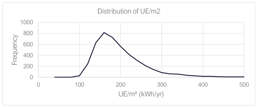
The following graph and tables show the (modelled) existing distribution of UE/m² in the Scottish housing stock.
| UE/m² at percentile | ||||||
|---|---|---|---|---|---|---|
| 0.5% | 98 | |||||
| 2.5% | 111 | |||||
| 5.0% | 117 | |||||
| 25.0% | 145 | |||||
| 50.0% | 172 | |||||
| 75.0% | 214 | |||||
| 95.0% | 311 | |||||
| 97.5% | 354 | |||||
| 99.5% | 466 | |||||
| Key stats - UE/m² | |||
|---|---|---|---|
| Average | 188 | ||
| Median | 172 | ||
| 50% are between | 145 | and | 214 |
| 90% are between | 117 | and | 311 |
| 95% are between | 111 | and | 354 |
| 99% are between | 98 | and | 466 |
To give further perspective on what level of UE/m² it is possible to achieve an example was run for a dwelling with new-build levels of insulation resulting in a figure of 80 kWh/yr/m². An example with approximately ‘passive house’ levels of fabric efficiency gave figure of about 40 kWh/yr/m².
On the basis of the above, we would recommend caution in setting a target in terms of UE/m² that is much above the value associated with the bottom of band C – e.g. around 162 kWh/yr/m² until it is clearer how achievable this is in practice.
Further, the analysis indicates that there might be a steep increase in difficulty in improving fabric beyond a level of around 112 kWh/yr/m² with current mass market options.
Effect of heating type on useful energy requirement
A possible shortcoming of using a useful energy metric is that, although it is independent of the heating system fuel factors and efficiency, the heating type can still impact the useful energy requirement via the heating control logic assumed in SAP. The key technology this impacts is heat pumps, where longer running hours are needed if the system’s output is low relative to the dwelling’s heat requirement. This can only be calculated for heat pumps from the Product Characteristics Database[11] (not from table defaults). It is assumed the unit is large relative to the dwelling when the default is used, although the efficiency used is very conservative, so in practice a better overall result is not achieved in terms of the existing EPC metric.
The following tables show the results of example calculations where the space heating energy requirement can be seen to vary if smaller output heat pumps are used. This increase is substantial (20%) where a very low-output heat pump is used in a home with high heat loss[12].
| Heating system | Useful energy requirement per m² (kWh/yr per m²) | |||
|---|---|---|---|---|
| Space heating | Water heating | TOTAL | % rise | |
| Gas boiler | 172 | 27 | 199 | 0% |
| Default heat pump | 172 | 27 | 199 | 0% |
| PCDB heat pump 12kW | 174 | 27 | 201 | 1% |
| PCDB heat pump 10kW | 177 | 27 | 204 | 2% |
| PCDB heat pump 8kW | 200 | 27 | 228 | 14% |
| PCDB heat pump 5kW | 205 | 27 | 232 | 16% |
| PCDB heat pump 3.5kW | 214 | 27 | 241 | 21% |
| Fairly well insulated 88.8m² semi-detached house average[14] | ||||
|---|---|---|---|---|
| Heating system | Useful energy requirement per m² (kWh/yr per m²) | |||
| Space heating | Water heating | TOTAL | % rise | |
| Gas boiler | 71 | 27 | 98 | 0% |
| Default heat pump | 71 | 27 | 98 | 0% |
| PCDB heat pump 12kW | 72 | 27 | 99 | 0% |
| PCDB heat pump 10kW | 72 | 27 | 99 | 0% |
| PCDB heat pump 8kW | 72 | 27 | 99 | 1% |
| PCDB heat pump 5kW | 72 | 27 | 99 | 1% |
| PCDB heat pump 3.5kW | 74 | 27 | 101 | 3% |
For a more sensibly sized heat pump (which is far more likely in practice – to avoid householder complaints), the uplift is much lower, at just a few percent. And once the same dwelling has been retrofitted (cavity wall insulation, loft insulation, modern glazing) its heat loss is reduced to the extent that even a small heat pump results in a small additional useful energy requirement.
This analysis confirms that while this is a factor and in extreme cases (potentially give unexpectedly poor UE/m² ratings), in more reasonable cases it would have only a small impact.
Contact
Email: EPCenquiries@gov.scot