Scottish Scallop Stocks: Results of 2025 Stock Assessments

This report presents the results of Scottish regional king scallop stock assessments carried out by the Marine Directorate including data up to 2024. It also provides background information on Scottish fisheries for scallops, and the current management and regulatory framework.


Appendix 2: Supplementary figures

Figure A.1 East Coast. Catch curves derived from log catch numbers-at-age (commercial catch data). Age 10 represents a plus group.
Line graph of catch curves derived from commercial catch numbers-at-age for the East Coast.
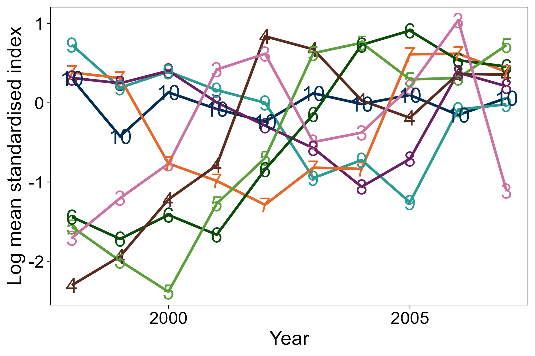
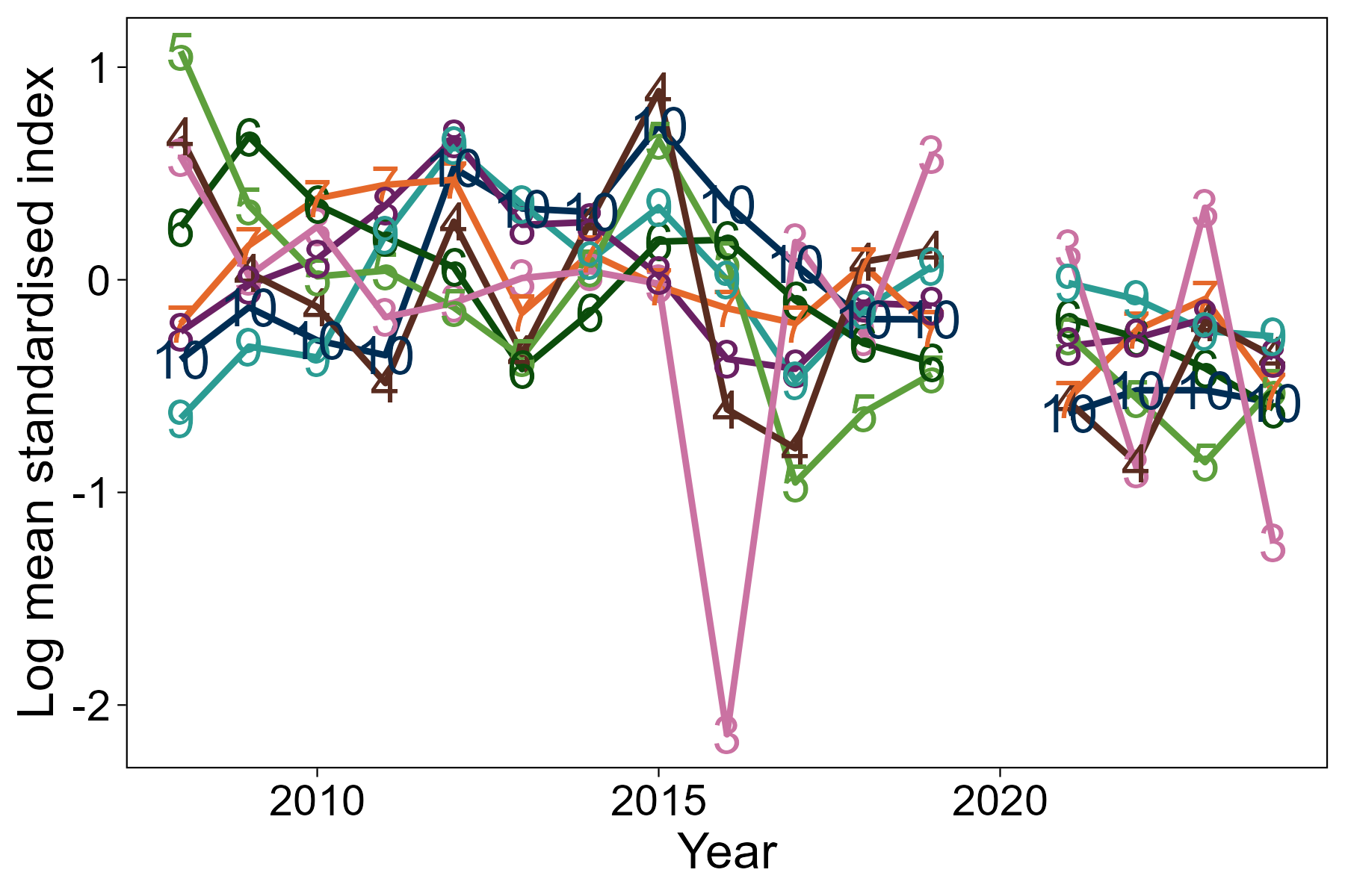
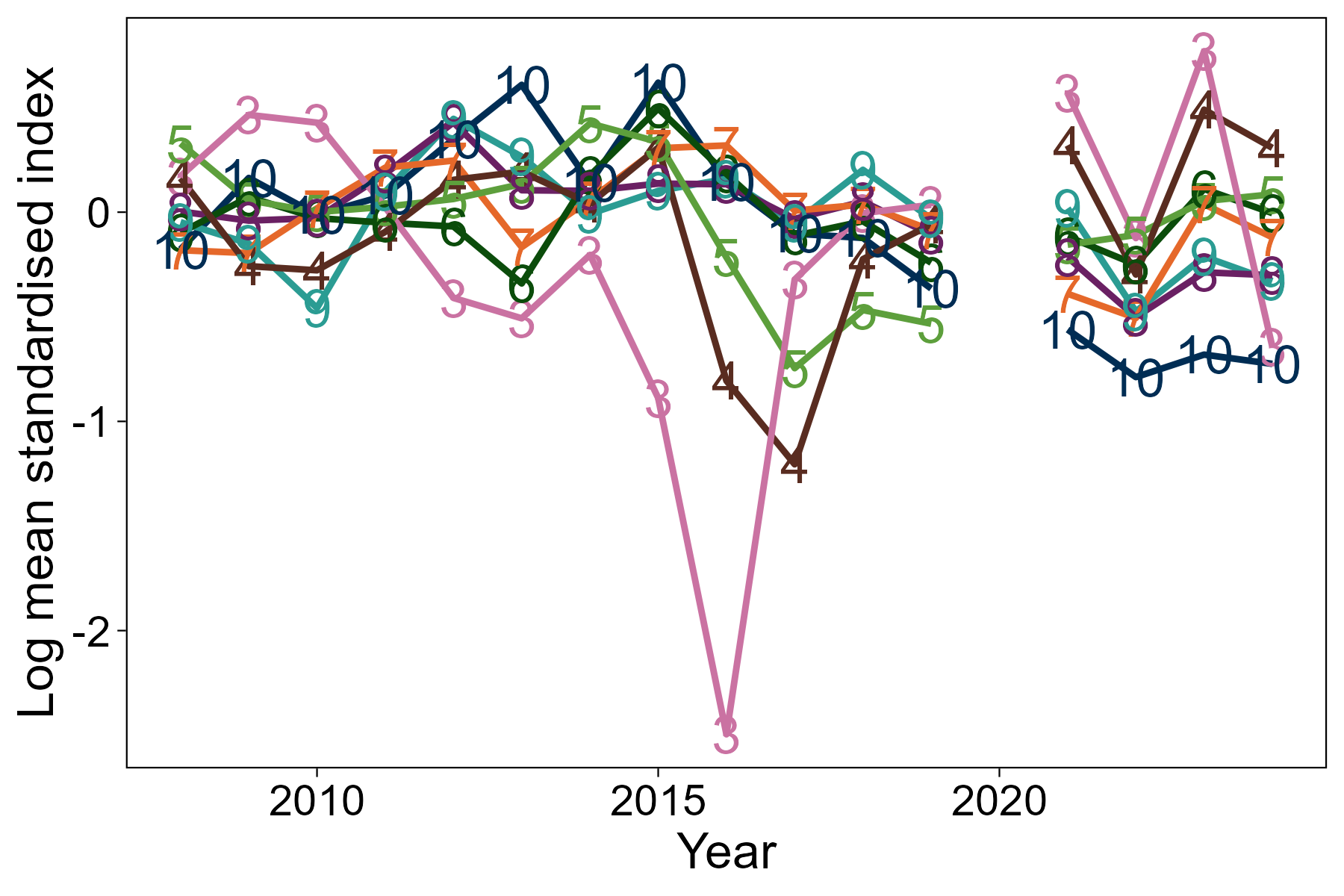
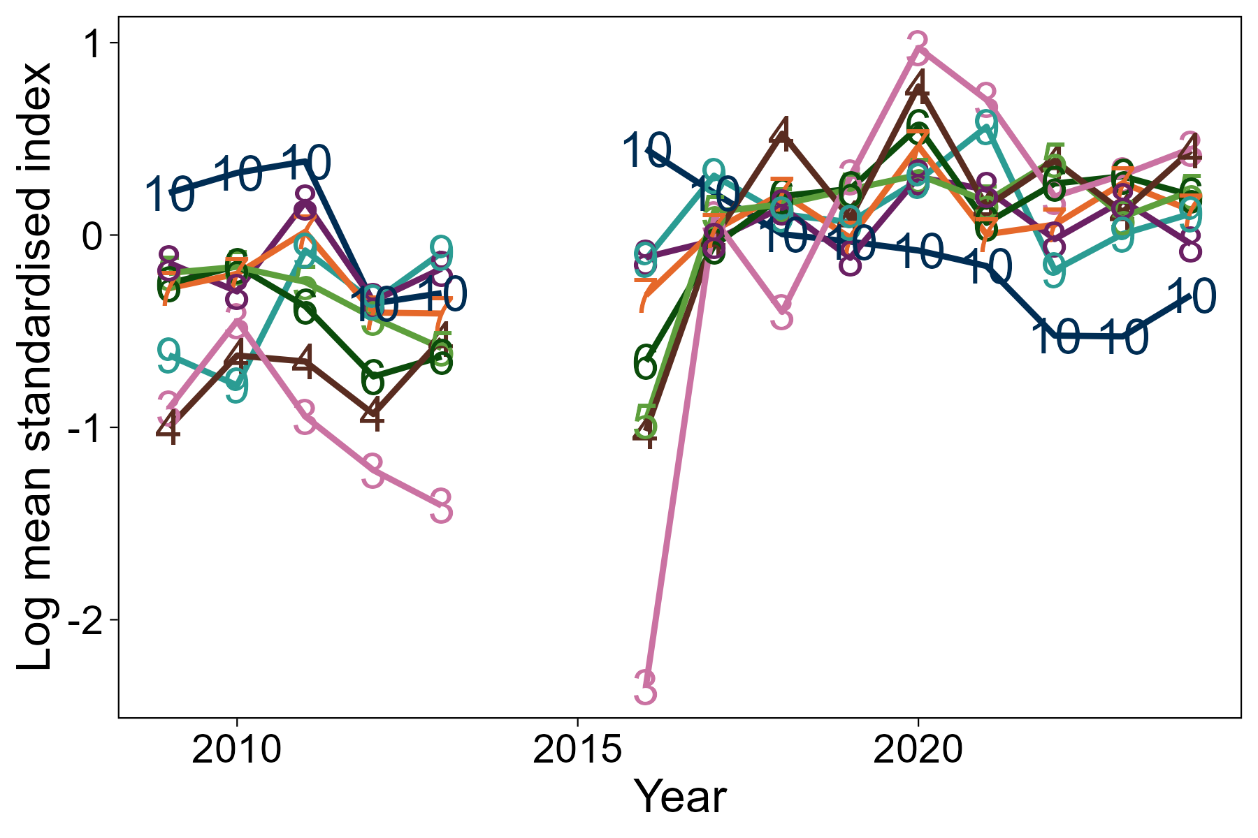
Figure A.2 East Coast. Log mean standardised survey indices-at-age over time for Clupea (upper) and Alba (lower) surveys. Age 10 represents a plus group, not used in assessment.
Top: Line graph of log mean standardised index at age, by age class, from the Clupea survey of the East Coast area.
Bottom: Line graph of log mean standardised index at age, by age class, from the Alba survey of the East Coast area.
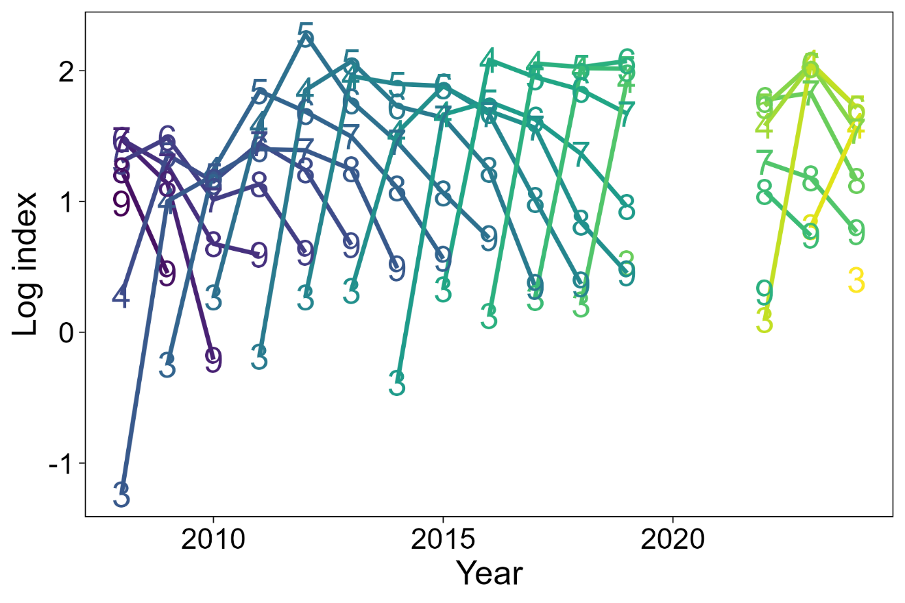
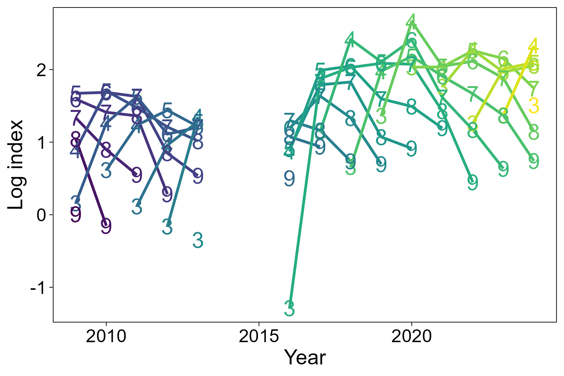
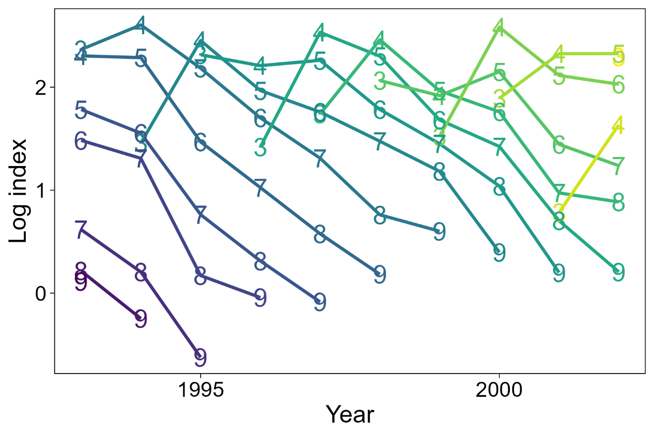
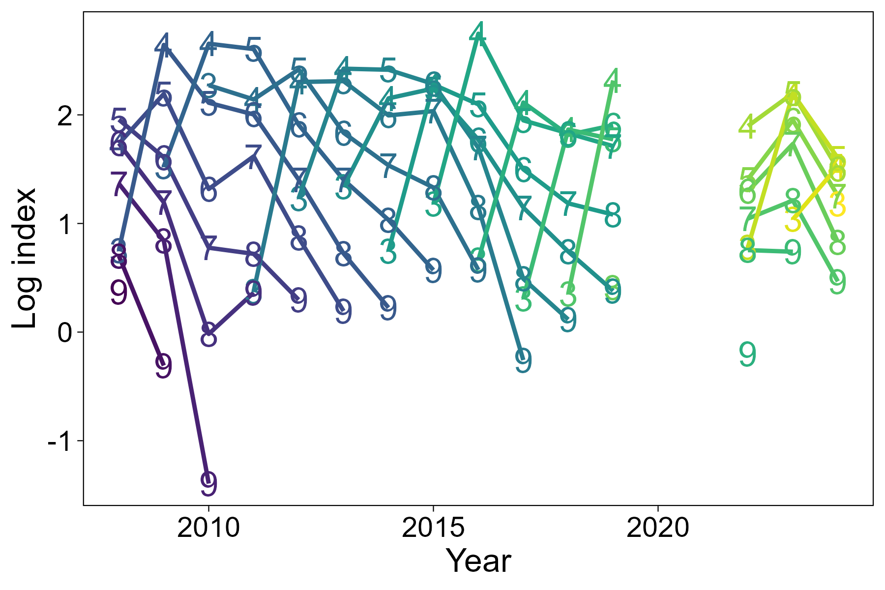
Figure A.3 East Coast. Catch curves for Clupea (upper) and Alba (lower) surveys.
Top: Line graph of catch curves by cohort from the Clupea survey of the East Coast.
Bottom: Line graph of catch curves by cohort from the Alba survey of the East Coast.
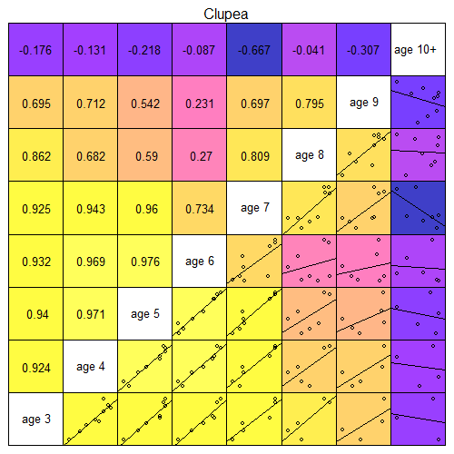
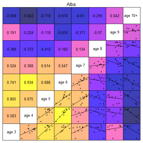
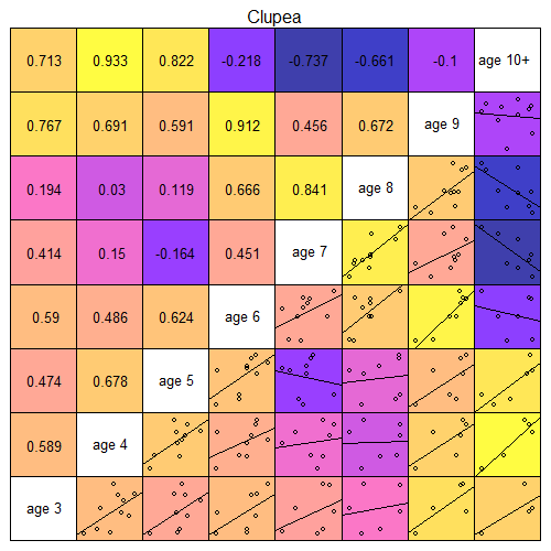
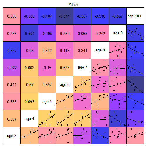
Figure A.4 East Coast. Scatterplots and correlation coefficients of log mean standardised survey indices by age for Clupea (upper) and Alba (lower) surveys. Yellow represents high correlation, darker colours represent poorer (or negative) correlation. Age 10+ is not used in assessment.
Grid of scatterplots and correlation coefficients for survey indices of cohorts at different ages, for EC Clupea surveys.
Grid of scatterplots and correlation coefficients for survey indices of cohorts at different ages, for EC Alba surveys.
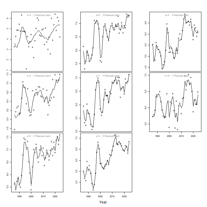
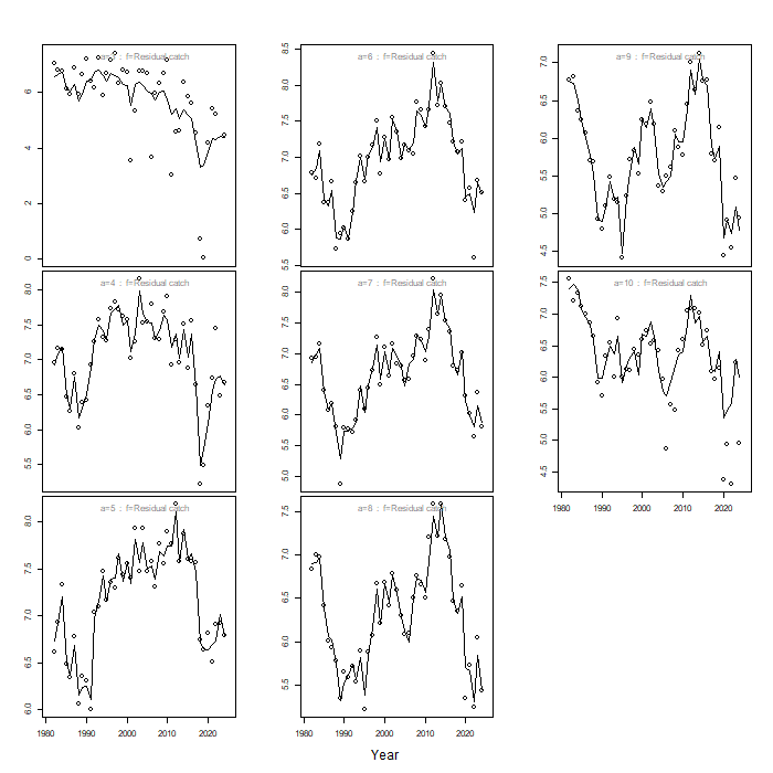
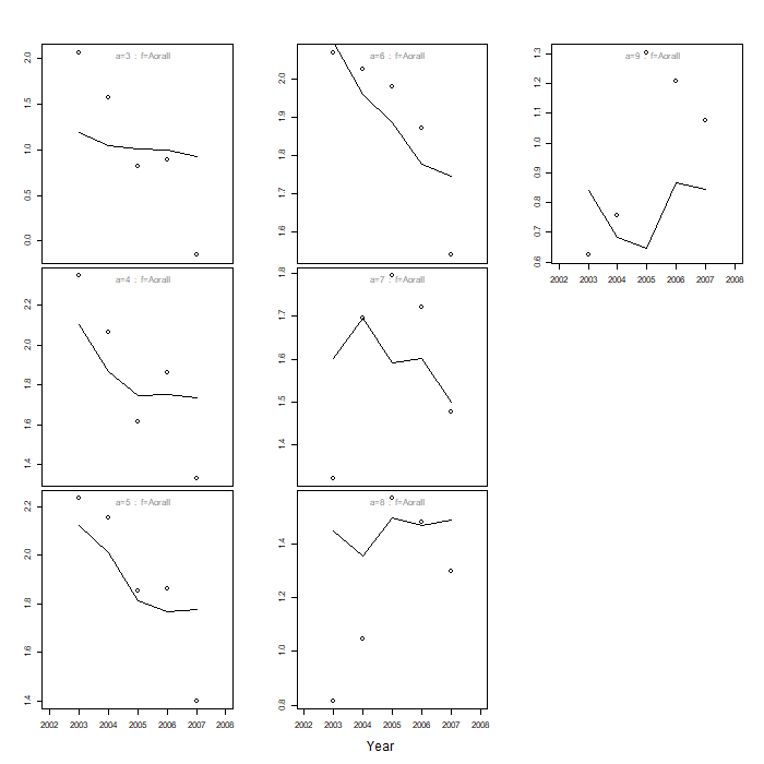
Figure A.5 East Coast. Comparison of model predictions (line) and observations (circle) of log catch numbers-at-age. Age 10 represents a plus group.
Line graphs of model predictions of catch, with points of observed catch, over time for each age class, for East Coast.
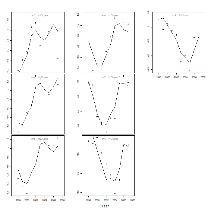
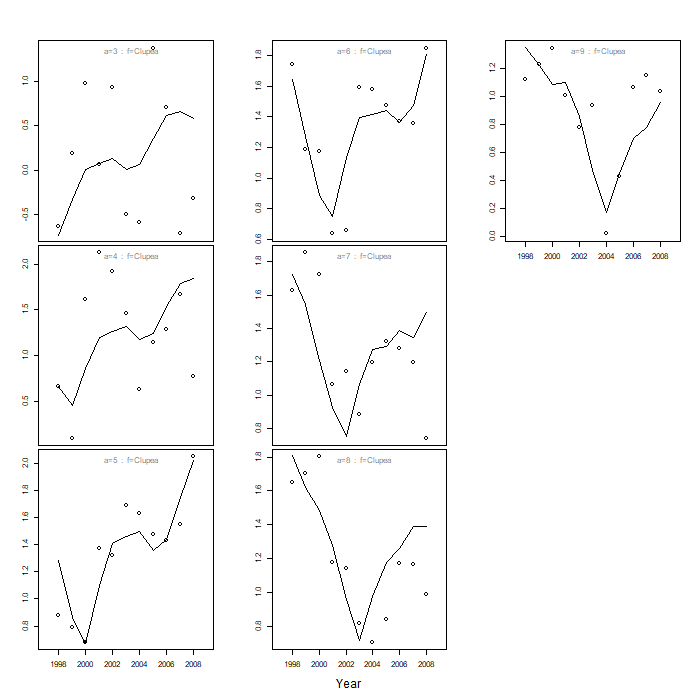
Figure A.6 East Coast. Comparison of model predictions (line) and observations (circle) of log survey numbers-at-age (Clupea).
Line graphs of model predictions of index, with points for observations, over time for each age class, for EC Clupea survey
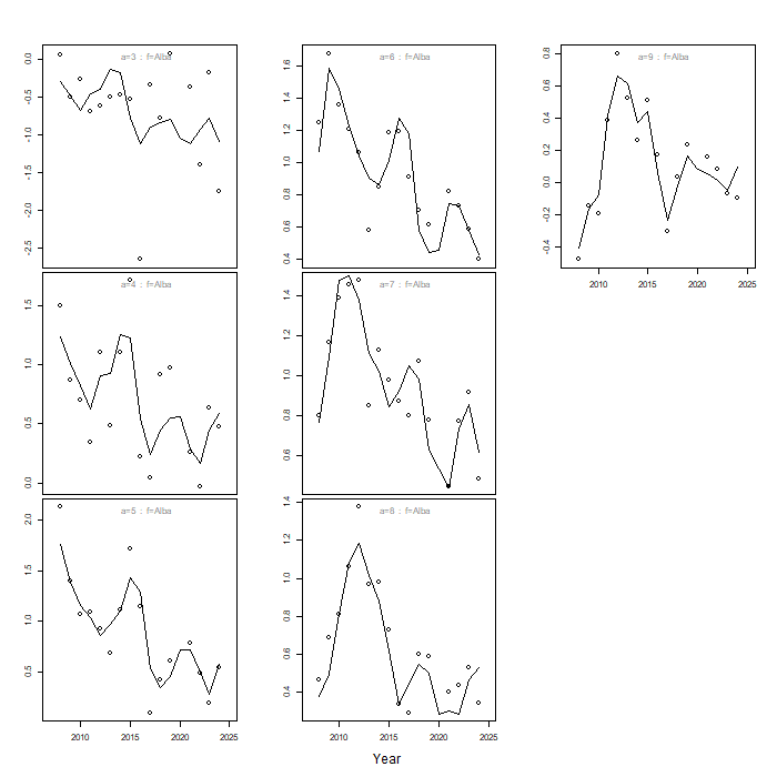
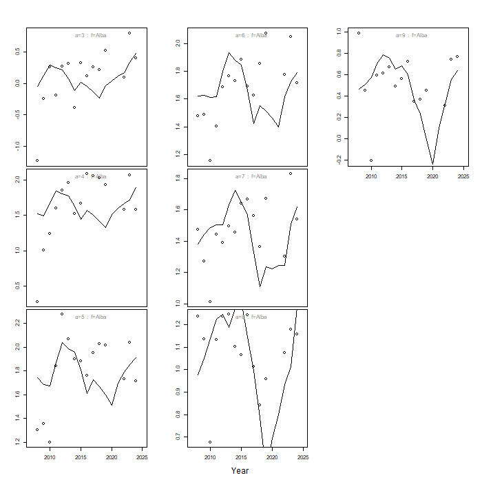
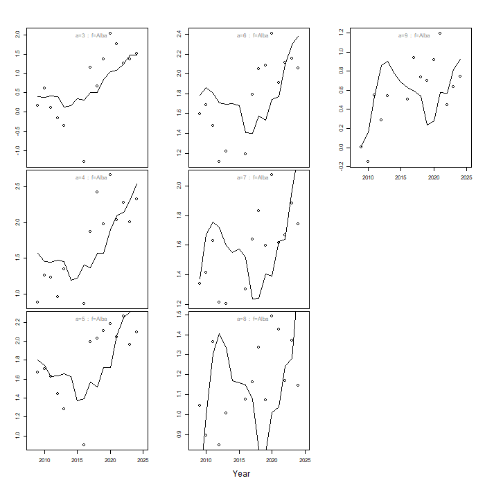
Figure A.7 East Coast. Comparison of model predictions (line) and observations (circle) of log survey numbers-at-age (Alba).
Line graphs of model predictions of index, with points for observations, over time for each age class, for EC Alba survey
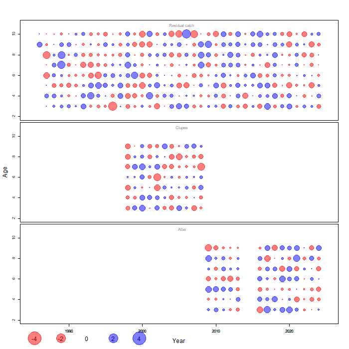
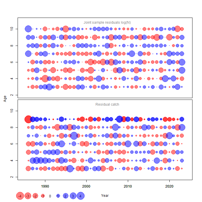
Figure A.8 East Coast. One-step-ahead residuals by age from the final SAM assessment. Age 10 represents a plus group.
Bubbleplots of OSA residuals by age for catch and surveys, for East Coast final SAM assessment
Figure A.9 East Coast. Process residuals for numbers and fishing mortality-at-age from the final SAM assessment. Age 10 represents a plus group.
Bubbleplots of process residuals for numbers and F-at-age, for East Coast final SAM assessment
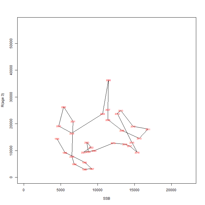
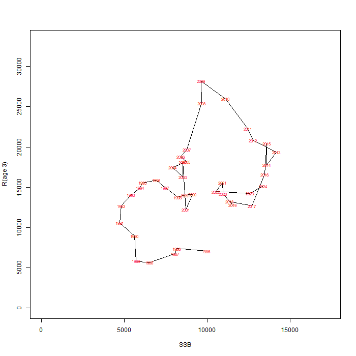
Figure A.10 East Coast. Stock-recruit plot from the final SAM assessment. Recruitment (age 3) is in thousands and SSB in tonnes. Values are labelled with recruitment year.
Line graph of relationship between recruitment and SSB, showing SAM estimated values for each year for East Coast.
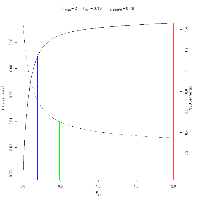
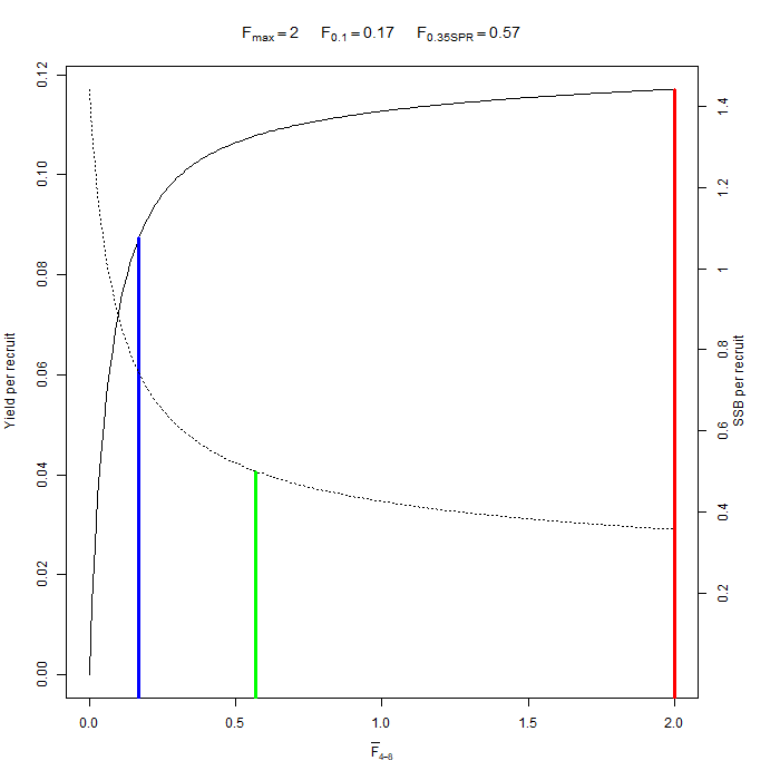
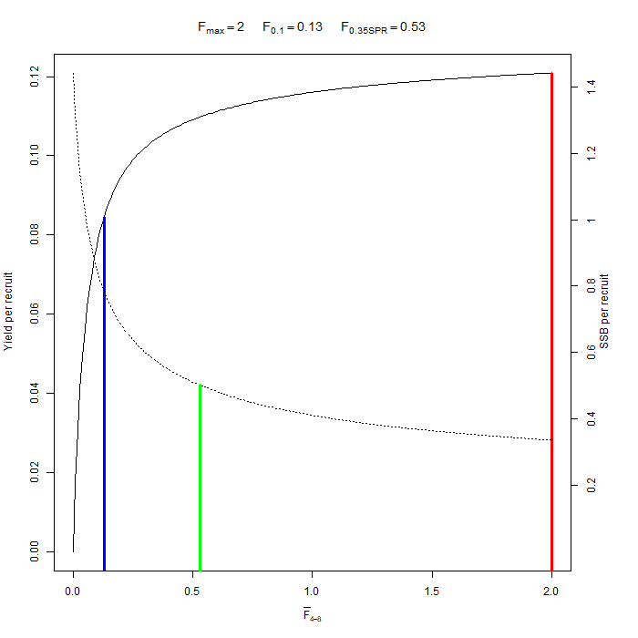
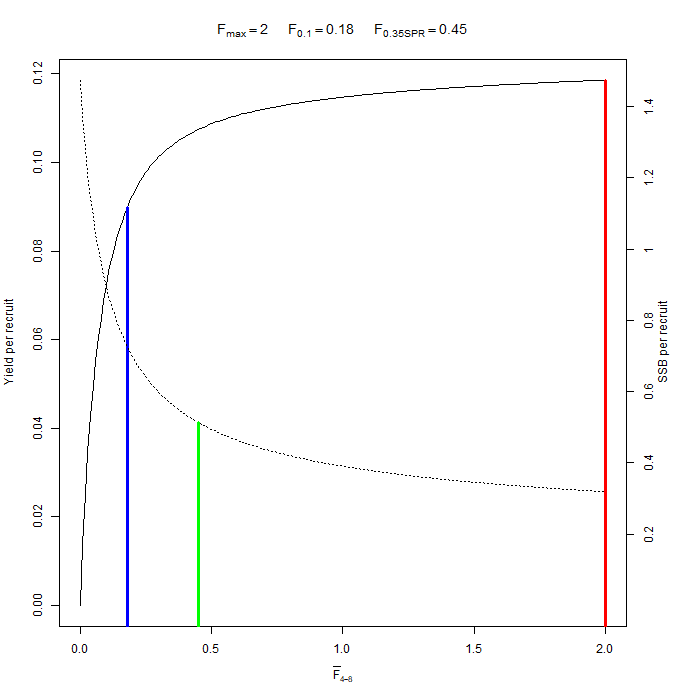
Figure A.11 East Coast. Estimated yield-per-recruit (solid line) and SSB-per-recruit (dashed line) from the final SAM assessment. Red line indicates Fmax, blue line F0.1 and green line F0.35SPR.
Line curves of estimated F against yield per recruit and estimated F against SSB per recruit for East Coast SAM assessment
Figure A.12 North East. Catch curves derived from log catch numbers-at-age (commercial catch data). Age 10 represents a plus group.
Line graph of catch curves derived from commercial catch numbers-at-age for the North East.
Figure A.13 North East. Log mean standardised survey indices-at-age over time for Clupea (upper) and Alba (lower) surveys. Age 10 represents a plus group, not used in assessment.
Top: Line graph of log mean standardised index at age, by age class, from the Clupea survey of the North East area.
Bottom: Line graph of log mean standardised index at age, by age class, from the Alba survey of the North East area
Figure A.14 North East. Catch curves for Clupea (upper) and Alba (lower) surveys.
Top: Line graph of catch curves by cohort from the Clupea survey of the North East.
Bottom: Line graph of catch curves by cohort from the Alba survey of the North East.
Figure A.15 North East. Scatterplots and correlation coefficients of log mean standardised survey indices by age for Clupea (upper) and Alba (lower) surveys. Yellow represents high correlation, darker colours represent poorer (or negative) correlation. Age 10+ is not used in the assessment.
Grid of scatterplots and correlation coefficients for survey indices of cohorts at different ages, for NE Clupea surveys.
Grid of scatterplots and correlation coefficients for survey indices of cohorts at different ages, for NE Alba surveys.
Figure A.16 North East. Comparison of model predictions (line) and observations (circle) of log catch numbers-at-age. Age 10 represents a plus group.
Line graphs of model predictions of catch, with points of observed catch, over time for each age class, for North East.
Figure A.17 North East. Comparison of model predictions (line) and observations (circle) of log survey numbers-at-age (Clupea).
Line graphs of model predictions of index, with points for observations, over time for each age class, for EC Clupea survey
Figure A.18 North East. Comparison of model predictions (line) and observations (circle) of log survey numbers-at-age (Alba).
Line graphs of model predictions of index, with points for observations, over time for each age class, for EC Alba survey
Figure A.19 North East. One-step-ahead residuals by age from the final SAM assessment. Age 10 represents a plus group.
Bubbleplots of OSA residuals by age for catch and surveys, for North East final SAM assessment
Figure A.20 North East. Process residuals for numbers and fishing mortality-at-age from the final SAM assessment. Age 10 represents a plus group.
Bubbleplots of process residuals for numbers and F-at-age, for North East final SAM assessment
Figure A.21 North East. Stock-recruit plot from the final SAM assessment. Recruitment (age 3) is in thousands and SSB in tonnes. Values are labelled with recruitment year.
Line graph of relationship between recruitment and SSB, showing SAM estimated values for each year for North East.
Figure A.22 North East. Estimated yield-per-recruit (solid line) and SSB-per-recruit (dashed line) from the final SAM assessment. Red line indicates Fmax, blue line F0.1 and green line F0.35SPR.
Line curves of estimated F against yield per recruit and estimated F against SSB per recruit for North East SAM assessment.
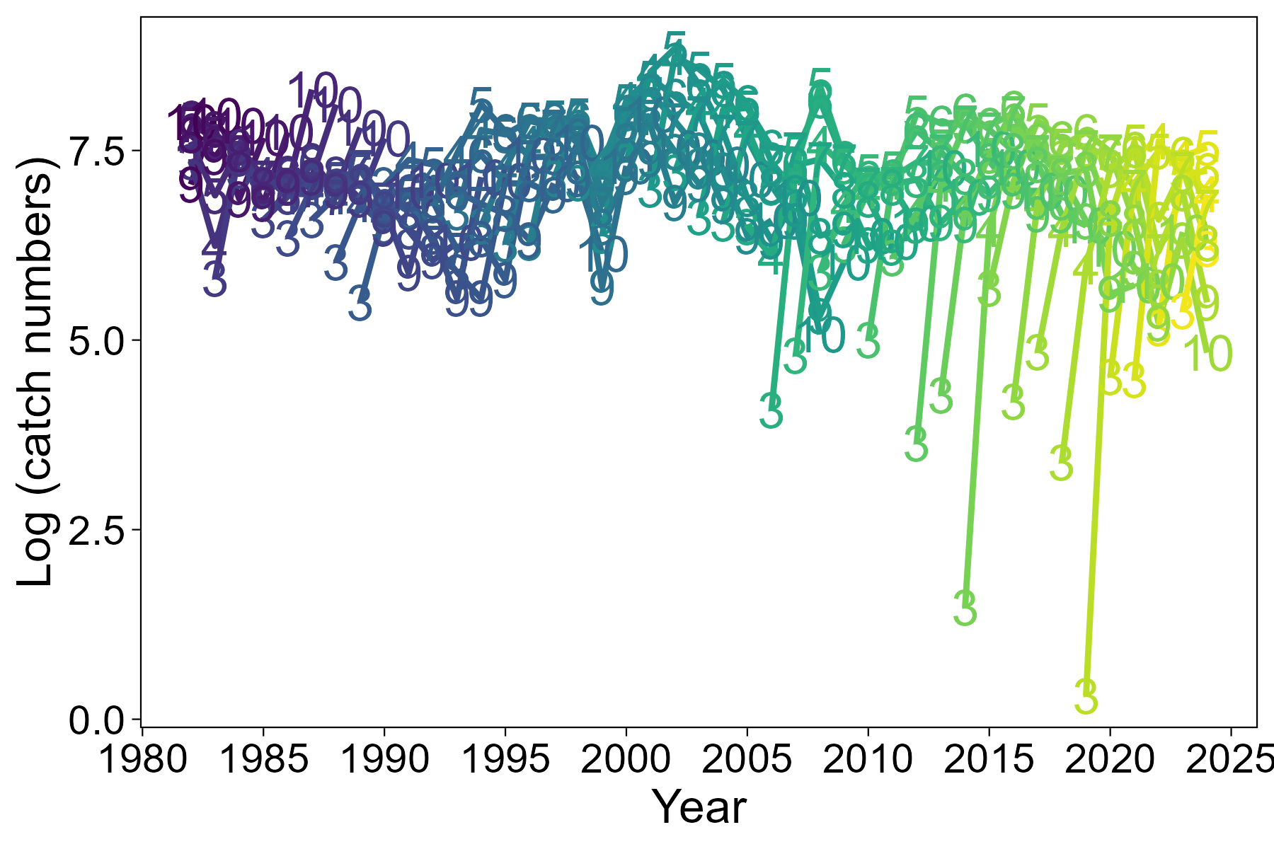
Figure A.23 North West. Catch curves derived from log catch numbers-at-age (commercial catch data). Age 10 represents a plus group.
Line graph of catch curves derived from commercial catch numbers-at-age for the North West.
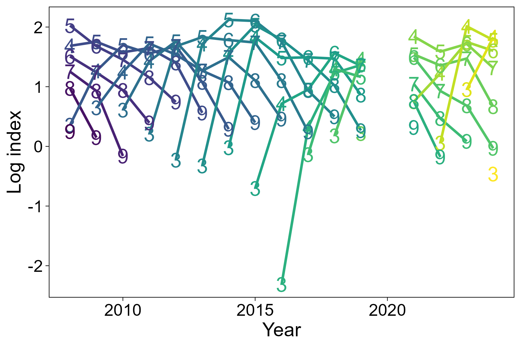
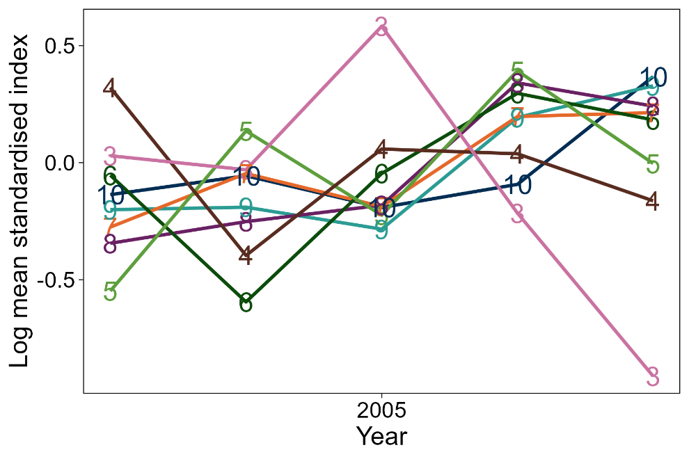
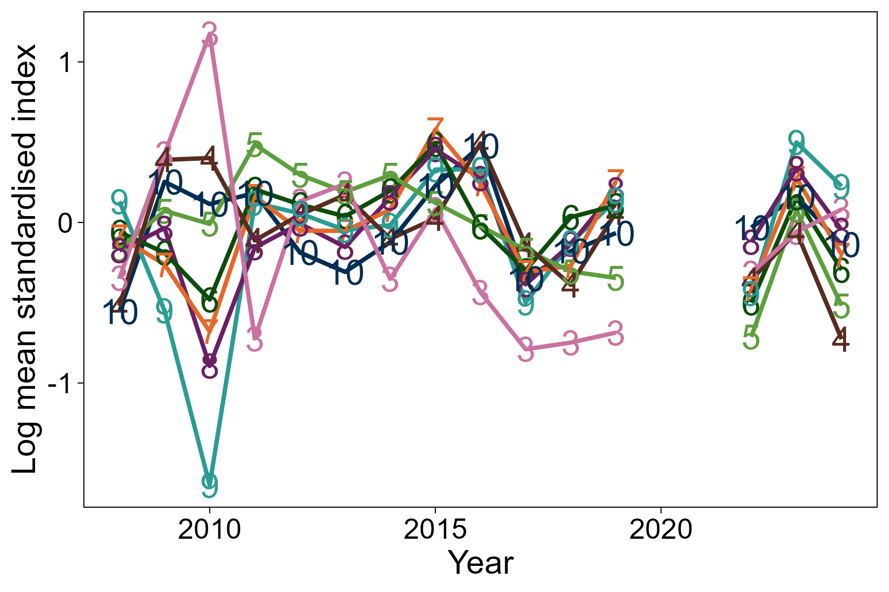
Figure A.24 North West. Log mean standardised survey indices-at-age by year. (top: Aora I survey; middle: Aora II survey; bottom: Alba survey). Age 10 represents a plus group, not used in assessment.
Top: Line graph of log mean standardised index at age, by age class, from the Aora 1 survey of the North West area.
Middle: Line graph of log mean standardised index at age, by age class, from the Aora 2 survey of the North West area.
Bottom: Line graph of log mean standardised index at age, by age class, from the Alba survey of the North West area.
Figure A.25 North West. Catch curves for Aora I survey (upper) and Alba survey (lower). The Aora II index is too short to provide useful catch curves.
Top: Line graph of catch curves by cohort from the Aora 1 survey of the North West.
Bottom: Line graph of catch curves by cohort from the Alba survey of the North West.
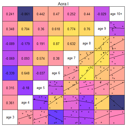
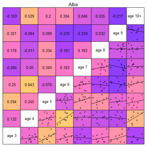
Figure A.26 North West. Scatterplots of log mean standardised survey indices by age (upper: Aora I; lower: Alba; insufficient years for Aora II). Darker colours represent poorer (or negative) correlation. Age 10+ not used in the assessment.
Grid of scatterplots and correlation coefficients for survey indices of cohorts at different ages, for NW Clupea surveys.
Grid of scatterplots and correlation coefficients for survey indices of cohorts at different ages, for NE Alba surveys.
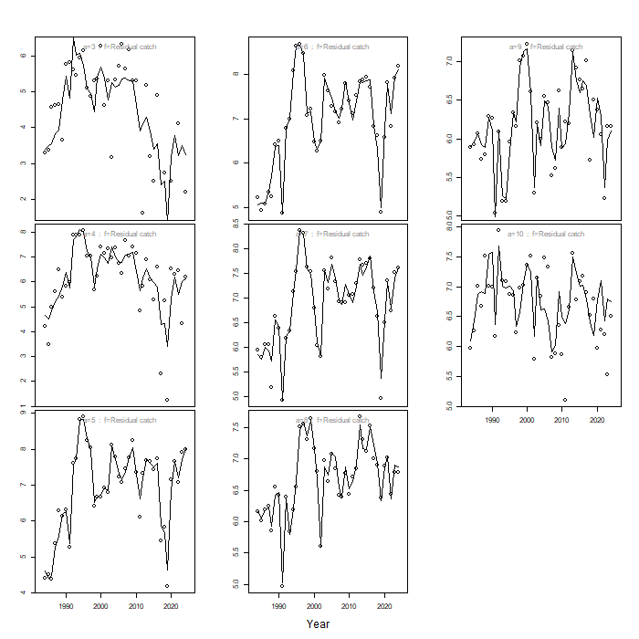
Figure A.27 North West. Comparison of model predictions (line) and observations (circle) of log catch numbers-at-age. Age 10 represents a plus group.
Line graphs of model predictions of catch, with points of observed catch, over time for each age class, for North West.
Figure A.28 North West. Comparison of model predictions (line) and observations (circle) of log survey numbers-at-age (Aora I).
Line graphs of model predictions of index, with points for observations, over time for each age class, for NW Aora 1 survey
Figure A.29 North West. Comparison of model predictions (line) and observations (circle) of log survey numbers-at-age (Aora II).
Line graphs of model predictions of index, with points for observations, over time for each age class, for NW Aora 2 survey
Figure A.30 North West. Comparison of model predictions (line) and observations (circle) of log survey numbers-at-age (Alba).
Line graphs of model predictions of index, with points for observations, over time for each age class, for NW Alba survey
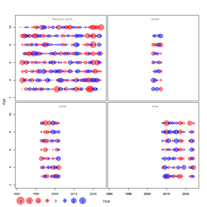
Figure A.31 North West. One-step-ahead residuals by age from the final SAM assessment. Age 10 represents a plus group.
Bubbleplots of OSA residuals by age for catch and surveys, for North West final SAM assessment
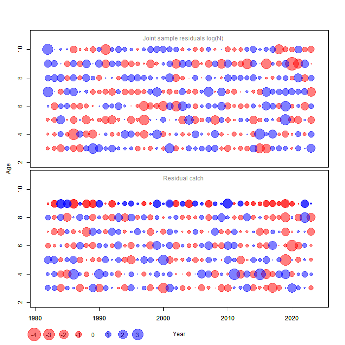
Figure A.32 North West. Process residuals for numbers and fishing mortality-at-age from the final SAM assessment. Age 10 represents a plus group.
Bubbleplots of process residuals for numbers and F-at-age, for North West final SAM assessment
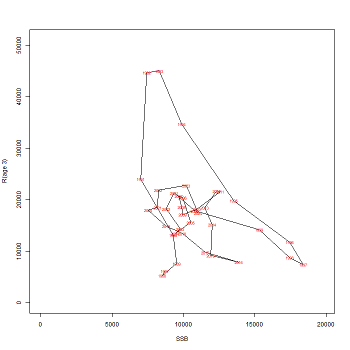
Figure A.33 North West. Stock-recruit plot from the final SAM assessment. Recruitment (age 3) is in thousands and SSB in tonnes. Values are labelled with recruitment year.
Line graph of relationship between recruitment and SSB, showing SAM estimated values for each year for North West.
Figure A.34 North West. Estimated yield-per-recruit (solid line) and SSB-per-recruit (dashed line) from the final SAM assessment. Red line indicates Fmax, blue line F0.1 and green line F0.35SPR.
Line curves of estimated F against yield per recruit and estimated F against SSB per recruit for North West SAM assessment.
Figure A.35 Shetland. Catch curves derived from log catch numbers-at-age (commercial catch data). Age 10 represents a plus group.
Line graph of catch curves derived from commercial catch numbers-at-age for the Shetland.
Figure A.36 Shetland. Log mean standardised survey indices-at-age over time for Clupea (upper) and Alba (lower) surveys. Age 10 represents a plus group, not used in assessment.
Top: Line graph of log mean standardised index at age, by age class, from the Clupea survey of the Shetland area.
Bottom: Line graph of log mean standardised index at age, by age class, from the Alba survey of the Shetland area.
Figure A.37 Shetland. Catch curves for Clupea (upper) and Alba (lower) surveys.
Top: Line graph of catch curves by cohort from the Clupea survey of the Shetland.
Bottom: Line graph of catch curves by cohort from the Alba survey of the Shetland.
Figure A.38 Shetland. Scatterplots and correlation coefficients of log mean standardised survey indices by age for Clupea (upper) and Alba (lower) surveys. Yellow represents high correlation, darker colours represent poorer (or negative) correlation. Age 10+ is not used in assessment.
Grid of scatterplots and correlation coefficients for survey index of cohorts at different ages, for Shetland Clupea surveys
Grid of scatterplots and correlation coefficients for survey index of cohorts at different ages, for Shetland Alba surveys
Figure A.39 Shetland. Comparison of model predictions (line) and observations (circle) of log catch numbers-at-age. Age 10 represents a plus group.
Line graphs of model predictions of catch, with points of observed catch, over time for each age class, for Shetland.
Figure A.40 Shetland. Comparison of model predictions (line) and observations (circle) of log survey numbers-at-age (Clupea).
Line graphs of model predictions of index, with points for observations, over time for each age class, for Shetland Clupea survey
Figure A.41 Shetland. Comparison of model predictions (line) and observations (circle) of log survey numbers-at-age (Alba).
Line graphs of model predictions of index, with points for observations, over time for each age class, for Shetland Alba survey
Figure A.42 One-step-ahead residuals by age from the final SAM assessment. Age 10 represents a plus group.
Bubbleplots of OSA residuals by age for catch and surveys, for Shetland final SAM assessment
Figure A.43 Shetland. Process residuals for numbers and fishing mortality-at-age from the final SAM assessment. Age 10 represents a plus group.
Bubbleplots of process residuals for numbers and F-at-age, for Shetland final SAM assessment
Figure A.44 Shetland. Stock-recruit plot from the final SAM assessment. Recruitment (age 3) is in thousands and SSB in tonnes. Values are labelled with recruitment year.
Line graph of relationship between recruitment and SSB, showing SAM estimated values for each year for Shetland.
Figure A.45 Shetland. Estimated yield-per-recruit (solid line) and SSB-per-recruit (dashed line) from the final SAM assessment. Red line indicates Fmax, blue line F0.1 and green line F0.35SPR.
Line curves of estimated F against yield per recruit and estimated F against SSB per recruit for Shetland SAM assessment.
Figure A.46 West of Kintyre. Catch curves derived from log catch numbers-at-age (commercial catch data). Age 10 represents a plus group.
Line graph of catch curves derived from commercial catch numbers-at-age for the West of Kintyre.
Figure A.47 West of Kintyre. Log mean standardised survey indices-at-age by year (top: Aora I survey; middle: Aora II survey; bottom: Alba survey). Age 10 represents a plus group, not used in assessment.
Top: Line graph of log mean standardised index at age, by age class, from the Aora 1 survey of the West of Kintyre area.
Middle: Line graph of log mean standardised index at age, by age class, from the Aora 2 survey of the West of Kintyre area.
Bottom: Line graph of log mean standardised index at age, by age class, from the Alba survey of the West of Kintyre area.
Figure A.48 West of Kintyre. Catch curves for Aora I survey (upper) and Alba survey (lower). The Aora II index is too short to provide useful catch curves.
Top: Line graph of catch curves by cohort from the Aora 1 survey of the West of Kintyre.
Bottom: Line graph of catch curves by cohort from the Alba survey of the West of Kintyre.
Figure A.49 West of Kintyre. Scatterplots and correlation coefficients of log mean standardised survey indices by age for Aora I (upper) and Alba (lower) surveys. Yellow represents high correlation, darker colours represent poorer (or negative) correlation. Age 10+ is not used in assessment.
Grid of scatterplots and correlation coefficients for survey index of cohorts at different ages, for WK Aora 1 surveys.
Grid of scatterplots and correlation coefficients for survey index of cohorts at different ages, for WK Clupea surveys.
Figure A.50 West of Kintyre. Comparison of model predictions (line) and observations (circle) of log catch numbers-at-age. Age 10 represents a plus group.
Line graphs of model predictions of catch, with points of observed catch, over time for each age class, for West of Kintyre.
Figure A.51 West of Kintyre. Comparison of model predictions (line) and observations (circle) of log survey numbers-at-age (Aora I).
Line graphs of model predictions of index, with points for observations, over time for each age class, for WK Aora 1 survey
Figure A.52 West of Kintyre. Comparison of model predictions (line) and observations (circle) of log survey numbers-at-age (Aora II).
Line graphs of model predictions of index, with points for observations, over time for each age class, for NW Aora 2 survey
Figure A.53 West of Kintyre. Comparison of model predictions (line) and observations (circle) of log survey numbers-at-age (Alba).
Line graphs of model predictions of index, with points for observations, over time for each age class, for WK Alba survey
Figure A.54 West of Kintyre. One-step-ahead residuals by age from the final SAM assessment. Age 10 represents a plus group.
Bubbleplots of OSA residuals by age for catch and surveys, for West of Kintyre final SAM assessment
Figure A.55 West of Kintyre. Process residuals for numbers and fishing mortality-at-age from the final SAM assessment. Age 10 represents a plus group.
Bubbleplots of process residuals for numbers and F-at-age, for West of Kintyre final SAM assessment
Figure A.56 West of Kintyre. Stock-recruit plot from the final SAM assessment. Recruitment (age 3) is in thousands and SSB in tonnes. Values are labelled with recruitment year.
Line graph of relationship between recruitment and SSB, showing SAM estimated values for each year for West of Kintyre.
Figure A.57 West of Kintyre. Estimated yield-per-recruit (solid line) and SSB-per-recruit (dashed line) from the final SAM assessment. Red line indicates Fmax, blue line F0.1 and green line F0.35SPR.
Line curves of estimated F against yield per recruit and estimated F against SSB per recruit for West of Kintyre SAM assessment.

Contact

Email: mss.fisheries.advice@gov.scot

Back to top