Designing a social capital dashboard: study
Study of approaches to presenting social capital data. The research is part of the process of developing the National Performance Framework.
3. Review of existing dashboards
This chapter considers the findings of the review of existing dashboards under seven main headings: defining the purpose of a dashboard; selecting indicators for inclusion; dashboard formats and features; levels of analysis; highlighting progress; user support and feedback; and resourcing.
Defining the purpose of a dashboard
From the outset it is important that both commissioners and users of a dashboard have a clear, shared understanding of the intended purpose of the tool and how it will be used. For commissioners, such clarity is a necessary prerequisite to identifying appropriate indicators (and wider content) for inclusion, and to communicating effectively and consistently with stakeholders and users about the tool. For stakeholders and users, clarity of purpose will enable them to make appropriate and best use of the data, and may also help obviate any concerns on the part of delivery agencies; in particular that the dashboard is simply a crude scorecard against which their performance will be assessed. Ultimately, in the absence of upfront clarity, there is a risk of investing considerable resources in a tool that does not deliver as intended.
The six dashboards reviewed shared a broadly similar purpose: to bring together into one place relevant and robust data on the topic(s) of focus, thereby providing a ready assessment of the current situation in respect of those topics and/or progress towards related policy or societal goals. The stated purpose of the ONS dashboard, for example, was to monitor and report on “how the UK is doing by producing accepted and trusted measures of the different areas of life that matter most to the UK public.” Similarly, the Public Health England Dashboard was described as a tool “to support local decision making by bringing existing comparative data into one place and making it accessible.”
As the latter statement illustrates, clarity around the purpose of a dashboard in large part means clarity in respect of its intended users. This is crucial in ensuring the content of the tool is appropriately pitched and, indeed, that it evolves in line with any changes in the intended or actual profile of users – while both the ONS and Public Heath England’s dashboards began as resources for ‘expert users’, the commissioners have increasingly moved towards making them more accessible to the public, reflecting the UK Government’s transparency agenda. Thus the purpose of a dashboard is something that should be considered and decided, not only at the initial developmental stages, but on a regular basis and with reference to the current policy and wider societal context.
The formal launch of a dashboard provides an obvious opportunity to communicate its purpose to stakeholders and other users. Careful consideration should thus be given to the form a launch might take and to whom it might best be targeted. At the same time, the review pointed to other, more ‘embedded’ ways of promoting shared understanding of purpose. For each of the dashboards reviewed, a key initial element of the developmental process was the convening of a steering group or stakeholder workshop, variously comprising relevant policy makers (internal and external), delivery partners and experts in data gathering and use, to obtain their views and feedback on the proposed dashboard, including the function it might serve/possible uses and potential issues or challenges. Though time-consuming, this type of “collaborative approach”, as several interviewees described it, was widely seen as helpful in promoting buy in – as well as in reaching agreement on the selection of indicators for inclusion; a point that is returned to in the next section.
Beyond the developmental phase, the review also pointed to ways in which commissioners can ensure that the purpose of a dashboard remains front and centre for users on a more consistent basis. The most obvious of these is simply including within the dashboard a clear introductory statement describing what it was for (and perhaps also what it was not for, though none of the examples reviewed took such an approach).
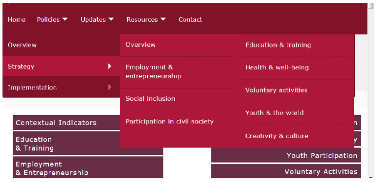
Several of the dashboards reviewed went a stage further by providing links to strategy and initiatives aimed at impacting the indicators. For example, the European Commission’s Youth Monitor incorporated a drop down ‘Policies’ menu with links to details of strategy and implementation for each areas of youth policy covered in the dashboard (see Figure 3.1 below). Included in the ‘Strategy’ pages were links to key policy documents and briefing papers for those wishing to ‘dig deeper’.
Figure 3.1: ‘Policies’ drop down menu from the European Commission’s Youth Monitor dashboard
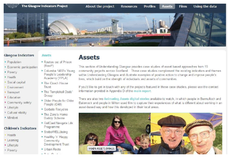
The Understanding Glasgow site took the approach a stage further still. It included a section providing case studies of asset-based approaches to improving people’s lives in the city (see Figure 3.2), as well as a section on “how to use the data”. These features transformed the site from an information resource to one offering practical, replicable examples of ways in which stakeholders have (and might further) affect change in respect of the indicators. The inclusion of such explicit guidance on using the data may also provide another, indirect means of assuaging potential concerns among delivery agencies that the dashboard is simply a tool for monitoring and critiquing their performance.
Figure 3.2: ‘Assets’ section of the Understanding Glasgow dashboard
Checklist dashboard format and features
- Consult with prospective users from the outset – and build in ample time for this
- Include a clear introductory statement of purpose in the dashboard
- Provide links to strategy and initiatives aimed at impacting the indicators included
- Provide guidance on how to use the data
- Review purpose and user profile on an ongoing basis with reference to current policy priorities
Selecting indicators for inclusion in a dashboard
Deciding on the number and type of indicators to include in a dashboard is arguably the most important, but also potentially one of the most challenging, aspects of developing such as tool. In the six dashboards reviewed, the number of indicators was relatively high, ranging from 20 to 85, but this in part reflected the fact that most of them covered a multiplicity of policy domains. The Public Health England and Active Scotland dashboards were the only ones that covered single policy domains, and each included around 20 indicators.
All of the dashboards incorporated a mixture of both subjective and objective measures. For example, the ONS Measures of Wellbeing dashboard included survey-based indicators such as personal wellbeing (life satisfaction, happiness etc.), self-assessed health status and personal finance, alongside official statistics on, among other things, life expectancy, unemployment rates and greenhouse gas emissions. A very similar approach was taken in the other dashboards, with the exception of the Public Health England site, which contained only one survey-based measure, with the bulk of the indicators derived from routinely collected administrative data.
Across the dashboards reviewed, two considerations appear to have been key in determining the selection of indicators for inclusion; one practical and one pragmatic. On the practical side, there was usually a focus on identifying indicators that aligned closely with the relevant “policy architecture”. For example, the Public Health England indicators were selected to reflect services that were mandated under the public health ring-fenced grant (although local tobacco control was included as an additional measure as it was deemed important to capture). Similarly, the European Youth monitor indicators were chosen to reflect the Commission’s eight core fields of actions for youth policy.
On the more pragmatic side, the commissioners had tended to focus on selecting indicators for which data was already collected and available in the public domain – few of them had budget they could devote to the collection of new data.
Beyond these considerations, interviewees commonly reiterated that engaging stakeholders early in the development phase using a steering group- or workshop-based model, as described above – had been important in helping determine the selection of indicators. Though the discussions had sometimes been protracted and areas of disagreement not uncommon, ultimately the engagement was seen as having facilitated the identification of policy objectives that needed to be reflected in the dashboards, as well as potential existing data sources and evidence gaps.
Another factor that interviewees had found helpful in terms of enabling them to “distil” or shortlist indicators, and one that often flowed directly from stakeholder engagement work, was the establishment of clear criteria against which potential indicators could be assessed. The team that developed the Understanding Glasgow site, for example, had three such criteria; namely, that indictors had to allow for comparison with other cities, the delivery of trend data, as well as a degree of local area disaggregation. Similarly, the developers of the Active Scotland dashboard selected indicators that would provide robust, nationally representative data, at both the aggregate and sub-group group level, and could be updated annually. Several interviewees noted that a secondary benefit of establishing such clear criteria was that it served as a ready justification as to why particular measures would/would not be considered for inclusion, thereby helping to minimise potential areas of debate or disagreement.
Several of the commissioners reported encountering some challenges in identifying potential data sources that met their criteria, however. For example, the European Commission team noted a lack of robust, subjective measures for some of their indicators – and in cases where measures did exist, difficulties obtaining these for the relevant age bracket of young people. The team behind the ONS Measures of National Wellbeing dashboard reported similar challenges and, indeed, noted that they had changed their data sources over time as better, or more regular, ones had become available. Arguably, such experiences underscore the case for selecting indicators based, for the most part, on what data is already collected, rather than on what would be ‘ideal’ – albeit leaving some scope for ‘aspirational indicators’ in the event that new budget/data sources become available; something that the Active Scotland team had consciously sought to do in refreshing the Framework’s outcome indicators.
On a related point, several interviewees noted the importance of considering the likely lifespan of a data source – that is, whether the organisation that collects the data is likely to have the resources to continue running the survey in the long term. The discontinuation of some surveys was an issue that a commissioner of the Active Scotland dashboard had faced in a separate piece of work aimed at assessing the legacy of Glasgow 2014.
It is worth nothing that none of the dashboards reviewed included any qualitative indicators. When interviewees were asked about this, they tended to say it was not something they had considered, not least as they saw qualitative evidence as somewhat in conflict with basic principles of a dashboard, which they felt were more about providing a robust snapshot of the status quo. That said, a couple of the commissioners commented that they did draw on qualitative indicators as part of their wider work in the field; for example, in monitoring and evaluating programmes.
Social capital indicators
Understanding Glasgow was the only dashboard of those reviewed that included indicators of social capital explicitly labelled as such. These covered respondents’ happiness during their childhood and childhood relationships with their parents; the extent to which they felt able to influence decision making; reciprocity; trust; perceived safety of their local area; ratings of neighbourhood; the perceived extent of neighbourhood problems; involvement in action to solve local problems; and volunteering. When interviewed, the developers of the dashboard noted that the indicators could equally have included other measures covered elsewhere in the dashboard; namely, life satisfaction, community cohesion and pride in local areas and the city as a whole (covered under a ‘Mindset’ heading); as well as participation in cultural activity and in sport (covered under a ‘Cultural Vitality’ heading). Ultimately, the choice of groupings was something of a pragmatic one, reflecting the developers’ aim of having around six indicators per domain, as well as the challenges involved in defining social capital and isolating it from other domains.
This challenge was also evident to an extent in the other dashboards reviewed. Though these dashboards did not explicitly cover social capital, they nonetheless included several indicators commonly associated with the concept, as summarised in Table 3.1 below.
Table 3.1: Indicators of social capital included in dashboards reviewed
| Dashboard |
Social capital indicators |
|---|---|
| ONS Measures of National Wellbeing |
Unhappy relationships, loneliness, having people to rely on (listed under a ‘personal relationships’ heading); volunteering, art and cultural participation, sports participation (listed under ‘what we do’); feelings of belonging to the neighbourhood (listed under ‘where we live’); and trust in government (listed under ‘governance’). |
| OECD ‘How’s Life?’ Data Visualisation Tool |
Feeling that you have a say in what government does (listed under ‘political efficacy’); and having friends or relatives that can be counted on in times of trouble (listed under ‘social networks’). |
| Active Scotland Outcomes Framework |
Adult participation in any sport (excluding walking) in the past four weeks; and children’s participation in sport in the past week. |
| The Situation of Young People in Europe |
Participation in amateur artistic activities, participation in cultural activities, participation in sports clubs, participation in leisure time or youth organisations, participation in cultural organisations (listed under ‘culture and creativity’); youth participation in elections (listed under ‘youth participation’); participation in voluntary activities, making a voluntary contribution to the local community (listed under ‘voluntary activities’); participation in political, community or environmental NGOs, participation in climate change/global warming issues and participation in human rights/development organisations (listed under ‘youth and the world’). |
This points to one possible way in which the Scottish Government might arrive at a consolidated list of social capital measures for inclusion in its dashboard: by considering whether any of its long list of potential measures might better sit elsewhere within the new National Performance Framework; and then reviewing which measures remain that might more directly address the Government’s information needs in this area.
Composite indicators
As noted above, previous research has highlighted weaknesses of composite indicators (e.g. Ormston and Hope, 2017) – in particular, that multiple questions are rarely in a consistent format which makes them difficult to equivalise, and it is often unclear whether, and on what basis, particular measures should be given more weight than others. There can also be large amounts of missing data given the samples for the component measures inevitably differ. Nonetheless, within the context of the review, composite indicators were considered alongside other features of dashboards discussed in this chapter.
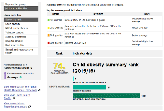
Just one of the dashboards reviewed – the Public Health England site – included a composite indicator. For each of the seven themes covered in the dashboard (Best Start in Life, Child obesity, Drug treatment, Alcohol treatment, NHS Health Checks, Sexual health services and Tobacco control) ‘summary rank indicators’ were provided, with each local authority “given a ranking and category description about how local delivery compares with all other local authorities and on a like-for-like basis.” (See Figure 3.3 below). When interviewed, the commissioners of the dashboard explained that the summary rank indicators were created using z-scores but, as these were meaningless to most people, the decision was taken to present the outputs in the form of rankings.[2]
In the event, the rankings met with a mixed reaction on the part of local authorities, with some welcoming them and others complaining that they decontextualised performance and thus resulted in very different authorities being unfairly pitted against each other. There was also some debate around how appropriate it was to combine indicators, for reasons outlined above, with some stakeholders favouring a focus on ‘headline’ indicators instead – that is, the identification of a single indicator for each of the seven themes to illustrate the status quo.
Figure 3.3: Example summary ranking (child obesity) from the Public Health (England) Dashboard
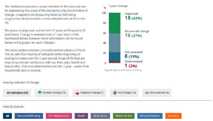
The ONS Measures of National Wellbeing Dashboard included a variation on a composite measure that showed the overall percentage of indicators in the dashboard that had improved, deteriorated or remained unchanged over the previous year (see Figure 3.4). There was also the option to view the individual indicators that fell into each of these three categories (as well as to view the indicators by domain). The obvious advantage of such an approach is that it provides a snapshot of the current situation and direction of travel, without the challenges associated with combining multiple, disparate measures.
Figure 3.4: Alternative ‘composite’ indicator from the ONS Measures of National Wellbeing dashboard
Checklist for selecting indicators
- Consult with a wide group of stakeholders – and build in ample time for this
- Establish clear criteria against which potential indicators can be assessed
- Select indicators based on the data available – but leave scope for aspirational measures
- Consider the likely lifespan of a data source – will it be available in the long run?
- Consider including a measure that summarises direction of travel rather than a composite indicator
Dashboard formats and features
There is a myriad of options available to commissioners of dashboards with regards to format and content, and this was reflected across the dashboards reviewed. While the identification and selection of indicators is perhaps the most important element of development, the significance of design should not be underestimated. The review identified three key considerations in this respect.
First, good design helps ensure the dashboard content is accessible and clear to a wide audience. Any dashboard developed by the Scottish Government will of course need to meet the accessibility standards required of all government publications, which demand that data must be presented in a clear and unambiguous manner, but the design will also need to go a step further, to ensure that what the data actually means, both in an immediate sense and in relation to the purpose of the dashboard, is self-evident. While the main intended users of the dashboards reviewed were primarily policy makers and delivery agencies, commissioners noted that it was important not to make assumptions about such stakeholders’ level of expertise or experience in interpreting statistical information. Further, and as described above, the actual (and intended) audiences for the dashboards reviewed had generally evolved over time to include the public, in part reflecting the increasing focus on transparency and public engagement in government. One of the five commitments set out in the 2016 Scottish Open Government Partnership Action Plan specifically mentions measuring Scotland’s progress: “making understandable information available through the National Performance Framework, which will be reviewed to reflect our commitments to Human Rights and the Sustainable Development Goals”.
Second, the design of a dashboard can have an impact on perceptions of the reliability of the indicators. For example, issues such as poor labelling or unclear links to data sources can cast doubt over the accuracy and credibility of the data and, consequently of the dashboard in its entirety. Of course, detailed labelling and multiple links to data sources can sometimes be at odds with the need for simplicity and accessibility. As Bartlett and Tkacz have argued, by condensing data for easy digestion, dashboards can “obscure a user’s knowledge of how trustworthy or accurate that data is” (2017:5). Thus there is a delicate balance to be struck between ensuring the data is easily understood by all levels of users and that there is sufficient detail to provide reassurance of the quality and accuracy of the data.
Finally, good design allows easy navigation and usability. Essentially, a well-designed online dashboard is one that allows the user to locate the data they are looking for easily, with logical progression from a general overview to detailed information – a key consideration for audiences such as policy makers and stakeholders who will often want to locate a specific piece of evidence quickly. If this is not possible, due to unclear or unintuitive signposting, the dashboard will simply not be used.
It is clear then that a significant amount of consideration should be given to the design format and features of a dashboard during the development process. At the same time, it is important to note that there is no single ‘correct’ way of approaching the design. Indeed, ‘good’ design may be more accurately characterised as design that is ‘fit for purpose’. This both reinforces the importance of having clarity around the intended purpose and audience for a dashboard and provides a case for the involvement of design professionals in discussions of purpose (as well as all subsequent phases of development).
An initial practical consideration in terms of the dashboard format is where it should be hosted. For the most part, the dashboards reviewed were embedded within the commissioners’/developers’ websites; the exception being Understanding Glasgow which consisted of a dedicated microsite. For the commissioners/developers interviewed, the key factor determining where their dashboard sat was a purely practical one: organisational websites often have a strict template and style guidelines that restrict what is possible with a dashboard. The degree of sophistication of the underlying IT system can be further limiting. A dedicated microsite allows greater freedom and control over content, though this must be balanced against the greater cost and technical resource required to develop and maintain such a site.
A couple of the Scottish Government commissioners/users interviewed highlighted specific constraints of the organisations IT system and website (exacerbated by the ongoing redevelopment of the site), that will likely need to be considered in decision around where to host any social capital dashboard and, perhaps indeed, the new National Performance Framework generally.
Balance of text to visuals
The data in the dashboards tended to be presented in a ‘clean’ and uncluttered way with a good amount of white space. This ranged from designs with almost no textual content (the Public Health England dashboard, see Figure 3.5) to those with a significant amount of contextual text accompanying visuals (Understanding Glasgow, see Figure 3.6).
Figure 3.5: Example of highly visual dashboard – Public Health England Dashboard
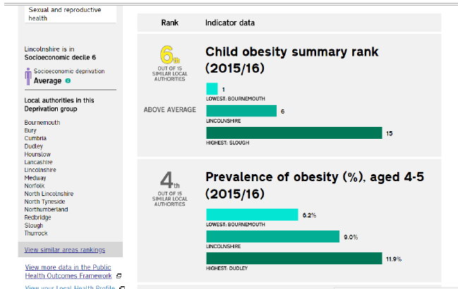
Figure 3.6: Example of text-heavy dashboard – Understanding Glasgow
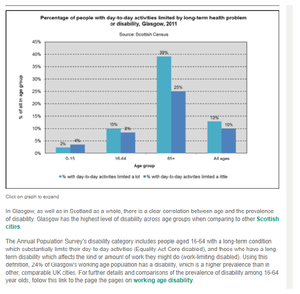
Most commonly, however, the dashboards incorporated a balance of these two approaches, with the focus primarily on the visual element for each indicator, with a small amount of explanatory or summative text. Pages that required more description (for example, about the purpose of the dashboard) were kept separate from the presentation of the data thus helping to keep the overall ‘clean’ look.
This broad approach was generally regarded by interviewees as preferable. Visuals were deemed key in making data accessible to users and enabling them to quickly locate and understand it. In addition, there was a view that attractive, visual elements helped engage audiences that might not traditionally interact with this kind of data, particularly the public. Still, the commissioners interviewed felt that such elements should not be at the expense of narrative around visuals, including both technical details for expert audiences, such as statisticians and academics wishing to interrogate the data in more detail (e.g. exact question wording, base sizes, links to original data sources) and contextual information for a wider audience who want to know what ‘the story’ is (e.g. What contributes to sub group differences? How does this compare to other geographic areas? How has this changed over time?). Of the dashboards reviewed, the more visual they were, the less likely they were to provide these two types of information in an obvious way. That said, almost all included links to further technical details.
Options for visual content
Charts were overwhelmingly the main type of visual used in the dashboards reviewed. Indeed, all of the dashboards, with the exception of the OECD ‘How’s Life?’ tool, included a chart for each of the indicators presented.
Figure 3.7: Examples of charts – ONS Wellbeing dashboard
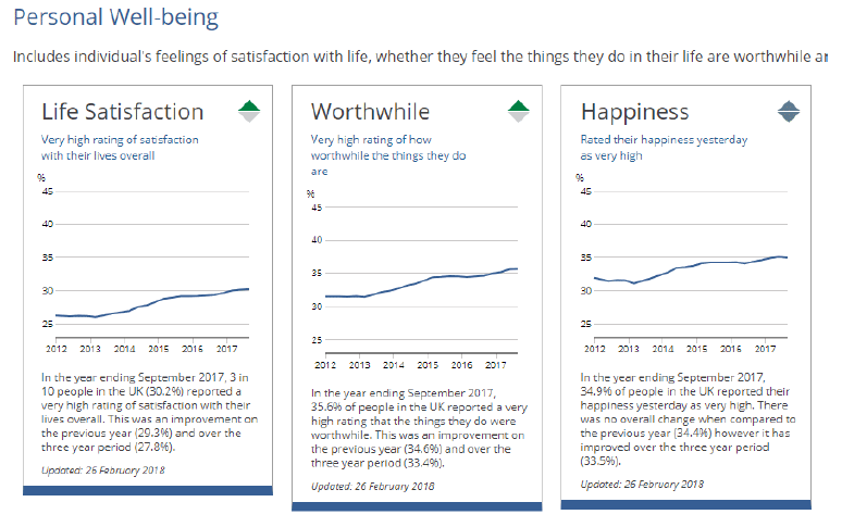
The charts tended to be fairly basic i.e. bar charts or, for the presentation of trend data, line charts (see Figure 3.7 for an example). The commissioners interviewed noted that, to some extent, this had been driven by their desire to keep the information accessible and easy to understand. However, in some cases, it had also been based on expediency, in the sense that they did not have the resource in place (whether in terms of design skills or IT support) to allow for a more sophisticated design.
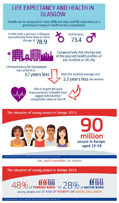
Two of the dashboards contained infographic elements – Understanding Glasgow and the European Commission Youth Monitor. While Understanding Glasgow had summary infographics for each domain (and sometime more than one), the Youth monitor incorporated infographic images on its home page only (see Figure 3.8).
A developer and user of Understanding Glasgow highlighted that one of the key benefits of the infographics, aside from making the data more accessible and engaging, was that they could be downloaded as .pdf files, printed then used as handouts (e.g. at a conference, in the classroom). Of course, if infographics are to be used in this way, it is vital that they contain the relevant technical details (e.g. data sources, survey years etc.) that would typically appear within the dashboard proper.
Figure 3.8: Examples of infographic images – Understanding Glasgow and EC Youth Monitor
Another visual element of the Understanding Glasgow dashboard that was praised by users was the use of videos and animations explaining what can be found on the site[3] and exploring different projects related to the indicators. The only other dashboard that incorporated videos was the OECD How’s Life? Data visualisation tool. This included an animation of ‘the story’ of the data[4], in addition to a SlideShare presentation of the key findings. While the developers reported that the video elements were time consuming to produce and required the input of external technical expertise, they nonetheless felt they were an extremely effective method for engaging the lay audience – a perspective that was shared by the site users interviewed.
Four of the dashboards incorporated interactive elements (Public Health England, Understanding Glasgow, OECD How’s Life? and the European Commission’s Youth Monitor). For the most part, the interactive elements tended to be map-based – and these were popular among users – though the OECD site used a sophisticated data visualisation tool to explore both geographical differences, as well as analysing the data by inequalities groups. These features are returned to in more detail in the ‘levels of analysis’ section below.
For all of the different types of visual information discussed above, three issues need to be borne when developing new dashboards:
- as noted earlier in this section, the design of the dashboard can only be as sophisticated as the IT systems underpinning it – to allow for the full spectrum of visual and interactive elements a dedicated microsite would be the best option, although the associated costs would need to be considered
- there should be a realistic assessment of the financial and technical resources required and available. In order to deliver visual elements effectively, input will be required from various technical experts (graphic design, IT, video production etc.)
- such input will also be required on a more ongoing basis to ensure that everything is still functioning as it should and that visuals are updating in line with the main indicator updates. As previously noted, if resources are out-of-date, this can frustrate users and impact on the credibility of the data.
Ease of use and navigation
Overall, the dashboards reviewed tended to be easy to navigate with clear signposting for the different domains/topic areas. Aspects of the design that interviewees felt aided navigation were clear labelling, colour coding, and common layout of topic areas. Further, well-labelled links that followed a logical progression from a general overview to detailed subpages were appreciated by users.
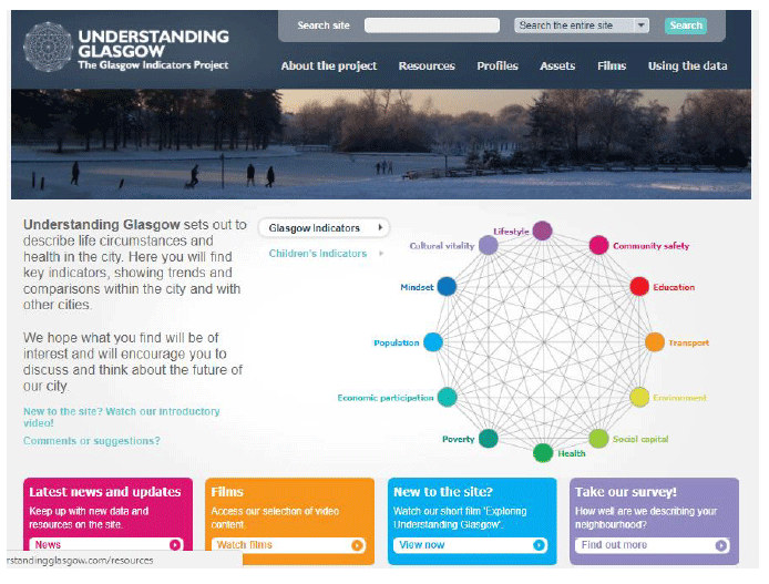
As any social capital framework is likely to encompass a complex set of concepts across several different domains, a multi-layered site with sub-pages will likely be required. It will be important to ensure that there is a clear, attractive front page which summarises the domains and indicators succinctly as possible. Understanding Glasgow provides a particularly good example of this, with a mandala diagram used to summarise the 12 domains included in the site (see Figure 3.9).
Figure 3.9 Understanding Glasgow – front page summary diagram
All of the dashboards incorporated links to either policy documentation, or other relevant further reading. As previously noted, such information can help to provide a contextual narrative for the dashboard and choice of indicators. Indeed, users reported finding it very useful for these reasons. The ease with which the links could be located across the different dashboards was somewhat variable, however. The best examples tended to include all the information in one dedicated section of the site, as in the case of Understanding Glasgow and the European Commission Youth Monitor (see, for example, Figure 3.1 above).
The main shortcomings of the dashboards reviewed in relation to usability and navigation were generally technical and included:
- links that did not work, or took you to a different page than labelled, or a web page that no longer existed
- one dashboard that only worked on a particular browser
- charts that crashed when loading.
Again, these types of problems with a dashboard will cause annoyance among users, and result in the dashboard going unused. Care therefore needs to be taken during the development phase, and on an ongoing basis, to mitigate them.
Checklist dashboard format and features
- Ensure that the purpose and intended audience underpin design decisions
Host on a dedicated microsite if budget allows
Consider the balance between text and visuals – retain white space for a clean look - Consider including visuals beyond charting the data – particularly infographics and videos
- Make a realistic assessment of the resources available – for both development and maintenance
- Consider the technical constraints within which you are working and plan accordingly
Levels of analysis
For the dashboards reviewed, the intended audiences were generally policy makers and delivery agencies, though, as noted, several of the commissioners had taken steps (or were in the process of doing so), to make the dashboards more accessible to a wider audience, including the general public.
This user profile was broadly reflected in the levels of analysis provided in the dashboards. In the Scottish and UK dashboards, the main sub-aggregate analyses provided were by region (in the case of the ONS Measures of Wellbeing tool), local authority (Public Health England, Active Scotland Framework) or neighbourhood (Understanding Glasgow), along with deprivation (all of the dashboards). In the OECD and European Commission dashboards main sub-aggregate analysis presented was at the country level.
Demographic breakdowns were provided to varying degrees across and within the dashboards, including by:
- gender (Understanding Glasgow, Active Scotland Framework, OECD)
- age (Understanding Glasgow, Active Scotland Framework, OECD)
- education (OECD)
- equalities characteristics (Active Scotland Framework, OECD)
- income (Active Scotland Framework)
Of course such sub-aggregate analysis is only possible in cases where the sample size for the data source is sufficiently large. Given that it is likely that any data used for a social capital dashboard would be nationally representative and therefore have a suitable number of respondents for lower level analysis, this should not be an issue.
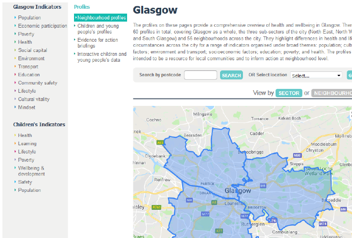
The dashboards reviewed took a range of approaches to the presentation of sub-aggregate data. Given the focus on geographical-based analyses, a number of them used interactive maps to highlight these differences (Public Health England, European Commission Youth Monitor and Understanding Glasgow). Understanding Glasgow includes interactive sector and neighbourhood profile maps (60 in total) that users can click on for an overview of health and life circumstances in each area (see Figure 3.10). These are ”intended to be a resource for local communities and to inform action at neighbourhood level.”
Figure 3.10: Area profile home page from Understanding Glasgow site
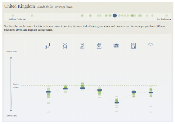
Besides the dashboards that incorporated maps to display sub-aggregate data, two others – the OECD How’s Life? data visualisation tool and the Active Scotland Outcomes Framework took different approaches. The OECD tool is an online interface that allow the user to explore sub group differences on a series of wellbeing measures. The data can be broken down by country, or can be explored at a country level by a number of other equalities variables.
Figure 3.11: OECD How’s Life? data visualisation tool
The Active Scotland Outcomes Framework presents subgroup data only indirectly, in the form of a link to a subpage where the full data can be accessed in an Excel file.
The interviewees highlighted both pros and cons of providing indicators at the sub-aggregate level. In terms of pros, there appeared to be strong demand for this type of data from delivery partners and other data users. The developers of Understanding Glasgow reported that the neighbourhood profiles section of the site is among the most heavily used, while the ONS team said they would strongly recommend that the Scottish Government included analyses by key demographic groups in any dashboard it produced, otherwise users would simply request this information – they noted such requests were among the most common of those they received about the National Measures of Wellbeing dashboard.
In terms of challenges that can arise from the presentation of sub-aggregate analysis, and as noted previously, the Public Health England commissioners encountered some pushback from local authorities regarding the ranking of local authority performance on the indicators. On a more practical point, the more different levels of analysis that are provided in a dashboard, the more resource intensive maintenance of the tool becomes. The issue of resourcing is returned to below.
Checklist for levels of analysis
- Provide breakdowns by local authority and deprivation to meet demand for this
- Provide breakdowns for key demographics (e.g. sex, age and possibly equalities indicators)
- Avoid directly comparing the performance of different delivery agencies
Highlighting progress
Only two of the dashboards explicitly highlighted direction of travel in respect of the indicators; the ONS Measures of National Wellbeing and the Active Scotland Outcomes Framework. The ONS dashboard assigned colour coded arrows to each indicator (located in the top right corner of each chart), to indicate positive change, negative change or no change, as shown in Figure 3.12).
Figure 3.12: Progress monitoring key for the ONS Measures of Wellbeing Dashboard

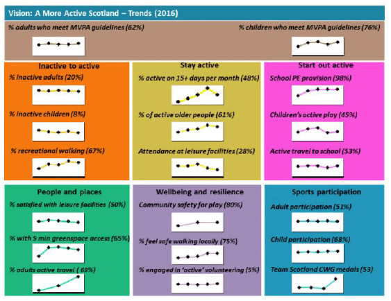
The Active Scotland Outcome Framework did not contain a graphical indicator of progress but did provide text narrative on the movement of indicators in each indicator subpage, in addition to showing trend data on the dashboard overview page (Figure 3.13).
Figure 3.13: Progress monitoring in the Active Scotland Outcome Framework
Interviewees for the other dashboards, gave two main reasons for not explicitly highlighting direction of travel in the dashboards. First, if a dashboard is updated once (or even twice) a year then there are bound to be small fluctuations in the data on an ongoing basis. These fluctuations may not actually represent ‘real change’ in the indicator but rather could, for example, be due to survey error. If progress indicators are included this may results in users inferring change that is not actually ‘real’, and undertaking unnecessary work to identify reasons for it.
Second, there was a concern from dashboards developers that including measures of progress may cause contention among delivery partners who feel that their activities are being crudely monitored via the dashboards; something that was borne out to an extent by reactions to Public Health England’s local authority comparisons.
User support and feedback
The dashboards reviewed provided varying degrees of user support and varying opportunities for users to provide feedback.
In terms of user support, this ranged from the simple inclusion of a ‘contact us’ link, to the provision of written guidance on interpreting charts and, in the case of Understanding Glasgow, a dedicated ‘Using the data’ section, as described above. The latter includes not only information on how to use the data as an academic resource or to “stimulate discussion”, but an innovative tool called the ‘Glasgow Game’. This is a learning game intended to “encourage understanding of health and wellbeing in Glasgow, to promote thinking about the complexities and context of the city and to help people consider possible futures for the city.” The ‘Glasgow Game’ was developed in collaboration with the International Futures Forum (IFF) and is, in essence, a version of the IFF’s ‘World Game’. It can involve 20 – 40 participants, provides a structured way of investigating strategic questions, making use of intelligence from Understanding Glasgow and tapping into the experience and knowledge of participants. The developers described how it has been used by many groups (planners, third sector groups, and students in universities and schools) to address strategic issues affecting Glasgow and to formulate “transformative responses”, including in relation to, among others, the challenges around drugs and alcohol; the food environment in the city; and, how Glasgow might become a better connected city.
This type of resource could be said to provide a useful means of bridging the gap for users between indicators and outcomes; in other words, of helping them identify how they/their organisation might affect changes and improvements. Gamification specifically has been credited with having positive effects on engagement and innovation, including in the public sector. The DWP for example, has successfully employed a platform called Idea Street to capture and develop ideas generated by DWP staff and, where appropriate, convert them into a meaningful set of projects that could be implemented.[5]
Figure 3.14: The ‘Glasgow Game’ resource from Understanding Glasgow
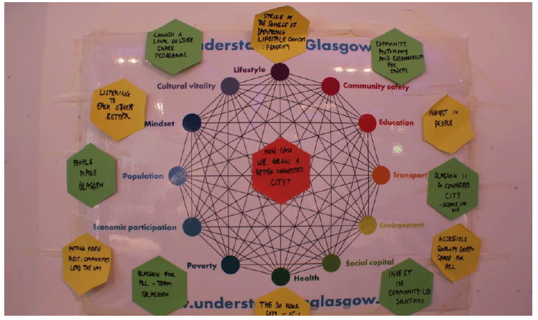
In terms of mechanisms for collecting user feedback, the inclusion of a simple ‘contact us’ link was the most common approach evident in the dashboards. However, both ONS and Public Health England had recently undertaken user consultations and were in the midst of writing up the findings, while the Understanding Glasgow team had undertaken a similar exercise in the past. The OECD team was about to embark on a formal consultation on the broad ‘How’s Life’ framework to ensure the indicators remained fit for purpose seven years after its initial launch.
Several of the commissioners/developers described also having made use of Google analytics to assess the user journey through their dashboards. While the tool did not enable them to see who was using the dashboards, it did record length of use and which sections of the sites were the most widely used. This in turn enabled them to tailor content development accordingly.
A couple of commissioners/developers highlighted the benefits of a ‘soft launch’ prior to a dashboard being launched in earnest, to collect user feedback and help refine the tool. One suggested that this could have added benefits in terms of making stakeholders feel included in the process and appropriately consulted.
Checklist for user support and feedback
- Provide guidance on how to use the data, including case study examples
- Use web analysis to tailor content development
- Conduct a ‘soft launch’ of the dashboard
- Conduct usability testing
Resourcing
Initial development
Obtaining a clear picture of the resourcing requirements for the dashboards reviewed was complicated by the fact that several of the individuals who originally commissioned/developed them were no longer in post. The extent to which some participants were able to comment on the initial development of the dashboards was, therefore, limited.
All of the dashboards reviewed had been developed in-house. Interviewees reported that this was more cost-effective than outsourcing (and, indeed, in cases when there was no dedicated budget available for the dashboard, necessary). It also gave the organisations greater control over both the initial and ongoing development of the dashboards. The main challenge of in-house development centred on the availability, or lack thereof, of staff with the requisite technical skills.
The development of dashboards can be separated into four distinct elements: the initial agreement of the intended audience and broad content; technical development; testing; and pre-launch communications. The consensus among those who had been involved in developing dashboards was that the first of these – agreeing the intended audience and content – was the most resource intensive. As mentioned above, it tended to include the formation of a steering group and the engagement of both internal and external stakeholders. This process could be fairly lengthy – for example the agreement of content for Understanding Glasgow took a year – but there were also examples of shorter timescales (four months from request to launch in the case of the Public Health England Dashboard and six months for the Active Scotland Outcomes Framework dashboard). The specific approach taken to selecting indicators impacted to a degree on the time required to finalise the content. The process was far more resource intensive when ‘ideal’ indicators to measure progress on outcomes were identified first and then data was sourced, as opposed to when available datasets were reviewed first and the ‘best available’ indicators were selected from that data.
While it was not always possible to obtain firm estimates of the resources required in the development phases (excluding technical development) of the dashboards, the review ascertained that:
- the European Commission Youth Monitor involved one person working intensively on it for one year
- the Public Health England Dashboard involved three or four members of the core team spending half a day per week on it (the core project team included the head and deputy head of an analytical team, a methods expert, a principal analyst and an analyst)
In terms of technical development there was agreement that, with the range of software options available (some of which were free), this should be a relatively quick and inexpensive process – although, as noted above, it requires specific design/development expertise. Participants commonly recommended designing the dashboards to be as ‘future proof’ as possible from a technical perspective, to avoid having to make large-scale changes to them. This included ensuring they were device agnostic and used coding which is more modular or generic rather than ‘hard’.
Little information was available on the resources required for the testing phase specifically. The main exception was in respect of the Public Health England Dashboard, for which there was a two week period in which intended users were asked to comment on a test version of the tool and minor changes were made as a result. Further Public Health England interviewees noted that resources had been required following agreement of the dashboard, but in advance of its launch, to communicate its purpose, and the reasons for the inclusion/exclusion of particular indicators, to stakeholder organisations.
Ongoing maintenance
The following factors had affected the resource required for the ongoing maintenance of the dashboards reviewed:
- whether, from a technical perspective, the dashboard had been designed to be future-proof and adaptable
- the frequency of updates to indicators
- the data sources used
- the process for updating indicators, and the extent to which this was automated.
As previously noted, the ongoing maintenance of a dashboard, and likely constraints around this, was something interviewees felt should be considered during the initial design phase with a view to minimising the work required. Indeed, a Public Health England Dashboard interviewee described the process they now use in development of dashboards and similar IT products as “agile working.” They have an overall ‘road map’ of what they are trying to achieve, including a continual build and test process whereby work is completed in two week ‘sprints’ rather than working towards a fully finished product.
As would be expected, the resources required in maintaining the dashboards was related to the frequency with which they were updated. Given that most of the data sources used for the indicators reported annually (although potentially at different times throughout the year), dashboards tended to follow suit with all indicators updated at set points, once (or in some cases twice) a year. Some of the commissioners/developers reported having resisted requests to update them more frequently due to resourcing issues.
Linked to this, participants noted that when thinking about likely resourcing for ongoing maintenance, it was important to consider both the source/s of data (internal or external) and the number of different sources used. Using external data has implications in terms of keeping to timescales for updating as it relies on the timely publication on the part of other organisations. And the greater number of different sources used (particularly if each reports at a different time) the greater the resource required to collate these. One of the Active Scotland Framework interviewees noted that, while they had a large number of indicators to update, the process was simplified by the fact that almost all of the data came from two internal surveys. On the other hand, the greatest challenge in updating the How’s Life?’ dashboard was the timeliness with which external data was published. As the data covered multiple countries, the OECD’s timescales for updates were driven by whichever country was last to publish.
Processes for updating indicators varied across organisations and were, in part, linked to the IT facilities available. Several of the dashboards incorporated automated updates (principally for objective rather than subjective measures) which, for obvious reasons were seen as preferable to manual updates where IT systems could support them. ONS’s Measure of National Wellbeing, the European Commission Youth Monitor and the Public Health England dashboard were using, or working towards using, automation to update some of their indicators, for example by linking to other parts of their websites. Public Health England also noted that they were trying to increase the amount of automation through the use of programmes such as SQL and R.
Manual updating of indicators was considerably more resource intensive. The Active Scotland Outcomes Framework did not utilise any automation and considered ongoing maintenance a major commitment. The interviewee felt that investment in an IT system that would support automation should be a key priority. The Public Health England Dashboard development team managed the workload in part by outsourcing responsibility for updating the various dashboards they maintain to analytical teams within the organisation, with the core team retaining responsibility for the maintenance of just the underlying site architecture. The European Commission team operated a similar model, with responsibility for updating the indicators lying with Eurostat. The Understanding Glasgow team had commissioned a member of staff from ISD to update the site.
Technical updates were also mentioned. More than one respondents mentioned that they had stopped, or wanted to stop, using the Flash Player plug-in with the dashboard. While this has been a useful piece of software in the past for supporting images and animations, it is now thought to be a weak point for security attacks. Furthermore, the new HTML 5 standard can now perform the functions of Flash without requiring any additional software. This suggests that in order keep the dashboard performing at its full potential, these types of IT developments must be monitored and updated where appropriate, in addition to the actual content.
Beyond basis updates, several interviewees highlighted the ongoing resource required to continue to develop and promote the dashboards. Both the European Commission Youth Monitor and Public Health England Dashboard interviewees respondents described this as a particular challenge given the lack of staffing resource and other demands on staff time. Interviewees also highlighted the need to build in time to respond to enquiries from users, though they noted that most such enquiries – and visits to the dashboards generally – tend to come around the time updates are added.
Checklist for dashboard resources
- Allow ample time for the consultation and dashboard development
- Keep in mind the resource needs for ongoing maintenance when developing the dashboard
- Consider outsourcing some development and maintenance tasks where budget allows
- Introduce automated data updates where possible
- Build in time to respond to user enquiries
Contact
Email: Ben Cavanagh