Coronavirus (COVID-19): modelling the epidemic (issue no. 66)
Latest findings in modelling the COVID-19 epidemic in Scotland, both in terms of the spread of the disease through the population (epidemiological modelling) and of the demands it will place on the system, for example in terms of health care requirement.
Coronavirus (COVID-19): modelling the epidemic in Scotland (Issue No. 66)
Background
This is a report on the Scottish Government modelling of the spread and level of Covid-19. This updates the previous publication on modelling of Covid-19 in Scotland published on 19th August 2021. The estimates in this document help the Scottish Government, the health service and the wider public sector plan and put into place what is needed to keep us safe and treat people who have the virus.
This edition of the research findings focuses on the epidemic as a whole, looking at estimates of R, growth rate and incidence as well as local measures of change in the epidemic.
In Scotland, the modelled estimate for R is between 1.0 and 1.3, with the growth rate between -1% and 6%, based on the period up to 23rd August.
The number of new cases has continued to increase over the last week. The estimate of R has increased to above 1.
Key Points
- The reproduction rate R in Scotland is currently estimated as being between 1.0 and 1.3, based on the period up to 23rd August. This is an increase in the lower and upper limits from last week, is now clearly above 1, and is the highest upper limit of R since 12th July 2021.
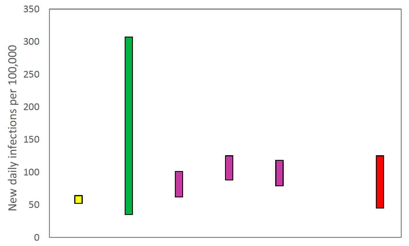
- The number of new daily infections for Scotland is estimated as being between 45 and 125, per 100,000 people, based on the period up to 23rd August. This is an increase in the lower and upper limits since last week.
- The growth rate for Scotland is currently estimated as between -1% and 6%, based on the period up to 23rd August. This is an increase in the lower and upper limits since last week.
- Average contacts have increased by 15% in the last two weeks (comparing surveys pertaining to 5th August - 11th August and 19th August - 25th August) with a current level of 4.7 daily contacts.
- Contacts within the work have increased by approximately 64% compared to two weeks prior. Contacts within the home and other settings (contacts outside of the home, school and work) have remained at similar levels over the same period.
- All age groups with the exception of those aged 18-29 have had an rise in contacts within the last two week, with those aged 30-39 approximately doubling. Increases across the age groups are largely driven by a rise in contacts within the work setting.
- The biggest increase in interactions is seen between those 30-39 with those under 18.
- Visits to a work place have increased from approximately 14% to 19% with individuals visiting a pub or restaurant increasing from 46% to 49% in the last two weeks.
- Hospitalisations are now rising. Future hospital occupancy and intensive care use are likely to continue rising as infections rise.
- Modelled rates of positive tests per 100K using data to 23rd August indicate that, for the week commencing 5th September 2021, there are 28 local authorities which are expected to exceed 100 cases per 100k with at least 75% probability.
- Of these, twelve local authorities are expected to exceed 300 cases per 100k with at least 75% probability. These are Argyll & Bute, Edinburgh, Dumfries & Galloway, East Dunbartonshire, East Renfrewshire, Glasgow, North Ayrshire, North Lanarkshire, Renfrewshire, South Lanarkshire, West Dunbartonshire and West Lothian.
- Only one local authority, Dumfries & Galloway, is expected to exceed 500 cases per 100k with at least 75% probability.
- Nationwide, the latest levels of wastewater Covid-19 RNA have approximately doubled since the previous week.
- Wastewater Covid-19 RNA concentrations are now approaching the maximum level reached during the peak in July 2021. The rise in wastewater has been greatest in the central belt and the south.
- Modelling of Long Covid gives estimates that on 12th September 2021 between 0.8% and 2.1% of the population are projected to experience symptoms for 12 weeks or more after their first suspected Covid infection in Scotland. This is an increase in the upper limit from last week.
Recent cases
Figure 1 shows the number of cases reported in Scotland between May and August 2021. The vertical dashed lines indicate the cut off points for each of the modelling inputs; after these dates, the number of cases is not incorporated into the outputs.
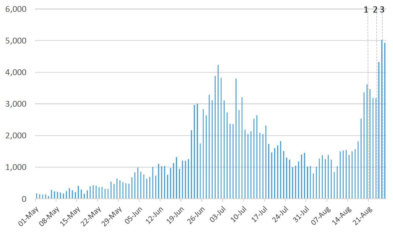
This report covers the period up to 20th August for wastewater analysis (indicated by dashed line 1). The estimates of R, incidence, growth rates, the modelled rates of positive tests per 100k, and the long Covid analysis use data to 23rd August (dashed line 2). The medium term projections by the Scottish Government of infections, hospitalisations and ICU beds, and the contact patterns use data to 25th August (dashed line 3).
Overview of Scottish Government Modelling
Modelling outputs are provided here on the current epidemic in Scotland as a whole, based on a range of methods. Because it takes a little over three weeks on average for a person who catches Covid-19 to show symptoms, become sick, and either die or recover, there is a time lag in what our model can tell us about any re-emergence of the epidemic and where in Scotland this might occur.
However modelling of Covid-19 deaths is an important measure of where Scotland lies in its epidemic as a whole. In addition, the modelling groups that feed into the UK Health Security Agency (UKHSA) consensus[1] use a range of other data along with deaths in their estimates of R and the growth rate. These outputs are provided in this research findings. The type of data used in each model to estimate R is highlighted in Figure 2.
We use the Scottish Contact Survey (SCS) to inform a modelling technique based on the number of contacts between people. Over time, a greater proportion of the population will be vaccinated. This is likely to impact contact patterns and will become a greater part of the analysis going forwards.
The logistical model utilises results from the epidemiological modelling, principally the number of new infections. The results are split down by age group, and the model is used to give a projection of the number of people that will go to hospital, and potentially to ICU. This will continue to be based on both what we know about how different age groups are affected by the disease and the vaccination rate for those groups to estimate the proportion of cases that will require hospital, and the length of time people that people will stay there.
What the modelling tells us about the epidemic as a whole
The R value and growth rates are estimated by several independent modelling groups based in universities, Public Health England (PHE) and the Joint Biosecurity Centre. Estimates are considered, discussed and combined at the Epidemiology Modelling Review Group (EMRG), which sits within the UKHSA.
UKHSA's consensus view across these methods as of 25th August, using data to 23rd August, was that the value of R in Scotland was between 1.0 and 1.3 (see Figure 2)[2].
This week the Scottish Government presented two outputs to EMRG. The first uses confirmed cases as published by Public Health Scotland (PHS), and deaths from National Records Scotland (NRS). The second uses instead wastewater data to estimate the number of cases. Both outputs are shown in Figures 2 and 3. Note that as the former model includes deaths, it is returning a lower R value than the latter model where deaths are not included.
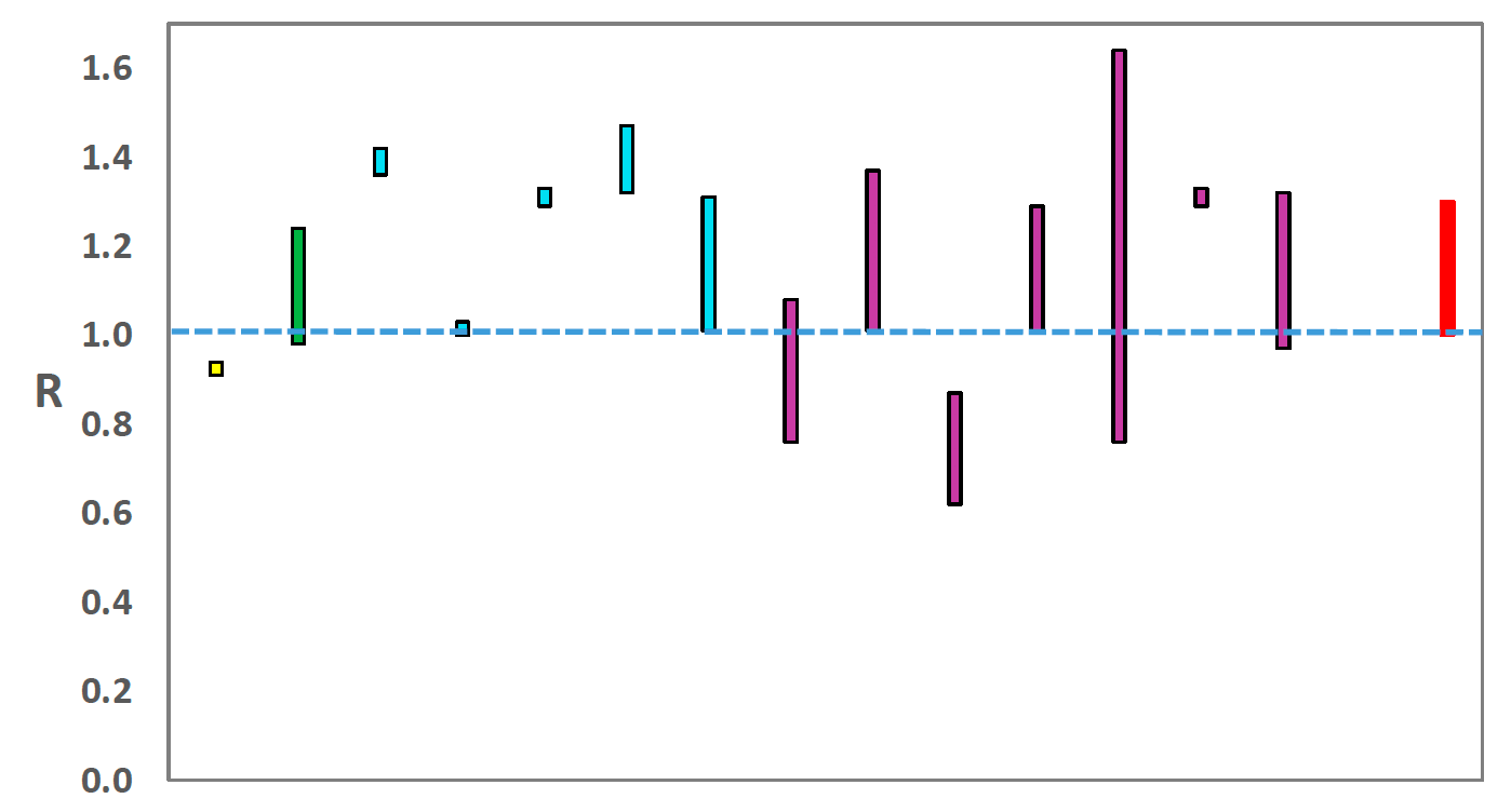
Source: EMRG
The various groups which report to the EMRG use different sources of data in their models to produce estimates of incidence (Figure 3). UKHSA's consensus view across these methods, using data to
23rd August, was that the incidence of new daily infections in Scotland was between 45 and 125 new infections per 100,000. This equates to between 2,500 and 6,800 people becoming infected each day in Scotland.
Source: EMRG
The consensus from UKHSA for this week is that the growth rate in Scotland is between -1% and 6% per day using data to 23rd August. The lower and upper limits have increased since last week.
What we know about who is testing positive with Covid
The Early Pandemic Evaluation and Enhanced Surveillance of Covid-19 (EAVE) 2 Study Group[4] has updated the pattern of demographics and clinical risk groups over time for those who tested positive in Scotland (see Technical Annex in issue 34 of the Research Findings).
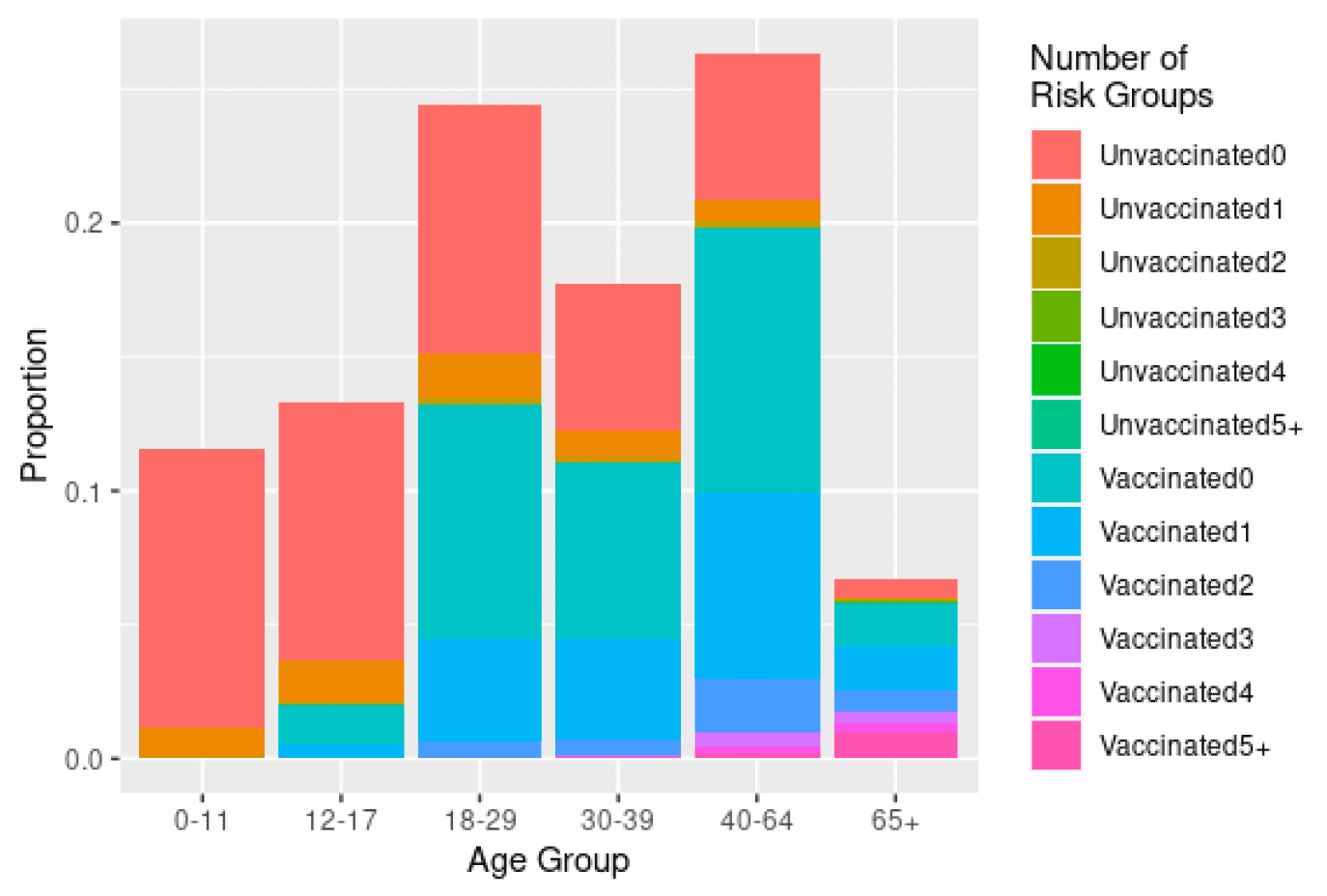
Figure 4 gives the age group, risk group and vaccination status of those first testing positive in the period 7th to 13th August 2021 and linking into the EAVE cohort. Vaccine status is a simple binary classification denoting that the individual had at least one dose of the vaccine before testing positive (vaccinated) or was unvaccinated at the time of testing positive. Risk group status is the number of Q-Covid[5] risk groups to which a person belongs.
One quarter of those testing positive are under 18, 50% are aged under 30 and only 6% aged 65+[6]. Among those aged under 18 the vast majority are unvaccinated while among those aged 18-29 just over half of them are vaccinated, most will just have had one dose. Very few individuals testing positive under 40 have multiple co-morbid conditions (0.2% of all cases were under 40 and had 3 or more co morbid conditions). The majority of those aged over 40 are vaccinated when testing positive, and most will have had two doses of vaccine, but a relatively small proportion are in the groups most at risk of a severe outcome. Among those testing positive 1.5% are aged 65+ and have 4 or more co-morbid conditions.
What we know about how people's contact patterns have changed
Average contacts have increased by 15% in the last two weeks (comparing surveys pertaining to 5th August - 11th August and 19th August - 25th August) with a current level of 4.7 daily contacts as seen in Figure 5. Contacts within the work have increased by approximately 64% compared to two weeks prior. Contacts within the home and other setting (contacts outside of the home, school and work) have remained at similar levels over the same period.
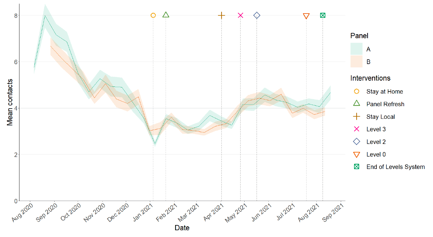
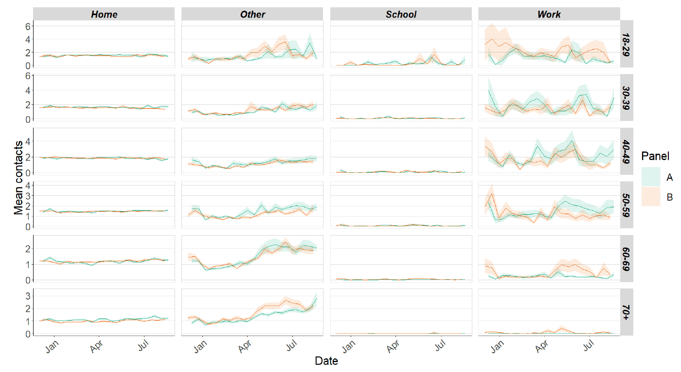
Figure 6 shows how contacts change across age group and setting. All age groups with the exception of those aged 18-29 have had an rise in contacts within the last two week, with those aged 30-39 approximately doubling. Increases across the age groups are largely driven by a rise in contacts within the work setting.
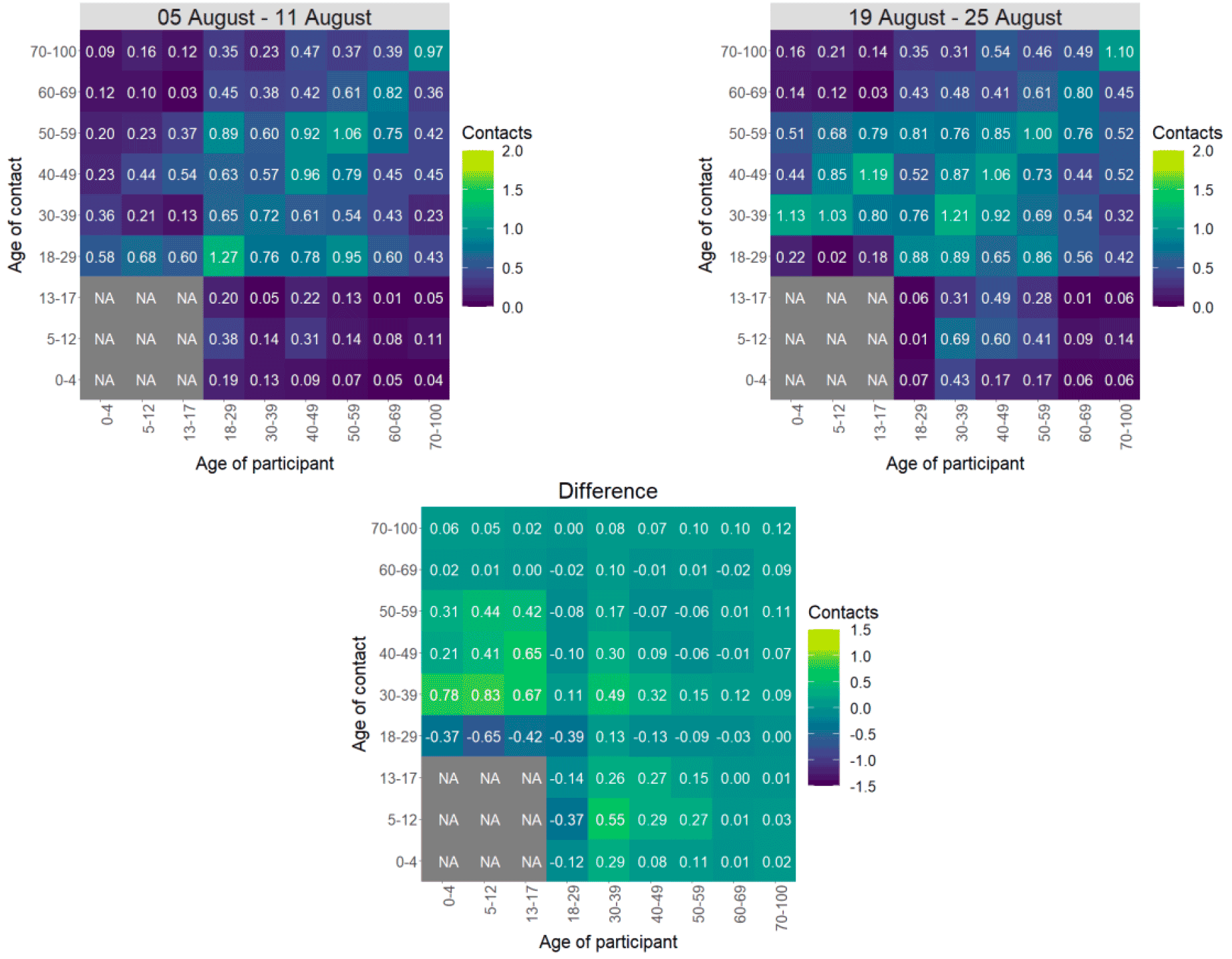
The heatmaps in Figure 7 show the mean overall contacts between age groups for the weeks relating to 5th August - 11th August and 19th August - 25th August and the difference between these periods. The biggest increase in interactions is seen between those 30-39 with those under 18.
As seen in Figure 8, the proportion of participants visiting different locations remains at similar levels across the majority of locations with those visiting a work place and also those visiting a pub or restaurant reporting the biggest increase in attendance. Visits to a work place have increased from approximately 14% to 19% with individuals visiting a pub or restaurant increasing from 46% to 49% in the last two weeks.
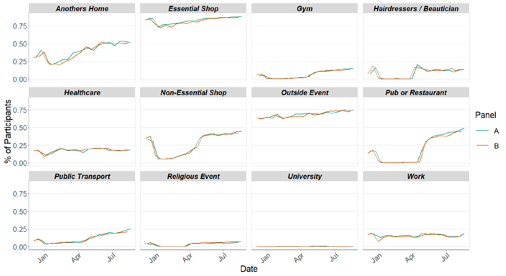
Figure 9 shows the proportion of participants that reported contacts had indoors and outdoors for contacts individually reported for panel A. A contact can be recorded as both indoor and outdoor. The graph also shows contacts reported as outside only and indoor only. The proportion of contacts reported to have been indoors only has increased slightly within the last two weeks, from 55% to 58%.
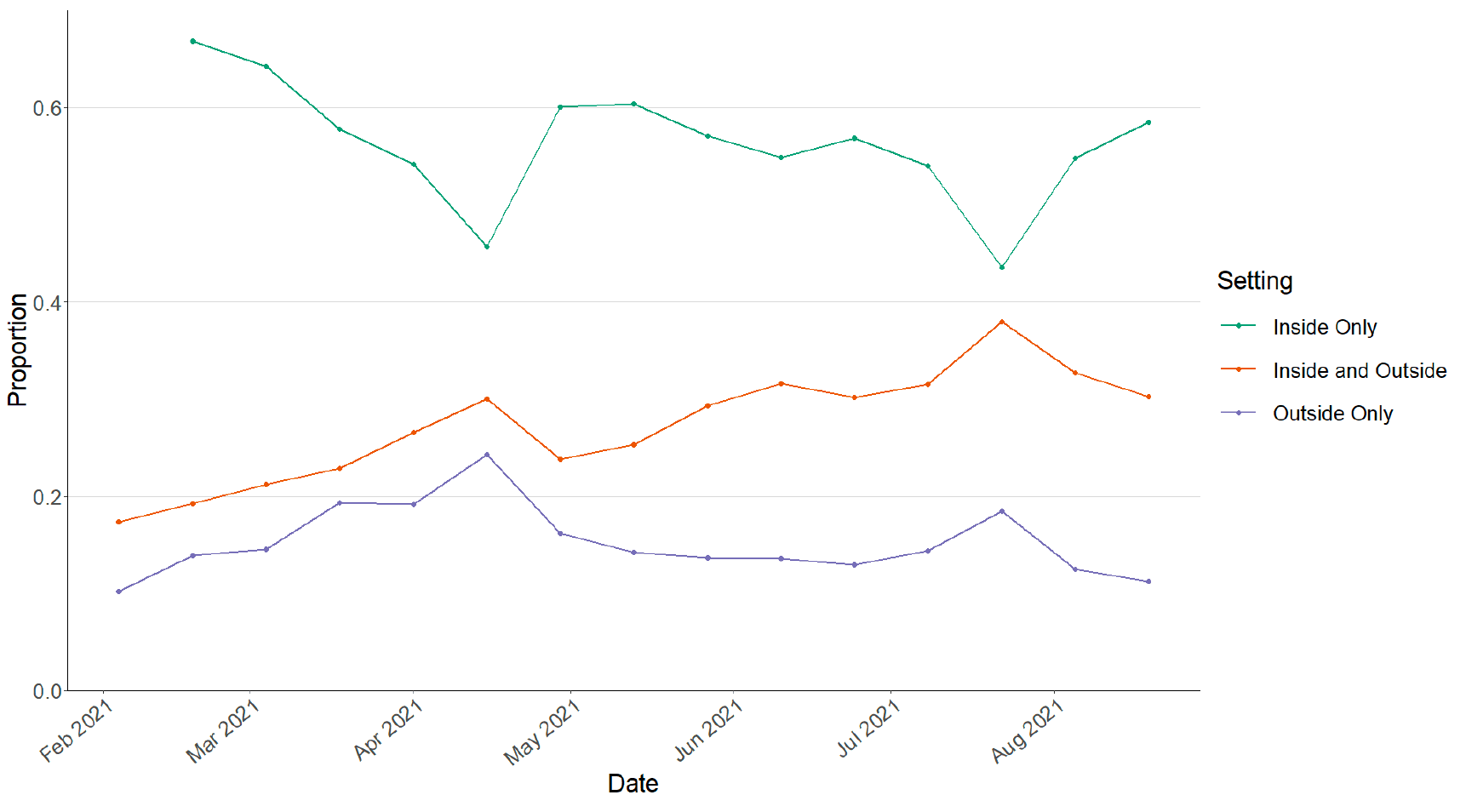
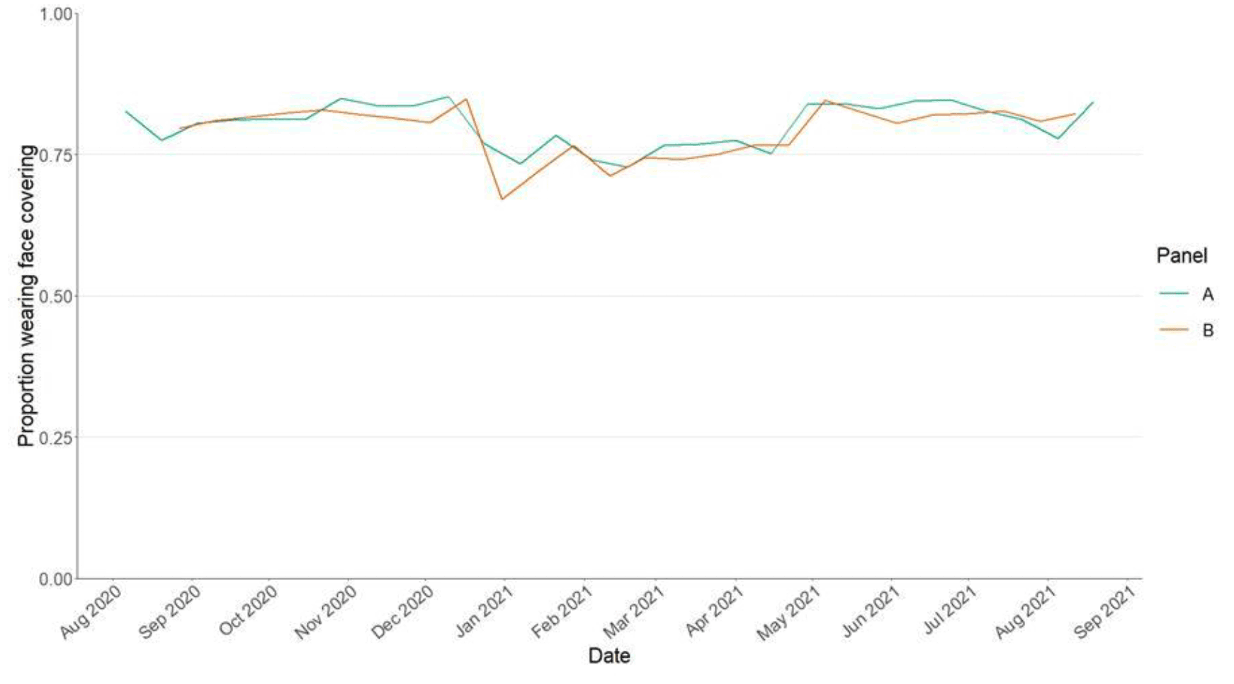
Figure 10 shows the number of people wearing a face covering where they have at least one contact outside of the home. This has increased from 78% to 84% in the last two weeks.
Vaccinations and contacts patterns
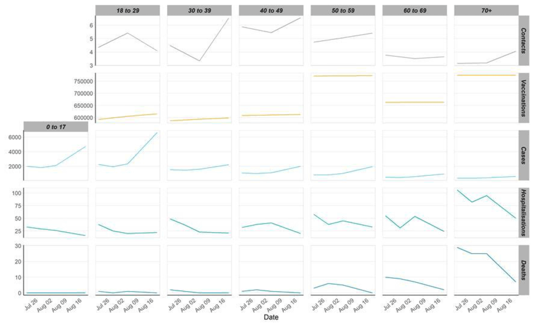
From Figure 11, it can be seen that the older age groups have similar levels of contacts but higher vaccinations than the youngest age group, they also have the lowest weekly case number comparatively to the younger age groups, which are currently rising. Despite that they have higher weekly hospitalization levels and deaths to that seen with the younger age groups.
What the modelling tells us about estimated infections as well as Hospital and ICU bed demand
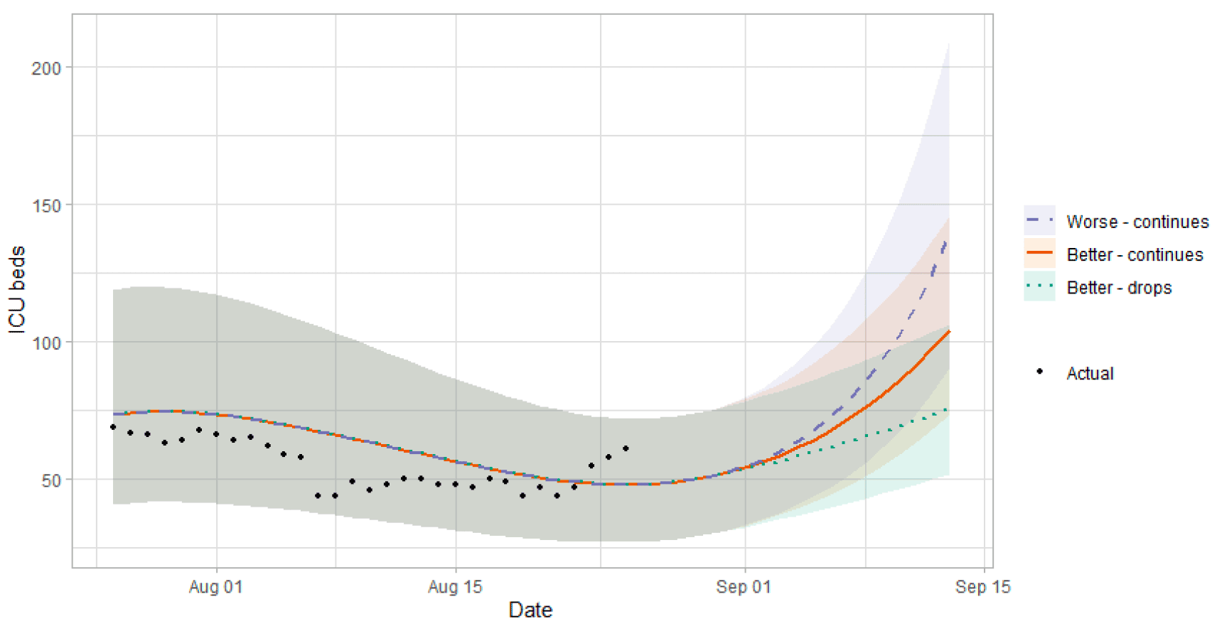
The Scottish Government assesses the impact of Covid-19 on the NHS in the next few weeks in terms of estimated number of infections. Figure 12 shows three projections over the three weeks to 12th September.
'Worse - continues' assumes that transmission increases, and this results in accelerating growth in infections. 'Better - continues' assumes transmission remains at the current level. 'Better - drops' assumes that the recent increase in transmission is short-lived, and it will return to previous levels[10].
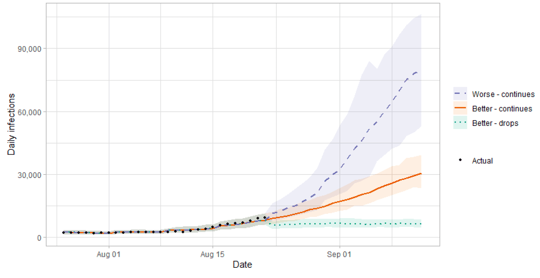
There is uncertainty as to how much infections will increase (or decrease) in coming weeks. This will drive how much hospital beds and intensive care beds will rise.
Figure 13 shows the impact of the projections on the number of people in hospital. The modelling includes all hospital stays, whereas the actuals only include stays up to 28 days duration that are linked to Covid-19.
Hospital and ICU occupancies are rising, and the future increase or decrease in hospital occupancy and intensive care use is highly uncertain, and depends on the number of infections.
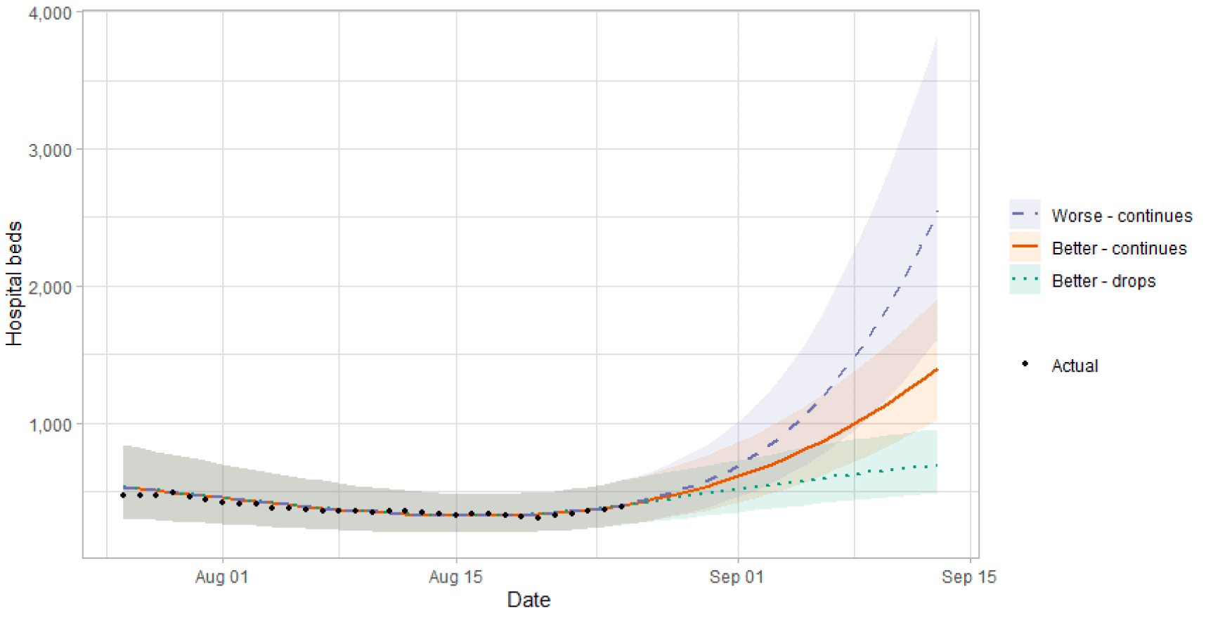
Figure 14 shows the impact of the projection on ICU bed demand.
A comparison of the actual data against historical projections is included in the Technical Annex.
What the modelling tells us about projections of hospitalisations and deaths in the medium term
SPI-M produces projections of the epidemic[13] (Figure 15), combining estimates from several independent models (including the Scottish Government's logistics modelling, as shown in Figures 12-14). These projections are not forecasts or predictions. They represent a scenario in which the trajectory of the epidemic continues to follow the trends that were seen in the data up to 23rd August and do not include the effects of any future policy or behavioural changes.
The delay between infection, developing symptoms, the need for hospital care, and death means they cannot fully reflect the impact of behaviour changes in the two to three weeks prior to 23rd August. Projecting forwards is difficult when the numbers of admissions and deaths fall to very low levels, which can result in wider credible intervals reflecting greater uncertainty. The interquartile range can be used, with judgement, as the projection from which estimates may be derived until the 7th September, albeit at lower confidence than the 90% credible interval.
These projections include the potential impact of vaccinations over the next few weeks. Modelling groups have used their expert judgement and evidence from Public Health England, Scottish Universities & Public Health Scotland, and other published efficacy studies when making assumptions about vaccine effectiveness.
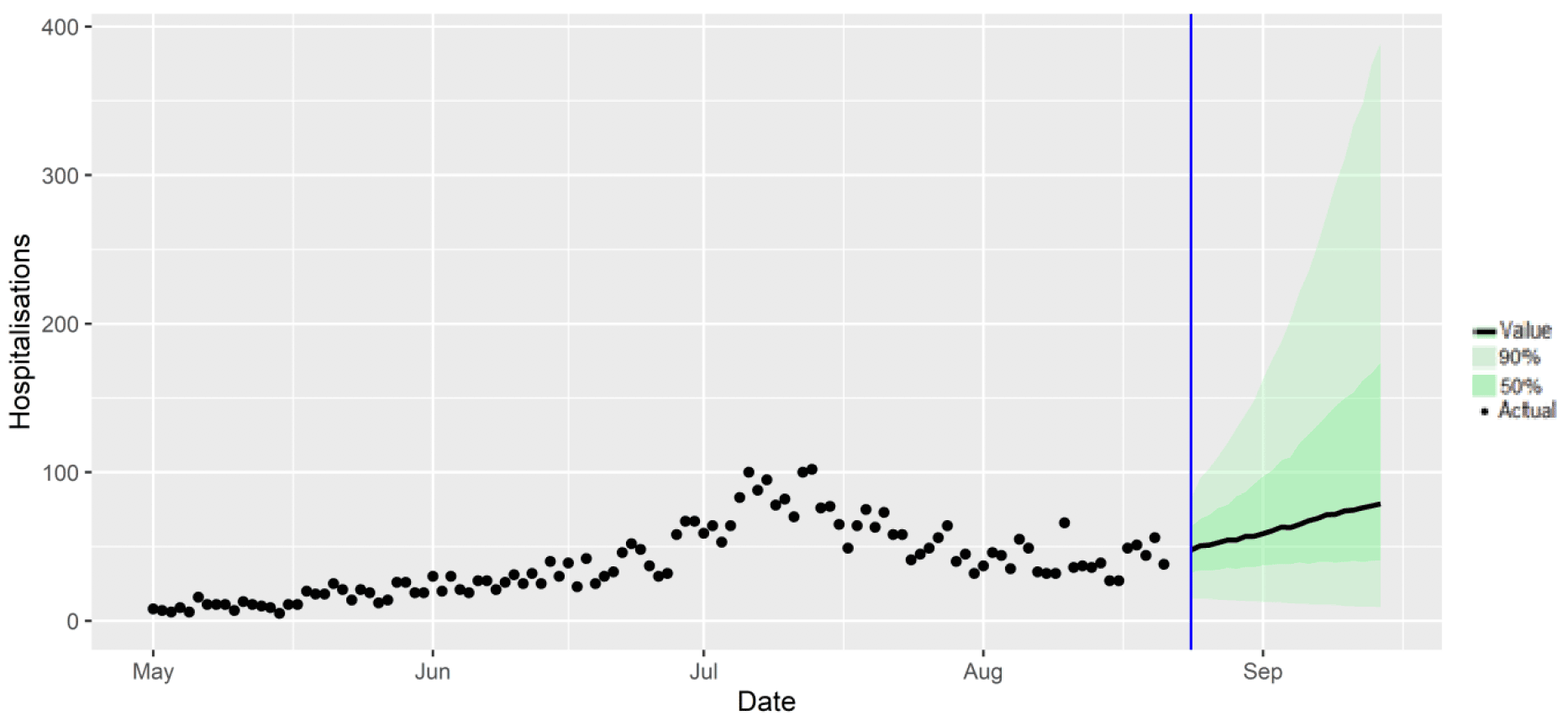
We are not projecting the numbers of people expected to die with Covid‑19 this week. The number of daily deaths remains at low levels.
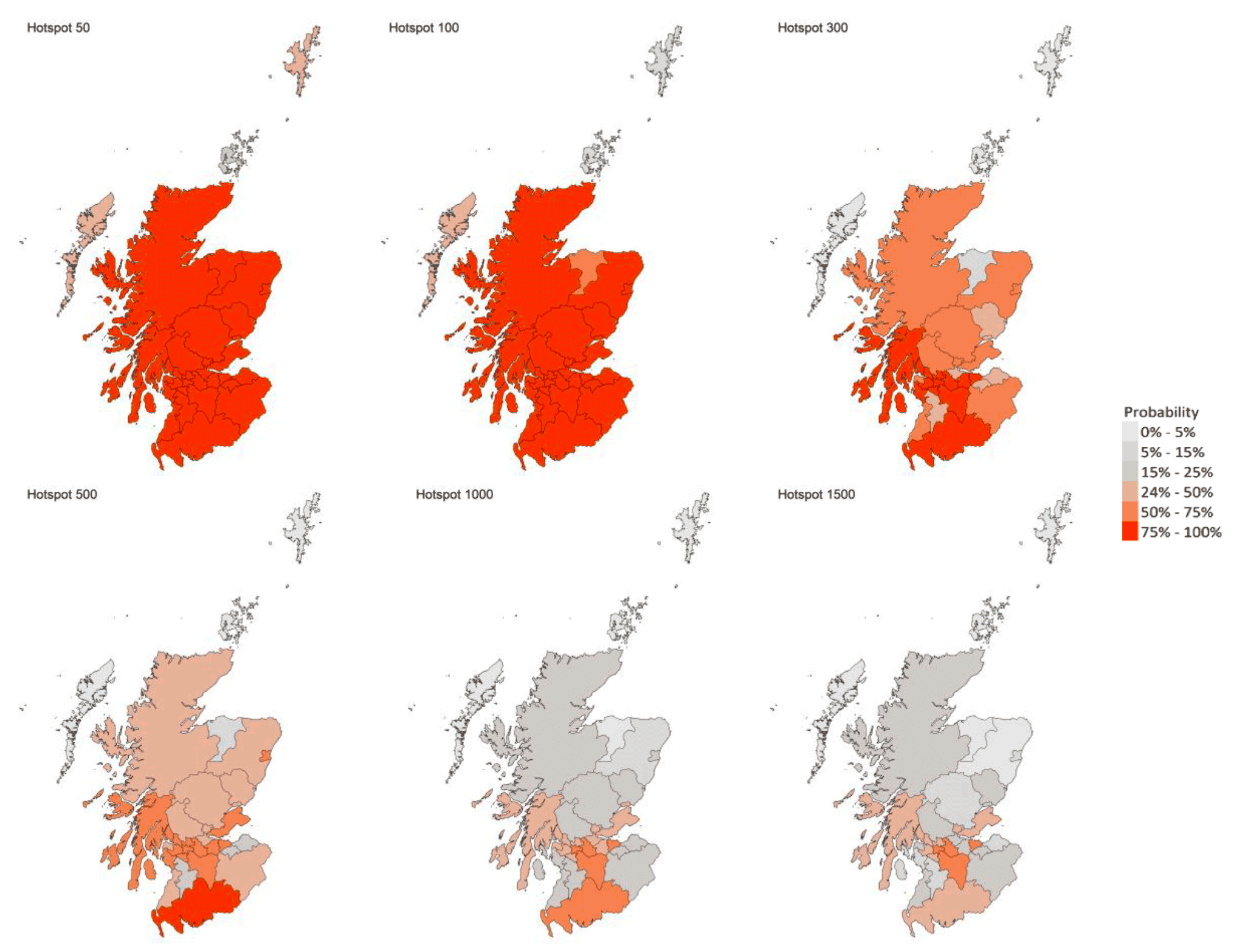
What we know about which local authorities are likely to experience high levels of Covid-19 in two weeks' time
We continue to use modelling based on Covid-19 cases and deaths using data to 23rd August from several academic groups to give us an indication of whether a local authority is likely to experience high levels of Covid-19 in the future. This has been compiled via SPI-M into a consensus. In this an area is defined as a hotspot if the two week prediction of cases (positive tests) per 100K population is predicted to exceed a threshold, e.g. 500 cases.
Because of the recent increase in cases, infections may be rising rapidly and that the local projections have yet to fully reflect this.
Modelled rates of positive tests per 100K using data to 23rd August (Figure 16) indicate that, for the week commencing 5th September 2021, there are 28 local authorities which are expected to exceed 100 cases per 100k with at least 75% probability[14].
Of these, twelve local authorities are expected to exceed 300 cases per 100k with at least 75% probability. These are Argyll & Bute, Edinburgh, Dumfries & Galloway, East Dunbartonshire, East Renfrewshire, Glasgow, North Ayrshire, North Lanarkshire, Renfrewshire, South Lanarkshire, West Dunbartonshire and West Lothian.
Only one local authority, Dumfries & Galloway, is expected to exceed 500 cases per 100k with at least 75% probability[15].
What can analysis of wastewater samples tell us about local outbreaks of Covid-19 infection?
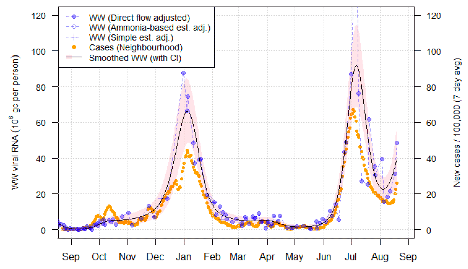
Levels of Covid-19 RNA in wastewater collected at a number of sites around Scotland are adjusted for population and local changes in intake flow rate and compared to 7-day average daily new case rates derived from Local Authority and Neighbourhood (Intermediate Zone) level aggregate data. See Technical Annex in Issue 34 of these Research Findings for the methodology.
Nationwide, the latest levels of wastewater (WW) Covid-19 RNA have approximately doubled since the previous week and averaged around 90 million gene copies per person per day (Mgc/p/d) for the week 14th to 20th August, compared to 42 Mgc/p/d the previous week.
Figure 17 shows the national weekly aggregate for the original 28 sites (sampled from August 2020, in blue) and, from January 2021, the aggregate for the full set of 110 sampled sites (in green), with a small number of unrealistically large outliers excluded. Both WW Covid-19 concentrations and cases are now approaching the maximum level reached during the peak in July 2021.
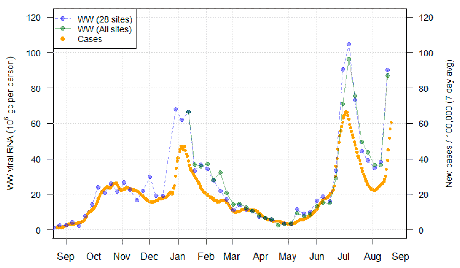
Figure 18 uses colours to map (i) the local authority average WW viral Covid-19 levels (in Mgc/p/d) over the two-week period from 7th August to 20th August, and (ii) the change in viral Covid-19 levels compared to the previous two-week period 24th July to 6th August. This shows that the rise has been greatest in the central belt and the south.
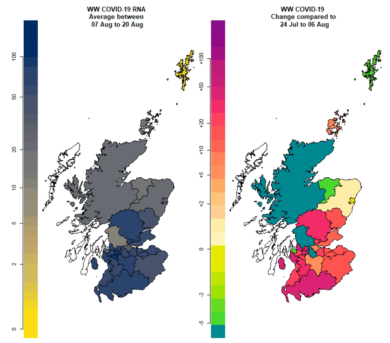
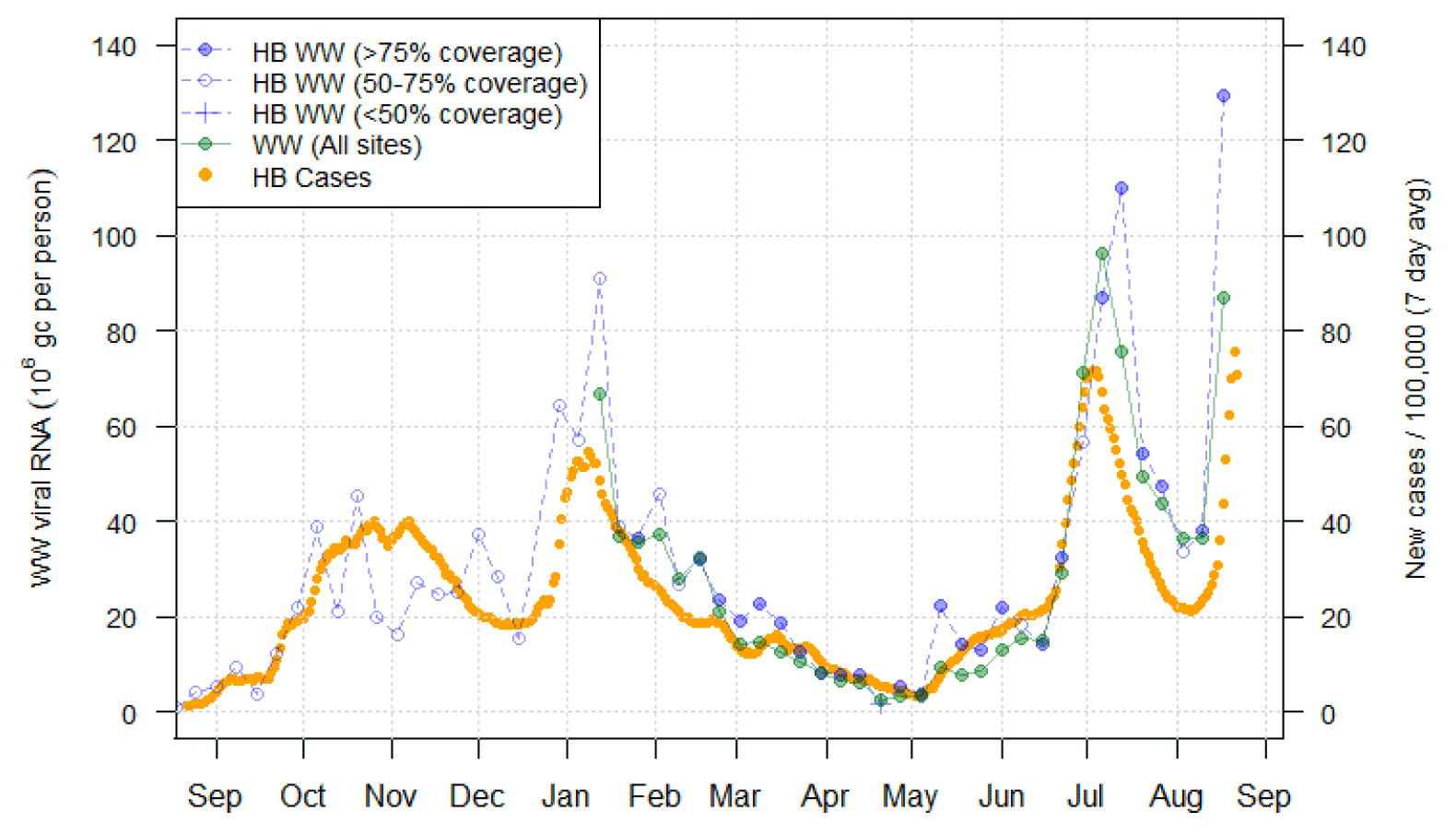
The increase in both WW Covid-19 concentrations and cases is especially marked in the area covered by the NHS Greater Glasgow and Clyde health board (Figure 19), where the most recent WW measurements at the sites at Dalmuir, Shieldhall, Dalmarnock and Paisley all show a sharp rise. However, increases are also starting to appear in other parts of Scotland, for example at Nigg in Aberdeen (Figure 20).
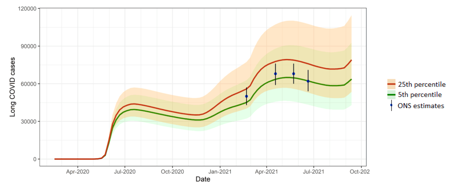
What estimates do we have of the number of people experiencing long Covid symptoms?
The Scottish Government is modelling the number of people likely to experience long Covid symptoms. This has been projected to estimate long Covid rates in the future, based on Scottish Government medium term projection modelling, as set out in Figure 21.
This modelling estimates that at 12th September 2021 between 43,000 (0.8% of the population) and 115,000 (2.1%) people are projected to experience symptoms for 12 weeks or more after their first suspected Covid infection in Scotland. This is an increase in the upper limit since last week.
These are preliminary results, further data on rates of long Covid and associated syndromes as research emerges are required.
What next?
The modelled estimates of the numbers of new cases and infectious people will continue to be provided as measures of the epidemic as a whole, along with measures of the current point in the epidemic such as Rt and the growth rate. Further information can be found at https://www.gov.scot/coronavirus-covid-19.
We may report on exceedance in future weeks when the background levels of Covid-19 reduces so that it can be useful in identifying outbreaks.