Coronavirus (COVID-19): modelling the epidemic (issue no.99)
Latest findings in modelling the COVID-19 epidemic in Scotland, both in terms of the spread of the disease through the population (epidemiological modelling) and of the demands it will place on the system, for example in terms of health care requirement.
Technical Annex
Epidemiology is the study of how diseases spread within populations. One way we do this is using our best understanding of the way the infection is passed on and how it affects people who catch it to create mathematical simulations. Because people who catch Covid-19 have a relatively long period in which they can pass it on to others before they begin to have symptoms, and the majority of people infected with the virus will experience mild symptoms, this "epidemiological modelling" provides insights into the epidemic that cannot easily be measured through testing e.g. of those with symptoms, as it estimates the total number of new daily infections and infectious people, including those who are asymptomatic or have mild symptoms.
Modelling also allows us to make short-term forecasts of what may happen with a degree of uncertainty. These can be used in health care and other planning. The modelling in this research findings is undertaken using different types of data which going forward aims to both model the progress of the epidemic in Scotland and provide early indications of where any changes are taking place.
The delivery of the vaccination programme will offer protection against severe disease and death. The modelling includes assumptions about compliance with restrictions and vaccine take-up. Work is still ongoing to understand how many vaccinated people might still spread the virus if infected. As Covid-19 is a new disease there remain uncertainties associated with vaccine effectiveness. Furthermore, there is a risk that new variants emerge for which immunisation is less effective.
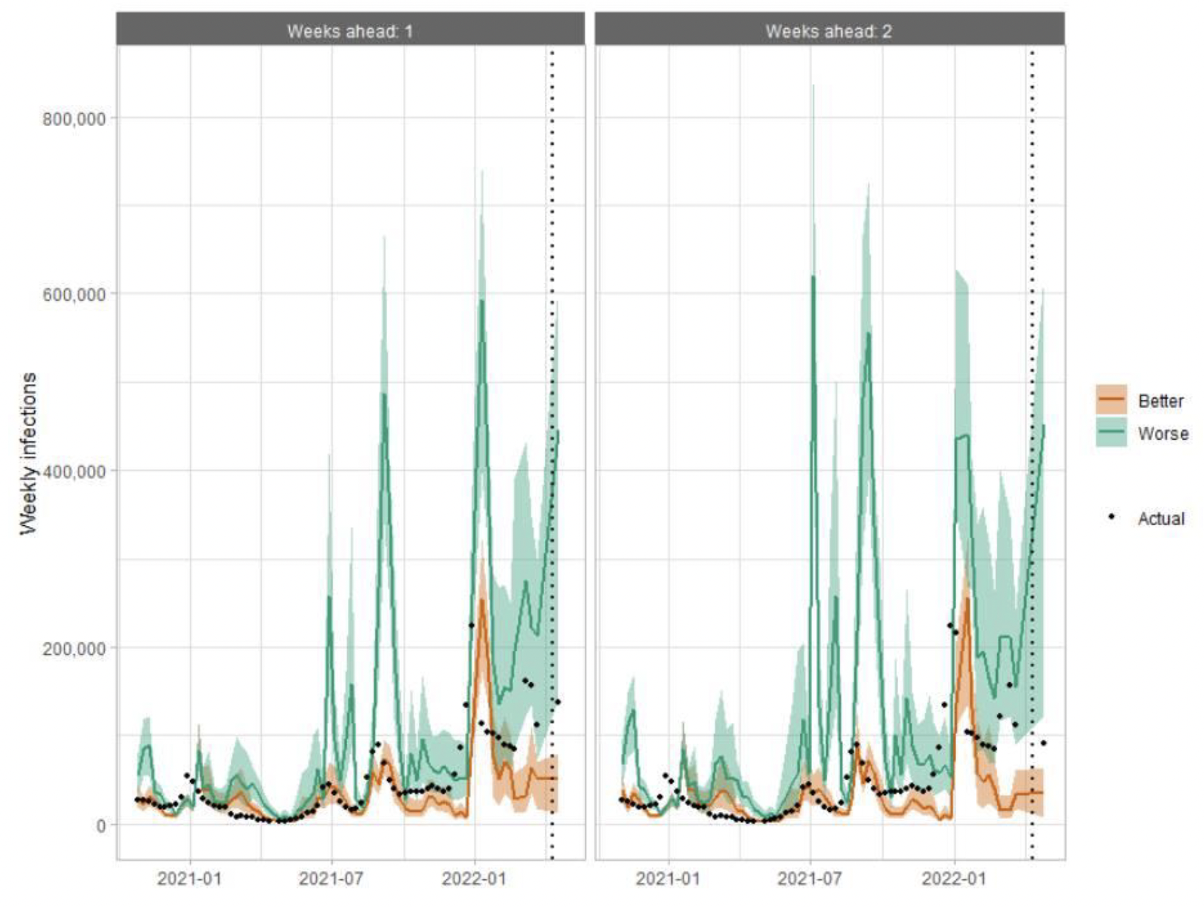
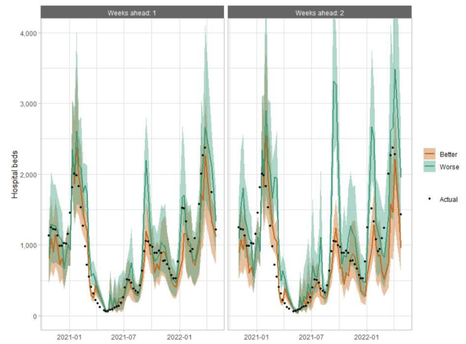
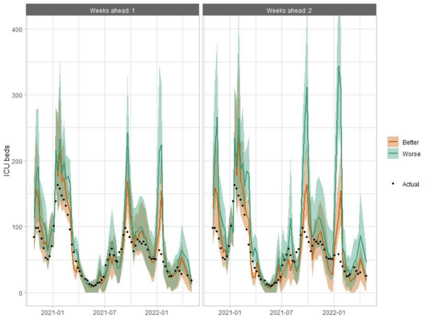
How the modelling compares to the real data as it emerges
The following charts show the history of our modelling projections in comparison to estimates of the actual data. The infections projections were largely accurate from mid-January 2021 until mid-December 2021, from which point the projections have underestimated the number of infections, due to the unforeseen effects of the Omicron variant. The same is true for the hospital beds projections, however the ICU beds projections have overestimated the actual figures since mid-December 2021, due to the lower severity of Omicron.
Hospital bed projections have generally been more precise than infections estimates due to being partially based on already known information about numbers of current infections, and number of people already in hospital. The projections are for number of people in hospital due to Covid-19, which is slightly different to the actuals, which are number of people in hospital within 28 days of a positive Covid-19 test.
As with hospital beds, ICU bed projections have generally been more precise than infections. The projections are for number of people in ICU due to Covid-19. The actuals are number of people in ICU within 28 days of a positive Covid-19 test up to 20 January 2021, after which they include people in ICU over the 28 day limit.
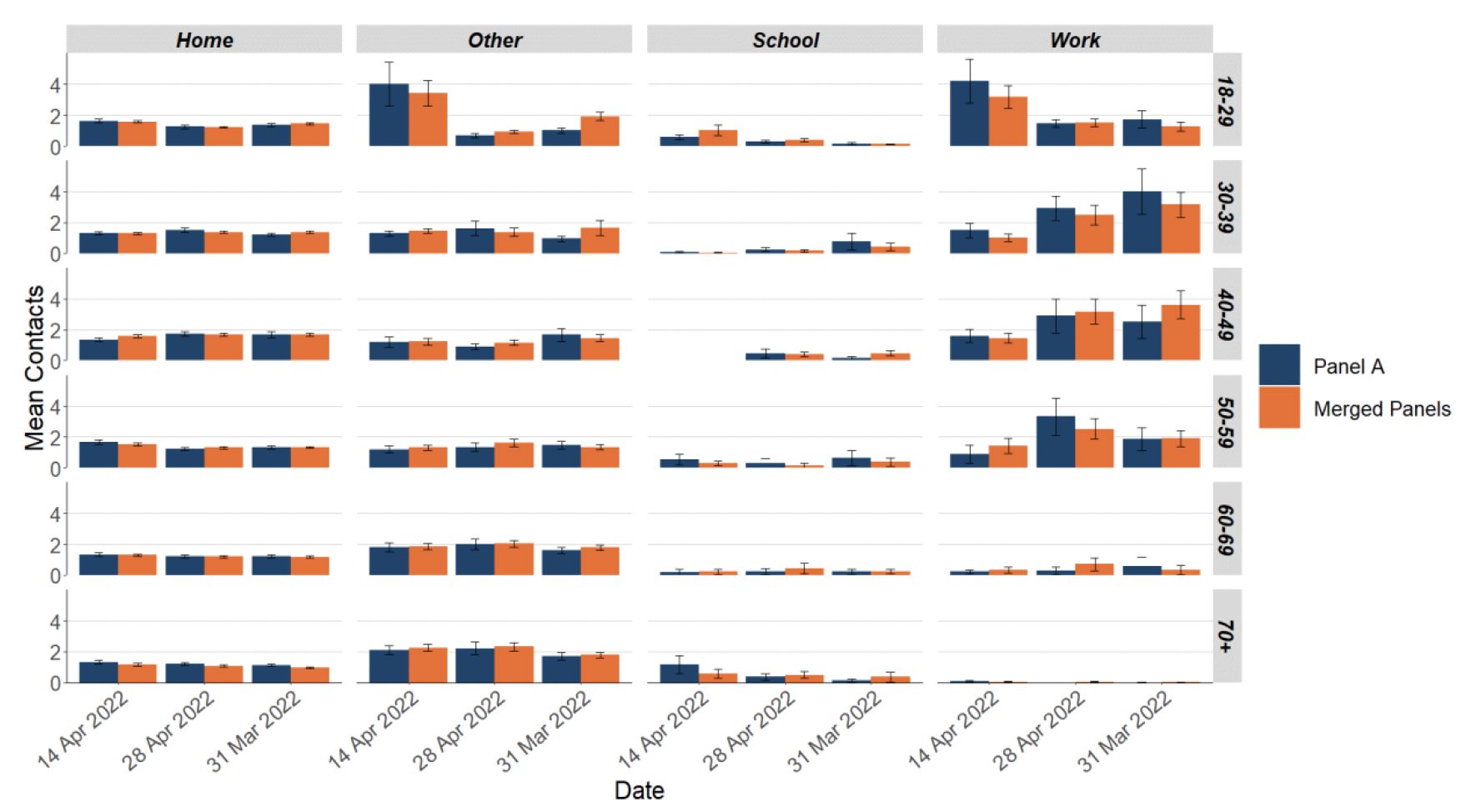
How has the reporting of the Scottish Contact Survey changed?
Following the change in publication frequency to fortnightly, panels A and B of the Scottish Contact Survey have been merged into one panel and surveys are now run fortnightly. There has been a short transition period where only panel A results were reported (issue numbers 97 and 98) and monitoring of the merged panels took place.
Figure 26 shows that the mean contacts for the merged panels (A and B) are similar to the mean contacts for panel A as previously reported and fit within the confidence intervals.

Breaking down the contacts into settings shows that equivalent results are reported for panel A compared to the merged panels across age groups as shown in Figure 27.
What levels of Covid-19 are indicated by wastewater data?
Table 2 provides population weighted daily averages for normalised WW Covid-19 levels in the weeks ending 3rd May and 10th May 2022, with no estimate for error. This is given in Million gene copies per person per day. Coverage is given as percentage of inhabitants in each local authority covered by a wastewater Covid‑19 sampling site delivering data during this period[16].
| Local Authority (LA) | w/e 3rd May | w/e 10th May | Coverage |
|---|---|---|---|
| Aberdeen City | 56 | 53 | 99% |
| Aberdeenshire | 76 | 72 | 46% |
| Angus | 33 | 62 | 68% |
| Argyll and Bute | – | 65 | 23% |
| City of Edinburgh | 65 | 165 | 98% |
| Clackmannanshire | 38 | 46 | 70% |
| Dumfries and Galloway | 42 | 41 | 38% |
| Dundee City | 36 | 75 | 100% |
| East Ayrshire | 140 | 101 | 69% |
| East Dunbartonshire | 96 | 115 | 99% |
| East Lothian | 69 | 149 | 65% |
| East Renfrewshire | 89 | 69 | 95% |
| Falkirk | 42 | 80 | 96% |
| Fife | 58 | 53 | 75% |
| Glasgow City | 80 | 71 | 98% |
| Highland | 54 | 90 | 44% |
| Inverclyde | 49 | 108 | 98% |
| Midlothian | 65 | 150 | 88% |
| Moray | 75 | 85 | 70% |
| Na h-Eileanan Siar | 62 | – | 0% |
| North Ayrshire | 128 | 74 | 92% |
| North Lanarkshire | 110 | 58 | 95% |
| Orkney Islands | – | 78 | 34% |
| Perth and Kinross | 61 | 94 | 45% |
| Renfrewshire | 62 | 67 | 97% |
| Scottish Borders | 124 | 38 | 40% |
| Shetland Islands | – | 10 | 29% |
| South Ayrshire | 145 | 83 | 88% |
| South Lanarkshire | 81 | 69 | 87% |
| Stirling | – | 37 | 63% |
| West Dunbartonshire | 246 | 57 | 98% |
| West Lothian | 26 | 74 | 95% |
Contact
There is a problem
Thanks for your feedback