Coronavirus (COVID-19): modelling the epidemic (Issue No. 64)
Latest findings in modelling the COVID-19 epidemic in Scotland, both in terms of the spread of the disease through the population (epidemiological modelling) and of the demands it will place on the system, for example in terms of health care requirement
Coronavirus (COVID-19): modelling the epidemic in Scotland (Issue No. 64)
Background
This is a report on the Scottish Government modelling of the spread and level of Covid-19. This updates the previous publication on modelling of Covid-19 in Scotland published on 5th August 2021. The estimates in this document help the Scottish Government, the health service and the wider public sector plan and put into place what is needed to keep us safe and treat people who have the virus.
This edition of the research findings focuses on the epidemic as a whole, looking at estimates of R, growth rate and incidence as well as local measures of change in the epidemic.
In Scotland, the modelled estimate for R is between 0.7 and 0.9, with the growth rate between -4% and -1%, based on the period up to 9th August.
The number of new cases in Scotland has been declining since the recent peak in early July (when there were over 400 per hundred thousand people). The estimate of R remains below 1. Hospital admissions have been declining slowly since mid-July, with ICU admissions also continuing to decline.
R is an indicator that lags by two to three weeks and therefore should not be expected to reflect recent fluctuations, such as the small increase in reported cases that has been seen in the last week.
Key Points
- The reproduction rate R in Scotland is currently estimated as being between 0.7 and 0.9, based on the period up to 9th August. This is unchanged since last week.
- The number of new daily infections for Scotland is estimated as being between 49 and 85, per 100,000 people, based on the period up to 9th August.
- The growth rate for Scotland is currently estimated as between -4% and -1%, based on the period up to 9th August.
- Average contacts have decreased by approximately 7% in the last two weeks (comparing surveys pertaining to 15th July - 21st July and 29th July - 4th August) with a current level of 3.7 daily contacts.
- Contacts within the work setting have increased by approximately 11% whereas contacts within the other setting (contacts outside of the work, school and home) have decreased by 16% compared to two weeks prior.
- Mean contacts across all age groups have shown a decrease in comparison to two weeks prior with the exception of those aged between 60-69 who have reported an increase of 12%.
- The proportion of contacts reported to have been indoors only has decreased within the last two weeks, whereas the proportion of contacts occurring outside only has shown an increase over the same period.
- Hospitalisations have been declining from a peak in mid-July. Potential future changes in hospital occupancy and intensive care use depend on both current infection levels and the impact of the recent relaxations of measures which will take a few weeks to become apparent.
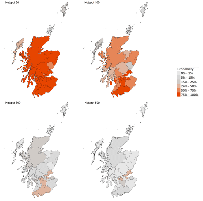
- Modelled rates of positive tests per 100K using data to 9th August indicate that, for the week commencing 22nd August 2021, there are 27 local authorities which are expected to exceed 50 cases per 100k with at least 75% probability.
- Of these, eight local authorities are expected to exceed 100 cases per 100k with at least 75% probability. These are Dumfries & Galloway, Fife, Glasgow, Midlothian, North Ayrshire, North Lanarkshire, South Lanarkshire and West Lothian.
- There are no local authorities expected to exceed 300 cases per 100k with at least 75% probability.
- Nationwide, wastewater Covid-19 concentrations have fallen by around 20% from last week. However regional variations exist.
- In both North and South Lanarkshire, wastewater Covid-19 levels remain higher than would be expected given the number of cases.
- The Scottish Government is modelling the number of people likely to experience long Covid symptoms. This modelling estimates that on 29th August 2021 between 0.7% and 1.9% of the population are projected to experience symptoms for 12 weeks or more after their first suspected Covid infection in Scotland.
Recent cases
Figure 1 shows the number of cases reported in Scotland between May and August 2021. The vertical dashed lines indicate the cut off points for each of the modelling inputs; after these dates, the number of cases is not incorporated into the outputs.
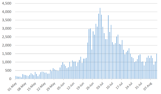
This report covers the period up to 4th August for contact patterns (indicated by dashed line 1). Wastewater data is provided to 6th August (dashed line 2). The estimates of R, incidence, growth rates, the modelled rates of positive tests per 100k, the medium term projections by the Scottish Government of infections, hospitalisations and ICU beds, and the long Covid analysis use data to 9th August (dashed line 3).
Overview of Scottish Government Modelling
Modelling outputs are provided here on the current epidemic in Scotland as a whole, based on a range of methods. Because it takes a little over three weeks on average for a person who catches Covid-19 to show symptoms, become sick, and either die or recover, there is a time lag in what our model can tell us about any re-emergence of the epidemic and where in Scotland this might occur.
However modelling of Covid-19 deaths is an important measure of where Scotland lies in its epidemic as a whole. In addition, the modelling groups that feed into the UK Health Security Agency (UKHSA) consensus[1] use a range of other data along with deaths in their estimates of R and the growth rate. These outputs are provided in this research findings. The type of data used in each model to estimate R is highlighted in Figure 2.
We use the Scottish Contact Survey (SCS) to inform a modelling technique based on the number of contacts between people. Over time, a greater proportion of the population will be vaccinated. This is likely to impact contact patterns and will become a greater part of the analysis going forwards.
The logistical model utilises results from the epidemiological modelling, principally the number of new infections. The results are split down by age group, and the model is used to give a projection of the number of people that will go to hospital, and potentially to ICU. This will continue to be based on both what we know about how different age groups are affected by the disease and the vaccination rate for those groups.
What the modelling tells us about the epidemic as a whole
The R value and growth rates are estimated by several independent modelling groups based in universities, Public Health England (PHE) and the Joint Biosecurity Centre. Estimates are considered, discussed and combined at the Epidemiology Modelling Review Group (EMRG), which sits within the UKHSA.
R is an indicator that lags by two to three weeks[2] and therefore should not be expected to reflect recent fluctuations, such as the small increase in reported cases that has been seen in the last week.
UKHSA's consensus view across these methods as of 11th August, using data to 9th August, was that the value of R in Scotland was between 0.7 and 0.9 (see Figure 2)[3].
This week the Scottish Government presented two outputs to EMRG. The first uses confirmed cases as published by Public Health Scotland (PHS). The second uses instead wastewater data to estimate the number of cases. Both outputs are shown in Figures 2 and 3.
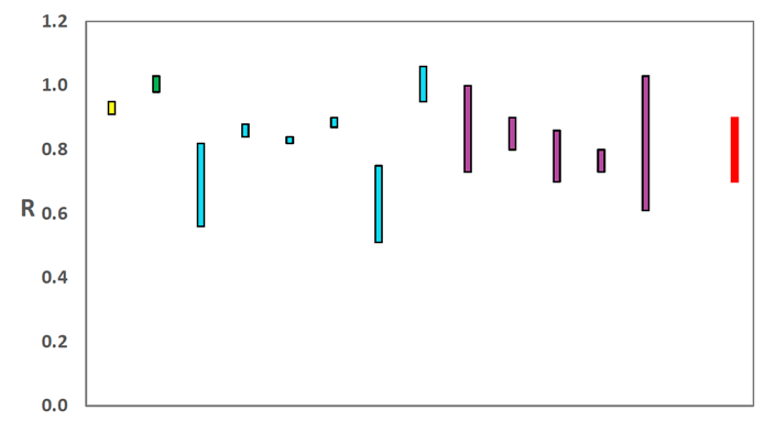
Source: EMRG
The various groups which report to the EMRG use different sources of data in their models to produce estimates of incidence (Figure 3). UKHSA's consensus view across these methods, using data to
9th August, was that the incidence of new daily infections in Scotland was between 49 and 85 new infections per 100,000. This equates to between 2,700 and 4,600 people becoming infected each day in Scotland.
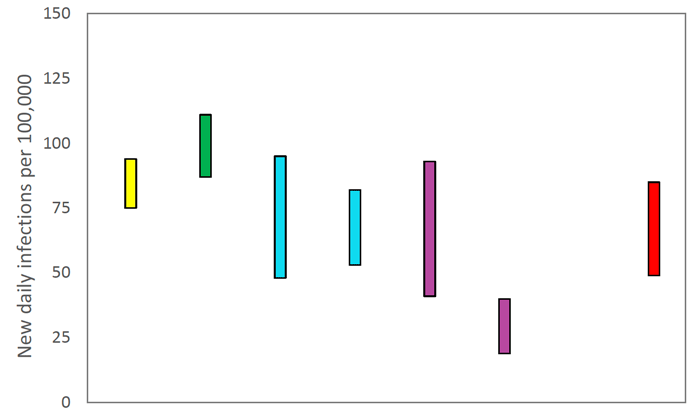
Source: EMRG
The consensus from UKHSA for this week is that the growth rate in Scotland is between -4% and -1% per day using data to 9th August. The lower and upper limits have decreased since last week.
What we know about how people's contact patterns have changed
Average contacts have decreased by approximately 7% in the last two weeks (comparing surveys pertaining to 15th July - 21st July and 29th July - 4th August) with a current level of 3.7 daily contacts as seen in Figure 4. Contacts within the work setting have increased by approximately 11% whereas contacts within the other setting (contacts outside of the work, school and home) have decreased by 16% compared to two weeks prior.
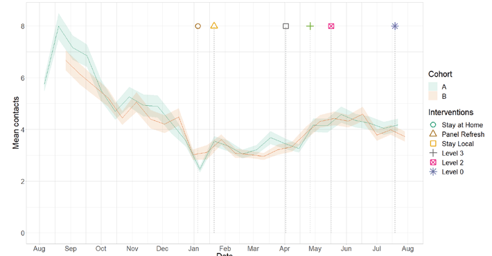
Figure 5 shows how contacts change across age group and setting. Mean contacts across all age groups have shown a decrease in comparison to two weeks prior with the exception of those aged between 60-69 who have reported an increase of 12%. Those aged 18-29 have shown the biggest decrease, by 22%, which is largely driven by a reduction in contacts within the other setting.
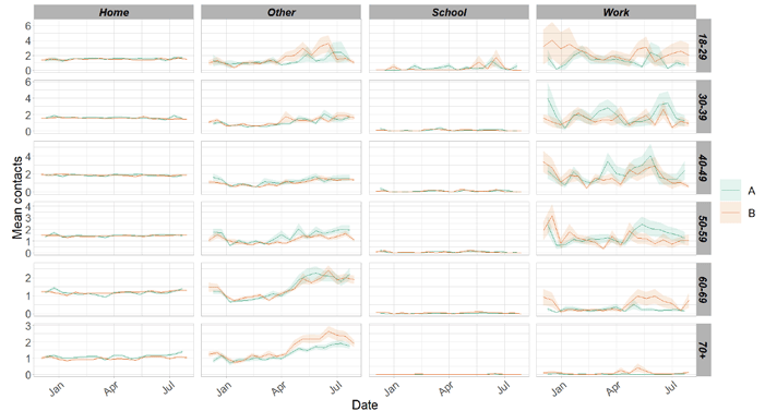
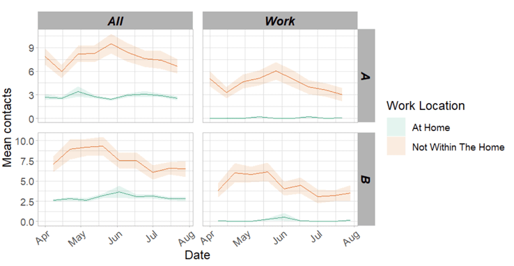
Figure 6 shows the difference in contacts between those who work from home compared to those who have a workplace outside of the home. This shows that those who do not work from home have higher and more variable contacts than those who work from home. This also shows that contacts had within the work place make up the majority of overall contacts for those who do not work at home, therefore changes in work contacts has proportionate impact on overall contacts.
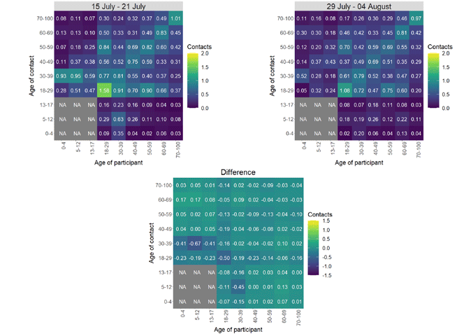
The heatmaps in Figure 7 show the mean overall contacts between age groups for the weeks relating to 15th July - 21st July and 29th July - 4th August and the difference between these periods. The biggest decrease in interactions in the last two weeks is seen between those aged 30-39 with individuals under 18 and also between those aged 18-29 with each other.
As seen in Figure 8, the proportion of participants visiting different locations remains at similar levels across the majority of locations with those visiting a pub or restaurant reporting the highest increase from 41% to 44% in the last two weeks.
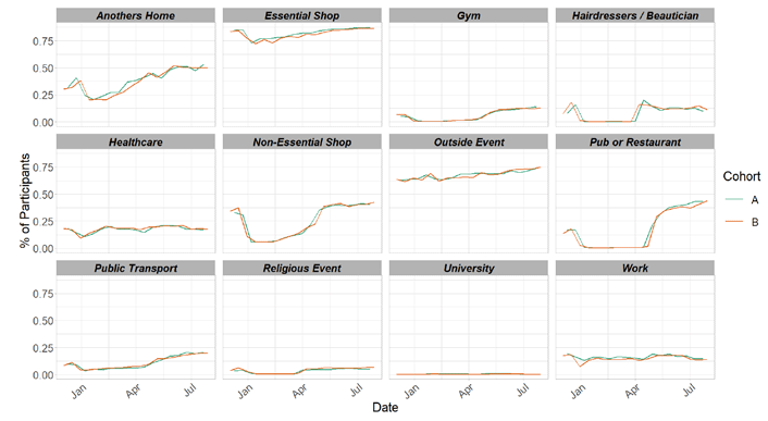
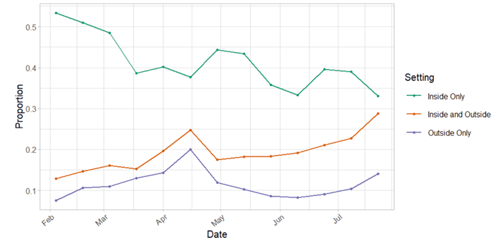
Figure 9 shows the proportion of participants that reported contacts had indoors and outdoors for contacts individually reported for panel B. A contact can be recorded as both indoor and outdoor. The graph also shows contacts reported as outside only and indoor only. The proportion of contacts reported to have been indoors only has decreased within the last two weeks whereas the proportion of contacts occurring outside only has shown an increase over the same period.
Vaccinations and contacts patterns
From Figure 10, it can be seen that the older age groups have fewer contacts and more vaccinations than the youngest age group, they also have the lowest weekly case number comparatively to the younger age groups. Despite that, they have similar, or higher for the oldest age group, weekly hospitalization levels and deaths to that seen with the younger age groups.
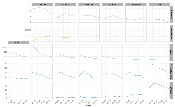
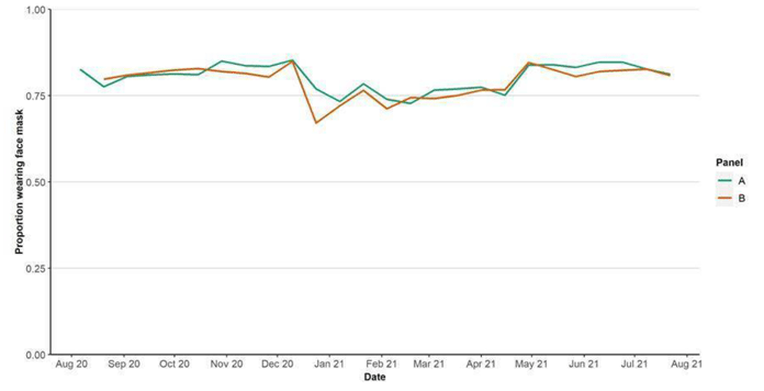
Figure 11 shows the estimated proportion of people wearing a face covering where they have had at least one contact outside of the home. Levels remained consistent up until the Christmas period when there was a decrease from approximately 85% to 67% in the proportion wearing a face covering. Following this, the proportion of people wearing face coverings increased to 84% by the end of April and has remained relatively consistent since.
What the modelling tells us about estimated infections as well as Hospital and ICU bed demand
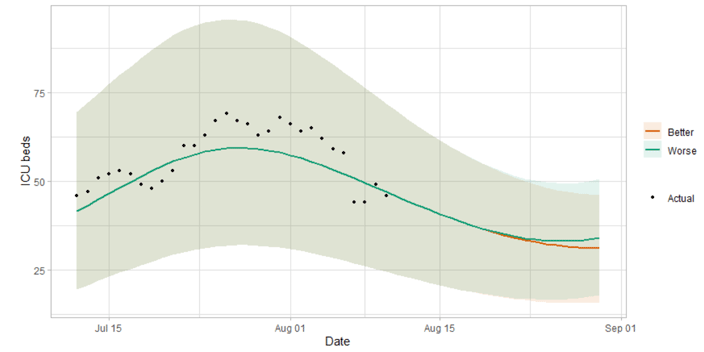
The Scottish Government assesses the impact of Covid-19 on the NHS in the next few weeks in terms of estimated number of infections. Figure 12 shows two projections over the three weeks to 29th August.
'Worse' assumes a behaviour change over a two month period following the changes in restrictions on the 9th of August. 'Better' assumes this behavioural change happens more gradually over a five to six month period leading to lower transmission[7].
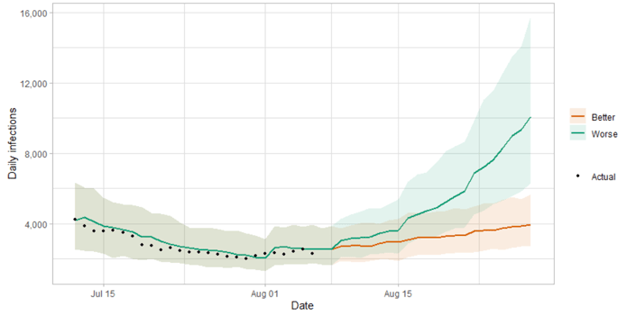
There is uncertainty as to whether infections will increase in coming weeks, and if so by how much. This will drive whether hospital beds and intensive care beds also continue to rise.
Figure 13 shows the impact of the projections on the number of people in hospital. The modelling includes all hospital stays, whereas the actuals only include stays up to 28 days duration that are linked to Covid-19.
Hospital and ICU occupancy from the June increase in cases are falling, and the future increase or decrease in hospital occupancy and intensive care use is highly uncertain, and depends on both current infection levels and the impact of the relaxation of restrictions.
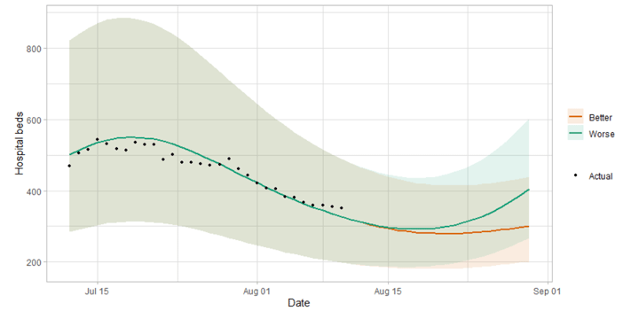
Figure 14 shows the impact of the projection on ICU bed demand.
A comparison of the actual data against historical projections is included in the Technical Annex.
What the modelling tells us about projections of hospitalisations and deaths in the medium term
SPI-M produces projections of the epidemic[10] (Figure 15), combining estimates from several independent models (including the Scottish Government's logistics modelling, as shown in Figures 12-14). These projections are not forecasts or predictions. They represent a scenario in which the trajectory of the epidemic continues to follow the trends that were seen in the data up to 9th August and do not include the effects of any future policy or behavioural changes.
The delay between infection, developing symptoms, the need for hospital care, and death means they cannot fully reflect the impact of behaviour changes in the two to three weeks prior to 9th August. Projecting forwards is difficult when the numbers of admissions and deaths fall to very low levels, which can result in wider credible intervals reflecting greater uncertainty. The interquartile range can be used, with judgement, as the projection from which estimates may be derived until the 29th August, albeit at lower confidence than the 90% credible interval.
These projections include the potential impact of vaccinations over the next few weeks. Modelling groups have used their expert judgement and evidence from Public Health England, Scottish Universities & Public Health Scotland, and other published efficacy studies when making assumptions about vaccine effectiveness.
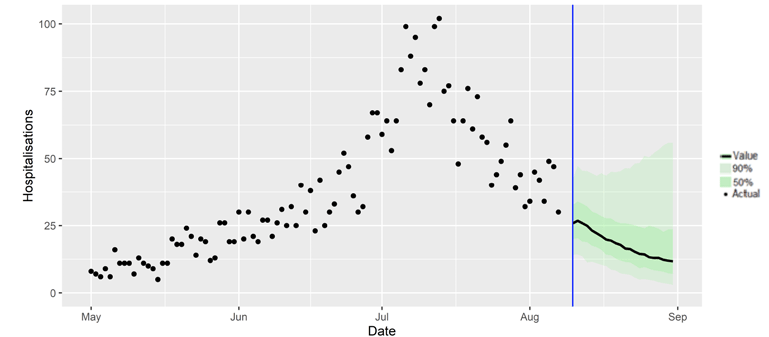
We are not projecting the numbers of people expected to die with Covid‑19 this week. The number of daily deaths has fallen to very low levels.
What we know about which local authorities are likely to experience high levels of Covid-19 in two weeks' time
We continue to use modelling based on Covid-19 cases and deaths using data to 19th July from several academic groups to give us an indication of whether a local authority is likely to experience high levels of Covid-19 in the future. This has been compiled via SPI-M into a consensus. In this an area is defined as a hotspot if the two week prediction of cases (positive tests) per 100K population is predicted to exceed a threshold, e.g. 500 cases.
Modelled rates of positive tests per 100K using data to 9th August (Figure 16) indicate that, for the week commencing 22nd August 2021, there are 27 local authorities which are expected to exceed 50 cases per 100k with at least 75% probability[11].
Of these, eight local authorities are expected to exceed 100 cases per 100k with at least 75% probability. These are Dumfries & Galloway, Fife, Glasgow, Midlothian, North Ayrshire, North Lanarkshire, South Lanarkshire and West Lothian.
There are no local authorities expected to exceed 300 cases per 100k with at least 75% probability[12].
What can analysis of wastewater samples tell us about local outbreaks of Covid-19 infection?
Levels of Covid-19 RNA in wastewater collected at a number of sites around Scotland are adjusted for population and local changes in intake flow rate and compared to 7-day average daily new case rates derived from Local Authority and Neighbourhood (Intermediate Zone) level aggregate data. See Technical Annex in Issue 34 of these Research Findings for the methodology.
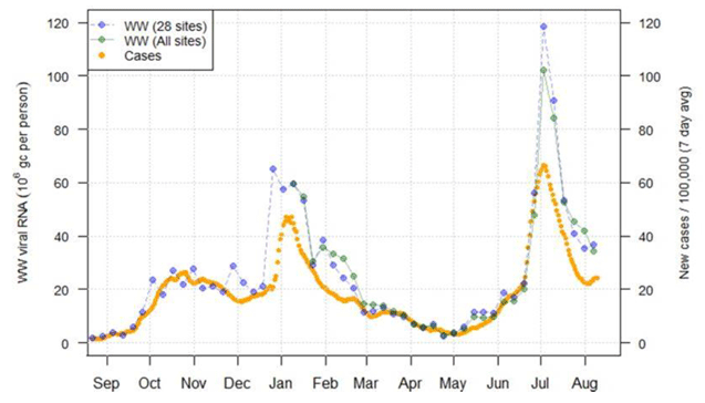
Nationwide, the latest levels of wastewater (WW) Covid-19 to 10th August averaged around 34 million gene copies per person per day (Mgc/p/d), with some suggestions that the decline has slowed and may be reaching a plateau. Levels in Lanarkshire remain high.
Figure 17 shows the national weekly aggregate for the original 28 sites (sampled from August 2020, in blue) and, from January 2021, the aggregate for the full set of 110 sampled sites (in green), with a small number of unrealistically large outliers excluded. Nationally WW Covid-19 concentrations have continued to decline slowly from the levels reported last week. Compared to levels seen previously during the pandemic, the current values remain in a similar range to that seen in late January/early February. WW viral levels are also high relative to case rates compared to the usual relationship of 1 Mgc/p/d equalling approximately 1 new case per 100k inhabitants per day.
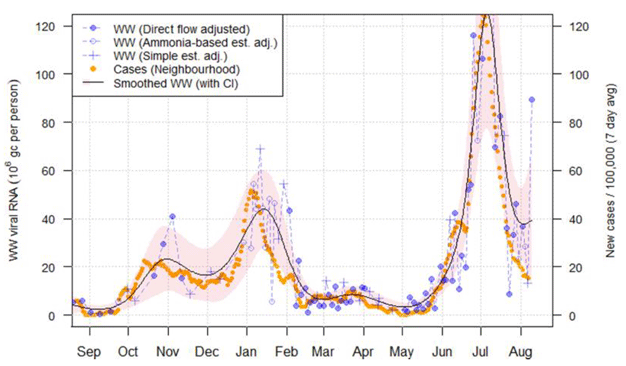
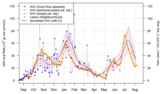
The larger sites all show a decline in WW Covid-19 from the peak in early July, but whereas at Hatton (Figure 18) and Seafield the timing of the peak largely coincided with that for cases, at Shieldhall (Figure 19), Nigg and Dalmuir the decline in WW Covid-19 has lagged behind the decline in cases. A recent high measurement was registered at Hatton, though further measurements are required to identify whether this shows a change in the trend.
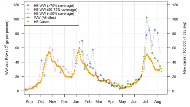
In NHS Lanarkshire (Figure 20) WW Covid-19 levels remain higher than would be expected given the number of cases. In South Lanarkshire, the level has declined from around 80 to about 50 Mgc/p/d.
The most recent measurement from Paisley in Renfrewshire is slightly higher than the one reported last week but still well below the peak reported in July. Peebles in the Borders has recorded two consecutive high WW measurements, counter to case records. Note that with the reduced number of samples measured, many smaller sites were not covered this week.
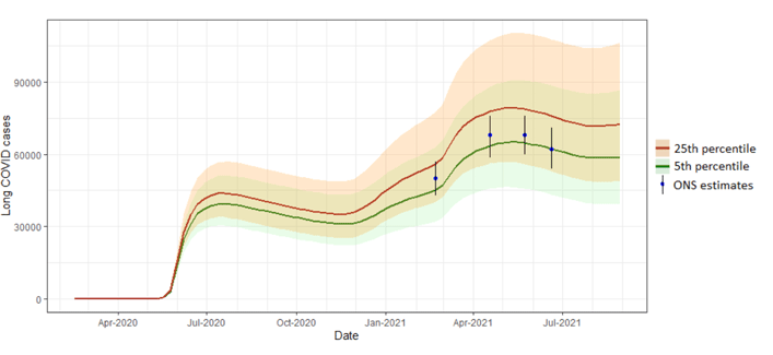
What estimates do we have of the number of people experiencing long Covid symptoms?
The Scottish Government is modelling the number of people likely to experience long Covid symptoms. This has been projected to estimate long Covid rates in the future, based on Scottish Government medium term projection modelling, as set out in Figure 21.
This modelling estimates that at 29 August 2021 between 40,000 (0.7% of the population) and 106,000 (1.9%) people were projected to experience symptoms for 12 weeks or more after their first suspected Covid-19 infection in Scotland.
These are preliminary results, further data on rates of long Covid and associated syndromes as research emerges is required.
What next?
The modelled estimates of the numbers of new cases and infectious people will continue to be provided as measures of the epidemic as a whole, along with measures of the current point in the epidemic such as Rt and the growth rate. Further information can be found at Coronavirus in Scotland (gov.scot).
We may report on exceedance in future weeks when the background levels of Covid-19 reduces so that it can be useful in identifying outbreaks.