Coronavirus (COVID-19): modelling the epidemic (issue no. 48)
Latest findings in modelling the coronavirus epidemic in Scotland, both in terms of the spread of the disease through the population (epidemiological modelling) and of the demands it will place on the system, for example in terms of health care requirements.
Coronavirus (COVID-19): modelling the epidemic in Scotland (Issue No. 48)
Background
This is a report on the Scottish Government modelling of the spread and level of Covid-19. This updates the previous publication on modelling of Covid-19 in Scotland published on 15 April 2021. The estimates in this document help the Scottish Government, the health service and the wider public sector plan and put in place what is needed to keep us safe and treat people who have the virus.
This edition of the research findings focuses on the epidemic as a whole, looking at estimates of R, growth rate and incidence as well as local measures of change in the epidemic.
Key Points
- The reproduction rate R in Scotland is currently estimated as being between 0.7 and 0.9. The range limits are lower than last week.
- The number of new daily infections for Scotland is estimated as being between 4 and 18, per 100,000 people. The upper range limit is lower than last week.
- The growth rate for Scotland is currently estimated as being between -4% and -1%. The upper limit is lower than last week.
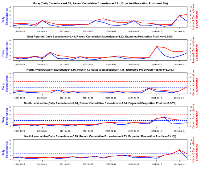
- There were 5 local authority areas which exceeded what would be expected at this stage in the epidemic between 13-19 April. Moray, East Ayrshire, North Ayrshire, South Lanarkshire and North Lanarkshire were areas of higher risk of transmission.
- Average contacts are higher than seen during the lockdown period (averaging around 3 daily contacts) and have increased slightly in the last two weeks, to a current level of 3.3 daily contacts.
- Contacts within the work and school setting have shown a decrease in the last two weeks, by 24% and 78% respectively, coinciding with spring holidays that commenced from 26th March.
- Contacts within the 'other' setting (contacts outside of the school, home or work settings) have increased by approximately 34%.
- All age groups have shown an increase in contacts with the exception of those aged between 40 and 59. This increase in contacts is driven largely by increased contacts within the 'other' setting.
- The proportion of people that have visited a beautician/salon[1] has increased from less than 1% to 16% whilst the proportion visiting a non-essential shop[2] increased from 13% to 19% in the last two weeks, coinciding with the recent easing of restrictions on 5th April.
- Hospital bed and ICU occupancy are projected to fall over the next few weeks, but these both may plateau or increase as a result of schools reopening and other relaxations of non-pharmaceutical interventions.
- Modelled rates per 100K indicate that for the week commencing 2 May 2021, no local authorities have at least a 75% probability of exceeding 50 cases. This is unchanged from last week.
- The overall level of wastewater Covid has remained at a similar level for the past two weeks. The number of new cases has been declining so the level of Covid in wastewater is slightly above the rate of new cases in terms of relative levels.
Overview of Scottish Government Modelling
Epidemiology is the study of how diseases spread within populations. One way we do this is using our best understanding of the way the infection is passed on and how it affects people who catch it to create mathematical simulations. Because people who catch Covid-19 have a relatively long period in which they can pass it on to others before they begin to have symptoms, and the majority of people infected with the virus will experience mild symptoms, this "epidemiological modelling" provides insights into the epidemic that cannot easily be measured through testing e.g. of those with symptoms, as it estimates the total number of new daily infections and infectious people, including those who are asymptomatic or have mild symptoms.
Modelling also allows us to make short-term forecasts of what may happen with a degree of uncertainty. These can be used in health care and other planning. The modelling in this research findings is undertaken using different types of data which going forward aims to both model the progress of the epidemic in Scotland and provide early indications of where any changes are taking place.
Modelling outputs are provided here on the current epidemic in Scotland as a whole, based on a range of methods. Because it takes a little over three weeks on average for a person who catches Covid-19 to show symptoms, become sick, and either die or recover, there is a time lag in what our model can tell us about any re-emergence of the epidemic and where in Scotland this might occur. However modelling of Covid-19 deaths is an important measure of where Scotland lies in its epidemic as a whole. In addition, the modelling groups which feed into the SAGE consensus use a range of other data along with deaths in their estimates of R and the growth rate. These outputs are provided in this research findings. The type of data used in each model to estimate R is highlighted in Figure 1.
We use the Scottish Contact Survey (SCS) to inform a modelling technique based on the number of contacts between people. Over time, a greater proportion of the population will be vaccinated. This is likely to impact contact patterns and will become a greater part of the analysis going forwards.
The delivery of the vaccination programme will offer protection against severe disease and death. The modelling includes assumptions about compliance with restrictions and vaccine take-up. Work is still ongoing to understand how many vaccinated people might still spread the virus if infected. As Covid-19 is a new disease there remain uncertainties associated with vaccine effectiveness. Furthermore, there is a risk that new variants emerge for which immunisation is less effective.
The logistical model utilises results from the epidemiological modelling, principally the number of new infections. The results are split down by age group, and the model is used to give a projection of the number of people that will go to hospital, and potentially to ICU. This will continue to be based on both what we know about how different age groups are effected by the disease and the vaccination rate for those groups.
What the modelling tells us about the epidemic as a whole
The various groups which report to the Scientific Pandemic Influenza Group on Modelling (SPI-M) use different sources of data in their models (i.e. deaths, hospital admissions, cases) so their estimates of R are also based on these different methods. SAGE's consensus view across these methods, as of 21 April, was that the value of R in Scotland was between 0.7 and 0.9 (see Figure 1). The lower and upper limits have reduced from last week. Particular care should be taken when interpreting these estimates as they are based on low numbers of cases and deaths, and so should not be treated as robust enough to inform policy decisions alone.
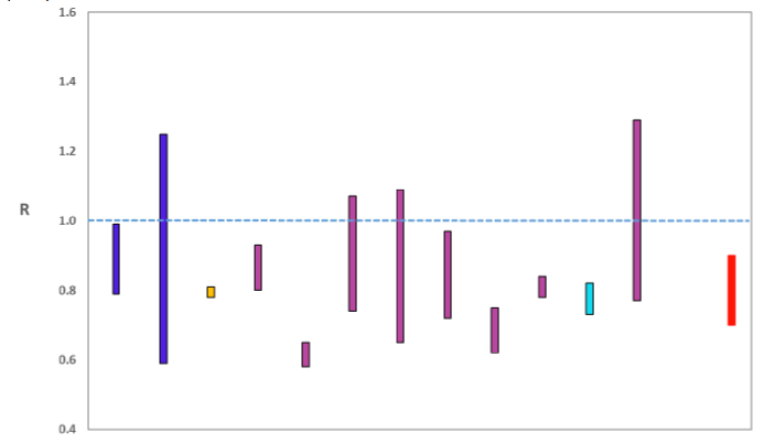
Source: Scientific Advisory Group for Emergencies (SAGE).
The various groups which report to the Scientific Pandemic Influenza Group on Modelling (SPI-M) use different sources of data in their models to produce estimates of incidence (Figure 2). The Scottish Government results this week have been computed using a platform called Epidemia (see Technical Annex in issue 37) which expands the Bayesian semi-mechanistic model which the Scottish Government runs. SPI-M's consensus view across these methods, as of 21 April, was that the incidence of new daily infections in Scotland was between 4 and 18 new infections per 100,000. The upper limit on the range is lower than last week. This equates to between 200 and 1,000 people becoming infected each day in Scotland.
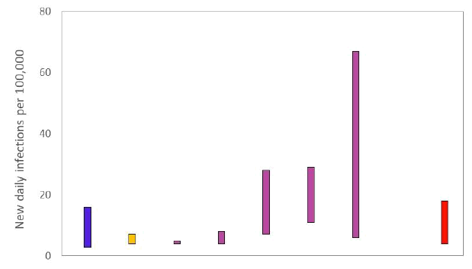
Source: Scientific Pandemic Influenza Group on Modelling (SPI-M).
The consensus from SAGE for this week is that the growth rate in Scotland is between -4% and -1% per day. The upper limit on the range is reduced from the estimate at 14 April.
What we know about how people's contact patterns have changed
Average contacts are higher than seen during the lockdown period (averaging around 3 daily contacts) and have increased slightly in the last two weeks, with a current level of 3.3 daily contacts as seen in Figure 3. Contacts within the work and school setting have shown a decrease in the last two weeks by 24% and 78% respectively, coinciding with spring holidays that commenced from 26th March. In contrast, mean contacts within the 'other' setting (contacts outside of the school, home or work settings) have increased by approximately 34% over the same period.
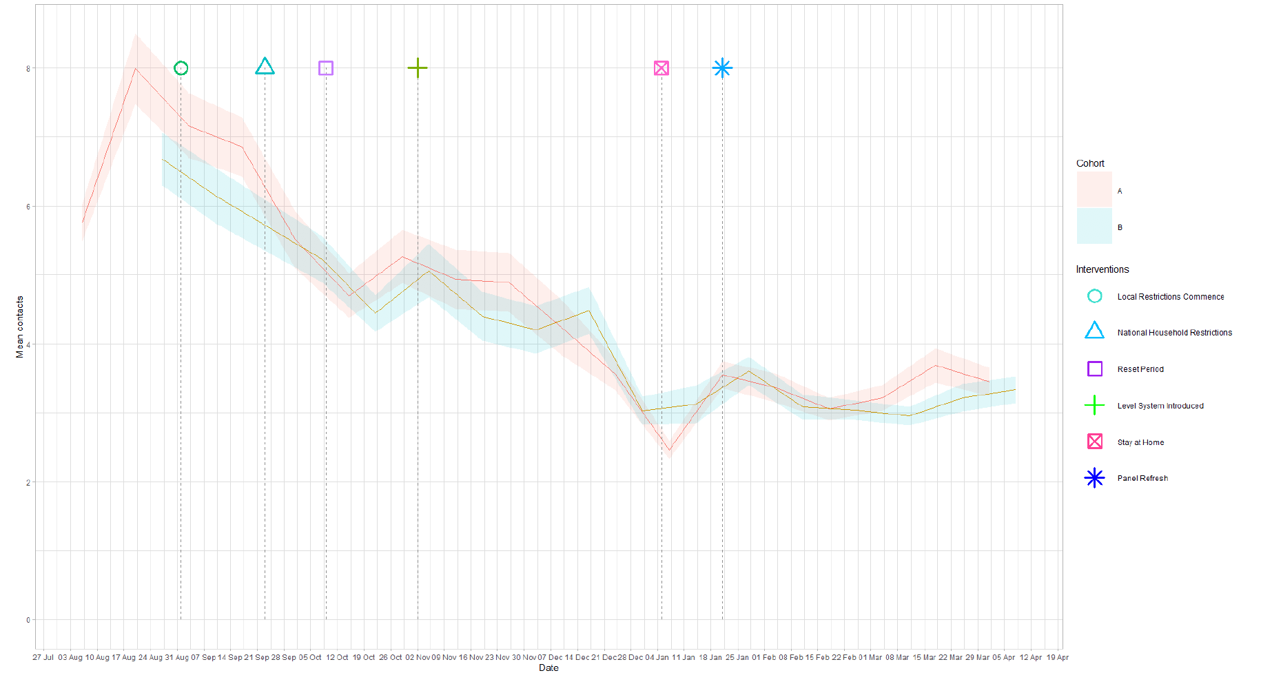
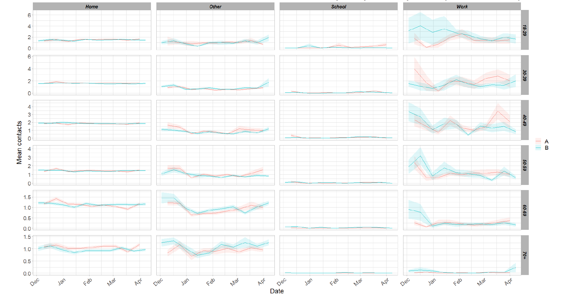
Figure 4 shows how contacts change across age group and setting. All age groups have shown an increase in contacts with the exception of those aged between 40 and 59. The increase in contacts is driven largely by increased contacts within the 'other' setting (contacts outside of the home, school or work) while the overall decrease for those aged between 40 and 59 is influenced by a reduction in contacts within the work and school setting.
The heatmaps in Figure 5 show the mean overall contacts between age groups for the weeks relating to 25th – 31st March and 8th – 14th April, and the difference between these periods. The 30 - 59 age group has shown a decrease in interactions with individuals under 18, whereas those aged 18 - 29 have increased their interactions with this age group.
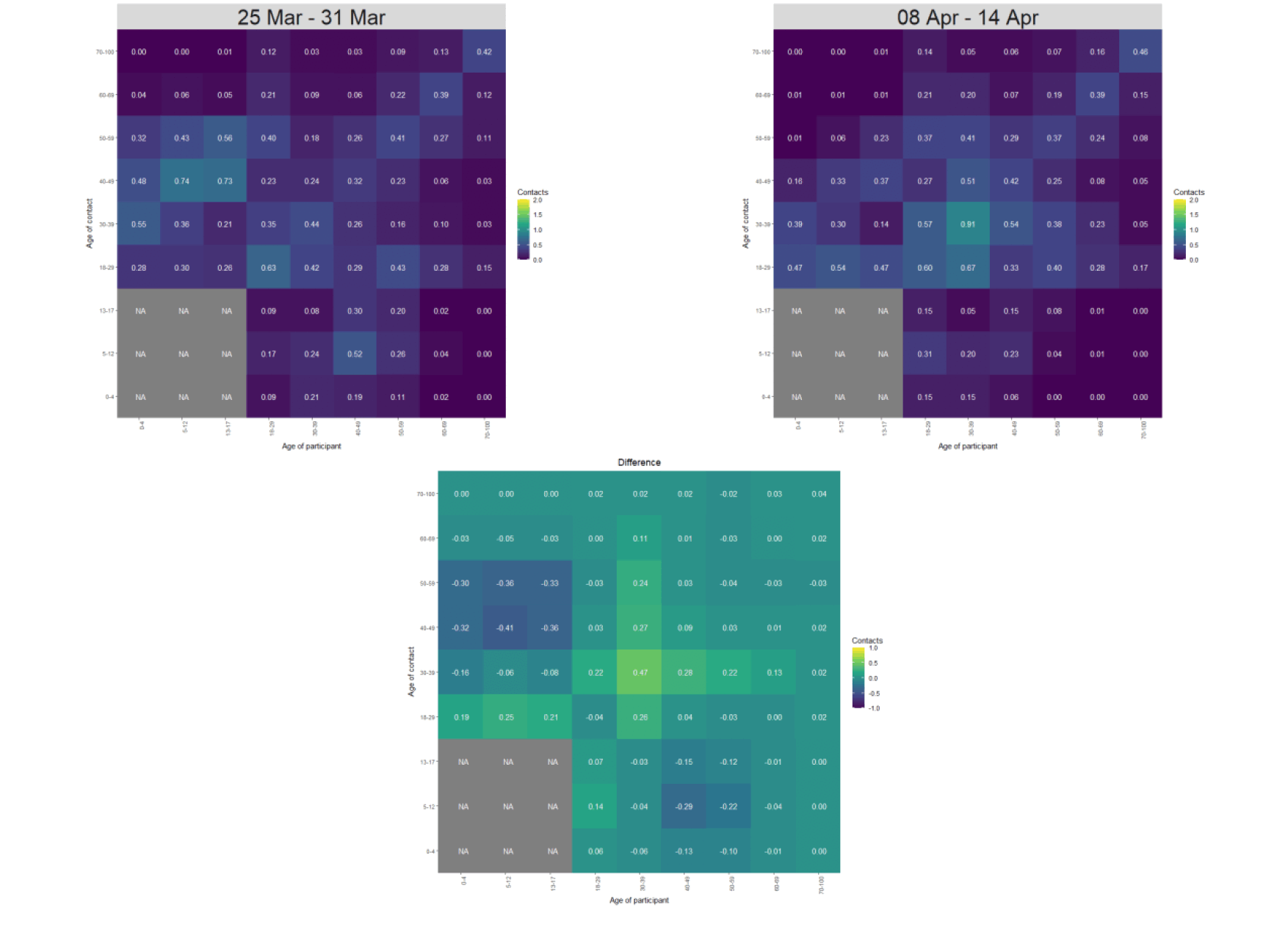
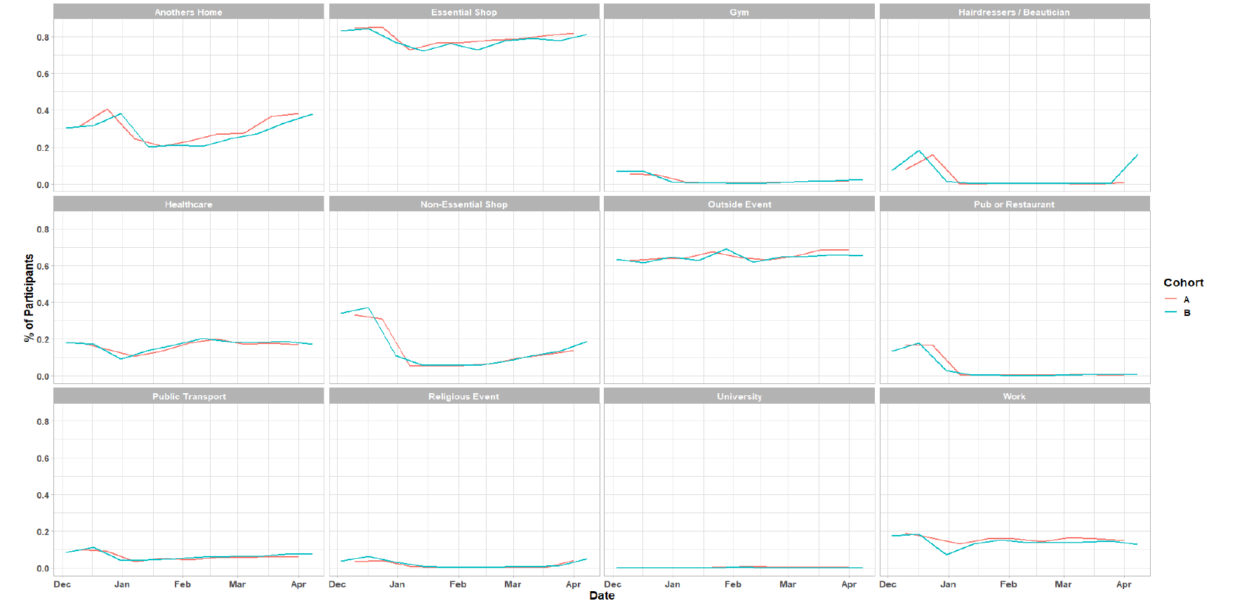
Figure 6 shows the proportion of participants visiting different locations. The biggest increase is seen in the number of individuals visiting a beautician/salon, increasing from less than 1% to 16 % followed by visiting a non-essential shop, increasing from 13% to 19% in the last two weeks. This coincides with the recent easing of restrictions on 5th April to include hairdressers, barbers, garden centres, some homeware stores and non-essential click and collect. Other services in these categories are yet to open. Increases are also seen in the number of participants who have visited another's home. This has increased from 33% to 38% in the most recent survey.
Vaccinations and contacts patterns
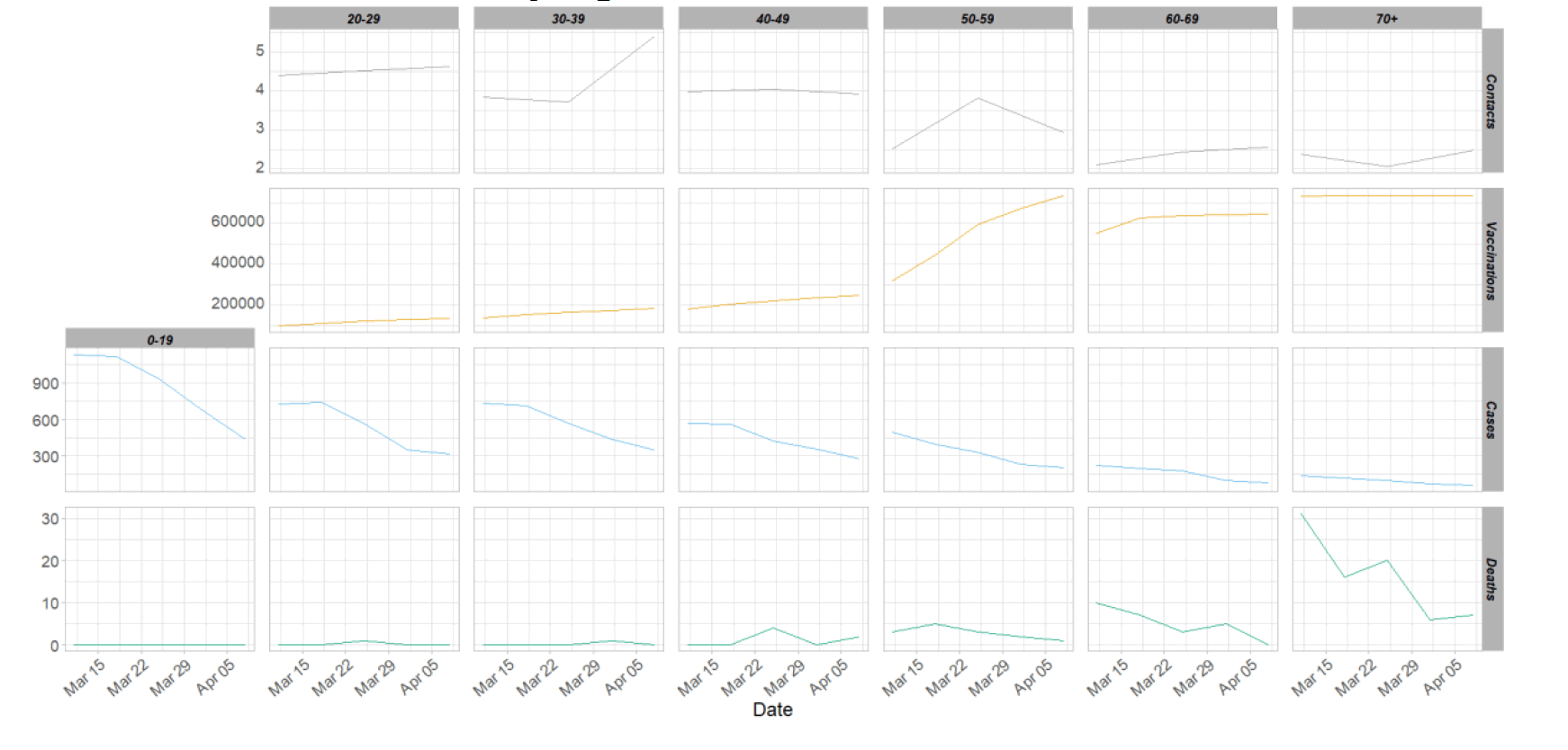
The vaccinations programme commenced in Scotland from December 2020. From Figure 7, it can be seen that where contacts have remained consistent or even increased for the older age groups, cases and deaths have decreased. This coincides with the increasing number of vaccinations supplied to the population.
What the modelling tells us about estimated infections as well as Hospital and ICU bed demand
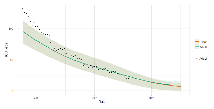
The Scottish Government assesses the impact of Covid-19 on the NHS in the next few weeks in terms of estimated number of infections. For more on how we do this see page 4 of Issue 1 of the Research Findings[5]. Figure 8 shows two projections[6] which take account of compliance and behaviour (better and worse[7]).
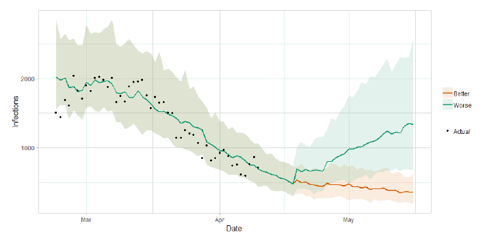
Figure 9 shows the impact of the projections on the number of people in hospital. The modelling includes all hospital stays, whereas the actuals only include stays up to 28 days duration which are linked to Covid-19. Work is ongoing to show the modelled occupancy for stays up to a 28 day limit.
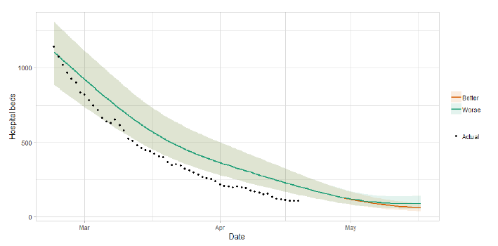
Figure 10 shows the impact of the projection on ICU bed demand.
A comparison of the actual data against historical projections is included in the Technical Annex.
What the modelling tells us about projections of hospitalisations and deaths in the medium term
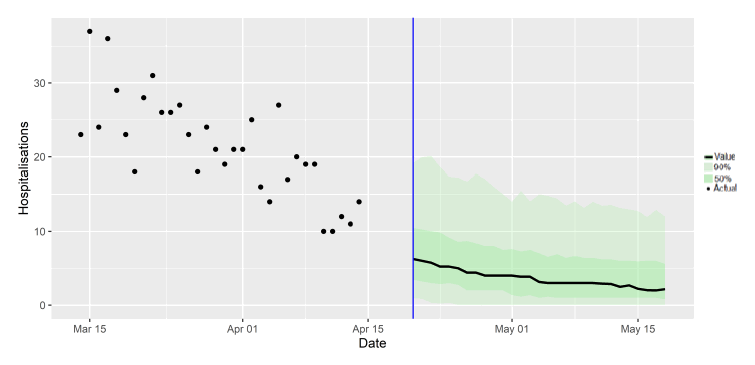
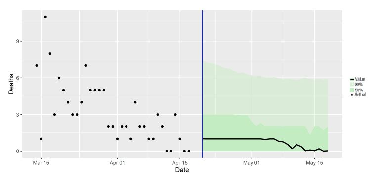
SAGE produces projections of the epidemic[10] (Figures 11 and 12), combining estimates from several independent models (including the Scottish Government's logistics modelling, as shown in Figures 9-10). These projections are not forecasts or predictions. They represent a scenario in which the trajectory of the epidemic continues to follow the trends that were seen in the data up to 19 April.
Modelling groups have used data from contact surveys, previous findings[11] and their own expert judgement to incorporate the impact of re‑opening schools and the Easter holidays on transmission. The projections do not include the effects of any other future policy or behavioural changes.
The delay between infection, developing symptoms, the need for hospital care, and death means they will not fully reflect the impact of behaviour changes in the two to three weeks prior to 19 April. Projecting forwards is difficult when the numbers of cases, admissions and deaths fall to very low levels, which can result in wider credible intervals reflecting greater uncertainty.
These projections include the potential impact of vaccinations over the next four weeks. Modelling groups have used their expert judgement and evidence from Public Health England, Scottish universities, Public Health Scotland and other published studies when making assumptions about vaccine effectiveness.
Beyond two weeks, the projections become more uncertain with greater variability between individual models. This reflects the large differences that can result from fitting models to different data streams, and the influence of small deviations in estimated growth rates and current incidence.
What we know about who is testing positive with Covid
The Early Pandemic Evaluation and Enhanced Surveillance of COVID-19 (EAVE) 2 Study Group[13] have updated the pattern of demographics and clinical risk groups over time for those who tested positive in Scotland (see Technical Annex in issue 34 of the Research Findings).
The proportion of young adults aged 18-39 testing positive peaked at the beginning of September before reducing (down to around 35% around the end of November) then increasing to over 40% in early April (Figure 13).
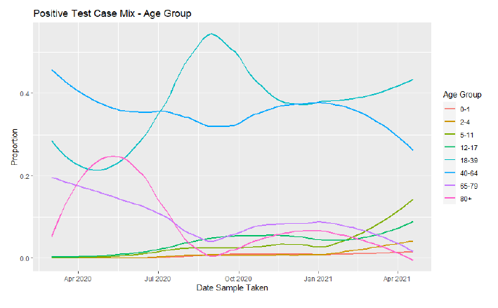
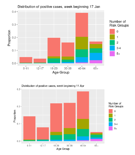
The proportion of people testing positive who were not categorised as being in any clinical risk group has risen from around 55% in November to over 70% in mid-April. Figure 14 shows that the proportion of positive test cases associated with the youngest age groups (under 39) was higher in mid-April than mid-January. In January just over 16% of people testing positive were 65 or over, this reduced to just over 5% in mid-April.
What the modelling tells us about whether Covid-19 infections exceeded what would be expected at this stage in the epidemic
Whilst metrics such as the R number, growth rate and incidence have helped us understand the spread of Covid-19 for the whole of Scotland, since October 2020 we have supplemented this with forecasts at local authority level to understand which areas include hotspots.
Recently the national number of cases has dropped below 50 per 100,000 people, so we are able to recommence modelling "exceedance" which we stopped in September 2020 (Issue 17) as we entered the resurgence of the virus over the autumn and winter. Exceedance indicates whether the number of confirmed infections (based on testing) in each local authority area exceeds the number that was expected (see the Technical Annex for more information on exceedance).
An analysis of trends across Local Authorities in Scotland has been developed by modellers at the University of Warwick on behalf of the Scottish Government. Numbers of positive tests recorded each day, adjusted for population of each local authority and number of cases seen in preceding weeks, should fall within a certain distribution of values, which will rise and fall depending on the number of cases being seen nationally. Areas where the number of positive test results fall beyond the upper 95th percentile of this distribution may be at risk of seeing increased local transmission of Covid and heightened vigilance may be required. This happens when the cumulative exceedance is higher than 6.0. No local authorities have experienced a significant cumulative exceedance in the last week as a result of national background levels.
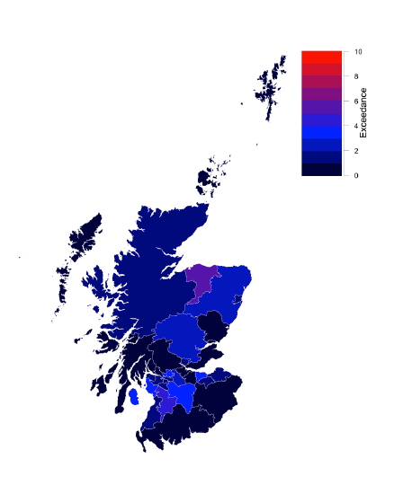
Figures 15 and 16 show exceedance for local authority areas. Recent cumulative exceedance highlights Moray (exceedance = 6.21), East Ayrshire (4.62), North Ayrshire (3.16), South Lanarkshire (3.14) and North Lanarkshire (3.03) as areas of higher risk of transmission.
What we know about which local authorities are likely to experience high levels of Covid-19 in two weeks' time
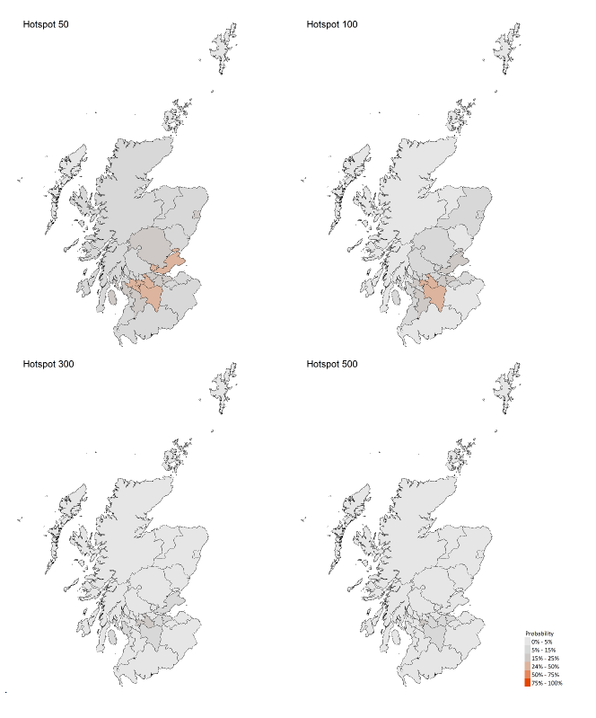
We are using modelling based on Covid-19 cases and deaths from several academic groups to give us an indication of whether a local authority is likely to experience high levels of Covid-19 in the future. This has been compiled via SPI-M into a consensus. In this an area is defined as a hotspot if the two week prediction of cases (positive tests) per 100K population are predicted to exceed a threshold, e.g. 500 cases.
Modelled rates per 100K (Figure 17) indicate that for the week commencing 2 May 2021, no local authorities have at least a 75% probability of exceeding 50 cases. This is the same as last week. Please note that the local estimates should be interpreted with caution as they are based on fewer models than previous reports.
What can analysis of wastewater samples tell us about local outbreaks of Covid-19 infection?
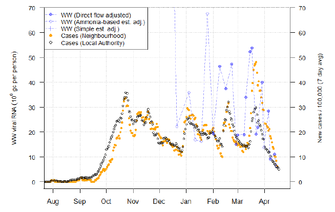
Levels of Covid in wastewater collected at 103 sites around Scotland are adjusted for population and local changes in intake flow rate and compared to daily 7-day average positive case rates derived from Local Authority and Neighbourhood (Intermediate Zone) level aggregate data. See Technical Annex in Issue 34 of these Research Findings for the methodology.
The overall level of wastewater Covid this week was again similar to last week, leaving wastewater Covid levels slightly above the rate of new cases in terms of relative levels. This is affected by the fact that normalisation to account for changing dilution levels is not currently possible for the most recent measurements from a few larger sites.
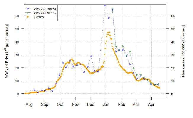
We show in Figure 18 the national aggregate for the original 28 sites with long-term records. This also shows in green the aggregate for the full set of 103 currently sampled sites. The expansion of sites that are sampled began in January and now covers 82% of the population (4.1 million). In both cases, we exclude an anomalous February reading from Seafield, Edinburgh – see issue 40 for details. Both sets of sites give very similar wastewater level readings this week, showing little change from levels last week (declining by about 1%).
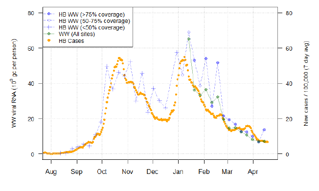
Averages for each health board are produced using postcodes to match the sites to the health boards, and weights computed for averaging based on the overlapping population. This allows sites to contribute to multiple health boards – this is particularly important for NHS Lanarkshire (Figure 19), which overlaps with the catchments of Shieldhall and Dalmuir, despite these mainly sampling from the Greater Glasgow area. The addition of such sites into the aggregate means coverage of Lanarkshire is now in excess of 90%, though caution is required due to sites covering two health boards. In these cases, we have to assume that the level of virus is the same in the parts of the catchments within both Glasgow and Lanarkshire, though this is unlikely to be true.
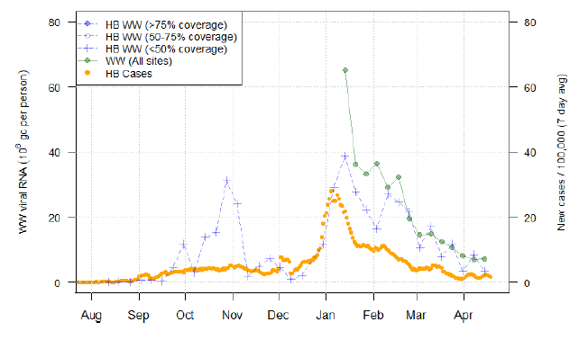
In contrast, coverage of NHS Highlands continues to be low at about 30%. This Health Board covers a very large area, with many rural communities served by smaller wastewater treatment works. The largest wastewater treatment works at Allanfearn cover a population of 62k in and around Inverness, where there have generally been higher levels of cases than at Fort William (population covered 8k) and Nairn (10k). Note however that this health board also includes Helensburgh in the West of Scotland, which has given persistently high wastewater Covid levels (20-70 million gene copies per person per day), despite low levels of cases (0-25 new cases/100k inhabitants/day) for reasons which are unclear.
This week there is a modest increase in the wastewater Covid level for a number of large sites including Dalmuir (Figure 21), Shieldhall, Nigg and Hatton. These recent readings are not currently adjusted for flow due to unavailability of flow or ammonia data. It is possible that the higher readings are at least in part due to dry weather conditions and they may be adjusted downwards in a future report. This is a contributing factor to the most recent averages involving these sites (e.g. the national total in Figure 18 and NHS Lanarkshire in Figure 19) showing no change or an increase in wastewater Covid.
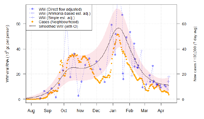
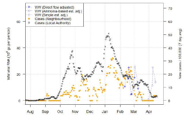
Following up on two sites covered in recent issues of this report, for East Calder in West Lothian (Figure 22), from the peak observed in mid-March, both wastewater Covid and new cases have now declined in close correspondence to each other. Meanwhile, at Largs in North Ayrshire (Figure 23), wastewater Covid levels continue to be relatively high, while in the corresponding neighbourhood there has been an increase in case levels placing levels in the locality above the level of censoring.
What next?
The Scottish Government continues to work with a number of academic modelling groups to develop other estimates of the epidemic in Scotland.
The modelled estimates of the numbers of new cases and infectious people will continue to be provided as measures of the epidemic as a whole, along with measures of the current point in the epidemic such as Rt and the growth rate. Further information can be found at https://www.gov.scot/coronavirus-covid-19.
Analysis from the EAVE 2 group, which tells us about the pattern of demographics and clinical risk groups over time for those who are testing positive with Covid-19, will be provided in future issues.