Coronavirus (COVID-19): modelling the epidemic (issue no. 43)
Latest findings in modelling the COVID-19 epidemic in Scotland, both in terms of the spread of the disease through the population (epidemiological modelling) and of the demands it will place on the system, for example in terms of health care requirement
Coronavirus (COVID-19): modelling the epidemic in Scotland (Issue No. 43)
Background
This is a report on the Scottish Government modelling of the spread and level of Covid-19. This updates the previous publication on modelling of Covid-19 in Scotland published on 11 March 2021. The estimates in this document help the Scottish Government, the health service and the wider public sector plan and put in place what is needed to keep us safe and treat people who have the virus.
This edition of the research findings focuses on the epidemic as a whole, looking at estimates of R, growth rate and incidence as well as local measures of change in the epidemic.
Key Points
- The reproduction rate R in Scotland is currently estimated as being between 0.7 and 1.0.
- The number of new daily infections for Scotland is estimated as being between 1 and 18, per 100,000 people.
- The growth rate for Scotland is currently estimated as being between -6% and -2%.
- Hospital bed and ICU occupancy are projected to fall over the next few weeks, but with the potential to plateau, or increase, as a result of schools reopening.
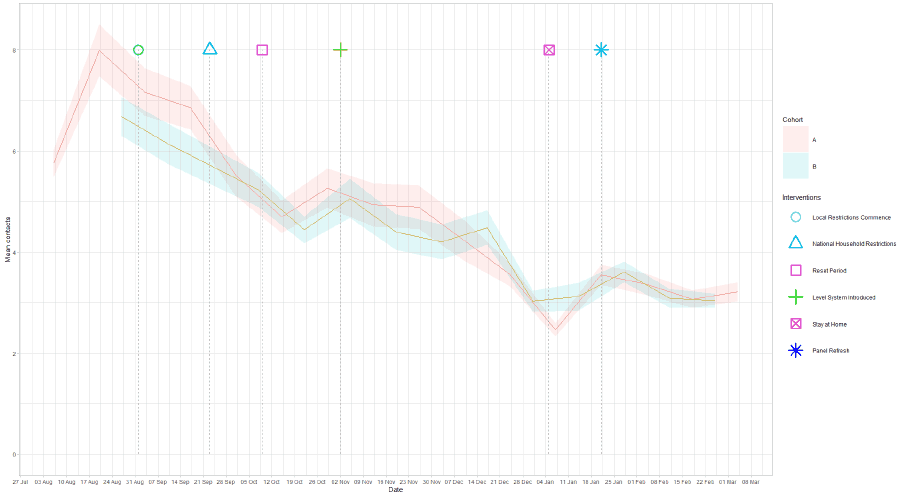
- As a whole, average contacts remain steady from two weeks ago to now, at a current level of 3.2 daily contacts. Contacts within the work setting have increased by 20%. This is an early indication that there may be a turning point in contact levels, which could drive a change in the progress of the epidemic.
- In the last two weeks, the largest increase in interactions was seen between those aged 30 to 50 and those under the age of 18.
- Individuals vaccinated within the 60-64 age group with underlying health conditions have a higher number of contacts than the unvaccinated, while there is no difference in 60-64 age group without underlying health conditions.
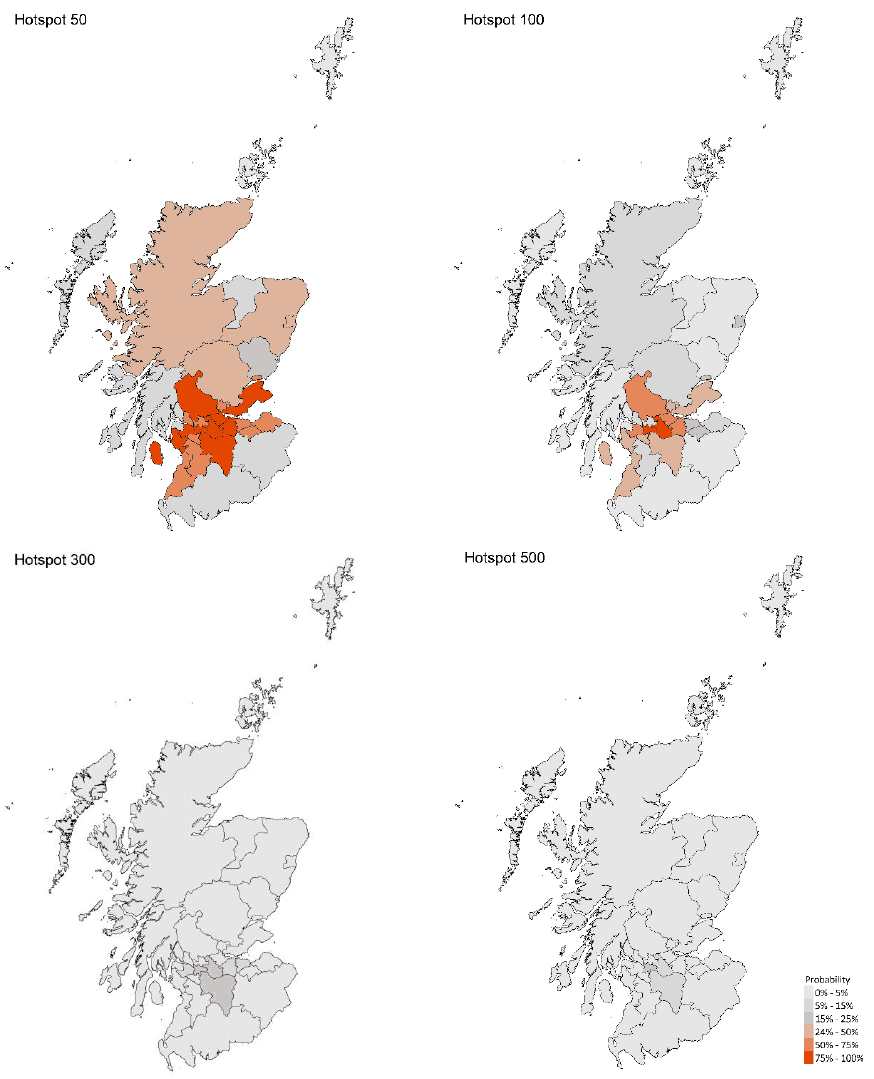
- Modelled rates per 100K indicate that by the week 28 March – 3 April 2021, 9 local authorities have at least a 75% probability of exceeding 50 cases, 2 of those have at least a 75% probability of exceeding 100 cases and none of those have at least a 75% probability of exceeding 300 cases. This is up from last week, when no local authorities had a 75% or higher probability of exceeding 50 cases. The local authorities which have at least a 75% probability of exceeding 100 cases are Glasgow City and North Lanarkshire.
- The overall level of Covid in wastewater this week was similar to the levels reported last week, reflecting a levelling off in the rate of new cases, rather than a continuation of the reduction seen in recent weeks. This pattern is seen in several local authorities with higher cases, and is consistent with the projection from modelling of increasing numbers of cases in some areas.
Overview of Scottish Government Modelling
Epidemiology is the study of how diseases spread within populations. One way we do this is using our best understanding of the way the infection is passed on and how it affects people who catch it to create mathematical simulations. Because people who catch Covid-19 have a relatively long period in which they can pass it on to others before they begin to have symptoms, and the majority of people infected with the virus will experience mild symptoms, this “epidemiological modelling” provides insights into the epidemic that cannot easily be measured through testing e.g. of those with symptoms, as it estimates the total number of new daily infections and infectious people, including those who are asymptomatic or have mild symptoms.
Modelling also allows us to make short-term forecasts of what may happen with a degree of uncertainty. These can be used in health care and other planning. The modelling in this research findings is undertaken using different types of data which going forward aims to both model the progress of the epidemic in Scotland and provide early indications of where any changes are taking place.
Modelling outputs are provided here on the current epidemic in Scotland as a whole, based on a range of methods. Because it takes a little over three weeks on average for a person who catches Covid-19 to show symptoms, become sick, and either die or recover, there is a time lag in what our model can tell us about any re-emergence of the epidemic and where in Scotland this might occur. However modelling of Covid deaths is an important measure of where Scotland lies in its epidemic as a whole. In addition, the modelling groups which feed into the SAGE consensus use a range of other data along with deaths in their estimates of R and the growth rate. These outputs are provided in this research findings. The type of data used in each model to estimate R is highlighted in Figure 1.
We use the Scottish Contact Survey to inform a modelling technique based on the number of contacts between people. Over time, a greater proportion of the population will be vaccinated. This is likely to impact contact patterns and will become a greater part of the analysis going forwards.
A medium term projection of the number of cases, ICU and hospital bed demand is provided at this stage of the epidemic in Scotland.
The delivery of the vaccination programme will offer protection against severe disease and death. As the programme progresses, the modelling and analysis of the epidemic will continue to be updated so it reflects the impact of widespread vaccination.
The logistical model utilises results from the epidemiological modelling, principally the number of new infections. The results are split down by age group, and the model is used to give a projection of the number of people that will go to hospital, and potentially to ICU. This will continue to be based on both what we know about how different age groups are effected by the disease and the vaccination rate for those groups.
What the modelling tells us about the epidemic as a whole
The various groups which report to the Scientific Pandemic Influenza Group on Modelling (SPI-M) use different sources of data in their models (i.e. deaths, hospital admissions, cases) so their estimates of R are also based on these different methods. SAGE’s consensus view across these methods, as of 17 March, was that the value of R in Scotland was between 0.7 and 1.0 (see Figure 1). The value of R on 10 March was between 0.6 and 0.8.
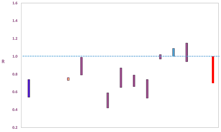
Source: Scientific Advisory Group for Emergencies (SAGE).
The various groups which report to the Scientific Pandemic Influenza Group on Modelling (SPI-M) use different sources of data in their models to produce estimates of incidence (Figure 2). The Scottish Government results this week have been computed using a platform called Epidemia (see Technical Annex in issue 37), which expands the Bayesian semi-mechanistic model which the Scottish Government runs. SPI-M’s consensus view across these methods, as of 17 March, was that the incidence of new daily infections in Scotland was between 1 and 18 new infections per 100,000. This equates to between 60 and 1,000 people becoming infected each day in Scotland.
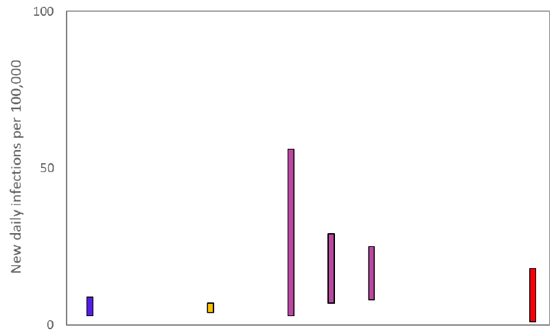
Source: Scientific Pandemic Influenza Group on Modelling (SPI-M).
The consensus from SAGE for this week is that the growth rate in Scotland is between -6 and -2% per day. On 10 March the growth rate was between -6 and -4%.
What we know about how people’s contact patterns have changed
As a whole, average contacts remain steady over the last two weeks, with a current level of 3.2 daily contacts as seen in Figure 3. Contacts within the school setting have increased from the levels two weeks prior but still remain at low levels. Contacts within the work setting have increased by 20% and contacts within the home and other setting remain at similar levels over the same period.
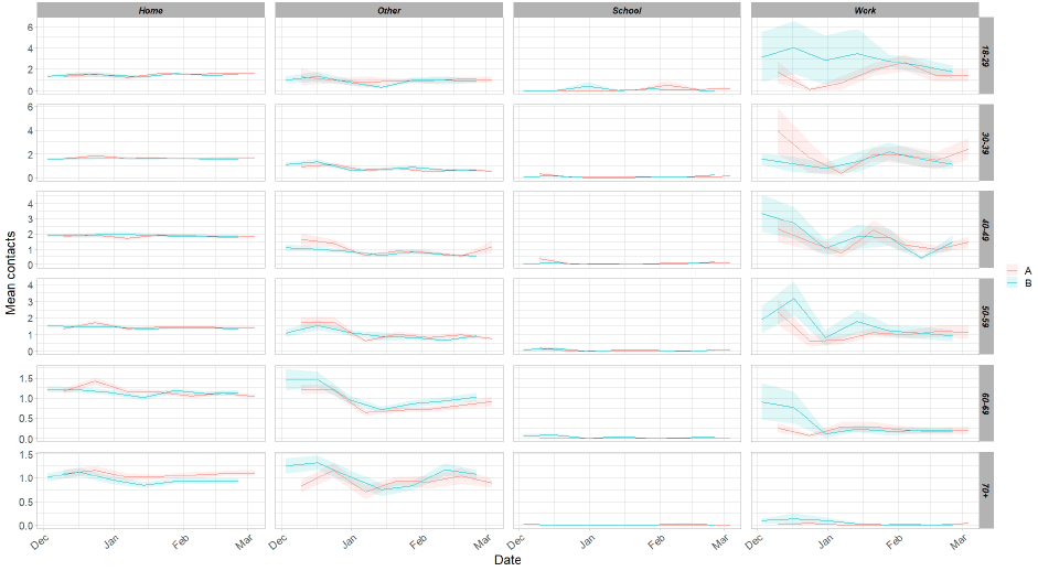
Figure 4 shows how contacts change across age group and setting. Those aged between 30 and 50 have shown a large increase in contacts in the most recent survey, largely due to a rise in contacts within the work setting and also to a larger extent the ‘other’ setting for those within the 40-49 age band.
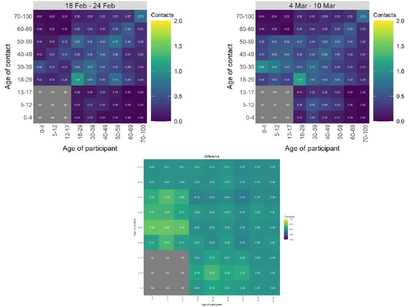
The heatmaps in Figure 5 show the mean overall contacts between age groups for the weeks pertaining to 18 – 24 February and 4 – 10 March and the difference between these interactions. In the last two weeks, the largest increase in interactions is seen between those aged 30 – 50 with those under the age of 18 which coincides with the recent return of schools (primary 1-3 returning on 22 February). This follows the trend seen in the alternate survey covering the weeks 11 – 17 February and the 25 February – 3 March.
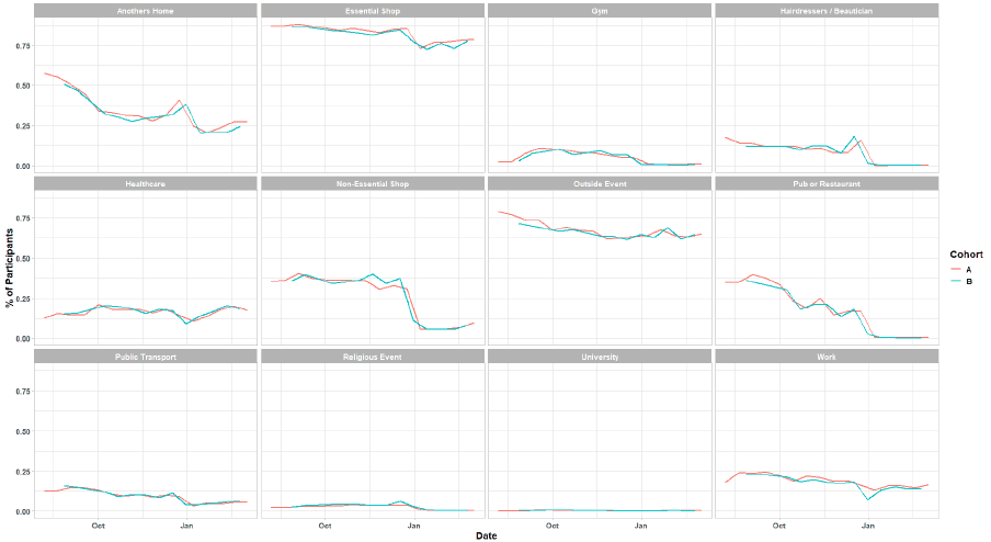
As seen in Figure 6 there has been little change in the number of participants visiting settings in the last two weeks. The biggest change, though slight, is seen in the proportion of people that visited a health care facility, up from 17% to 20% in the last 2 weeks.
Vaccinations and contacts patterns
The vaccinations programme commenced in Scotland from December 2020. This section looks at the contact patterns of those who have been vaccinated against those who have not.
Currently, the priority groups invited for vaccinations are anyone aged between 60 - 64 and also people aged between 16 - 64 with underlying health conditions.
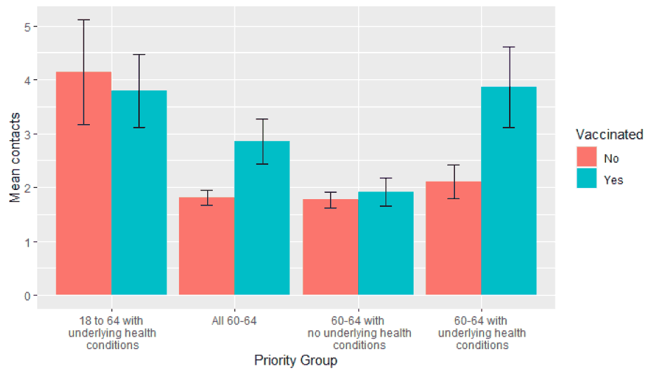
Figure 7 shows no significant difference between the vaccinated and unvaccinated in 18 - 64s with underlying health conditions, though both groups have relatively high contact levels (with the removal of healthcare professionals).
Looking at the entirety of the 60 - 64 age bracket, a distinct difference can be seen, with vaccinated individuals having more contacts. When this age group is subset into those with and without underlying health conditions it becomes clear the higher contacts for the vaccinated 60 - 64s can be attributed to those with underlying health conditions[1]. Individuals vaccinated within the 60 - 64 age group with underlying heath conditions have a higher number of contacts than the unvaccinated, while there is no difference in 60 - 64s without underlying health conditions.
It should also be noted that the unvaccinated 60 - 64 year olds with underlying health conditions have similar contacts to the remaining 60 - 64s and are much lower than individuals with underlying health conditions in the 18 - 64 group. This suggests that merely being within the 60 - 64 age group as an individual with an underlying health condition reduces the level of contacts from the relatively high one seen for the 18 - 64s with underlying health conditions as a whole, but once vaccinated the number of contacts increases to match the norm observed.
Due to the high number of vaccinations for those aged 65 and over (greater than 95% of the population[2]) no statistically significant comparison of the vaccinated against unvaccinated can be made for this group. See table 1 in the technical annex for the number of responses from individuals in the groups: 18-64 with underlying health conditions and 60-64.
What the modelling tells us about estimated infections as well as Hospital and ICU bed demand
Scottish Government assess the impact of Covid on the NHS in the next few weeks in terms of estimated number of infections. For more on how we do this see page 4 of Issue 1 of the Research Findings[3]. Figure 8 shows two projections which take account of compliance and behaviour (better and worse[4]).
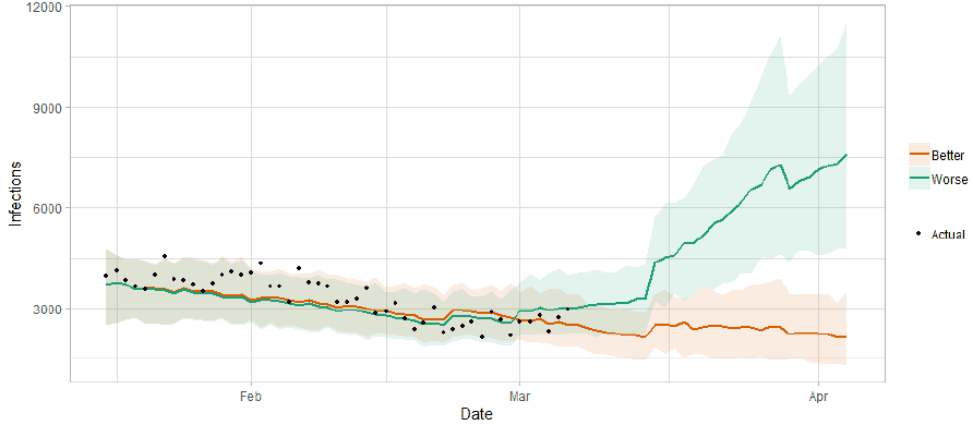
Figure 9 shows the impact of the projections on the number of people in hospital.
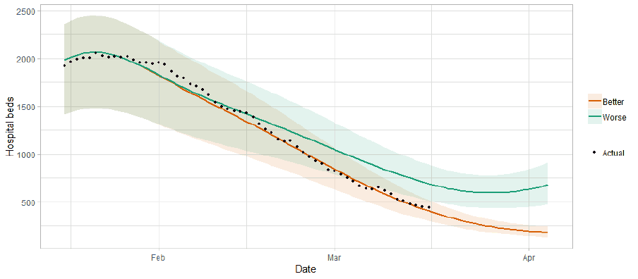
Figure 10 shows the impact of the projection on ICU bed demand.
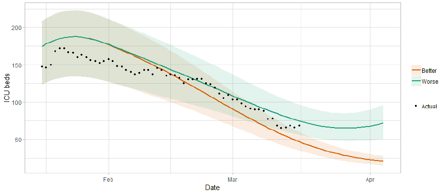
A comparison of the actual data against historical projections is included in the Technical Annex.
What the modelling tells us about projections of hospitalisations and deaths in the medium term
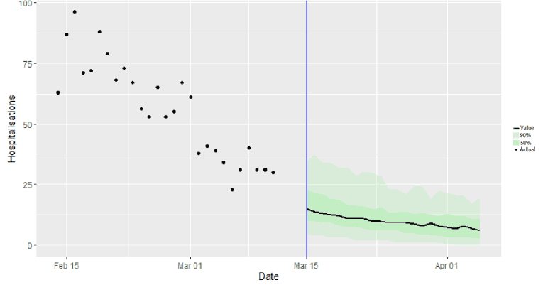
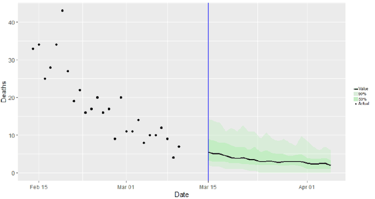
SAGE produce projections of the epidemic[8] (Figures 11 and 12), combining estimates from several independent models (including the Scottish Government’s logistics modelling, as shown in figures 8, 9 and 10). These projections are not forecasts or predictions. They represent a scenario in which the trajectory of the epidemic continues to follow the trends that were seen in the data up to 15 March.
Modelling groups have used data from contact surveys, previous findings[9] and their own expert judgement to incorporate the impact of re-opening schools. The projections do not include the effects of any other future policy or behavioural changes.
The delay between infection, developing symptoms, the need for hospital care, and death means they will not fully reflect the impact of behaviour changes in the two to three weeks prior to 15 March.
These projections include the potential impact of vaccinations over the next three weeks. Modelling groups have used their expert judgement and evidence from the JCVI, Public Health England, Scottish universities and Public Health Scotland as well as other published sources when making assumptions about vaccine effectiveness[10].
Beyond two weeks, the projections become more uncertain with greater variability between individual models. This reflects the large differences that can result from fitting models to different data streams, and the influence of small deviations in estimated growth rates and current incidence.
What we know about which local authorities are likely to experience high levels of Covid
We are using modelling based on Covid cases and deaths from several academic groups to give us an indication of whether a local authority is likely to experience high levels of Covid in the future. This has been compiled via SPI-M into a consensus. In this an area is defined as a hotspot if the two week prediction of cases (positive tests) per 100K population are predicted to exceed a threshold, e.g. 500 cases.
Modelled rates per 100K (Figure 13) indicate that by the week 28 March – 3 April 2021, 9 local authorities have at least a 75% probability of exceeding 50 cases, 2 of those have at least a 75% probability of exceeding 100 cases and none of those have at least a 75% probability of exceeding 300 cases. This is up from last week, when no local authorities had a 75% or higher probability of exceeding 50 cases.
What can analysis of wastewater samples tell us about local outbreaks of Covid-19 infection?
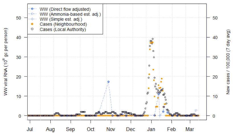
Levels of Covid in wastewater collected at 28 sites around Scotland are adjusted for population and local changes in intake flow rate and compared to daily 7-day average positive case rates derived from Local Authority and Neighbourhood (Intermediate Zone) level aggregate data. See Technical Annex in Issue 34 of these Research Findings for the methodology.
The overall level of wastewater Covid this week was similar to the levels reported last week, reflecting a levelling off in the rate of new cases. This pattern is due to a minority of sites with large catchment populations (>190k populations), whereas the majority of smaller sites have under 3 million gene copies/person (Mgc/p) of Covid-19 RNA detected.
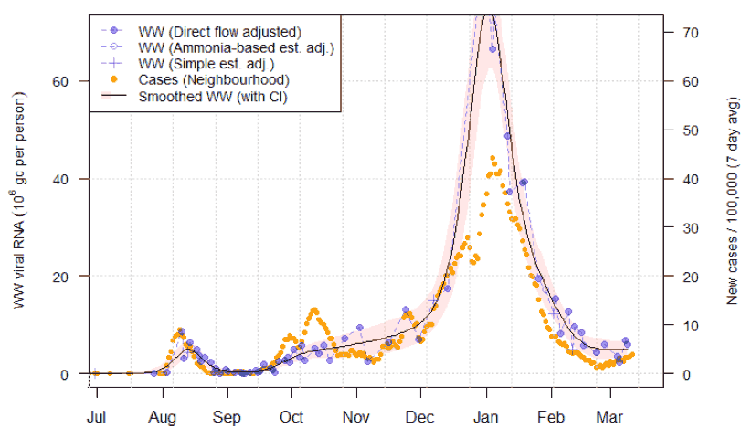
Figure 14 shows wastewater Covid data aggregated over sites to produce a national average time series, with new cases data overlaid. As discussed in Issue 40, the unfilled point in mid Feb denotes the average for that week after the removal of an anomalously high reading at Seafield (Edinburgh). Compared to last week, the national average shows a small increase in wastewater Covid of about 9%, which matches the slight increase in cases over the same period.
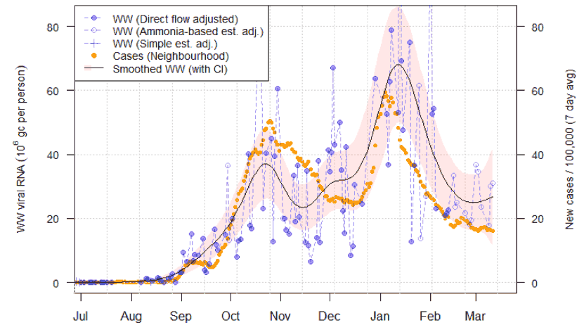
Figures 15 and 16 show the pattern of wastewater Covid at a number of larger sites in Scotland, with a smoother (see issue 40) applied to account for variability. Both Nigg in Aberdeen (Figure 15) and Shieldhall, Glasgow, (Figure 16) have shown a significant decline since the peak in early January, but for the last month wastewater Covid measurements have been approximately constant at a level similar to November. Shieldhall shows higher Covid-19 than Nigg. Dalmuir (also in Glasgow), Seafield (in Edinburgh) and Meadowhead (in Ayr) are other large catchments also showing a levelling off pattern in wastewater Covid levels.
In contrast, many smaller, more isolated sites like Lerwick (Figure 17) have very low amounts of Covid-19 by both cases and wastewater Covid, with 13 sites having recent levels less than 5 Mgc/p. However, while Lerwick has, according to neighbourhood aggregation, effectively no new cases for over a month, a positive wastewater Covid sample has recently been recorded. This suggests the renewed presence of Covid-19. Note that neighbourhood level case data below 3 in any 7 day period is subject to censorship for privacy reasons, so it is possible that small numbers of cases may in fact have been observed in the area. Small numbers of cases are present in the Shetlands local authority area outside of Lerwick itself.
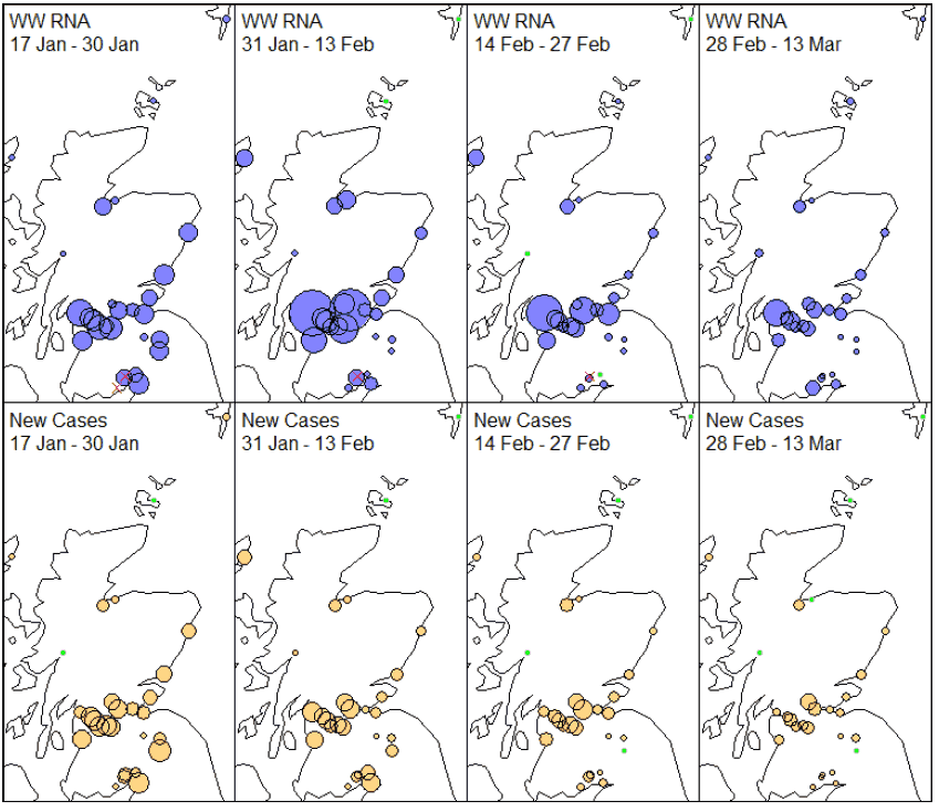
Wastewater Covid-19 has been detected at all sites in the most recent samples, though at some sites the levels are very low and near to the limit of detection of 1316 gene copies/litre (Nairn, Peebles, Dalscone and Galashiels). In contrast, a large number of sites have had case numbers below the threshold of censoring for a while.
This can be seen by mapping the geographic pattern of Covid-19 across the sites in Figure 18. Unlike previous maps, for this report we have fixed a minimum size on the bubbles used to indicate the amount of wastewater Covid/New cases at a location. A green colour is instead used to indicate levels that are below the minimum for each method – either falling below the detection limit as in the case of wastewater Covid, or below the censoring threshold for case data. We see that across a range of sites, there have been almost no new reported cases in the last two weeks. This suggests higher sensitivity of wastewater testing in the presence of very small amounts of (possibly asymptomatic) Covid-19 activity. In future work, we will examine whether the apparent low sensitivity of case numbers is explained by censoring rules.
What next?
The Scottish Government continues to work with a number of academic modelling groups to develop other estimates of the epidemic in Scotland.
The modelled estimates of the numbers of new cases and infectious people will continue to be provided as measures of the epidemic as a whole, along with measures of the current point in the epidemic such as Rt and the growth rate. Further information can be found at https://www.gov.scot/coronavirus-covid-19.
Investigations are ongoing by NERVTAG, SPI-M, SAGE and Scottish Government regarding the impact of the new variant, SARS-CoV-2 VOC 202012/01, which will be reflected here as work is undertaken.
Analysis from the EAVE 2 group, which tells us about the pattern of demographics and clinical risk groups over time for those who are testing positive with Covid, will be provided in future issues.