Coronavirus (COVID-19): modelling the epidemic (issue no. 40)
Latest findings in modelling the COVID-19 epidemic in Scotland, both in terms of the spread of the disease through the population (epidemiological modelling) and of the demands it will place on the system, for example in terms of health care requirement
Coronavirus (COVID-19): modelling the epidemic in Scotland (Issue No. 40)
Background
This is a report on the Scottish Government modelling of the spread and level of Covid-19. This updates the previous publication on modelling of Covid-19 in Scotland published on 18 February 2021. The estimates in this document help the Scottish Government, the health service and the wider public sector plan and put in place what is needed to keep us safe and treat people who have the virus.
This edition of the research findings focuses on the epidemic as a whole, looking at estimates of R, growth rate and incidence as well as local measures of change in the epidemic.
Key Points
- The reproduction rate R in Scotland is currently estimated as being between 0.7 and 0.9. This is the same as last week.
- The number of new daily infections for Scotland is estimated as being between 13 and 37, per 100,000 people.
- The growth rate for Scotland is currently estimated as being between -5% and -2%.
- Hospital bed and ICU occupancy are projected to fall over the next few weeks, but with the potential to plateau if infection numbers rise.
- Two Scottish Contact Survey panels have been refreshed with new respondents. The combined panels of old and new respondents show higher overall contacts this week (about 17%) in comparison to the combined panels last week.
- Current contact levels are at approximately 3.1 average contacts per day.
- The largest increase in interactions, in the last two weeks, is seen for those under 18 with the 18-29 age group and those over 70 with the 50-59 age group.
- Although overall average contacts have decreased within the last two weeks, those aged over 60 have shown an increase in contacts, with those aged over 70 increasing by 20%.
- We are beginning to look at whether there is a change in behaviour following the vaccination roll out.
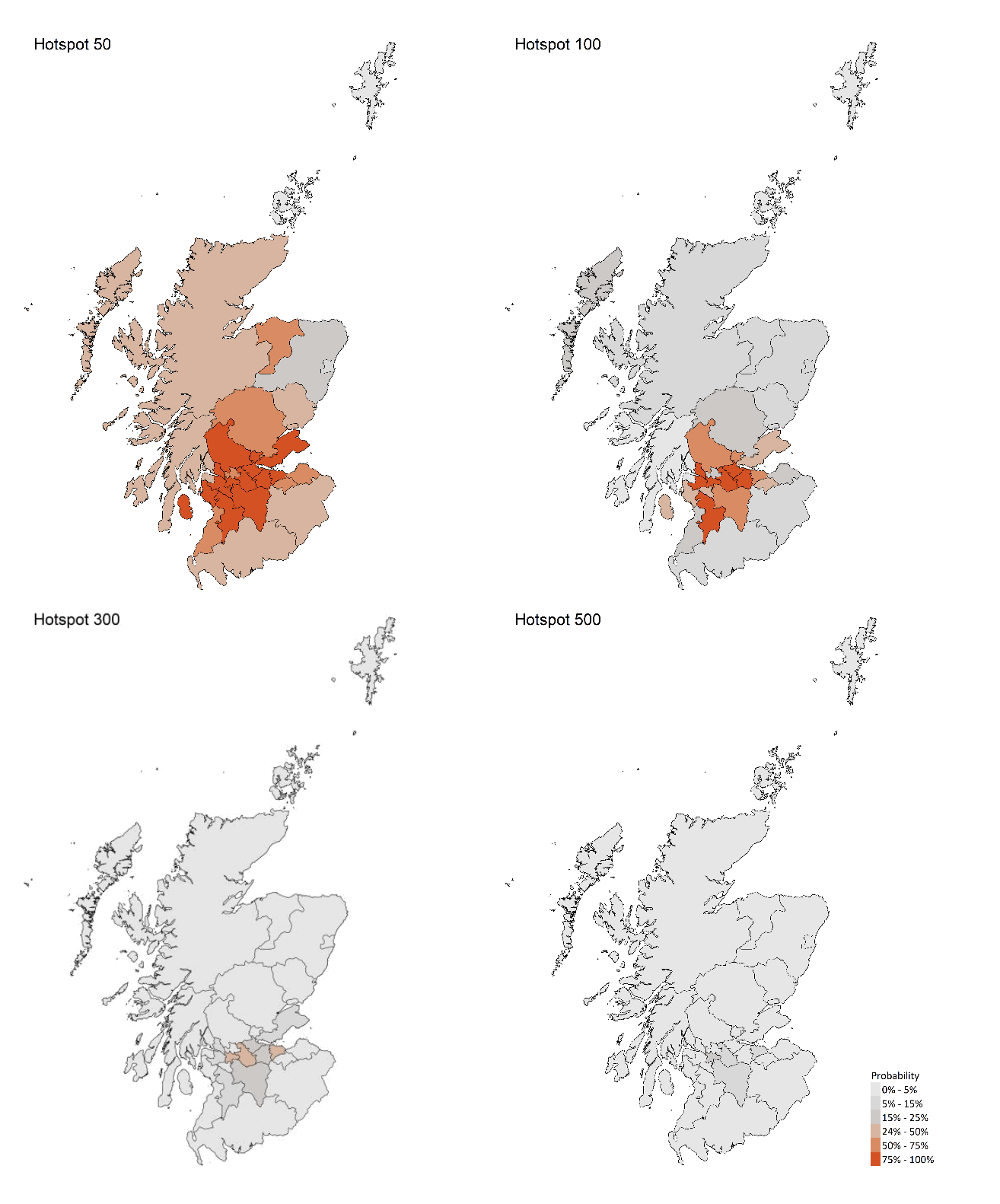
- Modelled rates per 100K indicate that by the week 7 – 13 March 2021, 14 local authorities have at least a 75% probability of exceeding 50 cases, 7 of those have at least a 75% probability of exceeding 100 cases and none of those have at least a 75% probability of exceeding 300 (or 500) cases.
- Nationally, levels of COVID in wastewater are similar to the previous week.
Overview of Scottish Government Modelling
Epidemiology is the study of how diseases spread within populations. One way we do this is using our best understanding of the way the infection is passed on and how it affects people who catch it to create mathematical simulations. Because people who catch Covid-19 have a relatively long period in which they can pass it on to others before they begin to have symptoms, and the majority of people infected with the virus will experience mild symptoms, this "epidemiological modelling" provides insights into the epidemic that cannot easily be measured through testing e.g. of those with symptoms, as it estimates the total number of new daily infections and infectious people, including those who are asymptomatic or have mild symptoms.
Modelling also allows us to make short-term forecasts of what may happen with a degree of uncertainty. These can be used in health care and other planning. The modelling in this research findings is undertaken using different types of data which going forward aims to both model the progress of the epidemic in Scotland and provide early indications of where any changes are taking place.
Modelling outputs are provided here on the current epidemic in Scotland as a whole, based on a range of methods. Because it takes a little over three weeks on average for a person who catches Covid-19 to show symptoms, become sick, and either die or recover, there is a time lag in what our model can tell us about any re-emergence of the epidemic and where in Scotland this might occur. However modelling of Covid deaths is an important measure of where Scotland lies in its epidemic as a whole. In addition, the modelling groups which feed into the SAGE consensus use a range of other data along with deaths in their estimates of R and the growth rate. These outputs are provided in this research findings. The type of data used in each model to estimate R is highlighted in Figure 1.
A medium term projection of the number of cases, ICU and hospital bed demand is provided at this stage of the epidemic in Scotland.
It should be noted that this research findings covers a period of uncertainty with the growth of the new variant in Scotland (SARS-CoV-2 VOC 202012/01).
What the modelling tells us about the epidemic as a whole
The various groups which report to the Scientific Pandemic Influenza Group on Modelling (SPI-M) use different sources of data in their models (i.e. deaths, hospital admissions, cases) so their estimates of R are also based on these different methods. SAGE's consensus view across these methods, as of 24 February, was that the value of R in Scotland was between 0.7 and 0.9 (see Figure 1). The value of R on 17 February was also between 0.7 and 0.9.
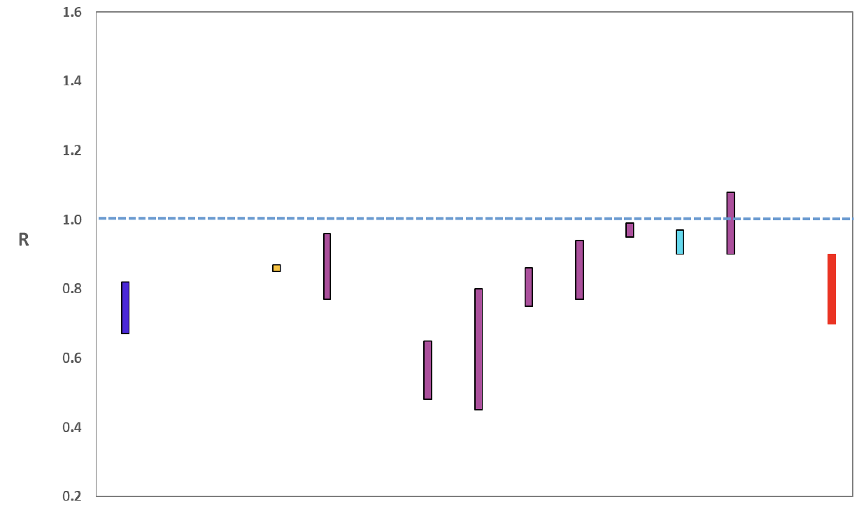
Source: Scientific Advisory Group for Emergencies (SAGE).
The various groups which report to the Scientific Pandemic Influenza Group on Modelling (SPI-M) use different sources of data in their models to produce estimates of incidence (Figure 2). SPI-M's consensus view across these methods, as of 24 February, was that the incidence of new daily infections in Scotland was between 13 and 37 new infections per 100,000. This equates to between 700 and 2,000 people becoming infected each day in Scotland. The Scottish Government results this week have been computed using a new platform called Epidemia (see Technical Annex in issue 37), which expands the Bayesian semi-mechanistic model which the Scottish Government runs.
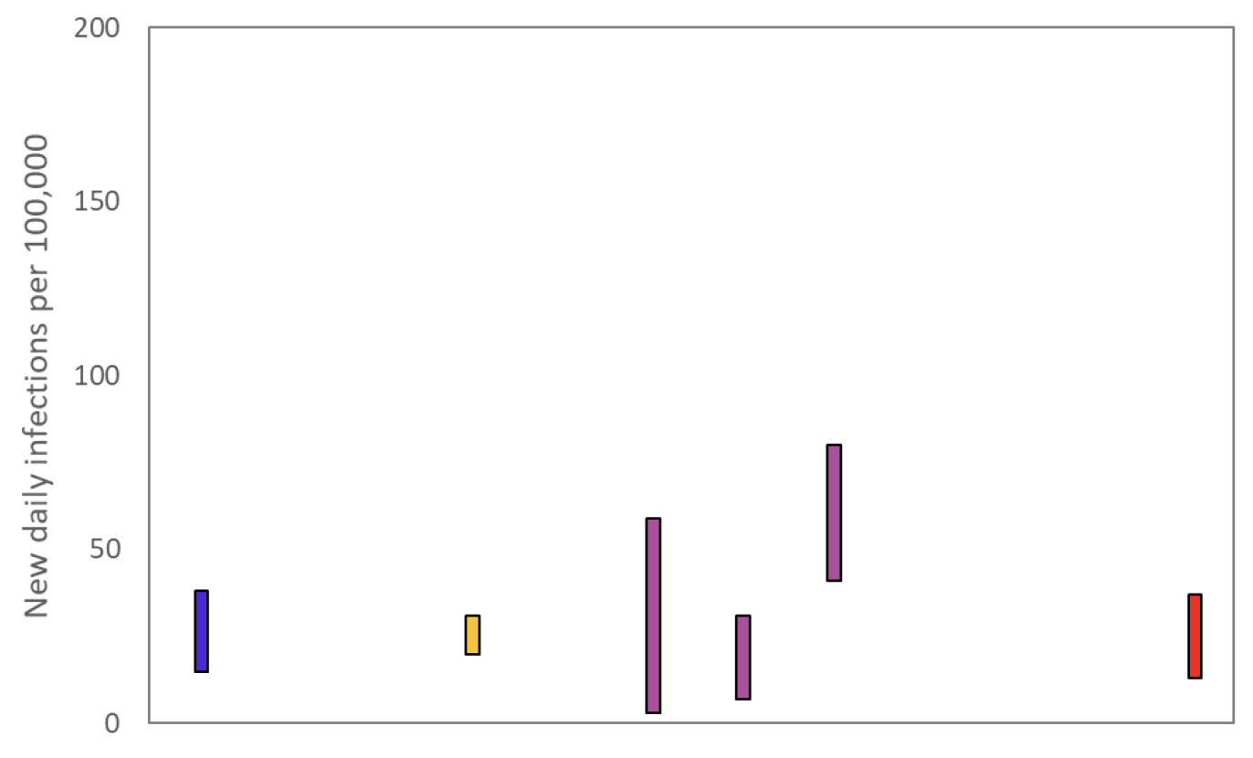
Source: Scientific Pandemic Influenza Group on Modelling (SPI-M).
The consensus from SAGE for this week is that the growth rate in Scotland is between -5 and -2% per day. On 17 February the growth rate was between -6 and -2%.
What the modelling tells us about estimated infections as well as Hospital and ICU bed demand
Scottish Government assess the impact of Covid on the NHS in the next few weeks in terms of estimated number of infections. For more on how we do this see page 4 of Issue 1 of the Research Findings[1]. Figure 3 shows two projections which take account of vaccine roll-out (better and worse[2]).
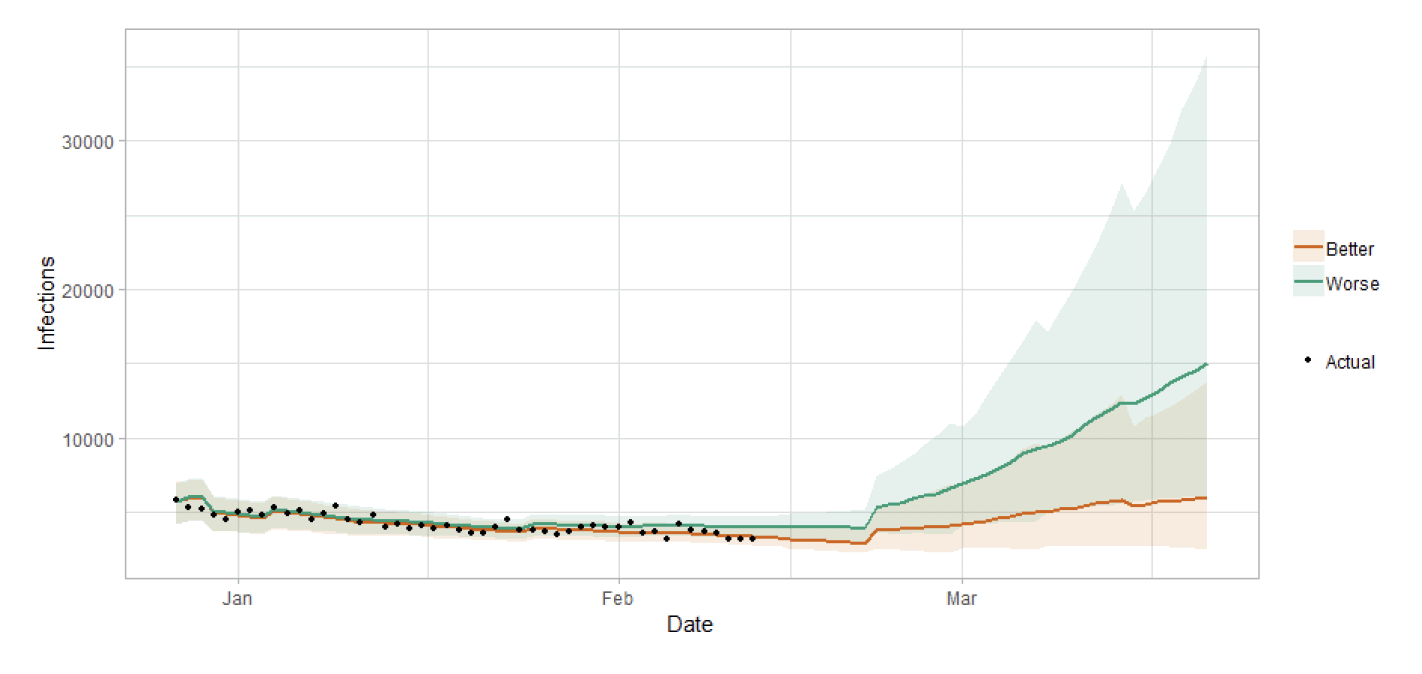
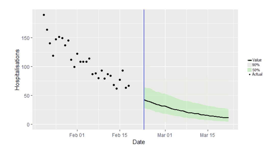
Figure 4 shows the impact of the projections on the number of people in hospital.
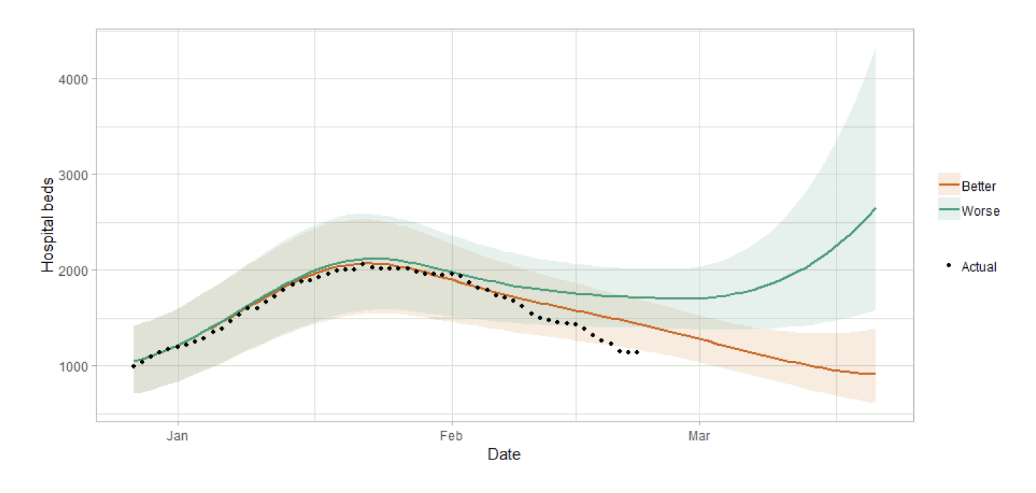
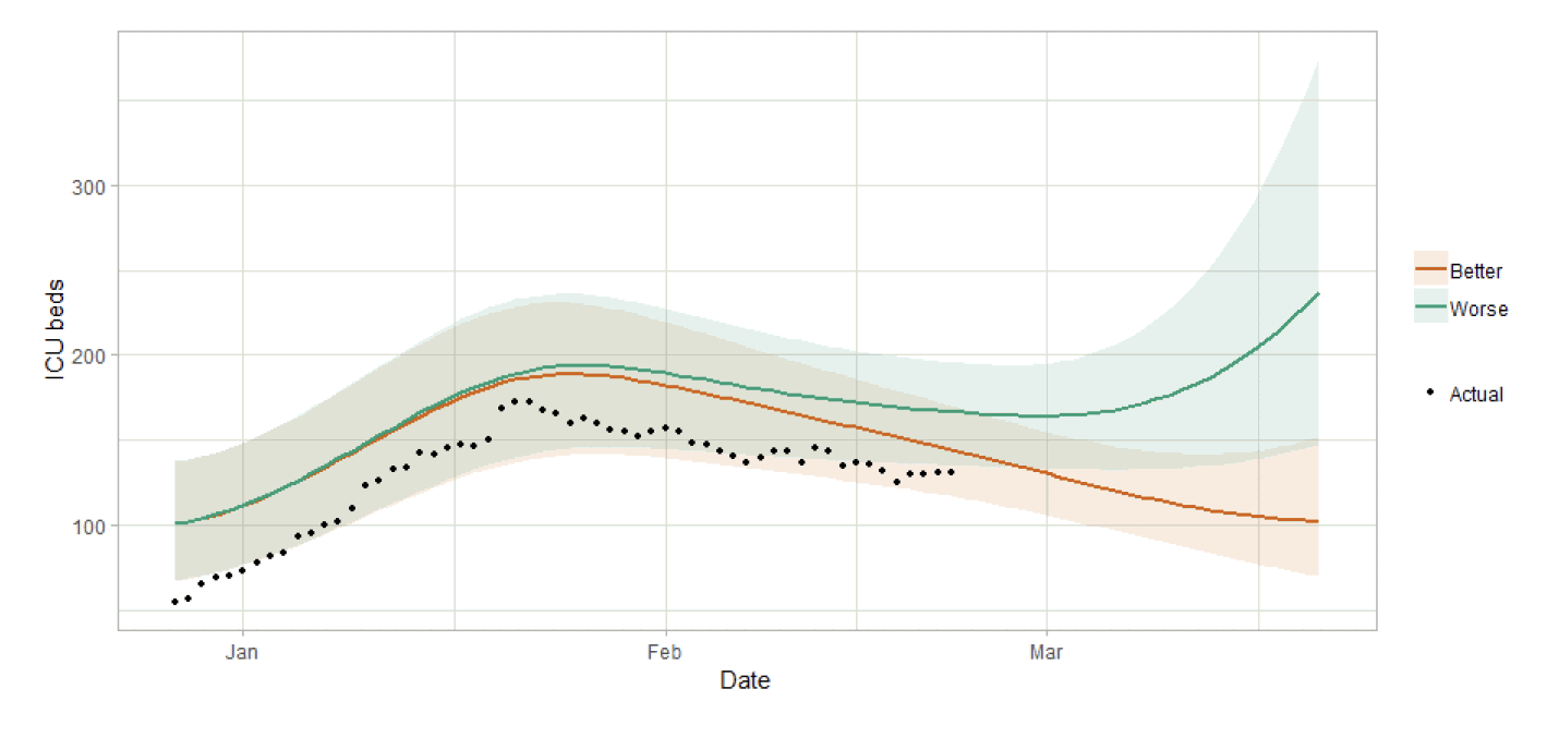
Figure 5 shows the impact of the projection on ICU bed demand.
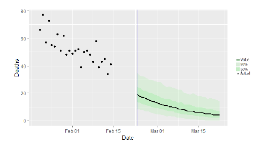
What the modelling tells us about projections of hospitalisations and deaths in the medium term
SAGE produce projections of the epidemic[6] (Figure 6), combining estimates from several independent models (including the Scottish Government's logistics modelling, as shown in figures 3, 4 and 5). These projections are not forecasts or predictions. They represent a scenario in which the trajectory of the epidemic continues to follow the trends that were seen in the data up to 22 February and do not account for the future impact of policy or behaviour changes, such as the phased reopening of schools from 22 February.
The delay between infection, developing symptoms, the need for hospital care, and death means they will not fully reflect the impact of behaviour changes in the two to three weeks prior to 22 February. Nor do they include seasonal effects that might increase transmission.
These projections include the potential impact of vaccinations over the next four weeks. The real-world effectiveness of vaccines, particularly against infection, is not yet known. The first dose effectiveness of the Pfizer-BioNTech and Oxford-AstraZeneca vaccines against both hospitalisation and death have been modelled in line with JCVI's advice[7].
Beyond two weeks, the projections become more uncertain with greater variability between individual models. This reflects the large differences that can result from fitting models to different data streams, and the influence of small deviations in estimated growth rates and current incidence.
How the modelling compares to the real data as it emerges
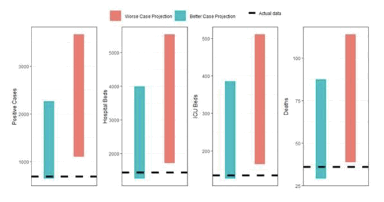
Estimates of case incidence, hospital bed and ICU bed demand, and deaths related to Covid-19 are routinely tested against real emerging data to consider how good the projected ranges were a month previously. Figure 8 shows the 5th to 95th percentile ranges for these four projected parameters, as published in Research Findings issue 35[8] for both Better and Worse case scenarios. The projected ranges represent our estimate for the date of 14 February 2021. The actual data for each parameter on that date are shown in the figures as a dashed line.
For the projections estimated on 18 January, all of the actuals sit within the range of our estimates, albeit at the bottom end of the range. This is well within the range of uncertainty considered reasonable, particularly for ICU beds and deaths, where there are low numbers involved. These projections were also published during a major change in the epidemic (i.e. influx of the new variant and vaccine rollout) and that is why our modelling is updated weekly to reflect emerging evidence on vaccination roll out, levels of the new variant and contact patterns.
What we know about how people's contact patterns have changed
Two new surveys have been created from the recent recruitment and have ran alongside current panels A & B from 21 January. These panels have been combined with the established panels to maintain numbers and demographic representation. Further details are presented in the Technical Annex.
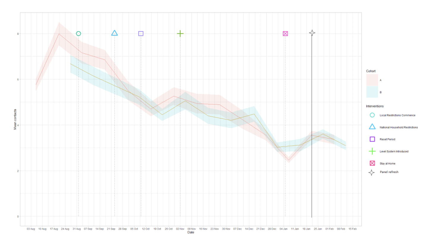
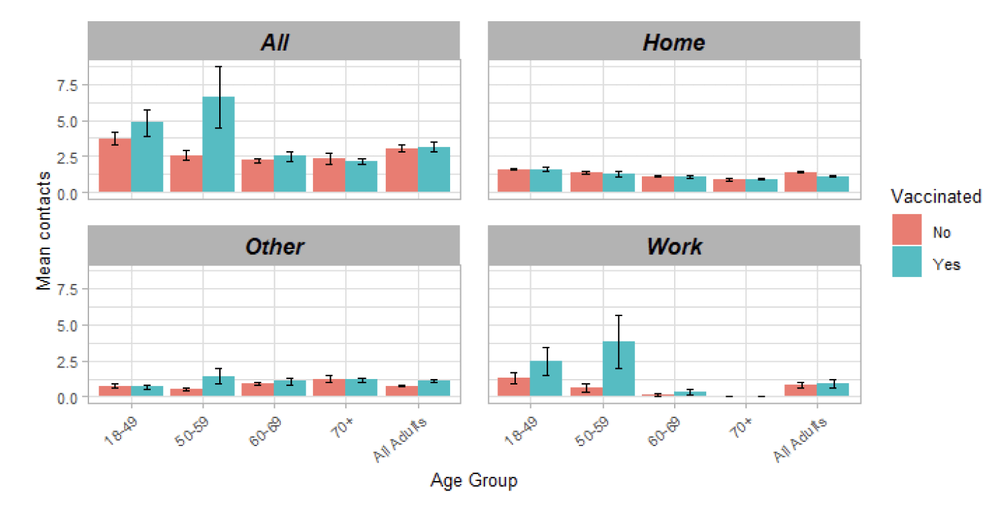
Current contact levels are at approximately 3.1 average contacts per day, this is for the refreshed panels[10].
Contacts within the work and school setting have decreased in the most recent survey in comparison to two weeks prior, by 33% and 39% respectively. Mean contacts in the home and other setting have remained at a similar level in comparison to the previous 2 weeks.
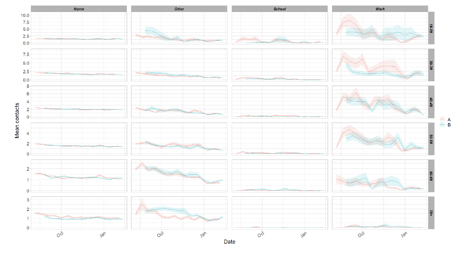
Although overall average contacts have decreased within the last two weeks, those aged over 60 have shown an increase in contacts, with those aged over 70 increasing by 20%. All age groups have shown decreases in home contacts with the exception of the over 70s where levels of contact remain similar to the previous 2 weeks.
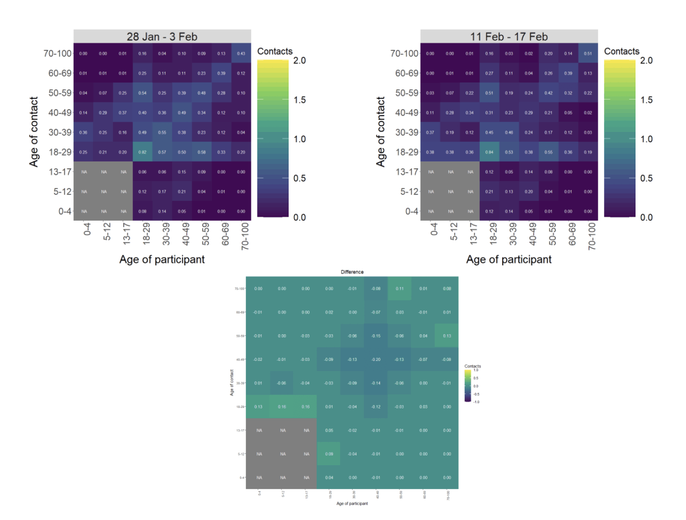
The heatmaps in Figure 11 show the change in mean overall contacts between age groups for the weeks pertaining to 28 January – 3 February and 11 – 17 February and the difference between these interactions. The highest interactions are seen between members of the 18-29 age group. The largest increase in interactions, in the last two weeks, is seen for those under 18 with the 18-29 age group and those over 70 with the 50-59 age group.
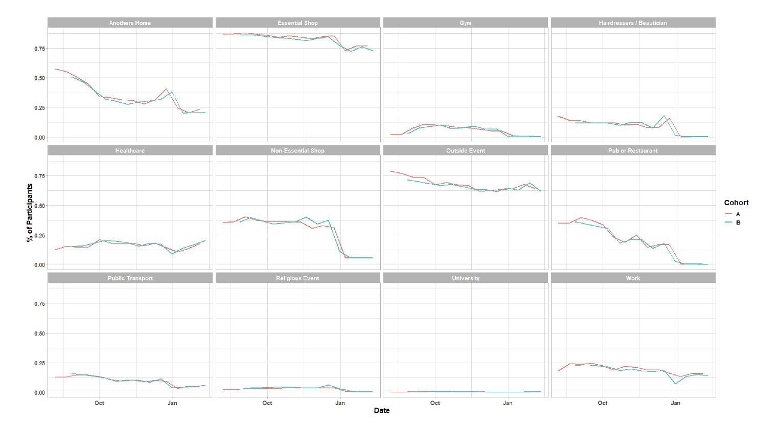
As Figure 12 shows, there has been little change in participant visits to different locations in the last two weeks. The biggest increase is seen in the proportion of people that have attended a health care facility, up from 17% (28 January – 3 February) to 21%(11 – 17 February). The proportion of participants attending an activity outside has decreased over the same period from 69% to 62%.
Vaccinations and contact patterns
The vaccinations programme commenced in Scotland from December 2020. As time progresses, a greater proportion of the population will be vaccinated. This section looks at the contact patterns of those who have been vaccinated against those who have not. The survey asks participants whether they have been vaccinated.
| Vaccinated | Age Group | |||
|---|---|---|---|---|
| 18-49 | 50-59 | 60-69 | 70+ | |
| Yes | 4.81 | 6.62 | 2.5 | 2.14 |
| No | 3.72 | 2.58 | 2.24 | 2.33 |
When looking at the average contacts between those vaccinated and those who are not, some differences emerge, particularly in the 50-59 age group, but also to a certain extent in the 18-49 age group. As laid out in the section above, there has been an increase in contacts in general for those aged 60 and over, regardless of vaccination status. Also, there has been more mixing between the 50-59 and the 70+ age groups. This suggests we may be seeing the beginning of a change in behaviour, most lower age groups will have been vaccinated because of work, which can be seen in Figure 13.
What we know about which local authorities are likely to experience high levels of Covid
From this week we are using modelling based on Covid cases and deaths from several academic groups to give us an indication of whether a local authority is likely to experience high levels of Covid in the future. This has been compiled via SPI-M into a consensus. In this an area is defined as a hotspot if the two week prediction of cases (positive tests) per 100K population are predicted to exceed a threshold, e.g. 500 cases.
Modelled rates per 100K (Figure 14) indicate that by the week 7 – 13 March 2021, 14 local authorities have at least a 75% probability of exceeding 50 cases, 7 of those have at least a 75% probability of exceeding 100 cases and none of those have at least a 75% probability of exceeding 300 (or 500) cases. The probability of exceeding will be affected by the lockdown as well as by how much new variant is present in a local authority area.
What can analysis of wastewater samples tell us about local outbreaks of Covid-19 infection?
Levels of Covid in wastewater collected at 28 sites around Scotland are adjusted for population and local changes in intake flow rate and compared to daily 7-day average positive case rates derived from Local Authority and Neighbourhood (Intermediate Zone) level aggregate data. See Technical Annex in Issue 34 of these Research Findings for the methodology.
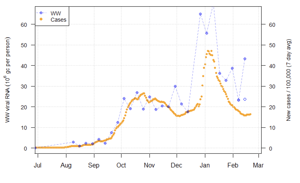
The overall level of wastewater this week is similar to last week, possibly indicating a pause in the recent decline. This conclusion depends on the discounting of a recent large spike observed in the Seafield (Edinburgh) catchment, that is suspected to be anomalous.
Figure 15 shows wastewater Covid data aggregated over sites to produce a national average time series, with new cases data overlaid. The two points for the most recent week show the national average with (filled point) and without (unfilled point) the inclusion of the most recent reading from Seafield (presented with more detail in Figure 17). Without this reading, average wastewater Covid levels are no longer falling (rising by 1.6%), which is similar to the recent trend in cases. If the Seafield reading were included, the average wastewater Covid level would show a large rise of 86%.
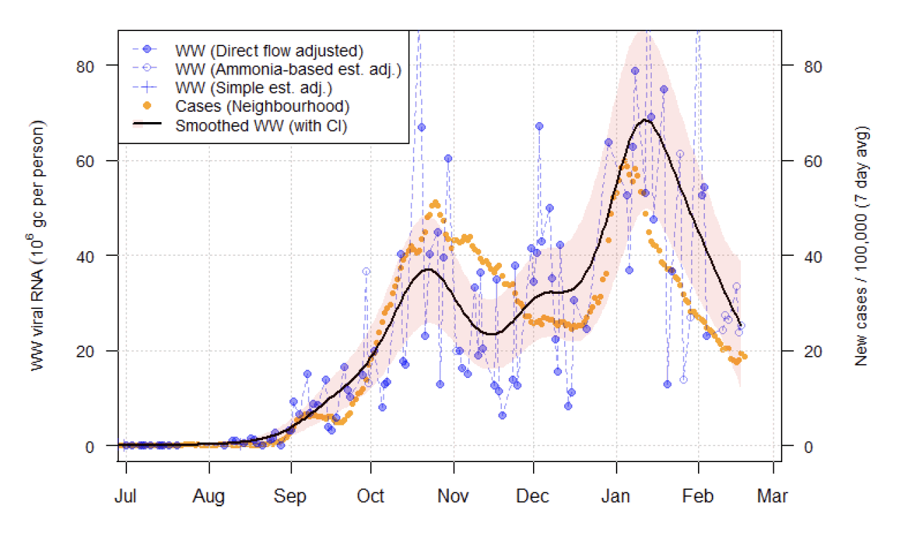
As noted in previous reports, the wastewater data can be noisy, particularly at some sites. To aid interpretation, ways have been investigated to fit smooth curves on the graphs to represent the general trends behind the noise. It is assumed that there is a smoothly varying underlying level of wastewater Covid, with individual measurements exhibiting some random variation around these levels. When presenting case numbers, moving averages are used for this purpose, but this approach is inappropriate for wastewater Covid as samples are not taken daily, but instead at irregular and often infrequent intervals. Instead, a statistical method known as generalized additive modelling (GAM) is used. It is assumed that the variability around the average can be described using the 'Tweedie' distribution. It is believed that this will capture the greater levels of variability seen in samples at higher Covid levels, while behaving well when Covid levels are very low. In addition, approximate confidence intervals (95%) can be given to indicate the uncertainty in estimated signal.
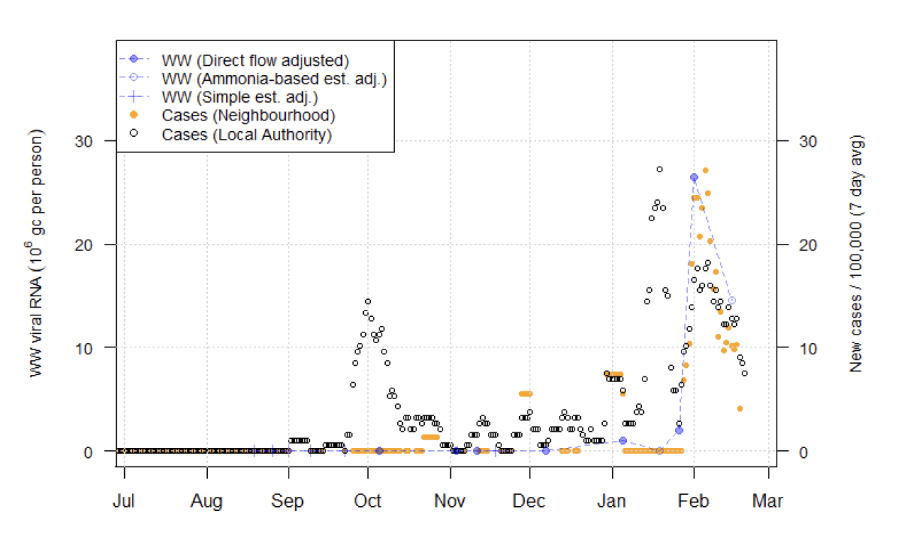
Figure 16 shows the application of this method for Shieldhall in Glasgow, where the large degree of variability makes smoothing especially valuable. A smooth estimate of wastewater RNA trend is superimposed, together with corresponding confidence intervals (the shaded area). This shows that despite the large amount of variation across samples, there is a clear dual peak pattern in wastewater Covid in the area, corresponding to similar trends in the case numbers.
The presence of large spikes in wastewater Covid readings continues to be problematic. This is exemplified by the situation at Seafield this week (Figure 17). Here there is a measurement of 98 million gc/person on Feb 15th, giving wastewater Covid levels slightly in excess of the previous January peak and representing an over 950% increase. Given the sudden nature of this rise, its location in only one site, and the only minimal corresponding increase in cases, it is considered that this latest reading is suspect. Seafield had otherwise produced wastewater trends that follow case levels well, and covers a large area, so this reading is surprising. Due to the large population within this catchment, inclusion of this reading would have a significant impact on the national average, as seen in Figure 15. A similar spike was seen in Nairn in the Highlands on 8 February. However, a subsequent sample at Nairn showed a return to much lower levels.
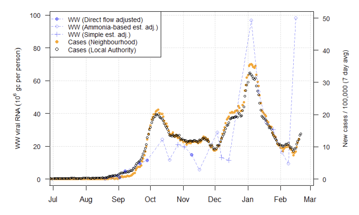
Finally, it is observed (Figure 18) that the increase in Wastewater Covid levels seen in Stornoway two weeks ago corresponded to a local surge in cases there, and that now both Wastewater Covid and case levels have subsequently reduced.
What next?
The Scottish Government continues to work with a number of academic modelling groups to develop other estimates of the epidemic in Scotland.
The modelled estimates of the numbers of new cases and infectious people will continue to be provided as measures of the epidemic as a whole, along with measures of the current point in the epidemic such as Rt and the growth rate. Further information can be found at Coronavirus in Scotland.
Investigations are ongoing by NERVTAG, SPI-M, SAGE and Scottish Government regarding the impact of the new variant, SARS-CoV-2 VOC 202012/01, which will be reflected here as work is undertaken.
Analysis from the EAVE 2 group, which tells us about the pattern of demographics and clinical risk groups over time for those who are testing positive with Covid, will be provided in future issues.
The delivery of the vaccination programme will both protect individuals and help prevent the onward spread of disease within the population as a whole. As the programme progresses the modelling and analysis of the epidemic will be updated so it reflects the impact of widespread vaccination.
In the section titled 'what the modelling tells us about infections, Hospital and ICU bed demand' we currently report 'better' and 'worse' projections. The better projection assumes an effect based on current vaccine roll-out plans and efficacy assumptions, whereas worse estimates what would be happening without vaccinations. In future issues the worse projection will be replaced with a projection corresponding to changes in behaviour and compliance.