Coronavirus (COVID-19): modelling the epidemic (issue no. 38)
Latest findings in modelling the COVID-19 epidemic in Scotland, both in terms of the spread of the disease through the population (epidemiological modelling) and of the demands it will place on the system, for example in terms of health care requirement.
Background
This is a report on the Scottish Government modelling of the spread and level of Covid-19. This updates the previous publication on modelling of Covid-19 in Scotland published on 4 February 2021. The estimates in this document help the Scottish Government, the health service and the wider public sector plan and put in place what is needed to keep us safe and treat people who have the virus.
This edition of the research findings focuses on the epidemic as a whole, looking at estimates of R, growth rate and incidence as well as local measures of change in the epidemic.
Key Points
- The reproduction rate R in Scotland is currently estimated as being between 0.7 and 0.9. This is the same as last week.
- The number of new daily infections for Scotland is estimated as being between 26 and 58, per 100,000 people.
- The growth rate for Scotland is currently estimated as being between -5% and -2%. This is the same as last week.
- At a national level the number of daily new infections are projected to continue falling in the next two weeks as result of lockdown restrictions. Hospital bed and ICU occupancy are also projected to fall over the next two weeks in advance of any partial schools re-opening effect.
Overview of Scottish Government Modelling
Epidemiology is the study of how diseases spread within populations. One way we do this is using our best understanding of the way the infection is passed on and how it affects people who catch it to create mathematical simulations. Because people who catch Covid-19 have a relatively long period in which they can pass it on to others before they begin to have symptoms, and the majority of people infected with the virus will experience mild symptoms, this “epidemiological modelling” provides insights into the epidemic that cannot easily be measured through testing e.g. of those with symptoms, as it estimates the total number of new daily infections and infectious people, including those who are asymptomatic or have mild symptoms.
Modelling also allows us to make short-term forecasts of what may happen with a degree of uncertainty. These can be used in health care and other planning. The modelling in this research findings is undertaken using different types of data which going forward aims to both model the progress of the epidemic in Scotland and provide early indications of where any changes are taking place.
Modelling outputs are provided here on the current epidemic in Scotland as a whole, based on a range of methods. Because it takes a little over three weeks on average for a person who catches Covid-19 to show symptoms, become sick, and either die or recover, there is a time lag in what our model can tell us about any re-emergence of the epidemic and where in Scotland this might occur. However modelling of Covid deaths is an important measure of where Scotland lies in its epidemic as a whole. In addition, the modelling groups which feed into the SAGE consensus use a range of other data along with deaths in their estimates of R and the growth rate. These outputs are provided in this research findings. The type of data used in each model to estimate R is highlighted in Figure 1.
A medium term projection of the number of cases, ICU and hospital bed demand is provided at this stage of the epidemic in Scotland.
It should be noted that this research findings covers a period of uncertainty with the growth of the new variant in Scotland (SARS-CoV-2 VOC 202012/01). The percentage of cases composed of this new variant is increasing in Scotland, from 73% in the 24 hour reporting period from 31 January to 1 February to 79% from 7 to 8 February[1].
What the modelling tells us about the epidemic as a whole
The various groups which report to the Scientific Pandemic Influenza Group on Modelling (SPI-M) use different sources of data in their models (i.e. deaths, hospital admissions, cases) so their estimates of R are also based on these different methods. SAGE’s consensus view across these methods, as of 10 February, was that the value of R in Scotland was between 0.7 and 0.9 (see Figure 1). The value of R on 3 February was between 0.7 and 0.9.
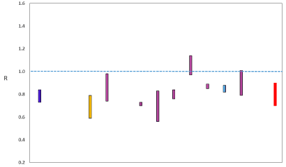
Source: Scientific Advisory Group for Emergencies (SAGE).
The various groups which report to the Scientific Pandemic Influenza Group on Modelling (SPI-M) use different sources of data in their models to produce estimates of incidence (Figure 2). SPI-M’s consensus view across these methods, as of 10 February, was that the incidence of new daily infections in Scotland was between 26 and 58 new infections per 100,000. This equates to between 1,400 and 3,200 people becoming infected each day in Scotland. The Scottish Government results this week have been computed using a new platform called Epidemia (see Technical Annex in issue 37), which expands the Bayesian semi-mechanistic model which Scottish Government runs.
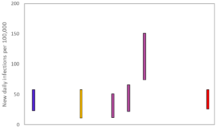
Source: Scientific Pandemic Influenza Group on Modelling (SPI-M).
The consensus from SAGE for this week is that the growth rate in Scotland is between -5 and -2% per day. On 3 February the growth rate was between -5 and -2%.
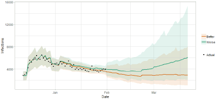
Scottish Government assess the impact of Covid on the NHS in the next few weeks in terms of estimated number of infections. For more on how we do this see page 4 of Issue 1 of the Research Findings for details[2].
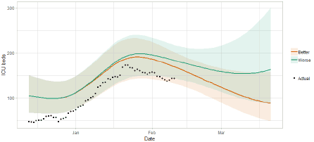
Figure 3 shows two projections which take account of vaccine roll-out (better and worse[3]).
What the modelling tells us about Hospital bed and ICU bed demand
Figure 4 shows the impact of the projections on the number of people in hospital.
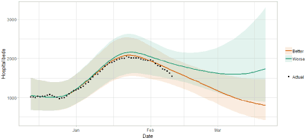
Figure 5 shows the impact of the projection on ICU bed demand.
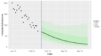
What the modelling tells us about projections of hospitalisations in the medium term
SAGE produce projections of the epidemic[5] (Figure 6), combining estimates from several independent models (including the Scottish Government’s logistics modelling, as shown in figures 3, 4 and 5). These projections are not forecasts or predictions. They represent a scenario in which the trajectory of the epidemic continues to follow the trends that were seen in the data up to 8 February and do not account for the impact of future policy or behaviour changes, such as the phased reopening of schools from the 22 February.
The delay between infection, developing symptoms, the need for hospital care, and death means they will not fully reflect the impact of behaviour changes in the two to three weeks prior to 8 February. Nor do they include seasonal effects that might increase transmission.
These projections include the potential impact of vaccinations over the next six weeks. The real-world effectiveness of vaccines, particularly against infection, is not yet known. The first dose effectiveness of the Pfizer-BioNTech and Oxford-AstraZeneca vaccines against both hospitalisation and death have been modelled in line with JCVI’s advice[6].
Beyond two weeks, the projections become more uncertain with greater variability between individual models. This reflects the large differences that can result from fitting models to different data streams, and the influence of small deviations in estimated growth rates and current incidence.
What can analysis of wastewater samples tell us about local outbreaks of Covid-19 infection?
Levels of Covid in wastewater collected at 28 sites around Scotland are adjusted for population and local changes in intake flow rate and compared to daily 7-day average positive case rates derived from Local Authority and Neighbourhood (Intermediate Zone) level aggregate data. See Technical Annex in Issue 34 of these Research Findings for the methodology.
Nationally, levels of COVID in wastewater have broadly stabilised, with only a minor increase of around 11% from the previous week, in contrast to the continued decline in the rate of new cases (Figures 1 and 5). Though there is substantial variation between sites making up the national figure, this continues the recent trend where the ratio of wastewater Covid levels to case rates is higher than in earlier periods. It is important to continue to monitor this feature.
Figure 7 shows wastewater Covid levels data aggregated over sites to produce a national average time series, with new cases data overlaid. The national picture for new cases data for the last week shows a continued (albeit slowing) decline in levels, while wastewater shows a small increase.
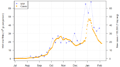
This increase may indicate a resurgence of coronavirus at some sites, or may be due to a number of recent factors that could serve to decouple wastewater from case data (such as new virus variants, changing weather, or testing patterns.)
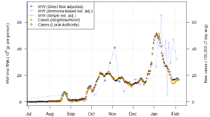
Recent wastewater Covid levels movement does differ substantially from site to site. In Nigg in Aberdeen, for instance (Figure 8), wastewater levels have followed the course of new cases in a rapid decline. A similar case applies in Seafield in Edinburgh where wastewater levels have also declined (not shown in this report), though levels are still somewhat high.
In contrast, in several other sites, any decline in wastewater Covid levels from the early January peak has either halted or not begun substantially in the first place. This is the case at Hatton in Angus (Figure 9) where wastewater Covid levels has hovered around the 30-40 million gc/person level even as the rate of new cases has dropped by around 60%. A similar situation may be present in Shieldhall in Glasgow, though wastewater measurement there is quite volatile.
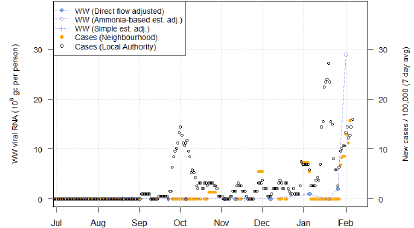
Finally, in a number of locations, there is a recent rise in wastewater Covid levels. In some cases, such as Stornoway in the Western Isles (Figure 10), as well as Falkirk and Lockerbie, this is corroborated by a recent increase in case rates in the local neighbourhoods. However, in Stirling and Carbarns, we saw very high levels even as case numbers remained flat.
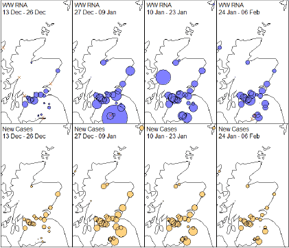
We may once again map out 2-week means for both the wastewater Covid levels data and the corresponding neighbourhood level case data (Figure 11), with the sizes of the circles denoting the local level of flow adjusted viral RNA per person (blue) or the rate of new cases (orange). Red crosses denote sites with no observations during that period.
In this representation we see that the large peak in wastewater Covid levels at Fort William has disappeared. However, in other locations, especially around the area of the central belt, wastewater levels have remained relatively constant between the last two 2-week periods even as they have declined in terms of new cases.
What next?
The Scottish Government continues to work with a number of academic modelling groups to develop other estimates of the epidemic in Scotland.
The modelled estimates of the numbers of new cases and infectious people will continue to be provided as measures of the epidemic as a whole, along with measures of the current point in the epidemic such as Rt and the growth rate. Further information can be found at https://www.gov.scot/coronavirus-covid-19.
Investigations are ongoing by NERVTAG, SPI-M, SAGE and Scottish Government regarding the impact of the new variant, SARS-CoV-2 VUI 202012/01, which will be reflected here as work is undertaken.
Updates of results from the Scottish Contact Survey (SCS) which tells us how people’s contact patterns have changed will be included in next week’s issue. Imperial local forecasts which indicate which local authorities are likely to experience high levels of Covid will also be included next week. Analysis from the EAVE 2 group, which tells us about the pattern of demographics and clinical risk groups over time for those who are testing positive with Covid, will be provided in future issues.