Coronavirus (COVID-19): modelling the epidemic (issue no. 36)
Latest findings in modelling the COVID-19 epidemic in Scotland, both in terms of the spread of the disease through the population (epidemiological modelling) and of the demands it will place on the system, for example in terms of health care requirement
Coronavirus (COVID-19): modelling the epidemic in Scotland (Issue No. 36)
Background
This is a report on the Scottish Government modelling of the spread and level of Covid-19. This updates the previous publication on modelling of Covid-19 in Scotland published on 21 January 2021. The estimates in this document help the Scottish Government, the health service and the wider public sector plan and put in place what is needed to keep us safe and treat people who have the virus.
This edition of the research findings focuses on the epidemic as a whole, looking at estimates of R, growth rate and incidence as well as local measures of change in the epidemic.
Key Points
- The reproduction rate R in Scotland is currently estimated as being between 0.7 and 1.0. This is a decrease compared to last week.
- The number of new daily infections for Scotland is estimated as being between 63 and 104, per 100,000 people.
- The growth rate for Scotland is currently estimated as being between
- -5% and -1%.
- Overall, average contacts have remained at a consistent level in the last two weeks (3.1 average contacts) but contacts in the workplace have increased by 71% and in the school they have risen by 35%. Contacts within the home setting have decreased for all age groups in the last two weeks.
- The proportion of participants visiting the work place has increased from 7% to 13% whereas those visiting another’s home has decreased from 38% to 20% in the last two weeks. In general, interactions between age groups have decreased from the level observed before the festive period (17 – 23 December).
- Modelled rates per 100K indicate that by the week of 7 - 13 February 2021, 19 (down 6 from last week) local authorities have at least a 75% probability of exceeding 50 cases, 9 (down 3) of those have at least a 75% probability of exceeding 100 cases and none of those have at least a 75% probability of exceeding 300 (or 500) cases. This is an improvement compared to the position last week.
- Analysis of levels of Covid in wastewater and new cases for the last week both show a similar reduction from the peak (in the first week of the New Year) by approximately 40%. However, nationally the level of Covid in wastewater is still, in the most recent week of available data, higher than the peak in November 2020.
Overview of Scottish Government Modelling
Epidemiology is the study of how diseases spread within populations. One way we do this is using our best understanding of the way the infection is passed on and how it affects people who catch it to create mathematical simulations. Because people who catch Covid-19 have a relatively long period in which they can pass it on to others before they begin to have symptoms, and the majority of people infected with the virus will experience mild symptoms, this “epidemiological modelling” provides insights into the epidemic that cannot easily be measured through testing e.g. of those with symptoms, as it estimates the total number of new daily infections and infectious people, including those who are asymptomatic or have mild symptoms.
Modelling also allows us to make short-term forecasts of what may happen with a degree of uncertainty. These can be used in health care and other planning. The modelling in this research findings is undertaken using different types of data which going forward aims to both model the progress of the epidemic in Scotland and provide early indications of where any changes are taking place.
Modelling outputs are provided here on the current epidemic in Scotland as a whole, based on a range of methods. Because it takes a little over three weeks on average for a person who catches Covid-19 to show symptoms, become sick, and either die or recover, there is a time lag in what our model can tell us about any re-emergence of the epidemic and where in Scotland this might occur. However modelling of Covid deaths is an important measure of where Scotland lies in its epidemic as a whole. In addition, the modelling groups which feed into the SAGE consensus use a range of other data along with deaths in their estimates of R and the growth rate. These outputs are provided in this research findings. The type of data used in each model to estimate R is highlighted in Figure 1.
A medium term projection of the number of cases, ICU and hospital bed demand is provided at this stage of the epidemic in Scotland.
An update of results are provided from the Scottish Contact Survey (SCS), to indicate how people's contacts have changed over the last two weeks.
It should be noted that this research findings covers a period of uncertainty with the growth of the new variant in Scotland (SARS-CoV-2 VUI 202012/01). The percentage of cases composed of this new variant is increasing in Scotland, from 64% in the 24 hour reporting period from 17 to 18 January to 67% from 24 to 25 January 2021[1]. The rate of percentage increase of the new variant has reduced in the last two weeks.
What the modelling tells us about the epidemic as a whole
The various groups which report to the Scientific Pandemic Influenza Group on Modelling (SPI-M) use different sources of data in their models (i.e. deaths, hospital admissions, cases) so their estimates of R are also based on these different methods. SAGE’s consensus view across these methods, as of 27 January, was that the value of R in Scotland was between 0.7 and 1.0 (see Figure 1). The value of R on 20 January was between 0.8 and 1.1.
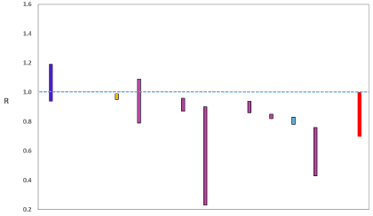
Source: Scientific Advisory Group for Emergencies (SAGE).
The various groups which report to the Scientific Pandemic Influenza Group on Modelling (SPI-M) use different sources of data in their models to produce estimates of incidence (Figure 2). SPI-M’s consensus view across these methods, as of 27 January, was that the incidence of new daily infections in Scotland was between 63 and 104 new infections per 100,000. This equates to between 3,400 and 5,700 people becoming infected each day in Scotland.
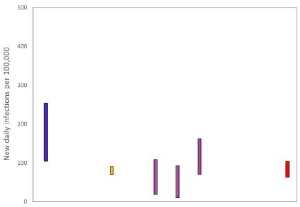
Source: Scientific Pandemic Influenza Group on Modelling (SPI-M).
The consensus from SAGE for this week is that the growth rate in Scotland is between -5 and -1% per day. On 20 January the growth rate was between -4 and 1%.
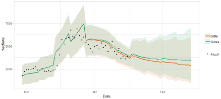
The logistical model developed by Scottish Government to assess implications for health care demand (see previous Research Findings) has been adapted to produce a medium-term prediction of infections.
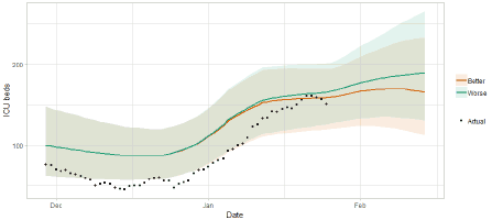
Figure 3 shows two projections which take account of vaccine roll-out (better and worse).
What the modelling tells us about Hospital bed and ICU bed demand
Figure 4 shows the impact of the projections on the number of people in hospital.
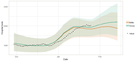
Figure 5 shows the impact of the projection on ICU bed demand.
What the modelling tells us about projections of hospitalisations in the medium term
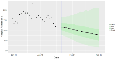
SAGE produce projections of the epidemic[3] (Figure 6), combining estimates from several independent models (including the Scottish Government’s logistics modelling, as shown in figures 3, 4 and 5). These projections are not forecasts or predictions. They represent a scenario in which the trajectory of the epidemic continues to follow the trends that were seen in the data up to 25 January and do not account for the impact of future policy or behaviour changes.
The delay between infection, developing symptoms, the need for hospital care, and death means they will not fully reflect the impact of behaviour changes in the two to three weeks prior to 25 January. Nor do they include seasonal effects that might increase transmission.
These projections include the potential impact of vaccinations over the next 3 weeks. The delay between vaccination, the build-up of immunity and infection means the impact on admissions and deaths over the next 3 weeks is expected to be limited.
Beyond two weeks, the projections become more uncertain with greater variability between individual models. This reflects the large differences that can result from fitting models to different data streams, and the influence of small deviations in estimated growth rates and current incidence.
What we know about how people’s contact patterns have changed
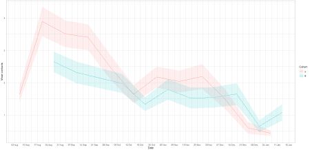
Since the survey that pertained to the period of 31 December – 6 January, mean contacts have remained consistent at approximately 3.1 average contacts as shown in Figure 7.
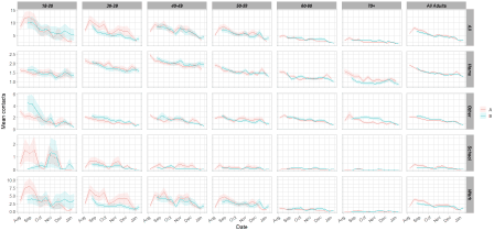
Although overall contacts have remained at a similar level, there are significant changes to contacts across settings as seen in Figure 8. Mean contacts in the workplace have increased by 71% (Figure 9) and contacts in the school have also risen by 35%. These increases have been offset by the decreases seen within the home and other setting where there have been reductions of 23 and 9% respectively.
Changes between age groups within settings are similar. All age groups have shown an increase in work contacts with the exception of those over 70. This is likely due to those returning to work after the festive holidays and those unable to work from home. Individuals aged between 50 and 70 have reported the largest rise in work contacts, increasing by double in the last 2 weeks. Contacts within the home setting have decreased for all age groups with the largest reduction observed with those over 50, with an average 12% reduction.
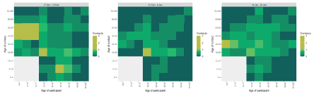
The heatmaps in Figure 10 show mean contacts between age groups before (17 – 23 December), during (31 December – 6 January) and after the festive period (14 – 20 January). This illustrates that most interactions before the festive period were between those under 18 with individuals aged between 40 and 70. This changes during the festive period where a reduction, ranging between 55-99%, is seen in contacts between these age groups. Interactions between 40-49 have maintained their low level after the festive period with under 18’s, whereas contacts between those aged 50-70 have increased with under 18’s. This higher magnitude of contacts however is still a reduction, ranging between 59% to 82%, compared to before the festive period (17 – 23 December).
In general there has been a reduction in interactions amongst the over 18s since the period before the festive period (17 – 23 December) with notable decreases seen in the 18-29 age group (30% on average) and 50-59 (12% on average), despite the latter group demonstrating an increase immediately after the festive period.
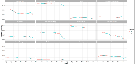
As Figure 11 shows, changes in participant behaviour has varied across settings. Decreases are seen in the most settings with the exception of visits to a work place, healthcare setting and public transport where there has been increases. The biggest decrease in participant behaviour over the last two weeks has been in visits to another’s home, dropping from 38% (31 December – 6 January) to 20% (14 – 30 January). The percentage of participants visiting the work place has increased from 7% to 13% over the same period.
What we know about which local authorities are likely to experience high levels of Covid
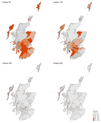
We use modelling based on Covid cases and deaths[4], conducted by Imperial College London, to give us an indication of whether a local authority is likely to experience high levels of Covid in the future. An area is defined as a hotspot if the two week prediction of cases (positive tests) per 100K population are predicted to exceed a threshold, e.g. 500 cases. See technical annex in issue 24.
Modelled rates per 100K (Figure 12) indicate that by the week of 7 - 13 February 2021, 19 (down 6 from last week) local authorities have at least a 75% probability of exceeding 50 cases, 9 (down 3) of those have at least a 75% probability of exceeding 100 cases and none of those have at least a 75% probability of exceeding 300 (or 500) cases. The probability of exceeding will be affected by the lockdown as well as by how much new variant is present in a local authority area. This adds to the uncertainty around this modelling this week.
What can analysis of wastewater samples tell us about local outbreaks of Covid-19 infection?
Levels of Covid in wastewater collected at 28 sites around Scotland are adjusted for population and local changes in intake flow rate and compared to daily 7-day average positive case rates derived from Local Authority and Neighbourhood (Intermediate Zone) level aggregate data. See Technical Annex in Issue 34 of these Research Findings for the methodology.
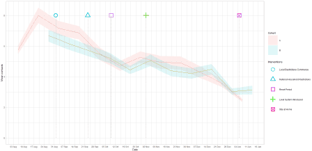
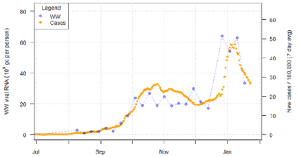
Analysis of levels of Covid in wastewater[6] and new cases data for the last week show a similar clear decline in levels from the peak seen in the first week after New Year by approximately 40% in the most recent week in the data, as can be seen in Figure 13. However, nationally the level of Covid in wastewater, in the most recent week, is still higher than the peak in November 2020.
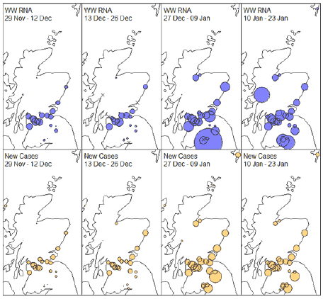
The geographic pattern of COVID-19 across the sites can be seen in Figure 14. Here we take two-week aggregate means for both the wastewater Covid data and the corresponding neighbourhood level case data, and plot this as a map, with the sizes of the circles denoting the local level of viral RNA (in gc/person) (blue) or the rate of new cases (yellow). Crosses denote wastewater sites with no observations during that period.
The relative changes are similar between both wastewater and new case data in many sites, though some exceptions exist where the levels of Covid in wastewater have continued to climb during January whereas the rate of new cases have declined. In particular, the three sites in the Borders, and Nairn and Allanfearn near Inverness.
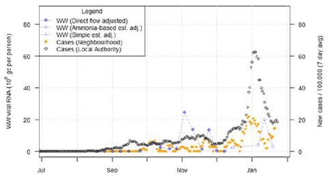
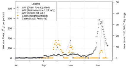
Focusing on Galashiels in the Borders region (Figure 15), we see that the match of levels of Covid in wastewater to new case rates for the corresponding neighbourhoods is not very close. However, there is a suggestion that the peak in level of Covid in wastewater in the New Year seems to be delayed relative to the peak in reported new cases at this site, as well as the Borders, Nairn, and Allanfearn sites. This delay is not always seen at all sites. Timing lag will be the focus of future study.
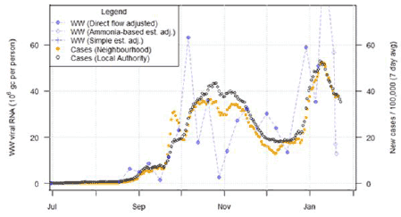
In contrast, considering Dalmuir (near Glasgow) in Figure 16, the levels of Covid in wastewater appears to show a good, if noisy correspondence to case rates. Similar strong correspondence continues to be present at the major city sites of Nigg, Shieldhall and Seafield shown in previous reports.
Finally, in the case of Fort William, we have seen occasional instances of extremely high levels of wastewater Covid (especially relative to the small population and level of influent flow). One measurement falls beyond the axis range. However, the timing of the large peaks and falls in the wastewater Covid levels match well the peak and falls in the neighbourhood case levels.
In both Figure 15 (Galashiels) and Figure 17 (Fort William, very different case trends can be seen for the relatively small local neighbourhood (orange dots) compared to the much larger local authority (black dots). This underlines the need to match up geographically the occurrence of confirmed cases to wastewater treatment works catchment areas. We are in the process of gaining access to finer resolution datazone based case data, which would improve matching for smaller catchments.
What next?
The Scottish Government continues to work with a number of academic modelling groups to develop other estimates of the epidemic in Scotland.
The modelled estimates of the numbers of new cases and infectious people will continue to be provided as measures of the epidemic as a whole, along with measures of the current point in the epidemic such as Rt and the growth rate. Further information can be found at https://www.gov.scot/coronavirus-covid-19.
Investigations are ongoing by NERVTAG, SPI-M, SAGE and Scottish Government regarding the impact of the new variant, SARS-CoV-2 VUI 202012/01, which will be reflected here as work is undertaken.