Patient pathways - basic building blocks methodology: guidance
Guidance on the use of the Basic Building Blocks methodology which is a systematic approach to the demand and capacity analysis of existing patient pathways.
4. Inpatient Staging Post Profiling
Inpatient Units which form part of an emergency patient's pathway will require baseline analysis and profiling. It is recommended that receiving or admission units are individually profiled, however when you are analysing downstream general wards it is possible to group these together. It is advisable to profile specialist units individually such as Coronary Care Units, Intensive Care Unit, and Medical High Dependency Unit etc.
For each inpatient staging post there are 3 key areas of analysis:
a) demand profiling
b) length of stay profiling
c) occupancy
This information will aid operational management in optimising flow through the ward/unit.
a) Demand Profiling
The profiling boxplot chart on the following page (Fig 18) summarises the key statistics relating to a sample inpatient unit's admissions, based on a 12 month dataset. Boxplot analysis is useful as it provides information on the admission demand per day, derived from previous data. In this case a full 12 months has been analysed, but it can be useful to generate these charts on a quarterly or even monthly basis to identify seasonal variations. The statistics generated provide an understanding of the inter-week variation in admission numbers to a unit, and provide an 'expected' level of admissions to facilitate capacity planning. Although the 'average' admission number is often used the optimal measure for capacity planning is considered the 85 th percentile level of anticipated demand.
By planning systems to the 85 th percentile of admissions we are building a system that will be resilient enough to cope with all but the most extreme levels of demand. At ward level we can reduce variation and improve flow in a number of ways, such as, by smoothing discharge more evenly over the day, ensuring discharge tasks are completely in a timely manner, or by pulling patients from upstream rather than waiting for work to be pushed on the ward.
The summary statistics generated in the boxplot graph and table on the following page (Fig 18) are the same as those previously prepared for the Emergency Department. Guidance on interpretation can be found on page 13.
Fig 18.
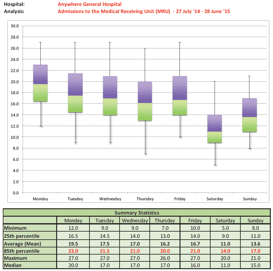
In Fig 18, the daily admissions to a 20 bedded Medical Receiving Unit have been analysed. The admission profile of this unit is similar to many receiving/admission units:
- Monday is the busiest day for admissions, with on average anticipated 19.5 admissions and with 23 anticipated at the 85 th percentile.
- You will see that the average daily anticipated admission numbers reduce slight mid-week, increase on Friday and then reduce through the weekend.
The identification and understanding of intra-week variation is very important as it informs capacity planning and the development of local strategies to cope with the 'expected' higher levels of admissions on certain days.
Inpatient Admissions and Discharges
Balancing the demand for admission with bed capacity, in the right place at the right time can be challenging. The first steps of analysis to support the alignment of demand and capacity requires some baseline analysis of your current inpatient wards.
The initial stage of analysis involves the generation of current admissions numbers per hour of the day, per day of the week. This analysis provides a set of daily admission profiles by hour which represents how your current inpatient wards services the demand for admission. This must be distinguished from the actual demand for admission, which can be derived from the time when the decision to admit the patient was made, or a patient became ready for transfer and the bed request was made.
The following example takes you through the analysis generated for the 20 bedded medical receiving unit in Anytown Hospital. A full year of data (2015/16) was analysed. In this example the analysis generated is for Monday's. To complete a full review of capacity and demand this analysis will be required for each day.
The baseline average admission profile on a Monday is shown in Fig 19. This chart represents the average number of patients admitted per hour on a Monday. It represents the current system.
Fig 19.
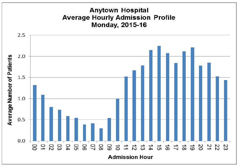
In Fig 19. the current hourly admission pattern is shown, however the next stage is to identify what it should be. To prepare this chart requires data on the 'decision to admit' time for each patient or the 'bed request' time. If this information is not readily available electronically a prospective audit can be carried out to gather this dataset.
In Anytown Hospital, data relating to decision to admit time is available from the electronic system. A chart (Fig 20) can be generated indicating what the admission profile on a Monday should look like if patients are admitted within 30 minutes of a bed request or decision to admit.
Fig 20.
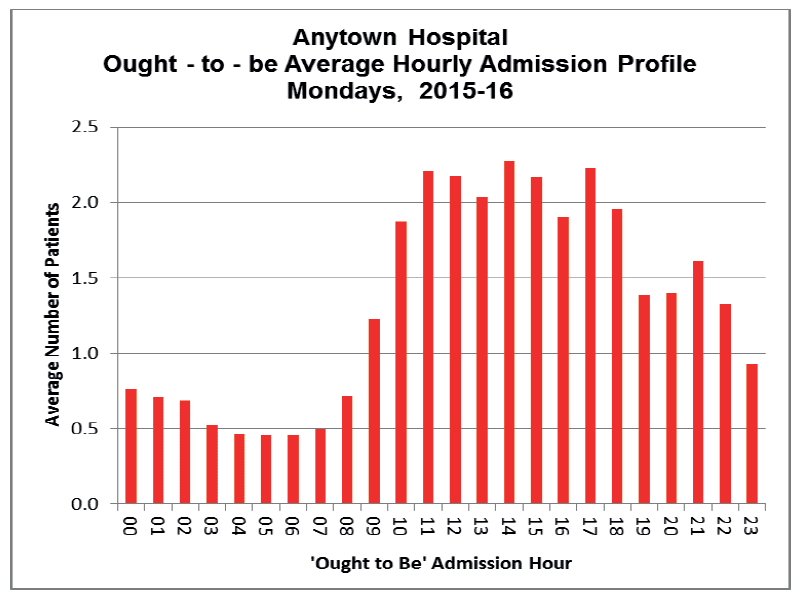
The current admission profile can now be compared to the 'ought to be' profile. Ideally, to minimise patient delay, the 2 datasets should 'match'.
From a comparator graph (Fig 21) a misalignment between the actual admission demand (the ought-to-be hourly profile), and the current system is evident. It is apparent in this case that the actual demand for admission is earlier in the day than the capacity created and delivered by the current system. As a result in the evening period, the system 'catches up' with the demands of the day.
Fig 21.
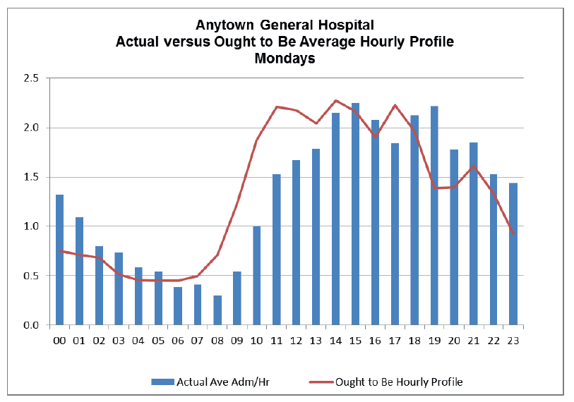
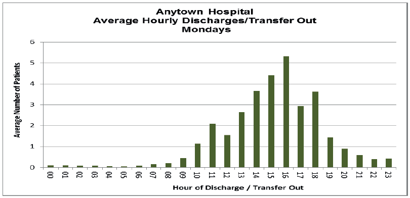
This misalignment is common occurrence and is often driven by the discharge profiles within the inpatient wards. In Anytown Hospital the number of morning discharges is low, with the majority of patients being discharged and transferred out in the afternoon and into the evening (Fig 22). This discharge pattern does not meet the demands for admission and results in patient delays and poor flow through the afternoon period.
Fig 22.
This type of admission demand analysis can identify two types of capacity and demand misalignment, either a shortfall overall capacity or the time when capacity becomes available. When a shortfall in overall bed capacity is the cause you will see frequent and sustained boarding of patients to other specialty wards from admission. However the common cause of the misalignment is due to the hour of the day when capacity is created versus the hourly demand, as is the case in this example hospital. Once a mismatch is identified further analysis is required to identify the cause to inform improvements and test of change required.
There are a few further charts that are useful to determine some metrics for daily inpatient discharges. By using the same dataset, a cumulative discharge profile can be produced.
Fig 23.
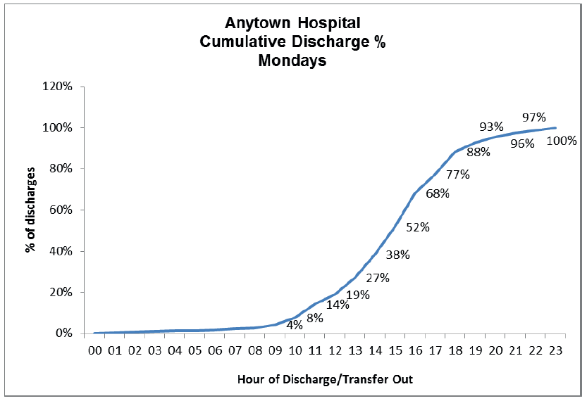
Fig 23. shows that this unit achieves 19% of anticipated discharges or transfers by 1 p.m.
From the 'ought to be' demand levels for this unit, the percentage of admissions which 'ought to be admitted' from midnight to 1 p.m. is 40.1%.
This analysis can be used to highlight misalignment in capacity and demand, at specific hours in the day. In this specific example the data has provided a clear focus for improvement, focusing on earlier discharge.
b) Length of Stay Profiling
An initial analysis of length of stay analysis within each inpatient unit using retrospective data should be prepared. This information provides a baseline of the unit's current performance. It is useful to analyse length of stay by day of arrival and by month (to check for seasonality). Examples are provided below (Fig 24) using the dataset from Anytown General Hospital MRU.
The overall average length of stay within the MRU (12 months dataset) was 21.4 hours. This average length of stay by day of arrival is summarised below.
Fig 24.

From these summary statistics a number of interesting features can be identified;
- Each day there are a number of patients who are admitted into this unit and discharged immediately - in this case investigation revealed a small number of patients each day who are instantly re-directed to an ambulatory care unit.
- The 25 th percentile shows that 25% of the patients admitted are discharged or transferred within 6.5 hours on a Monday, 8.3 hours on a Saturday etc. Understanding the patient groups who remain within an inpatient unit for a short time period is worth further consideration. Depending on the type and purpose of the unit this may be normal but in some cases it may indicate that there is a group of patients whose care may be suited to an alternative service (for example ambulatory care). Remember that all these summary statistics have the individual patient episodes behind them therefore your data analyst will be able to extract specific patient cohorts for more detailed review.
- The average length of stay is relatively consistent Monday -Thursday, but you will note a rise for those being admitted at the weekend. This is mirrored in the rise in the 85 th percentile average length of stay for those being admitted on Friday and Saturday. Further examination of this cohort is worthwhile to understand the causes of this weekend effect.
- The maximum length of stay recorded by day is extremely high for a unit that aims for a 24 hour stay. Again it is useful to prepare further analysis of the long staying cohort to understand causes e.g. clinical, lack of bed availability for transfer, lack of single rooms etc.
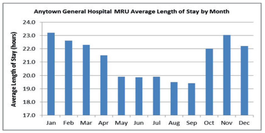
A baseline review of monthly average length of stay is beneficial to ascertain seasonal variation. You will note there is a clear variation in the winter and summer periods in this chart. (Fig 26)
Fig 26.
A further useful graph for displaying the length of stay within an inpatient unit is shown below (Fig 27.).
Fig 27.
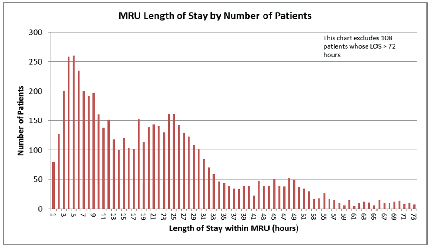
This graph displays the total number of patients by each hourly length of stay. Two peaks are evident at 4-5 hours and 25-26 hours. This chart can be useful to identify the range of length of stay within an inpatient unit.
Very often this range can be linked to different cohorts of patients, those with single issue conditions with a short admission to more complex patients who require an extended period of care, and often have rehabilitation requirements. It is beneficial to look at average length of stay by outcome (discharge or transfer to another ward/unit). Further local internal audit can help provide more detailed information on what drives the unit length of stay such as; clinical reasons, delays to diagnostics, or transfer and transport issues
A unit's length of stay should be continuously monitored utilising SPC charts. These charts should be routinely updated and reviewed to pick up any developing trends, and any occurrence of special cause variation which should be examined. In addition these charts can be used to monitor the impact of any re-design or improvement work
c) Occupancy Profiling
Understanding an inpatient unit's occupancy per hour per day is important as the level of "fullness" significantly impacts on its ability to meet the demand for beds placed on it. Often downstream inpatient ward run at high occupancy and operate on a one out / one in basis throughout the day. However in receiving or inpatient admission units, high occupancy throughout the day often leads to backlogs, poor flow and 'bed waits' for patients.
An analysis of occupancy of a 20 bedded Medical Receiving Unit over a seven day period (in the summer) is shown in Fig 28. This type of analysis can and should be generated over longer periods, particularly if seasonal variation is evident.
Fig 28.
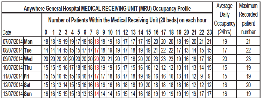
From this analysis you will note that even in the summer period the unit has periods of very high occupancy and at times is over-occupied. The use of the occupancy template is advised to support improvement. The data can be analysed by day of week, or by month, to identify particular periods of high occupancy. When high occupancy periods are identified further analysis or audit can help to determine cause, which may be due to a number of factors including medical and nurse staffing levels, portering resources etc. The template can also be used to assess the impact of improvement work.
Contact
Email: Unscheduled Care Team