Quality Improvement and Measurement - What Non-Executive Directors need to know
This publication is designed to give Non-Executive Directors of Health Boards an overview of what Quality Improvement and measurement is and how they can ensure that this approach is used by Health Boards.
Appendix 2d - Showing data and variation over time
Data is often aggregated and presented over long time periods, yet shown as discrete points in time. If there are not enough points in time this can lead to poor interpretation. Presenting data continuously over time can provide a more accurate basis for decision making. An example of this is shown at:
http://www.institute.nhs.uk/images/documents/Share%20and%20network/PEN/Measurement%20for%20Improvement.ppt
Run charts
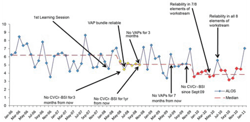
Run charts are line graphs where a measure is plotted over time with the median also shown. Changes made to a process are also often marked on the graph so that they can be connected with the impact on the process.
Example of an annotated run chart
Average length of stay (ALOS) in Intensive Care Unit (days)

Courtesy of Professor Kevin Rooney, University of the West of Scotland and NHS Greater Glasgow and Clyde.
More information on run charts can be found at:
http://www.qihub.scot.nhs.uk/knowledge-centre/quality-improvement-tools/run-chart.aspx
Contact
Email: Sarah Hildersley