Experience Panels - branding of Social Security Scotland: visual summary
Visual summary of findings from research into Social Security Scotland’s name and logo, and branding and wording guidance.
Icons
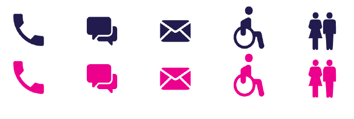
Survey and focus group participants were shown a set of icons (fig. 9) and asked to rate them against attributes on a five-point scale. It was made clear to participants that the icons presented to them were provisional.
Figure 9: Icons

Participant views on icons
Survey participants tended to agree the icons reflected the attributes, with at least four out of five participants agreeing with all of the attributes except inclusive. Almost a quarter of participants neither agreed nor disagreed that the icons were inclusive, and one on ten disagreed or strongly disagreed.
Table 10: Survey participant views on icons (n=89-91)
| Attribute | Strongly Agree or Agree (%) | Neither agree nor disagree (%) | Disagree or Strongly disagree (%) |
|---|---|---|---|
| Clear | 92 | 4 | 3 |
| Easy to see | 94 | 2 | 3 |
| Easy to understand | 80 | 9 | 11 |
| Bright | 88 | 11 | 1 |
| Helpful | 84 | 13 | 3 |
| Inclusive | 63 | 25 | 12 |
Some survey respondents explained their views on the inclusive attribute in the text box provided. A number of participants commented on the male/female icon in particular:
“…And why have male and female figures, without a non-binary figure…”
“Why is there an old fashioned male/female sign? This is in no way society’s take on gender and will bother many people.”
Other participants felt the wheel chair logo was problematic:
“disabled people represented by a wheelchair? Great. How very clichéd.”
“Inclusive? This is the problem with your disabled person […] is not always in a wheelchair”
A recurring theme in focus groups was how to strike the balance between using a recognizable symbol such as the wheelchair or male and female logo, and adopting a newer, potentially more inclusive symbol which was unlikely to be as widely understood.
During focus groups, participants tended to believe being more readily understood was of greater importance than using a more inclusive symbol.
Understanding the icons
Many participants felt they could understand the icons presented to them:
“I like the icons and it is easy to understand what they represent”
“The signs are simple, bright and understandable”
A minority of participants commented on potential difficulties understanding certain icons. This tended to relate to the speech bubble ‘webchat’ icon and whether the envelope icon was referring to email or post:
“The icon for message and email may not be understood by elderly clients”
To address this, some suggested that icons should never be used in isolation and should always have accompanying text giving to give context.
Contact
Email: James.Miller@gov.scot