Coronavirus (COVID-19): modelling the epidemic (issue no. 44)
Latest findings in modelling the COVID-19 epidemic in Scotland, both in terms of the spread of the disease through the population (epidemiological modelling) and of the demands it will place on the system, for example in terms of health care requirement.
Coronavirus (COVID-19): modelling the epidemic in Scotland (Issue No. 44)
Background
This is a report on the Scottish Government modelling of the spread and level of Covid-19. This updates the previous publication on modelling of Covid-19 in Scotland published on 18 March 2021. The estimates in this document help the Scottish Government, the health service and the wider public sector plan and put in place what is needed to keep us safe and treat people who have the virus.
This edition of the research findings focuses on the epidemic as a whole, looking at estimates of R, growth rate and incidence as well as local measures of change in the epidemic.
Key Points
- The reproduction rate R in Scotland is currently estimated as being between 0.8 and 1.0.
- The number of new daily infections for Scotland is estimated as being between 13 and 30, per 100,000 people.
- The growth rate for Scotland is currently estimated as being between -4% and -1%.
- Average contacts remain relatively steady from the last two weeks to now, with a current level of 3.0 daily contacts.
- Those aged over 70 have the largest increase in contacts in the most recent survey. compared to two weeks before, reporting a rise in contacts in all settings.
- In the last two weeks the biggest increase in interactions between age groups is for individuals aged 40-49 with those under 18.
- The biggest change, though slight, is seen in the proportion of people visiting another's home, up from 24% to 27% in the last two weeks.
- Hospital bed and ICU occupancy are projected to fall over the next few weeks, but with the potential to plateau, or increase, as a result of schools reopening.
- The proportion of people testing positive who were categorised as not being in any clinical risk group has risen from around 55% in November to over 60% in mid-March. In mid-January just over 16% of people testing positive were 65 or over, this reduced to just over 5% in early March.
- Modelled rates per 100K indicate that by the week 4 - 10 April 2021, 8 local authorities have at least a 75% probability of exceeding 50 cases, 1 of those have at least a 75% probability of exceeding 100 cases and none of those have at least a 75% probability of exceeding 300 cases. In last week's issue of these Research Findings, 9 local authorities had a 75% or higher probability of exceeding 50 cases per 100K.
- The overall level of wastewater Covid this week was similar to the last two weeks, reflecting the ongoing plateau in the rate of new cases. This pattern was driven by the largest catchments, which sustained moderate levels of Covid-19 in wastewater. In contrast many small, more isolated, catchments have very low levels.
Overview of Scottish Government Modelling
Epidemiology is the study of how diseases spread within populations. One way we do this is using our best understanding of the way the infection is passed on and how it affects people who catch it to create mathematical simulations. Because people who catch Covid-19 have a relatively long period in which they can pass it on to others before they begin to have symptoms, and the majority of people infected with the virus will experience mild symptoms, this "epidemiological modelling" provides insights into the epidemic that cannot easily be measured through testing e.g. of those with symptoms, as it estimates the total number of new daily infections and infectious people, including those who are asymptomatic or have mild symptoms.
Modelling also allows us to make short-term forecasts of what may happen with a degree of uncertainty. These can be used in health care and other planning. The modelling in this research findings is undertaken using different types of data which going forward aims to both model the progress of the epidemic in Scotland and provide early indications of where any changes are taking place.
Modelling outputs are provided here on the current epidemic in Scotland as a whole, based on a range of methods. Because it takes a little over three weeks on average for a person who catches Covid-19 to show symptoms, become sick, and either die or recover, there is a time lag in what our model can tell us about any re-emergence of the epidemic and where in Scotland this might occur. However modelling of Covid deaths is an important measure of where Scotland lies in its epidemic as a whole. In addition, the modelling groups which feed into the SAGE consensus use a range of other data along with deaths in their estimates of R and the growth rate. These outputs are provided in this research findings. The type of data used in each model to estimate R is highlighted in Figure 1.
We use the Scottish Contact Survey to inform a modelling technique based on the number of contacts between people. Over time, a greater proportion of the population will be vaccinated. This is likely to impact contact patterns and will become a greater part of the analysis going forwards.
The delivery of the vaccination programme will offer protection against severe disease and death. The modelling includes assumptions about compliance with restrictions and vaccine take-up. Work is still ongoing to understand how many vaccinated people might still spread the virus if infected. As Covid-19 is a new disease there remain uncertainties associated with vaccine effectiveness. Furthermore, there is a risk that new variants emerge for which immunisation is less effective.
The logistical model utilises results from the epidemiological modelling, principally the number of new infections. The results are split down by age group, and the model is used to give a projection of the number of people that will go to hospital, and potentially to ICU. This will continue to be based on both what we know about how different age groups are effected by the disease and the vaccination rate for those groups.
What the modelling tells us about the epidemic as a whole
The various groups which report to the Scientific Pandemic Influenza Group on Modelling (SPI-M) use different sources of data in their models (i.e. deaths, hospital admissions, cases) so their estimates of R are also based on these different methods. SAGE's consensus view across these methods, as of 24 March, was that the value of R in Scotland was between 0.8 and 1.0 (see Figure 1). The value of R on 17 March was between 0.7 and 1.0.
Figure 1. Estimates of Rt for Scotland, as of 24 March, including 90% confidence intervals, produced by SAGE. The blue bars are death-based models, purple use multiple sources of data and cyan uses Covid-19 test results. The estimate produced by the Scottish Government is the 2nd from left (yellow), while the SAGE consensus range is the right-most (red).
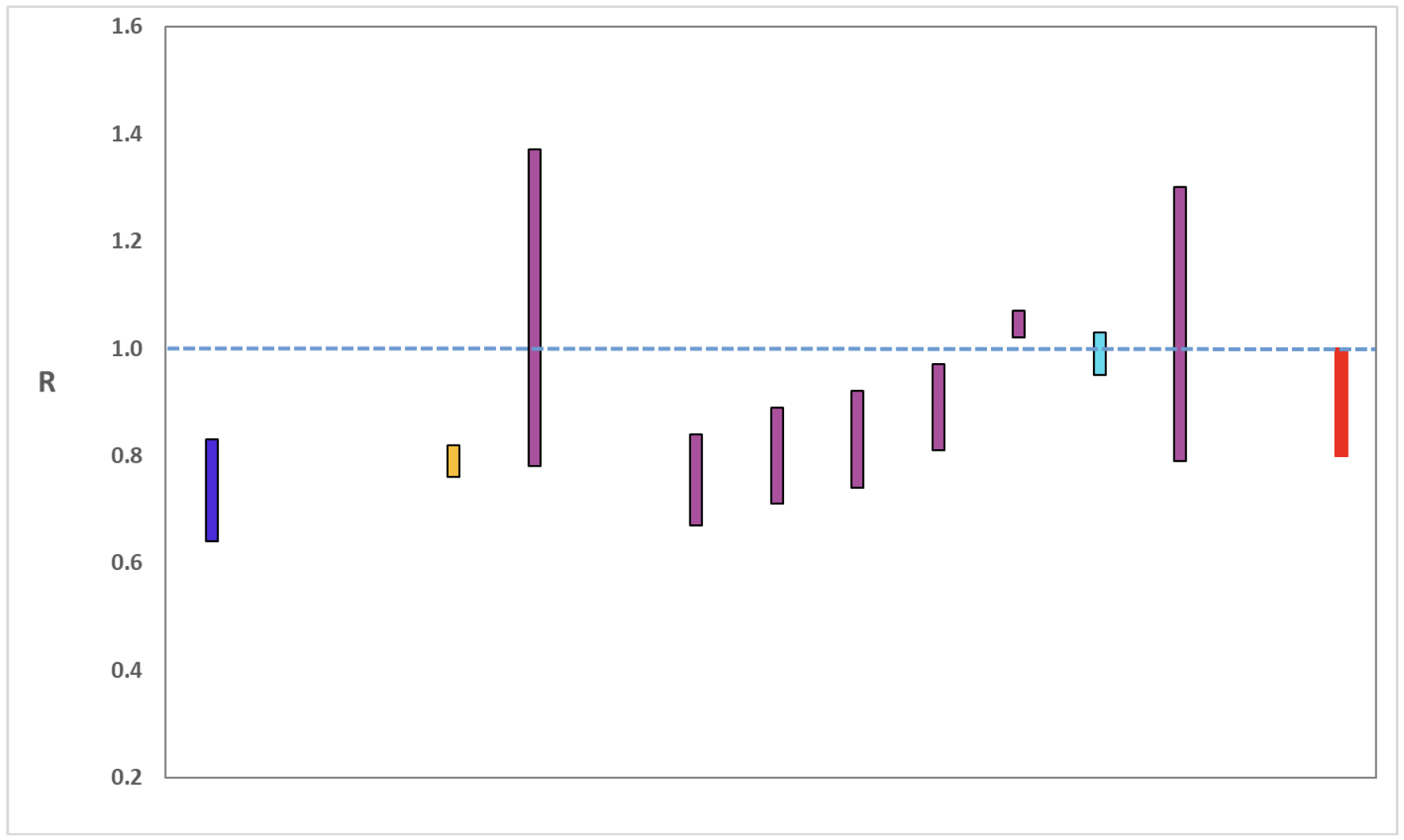
Image Description:
A graph showing the range of values which each of the academic groups reporting an R value to SAGE are likely to lie within. The blue bar is a death-based model, purple (3rd to 8th and 10th from the left) use multiple sources of data and cyan uses Covid-19 test results. The estimate produced by the Scottish Government (a deaths-based model) is the 2nd from left (yellow). The R value estimated by the Scottish Government is similar to the estimates of other groups using models which draw upon numbers of deaths. The SAGE consensus, shown at the right hand side of the plot, is that the most likely range is between 0.8 and 1.0.
Source: Scientific Advisory Group for Emergencies (SAGE).
The various groups which report to the Scientific Pandemic Influenza Group on Modelling (SPI-M) use different sources of data in their models to produce estimates of incidence (Figure 2). The Scottish Government results this week have been computed using a platform called Epidemia (see Technical Annex in issue 37), which expands the Bayesian semi-mechanistic model which the Scottish Government runs. SPI-M's consensus view across these methods, as of 24 March, was that the incidence of new daily infections in Scotland was between 13 and 30 new infections per 100,000. This equates to between 710 and 1,640 people becoming infected each day in Scotland.
Figure 2. Estimates of incidence for Scotland, as of 24 March, including 90% confidence intervals, produced by SPI-M. The blue bar is a death-based model and the purple bars represent models which use multiple sources of data. The estimate produced by the Scottish Government (a semi-mechanistic model) is the 2nd from left (yellow), while the SAGE consensus range is the right-most (red).
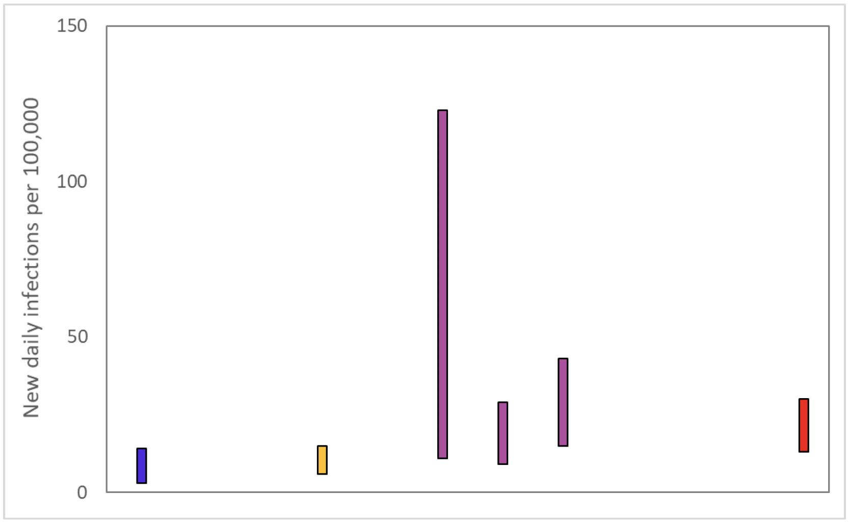
Image Description:
A graph showing the ranges the values which each of the academic groups in SPI-M are reporting for incidence (new daily infections per 100,000) are likely to lie within. The blue bar is a death based model (1st from left). The purple bars (3rd to 5th from the left) use multiple sources of data. The estimate produced by the Scottish Government (a deaths-based model) is the 2nd from the left (yellow). The SAGE consensus is shown at the right hand side of the plot, between 13 and 30.
Source: Scientific Pandemic Influenza Group on Modelling (SPI-M).
The consensus from SAGE for this week is that the growth rate in Scotland is between -4 and -1% per day. On 17 March the growth rate was between -6 and -2%.
What we know about how people's contact patterns have changed
As a whole, average contacts remain steady from the last two weeks to now, with a current level of 3.0 daily contacts as seen in Figure 3. Contacts within the work setting have decreased by 23% in the last two weeks while contacts within all other settings remain at similar levels over the same period.
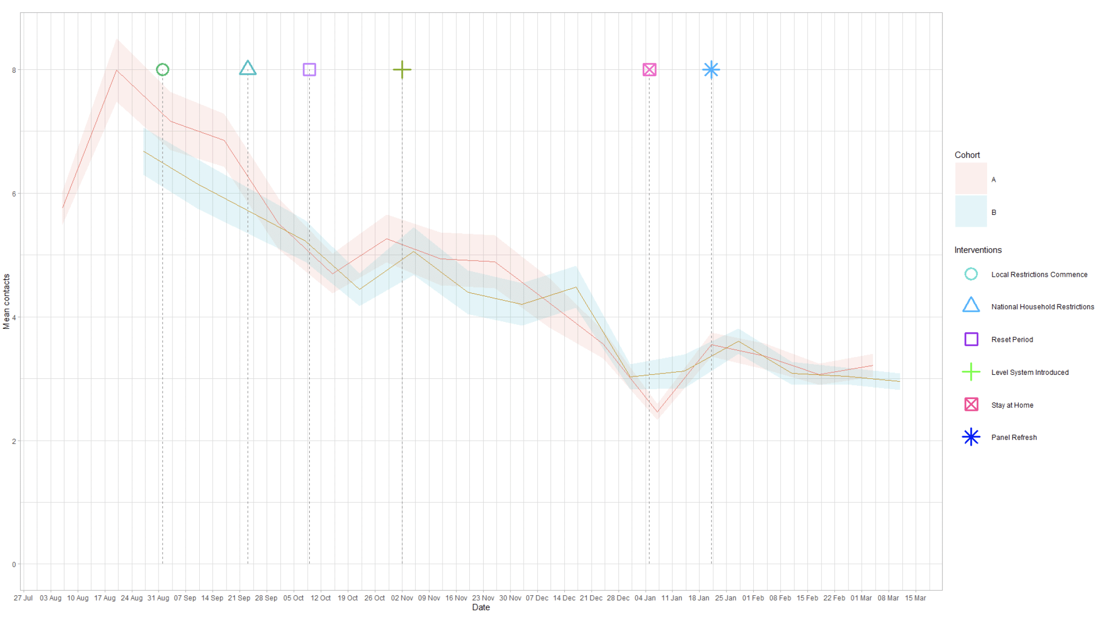
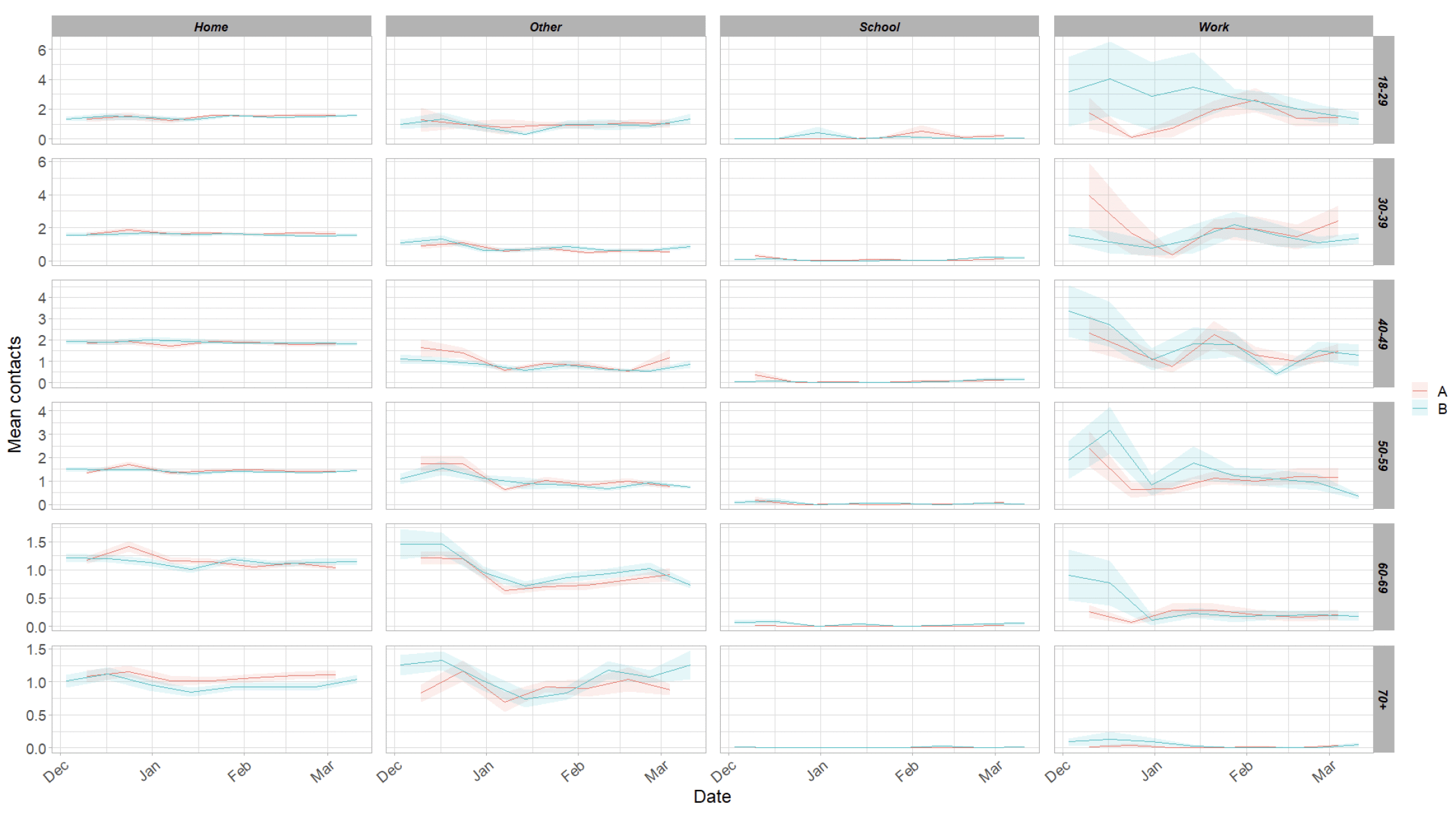
Figure 4 shows how contacts change across age group and setting. Those aged over 70 have the largest increase in contacts in the most recent survey, reporting a rise in contacts within all settings. Those aged between 50-70 have shown a reduction in overall contacts, largely driven by the work and other settings.
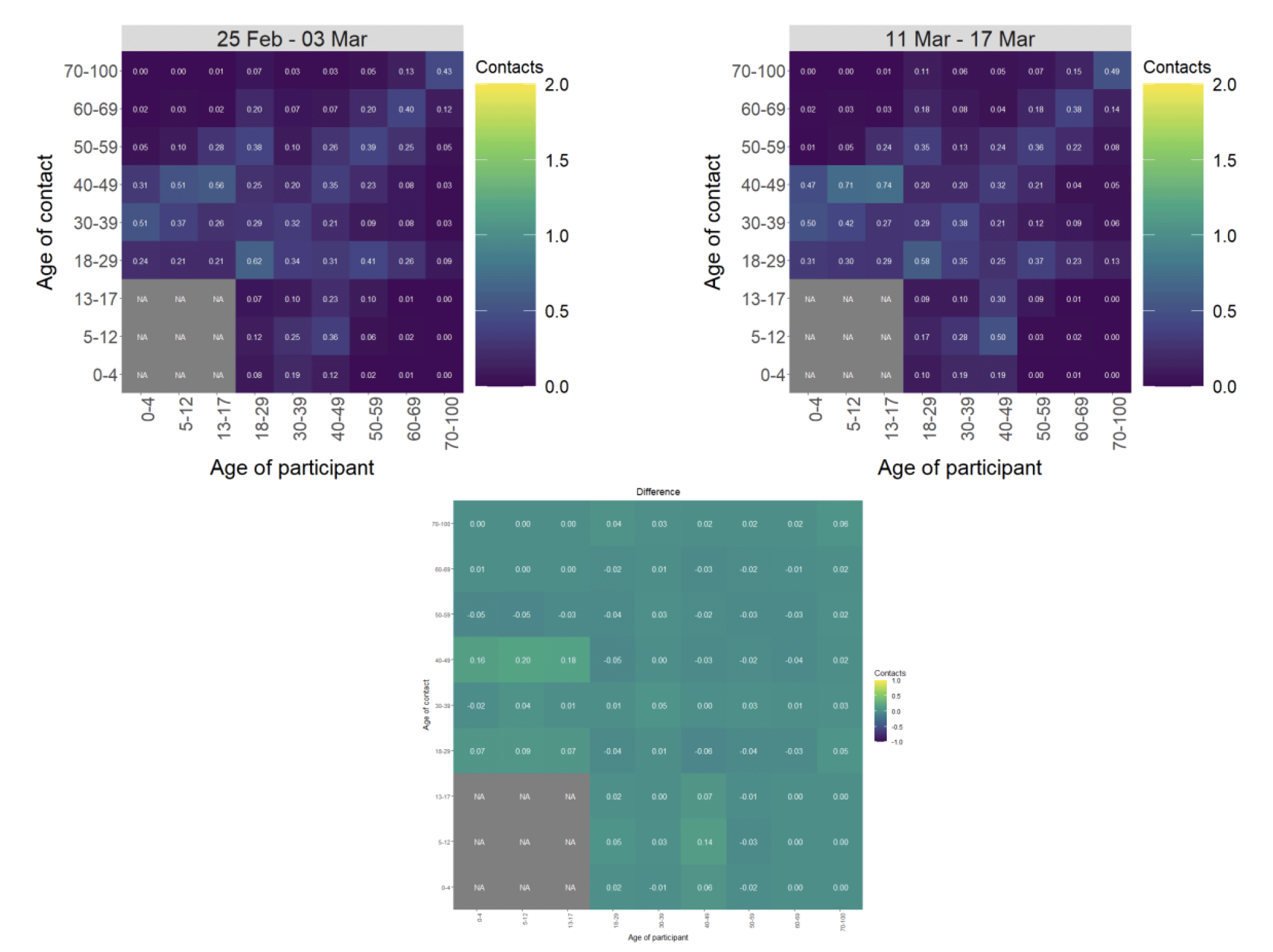
The heatmaps in Figure 5 show the mean overall contacts between age groups for the weeks pertaining to 25 February – 3 March and the 11 – 17 March, and the difference between these periods. In the last two weeks the biggest increase in interactions is for those aged 40-49 with individuals under 18. Those aged over 70 have shown an increase in interactions with every age group over the same period.
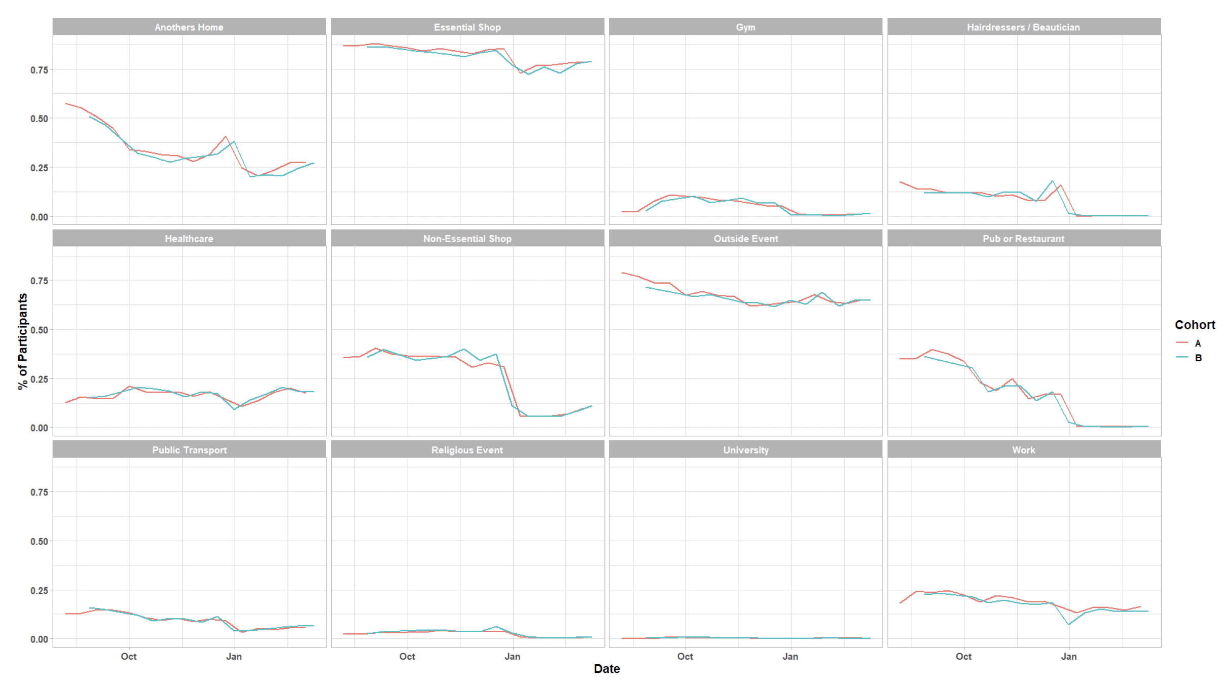
As seen in Figure 6 there has been little change in the number of participants visiting settings in the last two weeks. The biggest change, though slight, is seen in the proportion of people that visit another's home, up from 24% to 27% in the last 2 weeks.
Vaccinations and contacts patterns
The vaccinations programme commenced in Scotland from December 2020. This section looks at the contact patterns of those who have been vaccinated against those who have not.
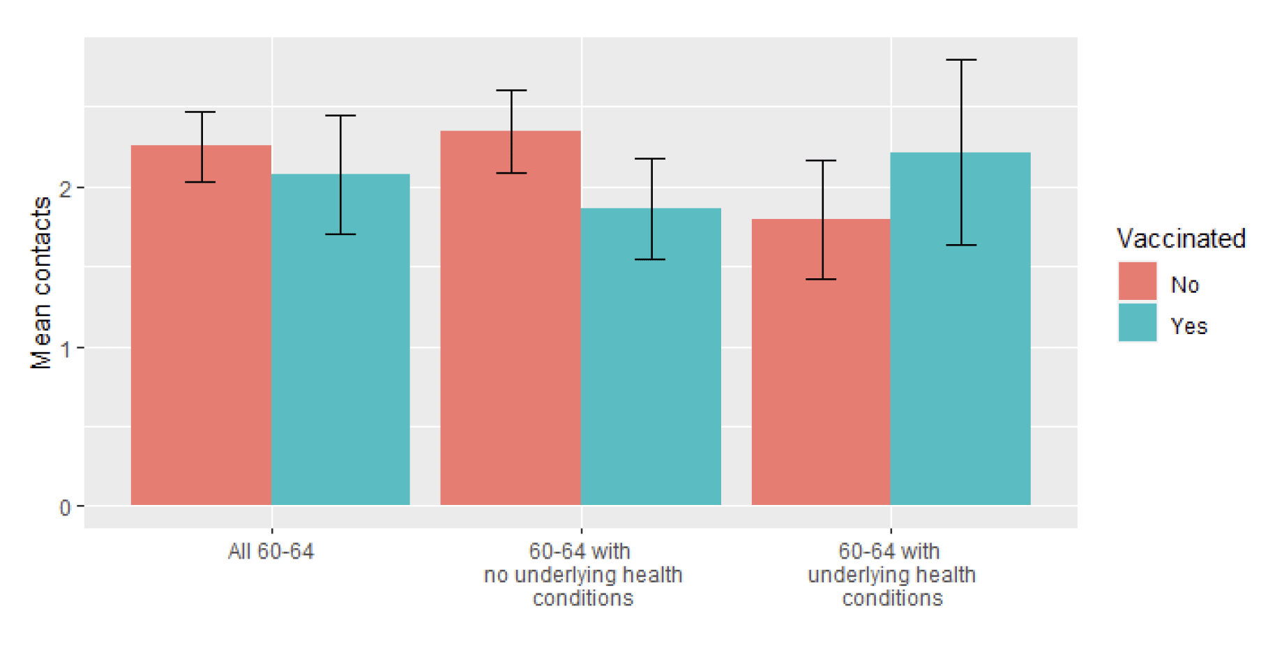
Currently, the age group invited for vaccinations are those aged between 60-64. Figure 7 shows that although the contacts are higher for the unvaccinated than the vaccinated groups within the 60-64 age band (with the removal of healthcare professionals), the confidence intervals overlap and the difference is not statistically significant. In issue 43 of these Research Findings there was a significant difference in the number of contacts between these groups, this difference was driven by the higher number of contacts seen for individuals with underlying health conditions and the majority of the vaccinations in the population. As more individuals without healthcare conditions have been vaccinated and take up a greater proportion of the population, the difference in contacts seen between vaccinated and unvaccinated participants has become insignificant.
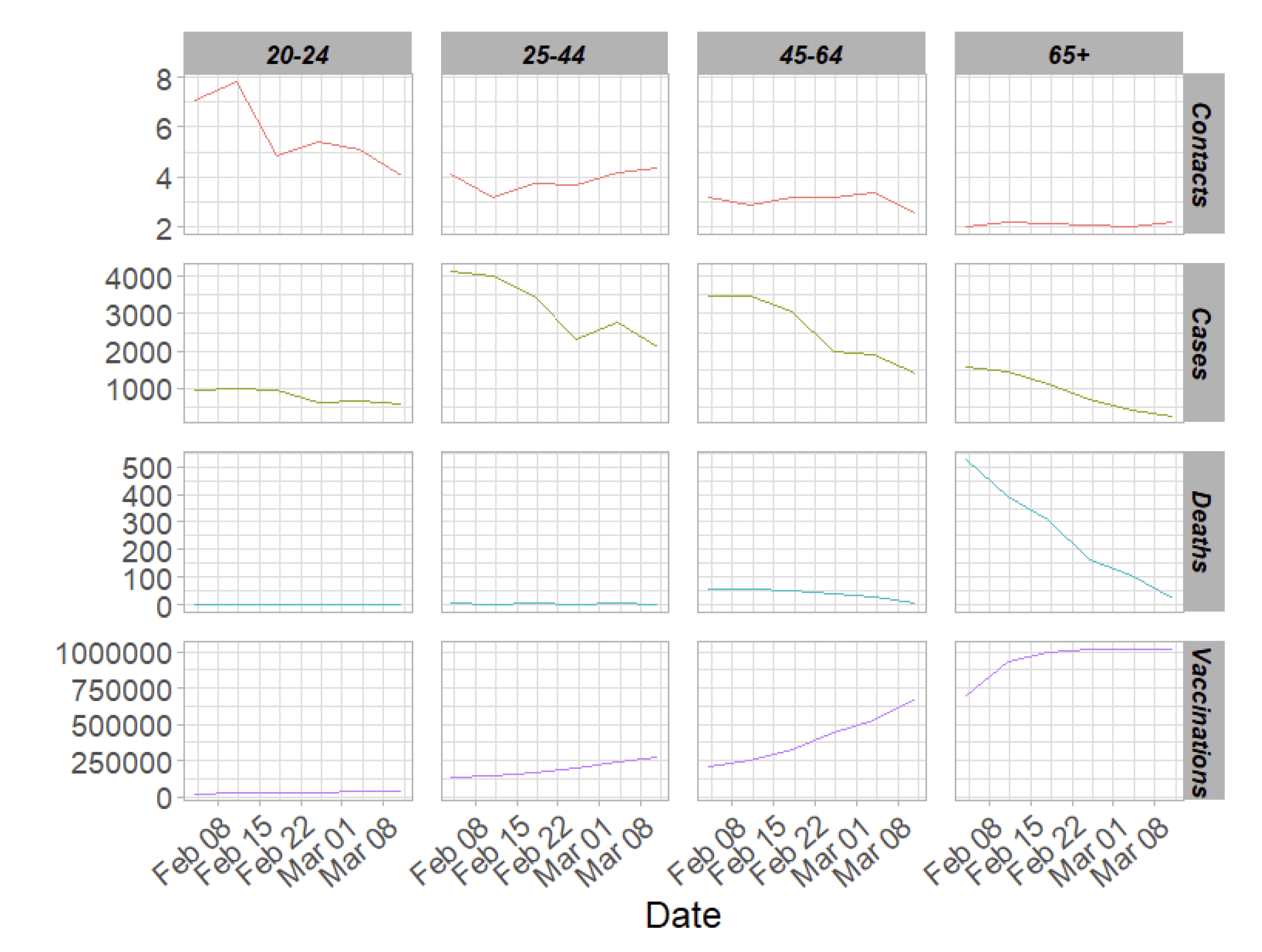
From Figure 8, it can be seen that where contacts have remained consistent, or even increased, cases and deaths have decreased. This coincides with the increasing number of vaccinations supplied to the population. This is most pronounced within the 65+ age band where contacts have remained consistent throughout the time period but deaths and cases have dropped dramatically.
What the modelling tells us about estimated infections as well as Hospital and ICU bed demand
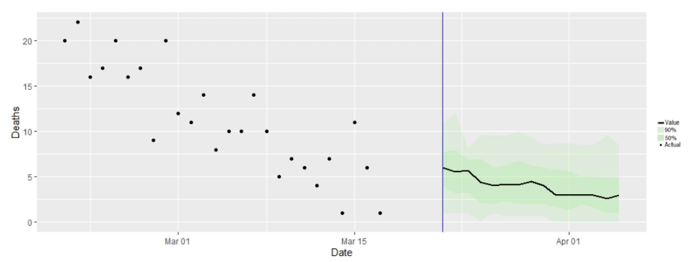
Scottish Government assess the impact of Covid on the NHS in the next few weeks in terms of estimated number of infections. For more on how we do this see page 4 of Issue 1 of the Research Findings[1]. Figure 8 shows two projections[2] which take account of compliance and behaviour (better and worse[3]).
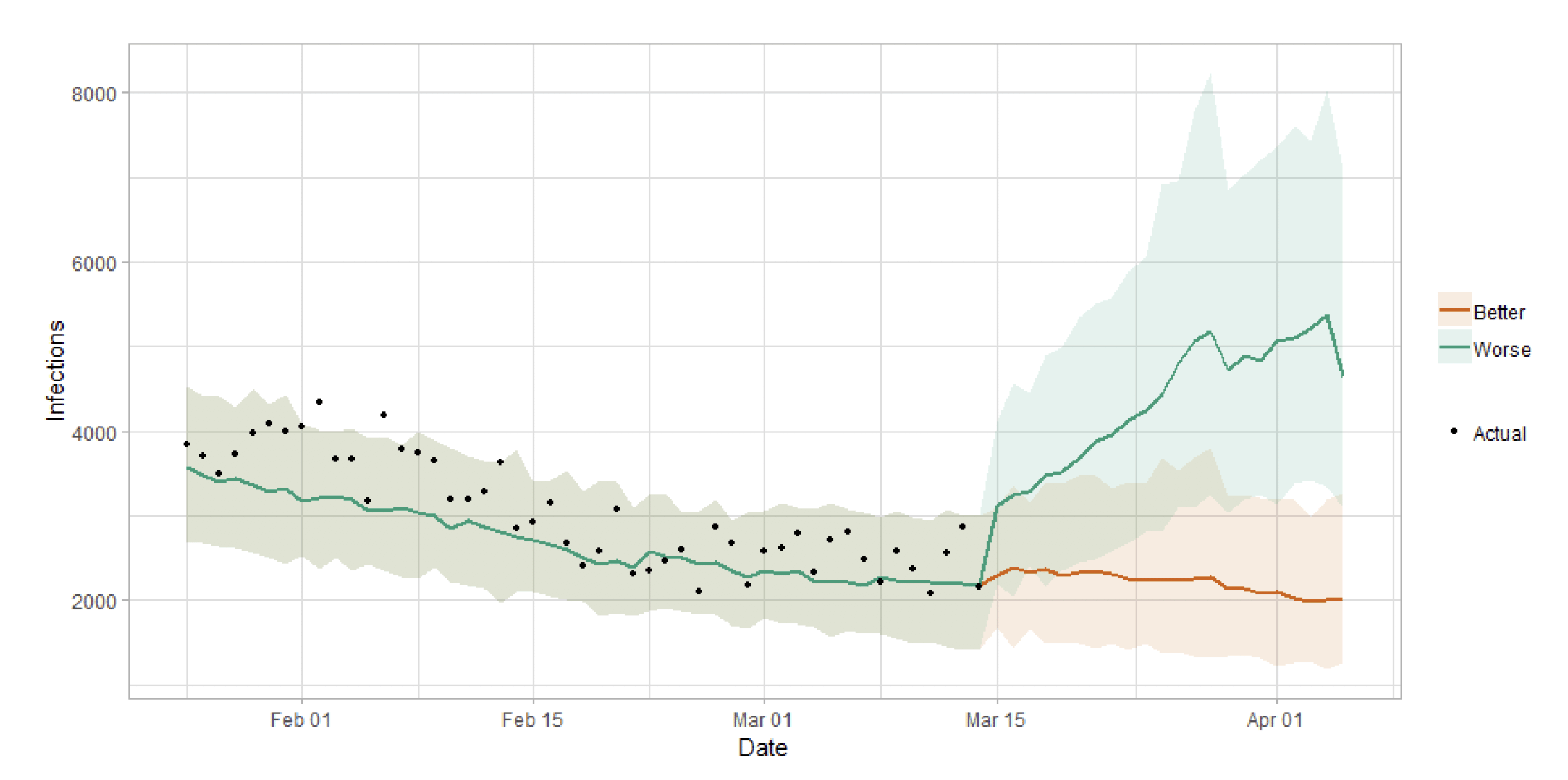
Figure 10 shows the impact of the projections on the number of people in hospital.
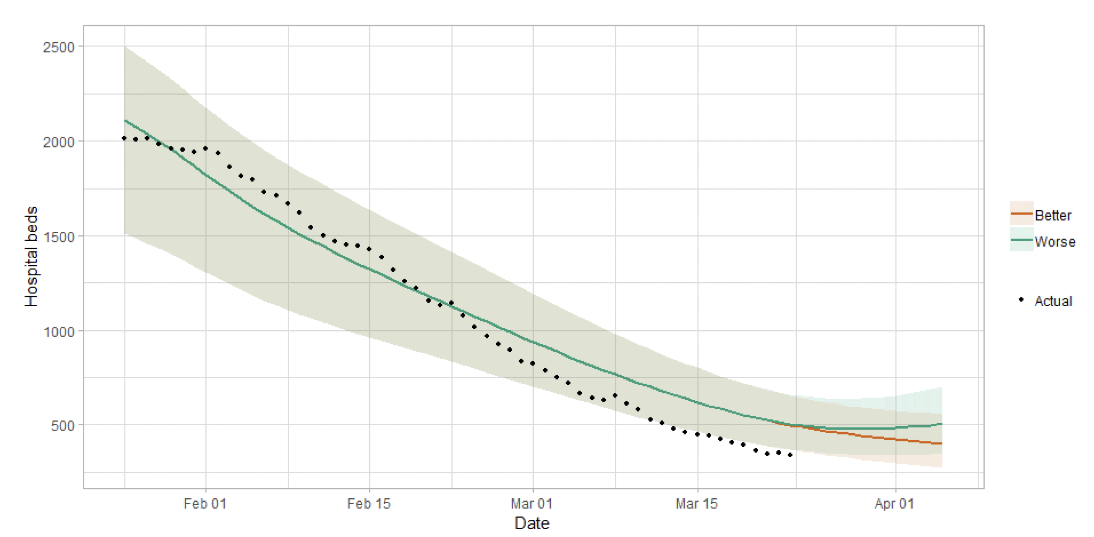
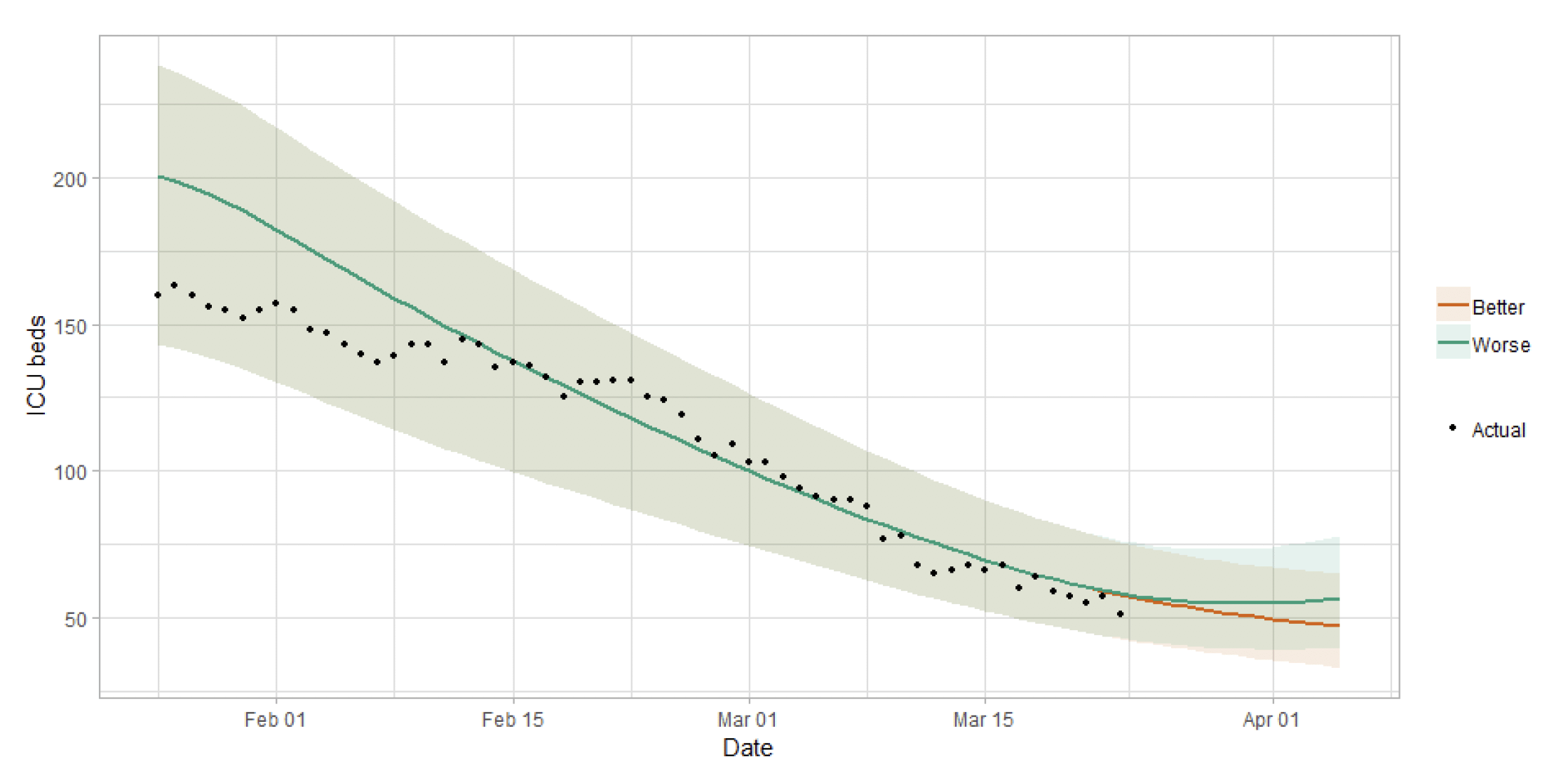
Figure 11 shows the impact of the projection on ICU bed demand.
A comparison of the actual data against historical projections is included in the Technical Annex.
What the modelling tells us about projections of hospitalisations and deaths in the medium term
SAGE produce projections of the epidemic[7] (Figures 12 and 13), combining estimates from several independent models (including the Scottish Government's logistics modelling, as shown in figures 9, 10 and 11). These projections are not forecasts or predictions. They represent a scenario in which the trajectory of the epidemic continues to follow the trends that were seen in the data up to 22 March.
Modelling groups have used data from contact surveys, previous findings[8] and their own expert judgement to incorporate the impact of re-opening schools. The projections do not include the effects of any other future policy or behavioural changes.
The delay between infection, developing symptoms, the need for hospital care, and death means they will not fully reflect the impact of behaviour changes in the two to three weeks prior to 22 March. Projecting forwards is difficult when the numbers of cases, admissions and deaths fall to very low levels.
These projections include the potential impact of vaccinations over the next two weeks. Modelling groups have used their expert judgement and evidence from the JCVI, Public Health England, Scottish universities and Public Health Scotland as well as other published sources when making assumptions about vaccine effectiveness[9].
Beyond two weeks, the projections become more uncertain with greater variability between individual models. This reflects the large differences that can result from fitting models to different data streams, and the influence of small deviations in estimated growth rates and current incidence.
What we know about who is testing positive with Covid
The Early Pandemic Evaluation and Enhanced Surveillance of COVID-19 (EAVE) 2 Study Group[11] have updated the pattern of demographics and clinical risk groups over time for those who tested positive in Scotland (see Technical Annex in issue 34 of the Research Findings).
The proportion of young adults aged 18-39 testing positive peaked at the beginning of September before reducing (down to around 35% at the end of November) then increasing to just over 40% in early March (Figure 14).
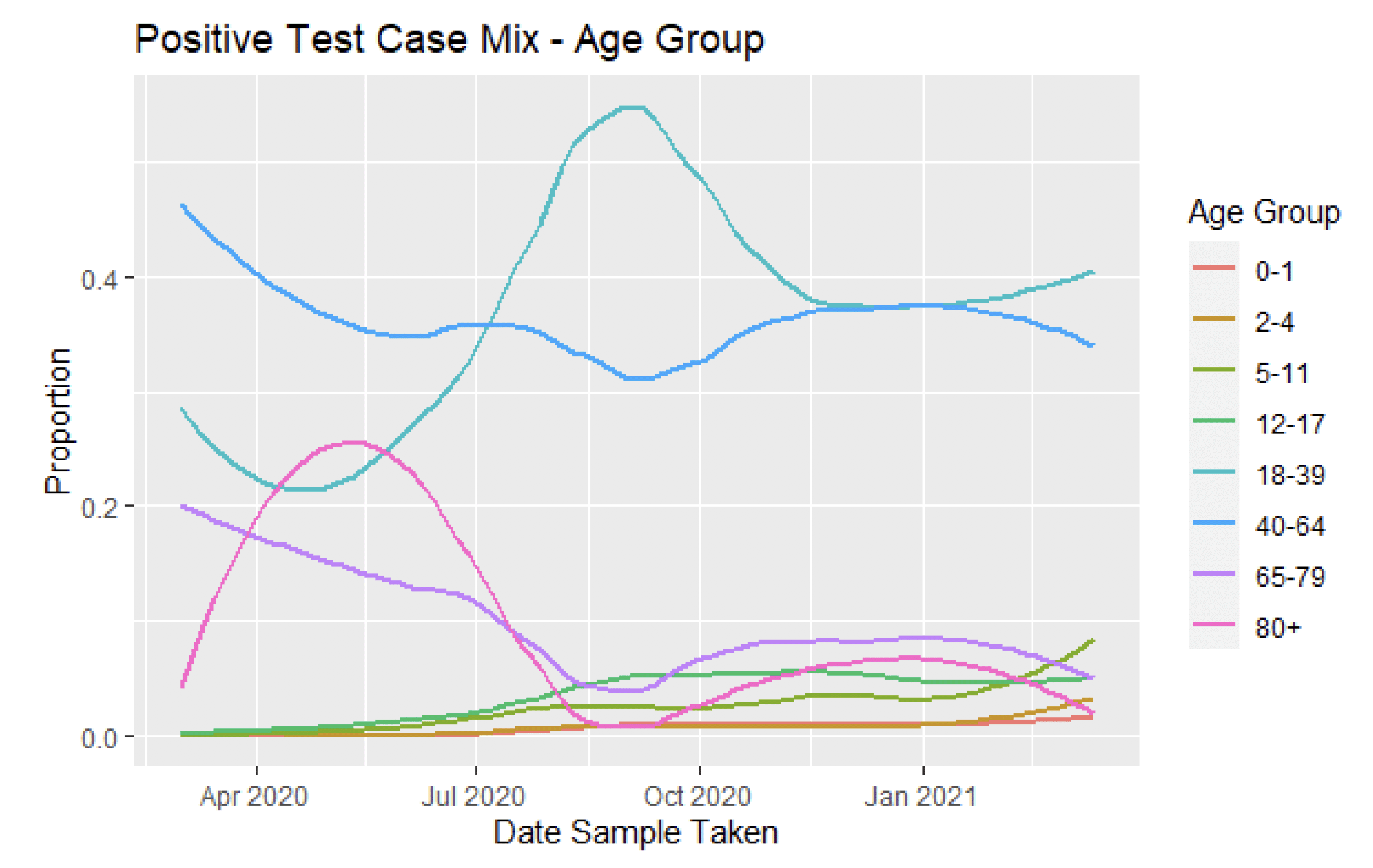
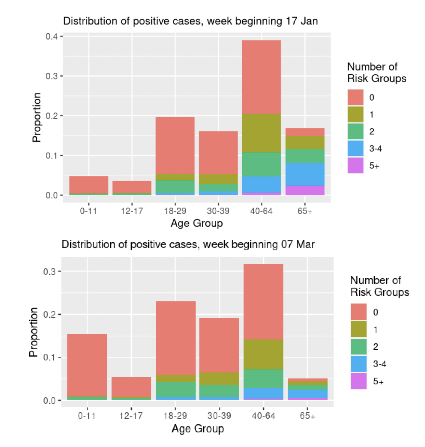
The proportion of people testing positive who were not categorised as being in any clinical risk group has risen from around 55% in November to over 60% in mid-March. Figure 15 shows that the proportion of positive test cases associated with the youngest age groups (under 39) was lower in mid-January than early March. In mid-January just over 16% of people testing positive were 65 or over, this reduced to just over 5% in early March.
What we know about which local authorities are likely to experience high levels of Covid
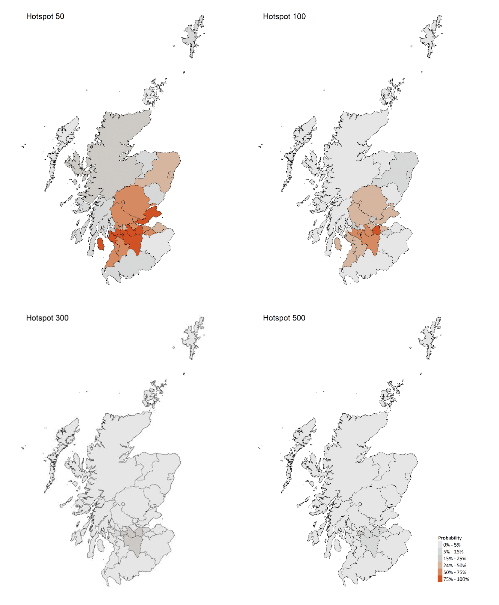
We are using modelling based on Covid cases and deaths from several academic groups to give us an indication of whether a local authority is likely to experience high levels of Covid in the future. This has been compiled via SPI-M into a consensus. In this an area is defined as a hotspot if the two week prediction of cases (positive tests) per 100K population are predicted to exceed a threshold, e.g. 500 cases.
Modelled rates per 100K (Figure 16) indicate that by the week 4 - 10 April 2021, 8 local authorities have at least a 75% probability of exceeding 50 cases, 1 of those have at least a 75% probability of exceeding 100 cases and none of those have at least a 75% probability of exceeding 300 cases. In last week's issue of these Research Findings, 9 local authorities had a 75% or higher probability of exceeding 50 cases per 100K.
What can analysis of wastewater samples tell us about local outbreaks of Covid-19 infection?
Levels of Covid in wastewater collected at 28 sites around Scotland are adjusted for population and local changes in intake flow rate and compared to daily 7-day average positive case rates derived from Local Authority and Neighbourhood (Intermediate Zone) level aggregate data. See Technical Annex in Issue 34 of these Research Findings for the methodology.
The overall level of wastewater Covid this week was similar to the last two weeks, reflecting the continued levelling off in the rate of new cases (Figure 18). This pattern was driven by the largest catchments, which sustained moderate levels. In contrast, many small, more isolated catchments have very low levels.
This week, the technical annex includes a discussion of the advantage of wastewater Covid-19 data and the associated challenges. The wastewater sampling programme, previously focused on 28 sites, has now been expanded to a much larger number of additional sites, making up 92 at present.
Figure 17 shows the recent data for East Calder, covering Livingston. Here levels are currently high, and a rise in wastewater Covid levels appears to have preceded a recent rise in Covid-19 case levels in the latter half of March.
Figure 17. Wastewater Covid levels and daily case rate (7 day moving average) for East Calder in West Lothian (pop: 73k)
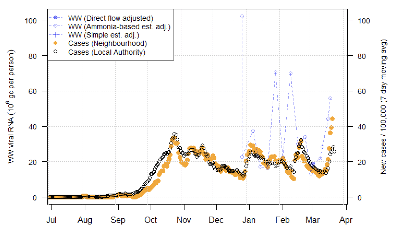
Image Description:
A combination scatter plot and line graph showing the temporal trend of the recorded daily 7-day average positive case rates derived from Local Authority and Neighbourhood (Intermediate Zone) level aggregate data and viral RNA levels at Waste water treatment sites. This graph corresponds to East Calder in West Lothian.
For the original 28 sites with long-term records, the national aggregate shows a mild decline from last week, consistent overall with stable Covid levels (Figure 18). As discussed in the last issue, remaining levels of Covid 19 in the wastewater aggregate is primarily due to large catchments like Dalmuir (Figure 19), that have shown a decline from high levels in January but continue to have moderate levels of wastewater Covid and newly reported cases.
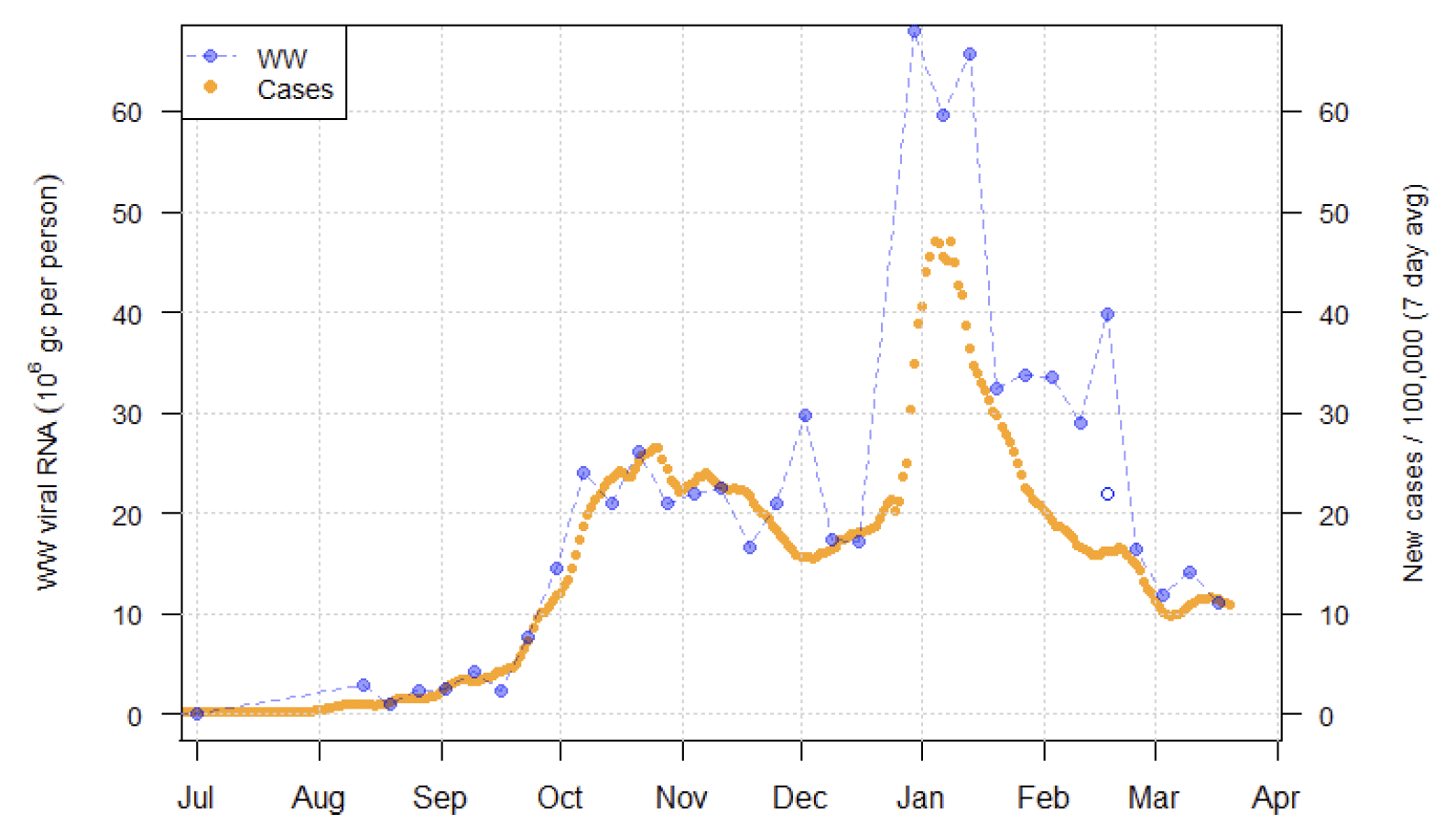
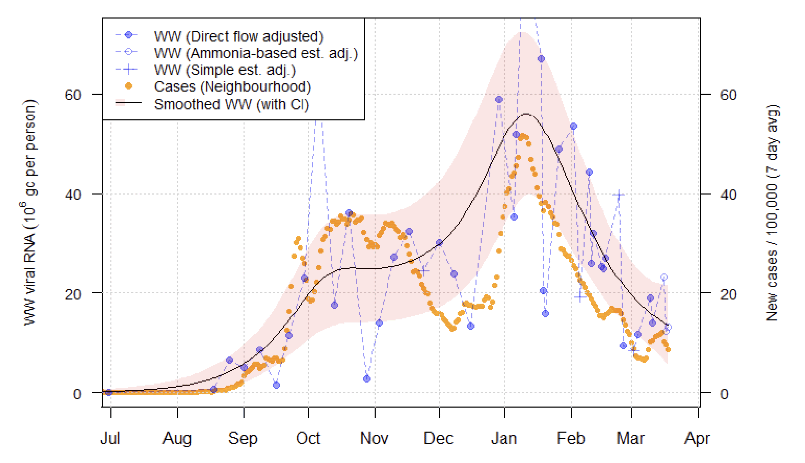
Image Description:
A combination scatter plot and line graph showing the temporal trend of the recorded daily 7-day average positive case rates derived from Local Authority and Neighbourhood (Intermediate Zone) level aggregate data and viral RNA levels at Waste water treatment sites. This graph corresponds to Dalmuir in West Dunbartonshire.
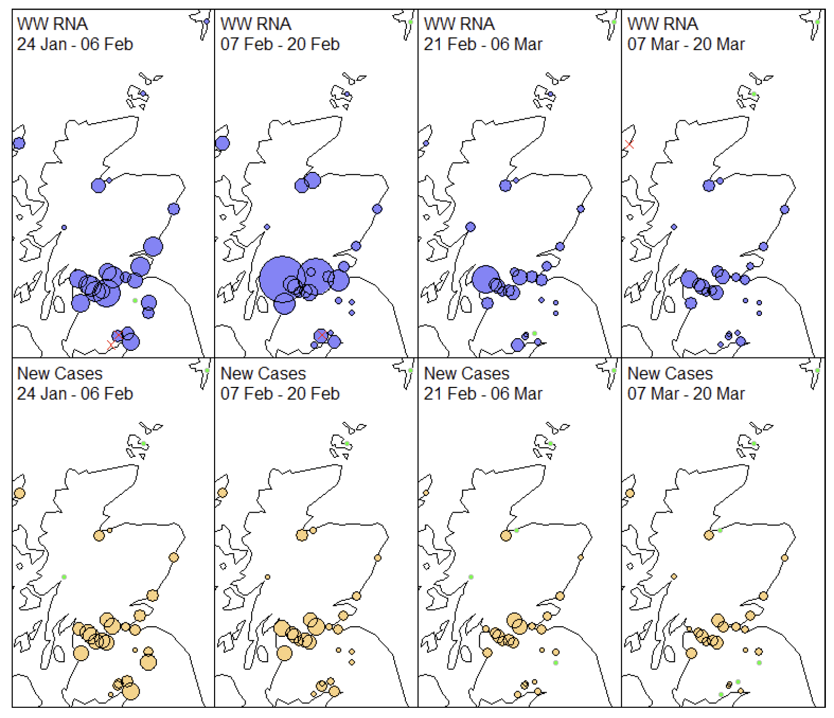
Mapping of the geographic pattern of Covid-19 across the sites is shown in Figure 18. The pattern of wastewater Covid prevalence is similar in recent weeks to that of case data. Using a green colour to indicate levels that are below the minimum for each method (either falling below the detection limit as in the case of wastewater Covid, or below the censoring threshold for case data), we see the continued prevalence of sites with no recently reported new cases (at least, above the threshold for censoring applied to neighbourhood cases) but still positive levels of wastewater Covid.
Note that in the previous report we discussed a positive measurement at Lerwick in the Shetlands. On re-running this has been determined to be due to an error in the lab and that reading is now corrected to be negative.
What next?
The Scottish Government continues to work with a number of academic modelling groups to develop other estimates of the epidemic in Scotland.
The modelled estimates of the numbers of new cases and infectious people will continue to be provided as measures of the epidemic as a whole, along with measures of the current point in the epidemic such as Rt and the growth rate. Further information can be found at https://www.gov.scot/coronavirus-covid-19.
Investigations are ongoing by NERVTAG, SPI-M, SAGE and Scottish Government regarding the impact of the new variant, SARS-CoV-2 VOC 202012/01, which will be reflected here as work is undertaken.
Analysis from the EAVE 2 group, which tells us about the pattern of demographics and clinical risk groups over time for those who are testing positive with Covid, will be provided in future issues.