Coronavirus (COVID-19): modelling the epidemic (issue no. 41)
Latest findings in modelling the COVID-19 epidemic in Scotland, both in terms of the spread of the disease through the population (epidemiological modelling) and of the demands it will place on the system, for example in terms of health care requirement
Coronavirus (COVID-19): modelling the epidemic in Scotland (Issue No. 41)
Background
This is a report on the Scottish Government modelling of the spread and level of Covid-19. This updates the previous publication on modelling of Covid-19 in Scotland published on 25 February 2021. The estimates in this document help the Scottish Government, the health service and the wider public sector plan and put in place what is needed to keep us safe and treat people who have the virus.
This edition of the research findings focuses on the epidemic as a whole, looking at estimates of R, growth rate and incidence as well as local measures of change in the epidemic.
Key Points
- The reproduction rate R in Scotland is currently estimated as being between 0.7 and 0.9. This is the same as last week.
- The number of new daily infections for Scotland is estimated as being between 14 and 32, per 100,000 people.
- The growth rate for Scotland is currently estimated as being between -6% and -2%.
- Hospital bed and ICU occupancy are projected to fall over the next few weeks, but with the potential to plateau, or increase as a result of schools reopening and from increased contacts amongst older age groups where most people have been vaccinated.
- Average contacts remain at the same level as two weeks ago (approximately 3.1 per day).
- Individuals aged over 50 have shown an increase in contacts, compared to two weeks previously.
- The largest increase in interactions in the last two weeks is seen between members of the 50-59 age group.
- The biggest increase in locations participants have visited is seen for those who visited another's home, up from 23% to 27% in the last two weeks.
- Modelled rates per 100K indicate that by the week 14 – 20 March 2021, 8 (down 6) local authorities have at least a 75% probability of exceeding 50 cases, 0 (down 7) of those have at least a 75% probability of exceeding 100 cases and none of those have at least a 75% probability of exceeding 300 (or 500) cases.
- Nationally, levels of COVID in wastewater showed a decline compared with the previous week.
Overview of Scottish Government Modelling
Epidemiology is the study of how diseases spread within populations. One way we do this is using our best understanding of the way the infection is passed on and how it affects people who catch it to create mathematical simulations. Because people who catch Covid-19 have a relatively long period in which they can pass it on to others before they begin to have symptoms, and the majority of people infected with the virus will experience mild symptoms, this "epidemiological modelling" provides insights into the epidemic that cannot easily be measured through testing e.g. of those with symptoms, as it estimates the total number of new daily infections and infectious people, including those who are asymptomatic or have mild symptoms.
Modelling also allows us to make short-term forecasts of what may happen with a degree of uncertainty. These can be used in health care and other planning. The modelling in this research findings is undertaken using different types of data which going forward aims to both model the progress of the epidemic in Scotland and provide early indications of where any changes are taking place.
Modelling outputs are provided here on the current epidemic in Scotland as a whole, based on a range of methods. Because it takes a little over three weeks on average for a person who catches Covid-19 to show symptoms, become sick, and either die or recover, there is a time lag in what our model can tell us about any re-emergence of the epidemic and where in Scotland this might occur. However modelling of Covid deaths is an important measure of where Scotland lies in its epidemic as a whole. In addition, the modelling groups which feed into the SAGE consensus use a range of other data along with deaths in their estimates of R and the growth rate. These outputs are provided in this research findings. The type of data used in each model to estimate R is highlighted in Figure 1.
A medium term projection of the number of cases, ICU and hospital bed demand is provided at this stage of the epidemic in Scotland.
The delivery of the vaccination programme will offer protection against severe disease and death. As the programme progresses, the modelling and analysis of the epidemic will continue to be updated so it reflects the impact of widespread vaccination.
We use the Scottish Contact Survey to inform a modelling technique based on the number of contacts between people. Over time, a greater proportion of the population will be vaccinated. This is likely to impact contact patterns and will become a greater part of the analysis going forward.
The logistical model utilises results from the epidemiological modelling, principally the number of new infections. The results are split down by age group, and the model is used to give a projection of the number of people that will go to hospital, and potentially to ICU. This will continue to be based on both what we know about how different age groups are effected by the disease and the vaccination rate for those groups.
The two projections (better and worse) for our logistical model have been reviewed and amended for this issue. Both scenarios are based on current vaccine roll-out plans and efficacy assumptions. The difference between the two projections reflects uncertainty about behaviour and compliance as interventions are relaxed.
What the modelling tells us about the epidemic as a whole
The various groups which report to the Scientific Pandemic Influenza Group on Modelling (SPI-M) use different sources of data in their models (i.e. deaths, hospital admissions, cases) so their estimates of R are also based on these different methods. SAGE's consensus view across these methods, as of 3 March, was that the value of R in Scotland was between 0.7 and 0.9 (see Figure 1). The value of R on 24 February was also between 0.7 and 0.9.
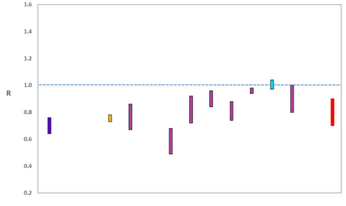
Source: Scientific Advisory Group for Emergencies (SAGE).
The various groups which report to the Scientific Pandemic Influenza Group on Modelling (SPI-M) use different sources of data in their models to produce estimates of incidence (Figure 2). SPI-M's consensus view across these methods, as of 3 March, was that the incidence of new daily infections in Scotland was between 14 and 32 new infections per 100,000. This equates to between 800 and 1,700 people becoming infected each day in Scotland. The Scottish Government results this week have been computed using a new platform called Epidemia (see Technical Annex in issue 37), which expands the Bayesian semi-mechanistic model which the Scottish Government runs.
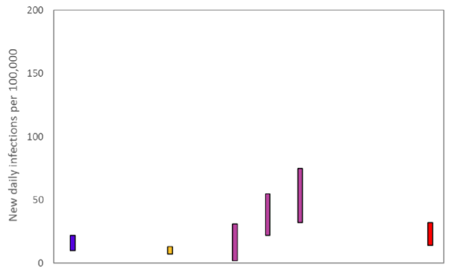
Source: Scientific Pandemic Influenza Group on Modelling (SPI-M).
The consensus from SAGE for this week is that the growth rate in Scotland is between -6 and -2% per day. On 24 February the growth rate was between -5 and -2%.
What the modelling tells us about estimated infections as well as Hospital and ICU bed demand
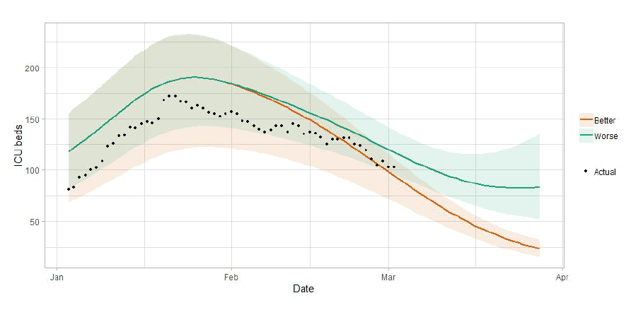
Scottish Government assess the impact of Covid on the NHS in the next few weeks in terms of estimated number of infections. For more on how we do this see page 4 of Issue 1 of the Research Findings[1]. Figure 3 shows two projections which take account of compliance and behaviour (better and worse[2]).
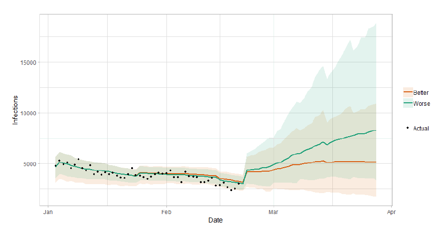
The better and worse scenarios are based on current vaccine roll-out plans and efficacy assumptions. The difference between the two projections reflects uncertainty about behaviour and compliance as interventions are relaxed. This differs from previous research findings where the difference between the two projections was based on the effectiveness of the vaccine roll out.
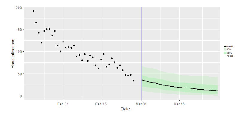
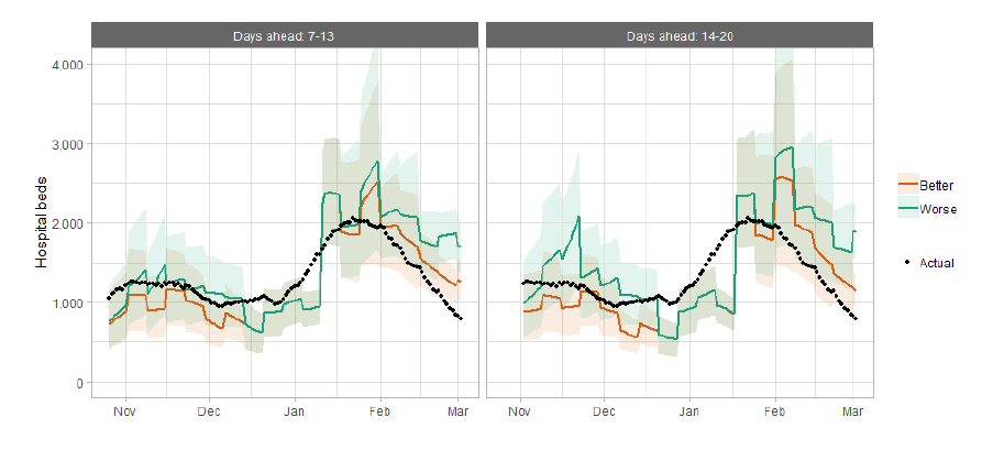
Figure 4 shows the impact of the projections on the number of people in hospital.
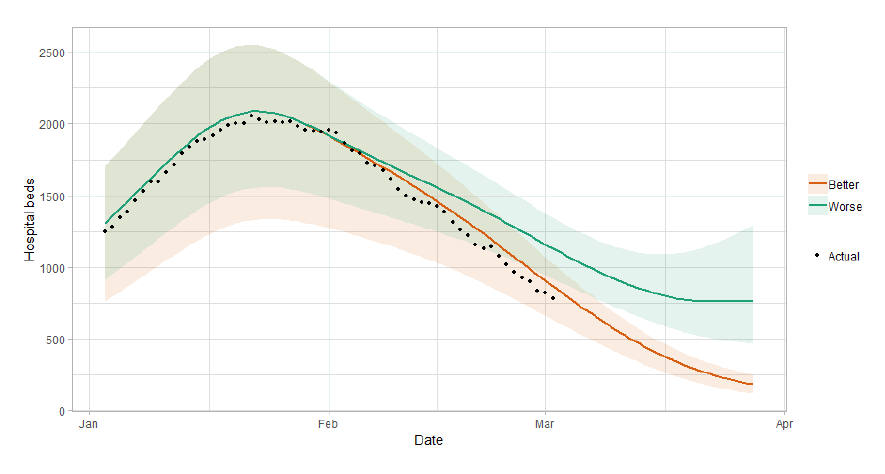
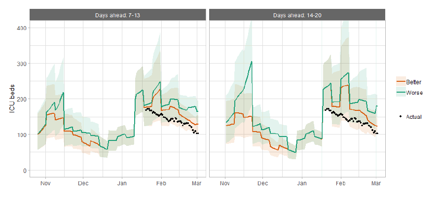
Figure 5 shows the impact of the projection on ICU bed demand.
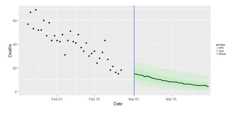
What the modelling tells us about projections of hospitalisations and deaths in the medium term
SAGE produce projections of the epidemic[6] (Figure 6), combining estimates from several independent models (including the Scottish Government's logistics modelling, as shown in figures 3, 4 and 5). These projections are not forecasts or predictions. The impact of schools re-opening has been included in the projections where possible. However, the delay between infection, hospitalisation and death means the impact over the next 4 weeks is expected to be limited. The projections do not include the effects of any other future policy or behavioural changes.
The delay between infection, developing symptoms, the need for hospital care, and death means they will not fully reflect the impact of behaviour changes in the two to three weeks prior to 1 March. Nor do they include seasonal effects that might increase transmission.
These projections include the potential impact of vaccinations over the next four weeks. Evidence around the real-world effectiveness of vaccines, particularly against infection, is still developing. Modelling groups have used their expert judgement and evidence from the JCVI, Public Health England, Scottish universities and Public Health Scotland as well as other published sources when making assumptions about vaccine effectiveness[7].
Beyond two weeks, the projections become more uncertain with greater variability between individual models. This reflects the large differences that can result from fitting models to different data streams, and the influence of small deviations in estimated growth rates and current incidence.
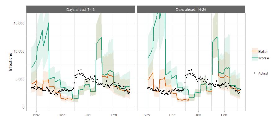
How the modelling compares to the real data as it emerges
The following charts show the history of our modelling projections in comparison to estimates of the actual data. The infections projections were largely accurate during October to mid-December and from mid-January onward. During mid-December to mid-January, the projections underestimated the number of infections, due to the unforeseen effects of the new variant.
Hospital bed projections have generally been more precise than infections estimates due to being partially based on already known information about numbers of current infections, and number of people already in hospital. The projections are for number of people in hospital due to Covid, which is slightly different to the actuals, which are number of people in hospital within 28 days of a positive Covid test.
As with hospital beds, ICU bed projections have generally been more precise than infections. The projections are for number of people in ICU due to Covid. The actuals are number of people in ICU within 28 days of a positive Covid test up to 20 January, after which they include people in ICU over the 28 day limit.
What we know about how people's contact patterns have changed
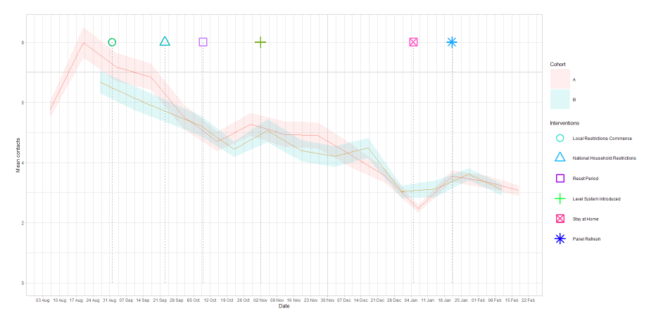
The Scottish Contact Survey has been refreshed with new respondents. The combined panels of old and new respondents show higher overall contacts for the survey weeks pertaining to 21 and 28 January (Figure 11). This is due to the merging of the panels as discussed in the Technical Annex in issue 40 of the Research Findings. Currently, average contacts are approximately 3.1 per day.
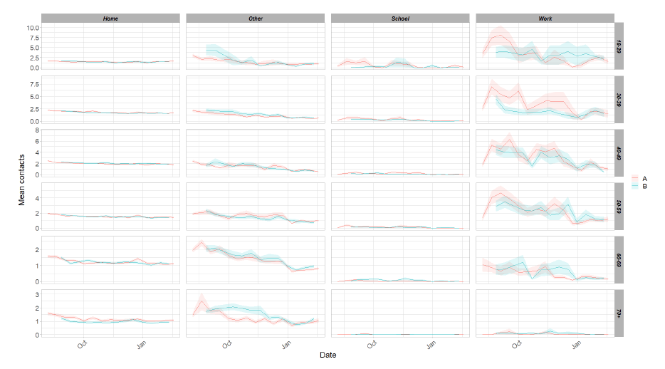
Changes in contacts appear across age groups. While those aged under 50 have decreased their contacts, those aged over 50 have shown an increase in contacts. The overall increases for the 50-59 age group are driven by increased contacts within the work and other setting whereas for those over 60 it is linked to increases in other and home contacts.
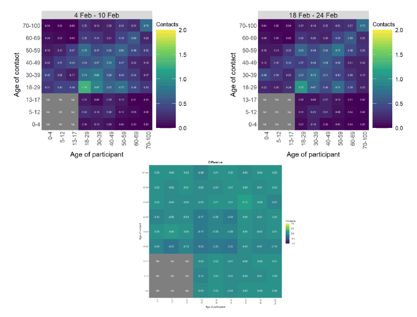
The heatmaps in Figure 13 show the change in mean overall contacts between age groups for the weeks pertaining to 4 – 10 February and the 18 – 24 February and the difference between these interactions. The biggest reduction in interactions is seen between members of the 18-29 age group however, this group continues to have the highest interactions. The largest increase in interactions, in the last two weeks, is seen between members of the 50-59 age group.
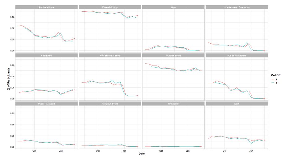
As Figure 14 shows, the biggest increase in locations that participants have visited is seen for those who visited another's home up from 23% (28 January – 3 February ) to 27% (11 – 17 February).
Vaccinations and contact patterns
The vaccinations programme commenced in Scotland from December 2020. Currently vaccinations have been rolled out to individuals over 65[9]. As time progresses, a greater proportion of the population will be vaccinated[10]. This section looks at the contact patterns of those who have been vaccinated against those who have not.
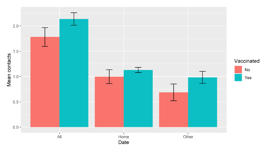
For the survey week 18 – 24 February, 91% of participants aged over 65 within the Scottish Contact Survey (SCS) reported being vaccinated. Figure 15 shows that those who have been vaccinated within this age group have a higher level of contacts in comparison to those who haven't for the latest survey, 2.1 and 1.8 respectively[11]. As discussed in the section above, there has been an increase in contacts in general for those aged 65 and over, regardless of vaccination status.
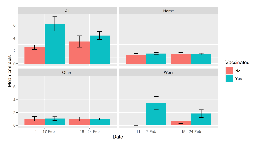
There are other people who have been vaccinated such as front line health and social care workers and those aged 16 to 64 with underlying health conditions. Within the SCS, 79% of health and social care workers have had the vaccine. Figure 16 shows that those within this category who have had the vaccine have a higher number of contacts than those who haven't. This largely driven by contacts within the work setting whereas contacts within the home and other setting remain similar between vaccination status.
We will continue to monitor changes in behaviour as the vaccine roll out continues. Future analysis will provide greater detail with regards to those aged 16 to 64 with underlying health conditions and how vaccination alters the behaviour of these individuals.
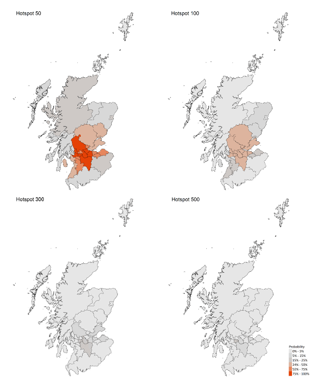
What we know about which local authorities are likely to experience high levels of Covid
From this week we are using modelling based on Covid cases and deaths from several academic groups to give us an indication of whether a local authority is likely to experience high levels of Covid in the future. This has been compiled via SPI-M into a consensus. In this an area is defined as a hotspot if the two week prediction of cases (positive tests) per 100K population are predicted to exceed a threshold, e.g. 500 cases.
Modelled rates per 100K (Figure 17) indicate that by the week 14 – 20 March 2021, 8 (down 6) local authorities have at least a 75% probability of exceeding 50 cases, 0 (down 7) of those have at least a 75% probability of exceeding 100 cases and none of those have at least a 75% probability of exceeding 300 (or 500) cases. The probability of exceeding will be affected by the lockdown as well as by how much new variant is present in a local authority area.
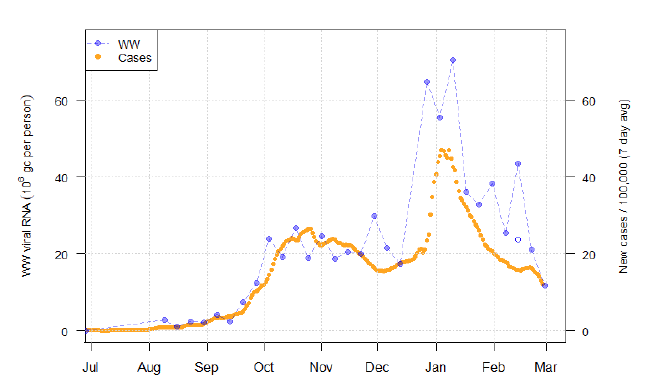
What can analysis of wastewater samples tell us about local outbreaks of Covid-19 infection?
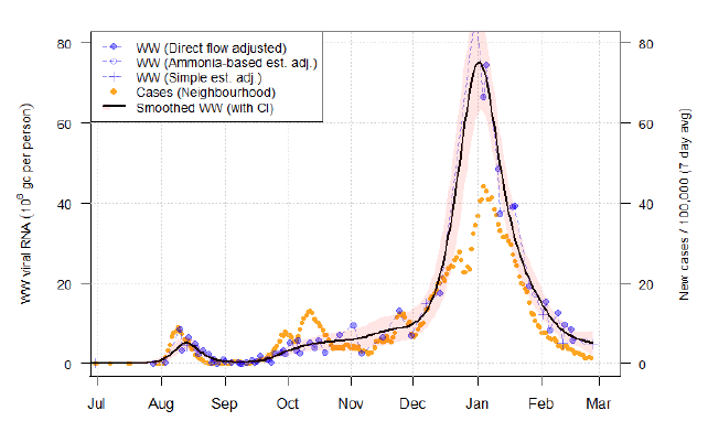
Levels of Covid in wastewater collected at 28 sites around Scotland are adjusted for population and local changes in intake flow rate and compared to daily 7-day average positive case rates derived from Local Authority and Neighbourhood (Intermediate Zone) level aggregate data. See Technical Annex in Issue 34 of these Research Findings for the methodology.
The overall level of wastewater Covid this week showed a decline in levels, continuing the trend from last week if the unusually high reading from Seafield (Edinburgh) was discounted. Several of the smaller sites have fallen below the limit of detection for wastewater Covid.
Figure 18 shows wastewater Covid data aggregated over sites to produce a national average time series, with new cases data overlaid. As with the similar graph in the last report, the single unfilled point in the second week of February denotes the average for that week after the removal of an anomalously high reading at Seafield. Since that report, samples have been tested relating to two further weeks. The final data point in Figure 18 represents a week of partially complete data that includes most of the more populous catchments.
Taken together, the figure shows a continued decline in Covid levels, down at least 11% from the previous report (with anomalous reading removed).
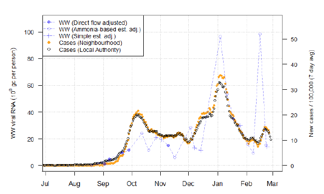
Figure 19 examines the levels at the Seafield site. A suspiciously high Covid measurement here was responsible for the apparent increase in National wastewater levels in the prior report. As can be seen, two new samples were taken which show wastewater levels around 15 million gc/person, about 85% less than the prior reading of 98 million gc/person.
The decline back from the individual spike was not unexpected, due to the suddenness of the rise and lack of corresponding signal in the cases. BioSS is currently working on building a framework to more formally detect and handle these large spikes.
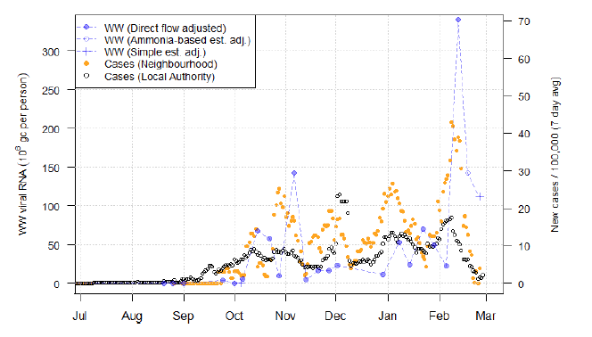
Sites can exhibit anomalies that are not characterized by the simple case of individually high measurements. One site in particular is Helensburgh, as shown in Figure 20. Here, in recent weeks there have been three measurements in a row of very high wastewater Covid levels (in excess of 100 million gc/person). While the levels are down from the initial rise to over 300 million gc/person, the persistence of the high levels is unusual and difficult to explain. Helensburgh has generally displayed a poor relationship between wastewater Covid and cases, as well as an unusually cyclical pattern in case rates. Finally, relative to its population, Helensburgh is notable for having an unusually high average rate of flow – almost 2000 litres/person/day, compared to the average across sites of 760 l/p/d.
In contrast, Nigg (Figure 21) continues to be the most well behaved of the sites. The tight correspondence of the confidence intervals to the smooth curve indicates the low variability of wastewater Covid levels, which also corresponds well to case rates.
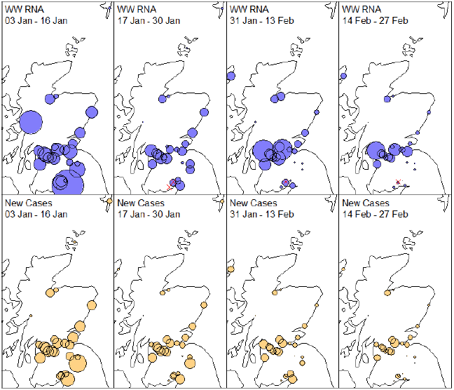
Mapping the geographic pattern of Covid-19 across the sites, as in Figure 22, indicates that Covid levels by both measures have fallen in the last two weeks to very low levels outside of the Central Belt. Lockerbie, Kirkwall, Lerwick, Fort William, Hawick, and Galashiels (mostly small sites) fell below the limit of detection.
As Covid levels hopefully continue to fall, we aim to use wastewater Covid to detect the presence of residual cases missed by case data. We will consider how best to interpret the wastewater data in the context of low numbers of infected individuals.
What next?
The Scottish Government continues to work with a number of academic modelling groups to develop other estimates of the epidemic in Scotland.
The modelled estimates of the numbers of new cases and infectious people will continue to be provided as measures of the epidemic as a whole, along with measures of the current point in the epidemic such as Rt and the growth rate. Further information can be found at https://www.gov.scot/coronavirus-covid-19.
Investigations are ongoing by NERVTAG, SPI-M, SAGE and Scottish Government regarding the impact of the new variant, SARS-CoV-2 VOC 202012/01, which will be reflected here as work is undertaken.
Analysis from the EAVE 2 group, which tells us about the pattern of demographics and clinical risk groups over time for those who are testing positive with Covid, will be provided in future issues.
| LA |
P (Cases > 500) |
P (Cases > 300) |
P (Cases > 100) |
P (Cases > 50) |
|---|---|---|---|---|
| Aberdeen City |
0-5% |
0-5% |
5-15% |
15-25% |
| Aberdeenshire |
0-5% |
0-5% |
5-15% |
5-15% |
| Angus |
0-5% |
0-5% |
5-15% |
25-50% |
| Argyll and Bute |
0-5% |
0-5% |
0-5% |
5-15% |
| City of Edinburgh |
5-15% |
5-15% |
25-50% |
50-75% |
| Clackmannanshire |
0-5% |
0-5% |
25-50% |
50-75% |
| Dumfries and Galloway |
0-5% |
0-5% |
0-5% |
5-15% |
| Dundee City |
0-5% |
0-5% |
15-25% |
25-50% |
| East Ayrshire |
0-5% |
0-5% |
15-25% |
50-75% |
| East Dunbartonshire |
0-5% |
0-5% |
25-50% |
50-75% |
| East Lothian |
0-5% |
5-15% |
15-25% |
50-75% |
| East Renfrewshire |
0-5% |
0-5% |
5-15% |
50-75% |
| Falkirk |
0-5% |
0-5% |
25-50% |
75-100% |
| Fife |
0-5% |
5-15% |
25-50% |
25-50% |
| Glasgow City |
15-25% |
15-25% |
25-50% |
75-100% |
| Highland |
0-5% |
0-5% |
0-5% |
15-25% |
| Inverclyde |
0-5% |
0-5% |
5-15% |
15-25% |
| Midlothian |
0-5% |
0-5% |
15-25% |
50-75% |
| Moray |
0-5% |
0-5% |
0-5% |
5-15% |
| Na h-Eileanan Siar |
0-5% |
0-5% |
0-5% |
5-15% |
| North Ayrshire |
0-5% |
0-5% |
5-15% |
25-50% |
| North Lanarkshire |
5-15% |
15-25% |
25-50% |
75-100% |
| Orkney Islands |
0-5% |
0-5% |
0-5% |
0-5% |
| Perth and Kinross |
0-5% |
0-5% |
25-50% |
25-50% |
| Renfrewshire |
0-5% |
0-5% |
25-50% |
75-100% |
| Scottish Borders |
0-5% |
0-5% |
0-5% |
15-25% |
| Shetland Islands |
0-5% |
0-5% |
0-5% |
0-5% |
| South Ayrshire |
0-5% |
0-5% |
15-25% |
25-50% |
| South Lanarkshire |
5-15% |
15-25% |
25-50% |
75-100% |
| Stirling |
0-5% |
5-15% |
25-50% |
75-100% |
| West Dunbartonshire |
0-5% |
0-5% |
25-50% |
75-100% |
| West Lothian |
0-5% |
5-15% |
25-50% |
75-100% |