Coronavirus (COVID-19): modelling the epidemic (issue no. 37)
Latest findings in modelling the COVID-19 epidemic in Scotland, both in terms of the spread of the disease through the population (epidemiological modelling) and of the demands it will place on the system, for example in terms of health care requirement
Coronavirus (COVID-19): modelling the epidemic in Scotland (Issue No. 37)
Background
This is a report on the Scottish Government modelling of the spread and level of Covid-19. This updates the previous publication on modelling of Covid-19 in Scotland published on 28 January 2021. The estimates in this document help the Scottish Government, the health service and the wider public sector plan and put in place what is needed to keep us safe and treat people who have the virus.
This edition of the research findings focuses on the epidemic as a whole, looking at estimates of R, growth rate and incidence as well as local measures of change in the epidemic.
Key Points
- The reproduction rate R in Scotland is currently estimated as being between 0.7 and 0.9.
- The number of new daily infections for Scotland is estimated as being between 31 and 71, per 100,000 people.
- The growth rate for Scotland is currently estimated as being between -5% and -2%.
- At a national level the number of daily new infections are projected to continue falling in the next two weeks as result of lockdown restrictions. Hospital bed and ICU occupancy are also projected to fall over the next two weeks.
- There may be a higher risk of hospital admission in Scotland among those with the new variant[1] compared to those with the non-new variant. Preliminary results indicate this as a 63% (95% Confidence Interval 48% - 80%)[2] increase. Individuals with a weak positive result continue to be at a lower risk of having a hospital admission. This analysis may change as more data becomes available in the coming weeks[3].
- There may be a higher risk of death in Scotland among those with the new variant compared to those with the non-new variant. Preliminary results suggest this may be a 37% (95% Confidence Interval 2% - 84%)2 increase. This analysis may change as more data becomes available in the coming weeks.
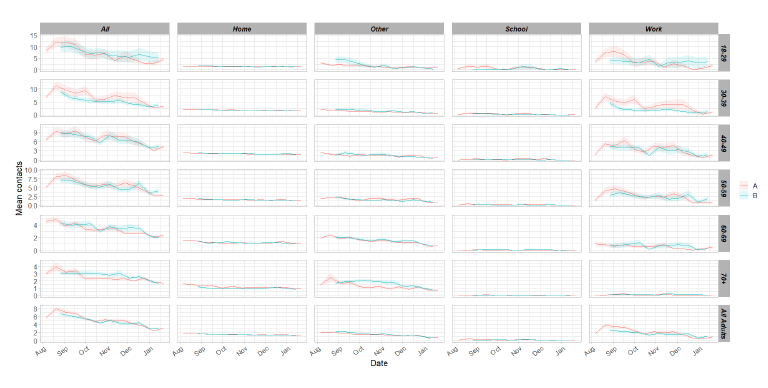
- Average contacts across all settings are consistent with last week, at around 3.1. The average contacts in the workplace and school settings have both doubled compared to two weeks prior. Contacts within the 'other' setting have also increased for all age groups, with the exception of 30-39 age group.
- The same number of people are visiting the workplace compared to two weeks previously but they are having more contacts when they do.
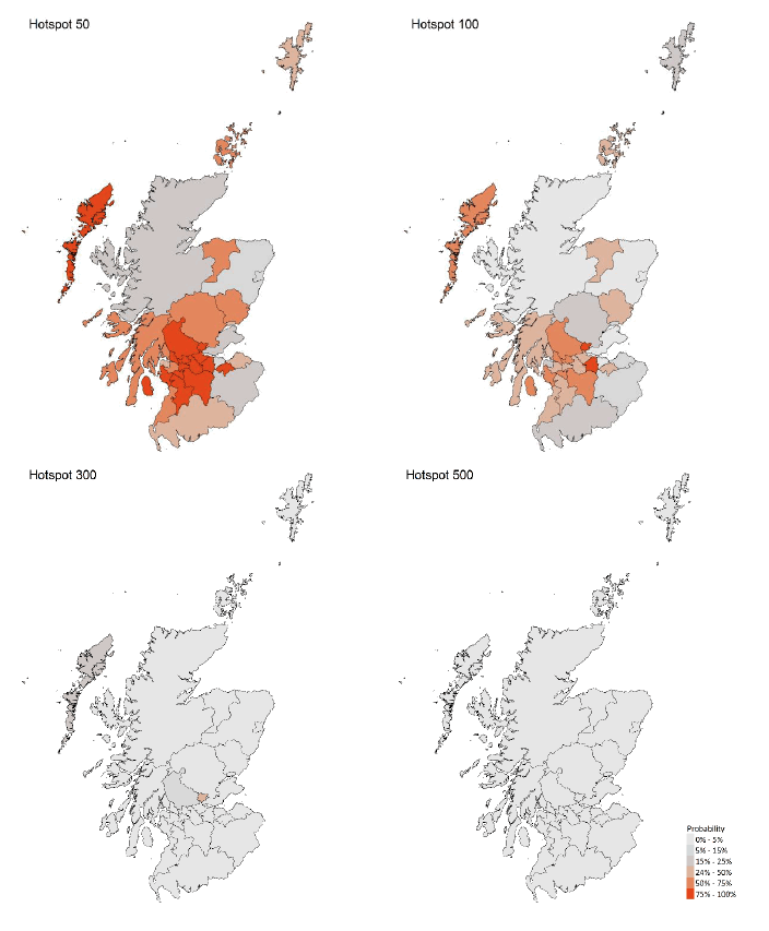
- Modelled rates per 100K indicate that by the week of 14 - 20 February 2021, 14 (down 5 from last week) local authorities have at least a 75% probability of exceeding 50 cases, 2 (down 7) of those have at least a 75% probability of exceeding 100 cases and none of those have at least a 75% probability of exceeding 300 (or 500) cases. This is an improvement compared to the position last week.
- Nationally, during the last week levels of Covid in wastewater reduced by around 17% on average. This continues the decline from the early January peak. In the latest data, the nationwide level of Covid in wastewater is slightly higher than the peak in November 2020.
Overview of Scottish Government Modelling
Epidemiology is the study of how diseases spread within populations. One way we do this is using our best understanding of the way the infection is passed on and how it affects people who catch it to create mathematical simulations. Because people who catch Covid-19 have a relatively long period in which they can pass it on to others before they begin to have symptoms, and the majority of people infected with the virus will experience mild symptoms, this "epidemiological modelling" provides insights into the epidemic that cannot easily be measured through testing e.g. of those with symptoms, as it estimates the total number of new daily infections and infectious people, including those who are asymptomatic or have mild symptoms.
Modelling also allows us to make short-term forecasts of what may happen with a degree of uncertainty. These can be used in health care and other planning. The modelling in this research findings is undertaken using different types of data which going forward aims to both model the progress of the epidemic in Scotland and provide early indications of where any changes are taking place.
Modelling outputs are provided here on the current epidemic in Scotland as a whole, based on a range of methods. Because it takes a little over three weeks on average for a person who catches Covid-19 to show symptoms, become sick, and either die or recover, there is a time lag in what our model can tell us about any re-emergence of the epidemic and where in Scotland this might occur. However modelling of Covid deaths is an important measure of where Scotland lies in its epidemic as a whole. In addition, the modelling groups which feed into the SAGE consensus use a range of other data along with deaths in their estimates of R and the growth rate. These outputs are provided in this research findings. The type of data used in each model to estimate R is highlighted in Figure 1.
A medium term projection of the number of cases, ICU and hospital bed demand is provided at this stage of the epidemic in Scotland.
An update of results are provided from the Scottish Contact Survey (SCS), to indicate how people's contacts have changed over the last two weeks.
It should be noted that this research findings covers a period of uncertainty with the growth of the new variant in Scotland (SARS-CoV-2 VUI 202012/01). The percentage of cases composed of this new variant is increasing in Scotland, from 67% in the 24 hour reporting period from 24 to 25 January 2021 to 73% from 31 January to 1 February[4].
What the modelling tells us about the epidemic as a whole
The various groups which report to the Scientific Pandemic Influenza Group on Modelling (SPI-M) use different sources of data in their models (i.e. deaths, hospital admissions, cases) so their estimates of R are also based on these different methods. SAGE's consensus view across these methods, as of 3 February, was that the value of R in Scotland was between 0.7 and 0.9 (see Figure 1). The value of R on 27 January was between 0.7 and 1.0.
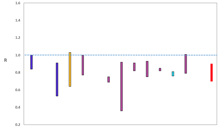
Source: Scientific Advisory Group for Emergencies (SAGE).
The various groups which report to the Scientific Pandemic Influenza Group on Modelling (SPI-M) use different sources of data in their models to produce estimates of incidence (Figure 2). SPI-M's consensus view across these methods, as of 3 February, was that the incidence of new daily infections in Scotland was between 31 and 71 new infections per 100,000. This equates to between 1,700 and 3,900 people becoming infected each day in Scotland. The Scottish Government results this week have been computed using a new platform called Epidemia (see Technical Annex), which expands the Bayesian semi-mechanistic model which Scottish Government runs.
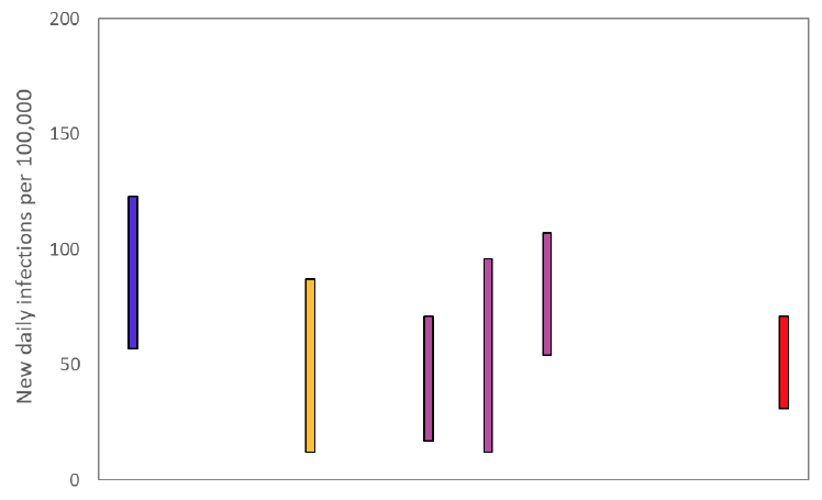
Source: Scientific Pandemic Influenza Group on Modelling (SPI-M).
The consensus from SAGE for this week is that the growth rate in Scotland is between -5 and -2% per day. On 27 January the growth rate was between -5 and -1%.
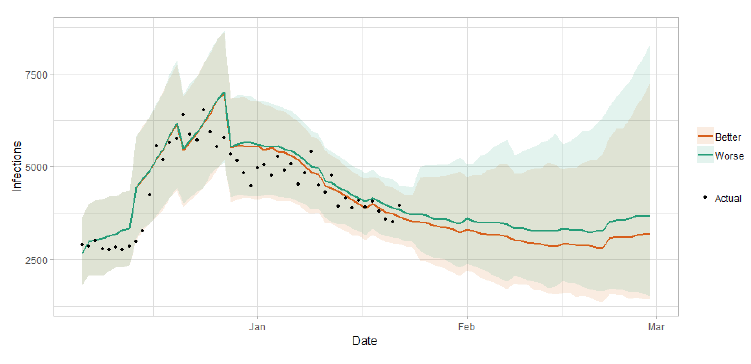
Scottish Government assess the impact of Covid on the NHS in the next few weeks in terms of estimated number of infections. For more on how we do this see page 4 of Issue 1 of the Research Findings for details[5].
Figure 3 shows two projections which take account of vaccine roll-out (better and worse[6]).
What the modelling tells us about Hospital bed and ICU bed demand
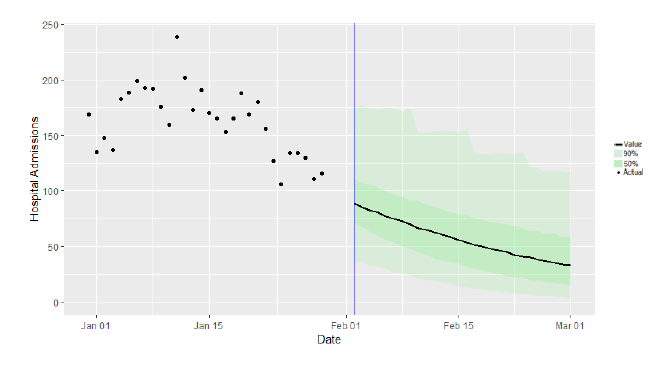
Figure 4 shows the impact of the projections on the number of people in hospital.
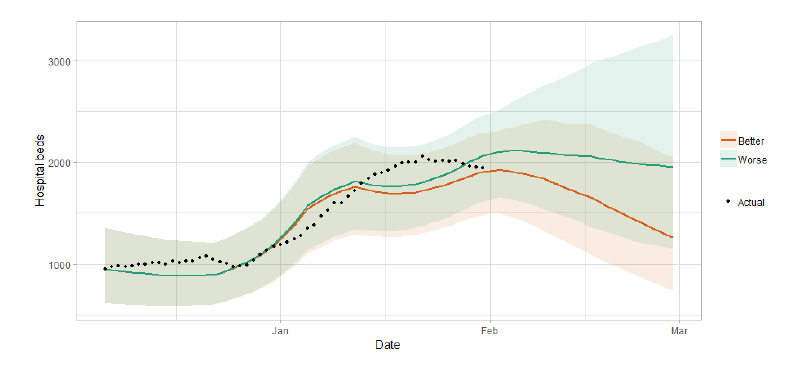
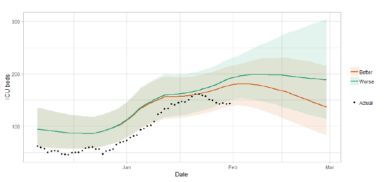
Figure 5 shows the impact of the projection on ICU bed demand.
What the modelling tells us about projections of hospitalisations in the medium term
SAGE produce projections of the epidemic[8] (Figure 6), combining estimates from several independent models (including the Scottish Government's logistics modelling, as shown in figures 3, 4 and 5). These projections are not forecasts or predictions. They represent a scenario in which the trajectory of the epidemic continues to follow the trends that were seen in the data up to 1 February and do not account for the impact of future policy or behaviour changes.
The delay between infection, developing symptoms, the need for hospital care, and death means they will not fully reflect the impact of behaviour changes in the two to three weeks prior to 1 February. Nor do they include seasonal effects that might increase transmission.
These projections include the potential impact of vaccinations over the next four weeks. The real-world effectiveness of vaccines, particularly against infection, is not yet known. The first dose effectiveness of the Pfizer-BioNTech and Oxford-AstraZeneca vaccines against both hospitalisation and death have been modelled in line with JCVI's advice[9].
Beyond two weeks, the projections become more uncertain with greater variability between individual models. This reflects the large differences that can result from fitting models to different data streams, and the influence of small deviations in estimated growth rates and current incidence.
What we know about the risk of hospitalisation and death due to the new variant
The Early Pandemic Evaluation and Enhanced Surveillance of COVID-19 (EAVE) 2 Study Group[10] linked individual patient-level data from all primary, secondary, mortality and virological/serological testing data in Scotland (see Technical Annex in issue 34 of the Research Findings). They used this national dataset to investigate the temporal progression of COVID-19 in the Scottish population and the development of COVID-19 morbidity and mortality in individuals.
Among individuals tested in the community since November 16th, and whose sample is processed using the TaqPath[11] assay at the lighthouse laboratory, the risk of hospitalisation following a positive test result has been estimated and individuals with the new variant[12] have now been shown to be at increased risk compared to those with the non-new variant. There may be an increased risk of hospitalisation (hazard ratio), when adjusted for demographics and clinical characteristics, this is preliminarily thought to be 1.63 (95% CI 1.48, 1.80) for those with the new variant. Individuals with a weak positive result continue to be at a lower risk of having a hospital admission. In context, about 3% of individuals who test positive, with non-new variant, in this group are admitted to hospital within 14 days of the positive test and this rises to 4.5% among those with the new variant.
There may be a higher risk of death among those with the new variant compared to those with the non-new variant. Adjusting for age, sex, deprivation and number of clinical risk groups the hazard ratio of death within 28 days of a positive test is preliminarily thought to be 1.37 (95% CI 1.02, 1.84) for those with the new variant. Among individuals who tested positive from the lighthouse laboratory, 0.4% died within 28 days if they had a non-new variant and 0.5% with the new variant.
These are preliminary results and the analyses may change when updated in the coming weeks. It should be noted that there are potential biases in this work as those tested in the lighthouse laboratory are largely healthy people. Furthermore, approximately 50% of people who are admitted to hospital are tested within the NHS laboratories and for these people there is no information available on whether they have the new variant.
What we know about how people's contact patterns have changed
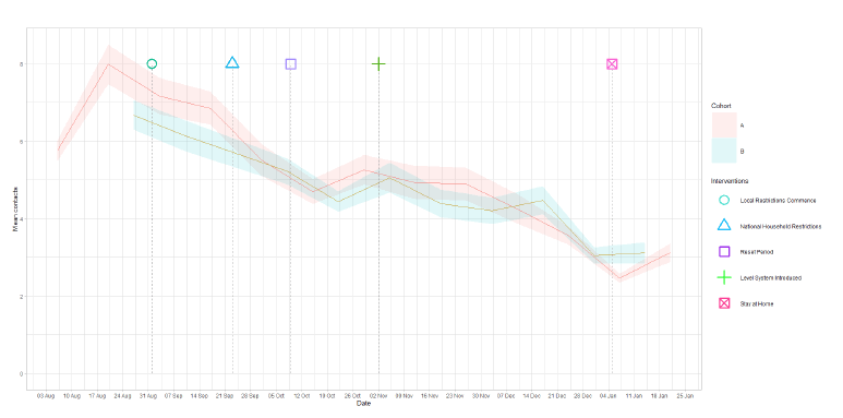
Since the survey pertaining to 7 – 13 January, mean contacts have increased by 27%, however this level is now consistent across both panels with approximately 3.1 average contacts as shown in Figure 7.
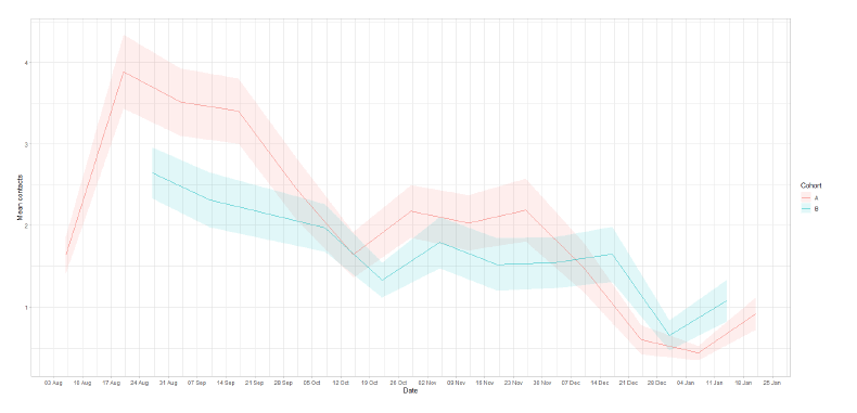
There have been increases in contacts within the work and school settings. An increase in these settings was also seen in Panel B for the survey relating to 14 – 20 January, however the magnitude is greater for panel A in both settings. This increasing trend is shown for work contacts in Figure 8. Mean contacts in the workplace and in the school have more than doubled, while contacts in other settings increased by approximately 30%. Contacts within the home have remained at a consistent level in comparison to the previous 2 weeks.
As seen in Figure 9, all age groups have shown an increase in work contacts with the exception of those over 70. Adults aged between 18 and 50 have reported the largest rise in work contacts, increasing by at least double in the last 2 weeks. Contacts within the other setting have increased for all age groups with the exception of 30-39 age group. The largest increase in the other setting is observed with those within the 40-49 age band, with an average 74% increase.
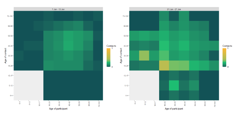
The heatmaps in Figure 10 show the change in mean work contacts between age groups for the weeks pertaining to 7 – 13 January and 21 – 27 January. The most interactions are seen amongst the 18-29 age group. This age group also shows an increase in work contacts with all other age groups. The biggest change in interactions are seen with those aged 30-39 and the 5-12 age group and also those 40-49 with the 0-4 age group, increasing by 7.5 times.
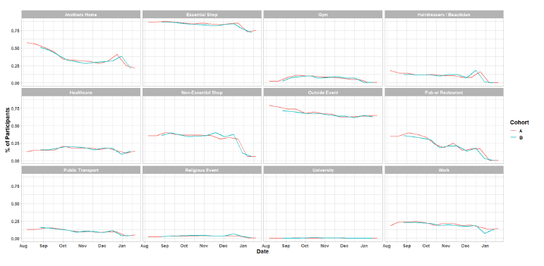
As Figure 11 shows a slight decrease in the proportion of people that have visited another's home, down from 25% (7 – 13 January) to 21% (21 – 27 January). Although average contacts in the work setting have increased, the percentage of participants visiting the work place has remained at a consistent level compared to two weeks prior, at approximately 15%.
What we know about which local authorities are likely to experience high levels of Covid
We use modelling based on Covid cases and deaths[13], conducted by Imperial College London, to give us an indication of whether a local authority is likely to experience high levels of Covid in the future. An area is defined as a hotspot if the two week prediction of cases (positive tests) per 100K population are predicted to exceed a threshold, e.g. 500 cases. See technical annex in issue 24.
Modelled rates per 100K (Figure 12) indicate that by the week of 14 - 20 February 2021, 14 (down 5 from last week) local authorities have at least a 75% probability of exceeding 50 cases, 2 (down 7) of those have at least a 75% probability of exceeding 100 cases and none of those have at least a 75% probability of exceeding 300 (or 500) cases. The probability of exceeding will be affected by the lockdown as well as by how much new variant is present in a local authority area. This adds to the uncertainty around this modelling this week.
What can analysis of wastewater samples tell us about local outbreaks of Covid-19 infection?
Levels of Covid in wastewater collected at 28 sites around Scotland are adjusted for population and local changes in intake flow rate and compared to daily 7-day average positive case rates derived from Local Authority and Neighbourhood (Intermediate Zone) level aggregate data. See Technical Annex in Issue 34 of these Research Findings for the methodology.
Nationally, during the last week levels of Covid[15] in wastewater (WW) reduced by around 17%. This continues the decline from the early January peak, in line with new cases data (Figures 13 & 17), though there is some variation between sites in the extent. In the latest data, the nationwide level of Covid in wastewater is slightly higher than the peak in November 2020. Over late December and into January, levels of Covid in wastewater were proportionately higher relative to cases than during August to November. We will monitor whether this feature is maintained going forward.
Figure 13 shows levels of Covid in wastewater data aggregated over sites to produce a national average time series, compared to new cases data. The national picture for both wastewater Covid data and new cases data for the last week show a continued decline in levels, albeit at a slower rate than last week for wastewater, suggesting that levels may be stabilising.
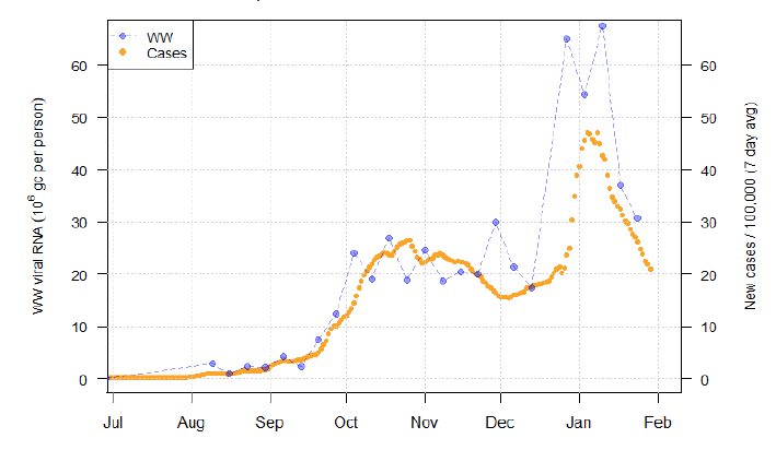
Figure 13 suggests that after December 2020, there is a departure from the pattern seen in previous months. While in the earlier period, flow and population adjusted wastewater Covid has a roughly one-to-one relationship with the daily rate of new cases, from December the level of Covid in wastewater has been consistently higher than might have been expected. A variety of possible explanations exist for this, including:
- Changing patterns of testing, leading to underreporting of cases during the New Year spike.
- The emergence of new variants of Covid with possibly higher viral loads and shedding rates or different symptoms causing a change in patterns of testing.
- Environmental factors affecting wastewater Covid level detection.
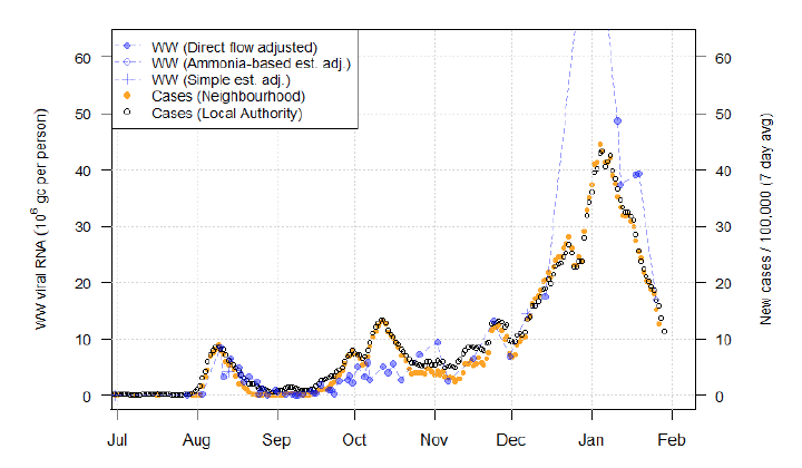
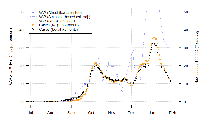
While in the last two weeks, the discrepancy has apparently reduced, we will continue monitoring to see if the discrepancy disappears or persists. This may also differ from site to site. For example, Figure 14 shows that at Nigg in Aberdeen, despite a high peak of around 88 million gc/person at the start of the year (this exceeds the maximum value shown on the graph), wastewater Covid levels have declined dramatically to 17 Mgc/person and now align well with new case rates. In contrast, at Seafield in Edinburgh (Figure 15), though levels are down from the extreme peak of 97 Mgc/person (again, off the limits of the graph), levels remain at over twice that predicted by the prior, approximately 1-to-1 alignment.
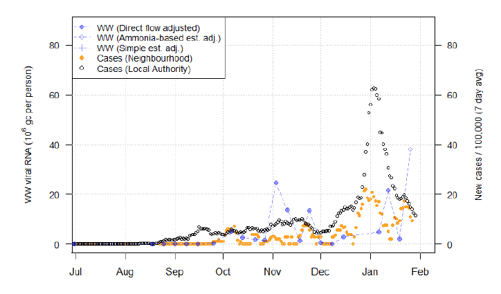
It is important to note that Figure 13 is just a national overview. At some sites, like Galashiels (Figure 16), wastewater RNA appears if anything to be increasing recently, albeit from a low level.
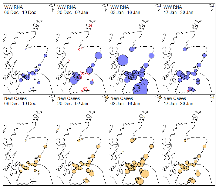
We map out, for a series of non-overlapping 2-week periods, means across Scotland for both the wastewater Covid levels data and the corresponding neighbourhood level case data (Figure 17). The sizes of the circles denote the local level of flow adjusted Covid levels per person (blue) or the rate of new cases (orange). Red crosses denote sites with no observations during each time period.
Via this representation, we see that the largest divergence between the two variables – the very high wastewater Covid levels at Annan and Fort William – has disappeared, with levels at both of these sites falling to very low levels again in accordance with new cases. Helensburgh (Argyll and Bute) appears as a possible site with a discrepancy between levels of Covid in wastewater and case data. On examination of more detailed data (not shown) wastewater levels there have reached a recent peak of around 70 Mgc/person despite the daily new case rate being only about 10/100k residents.
What next?
The Scottish Government continues to work with a number of academic modelling groups to develop other estimates of the epidemic in Scotland.
The modelled estimates of the numbers of new cases and infectious people will continue to be provided as measures of the epidemic as a whole, along with measures of the current point in the epidemic such as Rt and the growth rate. Further information can be found at https://www.gov.scot/coronavirus-covid-19.
Investigations are ongoing by NERVTAG, SPI-M, SAGE and Scottish Government regarding the impact of the new variant, SARS-CoV-2 VUI 202012/01, which will be reflected here as work is undertaken.