Coronavirus (COVID-19): modelling the epidemic (issue no. 33)
Latest findings in modelling the COVID-19 epidemic in Scotland, both in terms of the spread of the disease through the population (epidemiological modelling) and of the demands it will place on the system, for example in terms of health care requirement
Coronavirus (COVID-19): modelling the epidemic in Scotland (Issue No. 33)
Background
This is a report on the Scottish Government modelling of the spread and level of Covid-19. This updates the previous publication on modelling of Covid-19 in Scotland published on 23 December 2020. The estimates in this document help the Scottish Government, the health service and the wider public sector plan and put in place what is needed to keep us safe and treat people who have the virus.
This edition of the research findings focuses on the epidemic as a whole, looking at estimates of R, growth rate and incidence as well as local measures of change in the epidemic.
Key Points
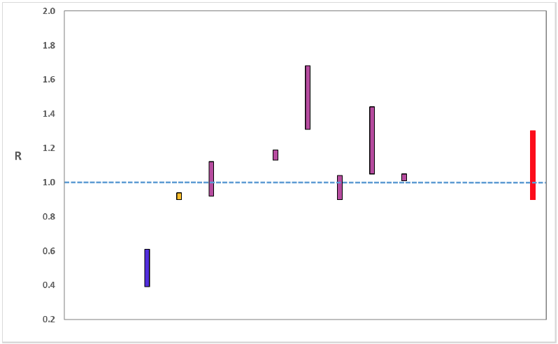
☐ The reproduction rate R in Scotland is currently estimated as being between 0.9 and 1.3.
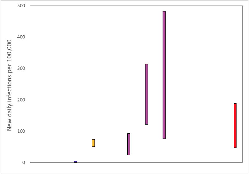
☐ The number of new daily infections for Scotland is estimated as being between 47 and 188, per 100,000 people.
☐ The growth rate for Scotland is estimated as being between -2% and 5%.
☐ Despite an overall decrease in contacts (14%) in the last two weeks, there has been a 16% increase in contacts within the home. As a whole interactions between each age group have increased within this setting.
☐ In addition, during the festive period participants visiting another's home increased from 31% to 41%. The decrease in mean contacts during the last two weeks is therefore largely due to reductions in contacts at school and work.
☐ Modelled rates per 100K indicate that by the week of 17 - 23 January 2021, 28 (up 7 in the last fortnight) local authorities have at least a 75% probability of exceeding 50 cases, 28 (up 19) of those have at least a 75% probability of exceeding 100 cases, 21 (up 20) of those have at least a 75% probability of exceeding 300 cases and 15 (up 15) have at least a 75% probability of exceeding 500 cases. This is a starkly different position compared to two weeks ago. The probability of exceeding will be effected by the lockdown as well as by how much new variant is present in a local authority area. This adds to the uncertainty around this modelling this week.
Overview of Scottish Government Modelling
Epidemiology is the study of how diseases spread within populations. One way we do this is using our best understanding of the way the infection is passed on and how it affects people who catch it to create mathematical simulations. Because people who catch Covid-19 have a relatively long period in which they can pass it on to others before they begin to have symptoms, and the majority of people infected with the virus will experience mild symptoms, this "epidemiological modelling" provides insights into the epidemic that cannot easily be measured through testing e.g. of those with symptoms, as it estimates the total number of new daily infections and infectious people, including those who are asymptomatic or have mild symptoms.
Modelling also allows us to make short-term forecasts of what may happen with a degree of uncertainty. These can be used in health care and other planning. The modelling in this research findings is undertaken using different types of data which going forward aims to both model the progress of the epidemic in Scotland and provide early indications of where any changes are taking place.
Modelling outputs are provided here on the current epidemic in Scotland as a whole, based on a range of methods. Because it takes a little over three weeks on average for a person who catches Covid-19 to show symptoms, become sick, and either die or recover, there is a time lag in what our model can tell us about any re-emergence of the epidemic and where in Scotland this might occur. However modelling of Covid deaths is an important measure of where Scotland lies in its epidemic as a whole. In addition, the modelling groups which feed into the SAGE consensus use a range of other data along with deaths in their estimates of R and the growth rate. These outputs are provided in this research findings. The type of data used in each model to estimate R is highlighted in Figure 1.
A short term forecast and projection of the number of cases, ICU and hospital bed demand is also provided at this stage of the epidemic in Scotland.
An update of results are provided from the Scottish Contact Survey (SCS), to indicate how people's contacts have changed over the last two weeks.
It should be noted that this is the first research findings of 2021, and covers a period of uncertainty with the growth of the new variant in Scotland (SARS-CoV-2 VUI 202012/01), and the festive period. The
percentage of cases composed of this new variant is increasing rapidly in Scotland, from 42.7% on 31 December to 49.7% on 4 January. It is very likely that this strain will further increase in dominance in Scotland in a similar way to that already seen in London and SE England.
These research findings will see the effect of the stay-at-home lockdown in Scotland announced on 4 January in future weeks as most of the modelling presented here was undertaken using data prior to this coming into force.
What the modelling tells us about the epidemic as a whole
The various groups which report to the Scientific Pandemic Influenza Group on Modelling (SPI-M) use different sources of data in their models (i.e. deaths, hospital admissions, cases) so their estimates of R are also based on these different methods. SAGE's consensus view across these methods, as of 6 January, was that the value of R in Scotland was between 0.9 and 1.3 (see Figure 1). The value of R on 22 December was between 0.9 and 1.1
Figure 1. Estimates of Rt for Scotland, as of 6 January, including 90% confidence intervals, produced by SAGE. The blue bar is a death-based model and purple use multiple sources of data. The estimate produced by the Scottish Government (a semi-mechanistic model) is the 2nd from left (yellow), while the SAGE consensus range is the right-most (red).
Source: Scientific Advisory Group for Emergencies (SAGE).
Figure Description:
Figure 1. A graph showing the range of values which each of the academic groups reporting an R value to SAGE are likely to lie within, as of 6 January. The blue bar (first from left) are death-based models, purple (3rd to 8th from the left) use multiple sources of data. The estimate produced by the Scottish Government (a deaths-based model) is the 2nd from left (yellow). The R value estimated by the Scottish Government is similar to the estimates of other groups using models which draw upon numbers of deaths. The SAGE consensus, shown at the right hand side of the plot, is that the most likely range is between 0.9 and 1.3.
The various groups which report to the Scientific Pandemic Influenza Group on Modelling (SPI-M) use different sources of data in their models to produce estimates of incidence (Figure 2). SPI-M's consensus view across these methods, as of 6 January, was that the incidence of new daily infections in Scotland was between 47 and 188 new infections per 100,000. This equates to between 2,600 and 10,300 people becoming infected each day in Scotland.
Figure 2. Estimates of incidence for Scotland, as of 6 January, including 90% confidence intervals, produced by SPI-M. The blue bar is a death-based model and the purple bars represent models which use multiple sources of data. The estimate produced by the Scottish Government (a semi-mechanistic model) is the 2nd from left (yellow), while the SAGE consensus range is the right-most (red).
Source: Scientific Pandemic Influenza Group on Modelling (SPI-M).
Figure Description:
Figure 2. A graph showing the ranges the values which each of the academic groups in SPI-M are reporting for incidence (new daily infections per 100,000) are likely to lie within, as of 6 January. The blue bar is a death based models (1st from left). The purple bars (3rd to 5th from the left) use multiple sources of data. The estimate produced by the Scottish Government (a deaths-based model) is the 2nd from the left (yellow). The SAGE consensus (47 to 188 new daily infections per 100,000) is shown at the right hand side of the plot.
The consensus from SAGE for this week is that the growth rate in Scotland is between -2 and 5% per day. On 22 December the growth rate was in the range -2% and 2%.
The logistical model developed by Scottish Government to assess implications for health care demand (see previous Research Findings) has been adapted to produce a short/medium-term prediction of infections.
Figure 3 shows a projection that assumes the R value has dropped due to the measures announced on 4 January, but is rising as the new more transmissible variant spreads.
Figure 3. Short term forecast of modelled total new infections, adjusting positive tests to account for asymptomatic and undetected infections, from Scottish Government modelling, positive test data up to 2 January.
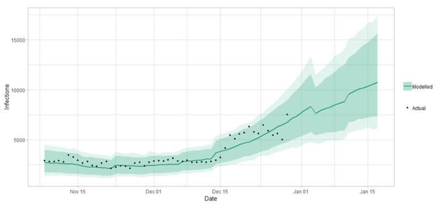
Figure Description:
Figure 3. Line graph showing the short term forecast of modelled new infections. The forecast indicates up to around 17500 infections in two weeks.
What the modelling tells us about Hospital bed and ICU bed demand
Figure 4 shows the impact of the projection on the number of people in hospital.
Figure 4. Short term forecast of modelled hospital bed demand, from Scottish Government modelling.
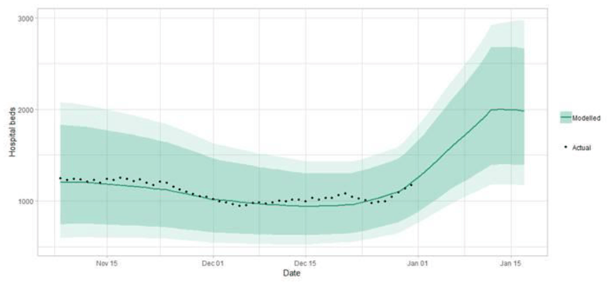
Figure Description:
Figure 4. A line graph showing the short term forecast of hospital bed demand. The forecast indicates up to around 3000 may be required in two weeks.
Figure 5 shows the impact of the projection on ICU bed demand.
Figure 5. Short term forecast of modelled ICU bed demand, from Scottish Government modelling[1].
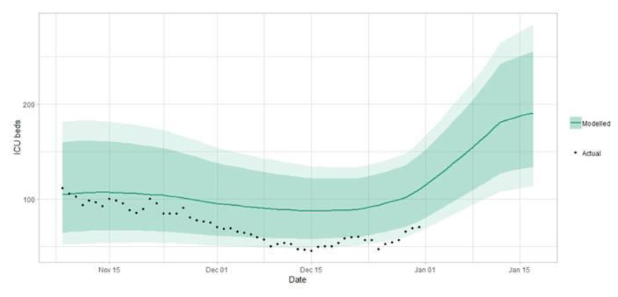
Figure Description:
Figure 5. A line graph showing a short term forecast of modelled ICU bed demand, from Scottish Government modelling. This shows up to around 300 ICU may be required in two weeks.
What the modelling tells us about projections of hospitalisations in the medium term
SAGE produce projections of the epidemic[2] (Figure 6), combining estimates from several independent models (including the Scottish Government Government's logistics modelling, as shown in figures 3, 4 and 5). These projections are not forecasts or predictions. They represent a scenario in which the trajectory of the epidemic continues to follow the trends that were seen in the data up to the 4th of January and do not account for the impact of future policy or behaviour changes. Nor do they include seasonal effects that might increase transmission.
The delay between infection, developing symptoms, hospitalisation and death means the projections cannot fully reflect changes in transmission that might have occurred over the past two to three weeks, such as the levels of mixing over the festive period.
Beyond two weeks, the projections become more uncertain with greater variability between individual models. This reflects the large differences that can result from fitting models to different data streams, and the influence of small deviations in estimated growth rates and current incidence.
Figure 6. SAGE medium-term projection of daily hospitalisations in Scotland, including 50% and 90% credible intervals.
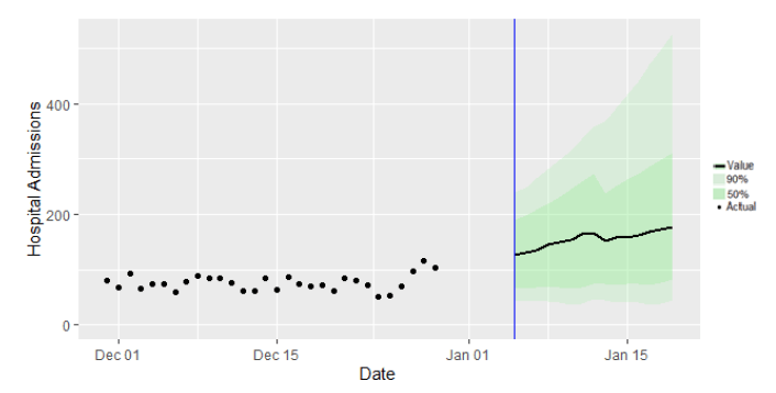
Figure 6:
Figure 6. A combination scatter plot and line graph showing the SAGE medium-term projection of daily hospitalisations in Scotland, including the actuals, 50% and 90% credible intervals.
What we know about how people's contact patterns have changed
There has been a noticeable reduction in mean contacts during the most recent survey covering 24 – 30 December compared to two weeks prior (3.6 and 4.2 respectively) as shown in Figure 7. This period includes the festive relaxation as well as the introduction of post-festive level 4 restrictions. This decrease is mainly due to a significant reduction in work and school contacts, 59% and 95% respectively, while contacts in the home have shown an increase by 16% as seen in Figure 8.
Figure 7: Mean Adult Contacts (truncated at 100) from SCS.
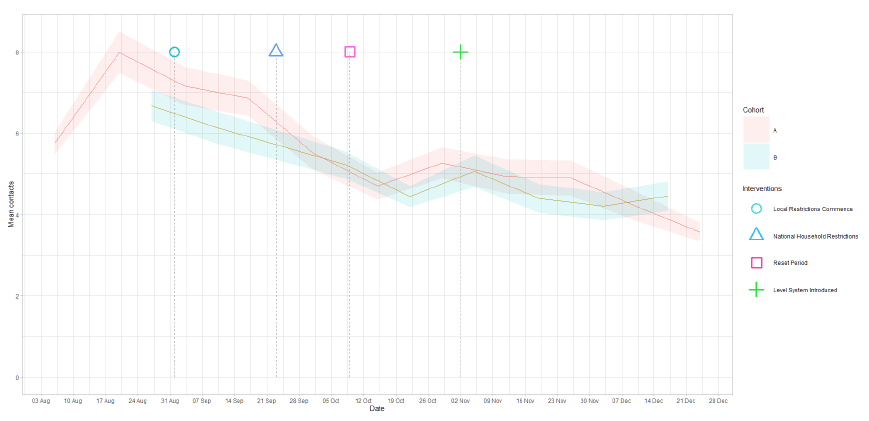
Figure Description:
Figure 7. A line graph showing mean adult contacts by age group for panel A and panel B from 6 Aug to 30 Dec 2020.
Figure 8: Average (mean) contacts for each panel per day by setting for adults in Scotland, truncated to 100 contacts per participant (from SCS).
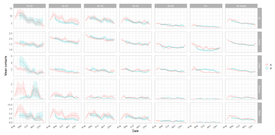
Figure Description:
Figure 8. A series of line graphs showing mean adult contacts by setting and age group for panel A and panel B from 6 Aug to 30 Dec.
The impact of the festive relaxation period is demonstrated through the increase in mean contacts for all age groups in the home setting. Although overall mean contacts has shown a reduction for the week of 24 – 30 December compared to two weeks prior, contacts within the home have increased by 16% overall. The 50-59 age group show the largest increase of 26% followed by those aged 60-69 with a 21% increase. In contrast, the work and school settings for all ages show a decrease in mean contacts which is likely due to the festive period. There is a significant reduction in mean work contacts for the 18-30 age group over this period, reducing by 92%.
Figure 9: Mean home contacts by age group before and during the festive period.
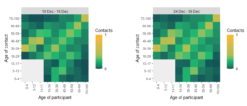
Figure Description:
Figure 9. Two heat maps showing the mean contacts by age group for 10 – 16 Dec and 24 – 30 Dec, from SCS.
The heatmaps in Figure 9 show mean contacts in the home setting between age groups before (10 – 16 December) and during the festive period (24 – 30 December). This illustrates a widespread increase in contacts, although the change is slight. The biggest proportional increases are seen in the interactions between the 30-39 age group with the age groups 60 or older with at least a 65% increase in contacts observed.
Also as Figure 10 shows, there have been increases in participants visiting another's home and beauticians/hairdressers in the last two weeks. All remaining settings display a slight decrease or are consistent with the level two weeks prior. The biggest change in participant behaviour over the last two weeks has been visiting another's home. The percentage of participants has increased from 31% in the week of 10 – 16 December to 41% for the week 24 – 30 December. This follows the relaxation of the household restrictions, the first since 23 September.
Figure 10: Locations visited by participants at least once for panel A and B (from SCS).
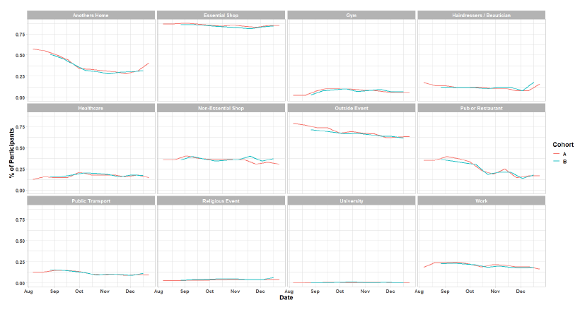
Figure Description:
Figure 10: A series of line graphs showing locations visited by participants at least once for panel A and panel B from 6 Aug to 30 Dec.
What we know about which regions are experiencing high levels of Covid
We use modelling based on Covid cases and deaths[3], conducted by Imperial College London, to give us an indication of whether a local authority is experiencing high levels of Covid. Please note that this modelling does not account for the stay-at-home legal requirement in Scotland announced on 4 January. An area is defined as a hotspot if the two week prediction of cases (positive tests) per 100K population are predicted to exceed a threshold, e.g. 500 cases. See technical annex in issue 24.
Modelled rates per 100K (Figure 11) indicate that by the week of 17 - 23 January 2021, 28 (up 7 in the last fortnight) local authorities have at least a 75% probability of exceeding 50 cases, 28 (up 19) of those have at least a 75% probability of exceeding 100 cases, 21 (up 20) of those have at least a 75% probability of exceeding 300 cases and 15 (up 15) have at least a 75% probability of exceeding 500 cases. The probability of exceeding will be effected by the lockdown as well as by how much new variant is present in a local authority area. This adds to the uncertainty around this modelling this week.
Figure 11. Probability of local authority areas having more than 50, 100, 300 or 500 cases per 100K (17 - 23 January 21). Data updated on 5 January[4].
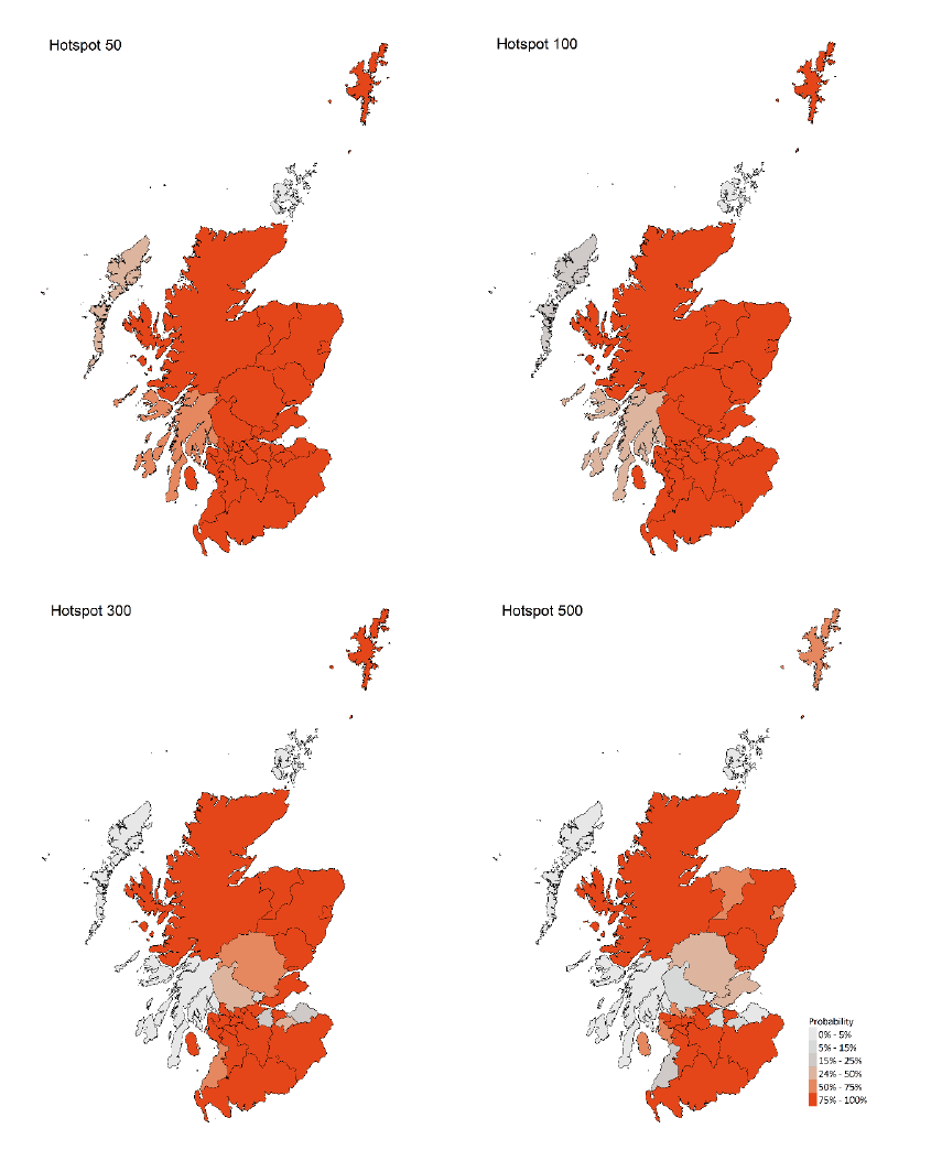
Figure Description:
Figure 11. A series of four choropleths showing the probability of Scottish local authorities having more than 50, 100, 300 or 500 cases per 100,000 population, corresponding to data for 17 – 23 January 21.
What next?
The Scottish Government continues to work with a number of academic modelling groups to develop other estimates of the epidemic in Scotland.
The modelled estimates of the numbers of new cases and infectious people will continue to be provided as measures of the epidemic as a whole, along with measures of the current point in the epidemic such as Rt and the growth rate. Further information can be found at https://www.gov.scot/coronavirus-covid-19.
Investigations are ongoing by NERVTAG, SPI-M, SAGE and Scottish Government regarding the impact of the new variant, SARS-CoV-2 VUI 202012/01, which will be reflected here as work is undertaken.
In the coming weeks the impact of the lockdown will be reflected in the modelling.