Coronavirus (COVID-19): modelling the epidemic (issue no. 26)
Latest findings in modelling the COVID-19 epidemic in Scotland, both in terms of the spread of the disease through the population (epidemiological modelling) and of the demands it will place on the system, for example in terms of health care requirement.
Coronavirus (COVID-19): modelling the epidemic in Scotland (Issue No. 26)
Background
This is a report on the Scottish Government modelling of the spread and level of Covid-19. This updates the previous publication on modelling of Covid-19 in Scotland published on 5 November 2020. The estimates in this document help the Scottish Government, the health service and the wider public sector plan and put in place what is needed to keep us safe and treat people who have the virus.
This edition of the research findings focuses on the epidemic as a whole, looking at estimates of R, growth rate and incidence as well as local measures of change in the epidemic.
Key Points
- The reproduction rate R in Scotland is currently estimated as being between 0.8 and 1.1.
- The number of new daily infections for Scotland is estimated as being between 46 and 150, per 100,000 people.
- The growth rate for Scotland is estimated as being between -4% and +1%.
- The number of contacts has increased in the last week (up around 15%). This follows the end of half term which varies across Scotland, ending between 16 - 27 October, and results in an increase in contacts made at work and school.
- Modelled rates per 100K indicate that by the week of 15 - 21 November, 21 (down 1 from last week) local authorities have at least a 75% probability of exceeding 50 cases, 14 (down 4) of those have at least a 75% probability of exceeding 100 cases and none of those have at least a 75% probability of exceeding 300 (or 500) cases. This is an improvement on last week's forecast.
Overview of Scottish Government Modelling
Epidemiology is the study of how diseases spread within populations. One way we do this is using our best understanding of the way the infection is passed on and how it affects people who catch it to create mathematical simulations. Because people who catch Covid-19 have a relatively long period in which they can pass it on to others before they begin to have symptoms, and the majority of people infected with the virus will experience mild symptoms, this "epidemiological modelling" provides insights into the epidemic that cannot easily be measured through testing e.g. of those with symptoms, as it estimates the total number of new daily infections and infectious people, including those who are asymptomatic or have mild symptoms.
Modelling also allows us to make short-term forecasts of what may happen with a degree of uncertainty. These can be used in health care and other planning. The modelling in this research findings is undertaken using different types of data which going forward aims to both model the progress of the epidemic in Scotland and provide early indications of where any changes are taking place.
Modelling outputs are provided here on the current epidemic in Scotland as a whole, based on a range of methods. Because it takes a little over three weeks on average for a person who catches Covid-19 to show symptoms, become sick, and either die or recover, there is a time lag in what our model can tell us about any re-emergence of the epidemic and where in Scotland this might occur. However modelling of Covid deaths is an important measure of where Scotland lies in its epidemic as a whole. In addition, the modelling groups which feed into the SAGE consensus use a range of other data along with deaths in their estimates of R and growth rate. These outputs are provided in the first part of this research findings. The type of data used in each model to estimate R is highlighted in Figure 2.
A short term forecast of the number of cases in the next two weeks is also provided, as the focus at this stage of the epidemic is the re-emergence of the virus in Scotland.
A new tranche of results are provided from the Scottish Contact Survey (SCS), to indicate how people's contacts are changing.
What the modelling tells us about the epidemic as a whole
The various groups which report to the Scientific Pandemic Influenza Group on Modelling (SPI-M) use different sources of data in their models (i.e. deaths, hospital admissions, cases) so their estimates of R are also based on these different methods. SAGE's consensus view across these methods, as of 11 November, was that the value of Rt in Scotland was between 0.8 and 1.1. The R value estimated by the Scottish Government is within the consensus range (Figure 1).
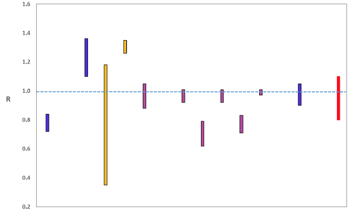
Source: Scientific Advisory Group for Emergencies (SAGE).
Figure 2 shows how Rt has changed since February (including 50% and 95% confidence intervals). Before the "stay at home" restrictions were put in place Rt was above 1, and most likely to have been between 3 and 4 before any interventions were put in place.
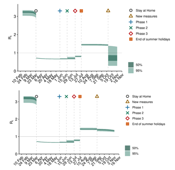
Source: Scottish Government modelled estimates using Imperial College model code; actual data from https://www.nrscotland.gov.uk/statistics-and-data/statistics/statistics-by-theme/vital-events/general-publications/weekly-and-monthly-data-on-births-and-deaths/deaths-involving-coronavirus-covid-19-in-scotland
On 9 November, Public Health Scotland recorded 1,091[1] positive new cases, with 8,259 positive new cases over the week of 2 – 8 November.
The various groups which report to the Scientific Pandemic Influenza Group on Modelling (SPI-M) use different sources of data in their models to produce estimates of incidence (Figure 3). SPI-M's consensus view across these methods, as of 11 November, was that the incidence of new daily infections in Scotland was between 46 and 150 new infections per 100,000. This equates to between 2,500 and 8,200 people becoming infected each day in Scotland.
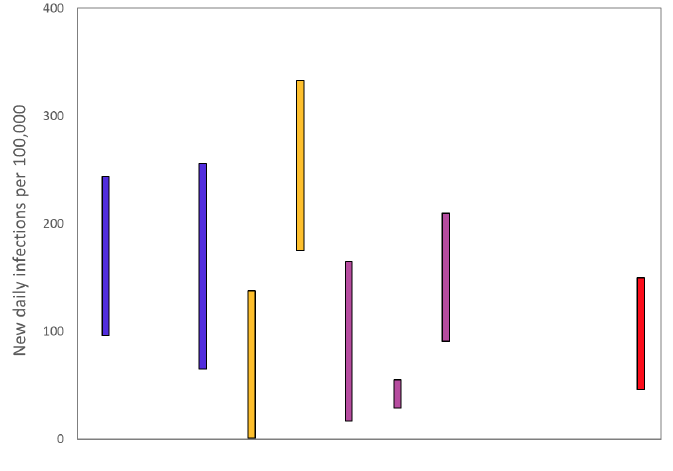
Source: Scientific Pandemic Influenza Group on Modelling (SPI-M).
The consensus from SAGE for this week is that the growth rate in Scotland is between -4% and +1% per day. Last week the growth rate was in the range -1% and +2%.
Figure 4 shows the epidemiological model forecasts of daily deaths produced by the Scottish Government, given the present set of interventions.
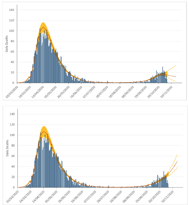
Source: Scottish Government modelled estimates using Imperial College model code; actual data from https://www.nrscotland.gov.uk/statistics-and-data/statistics/statistics-by-theme/vital-events/general-publications/weekly-and-monthly-data-on-births-and-deaths/deaths-involving-coronavirus-covid-19-in-scotland
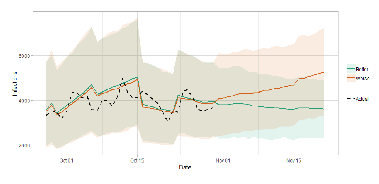
The logistical model developed by Scottish Government to assess implications for health care demand (see previous Research Findings) has been adapted to produce a short/medium-term predictions of infections.
The following two week prediction uses this model to extend the estimated number of infections from the Imperial College model, in a manner that fits with the estimated number of actual infections, adjusting people who have tested positive to account for asymptomatic and undetected infections.
Figure 5 shows a "better scenario", which assumes the Rt value is currently slightly below 1 and there will be limited increase in transmission from winter conditions, and a "worse scenario", which assumes that Rt is currently slightly above 1, and it will increase as winter sets in.
What the modelling tells us about Hospital bed and ICU bed demand
Figure 6 shows the impact of the better and worse scenarios on the number of people in hospital.
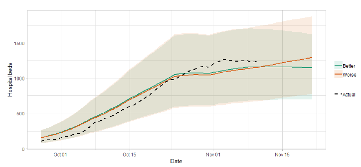
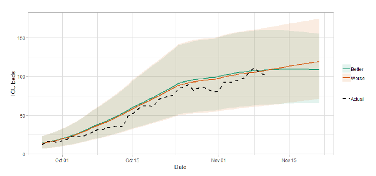
Figure 7 shows the impact of the better and worse scenarios on ICU bed demand. As things stand, the bed demand estimates lie consistently above the actual number of people in ICU, though it is well within the prediction interval.
What the modelling tells us about projections of hospitalisations in the medium term
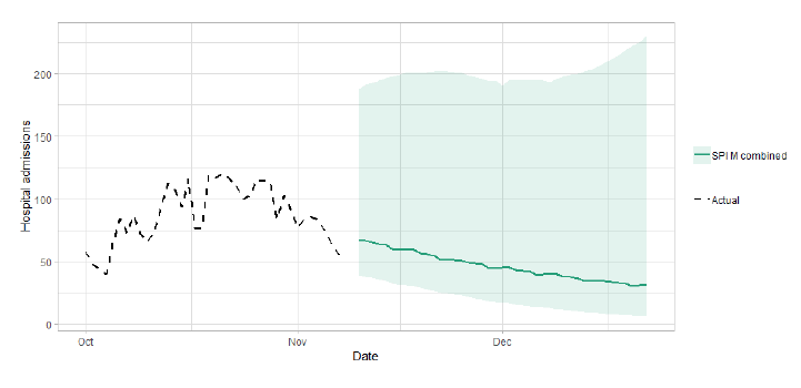
SAGE produce projections of the epidemic over the next six weeks (Figure 8), combining estimates from several independent models (including the Scottish Government Government's logistics modelling, as shown in figures 5, 6 and 7). These projections are not forecasts or predictions. They represent a scenario in which the trajectory of the epidemic continues to follow current trends and do not account for the impact of future policy or behaviour changes. Nor do they include seasonal effects that might increase transmission.
The delay between infection, developing symptoms, hospitalisation and death means the projections cannot fully reflect changes in transmission that might have occurred over the past two to three weeks.
Beyond two weeks, the projections become more uncertain with greater variability between individual models. This reflects the large differences that can result from fitting models to different data streams, and the influence of small deviations in estimated growth rates and current incidence.
What we know about how people's contact patterns have changed
It is now possible for us to estimate how much contact people in Scotland have with each other, with a good degree of accuracy. This provides an update of the modelled results presented in issue 25 using methodologies developed by the London School of Hygiene and Tropical Medicine. The modelling is based on a survey asking about where respondents have been and how many contacts they met in a given week.
The average number of contacts per day are approximately 90% higher than they were at the beginning of the Stay-at-home-advice, and less than half the level pre-Stay-at-home-advice (UK comparison 10.8). The number of contacts has increased in the last week, up around 15% (Figure 9). Interactions between age groups have decreased since the end of August. This suggests the rule of six, restrictions on households meeting and other restrictions have had a noticeable effect, however, from the recent increase, there are signs this could be diminishing. Older people generally have fewer reported contacts than younger people, but the difference is largely from work and school contacts, rather than in the home or in other settings. There is a drop off in how many people are visiting different locations, particularly in the pubs category.
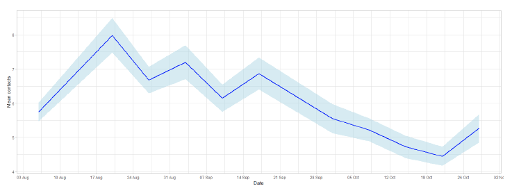
The Scottish Survey is split into two sample groups, Panel A and Panel B. These are updated every two weeks for each panel (alternating). The following visualisations combine both sample groups and show how their mean contacts change over time (See technical annex in issue 18 of the Research Findings). Data covering the periods from 12 – 19 August (Panel B week 1) and 24 – 30 September (Panel B week 4), have been removed due to anomalous entries.
There was a significant increase when schools went back in August, from 6 to 8 average contacts, however both Panels A and B show a consistent reduction in the number of mean contacts between the end of August and mid-October. In the latest week of the survey the mean contacts increased by 15%. This follows the end of half term which varies across Scotland, ending between 16 - 27 October, and results in an increase in contacts made at work and school. The mean number of contacts remains higher than the 2.8 contacts per person for the UK as a whole at the beginning of the Stay-at-home-advice.
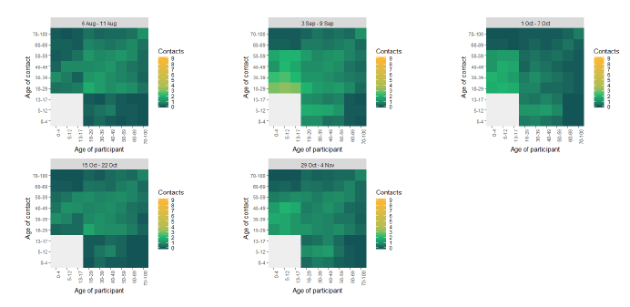
The heatmap in Figure 10 shows the mean contacts by age group over time from the start of August to start of November. This illustrates that individuals initially had an increase in mean contacts, particularly younger age groups, when schools reopened (August to September). However, this has steadily reduced for all age groups until mid-October where all contacts had less contact with other age groups compared to the start of August. In the most recent survey there has been an increase in mean contacts within the younger age groups which is likely due to individuals returning to work and school from half term.
As seen in Figure 11, contacts are fewer in older age groups, with the oldest age group having similar levels of contact to the UK at the beginning of the Stay-at-home-advice (2.0 from CoMix). This remains consistent with the previous survey. The youngest age group also shows similar levels of contacts to the UK average prior to the beginning of the Stay-at-home-advice (12.1 from POLYMOD[2]) until mid-September, this fell significantly at the start of October and remains the same for the most recent survey.
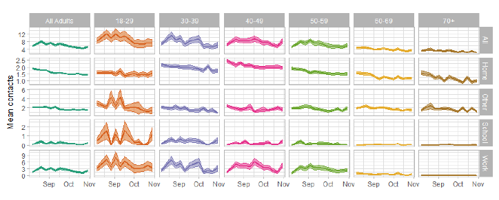
All contacts show a downward trend over time in all settings from August to the start of November, however the most recent survey shows an increase in the work and school settings (half term effect). The main difference between age groups is that younger people are having more contacts at work and at school. There is an initial increase in school contacts across most age groups as terms commences in late August, followed by a decrease in mid/late October which coincides with mid-term holidays. There's little difference in contacts reported in "other" settings but a slight gradual decrease can be seen in both the 30-39 age group and the 60-69 age group from August to October. The youngest and oldest age groups report an increase in contacts in the home in the most recent week (the middle age groups report higher contacts in the home than the youngest and oldest however this remains consistent from the previous week) as set out in Figure 11.
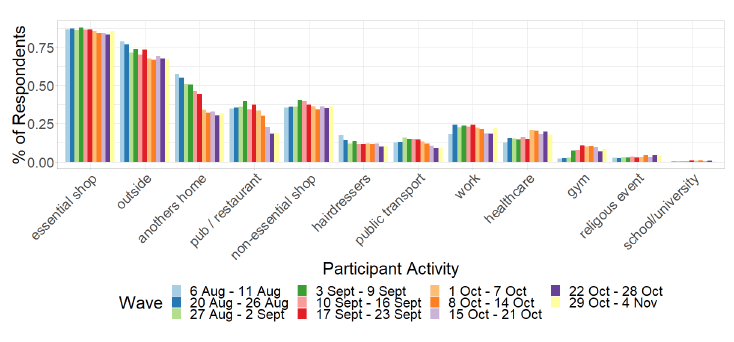
As Figure 12 shows, the biggest change in behaviour has been the drop off in the proportion of people that have visited other people's homes since the commencement of the survey until the start of November, dropping from 58% to 30%. The most significant decrease in the last few weeks can be seen in the number of people visiting pubs which will be largely due to the restrictions placed on hospitality, introduced on 9 October. The only increase in behaviour has been in healthcare from August to November.
What we know about which regions are experiencing high levels of Covid
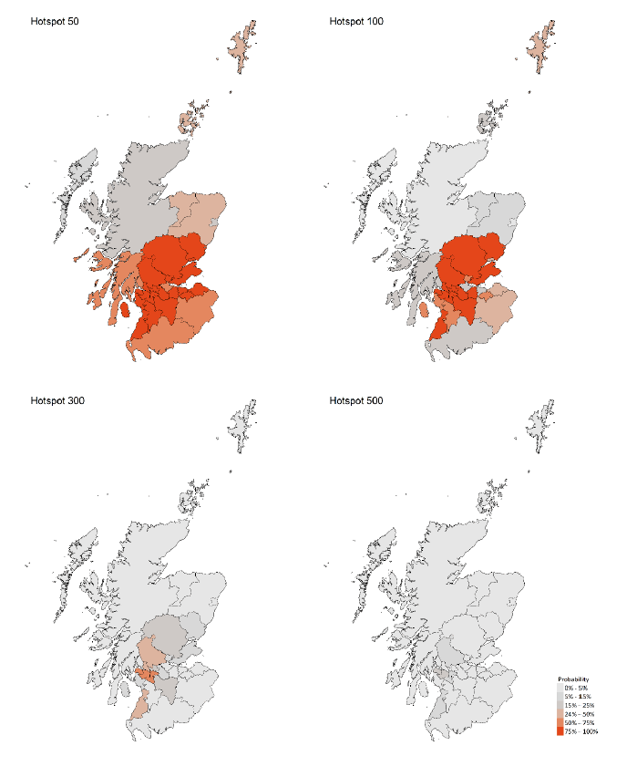
We use modelling based on Covid cases and deaths, conducted by Imperial College London[3], to give us an indication of whether a local authority is experiencing high levels of Covid. An area is defined as a hotspot if the two week prediction of cases (positive tests) per 100K population are predicted to exceed a threshold, e.g. 500 cases. See technical annex in issue 24.
Modelled rates per 100K (Figure 13) indicate that by the week of 22 - 28 November, 21 (down 1 in the last week) local authorities have at least a 75% probability of exceeding 50 cases, 14 (down 4) of those have at least a 75% probability of exceeding 100 cases and none have at least a 75% probability of exceeding 300 (or 500) cases.
What can analysis of wastewater samples tell us about local outbreaks of Covid-19 infection?
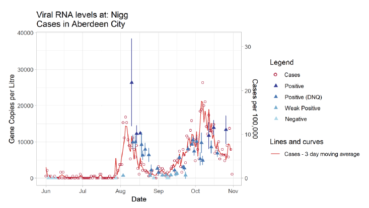
Samples from Waste Water Treatment Works (WWTW) in Scotland have been analysed by the Scottish Environment Protection Agency (SEPA) to detect fragments of SARS-Cov-2 virus RNA in waste water. This is reported from lab analysis as gene copies per litre. The reported levels of SARS-Cov-2 found have been compared to trends in confirmed Covid-19 cases in the surrounding areas.
Figure 14 shows that a particularly high level of gene copies were recorded at Nigg WWTW near to the time of the peak of positive cases during Aberdeen City's outbreak in early August. After this outbreak, the concentration levels came down as the number of confirmed cases reduced.
Analysis of Covid-19 viral concentrations in comparison to recorded positive tests shows similar trends to that in Figure 14 for a number of other outbreaks around Scotland. While this approach may not provide an early indication of a developing outbreak, it gives us confidence that the outbreak has indeed been contained and we are not missing a substantial number of asymptomatic viral spreaders.
What next?
The Scottish Government continues to work with a number of academic modelling groups to develop other estimates of the epidemic in Scotland. This includes updates to the forecast of the number of hospitalisations and the pattern of positive tests in different age and clinical risk groups which were reported in issue 23. This has not been included in this issue as the proportions have changed very little this week. We will provide an update when we see a significant change.
The modelled estimates of the numbers of new cases and infectious people will continue to be provided as measures of the epidemic as a whole, along with measures of the current point in the epidemic such as exceedance. Rt and growth rate will also be provided. Further information can be found at https://www.gov.scot/coronavirus-covid-19.
We will continue to track the analysis by SEPA of the reported levels of Covid-19 in wastewater samples.
Technical Annex
In May SEPA began exploratory work to pinpoint fragments of coronavirus' ribonucleic acid (RNA) in local waste water samples with the backing of Scottish Government and Public Health Scotland (PHS), alongside Scottish Water, CREW (Centre of expertise for Waters) and academic partners from the University of Edinburgh's Roslin Institute and Heriot Watt University.
Analysis on samples from across Scotland has identified traces in waste water from 13 health board areas. The results have been shared with PHS and areas with positive RNA findings are consistent with the areas known to have confirmed Covid-19 cases.
Testing is conducted on incoming waste water samples collected by Scottish Water and its operators at 28 public waste water treatment works across the country, covering all 14 NHS Scotland health board areas. Most locations are tested weekly, but this can be increased when local outbreaks are apparent.
Samples are representative of waste water from between 40-50 percent of the Scottish population and, in combination with community testing, are helping Scotland understand the prevalence and distribution of the virus.
A sample is described as 'Negative' where two out of the three replicate tests return no response for the COVID markers and are reported as a zero figure. Where two of three replicates return a positive signal but that signal is calculated as lower than the limit of detection (LoD), the sample is given a 'Weak Positive' description. Due to the uncertainties associated with these low values, Weak Positive results are generally reported as half of the Limit of detection, 658 gc/l in this case. A 'Positive (DNQ)' description is given to the sample where the average value of the three replicates is between the LoD and the LoQ (i.e. between 1,316 and 11,386 gene copies per litre). The Description of DNQ stands for Detected, Not Quantifiable (in a statistically significant way). Finally, a 'Positive' description is given where the average of the three replicates is above the Limit of Quantification and therefore gives a strong, quantifiable, positive result.
Central to the delivery of this project has been the partnership between SEPA, Scottish Water and the University of Edinburgh's Roslin Institute. Support has been received from across the public sector, agencies and institutions, including a donation of specialist equipment from Science and Advice for Scottish Agriculture.
Table 1 provides the underlying data used in the section above on "What we know about which regions are experiencing high levels of Covid". It is provided by Imperial College London.
| LA | P (Cases > 500) | P (Cases > 300) | P (Cases > 100) | P (Cases > 50) |
|---|---|---|---|---|
| Aberdeen City | 0% | 0% | 3% | 15% |
| Aberdeenshire | 0% | 0% | 8% | 38% |
| Angus | 0% | 5% | 78% | 97% |
| Argyll and Bute | 0% | 0% | 24% | 64% |
| City of Edinburgh | 0% | 0% | 23% | 80% |
| Clackmannanshire | 2% | 13% | 60% | 82% |
| Dumfries & Galloway | 0% | 0% | 17% | 56% |
| Dundee City | 0% | 1% | 43% | 83% |
| East Ayrshire | 0% | 3% | 64% | 92% |
| East Dunbartonshire | 1% | 19% | 89% | 99% |
| East Lothian | 0% | 1% | 46% | 85% |
| East Renfrewshire | 9% | 52% | 99% | 100% |
| Falkirk | 0% | 0% | 17% | 59% |
| Fife | 0% | 7% | 96% | 100% |
| Glasgow City | 6% | 57% | 100% | 100% |
| Highland | 0% | 0% | 3% | 20% |
| Inverclyde | 16% | 63% | 98% | 100% |
| Midlothian | 0% | 3% | 62% | 92% |
| Moray | 0% | 0% | 8% | 32% |
| Na h-Eileanan Siar | 0% | 0% | 3% | 9% |
| North Ayrshire | 0% | 5% | 70% | 95% |
| North Lanarkshire | 0% | 7% | 96% | 100% |
| Orkney Islands | 1% | 4% | 25% | 42% |
| Perth and Kinross | 4% | 24% | 91% | 99% |
| Renfrewshire | 21% | 74% | 100% | 100% |
| Scottish Borders | 0% | 0% | 36% | 75% |
| Shetland Islands | 1% | 4% | 29% | 47% |
| South Ayrshire | 6% | 44% | 98% | 100% |
| South Lanarkshire | 1% | 15% | 96% | 100% |
| Stirling | 7% | 32% | 95% | 100% |
| West Dunbartonshire | 3% | 26% | 95% | 100% |
| West Lothian | 0% | 3% | 79% | 99% |
Tables 2 and 3 provide the underlying data used in the section above on "What the modelling tells us about Hospital bed and ICU bed demand". They are based on modelling undertaken by Scottish Government (for more information see research findings issue 1).
The purpose of these predictions is to support a decision on what measures are needed in different parts of Scotland. As part of the medium term modelling, these predictions are not intended as short term forecasts (less than two weeks, for which management information is more appropriate), but the initial weeks are provided for completeness.
As the upper end of the range is presented for each health board, the aggregate cannot be used as a prediction of the number of beds required in Scotland as a whole.
| Area | Capacity (double) | 16/11/20 | 23/11/20 | 30/11/20 | 07/12/20 | 14/12/20 | 21/12/20 |
|---|---|---|---|---|---|---|---|
| Ayrshire & Arran | 20 | 7 - 13 | 5 - 17 | 5 - 18 | 5 - 19 | 6 - 22 | 6 - 24 |
| Borders | 10 | <5 | <5 | <5 | <5 | <5 | <5 |
| Dumfries & Galloway | 8 | <5 | <5 | <5 | <5 | <5 | <6 |
| Fife | 20 | 5 - 14 | <19 | <21 | <22 | <25 | <28 |
| Forth Valley | 14 | <14 | <18 | <19 | <20 | <23 | <25 |
| Grampian | 32 | <9 | <11 | <12 | <13 | <14 | <16 |
| Greater Glasgow & Clyde | 76 | 23 - 55 | 17 - 72 | 17 - 76 | 17 - 83 | 18 - 92 | 19 - 104 |
| Highland | 16 | <5 | <5 | <5 | <5 | <5 | <5 |
| Lanarkshire | 40 | 18 - 31 | 13 - 40 | 13 - 43 | 13 - 47 | 14 - 52 | 14 - 58 |
| Lothian | 55 | 7 - 15 | 5 - 19 | 5 - 20 | 5 - 22 | 5 - 25 | 6 - 28 |
| Orkney | 0 | <5 | <5 | <5 | <5 | <5 | <5 |
| Shetland | 0 | <5 | <5 | <5 | <5 | <5 | <5 |
| Tayside | 22 | 5 - 8 | <11 | <12 | <13 | <14 | <16 |
| Western Isles | 4 | <5 | <5 | <5 | <5 | <5 | <5 |
Values in this table give an interval, actual occupancy could be higher or lower.
| Area | Capacity | 16/11/20 | 23/11/20 | 30/11/20 | 07/12/20 | 14/12/20 | 21/12/20 |
|---|---|---|---|---|---|---|---|
| Ayrshire & Arran | 203 | 75 - 127 | 55 - 165 | 55 - 177 | 57 - 195 | 60 - 220 | 63 - 248 |
| Borders | 118 | <14 | <18 | <19 | <21 | <23 | <26 |
| Dumfries & Galloway | 90 | 7 - 16 | 5 - 21 | 5 - 23 | 5 - 25 | 6 - 28 | 6 - 32 |
| Fife | 322 | 45 - 84 | 33 - 108 | 33 - 116 | 34 - 128 | 36 - 144 | 38 - 163 |
| Forth Valley | 144 | 27 - 59 | 19 - 76 | 20 - 81 | 20 - 90 | 21 - 101 | 22 - 114 |
| Grampian | 295 | 20 - 38 | 15 - 49 | 15 - 53 | 15 - 58 | 16 - 66 | 17 - 74 |
| Greater Glasgow & Clyde | 1,070 | 372 - 593 | 272 - 769 | 274 - 823 | 283 - 910 | 297 - 1024 | 311 - 1155 |
| Highland | 176 | 7 - 21 | 5 - 27 | 5 - 28 | 5 - 31 | 6 - 35 | 6 - 40 |
| Lanarkshire | 455 | 187 - 328 | 137 - 426 | 138 - 456 | 142 - 504 | 149 - 568 | 157 - 640 |
| Lothian | 487 | 105 - 201 | 77 - 261 | 78 - 279 | 80 - 309 | 84 - 348 | 88 - 392 |
| Orkney | 28 | <5 | <5 | <5 | <5 | <5 | <5 |
| Shetland | 64 | <5 | <5 | <5 | <5 | <5 | <5 |
| Tayside | 172 | 41 - 84 | 30 - 110 | 31 - 117 | 32 - 130 | 33 - 146 | 35 - 165 |
| Western Isles | 32 | <5 | <5 | <5 | <5 | <5 | <5 |
Values in this table give an interval, actual occupancy could be higher or lower.