Cereal and oilseed rape harvest: final estimates - 2012
This publication contains final estimates of the 2012 cereal and oilseed rape harvest with commentary and graphics on longer term trends adn regional production.
Part of
3. Commentary
3.1 Harvest estimates for 2012 compared to 2011 harvest estimates(Table 1)
Charts 2, 3 and 4 show a breakdown of the 2012 harvest estimate compared to the 2011 estimates. Table 1, in the appendix, shows a summary of this breakdown.
Chart 2 shows the area of cereals in 2011 and 2012. There was an increase in the area of spring barley (up 10%) and oats (up 9%). Spring barley is the largest crop in Scotland, representing 64% of the total cereal area. When combined with the further 9% for winter barley, total barley accounts for around 73% in total. This is up from 2011, when barley represented 69% of cereal area. The other main cereals grown in Scotland are wheat, accounting for 22% of area in 2011, and oats which accounted for 5%. Further information on cereal area trends can be found in the "Final Results From The 2012 June Agricultural Census"[1] publication.
Chart 2 - Comparison of 2012 harvest to 2011: Area
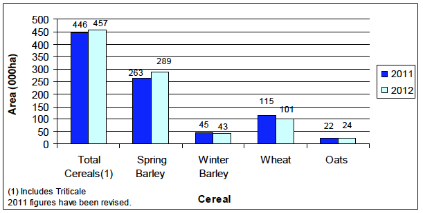
Chart 3 shows that overall cereal yields fell considerably between 2011 and 2012, down 17% overall to 5.5 tonnes per hectare in 2012. Yields have fallen across all crops, with wheat seeing the greatest change over the year (down 1.6 tonnes per hectare). While spring barley represents the largest area of cereals, it can be seen that the yield for spring barley is relatively low compared to other cereals at 5.0 tonnes per hectare in 2012. The yields for winter barley, wheat and oats stood at 6.5, 6.7 and 4.6 tonnes per hectare respectively in 2012.
Chart 3 - Comparison of 2012 harvest to 2011: Yield
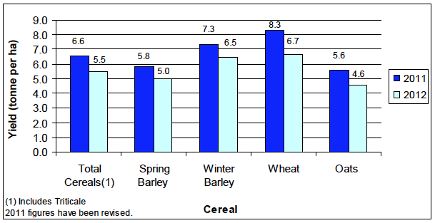
Chart 4 shows that total cereal production decreased 441,000 tonnes or 15% to 2.5 million tonnes in 2012, compared to 2011.
Chart 4 - Comparison of 2012 harvest to 2011: Production
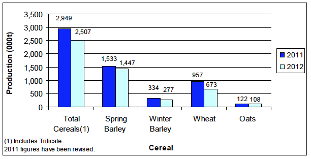
Despite increases in area, reduced yields caused decreases in spring barley (down 6%) and oats (down 11%) to 1.4 million tonnes and 108,000 tonnes respectively. Decreases in both areas and yields resulted in reduced production for winter barley (down 17%) and wheat (down 30%) of 277,000 tonnes and 673,000 tonnes respectively. The combined decreases in production resulted in an overall decrease of nearly half a million tonnes (441,000 tonnes) or 15% for total cereals to 2.5 million tonnes. The relatively low yield for spring barley means that it accounted for 58% of total cereal production compared to 63% of area. In 2012, wheat accounted for 27% of total cereal production.
3.2 Time Series of cereal production (Table 2)
Estimates from 2003 to 2011 have been revised in this release, the methodology and quality note at the back of this release contains an assessment of the impact of these revisions. Though readers should be aware of these revisions, on the whole the difference between original and revised estimates is low and so comparisons over the long term can still be drawn, though comparing between years immediately prior to and after 2003 may not be wholly reliable.
Chart 1 (front page) and Table 2 in the appendix show the trends in cereal production over the past 20 years. It can be seen that total production was at its lowest in 1993 and 1994. This coincides with the introduction of compulsory EC set-aside. Production then increased in 1995 and has fluctuated between 2.5 million and 3 million tonnes ever since, with a high of 3 million tonnes in 2008.
Chart 5 shows total cereal areas and yields for the last 20 years. It can be seen that overall area fell in 1994 following the introduction of compulsory set aside. The overall yield figure in 1994 was also the lowest in the last 20 years and together these two factors resulted in the lowest production over the time period of 2.1 million tonnes. Area then increased to a high of 476,000 hectares in 1997, followed by a downward trend to 2006 and 2007. Overall areas increased in 2008, but fell again in the following 2 years, with a recovery in 2011 and 2012. Despite the decrease in yields in 2012, average yields over the last 10 years were 11% higher compared to the previous 10 years.
Chart 5 - Trends in area and yield (all cereals): 1993 to 2012
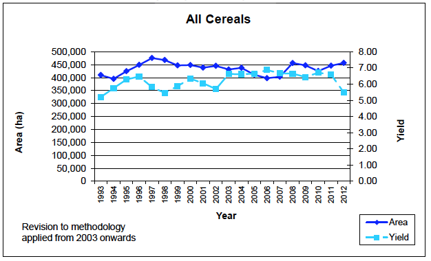
Chart 6, below, shows the trends in areas and yields for wheat. It can be seen that the area of wheat followed a general downward trend from 1993 to a low in 2001. Since 2001 it has been on an upward trend and the area of wheat in 2012 was similar to that 20 years ago, despite a decline of 13% from its peak in 2011. The average wheat yield for the last 10 years has been 8.3 tonnes per hectare, compared to 7.8 tonnes per hectare for the previous 10 years.
Chart 6- Trends in area and yield (wheat): 1993 to 2012
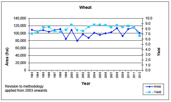
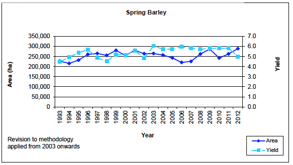
Chart 7 shows that the area of spring barley has fluctuated between 216,000 hectares and 289,000 hectares over the past 20 years. However, average spring barley yields over the last 10 years have been around 13% higher than the previous 10 years.
Chart 7: Trends in area and yield (spring barley): 1993 to 2012
The trends in winter barley area and yield are shown in Chart 8. The chart clearly shows that the area of winter barley fell in 1994 following the introduction of set-aside. This was followed by an increase in area between 1994 and 1997. There was then a large fall in 1999 and winter barley area has been on a general downward trend since then. The average area of winter barley in the last 10 years is 17% lower than the previous 10 years. Average yields in the last 10 years were 12% higher than the preceding 10 years. Winter barley production in 2012 (277,000 tonnes) was 47% lower than the peak production of the last 20 years (524,000 tonnes) in 1997.
Chart 8: Trends in area and yield (winter barley): 1993 to 2012
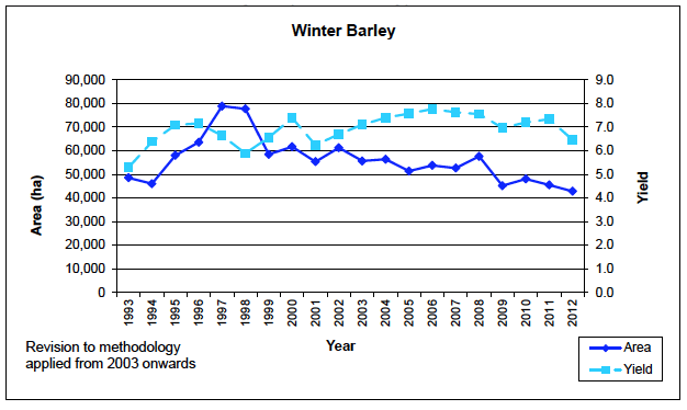
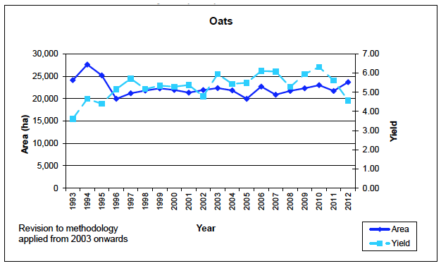
Chart 9 shows that the area of oats fell 28% between 1994 and 1996 and has been fairly stable since. The yield for oats has generally increased over the last 20 years with the yield in 2012 being around 24% higher than in 1993. This means that, despite the fall in average oats area over the past 10 years compared to the previous 10 years, average production has increased by 12%.
Chart 9: Trends in area and yield (oats): 1993 to 2012
3.3 Oilseed Rape Production (Tables 1& 4)
In 2012, Oilseed rape production decreased by 43,000 tonnes or 29% compared to 2011 to 106,000 tonnes (see Table 1). This decrease was caused by both a 5% decrease in area and a 25% decrease in yield.
Table 4, in the appendix, and Chart 10 show the trends in the production of oilseed rape over the last 20 years. It can be seen that oilseed rape production was higher in the 1990s than it has been in the last 10 years. It should be noted that these production estimates do not include any oilseed rape grown on set-aside land for industrial purposes.
Chart 10 - Trends in the production of oilseed rape: 1993 to 2012
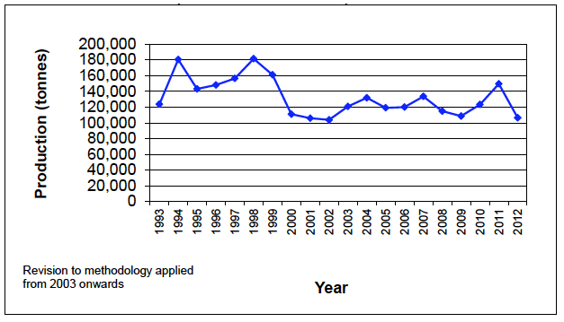
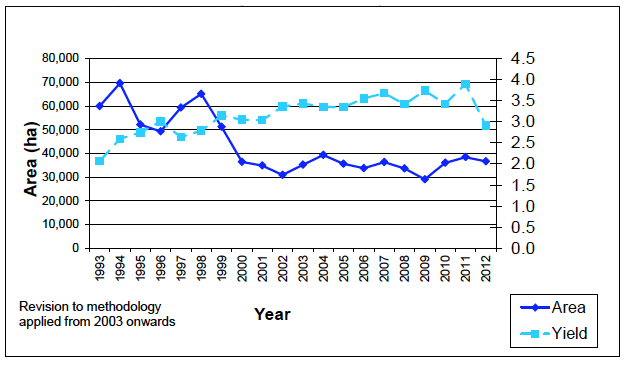
Chart 11 shows a breakdown of production into area and yield. It can be seen that oilseed rape areas fell 44% between 1998 and 2000, and have been relatively stable ever since. From a low in 1993, oilseed rape yields have been on an upward trend, but saw a relatively steep decline in 2012 to a level similar to that of 1998. Despite the recent decline, the average yield for the past 10 years is 22% higher than the previous 10 years.
Chart 11 - Trends in area and yield of oilseed rape: 1993 to 2012
3.4 Regional Production Estimates (Table 5)
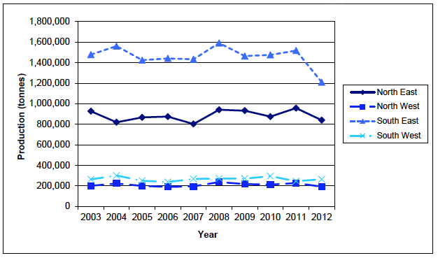
Chart 12 below shows the total cereal production for each of four regions in Scotland (North East, North West, South East and South West)over the last ten years. Table 5 provides a more detailed breakdown by crop. Chart 12 shows that the South East is the main cereal production region in Scotland, contributing almost half of total production (48%) in 2012. For all regions, between 1993 and 2011 production levels remained relatively constant. Between 2011 and 2012 all regions, except the South West saw a decline in production, this is particularly marked in the South East, where production levels fell by 19%, from 1.5 million tonnes to 1.2 million tonnes, accounting for around two thirds (70%) of the overall decrease in production over the last year. Production in the South West rose by 8%, mostly due to increased areas, and as a result production, of spring barley.
Chart 12 - Regional Cereal Production: 2003 to 2012
(includes triticale, excludes oilseed rape)
Contact
Email: Andrew Walker