Budget 2019 to 2020: feasibility of distributional analysis - study
A study of the feasibility of undertaking distributional analysis for tax, benefits and public services, for different income levels and protected characteristics.
4. Results
In this chapter we present outputs from the modelling to provide an illustration of the type of findings that would be possible from this type of distributional analysis. To accompany charts we present some descriptive information about what the chart shows. We also identify any issues or caveats that should be considered when looking at the chart to help interpretation and avoid misinterpretation.
Distributional analysis involves assumptions and decisions about approaches and inclusion of material – these assumptions obviously influence the results produced. Using different assumptions would produce different results. These value judgements mean that some have argued that in particular results on impacts of public services/benefits in kind should be interpreted very cautiously.[30]
This analysis is based on a single point in time. At that point in time some people will be paying tax and receiving little in terms of benefits and services, whilst others will be paying relatively little tax and receiving more in benefits and services. The analysis does not show how that changes over time; that is the nature of snapshots. We also need to remember that people contribute on the basis of their ability to pay – whilst they receive support on the basis of need – and this may also change over time. This type of snapshot analysis does not provide the ability to see how people fare over their entire lifetime in terms of contributions and receipts – other types of analysis do that.[31]
All charts produced are in Annex F and the underlying data is given in Annex G.
4.1 Household level charts
For household level charts, we have divided tax, benefits and public services by the number of people within each income decile or household type. This gives us an average amount per person.
Household net income deciles are calculated by taking the household's gross income and then deducting all taxes paid by the household. The household net income is then assigned to each person in the household. For students in higher education, we use their parents' net household income to re-order where they appear in the income distribution. Using these household net incomes, people are ordered from those with the lowest household net income (decile 1) to the highest (decile 10). The deciles are calculated in such a way to ensure there are the ten equal groups of people (see Annex E for details of the people in each income decile).
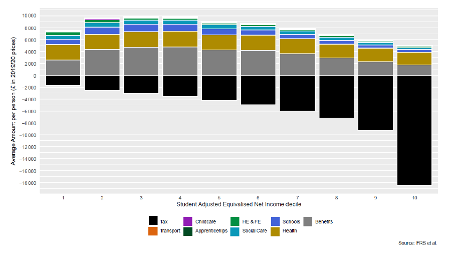
Chart 1 shows the average tax paid and spend on benefits and public services per person by student adjusted household net income deciles.
This shows the progressive nature of taxation. The average amount of tax paid increases as you move up the income deciles, with decile 10 paying the most in tax. It should be noted that this is based on the absolute amount of tax paid; the percentage of total income paid in tax has a slightly flatter profile and would be a useful sensitivity test in future analysis.
The chart shows that the overall spend on public services and benefits is also progressive as it is higher for lower income deciles. However, those in the lowest income decile do not benefit as highly from benefits and public spend as those in deciles 2, 3 and 4. This may be due to the make-up of this group, which includes people in the pre-retirement age band who may have low income but a reasonable standard of living from savings or other wealth, alongside students, unemployed people, women with children and people who are temporarily sick. Although ten percent of the population appears in each decile, particular lower income groups appear more in the lowest decile (Annex E provides detail of the characteristics of people in each income decile). These are:
- unemployed people (40% of all unemployed people are in the lowest decile)
- people who are temporarily sick/injured (32%)
- people looking after the family/home (22%)
- students (14% of all students are in the lowest decile – these include further education students)
- younger people (aged 18-24) (12% of all people aged 18-24) and people aged over 75+ (12% of all people aged 75+)
- people who are aged 55 to 64 (15%). These people – making up the largest group in this decile excluding the under 18s - may be pre-retirement and living off their savings.
Welfare benefits are typically less generous for younger people and this may explain the lower average spend on benefits. Younger people also tend to have lower income from earnings.
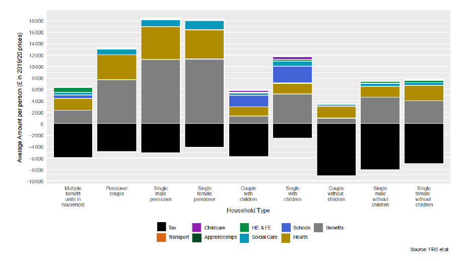
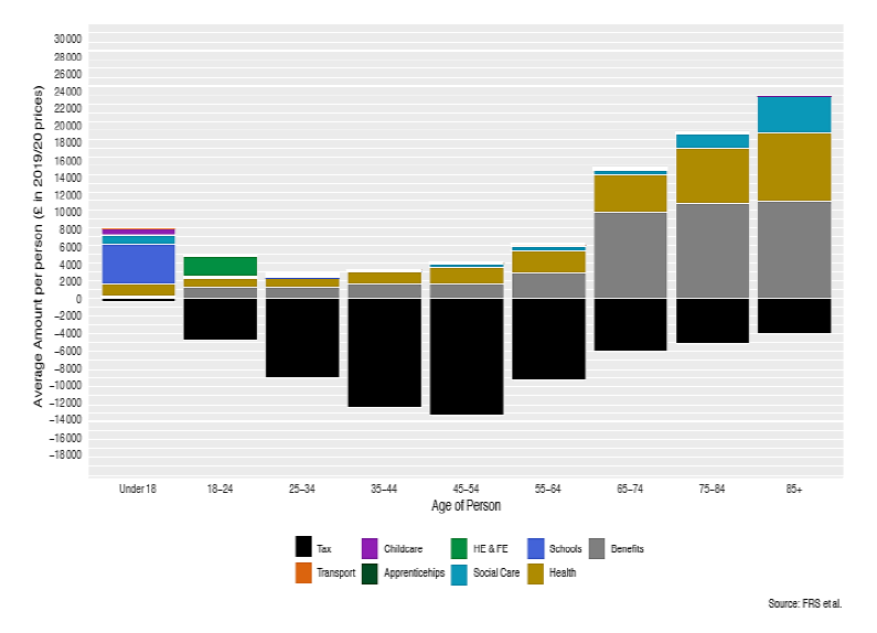
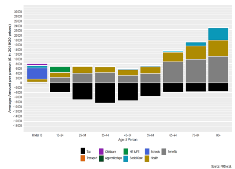
Chart 2 shows tax and expenditure for individuals by the household type which each person is in. Households with multiple benefit units are typically groups of people living within the same accommodation – for example, students or working people sharing a house.
From this chart we see the critical importance of life stages in the analysis and this is key to interpreting all the remaining analyses. It can be seen that pensioners receive a greater amount of benefit income than other households, which is due to the state pension. Health and social work (which includes social care) spend is also higher for older people, reflecting their greater need for care in later life. Transport expenditure is also higher in pensioner households, compared to other households, although this spend is much lower than other categories of spend.
Spending on schools and early learning & childcare (ELC) is concentrated, as would be expected, on households with children, whilst spend on universities and colleges is focussed on single person households, and those living in shared accommodation (multiple benefit units under one address).
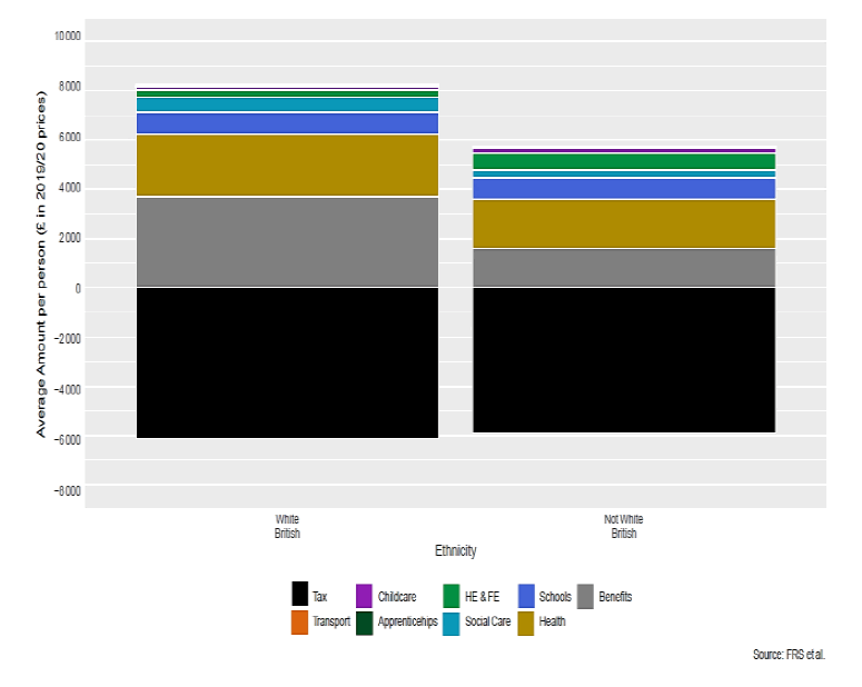
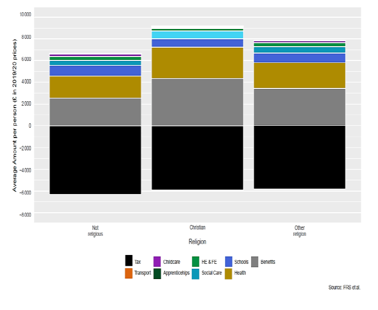
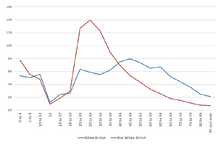
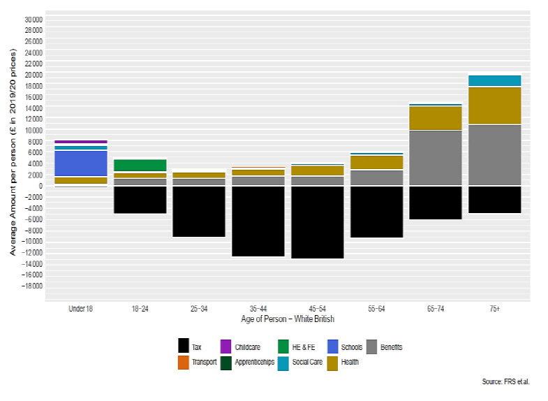
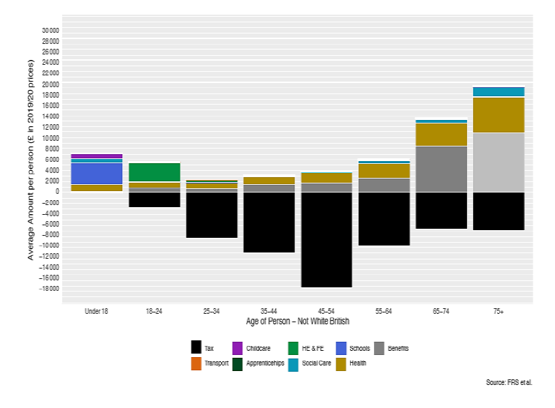
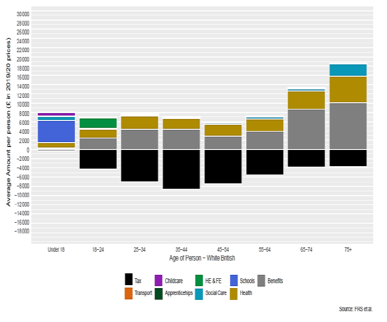
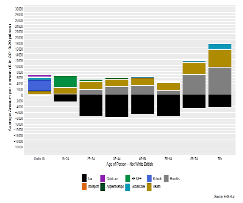
Charts 2A and 2B show distributional analysis by ethnicity (2A) and religion (2B). Chart 2A shows that "Not-White British" people receive less in benefits, health care and social care per person on average than "White British" people. A similar picture emerges when analysing by Religion (2B) - Christians are shown to receive more in benefits and health care spend on average than other groups. However, in interpreting these charts it is important to take into account the underlying age structures of the different groups, which explain these differences in expenditure.
The age profile for "Not-White British" people (Chart 2C red line) is much younger than for White British people (blue line). This difference in age profile is the key driver for the differences in expenditure seen. As noted above, subgroups with older populations will receive more in benefits (e.g. state pensions) and health service spend. It is important to take these age differences into account when interpreting the results.
4.2 Person level charts
For person level charts, for simplicity we have made the assumption that the following taxes and benefits are shared equally across all adults aged 16 or over in the household:
- Taxes: Indirect taxes & Council Tax
- Welfare Benefits:Council Tax Reduction, Scottish Welfare Fund, Housing Benefit, Universal Credit, Discretionary Housing Payments and free TV licenses
The person level charts presented here are all broken down by age and sex as we have seen the important role which these characteristics play in the analysis.
4.2.1 Charts 3 & 4 – Individual Amounts by Sex and Age
Charts 3 and 4 show average spend per person by age group for men and women. The charts again clearly show the impact of life stages. Young people aged under 18 benefit most in terms of spend from early learning & childcare and schooling. Higher and further education is spent mostly on those in the 18 to 24 year age group. The impact of the gender pay gap and unequal sharing of childcare responsibilities results in a clear difference in incomes and this impacts on the amount of taxes paid by males and females. Men earn more and therefore pay greater amounts of tax, peaking in the 45-54 age group. Health and social care spend is most visible in the older age groups.
For women, the key differences are a greater amount of benefit spend, compared to men, which reflects receipt of child benefit and tax credits for these individuals (driven by lower personal incomes and the allocation of child benefit to the mother based on evidence that it is more usually received by the mother rather than father). Health care costs for men aged 65+ are higher and this reflects the profile of average health spend (see annex D). Average social care spend for women is higher than for men as a result of their longer life expectancy. For example women aged 85+ out-number men of the same age in care homes by a ratio of 4:1.[33]
4.2.2 Charts 5 to 8 – Average Spend per person by Age and Sex and Ethnicity[34]
Charts 7 and 8 are similar to the charts 3 & 4 for age and sex, but are further broken down by whether people are "White British" or not. It should be noted that the breakdown by ethnicity as well as age and sex makes sample sizes very small so this analysis is less reliable and should be treated with caution. Whilst samples would be large enough to do a household ethnicity analysis without any further breakdowns, as age, or life stage, are key drivers of distributional analysis, it is potentially misleading to show spend by ethnicity without also considering age - because the age profile of ethnic minority households is very different to white-British households – they are typically younger.[35]
A key finding from these charts is that average spend on higher and further education is greater for "non-White British" people than for White British.[36] However, looking at spend per student shows that both "White British" and those who are "non-White British" receive similar amounts individually (£3,900 and £4,000 respectively).The proportion of Scottish domiciled BAME students in higher education is higher than in the general population. [37]
Charts 5 – 8 show the need to take great care in interpreting any results. A service may have equal spend on a per user basis. However, differences in take up for a particular service can alter the distributional analysis across the whole population.
4.2.3 Charts 9 to 12 – Average Spend per person by Age and Sex and Disability
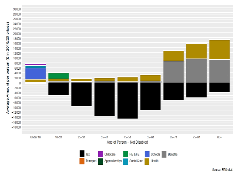
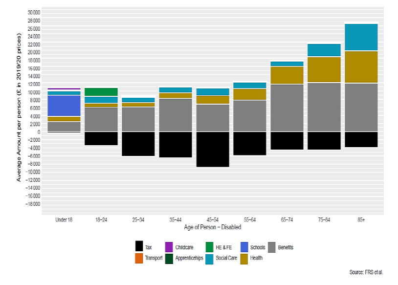
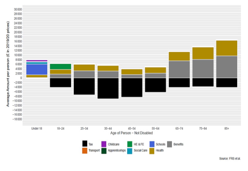
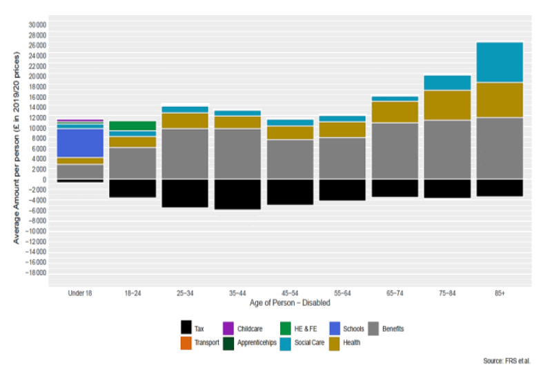
Charts 11 and 12 are similar to Charts 3 & 4 for age and sex, but are further broken down by whether or not the person is disabled. As much of the social work budget helps towards the care of disabled people, a higher spend on social care can clearly be seen in charts 10 and 12 for disabled men and women, compared to non-disabled people. Disabled people also typically receive more on average in welfare benefits and pay less in taxes than their non-disabled counterparts.[38] From other sources of information we know that on the whole disabled people have lower incomes and are more likely to be in poverty than those without disability[39] – therefore this finding is what we would expect.
4.2.4 Charts 13 to 18 – Average Spend per person by Age and Sex and Religion
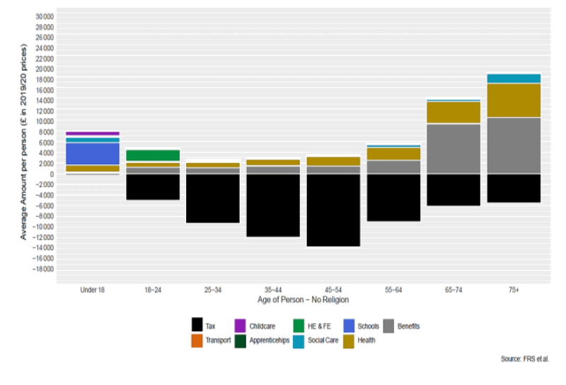
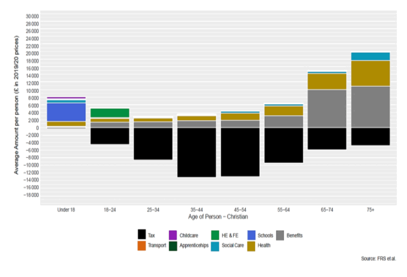
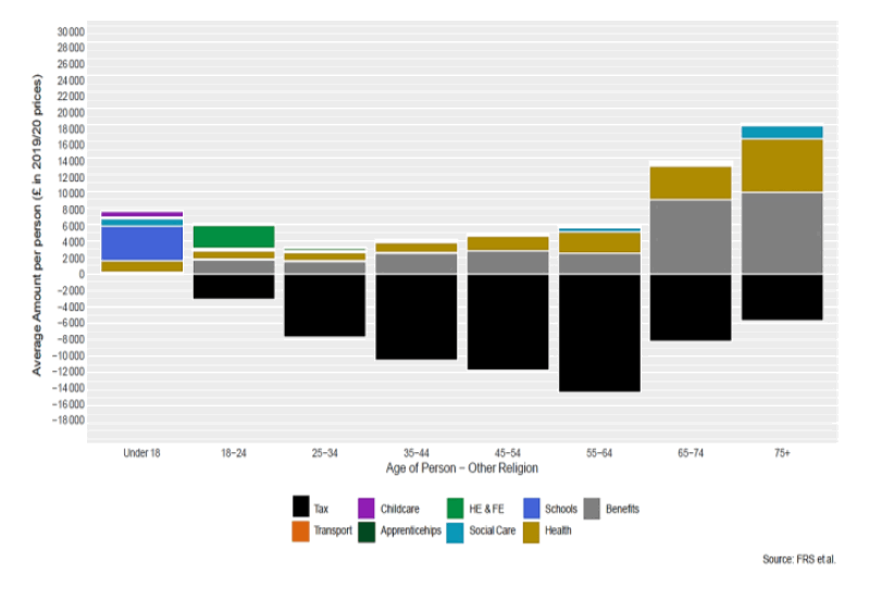
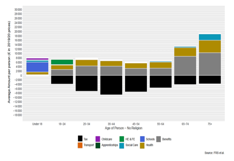
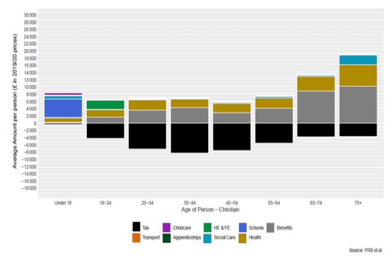
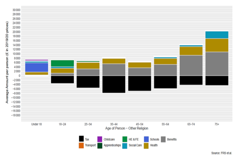
Charts 13 to 18 are similar to Charts 3 & 4 for age and sex, but are further broken down by whether the person identifies as Christian, another religion or of no religion.
Chart 15 shows that men in the 55-64 age group in the "Other Religion" category pay more in tax on average than men who are identified as no religion (Chart 13) or Christian (Chart 14). Other data shows that only 8% of those in this group were retired, whilst the figure was 14% for those of this age group with no-religion or Christian. The median age of the "other religion" group was also two years older in the sample than the no-religion or Christian men. This suggests that the "other religion" males in this age group could be paying more tax as they are working longer.
Looking more closely at the underlying survey data, we also find that Chart 15 has only 60 records for men in the "Other Religion", 55 to 64 age group, much smaller than the same groups in Chart 13 (957 records) and Chart 14 (1,414 records). This means the result should be treated with caution.
Overall, it is hard to determine whether this difference is real or is a consequence of the small sample size, or of underlying assumptions in our modelling.[40]
Contact
Email: aileen.mcintosh@gov.scot