Coronavirus (COVID-19): modelling the epidemic (issue no. 53)
Latest findings in modelling the COVID-19 epidemic in Scotland, both in terms of the spread of the disease through the population (epidemiological modelling) and of the demands it will place on the system, for example in terms of health care requirement.
Coronavirus (COVID-19): modelling the epidemic in Scotland (Issue No. 53)
Background
This is a report on the Scottish Government modelling of the spread and level of Covid-19. This updates the previous publication on modelling of Covid-19 in Scotland published on 20 May 2021. The estimates in this document help the Scottish Government, the health service and the wider public sector plan and put in place what is needed to keep us safe and treat people who have the virus.
This edition of the research findings focuses on the epidemic as a whole, looking at estimates of R, growth rate and incidence as well as local measures of change in the epidemic.
In Scotland, the modelled estimate for R is between 1.0 and 1.3, with the growth rate increasing to between 0% and 4% and modelled estimates of infections now increasing over the next four weeks. There has been a rise in hospital beds in use by Covid-19 patients, which is reflected in the projections over the next four weeks. The increase in Covid-19 cases is also reflected in the wastewater data. Exceedance modelling indicates that there are ten local authority areas at higher risk of increasing transmission.
The measures modelled for this week, as described above, indicate that we are continuing to see a resurgence of the virus in Scotland, with considerable uncertainty as to what this means for future weeks.
Key Points
- The reproduction rate R in Scotland is currently estimated as being between 1.0 and 1.3. This is an increase in the range since last week.
- The number of new daily infections for Scotland is estimated as being between 6 and 14, per 100,000 people. This has increased since last week.
- The growth rate for Scotland is currently estimated as being between 0% and 4%. This is an increase since last week.
- Average contacts have remained at a similar level in the last two weeks (comparing surveys pertaining to 29th April – 5th May and 13th -19th May) with a current level of 4.2 daily contacts.
- Contacts within the home, work and other setting remain at a similar level in comparison to two weeks prior whereas contacts within the school setting have decreased by 39%.
- The only age groups to increase their contacts in the last two weeks were those aged between 18-29 and 40-49. These increases were largely driven by contacts within the other setting (contacts outside of the work, home or school settings) for 18-29 and a combination of the other and work settings for 40-49.
- The biggest increase in the proportion of participants visiting different locations is seen in those visiting a pub or restaurant. This has increased from 21% to 32% in the last two weeks, followed by visiting a non-essential shop, increasing from 35% to 39%.
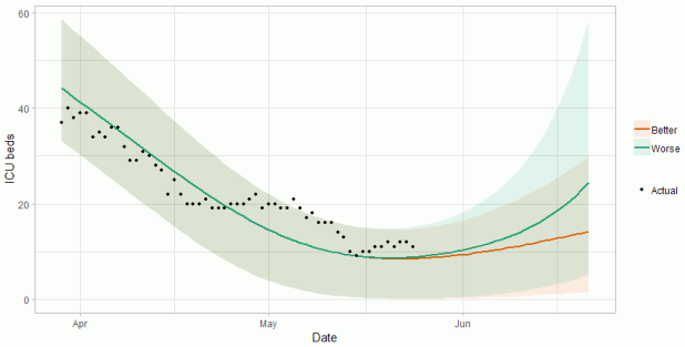
- Hospital bed and intensive care unit (ICU) occupancy are projected to plateau or rise over the next few weeks, as a result of relaxations of non-pharmaceutical interventions.
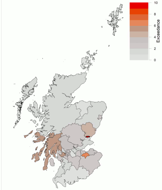
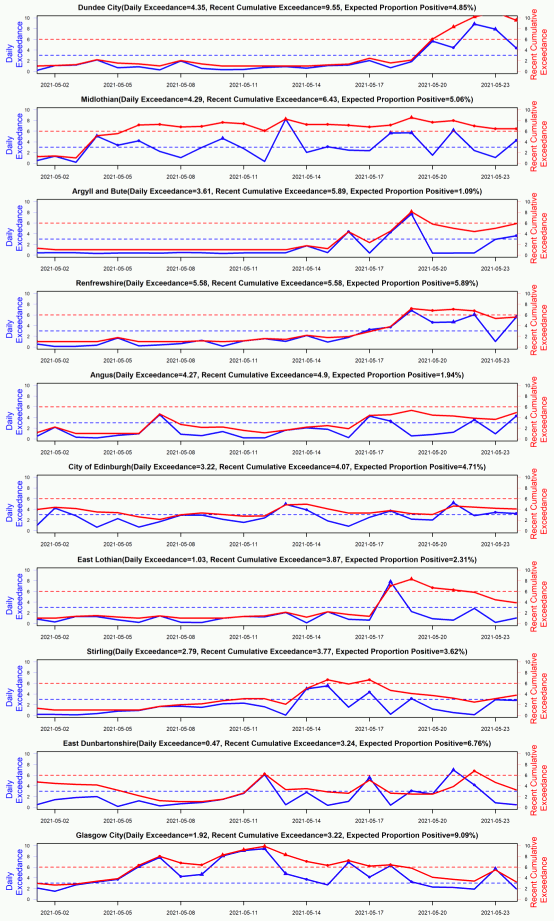
- There were ten local authority (LA) areas that exceeded what would be expected at this stage in the epidemic. Between 20th and 26th May, Dundee City, Midlothian, Argyll & Bute, Renfrewshire, Angus, Edinburgh City, East Lothian, Stirling, East Dunbartonshire and Glasgow City were areas at higher risk of increasing transmission.
- Modelled rates of positive tests per 100K indicate that for the week commencing 6 June 2021, the 6 local authorities with at least a 75% probability of exceeding 50 cases are East Dunbartonshire, East Renfrewshire, Glasgow City, Midlothian, Renfrewshire and South Lanarkshire. Of those, 2 local authorities have at least a 75% probability of exceeding 100 cases (East Renfrewshire and Glasgow City).
- The overall level of wastewater Covid-19 has remained at levels similar to last week. This is due to offsetting between large increases and decreases in the Glasgow area, while other locations show smaller increases.
- Inverclyde and the Falkirk area both show increases in virus levels that are not yet reflected by the case levels. If this follows the patterns seen in Alloa and Lerwick, rises in cases in these areas in the near future is possible.
Overview of Scottish Government Modelling
Epidemiology is the study of how diseases spread within populations. One way we do this is using our best understanding of the way the infection is passed on and how it affects people who catch it to create mathematical simulations. Because people who catch Covid-19 have a relatively long period in which they can pass it on to others before they begin to have symptoms, and the majority of people infected with the virus will experience mild symptoms, this “epidemiological modelling” provides insights into the epidemic that cannot easily be measured through testing e.g. of those with symptoms, as it estimates the total number of new daily infections and infectious people, including those who are asymptomatic or have mild symptoms.
Modelling also allows us to make short-term forecasts of what may happen with a degree of uncertainty. These can be used in health care and other planning. The modelling in this research findings is undertaken using different types of data which going forward aims to both model the progress of the epidemic in Scotland and provide early indications of where any changes are taking place.
Modelling outputs are provided here on the current epidemic in Scotland as a whole, based on a range of methods. Because it takes a little over three weeks on average for a person who catches Covid-19 to show symptoms, become sick, and either die or recover, there is a time lag in what our model can tell us about any re-emergence of the epidemic and where in Scotland this might occur. However modelling of Covid-19 deaths is an important measure of where Scotland lies in its epidemic as a whole. In addition, the modelling groups that feed into the SAGE consensus use a range of other data along with deaths in their estimates of R and the growth rate. These outputs are provided in this research findings. The type of data used in each model to estimate R is highlighted in Figure 1.
We use the Scottish Contact Survey (SCS) to inform a modelling technique based on the number of contacts between people. Over time, a greater proportion of the population will be vaccinated. This is likely to impact contact patterns and will become a greater part of the analysis going forwards.
The delivery of the vaccination programme will offer protection against severe disease and death. The modelling includes assumptions about compliance with restrictions and vaccine take-up. Work is still ongoing to understand how many vaccinated people might still spread the virus if infected. As Covid-19 is a new disease there remain uncertainties associated with vaccine effectiveness. Furthermore, there is a risk that new variants emerge for which immunisation is less effective.
The logistical model utilises results from the epidemiological modelling, principally the number of new infections. The results are split down by age group, and the model is used to give a projection of the number of people that will go to hospital, and potentially to ICU. This will continue to be based on both what we know about how different age groups are effected by the disease and the vaccination rate for those groups.
What the modelling tells us about the epidemic as a whole
The various groups which report to the Scientific Pandemic Influenza Group on Modelling (SPI-M) use different sources of data in their models (i.e. deaths, hospital admissions, cases) so their estimates of R are also based on these different methods. SAGE’s consensus view across these methods, as of 26th May, was that the value of R in Scotland was between 1.0 and 1.3 (see Figure 1). This has increased from the range of 0.9 to 1.2 last week[1].
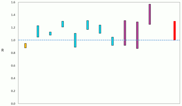
Source: Scientific Advisory Group for Emergencies (SAGE).
The various groups which report to the Scientific Pandemic Influenza Group on Modelling (SPI-M) use different sources of data in their models to produce estimates of incidence (Figure 2). SPI-M’s consensus view across these methods, as of 26th May, was that the incidence of new daily infections in Scotland was between 6 and 14 new infections per 100,000. This is an increase since last week. This equates to between 300 and 800 people becoming infected each day in Scotland.
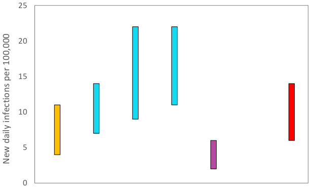
Source: Scientific Pandemic Influenza Group on Modelling (SPI-M).
The consensus from SAGE for this week is that the growth rate in Scotland is between 0% and 4% per day. This is an increase in the range from 19th May.
What we know about how people’s contact patterns have changed
Average contacts have remained at a similar level in the last two weeks (comparing surveys pertaining to 29th April – 5th May and 13th -19th May) with a current level of 4.2 daily contacts as seen in Figure 3. Contacts within the home, work and other setting remain at a similar level in comparison to two weeks prior whereas contacts within the school setting have decreased by 39%.
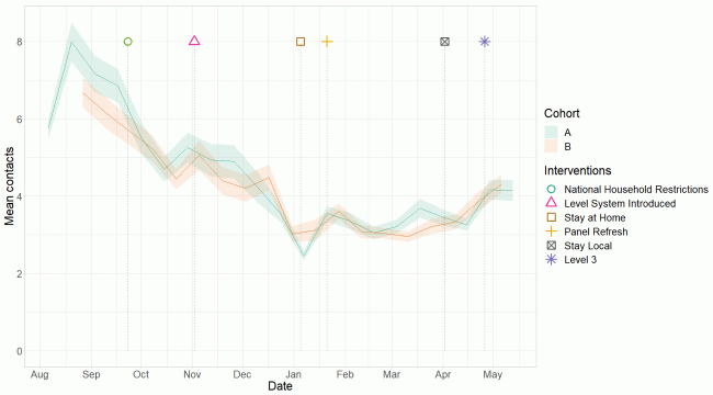
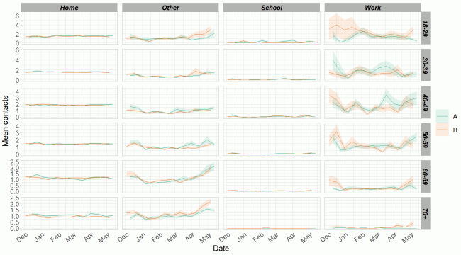
Figure 4 shows how contacts change across age group and setting. The only age groups to increase their contacts in the last two weeks were those aged between 18-29 and 40-49. These increases were largely driven by contacts within the other setting (contacts outside of the work, home or school settings) for 18-29 and a combination of the other and work settings for 40-49.
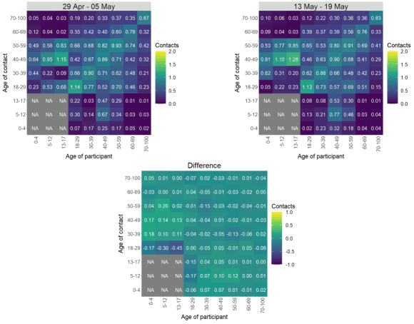
The heatmaps in Figure 5 show the mean overall contacts between age groups for the weeks relating to 29th April – 5th May and 13th - 19th May, and the difference between these periods. Interactions between all age groups remain at similar levels, with the exception of those aged between 18-29 showing the biggest reduction in contacts with those under 18.
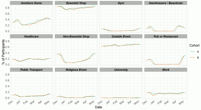
The biggest increase in the proportion of participants visiting different locations is seen in those visiting a pub or restaurant in Figure 6. This has increased from 21% to 32% in the last two weeks, followed by visiting a non-essential shop, increasing from 35% to 39%.
Vaccinations and contacts patterns
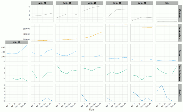
From Figure 7, it can be seen that even when contacts have increased or remained level, deaths have decreased. Generally the same is true for hospitalisations and cases, however there has been a recent uptick in cases across all the age groups and in hospitalisations across some age groups.
What the modelling tells us about estimated infections as well as Hospital and ICU bed demand
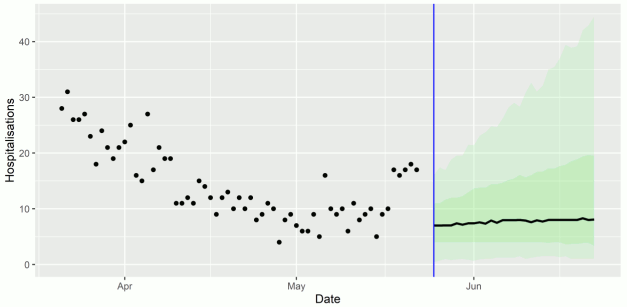
The Scottish Government assesses the impact of Covid-19 on the NHS in the next few weeks in terms of estimated number of infections.[4] Figure 8 shows two projections[5], which take account of new variants (little impact for ‘Better’ and high impact for ‘Worse’)[6], as well as the recent increase in infections observed in the last two weeks.
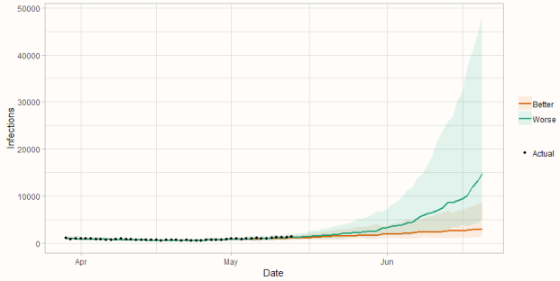
Figure 9 shows the impact of the projections on the number of people in hospital. The modelling includes all hospital stays, whereas the actuals only include stays up to 28 days duration that are linked to Covid-19. Work is ongoing to show the modelled occupancy for stays up to a 28 day limit.
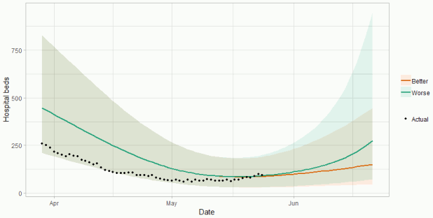
Figure 10 shows the impact of the projection on ICU bed demand.
A comparison of the actual data against historical projections is included in the Technical Annex.
What the modelling tells us about projections of hospitalisations and deaths in the medium term
SAGE produces projections of the epidemic[9] (Figure 11), combining estimates from several independent models (including the Scottish Government’s logistics modelling, as shown in Figures 8-10). These projections are not forecasts or predictions. They represent a scenario in which the trajectory of the epidemic continues to follow the trends that were seen in the data up to 24 May.
Modelling groups have used data from contact surveys, previous findings[10] and their own expert judgement to incorporate the impact of recent relaxations on transmission. The projections do not include the effects of any other future policy or behavioural changes.
The delay between infection, developing symptoms, the need for hospital care, and death means they will not fully reflect the impact of behaviour changes in the two to three weeks prior to 24 May. Projecting forwards is difficult when the numbers of cases, admissions and deaths fall to very low levels, which can result in wider credible intervals reflecting greater uncertainty. The interquartile range can be used, with judgement, as the projection from which estimates may be derived for the next four weeks, albeit at lower confidence than the 90% credible interval.
These projections include the potential impact of vaccinations over the next four weeks. Modelling groups have used their expert judgement and evidence from Public Health England, Scottish universities, Public Health Scotland and other published studies when making assumptions about vaccine effectiveness.
Beyond two weeks, the projections become more uncertain with greater variability between individual models. This reflects the large differences that can result from fitting models to different data streams, and the influence of small deviations in estimated growth rates and current incidence.
We are not projecting the numbers of people expected to die with Covid-19 this week. The number of daily deaths has fallen to very low levels over recent weeks. Projecting forwards is difficult when numbers fall to very low levels, therefore SPI-M-O have decided to pause producing medium term projections for daily deaths in Scotland. SPI-M-O's consensus view is that the number of deaths will remain very low over the next four weeks.
What the modelling tells us about whether Covid-19 infections exceeded what would be expected at this stage in the epidemic
Exceedance indicates whether the number of confirmed infections (based on testing) in each local authority area exceeds the number that was expected. Numbers of positive tests recorded each day, adjusted for population of each local authority and number of cases seen in preceding weeks, should fall within a certain distribution of values, which will rise and fall depending on the number of cases being seen nationally. Areas where the number of positive test results fall beyond the upper 95th percentile of this distribution may be at risk of seeing increased local transmission of Covid-19 and heightened vigilance may be required. This happens when the cumulative exceedance is higher than 6.0. See the Technical Annex in issue 47 for more information.
Figures 12 and 13 show exceedance for local authority areas. Recent cumulative exceedance highlights Dundee City (exceedance = 9.55), Midlothian (6.43), Argyll & Bute (5.89), Renfrewshire (5.58), Angus (4.90), Edinburgh City (4.07), East Lothian (3.87), Stirling (3.77), East Dunbartonshire (3.24) and Glasgow City (3.22) as areas at higher risk of increasing transmission.
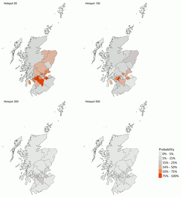
What we know about which local authorities are likely to experience high levels of Covid-19 in two weeks’ time
We are using modelling based on Covid-19 cases and deaths from several academic groups to give us an indication of whether a local authority is likely to experience high levels of Covid-19 in the future. This has been compiled via SPI-M into a consensus. In this an area is defined as a hotspot if the two week prediction of cases (positive tests) per 100K population is predicted to exceed a threshold, e.g. 500 cases.
Modelled rates of positive tests per 100K (Figure 14) indicate that for the week commencing 6 June 2021, the 6 local authorities with at least a 75% probability of exceeding 50 cases are East Dunbartonshire, East Renfrewshire, Glasgow City, Midlothian, Renfrewshire and South Lanarkshire. Of those, 2 local authorities have at least a 75% probability of exceeding 100 cases (East Renfrewshire and Glasgow City).
Last week only Glasgow City local authority had at least a 75% probability of exceeding 50 cases. None had at least a 75% probability of exceeding 100 cases.
What can analysis of wastewater samples tell us about local
outbreaks of Covid-19 infection?
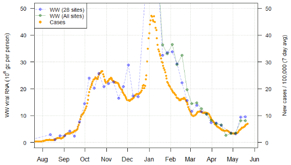
Levels of Covid-19 RNA in wastewater collected at a number of sites around Scotland are adjusted for population and local changes in intake flow rate and compared to daily 7-day average positive case rates derived from Local Authority and Neighbourhood (Intermediate Zone) level aggregate data. See Technical Annex in Issue 34 of these Research Findings for the methodology.
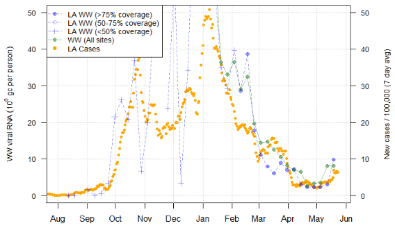
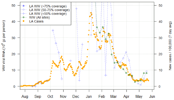
Nationwide, wastewater (WW) Covid-19 levels remained at levels similar to last week. This is due to offsetting between large increases and decreases in the Glasgow area, while other locations show smaller increases.
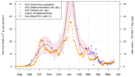
Figure 15 shows the national aggregate for the original 28 sites with long-term records (in blue) and, from January 2021, the aggregate for the full set of up to 107 currently sampled sites (in green). This national average shows a plateau in the levels of WW Covid-19 from last week.
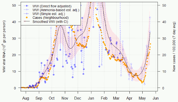
In terms of individual sites, however, the situation is more dynamic. Of particular concern is Shieldhall in Glasgow (Figure 16), where levels continue to increase rapidly in both cases and WW Covid-19 concentrations. This is offset by a lower WW measurement recently recorded at Dalmuir (covering the Dunbarton area).
Other sites show smaller increases in WW Covid-19 and cases. This includes Seafield in Edinburgh (Figure 17), sites in the North Ayrshire LA area (Figure 18), and Hatton in the vicinity of Dundee. Seafield’s increase is comparatively slight, consistent with the small increase in cases in the City of Edinburgh where most of the site’s catchment is located. However, the adjoining LA region of Midlothian which only overlaps somewhat with the Seafield catchment shows a much greater increase in cases, and the much smaller Penicuik WW sampling site which is entirely in Midlothian showed a measurement of in excess of 90 Mgc/p/d on 19 May, displaying clearly much higher than in the Seafield area.
The sites of Alloa (in Clackmannanshire) and Lerwick (in the Shetlands), where last week's report identified an increase in WW Covid-19 without a rise in cases, both showed a rise in case rates this week. However, the WW Covid-19 levels in both locations have reduced this week from values observed last week. This may be indicative of a decrease in Covid-19 levels with cases as a lagging indicator, or simply a temporary change due to variability. Further readings are required for confirmation.
Consistent elevated levels of WW Covid-19, with no current rise in cases, can be found in Inverclyde and the Falkirk area (Figure 19). If this follows the patterns seen in Alloa and Lerwick, rises in cases in these areas in the near future is possible.
What next?
The Scottish Government continues to work with a number of academic modelling groups to develop other estimates of the epidemic in Scotland.
The modelled estimates of the numbers of new cases and infectious people will continue to be provided as measures of the epidemic as a whole, along with measures of the current point in the epidemic such as Rt and the growth rate. Further information can be found at https://www.gov.scot/coronavirus-covid-19.