Coronavirus (COVID-19): modelling the epidemic (issue no. 28)
Latest findings in modelling the COVID-19 epidemic in Scotland, both in terms of the spread of the disease through the population (epidemiological modelling) and of the demands it will place on the system, for example in terms of health care requirement.
This document is part of a collection
Coronavirus (COVID-19): modelling the epidemic in Scotland (Issue No. 28)
Background
This is a report on the Scottish Government modelling of the spread and level of Covid-19. This updates the previous publication on modelling of Covid-19 in Scotland published on 19 November 2020. The estimates in this document help the Scottish Government, the health service and the wider public sector plan and put in place what is needed to keep us safe and treat people who have the virus.
This edition of the research findings focuses on the epidemic as a whole, looking at estimates of R, growth rate and incidence as well as local measures of change in the epidemic.
Key Points
- The reproduction rate R in Scotland is currently estimated as being between 0.8 and 1.0.
- The number of new daily infections for Scotland is estimated as being between 57 and 115, per 100,000 people.
- The growth rate for Scotland is estimated as being between -3% and 0%.
- The proportion of people testing positive aged 65 or over increased by around 5% from September to 13% in late October and has remained at a similar level for the last four weeks.
- There was a reduction of around 5% in the proportion of those admitted to hospital of age 70 and above, between September and October, down to just under 50%. The proportion admitted to hospital from the 40-59 age group increased by around 5% in the same period.
- Modelled rates per 100K indicate that by the week of 6 – 12 December, 21 (down 1 from last week) local authorities have at least a 75% probability of exceeding 50 cases, 7 (down 6) of those have at least a 75% probability of exceeding 100 cases and none of those have at least a 75% probability of exceeding 300 (or 500) cases. This is an improvement compared to last week.
Overview of Scottish Government Modelling
Epidemiology is the study of how diseases spread within populations. One way we do this is using our best understanding of the way the infection is passed on and how it affects people who catch it to create mathematical simulations. Because people who catch Covid-19 have a relatively long period in which they can pass it on to others before they begin to have symptoms, and the majority of people infected with the virus will experience mild symptoms, this "epidemiological modelling" provides insights into the epidemic that cannot easily be measured through testing e.g. of those with symptoms, as it estimates the total number of new daily infections and infectious people, including those who are asymptomatic or have mild symptoms.
Modelling also allows us to make short-term forecasts of what may happen with a degree of uncertainty. These can be used in health care and other planning. The modelling in this research findings is undertaken using different types of data which going forward aims to both model the progress of the epidemic in Scotland and provide early indications of where any changes are taking place.
Modelling outputs are provided here on the current epidemic in Scotland as a whole, based on a range of methods. Because it takes a little over three weeks on average for a person who catches Covid-19 to show symptoms, become sick, and either die or recover, there is a time lag in what our model can tell us about any re-emergence of the epidemic and where in Scotland this might occur. However modelling of Covid deaths is an important measure of where Scotland lies in its epidemic as a whole. In addition, the modelling groups which feed into the SAGE consensus use a range of other data along with deaths in their estimates of R and the growth rate. These outputs are provided in the first part of this research findings. The type of data used in each model to estimate R is highlighted in Figure 2.
A short term forecast of the number of cases, ICU and hospital bed demand in the next two weeks is also provided, as the focus at this stage of the epidemic is the re-emergence of the virus in Scotland.
Analysis of the pattern of demographics, deprivation and clinical risk groups over time for those people who tested positive and hospital admissions has also been included.
What the modelling tells us about the epidemic as a whole
Figure 1 shows how Rt has changed since February (including 50% and 95% confidence intervals). Before the "stay at home" restrictions were put in place Rt was above 1, and most likely to have been between 3 and 4 before any interventions were put in place.
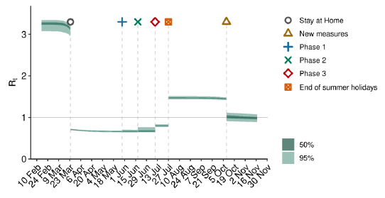
Figure Description
Graph showing the trends in the Rt value for Scotland over time, as calculated by the model. The graph shows step changes downwards at the point when each intervention was introduced. This figure shows Rt fell below 1.0 on the 23rd of March, when the “stay at home” advice was given. The Rt has been above 1 since around the time the school summer holidays ended.
Source: Scottish Government modelled estimates using Imperial College model code; actual data from https://www.nrscotland.gov.uk/statistics-and-data/statistics/statistics-by-theme/vital-events/general-publications/weekly-and-monthly-data-on-births-and-deaths/deaths-involving-coronavirus-covid-19-in-scotland
The various groups which report to the Scientific Pandemic Influenza Group on Modelling (SPI-M) use different sources of data in their models (i.e. deaths, hospital admissions, cases) so their estimates of R are also based on these different methods. SAGE's consensus view across these methods, as of 25 November, was that the value of Rt in Scotland was between 0.8 and 1.0. The R value estimated by the Scottish Government is within the consensus range (Figure 2).
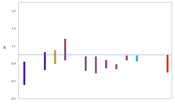
Figure Description
A graph showing the range of values which each of the academic groups reporting an R value to SAGE are likely to lie within, as of 25 November. The blue bars (first and second from left, 2nd from right) are death-based models, purple (5th to 10th from the left) use multiple sources of data. The estimate produced by the Scottish Government (a deaths-based model) is the 3rd from left (yellow). The R value estimated by the Scottish Government is similar to the estimates of other groups using models which draw upon numbers of deaths. The SAGE consensus, shown at the right hand side of the plot, is that the most likely “true” range is between 0.8 and 1.0.
Source: Scientific Advisory Group for Emergencies (SAGE).
The various groups which report to the Scientific Pandemic Influenza Group on Modelling (SPI-M) use different sources of data in their models to produce estimates of incidence (Figure 3). SPI-M's consensus view across these methods, as of 25 November, was that the incidence of new daily infections in Scotland was between 57 and 115 new infections per 100,000. This equates to between 3,100 and 6,300 people becoming infected each day in Scotland.
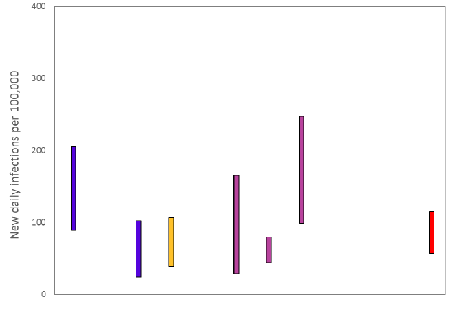
Figure Description
A graph showing the ranges the values which each of the academic groups in SPI-M are reporting for incidence (new daily infections per 100,000) are likely to lie within, as of 25 November. The blue bars are death based models (1st and 2nd from left). The purple bars (5th to 7th from the left) use multiple sources of data. The estimate produced by the Scottish Government (a deaths-based model) is the 3rd from the left (yellow). The SAGE consensus (57 to 115 new daily infections per 100,000) is shown at the right hand side of the plot.
Source: Scientific Pandemic Influenza Group on Modelling (SPI-M).
The consensus from SAGE for this week is that the growth rate in Scotland is between -3% and 0% per day. Last week the growth rate was in the range -4% and -1%.
Figure 4 shows the epidemiological model forecasts of daily deaths produced by the Scottish Government, given the present set of interventions.
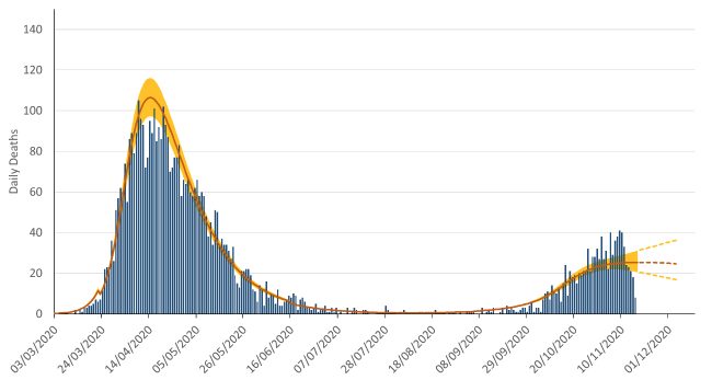
Figure description
Bar chart showing daily numbers of deaths caused by Covid-19 in Scotland between 12th March and 17th November, 2020. Overlain on this is the “estimated deaths” result from the model, which smooths out the cyclical weekly pattern in the reported numbers, due to fewer deaths being registered over a weekend.
Source: Scottish Government modelled estimates using Imperial College model code; actual data from https://www.nrscotland.gov.uk/statistics-and-data/statistics/statistics-by-theme/vital-events/general-publications/weekly-and-monthly-data-on-births-and-deaths/deaths-involving-coronavirus-covid-19-in-scotland
The logistical model developed by Scottish Government to assess implications for health care demand (see previous Research Findings) has been adapted to produce a short/medium-term predictions of infections.
Figure 5 shows a "Lower" projection, which assumes the Rt value is currently slightly below 1 and there will be limited increase in transmission from winter conditions, and a "Higher" projection, which assumes that Rt is currently slightly higher (but still below 1), and it will increase as winter sets in.
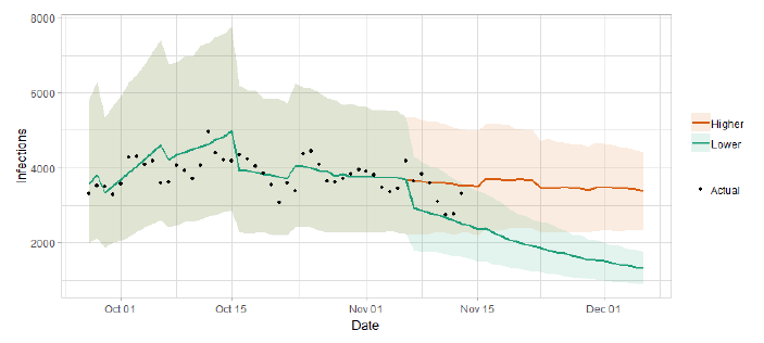
Figure Description
Line graph showing the two week ahead lower and higher scenario predictions using the logistics model to extend the estimated number of infections from the Imperial College model in a manner that fits with the number of actual cases. The higher scenario indicates over 4,000 infections, whereas the lower scenario indicates under 2,000 infections in two weeks.
What the modelling tells us about Hospital bed and ICU bed demand
Figure 6 shows the impact of the Lower and Higher scenarios on the number of people in hospital.
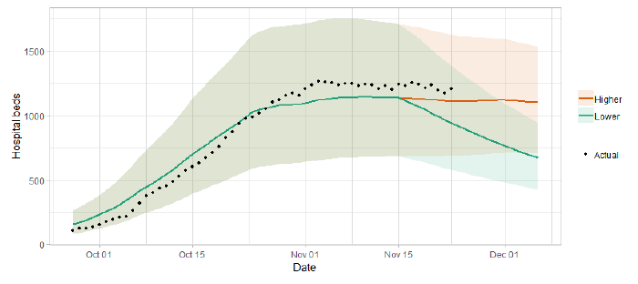
Figure Description
A line graph showing the two week ahead lower and higher scenario predictions of hospital bed demand. The higher scenario indicates up to around 1,500 beds, whereas the lower scenario indicates under 1,000 hospital beds required in two weeks.
Figure 7 shows the impact of the Lower and Higher scenarios on ICU bed demand.
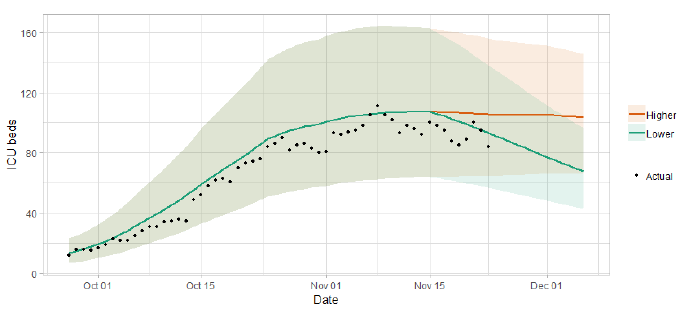
Figure Description
A line graph showing a short term forecast of modelled ICU bed demand, from Scottish Government modelling. The higher scenario indicates over 1460 ICU required, whereas the lower scenario indicates around 100 ICU required in two weeks.
What the modelling tells us about projections of hospitalisations in the medium term
SAGE produce projections of the epidemic over the next four weeks[1] (Figure 8), combining estimates from several independent models (including the Scottish Government Government's logistics modelling, as shown in figures 5, 6 and 7). These projections are not forecasts or predictions. They represent a scenario in which the trajectory of the epidemic continues to follow current trends and do not account for the impact of future policy or behaviour changes. Nor do they include seasonal effects that might increase transmission.
The delay between infection, developing symptoms, hospitalisation and death means the projections cannot fully reflect changes in transmission that might have occurred over the past two to three weeks.
Beyond two weeks, the projections become more uncertain with greater variability between individual models. This reflects the large differences that can result from fitting models to different data streams, and the influence of small deviations in estimated growth rates and current incidence.
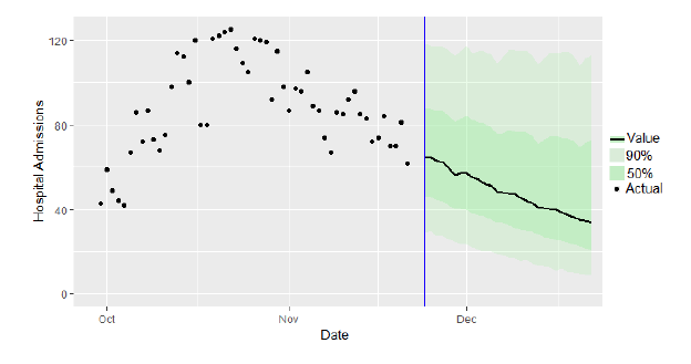
Figure Description
The SAGE medium-term projection of daily hospitalisations in Scotland, including the actuals and 90% credible interval.
What we know about who is testing positive with Covid
The Early Pandemic Evaluation and Enhanced Surveillance of COVID-19 (EAVE) 2 Study Group[2] have updated the pattern of demographics and clinical risk groups over time for those who tested positive.
EAVE 2 presents information on the changing pattern of individuals who tested positive for Covid 19 in Scotland during the period from March to the end of October, 2020.
There has been a big change in testing availability since the beginning of March and this has had an impact on the number of individuals testing positive. Early in the pandemic, at the beginning of April, the average age of those testing positive was 58, this decreased to 33 in September, and has increased to 43 in October (Figure 9).
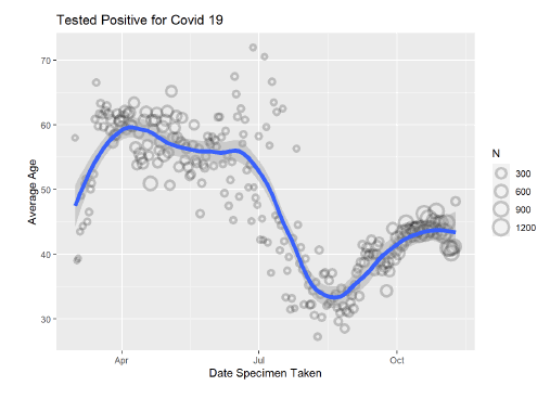
Figure Description
A series of 8 graphs showing the proportion various age groups account for of the total positive tests.
There has been a major change in the age group distribution amongst those testing positive (Figure 10). The proportion of people in the 0-39 age group increased from March until it peaked around the beginning of September 2020. It has reduced a little since then to around 35%. The proportion of those testing positive increased in October, compared to September, for the 40-59, 60-69 and 80+ age groups. In the first week of November 13% of people testing positive were 65 or over.
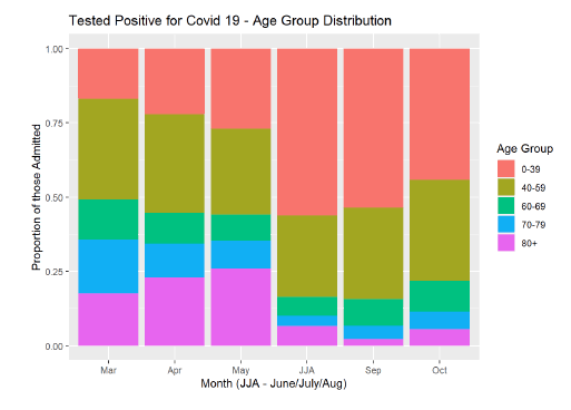
Figure Description
A line graph showing the average age of people who have tested positive from March to October 2020.
There have been changes in the deprivation mix over time. In March 22% of cases were from the most deprived quintile and this has increased to 29% in October. In March, 23% of cases were from the least deprived quintile and this has reduced to 16% in October (Figure 11).
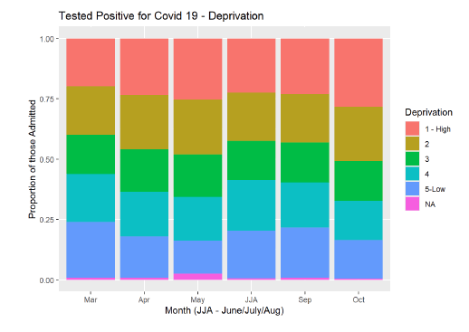
Figure Description
A bar chart showing the proportion of positive tests, by deprivation category from March to October 2020.
There has been a big change in the risk group distribution among those testing positive, from March to May about 30% of individuals testing positive had 3 or more co-morbid conditions and this has dropped to 13% in October (Figure 12).
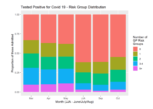
Figure Description
A bar chart showing the proportion of positive tests, by number of risk groups from March to October 2020.
Since the beginning of March the average age of patients admitted to hospital with Covid 19 has reduced from 72 to 65 (Figure 13).
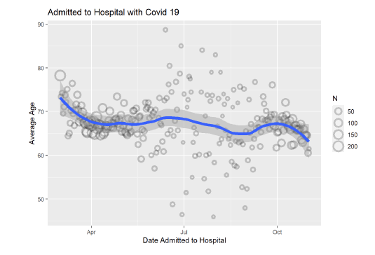
Figure Description
A line graph showing the average age of people who have been hospitalised from March to October 2020.
There was a reduction of around 5% in the proportion of those admitted to hospital of age 70 and above, from September to October, down to just under 50% (Figure 14). The proportion admitted to hospital in the 40-59 age group increased by a similar amount in the same period.
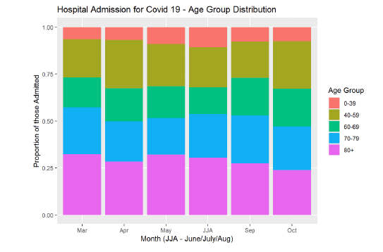
Figure Description
A bar chart showing the proportion of hospitalisations, by age group from March to October 2020.
The proportion who are in hospital from the most deprived quintile has increased from 24% in March to 35% in October (Figure 15), while the opposite trend is observed for the least deprived quintile (20% to 12%).
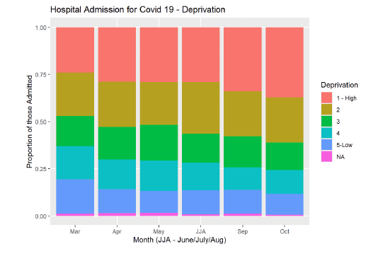
Figure Description
A bar chart showing the proportion of hospitalisations, by deprivation category from March to October 2020.
There has been little change in the pattern of patients in hospital with respect to the number of chronic co-morbid conditions that they have. In March 13% of patients in hospital with Covid 19 had 5+ co-morbid conditions and in October this was 14%; 45% had 3+ conditions in March compared to 43% in October (Figure 16).
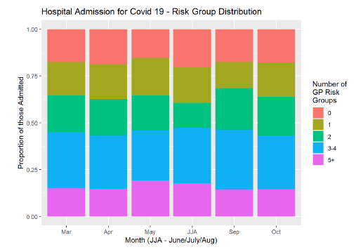
Figure Description
A bar chart showing the proportion of hospitalisations, by number of risk groups from March to October 2020.
What we know about which regions are experiencing high levels of Covid
We use modelling based on Covid cases and deaths, conducted by Imperial College London[3], to give us an indication of whether a local authority is experiencing high levels of Covid. An area is defined as a hotspot if the two week prediction of cases (positive tests) per 100K population are predicted to exceed a threshold, e.g. 500 cases. See technical annex in issue 24.
Modelled rates per 100K (Figure 17) indicate that by the week of 6 – 12 December, 21 (down 1 in the last week) local authorities have at least a 75% probability of exceeding 50 cases, 7 (down 6) of those have at least a 75% probability of exceeding 100 cases and none have at least a 75% probability of exceeding 300 (or 500) cases.
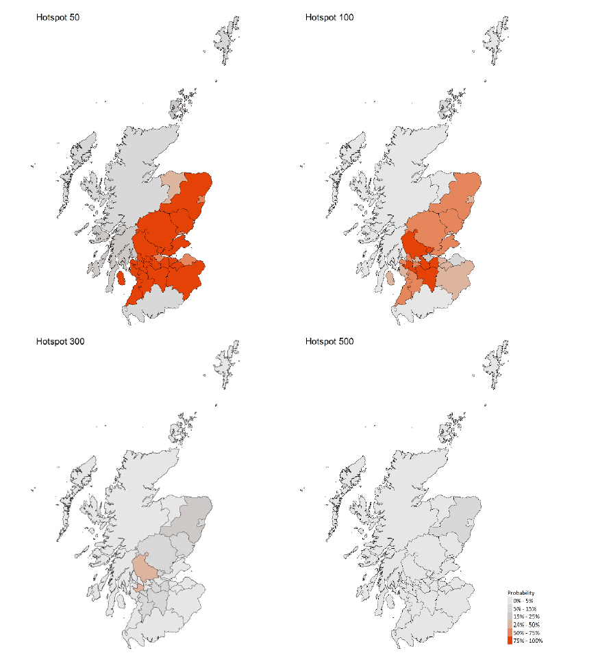
Figure Description
A series of four maps showing the probability of Scottish local authorities having more than 50, 100, 300 or 500 cases per 100,000 population, corresponding to data for 22 – 28 November 2020.
What next?
The Scottish Government continues to work with a number of academic modelling groups to develop other estimates of the epidemic in Scotland.
The modelled estimates of the numbers of new cases and infectious people will continue to be provided as measures of the epidemic as a whole, along with measures of the current point in the epidemic such as exceedance. Rt and growth rate will also be provided. Further information can be found at https://www.gov.scot/coronavirus-covid-19.
We continue to track the analysis by SEPA of the reported levels of Covid-19 in wastewater samples.
Two new tranches of the Scottish Contact Survey (SCS) for Wave 8 will be available 26 November and will be reported next week. This will enable us to update the trends in issue 27 (based on Waves up to Wave 7).
Technical Annex
| LA | P (Cases > 500) | P (Cases > 300) | P (Cases > 100) | P (Cases > 50) |
|---|---|---|---|---|
| Aberdeen City | 4% | 10% | 44% | 67% |
| Aberdeenshire | 6% | 16% | 67% | 89% |
| Angus | 1% | 6% | 71% | 93% |
| Argyll and Bute | 0% | 0% | 1% | 15% |
| City of Edinburgh | 0% | 2% | 37% | 79% |
| Clackmannanshire | 2% | 14% | 76% | 94% |
| Dumfries and Galloway | 0% | 0% | 1% | 8% |
| Dundee City | 0% | 1% | 30% | 70% |
| East Ayrshire | 1% | 6% | 52% | 84% |
| East Dunbartonshire | 0% | 2% | 46% | 84% |
| East Lothian | 0% | 0% | 12% | 53% |
| East Renfrewshire | 1% | 11% | 83% | 98% |
| Falkirk | 0% | 1% | 23% | 69% |
| Fife | 0% | 1% | 60% | 90% |
| Glasgow City | 0% | 1% | 62% | 96% |
| Highland | 0% | 0% | 0% | 5% |
| Inverclyde | 0% | 4% | 57% | 85% |
| Midlothian | 0% | 0% | 47% | 88% |
| Moray | 0% | 0% | 5% | 25% |
| Na h-Eileanan Siar | 0% | 0% | 1% | 5% |
| North Ayrshire | 0% | 2% | 39% | 76% |
| North Lanarkshire | 2% | 13% | 87% | 98% |
| Orkney Islands | 0% | 0% | 6% | 17% |
| Perth and Kinross | 3% | 13% | 72% | 91% |
| Renfrewshire | 4% | 33% | 98% | 100% |
| Scottish Borders | 0% | 0% | 33% | 79% |
| Shetland Islands | 0% | 0% | 5% | 14% |
| South Ayrshire | 0% | 2% | 64% | 92% |
| South Lanarkshire | 2% | 12% | 82% | 98% |
| Stirling | 5% | 36% | 97% | 100% |
| West Dunbartonshire | 0% | 1% | 69% | 94% |
| West Lothian | 1% | 7% | 78% | 97% |
Tables 2 and 3 provide the underlying data used in the section above on "What the modelling tells us about Hospital bed and ICU bed demand". They are based on modelling undertaken by Scottish Government (for more information see research findings issue 1).
The purpose of these predictions is to support a decision on what measures are needed in different parts of Scotland. As part of the medium term modelling, these predictions are not intended as short term forecasts (less than two weeks, for which management information is more appropriate), but the initial weeks are provided for completeness.
As the middle, lower and upper ends of the range are presented for each health board, the aggregate cannot be used as a prediction of the number of beds required in Scotland as a whole.
| Area | Cap. (double)[5] | 30/11/20 | 07/12/20 | 14/12/20 | 21/12/20 | 28/12/20 | 04/01/21 |
|---|---|---|---|---|---|---|---|
| Ayrshire and Arran | 20 | 7 (0-10) | 7 (0-10) | 7 (0-9) | 6 (0-8) | 6 (0-8) | 7 (0-9) |
| Borders | 10 | * (0-5) | * (0-5) | * (0-5) | * (0-5) | * (0-5) | * (0-5) |
| Dumfries and Galloway | 8 | * (0-5) | * (0-5) | * (0-5) | * (0-5) | * (0-5) | * (0-5) |
| Fife | 20 | 11 (0-18) | 11 (0-17) | 11 (0-16) | 11 (0-16) | 11 (0-16) | 12 (0-16) |
| Forth Valley | 14 | 6 (0-9) | 6 (0-8) | 6 (0-9) | 6 (0-10) | 6 (0-10) | 7 (0-10) |
| Grampian | 32 | 9 (0-13) | 9 (0-12) | 9 (0-12) | 10 (0-13) | 11 (0-13) | 11 (0-13) |
| Greater Glasgow and Clyde | 76 | 41 (16-52) | 40 (13-50) | 37 (10-48) | 35 (8-46) | 36 (7-46) | 38 (6-48) |
| Highland | 16 | * (0-5) | * (0-5) | * (0-5) | * (0-5) | * (0-5) | * (0-5) |
| Lanarkshire | 40 | 27 (10-34) | 26 (8-33) | 24 (7-31) | 23 (5-30) | 24 (5-30) | 25 (0-31) |
| Lothian | 55 | 13 (0-20) | 12 (0-19) | 12 (0-19) | 12 (0-18) | 12 (0-18) | 13 (0-19) |
| Orkney | 0 | * (0-5) | * (0-5) | * (0-5) | * (0-5) | * (0-5) | * (0-5) |
| Shetland | 0 | * (0-5) | * (0-5) | * (0-5) | * (0-5) | * (0-5) | * (0-5) |
| Tayside | 22 | 7 (0-10) | 7 (0-10) | 7 (0-10) | 7 (0-11) | 7 (0-11) | 8 (0-11) |
| Western Isles | 4 | * (0-5) | * (0-5) | * (0-5) | * (0-5) | * (0-5) | * (0-5) |
* indicates that the middle of the range is less than 5. Values in this table give an interval, actual occupancy could be higher or lower.
| Area | Cap. | 30/11/20 | 07/12/20 | 14/12/20 | 21/12/20 | 28/12/20 | 04/01/21 |
|---|---|---|---|---|---|---|---|
| Ayrshire and Arran | 203 | 106 (34-147) | 103 (29-140) | 97 (23-135) | 94 (19-131) | 98 (17-133) | 104 (15-139) |
| Borders | 118 | 15 (5-19) | 14 (0-18) | 15 (0-20) | 15 (0-21) | 16 (0-22) | 17 (0-23) |
| Dumfries and Galloway | 90 | 7 (0-9) | 7 (0-9) | 6 (0-8) | 5 (0-7) | 6 (0-7) | 6 (0-8) |
| Fife | 322 | 74 (23-104) | 72 (20-99) | 72 (17-101) | 73 (15-103) | 76 (13-105) | 81 (12-109) |
| Forth Valley | 144 | 57 (14-92) | 55 (12-88) | 58 (10-95) | 61 (9-101) | 63 (8-103) | 67 (7-107) |
| Grampian | 295 | 70 (23-94) | 68 (20-90) | 76 (17-110) | 88 (15-136) | 91 (13-139) | 97 (12-145) |
| Greater Glasgow and Clyde | 1,070 | 444 (156-569) | 431 (132-543) | 405 (105-522) | 384 (83-507) | 400 (73-517) | 423 (66-539) |
| Highland | 176 | 8 (0-18) | 8 (0-17) | 8 (0-17) | 8 (0-16) | 8 (0-16) | 9 (0-17) |
| Lanarkshire | 455 | 272 (99-337) | 264 (84-322) | 250 (68-310) | 241 (56-300) | 250 (49-306) | 265 (44-320) |
| Lothian | 487 | 178 (65-219) | 172 (55-209) | 169 (48-201) | 167 (42-195) | 174 (37-199) | 184 (33-208) |
| Orkney | 28 | * (0-5) | * (0-5) | * (0-5) | * (0-5) | * (0-5) | * (0-5) |
| Shetland | 64 | * (0-5) | * (0-5) | * (0-5) | * (0-5) | * (0-5) | * (0-5) |
| Tayside | 172 | 84 (29-108) | 81 (25-103) | 82 (21-107) | 85 (18-114) | 89 (16-116) | 94 (14-121) |
| Western Isles | 32 | * (0-5) | * (0-5) | * (0-5) | * (0-5) | * (0-5) | * (0-5) |
* indicates that the middle of the range is less than 5. Values in this table give an interval, actual occupancy could be higher or lower.
Contact
There is a problem
Thanks for your feedback