Developing regulation of energy efficiency of private sector housing (REEPS): modelling improvements to the target stock - Main Research Report
This report describes how the least energy efficient dwellings in the private sector were identified and how their ratings could be improved by a range of improvement measures. Modelling was used to ascertain the least cost way of reaching different standards, with findings presented on capital costs, fuel cost savings, carbon and energy reductions.
5 Improving The Target Stock
5.1 Following discussion among the REEPS Research Advisory Group and REEPS members, it was agreed that 4 policy scenarios should be modelled:
- Scenario 1: All dwellings to reach EPC band F (improve dwellings in EPC band G to reach minimum threshold of Band F).
- Scenario 2: All dwellings to reach EPC band E (improve dwellings in EPC bands G and F to reach minimum threshold of Band E).
- Scenario 3: All dwellings to reach EPC band D (improve dwellings in EPC bands G, F and E to reach minimum threshold of Band D).
- Scenario 4: All dwellings to move up one EPC band.
5.2 This chapter briefly summarises the potential impact of the 38 improvement measures individually before detailing the scope and impact of the 4 different policy scenarios.
Summary of individual measures
5.3 Table 5.1 shows the status of all 38 individual measures across the REEPS target stock. As noted in Chapter 4, individual measures were modelled for all dwellings where it was possible to implement and where they would potentially increase the SAP rating. Measures that were modelled in at least 50% of dwelling were:
- Insulated External Doors (99%)
- Low energy lighting to 100% (89%)
- 2m diameter wind turbine on roof (86%)
- Floor insulation (86%)
- 5m wind turbine on stand-alone mast (81%)
- Draught proofing windows and doors (79%)
- Triple glazing to a U-value of at least 1.4 W/m2K (79%)
- Loft insulation including top-up (75%)
- PV 2Kwp (64%)
- Solar thermal 4m2 (62%)
- Solid wall insulation (57%)
- and Hot water tank jacket of 80mm (54%).
5.4 The measures most commonly already present were:
- Double glazing to 1.8 W/m2K (71%)
- Programmer for heating system (67%)
- Thermostatic radiator valves (TRVs - 54%)
- Cylinder stat for hot water cylinder (45%)
- Room thermostats (31%).
Table 5.1: Summary of status[57] of individual measures across all of the target stock
| Already present | Modelled | Not appropriate | Not recommended | Total | Modelled (n) | |
|---|---|---|---|---|---|---|
| M10: Insulated External Doors | 0% | 99% | 0% | 1% | 100% | 397,356 |
| M33: Low Energy Lighting 100% | 11% | 89% | 0% | 0% | 100% | 356,043 |
| M31: 2M Diameter Wind Turbine On Roof | 0% | 86% | 0% | 14% | 100% | 346,307 |
| M6: Floor Insulation | 1% | 86% | 13% | 0% | 100% | 344,772 |
| M32: 5M Wind Turbine On Stand-Alone Mast | 0% | 81% | 0% | 19% | 100% | 326,251 |
| M12: Draughtproof Windows And Doors | 21% | 79% | 0% | 0% | 100% | 316,074 |
| M9: Triple Glazing To 1.4 | 1% | 79% | 0% | 20% | 100% | 314,738 |
| M1: Loft Insulation, Including Top Up | 14% | 75% | 10% | 0% | 100% | 300,669 |
| M30: Pv 2Kwp | 0% | 64% | 0% | 36% | 100% | 255,674 |
| M29: Solar Thermal 4M2 | 0% | 62% | 0% | 38% | 100% | 246,667 |
| M5: Solid Wall Insulation | 1% | 57% | 41% | 1% | 100% | 229,762 |
| M11: Hot Water Tank Jacket 80Mm | 17% | 54% | 28% | 1% | 100% | 216,082 |
| M13: Baffle / Damper To Open Fire | 2% | 46% | 52% | 0% | 100% | 182,296 |
| M4: Cavity Wall Insulation | 0% | 45% | 53% | 2% | 100% | 181,708 |
| M24: Room Thermostat | 31% | 37% | 31% | 2% | 100% | 147,386 |
| M14: Replace Gas Boiler With Condensing Boiler 88% | 6% | 35% | 58% | 1% | 100% | 141,859 |
| M20: Quantum Storage Heaters | 0% | 30% | 0% | 70% | 100% | 119,434 |
| M3: Room In The Roof Insulation | 1% | 29% | 70% | 0% | 100% | 118,072 |
| M19: Fan Elec Storage Heaters With Auto Charge Control | 1% | 29% | 0% | 71% | 100% | 115,201 |
| M35: Air To Air Heat Pump | 0% | 28% | 1% | 71% | 100% | 110,963 |
| M7: Double Glazing To 1.8 | 71% | 26% | 0% | 3% | 100% | 103,520 |
| M8: Secondary Glazing To 2.4 | 1% | 25% | 1% | 73% | 100% | 99,270 |
| M36: Replace Secondary Heating with more efficient one | 0% | 24% | 9% | 67% | 100% | 96,558 |
| M15: Replace Oil/LPG Boiler to 90% | 4% | 18% | 71% | 8% | 100% | 71,515 |
| M34: Cylinder Stat For Hot Water Cylinder | 45% | 14% | 41% | 0% | 100% | 57,247 |
| M26: Trvs | 54% | 14% | 32% | 0% | 100% | 57,100 |
| M2: Flat Roof Insulation | 0% | 12% | 88% | 0% | 100% | 46,617 |
| M38: Switch Electricity Tariff | 1% | 10% | 68% | 22% | 100% | 38,714 |
| M28: Auto Charge Control | 11% | 7% | 72% | 9% | 100% | 29,631 |
| M27: Full Controls Package | 21% | 4% | 31% | 44% | 100% | 15,705 |
| M18: Full Biomass Central Heating System Inc Controls | 0% | 4% | 0% | 96% | 100% | 14,979 |
| M16: Full Gas Central Heating System Inc Controls | 0% | 4% | 1% | 95% | 100% | 14,374 |
| M22: Air Source Heat Pump | 0% | 3% | 0% | 97% | 100% | 10,886 |
| M23: Ground Source Heat Pump | 0% | 3% | 0% | 97% | 100% | 10,800 |
| M17: Full Oil/LPG Central Heating System Inc Controls | 0% | 2% | 1% | 97% | 100% | 8,273 |
| M25: Programmer For Heating System | 67% | 2% | 31% | 1% | 100% | 6,201 |
| M21: Full Elec Radiator System Inc Controls - Off Peak | 0% | 1% | 0% | 99% | 100% | 2,412 |
| M37: Elec CPSU With Radiators And Controls On E18 Tariff | 0% | 0.5% | 1% | 99% | 100% | 1,941 |
5.5 The number of measures modelled by rurality, tenure and EPC banding is provided in Table A8.5 in Appendix 8.
5.6 Nine individual measures had a payback period of less than three years. These are shown in Figure 5.1.
Figure 5.1: Mean capital cost and annual reduction in energy costs of the nine measures with a payback period less than three years.
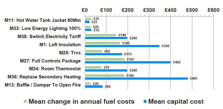
5.7 In terms of their impact on SAP scores and their potential scope among the target stock (Table A8.6):
- Adding a hot water tank jacket of 80mm increased the SAP score on average by 1.2 points and was modelled in 216,082 dwellings (54%).
- Low energy lighting increased the SAP score on average by 1.0 point and was modelled in 356,043 dwellings (89%).
- Switching electricity tariff raised the SAP score by 5.6 points on average and was modelled in 38,714 (10%) dwellings.
- Loft insulation, including top-up insulation increased the SAP score by 5.3 points on average and was modelled in 300,669 dwellings (75%).
- TRVs increased the SAP rating by 2.4 points on average and were modelled in 57,100 dwellings (14%).
- Full Control Package increased the SAP score by 4.1 points on average and was modelled in 15,705 dwellings (4%).
- Room thermostats increased the SAP score by 2.4 points on average and were modelled in 147,386 dwellings (37%).
- Replacing the secondary heating increased the SAP score by 5.2 points on average was modelled in 96,558 dwellings (24%).
- Adding a baffle/damper to an open fire increased the SAP score by 0.9 points on average and was modelled in 181,708 dwellings (45%).
Figure 5.2: Mean capital cost and annual reduction in energy costs of the ten improvement measures with an average payback period of between three and ten years.
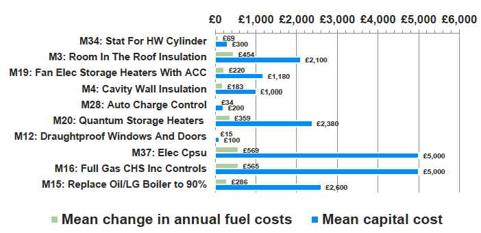
5.8 Ten individual measures had a payback period of between three and ten years (shown in Figure 5.2).
- Adding a cylinder stat for hot water cylinder increased the SAP score on average by 2.1 points and was modelled in 57,247 dwellings (14%) and
- Room in the roof insulation increased the SAP score on average by 13.0 points and was modelled in 118,072 dwellings (29%).
- Fan electric storage heaters with auto charge control increased the SAP score on average by 8.3 points and was modelled in 115,201 dwellings (29%).
- Cavity Wall Insulation increased the SAP score on average by 6.6 points and was modelled in 182,296 dwellings (46%).
- Auto charge control increased the SAP score on average by 1.2 points and was modelled in 29,631 dwellings (7%).
- Adding Quantum storage heaters increased the SAP score on average by 14.0 points and was modelled in 119,434 dwellings (30%).
- Draught proofing windows and doors increased the SAP score on average by 0.5 points and was modelled in 316,074 dwellings (79%).
- Adding an electric Combined Primary Storage Unit (CPSU) system with radiators and controls on E18 tariff increased the SAP score on average by 17.0 points and was but modelled in 1,941 dwellings (< 0.5%).
- Adding full gas central heating system including controls increased the SAP score on average by 26.2 points and was modelled in 14,374 dwellings (4%).
- Replacing an Oil/LG boiler with one that was 90% efficient increased the SAP score on average by 7.4 points and was modelled in 71,515 dwellings (18%).
5.9 The remaining 19 measures all had a payback period of more than ten years. Summary information on all 38 individual measures, including the average payback period, mean change in SAP, annual fuel costs, CO2e, Primary Energy, Delivered Energy[58] , and average capital costs are shown in Table A8.6 in Appendix 8.
Measures included in different scenarios
5.10 Table 5.2 shows the measures included in the improvement packages for each of the Scenarios. The most common measures included were loft insulation (including top-up loft insulation), room thermostats, low energy lighting, hot water tank jackets and cavity wall insulation. For Scenario 1, the most common measures were:
- Adding loft insulation (62% of target stock: 18,375 dwellings)
- Hot Water tank jacket (16% of target stock: 4,651 dwellings)
- Room thermostats (15% of target stock: 4,457 dwellings)
- Fan electric storage heaters with auto-charge control (10% of target stock: 2,878 dwellings)
- Replacing secondary heating system (9% of target stock: 2,537 dwellings).
5.11 For Scenario 2, the most common measures were:
- Adding loft insulation (44% of target stock: 74,369 dwellings)
- Low energy lighting (15% of target stock: 25,496 dwellings)
- Cavity wall insulation (14% of target stock: 24,611 dwellings)
- Hot Water tank jacket (13% of target stock: 21,783 dwellings)
- Replacing secondary heating system (13%: 21,700 dwellings).
5.12 For Scenario 3, the most common measures were:
- Adding loft insulation (39% of target stock: 157,256 dwellings)
- Low energy lighting (34% of target stock: 135,662 dwellings)
- Cavity wall insulation (26% of target stock: 103,250 dwellings)
- Hot Water tank jacket (22% of target stock: 88,179 dwellings)
- Floor insulation (22% of target stock: 87,806 dwellings)
- Replacing secondary heating system (18% of target stock: 70,274 dwellings)
- Room thermostats (15% of target stock: 58,363).
5.13 For Scenario 4, the most common measures were:
- Adding loft insulation (33% of target stock: 133,380 dwellings)
- Low energy lighting (25% of target stock: 101,310 dwellings)
- Hot Water tank jacket (16% of target stock: 62,406 dwellings)
- Cavity wall insulation (16% of target stock: 63,849 dwellings)
- Room thermostats (10% of target stock: 41,752 dwellings)
- Replacing secondary heating system (10% of target stock: 38,212 dwellings).
Table 5.2: Individual measures included in packages (counts and %age of dwellings where measure included. Improvements that were not recommended in any dwelling in any scenario are not shown).
| Scenario 1 - Reach Band F |
Scenario 2 - Reach Band E |
Scenario 3 - Reach Band D |
Scenario 4 - One band up |
|||||
|---|---|---|---|---|---|---|---|---|
| %age | Total | %age | Total | %age | Total | %age | Total | |
| Base (Total dwellings improved) | 29,676 | 170,708 | 400,548 | 400,548 | ||||
| M1: Loft Insulation, inc’ top up | 62% | 18,375 | 44% | 74,369 | 39% | 157,256 | 33% | 133,380 |
| M2: Flat Roof Insulation | 0% | 0 | 1% | 1,579 | 2% | 7,359 | 1% | 4,057 |
| M3: Room In The Roof Insulation | 0% | 0 | 10% | 16,815 | 18% | 71,075 | 5% | 18,722 |
| M4: Cavity Wall Insulation | 9% | 2,649 | 14% | 24,611 | 26% | 103,250 | 16% | 63,849 |
| M5: Solid Wall Insulation | 0% | 0 | 1% | 1,181 | 7% | 29,561 | 1% | 3,538 |
| M6: Floor Insulation | 5% | 1,632 | 5% | 9,262 | 22% | 87,806 | 9% | 34,983 |
| M7: Double Glazing To 1.8 | 0% | 0 | 0% | 0 | 1% | 2,701 | 0% | 0 |
| M8: Secondary Glazing To 2.4 | 0% | 0 | 0% | 438 | 2% | 6,504 | 1% | 2,248 |
| M10: Insulated External Doors | 0% | 0 | 1% | 1,604 | 3% | 11,196 | 2% | 6,515 |
| M11: HW Tank Jacket 80Mm | 16% | 4,651 | 13% | 21,783 | 22% | 88,179 | 16% | 62,406 |
| M12: Draught proof windows & doors | 0% | 0 | 4% | 7,492 | 5% | 20,275 | 3% | 13,619 |
| M13: Baffle/Damper To Open Fire | 0% | 0 | 3% | 5,412 | 6% | 22,214 | 5% | 19,169 |
| M14: Replace Gas Boiler With Condensing Boiler 88% | 0% | 0 | 3% | 4,519 | 6% | 25,928 | 3% | 12,650 |
| M15: Replace Oil/LPG Boiler to 90% | 3% | 1,002 | 6% | 10,046 | 7% | 28,566 | 2% | 9,730 |
| M16: Full Gas CH Sys Inc Controls | 0% | 0 | 0% | 0 | 0% | 1,704 | 0% | 0 |
| M17: Full Oil/LPG CH Sys Inc Controls | 0% | 76 | 1% | 1,802 | 1% | 5,312 | 0% | 779 |
| M18: Full Biomass CH Inc Controls | 0% | 0 | 0% | 41 | 0% | 41 | 0% | 0 |
| M19: Fan Elec Storage Heaters With Auto Charge Control | 10% | 2,878 | 10% | 16,541 | 5% | 19,211 | 4% | 15,342 |
| M20: Quantum Storage Heaters | 0% | 0 | 4% | 7,680 | 10% | 39,291 | 3% | 13,684 |
| M24: Room Thermostat | 15% | 4,457 | 8% | 12,998 | 15% | 58,363 | 10% | 41,752 |
| M26: TRVs | 4% | 1,124 | 2% | 2,980 | 6% | 24,864 | 5% | 18,371 |
| M27: Full Controls Package | 0% | 0 | 2% | 3,526 | 1% | 4,817 | 1% | 2,994 |
| M28: Auto Charge Control | 0% | 0 | 1% | 2,024 | 1% | 4,939 | 2% | 6,447 |
| M29: Solar Thermal 4m2 | 0% | 0 | 0% | 0 | 1% | 3,345 | 0% | 0 |
| M31: 2m Wind Turbine on roof | 0% | 0 | 0% | 0 | 0% | 1,287 | 0% | 1,287 |
| M33: Low Energy Lighting 100% | 3% | 949 | 15% | 25,496 | 34% | 135,662 | 25% | 101,310 |
| M34: Cylinder Stat For HW Cylinder | 2% | 708 | 2% | 2,791 | 4% | 17,288 | 3% | 10,051 |
| M36: Replace Secondary Heating system | 9% | 2,537 | 13% | 21,700 | 18% | 70,274 | 10% | 38,212 |
| M38: Switch Electricity Tariff | 2% | 611 | 2% | 2,878 | 3% | 13,399 | 4% | 16,038 |
5.14 There were some differences by rurality, particularly in relation to Scenario 3. This primarily reflects differences in the characteristics of the stock in rural areas, and in particular, the average unimproved position (discussed further below) and the main heating system.
5.15 A higher proportion of dwellings in rural areas than in urban areas have the following measures included in Scenario 3: room in the roof insulation. (28% compared to 10%), floor insulation (40% compared to 9%), and the replacement Oil/LPG Boilers to one with 90% efficiency (16% compared to 1%). (See Table A8.9 in Appendix 8). In contrast, dwellings in urban areas are more likely those in rural areas to have low energy lighting (36% compared to 30%) in Scenario 3.
5.16 In comparison, there was very little difference in the measures included in the packages by tenure. (See Table A8.7)
The four different policy scenarios
5.17 Table 5.3 summarises the key information for the different policy scenarios.
Table 5.3: Summary of key indicators for the different policy scenarios
| Scenario 1 | Scenario 2 | Scenario 3 | Scenario 4 | |
|---|---|---|---|---|
| All dwellings to Band F | All dwellings to Band E | All dwellings to Band D | ALL EFG to improve one band | |
| Number of dwellings improved | 29,676 | 170,708 | 400,548 | 400,548 |
| Mean SAP score pre improvement | 12.3 | 28.5 | 39.4 | 39.4 |
| Mean SAP score increase | 13.7 | 13.4 | 16.4 | 9.4 |
| Mean EI score pre improvements | 24.1 | 24.6 | 32.4 | 32.4 |
| Mean EI score increase | 7.6 | 7.6 | 11.9 | 6.9 |
| Mean capital cost of improvements | £627 | £1,232 | £2,672 | £969 |
| Overall capital cost of improvements | £18.6 m | £210.2 m | £1070.2 m | £388.1 m |
| Banded capital cost: %age (n) £0-£200 |
13% (3,936) |
13% (21,341) | 17% (68,078) |
23% (93,335) |
| Banded capital cost: %age (n) £201-£500 |
52% (15,396) |
35% (59,970) |
13% (52,689) |
30% (121,333) |
| Banded capital cost: %age (n) £501-£1,000 |
20% (6,000) |
15% (25,102) |
8% (30,187) |
14% (57,087) |
| Banded capital cost: %age (n) £1,001-£2,000 |
11% (3,266) |
12% (20,517) |
16% (62,725) |
16% (66,046) |
| Banded capital cost: %age (n) £2,001-£5,000 |
3% (1,002) |
24% (41,145) |
33% (133,000) |
15% (58,174) |
| Banded capital cost: %age (n) £5,001-£10,000 |
0% (76) |
1% (2,160) |
7% (29,113) |
1% (4,553) |
| Banded capital cost: %age (n) >£10,000 |
0% (0) |
0% (473) |
6% (24,756) |
0%(0) |
| Mean fuel cost pre improvement (£ per annum) | £2,464 | £2,062 | £1,642 | £1,642 |
| Mean reduction in fuel costs (£ per annum) | £542 | £463 | £483 | £279 |
| Overall fuel cost pre improvement (per annum) | £73.1 m | £352.0 m | £657.8 m | £657.8 m |
| Overall reduction in fuel costs (per annum) | £16.1 m | £79.0 m | £193.0 m | £111.6 m |
| Mean CO2e consumed pre improve’ (kg per annum) | 11,197 | 11,604 | 9,319 | 9,319 |
| Mean reduction in CO2e consumed (kg per annum) annum) | 2,113 | 2,119 kg | 2,617 kg | 1,515 kg |
| Overall CO2e consumed pre improvement (thou tons) | 332k tons | 1,981k tons | 3,733k tons | 3,733k tons |
| Overall reduction in CO2e (thousand tons per annum) | 62.7k tons m | 361.7k tons | 1,046k tons | 605.8k tons |
| Mean Primary Energy consumed pre (kWh pa) | 55,695 | 56,117 | 46,734 | 46,734 |
| Mean reduction in PE (kWh per annum) | 10,313 | 9,894 | 12,583 | 7,424 |
| Overall PE consumed before package (kWh pa) | 1,653 m | 9,580 m | 18,719 m | 18,719 m |
| Overall reduction in PE (kWH pa) | 306 m | 1,689 m | 5,030 m | 2,968 m |
| Mean Delivered Energy consumed pre (kWH pa) pm) | 36,447 | 37,532 | 31,104 | 31,104 |
| Mean reduction in DE (kWh per annum) | 6,885 | 7,460 | 8,927 | 5,114 |
| Overall DE consumed before package (kWH pa) | 1,082 m | 6,407 m | 12,459 m | 12,459 m |
| Overall reduction in DE (kWh pa) | 204 m | 1,273 m | 3,569 m | 2,044 m |
| Median payback period | 1.1 | 2.3 | 3.8 | 2.5 |
| Mean payback period | 1.2 | 2.7 | 5.5 | 3.5 |
| Mean capital cost per SAP point increase | £46 | £92 | £163 | £103 |
5.18 By definition, Scenario 1 (improving all dwellings to reach EPC band F) and Scenario 2 (all dwellings to reach EPC band E) would involve upgrading fewer dwellings than Scenarios 3 and 4 (all dwellings to reach D and all target dwellings to move up one banding).
- 29,676 dwellings would be improved by Scenario 1
- 170,708 dwelling would be improved by Scenario 2
- 400,548 dwellings would be improved by Scenarios 3 and 4.
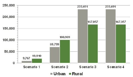
5.19 While 42% of the overall REEPS target stock is in rural areas, the proportion varies by EPC band (Figure 5.3). This has an impact on the urban/rural split covered by the different scenarios. The majority of dwellings affected by Scenarios 1 and 2 would be in rural areas (67% and 59% respectively). In comparison, 42% of dwellings affected by Scenarios 3 and 4 would be in rural areas.
Figure 5.3: Number of dwellings affected by each scenario by urban/rural split
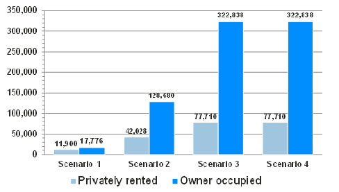
5.20 With regard to tenure, while 19% of the REEPS target stock is privately rented, a higher proportion of dwellings in the two lowest EPC bands, G & F, are privately rented. This affects the tenure split of stock targeted by the different scenarios (Figure 5.4). While 19% of the dwellings affected by Scenarios 3 and 4 are privately rented, 25% of those affected by Scenario 2 and 40% of those affected by Scenario 1 are privately rented.
Figure 5.4: Number of dwellings affected by each scenario by tenure
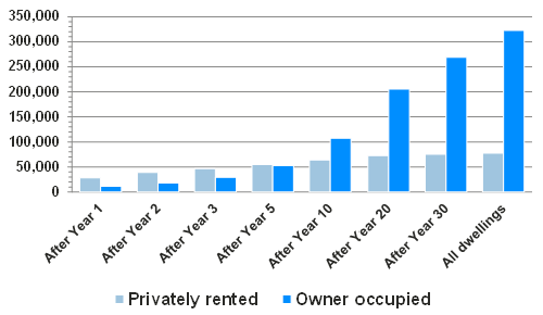
5.21 However, the turnover rate in the private rented sector is considerably higher than in the owner occupied sector[59]. For example, the turnover rate within 5 years among the REEPS target stock is 71% in the private rented sector, compared to 16% for owner occupied dwellings.
5.22 This has a large impact on the tenure make-up of dwellings affected by REEPS for all scenarios as illustrated in Figures 5.5, 5.6 and 5.7[60]. This is important as the implementation of regulations is likely to be closely linked to re-letting rental properties and sale of owner occupied dwellings.
Figure 5.5: Progress towards Scenario 1 based on estimated turnover rates by tenure.
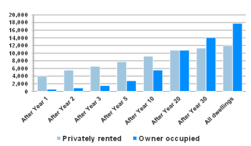
5.23 The private rented sector will make up the vast majority of dwellings affected in the first few years of REEPS, for all scenarios. After three years, private rented dwellings would account for:
- 81% of the 8,104 dwellings affected by Scenario 1
- 67% of the 34,353 dwellings affected by Scenario 2
- 62% of the 75,908 dwellings affected by Scenarios 3 & 4.
5.24 It would be a considerable length of time before the number of dwellings in the owner occupied sector would match those affected in the private rented sector: around 20 years for Scenario 1; between 5 and 10 years for Scenario 2; and around 5 years for Scenarios 3 and 4.
Figure 5.6: Progress towards Scenario 2 based on estimated turnover rates by tenure.
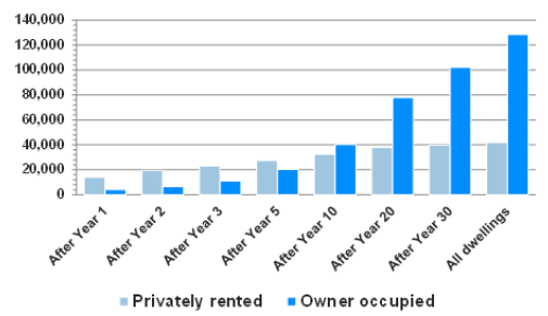
Figure 5.7: Progress towards Scenarios 3 and 4 based on estimated turnover rates by tenure.
Capital costs
5.25 The number of dwellings to be improved and the average capital cost of the improvements per dwelling drive the overall capital cost of each scenario.
- • Scenario 1 would require £18.6 million
- • Scenario 2 would require £210.2 million
- • Scenario 3 would require £1,070 million
- • Scenario 4 would require £388.1 million (Table 5.3).
5.26 The average capital cost of improvements reflects both how much each dwelling needs to be improved and the base position of the dwelling. Obviously, improvements that make a large increase in energy efficiency are, on average, more expensive than those that make a small increase.
5.27 The average cost of improving a dwelling in EPC band G up one band (to F) would be £627 (Table 5.4). In comparison, to reach band E from band G would on average cost £2,863 and £8,430 to reach band D.
5.28 Moreover, more efficient dwellings are more expensive to improve. The average cost of improving a dwelling in EPC band G by one band is £627. For dwellings in EPC band F, the corresponding figure is £888, while for those in EPC band E, the average cost of improving a dwelling by one band increases to £1,062.
Table 5.4: Average capital cost per dwelling by base position
| EPC banding before improvements | ||||
|---|---|---|---|---|
| G | F | E | All target dwellings | |
| Scenario 1 - To F | £627 | £627 | ||
| Scenario 2 - To E | £2,863 | £888 | £1,232 | |
| Scenario 3 - To D | £8,430 | £4,083 | £1,062 | £2,672 |
| Scenario 4 - 1 Up | £627 | £888 | £1,062 | £969 |
5.29 This is also reflected in the cost per SAP point increase (£46 per SAP point for dwellings moving from G to F, £88 for dwellings moving from F to E, and £126 for dwellings moving from E to D).
Figure 5.8: Banded capital costs to reach each scenario.
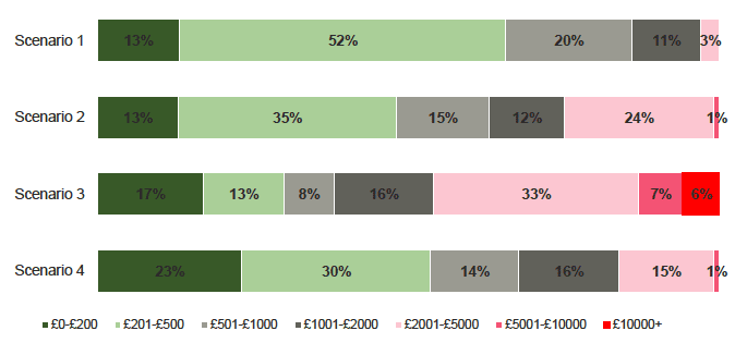
5.30 The average cost of investment for Scenario 1 would be £627 per dwelling:
- 3,936 (13%) would need investment of up to £200 (Figure 5.8)
- 15,396 (52%) would need investment of between £201 and £500
- 9,266 (31%) would need investment between £500 and £2,000
- 1,078 (3%) would need to invest more than £2,000
5.31 The average cost of investment for Scenario 2 would be £1,232 per dwelling
- 21,341 (13%) would need investment of up to £200
- 59,970 (35%) would need investment of between £201 and £500
- 45,619 (27%) would need investment between £500 and £2,000
- 43,778 (25%) would need to invest more than £2,000
5.32 The average cost of investment for Scenario 3 would be £2,672 per dwelling
- 120,767 (30%) would need investment of up to £500
- 92,912 (24%) would need investment of £500 to £2,000
- 133,000 (33%) would need investment of £2,001 to £5,000
- 53,869 (13%) would need investment of more than £5,000
5.33 The average cost of investment for Scenario 4 would be £969 per dwelling:
- 92,335 (23%) would need investment of up to £200
- 122,333 (30%) would need investment of between £201 and £500
- 123,133 (30%) would need investment between £500 and £2,000
- • 62,727 (16%) would need to invest more than £2,000
5.34 The average cost of improvements tends to be higher for dwellings in rural areas than dwellings in urban areas across all Scenarios. This difference is most marked for Scenario 3 (£4,092 compared to £1,656 - see Table A8.14 in Appendix 8). This is mainly because of the higher proportion of rural dwellings in EPC bands G and F. However, there is also a difference in the average capital costs of improvement for Scenario 4. The average cost is £1,166 for dwelling in rural areas, compared to £828 in urban areas. There is no clear difference in the average costs of improvements between Owner-Occupied stock and Private Rented Stock (Table A8.).
Impact of the different scenarios
5.35 Broadly, the overall impacts of the different scenarios follow a similar pattern to costs.
5.36 In terms of overall savings in relation to fuel costs, CO2e emissions and Primary and Delivered Energy consumption, Scenario 1 has the smallest impact and Scenario 3 has the largest impact due to the difference in terms of number of dwellings improved and scale of the improvements required. Generally, however, the more efficient a dwelling is pre-improvement, the smaller the impact of measures will be. This means that the average impact on each dwelling tends to be largest where the base position of the stock is the lowest.
Impact on fuel costs
5.37 The overall impact with regard to annual fuel cost savings of the different scenarios would be:
- Scenario 1 would give an annual fuel cost savings of £16.1million (a 22% decrease among dwellings improved).
- Scenario 2, £79.0 million (a 22% decrease)
- Scenario 3, £193.0 million (a 29% decrease)
- Scenario 4, £111.6 million (a 17% decrease)
5.38 The average impact per dwelling differs by the scale of the improvement required and the base position of the dwelling. (Table 5.5)
Table 5.5: Average annual fuel cost saving per dwelling and percentage decrease in fuel cost by base position
| EPC banding before improvements | ||||
|---|---|---|---|---|
| G | F | E | All GFE | |
| Scenario 1 - To F | £542 (22%) |
£542 (22%) |
||
| Scenario 2 - To E | £1,053 (43%) |
£338 (17%) |
£463 (22%) |
|
| Scenario 3 - To D | £1,398 (57%) |
£735 (37%) |
£209 (16%) |
£483 (29%) |
| Scenario 4 - 1 Up | £542 (22%) |
£338 (17%) | £209 (16%) | £279 (17%) |
5.39 The greater the scale of the improvements made, the greater the impact. Improving dwellings in EPC band G by one band (to F) would give an average annual fuel cost saving per dwelling of £542 (22% reduction) per annum compared to £1,053 (43% reduction) for improving this stock two bands to reach band E and £1,398 (57% reduction) for improving these dwellings three bands to reach band D.
5.40 Generally, however, the more efficient a dwelling is pre-improvement, the smaller the impact of improvements. The average annual fuel saving for improving a dwelling in EPC band G by one band is £542 (22% reduction). For dwellings in EPC band F, the corresponding figure is £338 (17% reduction), while for those in EPC band E, the saving decreases to £209 (16% reduction).
5.41 There are no clear differences in annual fuel cost savings by rurality. Within Scenario 1, dwellings in rural areas would save £525 per annum compared with £578 for dwellings in urban dwellings. (See Table A8.14). For Scenario 3, there is a considerable difference in the average fuel cost saving (£644 in rural areas, compared to £367 in urban areas). Note, however, that this is primarily due to a higher proportion of dwellings in rural areas than in urban areas being in bands G and F. For Scenario 4, the average annual fuel cost saving for rural dwellings is £326 compared to £246 in urban areas.
5.42 For the least efficient dwellings, the capital cost of improvements is lowest, and the financial gains are highest. It follows that the payback period is the shortest for these dwellings (Table 5.6). Scenario 1 has a mean payback period of 1.2 years, compared with 2.7 for Scenario 2, 5.5 for Scenario 3, and 3.5 year for Scenario 4.
Table 5.6: Mean payback period (years) by base position
| EPC banding before improvements | ||||
|---|---|---|---|---|
| G | F | E | All target dwellings | |
| Scenario 1 - To F | 1.2 | 1.2 | ||
| Scenario 2 - To E | 2.7 | 2.6 | 2.7 | |
| Scenario 3 - To D | 6.0 | 5.6 | 5.1 | 5.5 |
| Scenario 4 - 1 Up | 1.2 | 2.6 | 5.1 | 3.5 |
5.43 With regard to CO2e savings, when all properties are improved:
- Scenario 1 would give an annual saving of 63 thousand tons per annum
- Scenario 2 would give an annual saving of 362 thousand tons per annum
- Scenario 3 would give an annual saving of 1.046 million tons per annum
- Scenario 4 would give an annual saving of 606 thousand tons per annum.
Figure 5.9: Total CO2e saved (million tons per annum) and average per dwelling (kgs per annum) by scenario.
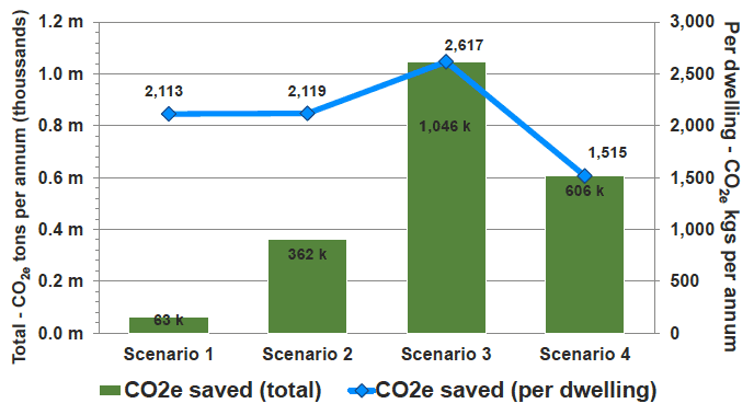
5.44 The average impact per dwelling again differs by the scale of the improvement required and the base position of the dwelling. (Table 5.7)
Table 5.7: Average annual CO2e savings (kgs) per dwelling and percentage decrease in CO2e by base position
| EPC banding before improvements | ||||
|---|---|---|---|---|
| G | F | E | All target dwellings | |
| Scenario 1 - To F | 2,113 (19%) |
2,113 (19%) |
||
| Scenario 2 - To E | 3,317 (30%) |
1,867 (16%) |
2,119 (18%) |
|
| Scenario 3 - To D | 5,036 (45%) |
4,374 (37%) |
1,222 (16%) |
2,617 (28%) |
| Scenario 4 - 1 Up | 2,113 (19%) | 1,867 (16%) |
1,222 (16%) |
1,515 (16%) |
5.45 In general, the larger the scale of the improvement made, the greater the impact on CO2e. However, unlike fuel cost savings, there is no clear relationship between the level of efficiency prior to improvement and impact on CO2e savings. Within Scenario 4, properties moving from G to F would see a 19% reduction in CO2e, properties moving from F to E a 16% reduction, and properties moving from E to D properties a 16% reduction.
5.46 Across all four scenarios, on average, dwellings in rural areas would see a greater reduction in CO2e than dwellings in urban areas[61] (Table A8.14).
Impact on primary and delivered energy
5.47 Figure 5.10 shows the overall reduction in delivered and primary energy that would result from the four scenarios:
- Scenario 1 would lead to an annual saving of 204m kWh per annum for delivered energy and 306m kWh per annum for primary energy
- Scenario 2 would lead to an annual saving of 1,273m kWh per annum for delivered energy and 1,695m kWh per annum for primary energy
- Scenario 3 would lead to an annual saving of 3,569m kWh per annum for delivered energy and 5,030m kWh per annum for primary energy
- Scenario 4 would lead to an annual saving of 2,044m kWh per annum for delivered energy and 2,968m kWh per annum for primary energy
Figure 5.10: Delivered and Primary Energy savings (kWh per annum) for capital costs to reach each scenario.
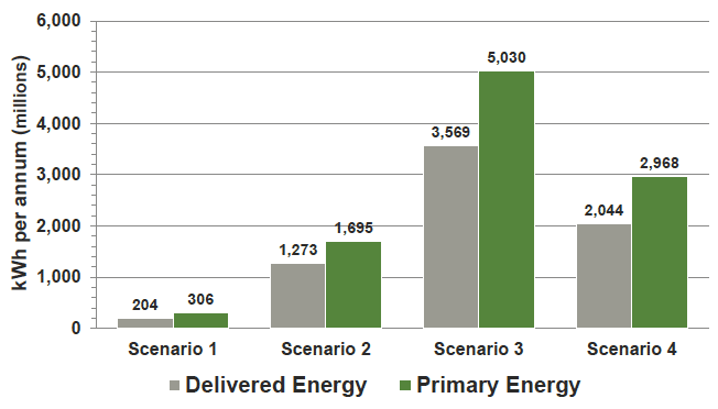
5.48 As with energy costs, the larger the scale of improvement made, the greater the impact. Improving dwellings in EPC band G by one band to F would give an average reduction in primary energy of 10,313 kWh per annum (19% reduction) compared to 14,956 kWh per annum (27% reduction) for improving this stock two bands to reach band E and 25,267 kWh per annum (45% reduction) for a three band improvement to D.
5.49 Moving a dwelling one band up has a larger impact on the least efficient dwellings. The average reduction in primary energy annual fuel saving for improving a dwelling from G to F is 10,313 kWh per annum (19% reduction). The corresponding figure for F to E improvements is 8,829 (16% reduction), and 6,184 (16% reduction) for E to D improvements.
Table 5.8: Average reduction in primary energy (kWh per annum) per dwelling and percentage decrease by base position
| EPC banding before improvements | ||||
|---|---|---|---|---|
| G | F | E | All target dwellings | |
| Scenario 1 - To F | 10,313 (19%) |
10,313 (19%) |
||
| Scenario 2 - To E | 14,956 (27%) |
8,829 (16%) |
9,894 (18%) |
|
| Scenario 3 - To D | 25,267 (45%) |
20,305 (36%) |
6,184 (16%) |
12,583 (27%) |
| Scenario 4 - 1 Up | 10,313 (19%) |
8,829 (16%) |
6,184 (16%) |
7,424 (16%) |
5.50 The pattern in delivered energy is similar.
Effect of "in-use"factors[62]
5.51 In-use factors are designed primarily to account for differences in performance of retrofit energy efficiency improvements in-situ compared to laboratory testing. These differences can arise due to:
- imperfect installation
- obstructions to insulating parts of walls, e.g. due to garages or conservatories
- natural variations in the thermal performance of structural and fabric elements that cannot be fully determined by the assessment, e.g. the U-values of un-insulated walls.
5.52 The in-use factor is not intended to account for occupants changing their behaviour, for example, comfort taking to achieve a warmer home[63].
5.53 One of the key requirements of the energy efficiency modelling conducted by this research project was to ensure results were consistent with those generated by Energy Performance Certificates (EPCs). As the underlying SAP and RdSAP software does not have the facility to incorporate in-use factors, these have not been included in the main research findings reported in this Chapter, nor have they been included in the detailed archetype modelling examples published with this report.
5.54 However, it is important that the impact of in-use factors is considered, especially in estimating the impact on CO2e reductions, generated by installing improvement measures. In-use factors will also affect estimates of energy use and running costs. These will be fully accounted for in the Business and Regulatory Impact Assessment (BRIA) produced by the Scottish Government.
5.55 In order to provide an indication of the effect of in-use factors, the following section illustrates the impacts on headline CO2e consumption and fuel cost results, for two of the policy scenarios.
5.56 In-use factors applied are provided by the Department for Energy and Climate Change (DECC)[64]. These factors are applied in assessments of eligibility for the Green Deal and for calculating the consequences of improvements funded under ECO. These have been interpreted for application to the measures included in this report as shown in Table 5.9, in descending order of impact.
Table 5.9: DECC In-use factors as applied to individual modelled measures - in descending order
| Code | Improvement Measure | In-Use Factor |
|---|---|---|
| M24 | room thermostat | 0.5 |
| M25 | programmer for heating system | 0.5 |
| M26 | TRVs | 0.5 |
| M27 | full controls package (r/stat, programmer and TRVs) | 0.5 |
| M28 | Auto charge control | 0.5 |
| M1 | loft insulation | 0.35 |
| M4 | cavity wall insulation | 0.35 |
| M3 | room in the roof insulation | 0.25 |
| M5 | solid wall insulation | 0.25 |
| M14 | replace gas boiler with condensing boiler 88% | 0.25 |
| M15 | replace oil boiler with condensing boiler 90% | 0.25 |
| M16 | full gas central heating system inc controls | 0.25 |
| M17 | full oil central heating system inc controls | 0.25 |
| M18 | full biomass central heating system inc controls | 0.25 |
| M22 | air source heat pump | 0.25 |
| M35 | Air to Air heat pump | 0.25 |
| M36 | replace secondary heating with one more efficient | 0.25 |
| M37 | electric CPSU with radiators and controls on E18 tariff | 0.25 |
| M2 | flat roof insulation | 0.15 |
| M6 | floor insulation | 0.15 |
| M7 | double glazing to 1.8 | 0.15 |
| M8 | secondary glazing to 2.4 | 0.15 |
| M9 | triple glazing to 1.4 | 0.15 |
| M10 | insulated external doors | 0.15 |
| M11 | hot water tank jacket 80mm | 0.15 |
| M12 | draughtproof windows and doors | 0.15 |
| M13 | baffle / damper to open fire | 0.15 |
| M19 | fan electric storage heaters with auto charge control | 0.1 |
| M20 | quantum storage heaters | 0.1 |
| M21 | full electric radiator system inc controls - off peak tariff | 0.1 |
| M23 | ground source heat pump | 0.1 |
| M34 | Cylinder stat for hot water cylinder | 0.1 |
| M29 | Solar thermal 4m2 | 0 |
| M30 | PV 2kWp | 0 |
| M31 | 2m diameter wind turbine on roof | 0 |
| M32 | 5m wind turbine on stand-alone mast | 0 |
| M33 | low energy lighting 100% | 0 |
| M38 | switch to E24 tariff | 0 |
5.57 The in-use factors in Table 5.9 range from 0 to 0.5, which corresponds to the benefits of these improvement measures being reduced by between 0% and 50%, when compared to results generated by EPC reports.
5.58 The impact of applying in-use factors to headline results on CO2 consumption and fuel costs for policy scenarios 2 and 3 is illustrated in Table 5.10.
5.59 The impact of in-use factors on CO2 consumption is a 28% reduction on headline results for both Scenarios 2 and 3. This reduces overall CO2 savings by 103k tons under Scenario 2 to 259k tons and by 289k tons under Scenario 3 to 757k tons.
5.60 The impact of in-use factors on fuel costs is a 26% reduction on headline results for both Scenarios 2 and 3. This reduces overall fuel costs savings by £20m under Scenario 2 to £59m and by £50m under Scenario 3 to £143m.
Table 5.10: DECC In-use factors as applied to headline results on CO2 consumption and fuel costs for Policy Scenarios 2 and 3.
| Scenario 2 | Scenario 3 | ||
|---|---|---|---|
| All dwellings to reach Band E | All dwellings to reach Band D | ||
| Number of dwellings improved | 170,708 | 400,548 | |
| Mean CO2 consumed pre improvement (kg per annum) | 11,604 kg | 9,319 kg | |
| Reduction | 2,119 kg | 2,617 kg | |
| Reduction after In-Use-Factors | 1,517 kg | 1,894 kg | |
| difference | 602 kg | 723 kg | |
| % difference | -28% | -28% | |
| Overall CO2 consumed pre improvement (k tons per annum) | 1,981 k tons | 3,733 k tons | |
| Reduction | 362 k tons | 1,046 k tons | |
| Reduction after In-Use-Factors | 259 k tons | 757 k tons | |
| difference | 103 k tons | 289 k tons | |
| % difference | -28% | -28% | |
| Mean fuel cost pre improvement (£) | £2,062 | £1,642 | |
| Reduction | £463 | £483 | |
| Reduction after In-Use-Factors | £344 | £359 | |
| difference | £119 | £124 | |
| % difference | -26% | -26% | |
| Overall fuel cost pre improvement (£m) | £352 m | £658 m | |
| Reduction | £79 m | £193 m | |
| Reduction after In-Use-Factors | £59 m | £143 m | |
| difference | £20 m | £50 m | |
| % difference | -26% | -26% | |
Contact
Email: Silvia Palombi